Expert Tips for the Perfect Blog Post Layout
Every marketer will tell you that content is the vital aspect of every digital marketing strategy. Content marketing increases brand awareness, helps build loyalty, trust and authority, drives traffic, helps you rank on search engine result pages, boosts engagement and much, much more. So, great content, be it evergreen or not, is essential. But what’s also important is that it’s presented in a way that complements its quality and message, and builds upon it. In short, it needs a perfect blog post layout.
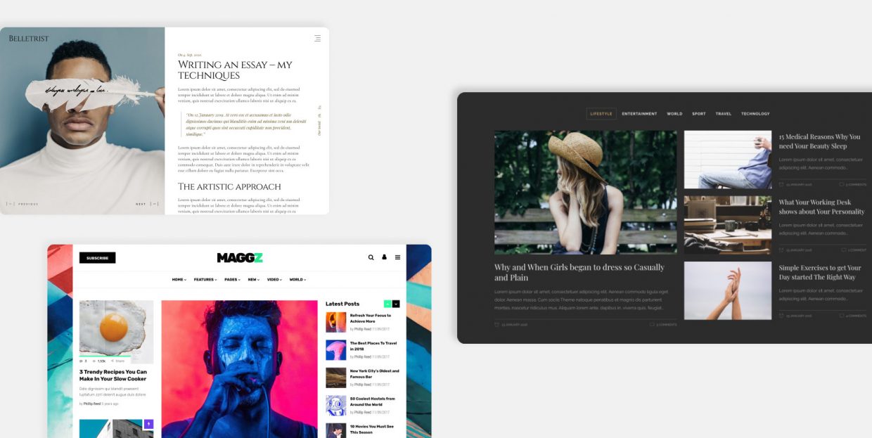
Choosing a content layout is easy when you have an excellent theme, like the Qi Theme, for instance. Such themes pack numerous blog layouts that can be adjusted to your liking, and come with a range of list and gallery options, interactive sections, carousels and whatnot.
If you’re working with a not-so-rich theme, you may need to tweak your available layouts a bit, perhaps with the help of a plugin or two, or with custom code, if the theme allows it.
Either way, today we want to share with you a couple of fail-safe tips for a perfect blog post layout:
Qode Themes: Top Picks
View Collection
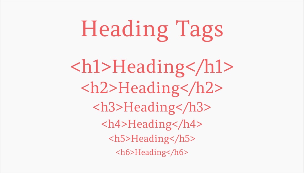
There are two main reasons why you want to make sure you have your headings right.
First is the readability. Headings and subheadings are one of the elements of text architecture that make it more readable and easier to consume. This is vital for longer posts. You don’t necessarily have to use all available heading types, but it’s recommended you go at least up to H3 or H4. Heading hierarchy helps your readers scan your text better and make sure no vital information, idea or concept is missed or skipped. Check your readability score regularly and monitor how headings help your text read better.
The other reason is that headings (or H tags) are very important for SEO. With headings, you signal to Google and other search engines what your content is about. This helps with indexing and increases your chances for good ranking. And if you place your keywords in your subheadings, all the better.
The design of the website needs to allow for the use of different subheadings. These days, most WordPress themes allow for the full range of H-tags. Make sure you use them hierarchically and apply common sense. Don’t use big tags for narrower ideas. Start wide and then narrow it down, from H1 to H3 or H4.
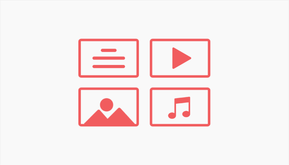
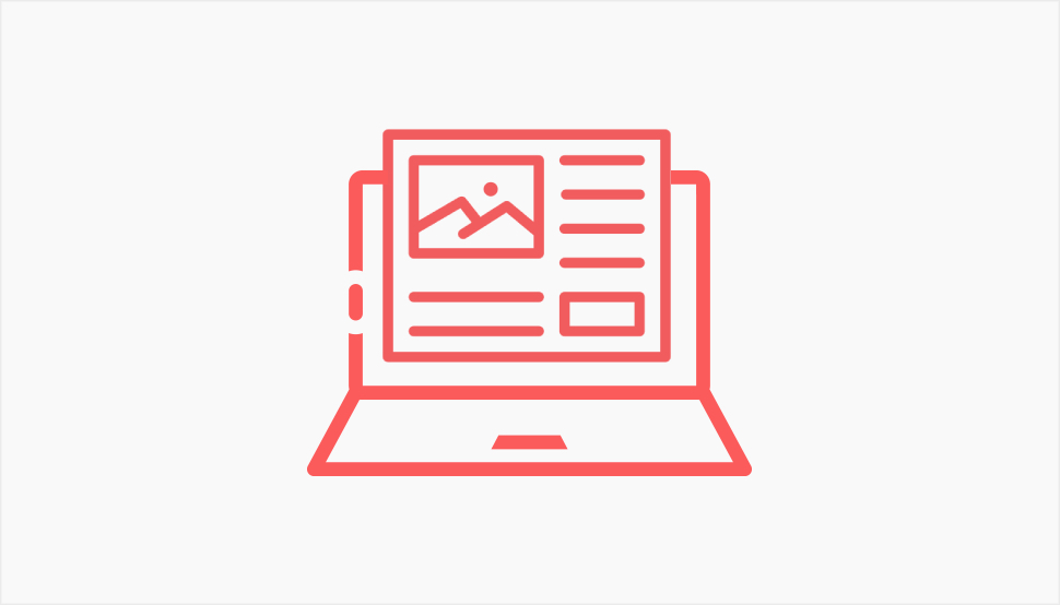
Multimedia (images, video, audio) is an important element of a blog post layout. No one uses text alone – these are not the early days of www when we had little options at our disposal. Text is usually combined with images, sometimes with videos. But how you display these is what separates a good post layout from a not so good one.
Sure, you can simply add an image or two in the middle of your text. But today we have so much more at our disposal. We have innovative ways of displaying multimedia, such as carousels, animated image sliders, interactive galleries and so on. For instance, you can use a divided showcase carousel that combines words and images. Or, you can display your images in an attractive cards slider that stacks them up like an interactive deck of cards.
The same goes for videos. Videos add dynamicity to your posts and make them more engaging, plus they can be great for link building and SEO. You can embed a video from YouTube or, if you have your own channel, you can display your latest uploads right on your page.
A good rule of thumb is not to overdo it with multimedia. If you have more images than text, it’s not a good layout. It’s cluttered and hard to parse. Try to find a perfect balance in which the images will complement the text and not overshadow it.
Once known as post thumbnails, featured images have been the default feature of WordPress ever since the version 2.9. A featured image is basically the main image for the post. Its size and precise location are defined by the theme you’re using, but in most cases it’s a big image set on top of the post. The featured image illustrates the post and helps build its tone and atmosphere.
You can hide the featured image for selected posts, if that makes sense for you. However, it is generally recommended to use them since a blog post without a featured image looks like it’s missing something. It looks incomplete, barren and dry.
Note that the featured image also serves as a thumbnail for your post in lists and galleries, so keep that in mind when picking one for your post.
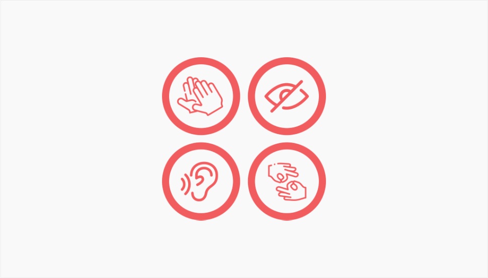
Accessibility is something that applies to the entire website, not just the individual posts, but it is a factor that greatly influences the success of your post layout, too. Accessibility means design that makes sure users with disabilities can access the content, too. These can be visual, auditory, cognitive, neurological and other disabilities. One of the main elements of designing for the differently abled is making sure your content can be accessed by electronic readers and other tools that parse your posts and then tell users what they’re about. Headings are essential here, as well as clearly marked links, alt attributes for images, and so on. Proper contrast is also vital.
If you’re unsure how you stand on the issue of accessibility, there are ways you can check it and also ways to improve your website’s overall accessibility, so make sure to read up on that.
Most blog posts we see around only use one column for the text. That’s perfectly fine, and it’s probably the best, simplest and cleanest way to display textual content. However, sometimes a post can benefit from two or even more columns. It can give it a newspaper-like feel and add an interesting visual touch.
This sort of layout is not for just any blog, though. It can be perfect for blogs about literature, film and music reviews, philosophy, science, etc. It is probably not the best idea for food blogs, for instance.
If you feel this sort of layout makes sense for your niche, check out our guide on how to use columns in WordPress with all the most popular page builders and editors.
Another thing you can consider is a narrow grid. Instead of having your text near the edges of the screen, you can add margins or apply a narrow grid to center your content towards the middle of the page, giving the layout an elegant look with a single column.
A lot of WordPress themes come with the option of placing a border, called passepartout, around your content, along the edges of the page. A passepartout is a term used in art and framing – it’s the border that separates the painting from the frame. In WordPress, you can add texture or color to it, you can adjust the width, and so on. This sort of layout will give your posts an elegant and sophisticated touch. Again, like multi-column layouts, it’s not for just any blog and any niche. It’s perfect for creative writing, prose, philosophy, psychology, art critique and so on. It can also look great on lifestyle, fashion, interior design and home decor blogs.
A similar layout you may want to consider is the boxed layout. It basically adds padding around the page so it appears like in a box. This “box” stays the same regardless of the screen size, unlike the full width layouts that adjust to the screen size and always go from one edge to the other.
A good layout is the one that doesn’t get in the way of the actual content. Experimenting is fine, but while multiple columns won’t clutter the page, elements like too many ads, sidebars, oversized menus and popups will.
A sidebar can be a great navigational tool, but only if it’s done right. A sidebar that is too big, has too many widgets in it and is too flashy won’t do any favors to your UX and to the overall look and feel of your posts. If you’re using the sidebar, place only what’s necessary in it. You can add a post archive to it if you have a lot of posts and if you’re sure you have an audience for that. Related posts are fine, too, and so are social links. However, things like links to the About and Contact page don’t belong there – they belong in the footer.
Finally, leverage the power of negative space. Not every single inch of your page needs to be filled with something. Negative or empty space is a designer’s best friend as it makes the layout breathable and light, and gives the visitor short periods of pause.
Every seasoned designer will tell you that fonts are equally important as the text itself. Typography communicates a lot just by the way it’s designed. Different fonts convey different feelings and create different atmospheres, and therefore cannot be used indiscriminately.
Choosing the right typography deserves as much time and attention as any other aspect of your post layout. Of course, the fonts you’ll use for titles, subtitles, paragraphs and other text will be set in the global options. They can also be set per page or post, but it’s not recommended to use different typography in different posts. Remember, consistency is key. The general rule of thumb says you shouldn’t use more than two or three different fonts. Also, your typography should be eligible across all devices, from the smallest to the largest.
Experimentation with typography, such as large or oversized fonts, can add value to your website, but it can also harm it, if not applied with good measure. For most blogs, it’s probably best to stick to the classic UX recommendations (moderation, legibility, clean fonts).
These days, there’s no lack of creative solutions for navigation. We have mega menus (note: these are generally not suitable for blogs, but for large eCommerce websites and magazines), fullscreen menus, interactive sidebars, sticky sidebars and whatnot. The point is to keep navigation sleek and streamlined, and to maintain the intuitive character of the UX. If an element of the navigation interferes with that, if it’s too loud, too obtrusive and steals the attention, it’s not a good element and needs to be avoided.
On the other hand, you can’t minimize navigation. People need to know where they can find certain pages and certain content. For blogs with lots of posts, it is vital to give them a clear way to access the archive. For that, you need to have your WordPress taxonomies in place – categories, as well as tags. You can sort the archive by categories and then place an archive widget or list in the sidebar.
The archive can also be linked to in the header or in the footer, if you prefer minimalist layouts. A sticky header menu can be a good solution if you have long posts and you want to make sure your most important links are easy to access. Also, if you intend on having longer posts, consider adding a “Back to top” button to your layout.
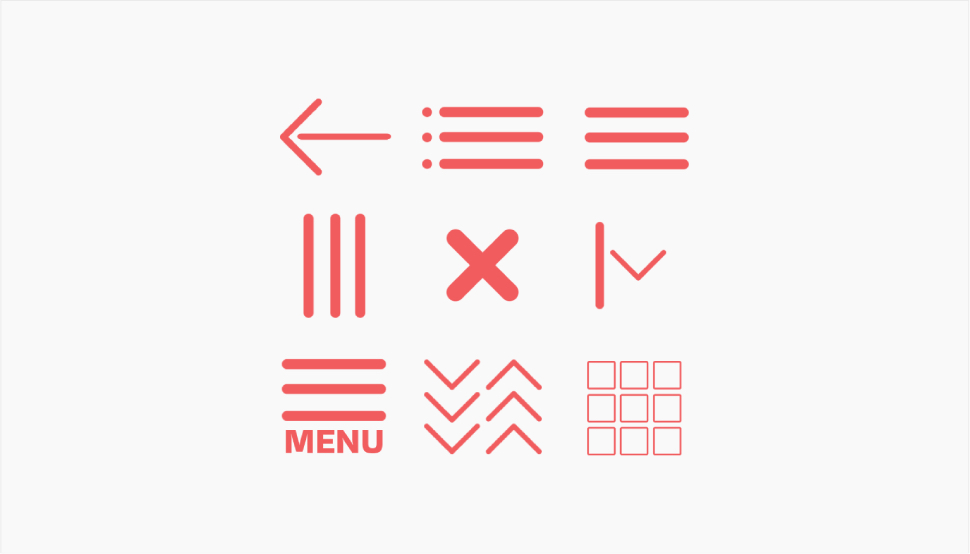
If you do have a lot of things to put in your menu, instead of creating a big fat header menu that clutters the layout, you can use a hidden menu, which can be as large as you like, even fullscreen, accessed by clicking on a simple and minimalist icon. Just make sure to use an icon that is associated with hidden menus and that clearly looks like a menu opener, such as a hamburger icon, otherwise your visitors may spend too much time looking for the menu.
Wrapping It Up
So, based on the tips we shared with you today, there are a couple of key takeaways when it comes to the perfect blog post layout:
-
Less is more when it comes to page elements
-
Tight structure and architecture are key
-
White space is your friend
-
Images and videos – absolutely yes, but in moderation
You can see that it’s really like with anything else in life. Once you find a good measure, everything falls into its place and your page layout starts working for you, luring in the visitors and keeping them on your pages longer. To achieve that good measure, follow the guidelines we set out in this article, and you should be just fine.
If you have your own blog layout tips to share with the world, make sure to leave us a comment!
