How to Improve the Accessibility of Your WordPress Website
Here at Qode, we bring beauty to WordPress. That’s literally our motto. But this doesn’t mean that we espouse putting style over substance. Designing for accessibility is an important consideration. Whether your content is targeted specifically towards people with disabilities or not, sparing a thought for differently abled visitors who might nonetheless appreciate what you have to offer can never be a bad thing. In this article, we will discuss several things you can do in order to increase your WordPress website’s accessibility. But before we get right down to the brass tacks, let us say a few words about accessibility design in WordPress.
In general, web accessibility means that website designers take steps to ensure that people with disabilities, be they cognitive, visual, auditory, neurological or other, can use the website.
Specifically, designing for accessibility means taking in mind those visitors who have disabilities which might prevent them from enjoying all of your website’s features, at least, or even prevent them from accessing your content, at the most extreme. The gist of it is that accessible design means being UX-forward for the differently abled.
Best practices in design now include several techniques which allow you to improve accessibility and make your WordPress website easier to use for people who can’t use it unassisted. This does not mean that designing for accessibility will only benefit your disabled visitors. It may also benefit people with temporary disabilities, such as those who may have broken an arm or temporarily lost vision due to eye surgery, people who are on a very slow connection, or people who just prefer their text in audio form.
This all means accessible design is not catering to a disabled minority, but instead makes for a better overall user experience – and a potential increase in the audience.
Qode Themes: Top Picks
View Collection
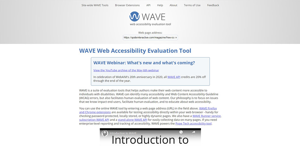
You can test your web pages for accessibility using one of several web-based accessibility evaluation tools, such as FAE, Achecker or WAVE. Out of those, we found WAVE to be the fastest and the most user friendly. Simply paste the web page address into the address field and click the arrow icon to get the report.
We have run a report on an article from the international edition of The Guardian, and we can easily see which areas need improvement, as they are labeled with icons. To get a detailed look at the issue, simply click the icon and read the tooltip. That is how you‘ll know how to resolve each issue.
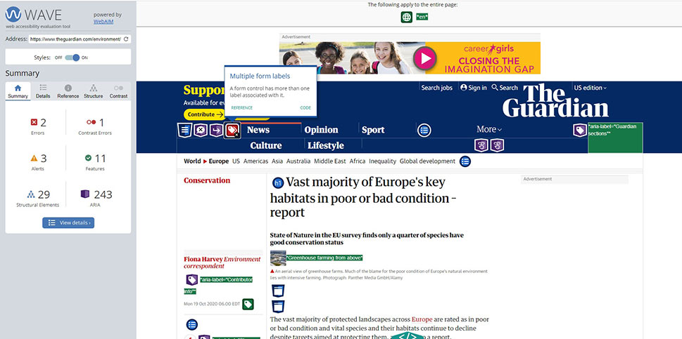
WAVE developers have also provided extensions for Chrome and Firefox, which you can use to return an accessibility report without sending any data to the WAVE servers, making it as secure as possible.
WordPress developers have instituted standards for accessibility for all new code and a best practices handbook for coders, with examples of code. But you don‘t need to know how to code in order to make your website more accessible.
Headings
For instance, a good heading structure is very important to persons using software such as screen readers. Making text large and bold will not make the screen reader understand that the text is a heading. Use a Heading block in Gutenberg, a Heading element in Elementor, or heading tags such as <h1> </h1> in the Classic editor. The Heading 1 is the principal page Heading, and should not be used for anything else.
The internal structure of the text should be subdivided using headings 2 to 6, without skipping levels. You should also avoid adding any additional functionalities to headings, such as links. Conversely, you shouldn‘t be using headings purely for aesthetic purposes. That’s what font size and style are for. A good heading structure will not simply help users with screen readers – it will also mean a better SEO score.
Links
When creating links, you should make sure that it is clear from the context what is and isn‘t a link. If a link is surrounded with other text, best practices mean it should be underlined and in a different colour.
Adding Alt Attributes to Images
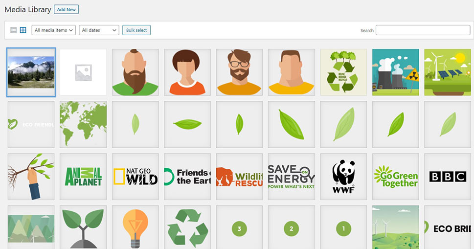
Adding alt attributes to images makes them “readable” for screen reader software, and it is very easy to do. All you need to do is access any image in your media library.
In the right-hand side menu, you will find the Alt text box. Simply put in a meaningful description of the image, which in our case is a landscape photograph meant for a purely decorative purpose, and requires nothing more than a simple description.
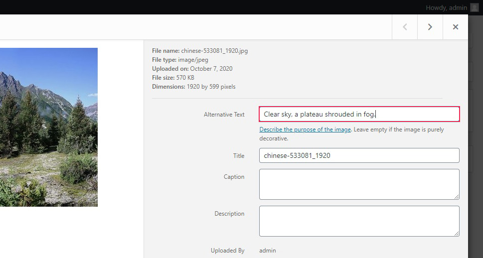
A person using a website reader will now have the textual description of the picture. This function of your media files is something you shouldn’t overlook – it can affect your SEO score. If you want to know more, we have a whole in-depth guide to alt text and image titles.
Some colour palettes can cause trouble for users suffering from poor eyesight, colour blindness, and similar conditions. Generally speaking, the more contrast, the better, although too much contrast can cause issues for people with sensitive eyes. This not only applies to text and background, but also to elements (such as buttons, icons, menus and other) and hover effects. For more on changing text colours in WordPress, check out our in-depth guide.
The recommended background:foreground luminosity contrast ratio is 4.5:1 for normal text, or 3:1 for large. There is a large number of tools you can use in order to check your contrast ratios, such as the WebAIM contrast checker. WAVE, being a comprehensive tool, will highlight contrast issues in your website design, too.
Forms are an important part of web interaction. There are a couple of things you can do to make them more accessible.
Firstly, good labeling is important. Label all your fields correctly and clearly. Secondly, use placeholder text – examples of text your visitors need to input into forms. For instance, if you are expecting an URL, use something like www.yourwebsite.com for a placeholder. Finally, a complete set of instructions on how to fill out a form could be a great help to the visually impaired.
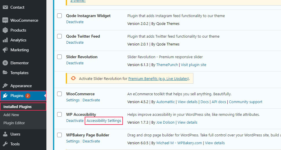
It is no surprise that there is a number of tools you can use to help fix some of the common problems WordPress websites have with accessibility. The plugin which we found potentially the most useful is WP Accessibility. We will guide you to some of its important features.
Once you install and activate the plugin, you need to configure it. Navigate to Accessibility Settings from the Installed Plugins screen on your dashboard.
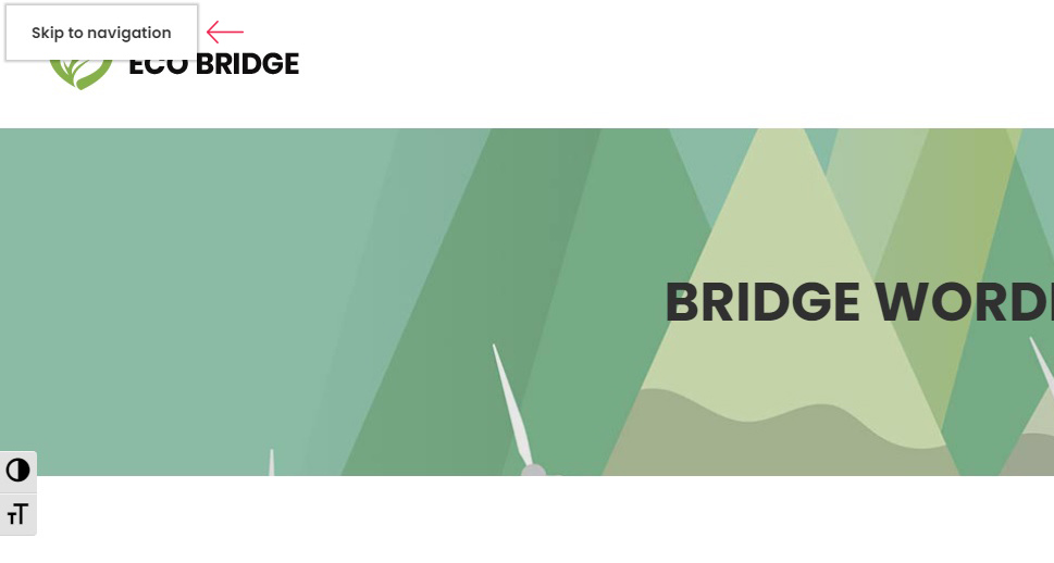
In order to make your website more accessible for website readers, you can add skiplinks. Skiplinks make the readers focus on the content, rather than having to read through all the menus and header data first. Configuring skiplinks takes a little code knowledge, so we won’t go into details here. It does provide your users with a button they can use to skip the unnecessary content and go straight to the heart of the matter. You just need to assign an ID attribute to where you want the link to take your visitor.
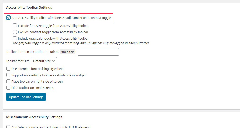
Next, there are the Accessibility Toolbar Settings. If you check Add Accessibility toolbar with fontsize adjustment and contrast toggle, your user will see a toolbar on the side of their screen.
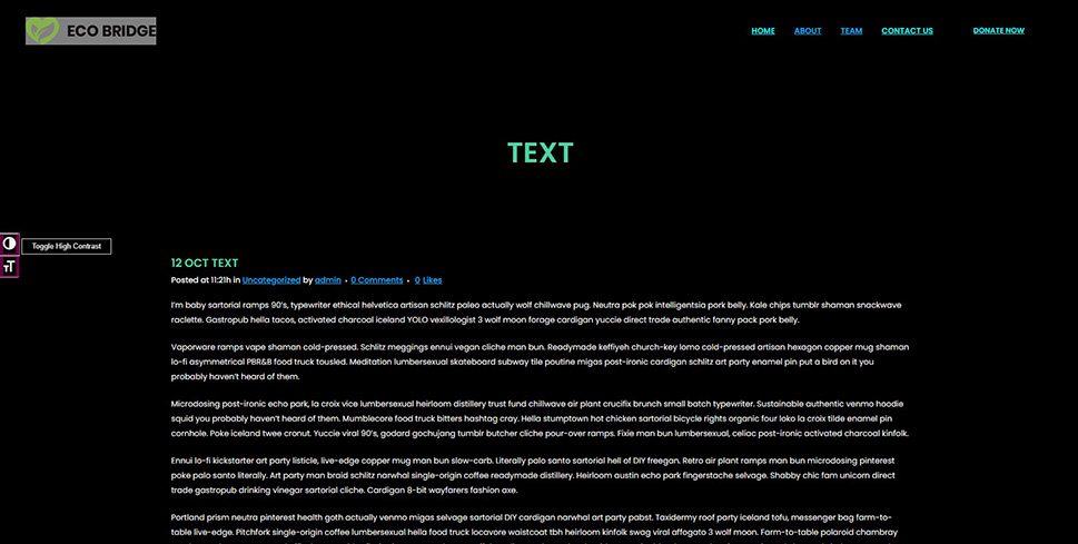
This they can use to view a high-contrast version of your website…
…or to enlarge the main font.
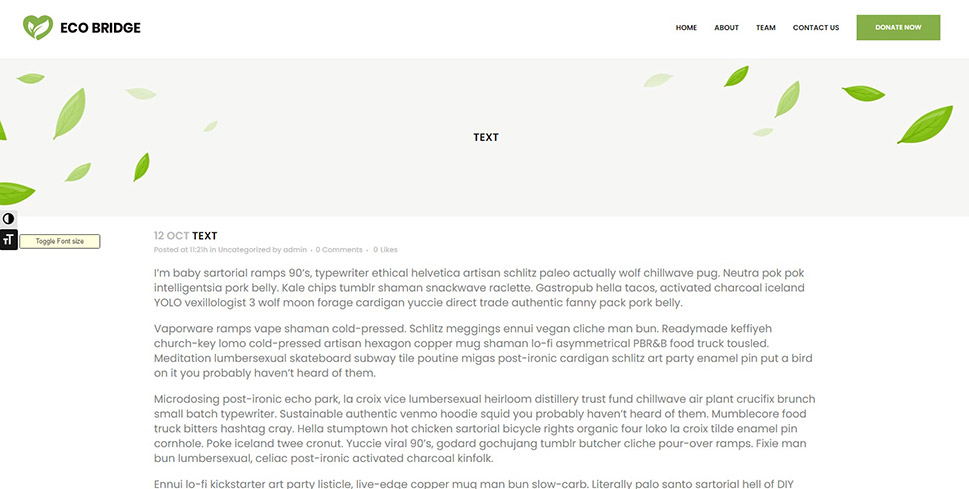
We won’t go into the nitty-gritty of the toolbar settings, but there are several options you may want to test before enabling them for your visitors.
Next, you have the Miscellaneous Settings section.
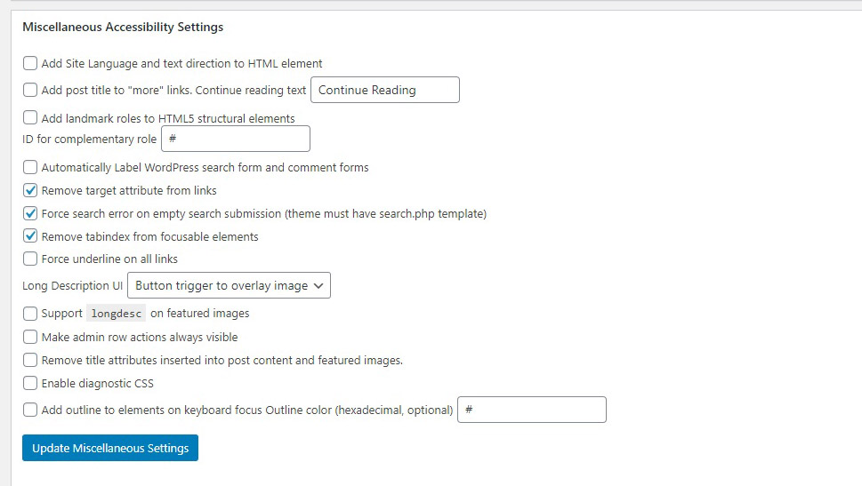
You may cycle through each of these individually, and see which ones work best for your website. For instance, your website may be using a RTL (right-to-left) text language – the plugin and the website reader need to know that. You may want your images to have longer descriptions, and there is an option for that, too.
Three of these checkboxes are checked by default: links carry no target attribute, the website returns a search error when the search field does not contain a string, and tabindex is removed from focusable elements.
Next, you have the Remove Title Attributes section. This serves to tell the website reader that some items in the layout are not titles. We suggest you go through this and remove the title attribute from whatever that doesn’t need it.
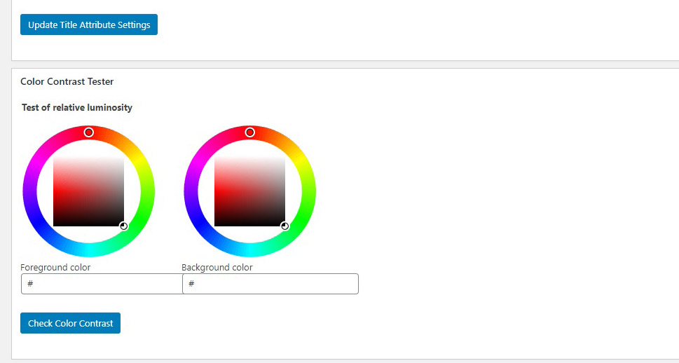
You also have a handy contrast-checking tool. Simply pick the colours you are using or paste their hex codes into the appropriate fields, and check whether your contrast ratios are what you need them to be.
In Conclusion
As we have shown, there are plenty of things you can do to make your website more accessible. Avoid the pitfall of thinking about accessible design as merely accommodating a minority – in fact, all you are doing is appealing to a broader range of visitors, investing only a little more time and effort into potentially great returns. Not to mention that some of these techniques might significantly improve your SEO score. Why wouldn’t you want to take advantage of that?
