How to Choose the Right Font for Your Website
Designing a website is an intense process that entails a lot of hard work. There’s so much to think about, from the color scheme and logo to the navigation, layout, and text design. But perhaps the trickiest part of designing a website is getting all these different elements to fit into one logical, compact and well-balanced unity.
Website fonts are an important part of that unity. Once they get an overall impression of your website, your visitors will inevitably focus on the text in order to find out more about you and your brand. That’s why, when trying to glue these design pieces together, it’s especially important to pay attention to your font design. There are tons of places where you can find quality fonts, but you need to make sure that the typeface you choose is readable, clean and just on the right side of striking, without diverting too much attention from the rest of the design.
Picking the right font is key to having a good website design, whether your site is a portfolio, a blog, a web store, or a huge corporation website. To help you figure out which font type best aligns with your brand essence, we’ve tried to make this process a bit simpler for you. Here are some things you should consider when choosing the ideal font for your website.
1. Start from the basics
When it comes to website fonts, there are so many things to look into, and it can get real overwhelming real fast. That’s why it’s best to start from the very basics before going any further.
-
Should you go for Serif or Sans: this is one of the elementary font category classifications. Based on the Roman alphabet, Serif typefaces are characterized by a decorative stroke located at the end of the vertical and horizontal strokes of the letters.
Some of the most famous serif fonts include Times New Roman and Georgia. The Times New Roman font in particular falls under the category of classic web-safe fonts. Overall, you can’t go wrong with choosing default font types such as this one, as they are usually easy to read and have been around for a long time, so lots of internet users are used to them. Still, if you’d rather try a bolder approach, then we recommend checking out fonts such as Noe Display, Freight Text or the Portrait collection. Of course, there are always Google’s serif typefaces that you can use for free, such as Playfair Display, Cormorant Garamond, or Crimson Text, to name a few.

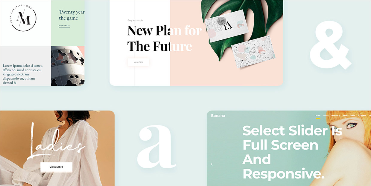
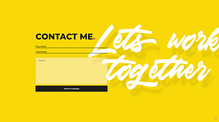
Attika theme with Playfair Display font

Etienne theme with Cormorant Garamond font

Bard theme with Crimson Text font
Sans typefaces have no serifs on the letters (the word “sans” stands for “without” in French), and they are known for having a more modern and clean design compared to their serif counterparts. Helvetica, Tahoma, Verdana, Futura, and Arial are all examples of widely used sans serif fonts. As for free fonts, we suggest trying out the following for the Google Fonts free font library: Roboto, Source Sans Pro, Poppins, Heebo, or Montserrat.

Foton theme with Poppins font

Quart theme with Heebo font

Mane theme with Montserrat font
What type you will choose largely depends on your target audience and the mood that you want to evoke with your font design. Generally, serif typefaces are used with the intention to bring forward a more formal and elegant tone, which is why you will often find them among many elegant fonts. Though they can also be used to give an alternative look to your web page, and can often be found in magazines and within the fashion industry.
Sans fonts, on the other hand, most often symbolize minimalism, simplicity and straightforwardness. However, one of the great characteristics of sans serif fonts is that they are highly flexible. For example, if paired with an old style typeface, a sans serif can take on its qualities, in turn giving off a more traditional vibe.
-
Kerning, leading and tracking: these three design elements can be vital when figuring out the look of your typeface. These methods have the purpose of modifying the space between letters in order to get a visually pleasing and easily readable font. Kerning stands for the space between two letters, leading represents the space between lines of text, and tracking (or letter-spacing) is the spacing between groups of letters.
-
Contrast: in typographic web design, contrast is used to emphasize different chunks of text in a multitude of ways, all with the purpose of making the important parts stand out more. Different contrast types include size, weight (making certain parts of the text appear bold), color, form (for example, capital or lowercase letters) and structure (different forms mixed with different typefaces).
-
Alignment: figuring out how the text will be placed on the page is also an element that can contribute greatly to your font design. You can align your text to the left, right, or center. In addition, you can choose whether you want the text to be ragged on the right or justified.
Generally speaking, the text aligned to the left is the easiest to read. Fully justified text is considered more formal as it lines up evenly on both sides of the margin, while ragged text has a reputation of being more informal and friendly. You can set up your alignment depending on your audience type, their expectations, and whether you have to think about the space limitations or not. In case you have to make full use of the writing space, then, by all means, go for the justified alignment. And if you want your perfectly aligned text to appear less dull, you can always divide different parts of the text by inserting some visuals or a subheading in between. If you do this, make sure to wrap your text around the images to give your page a cleaner and organized look.
When aligning your text, you should also pay attention to Line Length (the distance between the left and right side of the text block). The most effective way of measuring line length is by average characters per line. The optimal line length is from 45 to 80 characters, including spaces.
Top Themes for Creatives
View Collection


2. Your typographic choices should mirror your design purpose
There are so many different typefaces on the web to choose from, and your font choices are practically limitless. While this is good in itself, it can easily overcomplicate things if you don’t have at least some idea of what you want (or don’t want). That’s why it’s important to carefully consider the purpose of your web design, as well as the type of audience that you want to attract. Then, see if the styling of that typeface you’re considering corresponds with the general message that you want to convey to your visitors.
Burst Theme with Lato font
After figuring out these core principles, here are some additional questions to ask yourself when choosing your font design:
-
What is the nature of your brand? For example, is it serious or laid-back?
-
If your website revolves around a project, what type of project is it? Is it short-term or long-term? There is a possibility that a long-term project (for example, a magazine or a newsletter) could have more requirements than a short-term one, and may need a change of typefaces as the time progresses. It’s best to pick a large font family with different variants and weights to have different options at your disposal, just in case. If you’re working on a short-term project (like a product launch or a marketing campaign), then sticking to simple font versions without additional weight might just be enough.
-
Do you want to aim for practicality and functionality and go for one of the web-safe fonts, or do you want to stand out from the rest and try out a more unique font choice?
-
Will your website be more visually driven (graphics such as photos, animations, and video), or will it mostly consist of the large portions of text that provide plenty of information about your brand or products?
Asking yourself these questions should at least help you get a general idea of what you want, so when you stumble upon a font, deciding whether it works for you or not will be at least a little bit easier.
3. Choose the number of typefaces and rank them by importance
In typography, too much of a good thing can easily turn bad. When picking the number of typefaces for your website, our suggestion is to aim for no more than three different fonts. Allow us to elaborate on that in more detail.
-
Primary font: as this will be the most visible font on your page, your primary font should be most synonymous with your brand identity. Primary fonts are mostly used for larger text, such as headings.
Capri Theme with Montserrat font
-
Secondary font: you should use this font for your body copy. This means that any article or description on your page is going to be in your secondary font. Above all else, your secondary font should be clean and easy to read. Font types like Futura, Roboto or Verdana could all be a solid font choice for your body text.
-
Tertiary (accent) font: if you ask us, this one is entirely optional. Accent fonts can be used for specific website elements such as a call-to-action or a navigation menu. They should be prominent enough in order to quickly catch the eye of your visitors. But keep in mind that pairing two fonts is hard enough, without throwing a third into the mix. However, if you’re up for some experimenting and you want to try using a tertiary font after all, there are also many experimental typefaces you can check out for some additional inspiration.
Aoki Theme with Montserrat font
With all this being said, every brand has its own requirements, so nothing is really set in stone. Just remember that the more fonts you have, the harder it will be to harmonize them all together. So, if possible, try to keep your font number to a minimum unless it’s absolutely necessary to do otherwise.
4. Be mindful of the load times
In this day and age, nobody has time nor patience for slow sites. That’s why if a font takes too long to load, it might not be the best solution for you. Here are some things you can do to prevent a font from slowing down the speed of your website.
-
Stick to a limited number of typefaces. We’ve already mentioned why having too many fonts might not be the best idea. Loading speed is another reason why you shouldn’t go overboard with your font number.
-
Only pick the styles that you need. In this way, the size of your fonts will be minimal, and less size equals less loading time. For example, when downloading a font, choose only normal and bold style.
-
Don’t download the languages you won’t use. If you only require one or a few different languages for a particular font, then make sure to deselect the ones you’re certain you won’t have a need for when downloading it.
5. Think about font combinations
There are multiple things to consider when pairing different fonts. After all, each font has its own distinct character – some fonts appear more serious, some look more refined, while others have a more quirky and spontaneous feel to them.
Arrosa Theme with Montserrat and Tuesday Night fonts
Mixing two fonts with different “moods” might actually do the trick – they do say that opposites attract, and this rule applies to typefaces as well. Try combining blunt font types with more neutral, subdued ones. The former should be used for headlines, while the latter works best for body copy.
Another good combination you can rarely go wrong with is to mix serifs and sans serifs. The pairing of fonts is all about creating contrast, and serifs and sans serifs are more than sufficient to create a subtle but distinct difference when paired up.
In case you’re still uncertain what fonts to combine together, you can always choose a safe route and use two fonts that share the same font family, as they’re made to go together in the first place. Moreover, pairing fonts from the same font family can help you bring a sense of consistency, thus making the process of designing a website a lot easier. You can create contrast among the same font families by changing things like size, case, or weight, by mixing regulars with italics, and so on.
If you need help with pairing fonts, there are several great online tools that can help you out, like fontpair. Alternatively, you can always check out Google font combinations to learn which fonts from the Google collection go exceptionally well together.
6. Font Inspiration and other useful tools
In case you need additional assistance during your font search, there are plenty of places on the web that can provide you with font inspiration. For example, Typewolf is a site where you can find tons of font recommendations and lists that can spark your creativity or, at the very least, show you the route in which you can take your font design. Also, there is an entire collection of typography resources waiting for you – from books and tools that can help you identify a font to useful typography blogs.
Another great site for getting you started is Fonts In Use. Here you can browse through fonts that many designers use in the real world, as well as on the web.
Say that you stumble into a piece of design online that features a really cool font. You can easily picture this font on your webpage, but you don’t know its name, or how to find it on your own. Luckily, there are helpful online tools for these situations that can identify fonts for you. WhatTheFont is one such font identifier that is powered by one of the largest font collections on the web. All you need to do is upload a picture with your desired font and crop it, and the results will show you the name of the font in question.
Fontface Ninja is a free browser extension that allows you to inspect, try and/or buy any font you’re interested in. When you hover over a font, not only can you learn the name of the font you are inspecting, but you also get info about its size, kerning, line height and color.
On the other hand, if you really can’t be bothered to find website fonts on your own and just want to see how certain fonts would look like on your webpage as soon as possible, you’ll be happy to hear that many modern WordPress themes come with ready-made fonts. These fonts have been carefully picked and paired by designers, so there are bound to be some that will appeal to you and fit your idea of how typography on your web page should look like.
Final thoughts
Even though the web is bursting with gorgeous-looking graphic design elements such as motion graphics, illustration, and photography, the majority of online information can still be found in text. In fact, typography makes up about 90% of website content. Thus, the importance of font design must not be overlooked as it can have a direct influence on the user experience and, as such, can make or break your website. To assure your website is legible enough for the full reading comfort of your users, always test how your fonts appear on different devices and screen sizes.
When figuring out what font design works best for you, try to think of your design purpose first. Once you determine the general direction in which you want to go, pick the number of typefaces you want to have, and then start browsing the web for possible font combinations. There are plenty of choices available, so you’re bound to find something that works well for you. And once you find the perfect one, adding a font to your WordPress website is a piece.
