How to Create a Fullscreen Menu in WordPress

Nothing defines a good UX like intuitive website navigation. Menus, for instance, are among key navigation elements that, if done right, can greatly enhance the user experience of your website. They can even be a determining factor in whether they will keep browsing your site or flee, which is why you should be extra careful when designing them.
Fullscreen menus in particular have become increasingly popular over the years, as they are practical, creative and allow for some design experimentation. Thus, we have decided to talk in more detail about the pros (and cons) of fullscreen menus, as well as show you how you can set up a fullscreen menu on your WordPress site.
While many WordPress themes allow you to create a fullscreen menu, there are also plenty of them that don’t come with this option out of the box. For this reason, we’ve made sure to offer solutions that will allow everyone to generate a fullscreen menu on their WordPress site with ease.
Stick around as we show you:
Fullscreen Menu Themes
View Collection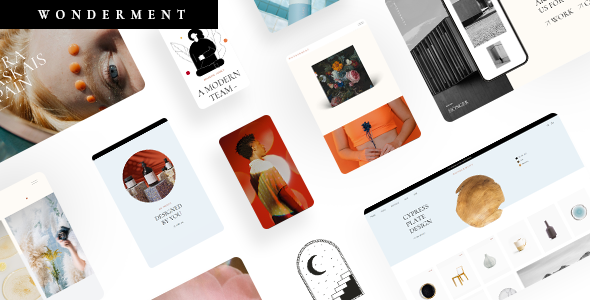
Wonderment
Agency Theme
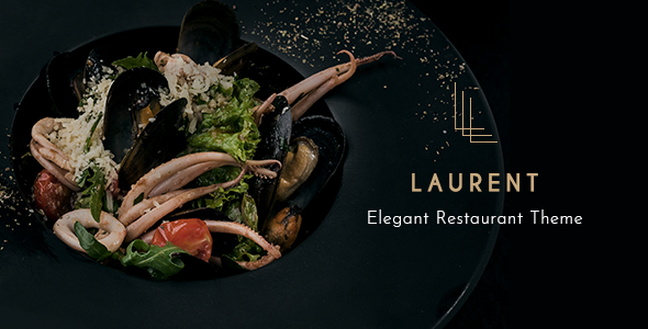
Laurent
Elegant Restaurant Theme
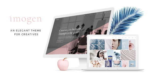
Imogen
Theme for Designers and Creative Businesses
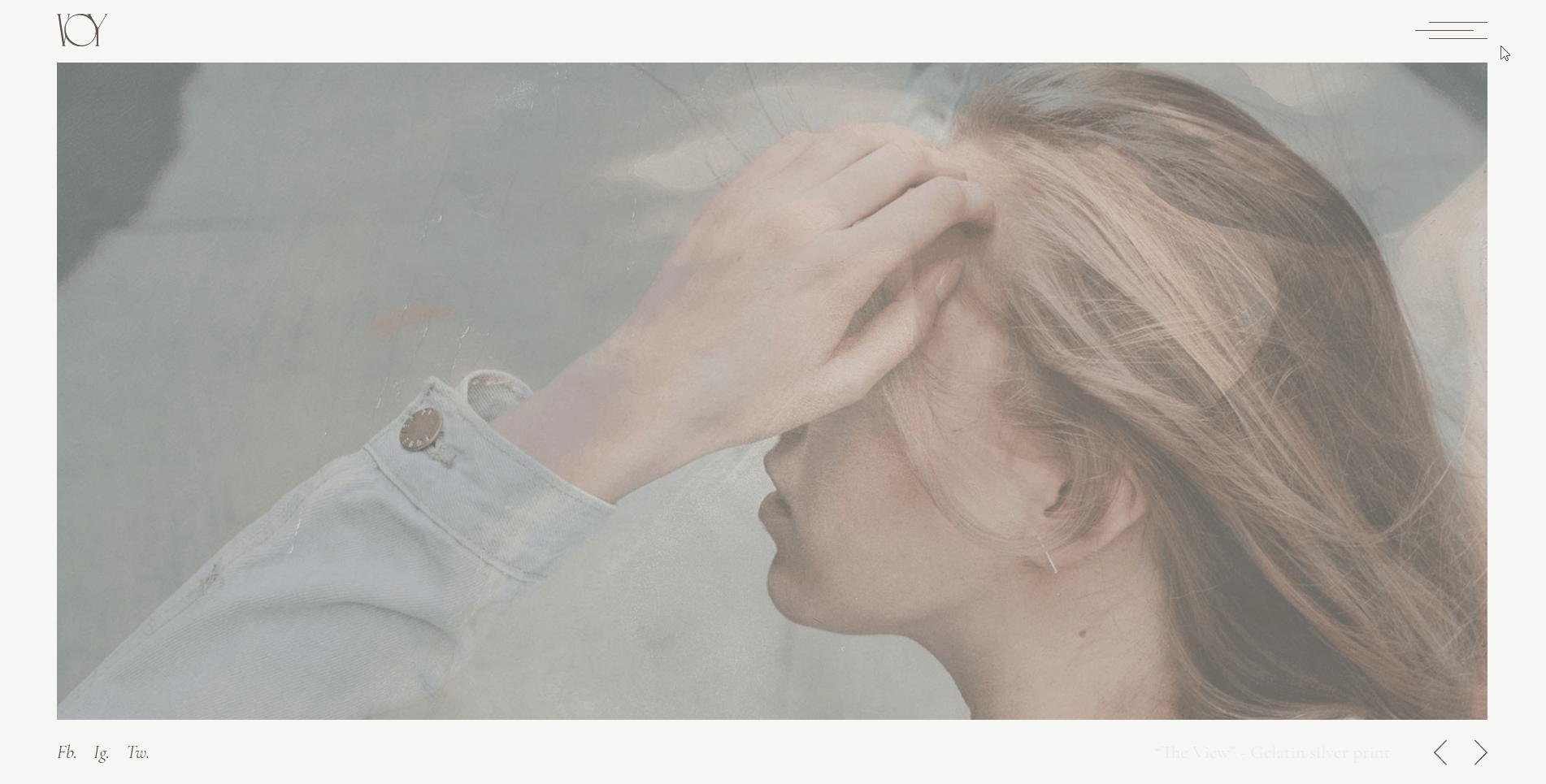
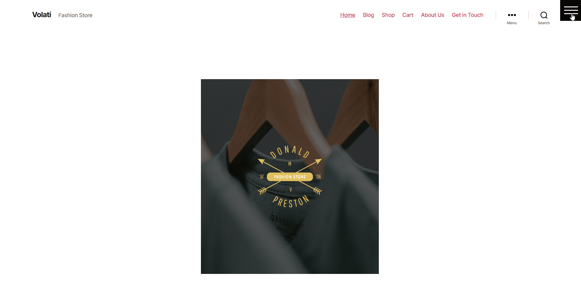
What’s typical of a fullscreen menu is that it is initially hidden from view and is accessed by clicking on a menu opener icon usually located somewhere on the side of the screen. This icon is easily recognizable as it most often appears in a form of two or three horizontal lines (otherwise known as a hamburger icon) or dots.
And while this menu icon, in our opinion, is intuitive enough in itself, some users may still get confused with this type of navigation. Namely, most people are used to seeing standard website navigation with menu links that are instantly visible somewhere at the top of the screen. So if a fullscreen menu (that is initially hidden from view) is the only type of navigation available, it can potentially disorient some website visitors.
That being said, a fullscreen menu still remains superior when it comes to introducing some creativity into your navigation. Since the entire structure of the fullscreen menu gets displayed across the entire screen, this gives you plenty of room for experimentation. For instance, you can style your menu in any way you want without disrupting the rest of the website design. With a fullscreen menu, you also have enough space to insert any additional elements. For example, you can add social media icons, your website logo, some additional info about you on your brand, and anything else you deem appropriate.
In general, you can play around with the design and create a rather remarkable fullscreen menu that will help your website stand out in a unique way. There are some impressive examples of fullscreen menus out there that perfectly illustrate the creative potential of this navigation type.
In short, a fullscreen menu is great because it has a dual role, in a way. When tucked away behind a single menu opener icon, it keeps the rest of the website design clean, simple, and minimalistic. On the other hand, it gives you the ability to create a unique-looking menu that is still intuitive and easy to navigate when opened. As such, it is the ideal type of navigation for all sorts of websites out there, including digital agencies, online portfolios, creative studios, and different types of interactive showcases.
However, this menu may not be the best solution for some websites, like online shops or businesses that have many pages on their site in general. These types of websites usually offer plenty of products and/or services and require a multilayered type of navigation. That is not to say that a fullscreen menu cannot be used to effectively display multiple products on a site, but it’s simply not considered standard practice. That’s because such websites usually have plenty of items that need to be displayed within a menu. Therefore, if you require a practical type of navigation and you don’t care much for the visual style, a more classical menu may work better for you.
With all this said, let’s take a look at how you can add a fullscreen menu to your WordPress site. We will show you how you can do this with the help of a plugin first, and then using one of our themes.
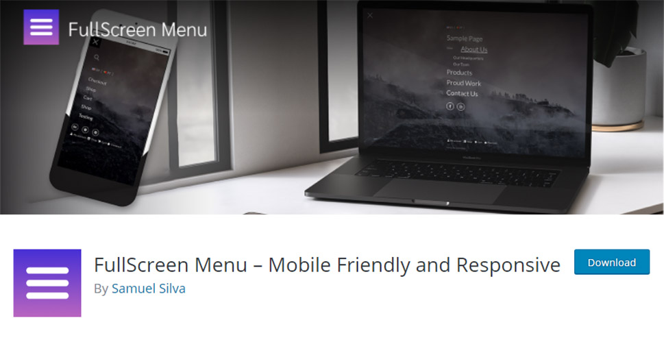
If the theme you’re using doesn’t come with the fullscreen menu functionality, don’t worry – you can easily add one using a plugin. Our choice is FullScreen Menu, a great plugin that comes with plenty of options and allows for a comprehensive customization of your fullscreen menu. The free version of the plugin allows you to set various fullscreen design and appearance-related features, such as fonts, animations, hover effects, and more. If you choose to upgrade to the pro version, you will get access to some additional features, like options that allow customization of a menu opener icon, the ability to add a background image, change menu text alignment, etc.
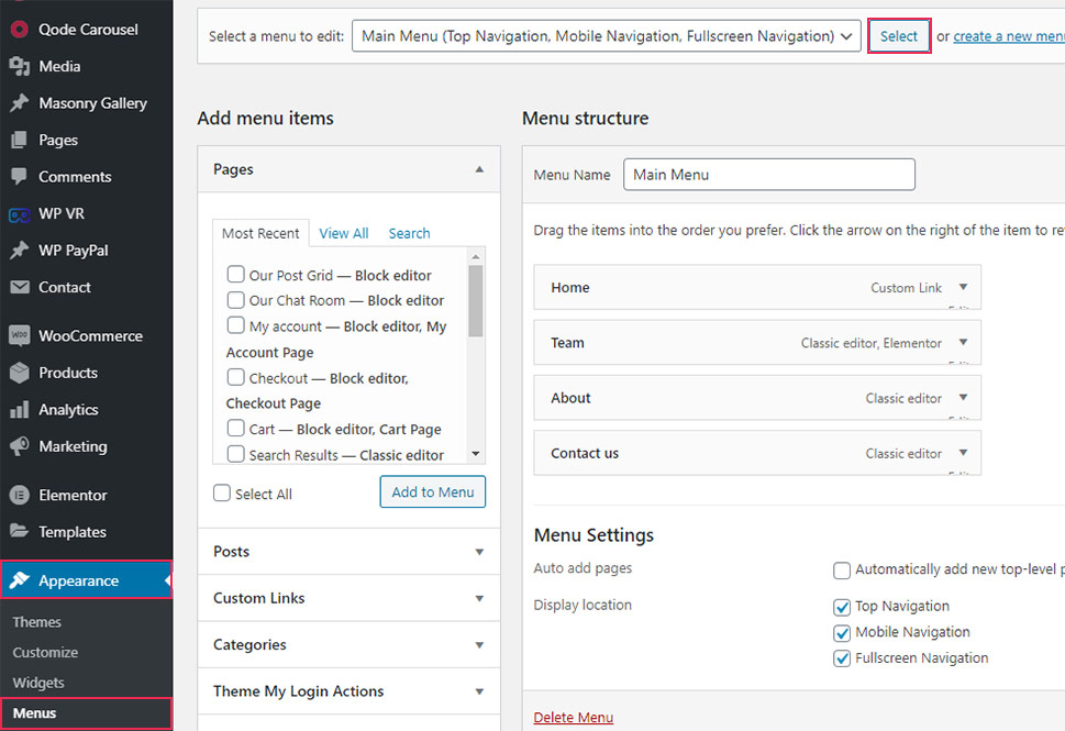
Before you begin adding a fullscreen menu using a plugin, don’t forget to create a navigation menu using Appearance >> Menus first.
After installing the plugin and activating it, find the Fullscreen Menu Options button in your admin dashboard and click on it.
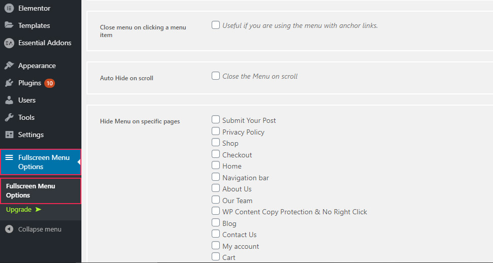
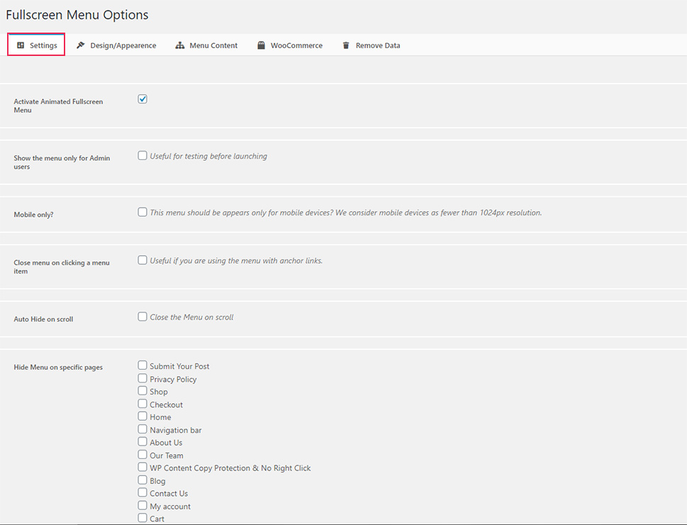
This will open an options screen where you will get to access several different tabs to configure the plugin to your liking.
First off, the Settings tab gives you access to a few rather useful options. Here, you will be able to activate the animated fullscreen menu, choose whether you want to show the menu to admin users only, or make it appear only on mobile devices. You will also get to auto-hide the menu on scroll or choose to hide it on specific pages.
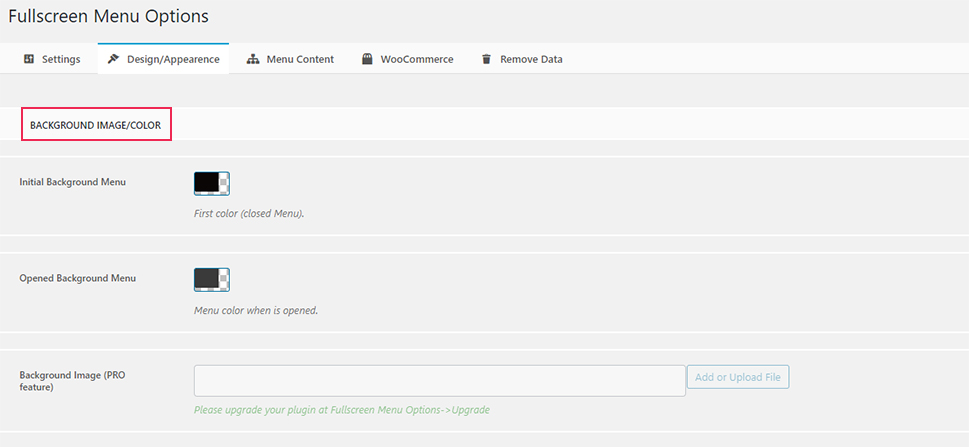
In the Design/Appearance tab, you will get to set different design and appearance elements of your fullscreen menu, including background, font, and animation.
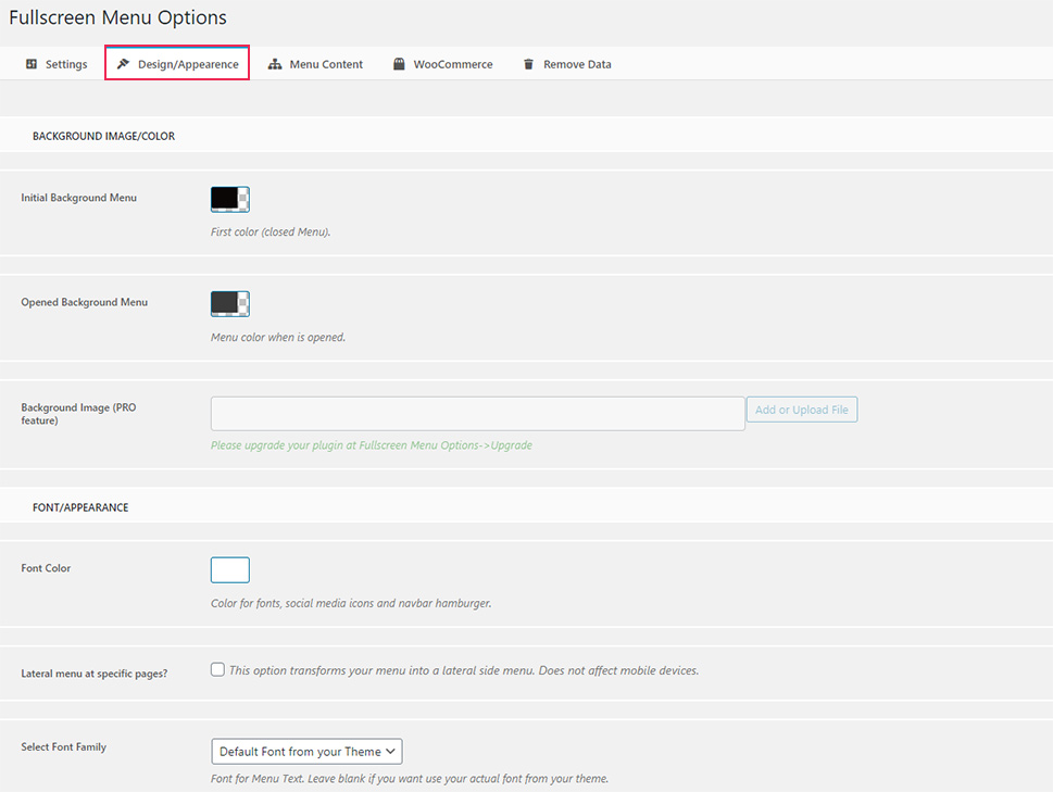
The Background image/Color section contains fields for changing the color when the menu is opened and when it’s closed, and the ability to add a background image (which is available only if you upgrade to the pro version of the plugin).
In the Font/Appearance section, you will get to change the font color of your menu items, as well as for social icons and the menu opener/hamburger icon.
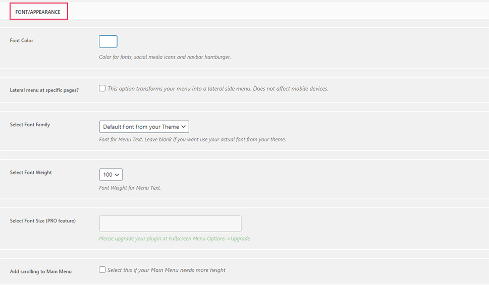
You will also be able to select the font family, size (which is a pro feature), font weight, and add scrolling (which is useful in case your main menu needs to have more height).
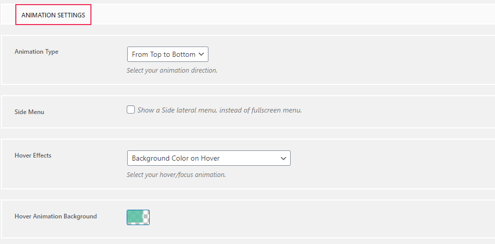
Finally, the Animation settings screen will allow you to choose your animation type (the effect that appears when you open a menu), enable the side lateral menu instead of a fullscreen menu, select a hover effect, and more.
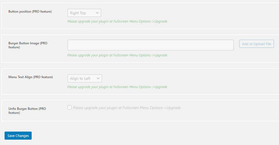
If you upgrade to the pro version of the plugin, you will have a few more options at your disposal, such as the ability to change the button position, choose a burger button image, change the menu text alignment, and unfix your burger button (customize its position).
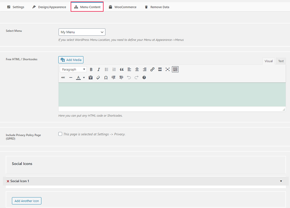
The Menu Content tab offers more useful options. Most importantly, here, you need to select a menu that you want to be displayed as your fullscreen menu, i.e. assign a specific menu (that you’ve previously created in Appearance >> Menus) to your fullscreen navigation.
Also, you will be able to add any additional shortcodes or HTML, include a privacy policy page, add social icons, and more.
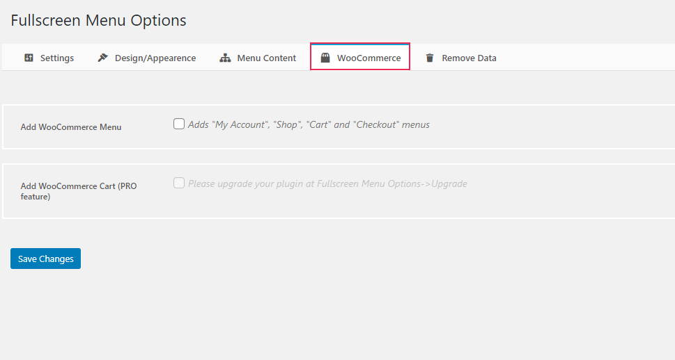
The WooCommerce tab allows you to add a WooCommerce menu (specifically My Account, Shop, Cart, and Checkout menus), and a WooCommerce cart (which is a pro feature).
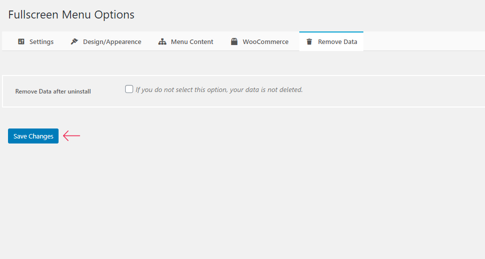
Finally, the Remove Data tab lets you enable the option that will remove your data related to your fullscreen menu in case you end up uninstalling the plugin.
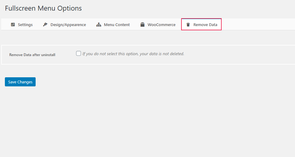
Of course, you should save your changes using the Save Changes button at the bottom of each tab to store any settings.
Once you’re satisfied with the way you configured your fullscreen menu options (and after you’ve made sure to select a menu to be displayed in your fullscreen navigation), you should go ahead and check out the look of your menu.
If you’re using (or plan to use) a Qode theme for your WordPress site, you’ll be happy to learn that our themes come packed with a set of comprehensive options that allow you to create a fully responsive, intuitive, and user-friendly fullscreen menu.
We also have to mention that there are many WordPress themes with fullscreen menus that contain a built-in and responsive fullscreen menu out of the box. Of course, if you want to further customize your fullscreen menu and style in any way you want, you will be able to do so with ease.
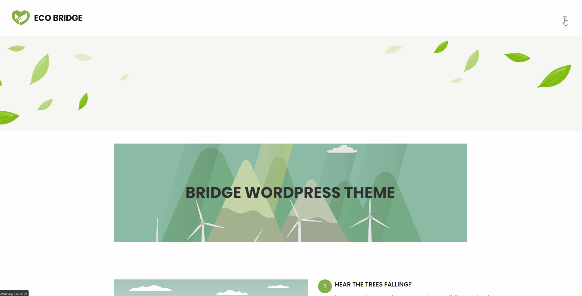
We will show you how to do that using the Bridge theme as an example. Before we begin, however, we should note that some specific options may vary from theme to theme. Still, the following example should give you a good idea of what you can expect if you’re using one of our themes.
If you prefer to follow video instructions, you can also check out our video on the same topic:
Once you’re in the admin dashboard area, access the Qode Options screen and choose the Header option.
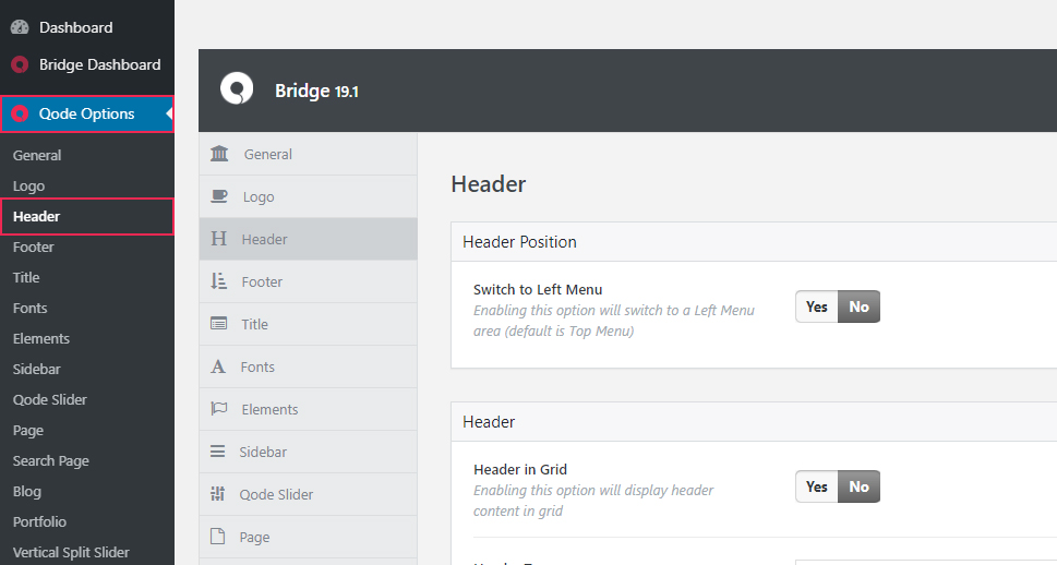
There, you will find a neat set of links that will allow you to jump to the specific section once you click on them. To access the Fullscreen Menu section, simply click on the anchor link with the same name.
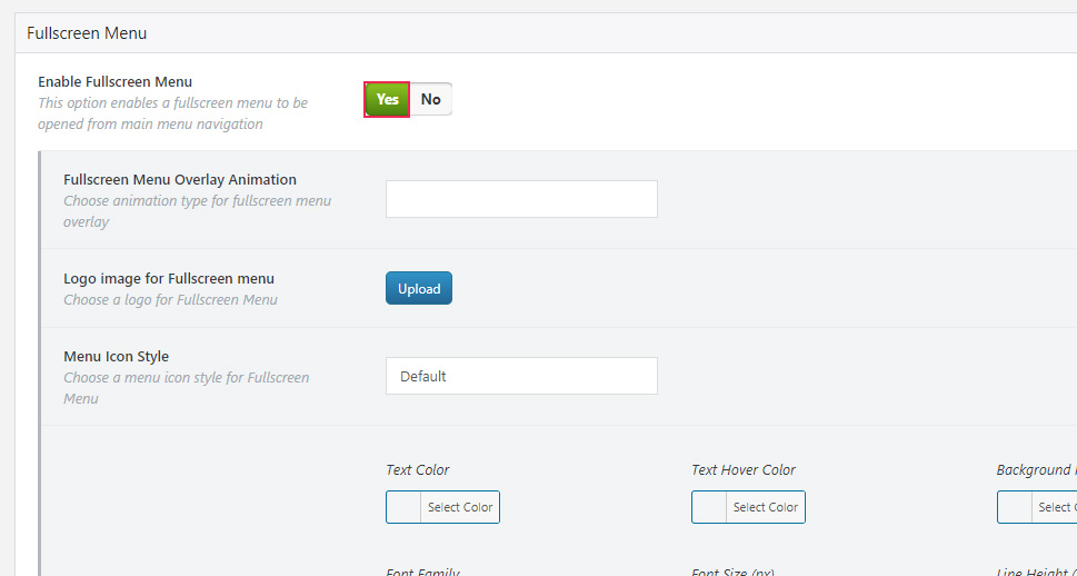
You will immediately see the option that allows you to enable a fullscreen menu. Simply click Yes.
Then, a whole new set of fullscreen menu-related options will open.
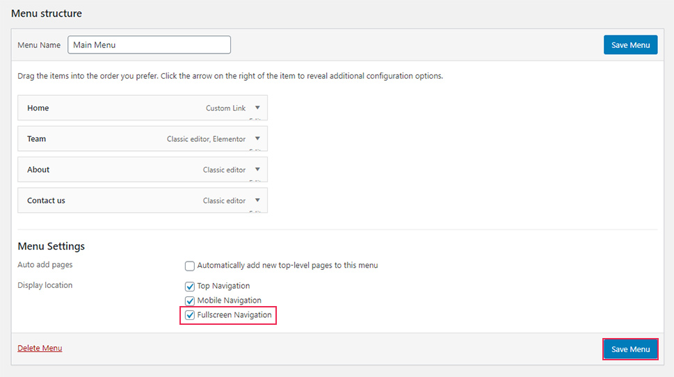
After you hit the Save Changes button, you should go to Appearance >> Menus to assign a menu to the fullscreen menu navigation.
There, you will also see the Menu Settings section. Mark the “Fullscreen Navigation” box and hit the Save Menu button.
In case you only want the fullscreen navigation menu to appear on your site, go to the Manage Locations tab and set the other navigation types to default (“Select a Menu”).
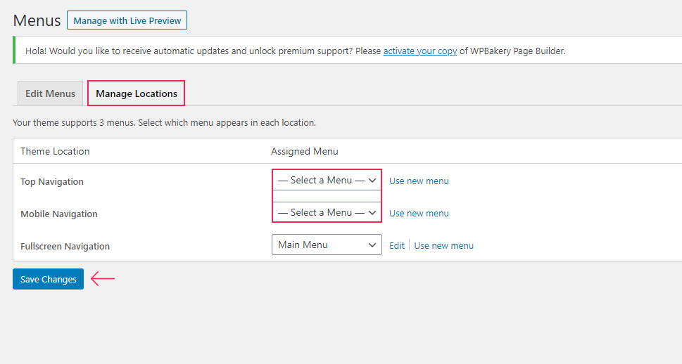
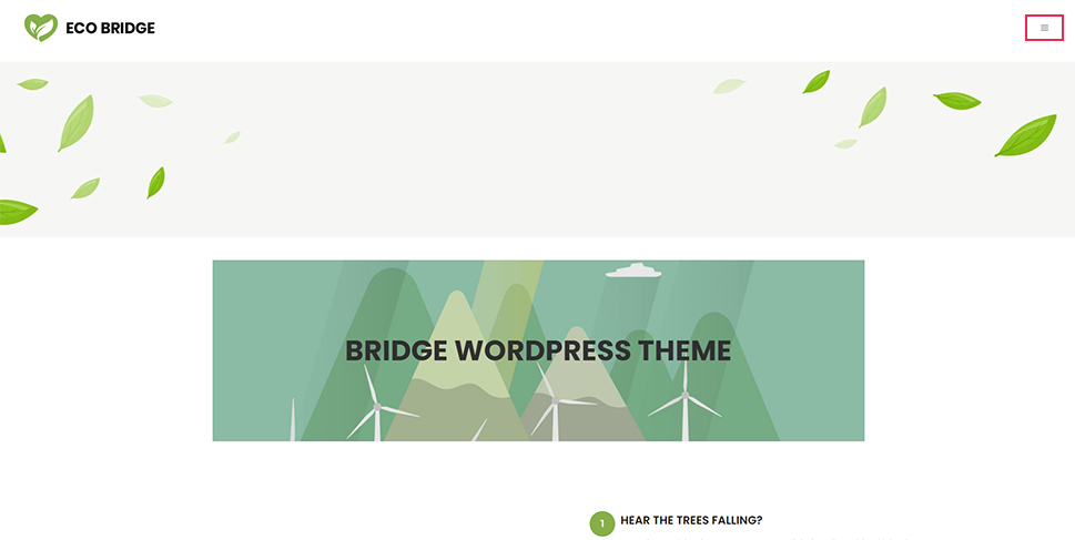
After hitting the Save Menu button, you can go ahead and preview your homepage. You will see that now only your fullscreen menu navigation is activated.
Now, go to Qode Options >> Header and scroll to Fullscreen Menu once again to set some design options related to your menu.
The Fullscreen Menu Overlay Animation, for example, lets you decide on an animation type for the fullscreen menu overlay (you can choose from Fade Push Text Right, Fade Push Text Top, and Fade Text Scaledown).
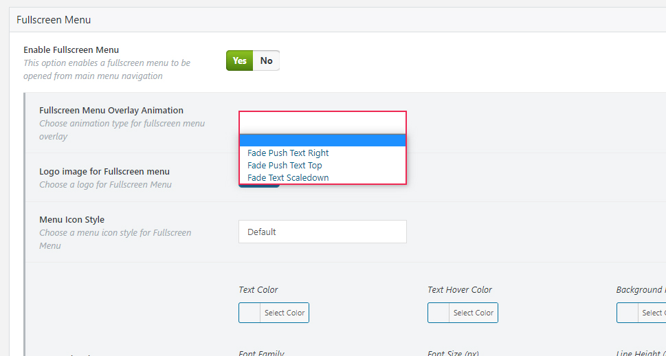
You can also replace your default fullscreen menu logo image (the one located in the top left corner when you click on the fullscreen menu).
The Menu Icon Style option allows you to choose the style for your menu opener. You can pick the default type, or something from Font Awesome and Font Elegant.
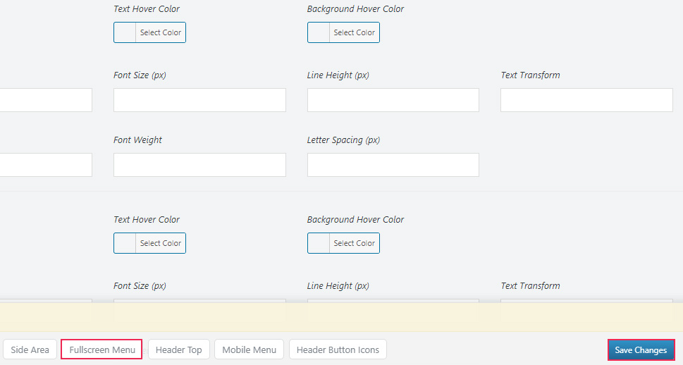
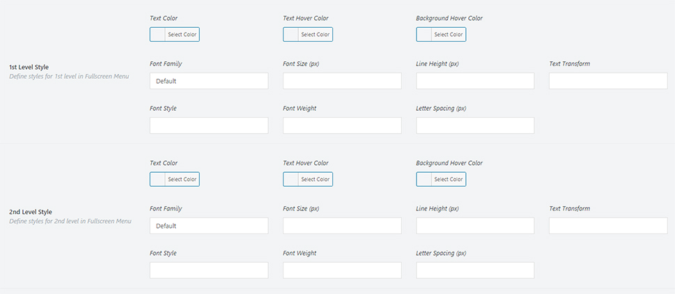
Another useful set of options are the ones that concern the style of your menu (both the first and the second level). This includes font family, font size, line height, font style, weight, etc.
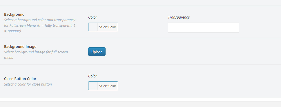
Finally, you will also be able to set the background color (and transparency) for the menu, choose your background image (if you prefer to have an image for your background instead of one color), and the color for your close button.
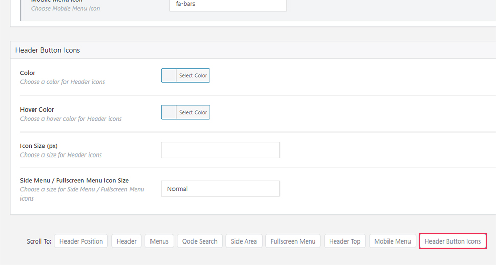
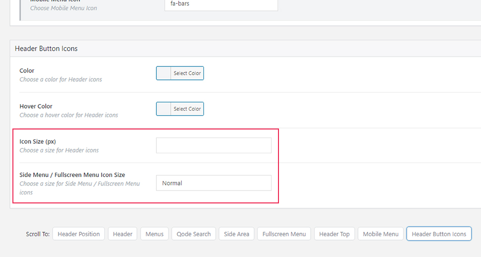
By clicking on Header Button Icons, you scroll directly to the area where you can predefine your options for the menu opener icon. This includes the icon color, hover color, and size.
When it comes to the icon size, you will see two different fields.
One field allows you to enter a custom size, which applies if you’re using the icon from one of the icon families, such as Font Awesome. In case you’re using the default icon, you should use the other (Side Menu / Fullscreen Menu Icon Size) field. You will be able to choose from Normal, Medium, and Large).
Once you’re done configuring all the design settings, you can go ahead and see the way your fullscreen menu looks like.
If you’re using Bridge as well, in case you don’t see the menu opener in the header even after having followed all these steps for setting your fullscreen menu, the reason might be that you have selected a header type that doesn’t support the fullscreen menu. In that case, you should head to Qode Options >> Header once again.
Scroll to the Header section (by clicking on the anchor link with the same name). You will be able to see that Bridge supports a few different header types, such as Fixed, Sticky, etc.
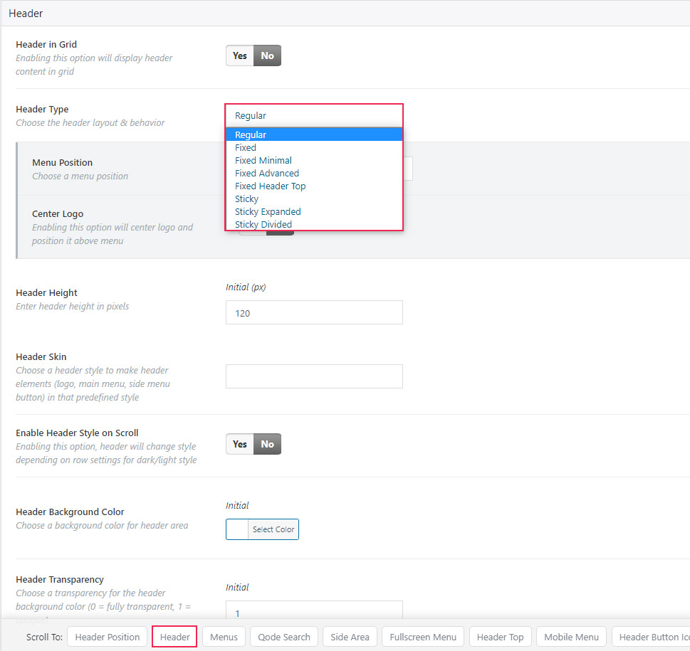
Some of these header layouts are designed for a more minimalistic style, therefore some of them won’t support the fullscreen menu opener icon.
If you select a Fixed Header Top or Sticky Divided Header, your menu opener won’t show. So make sure to choose any of the other available header layouts for your opener to appear.
Wrapping Things Up
A fullscreen menu is a great opportunity to present the most important links of your site in a way that will keep things clean, simple, and minimalistic for users. At the same time, it also allows you to get creative and add a layer of uniqueness to your site that will help differentiate you from the rest.
That being said, you should remember to always keep users in mind when organizing your fullscreen navigation system. You can do this by making sure that your menu is easy to find and is as intuitive to use as possible. No matter if you’re using one of our themes, or require the help of a plugin, if you end up following our instructions, you’ll be able to build a beautiful and functional fullscreen menu in no time.
