A Complete Guide to Improving Your WordPress Website Navigation
No matter what website platform you’re using, the way you plan out your website navigation will have a big influence on UX. You want your visitors to find what they need quickly and efficiently so that they don’t flee your website and remain interested in exploring your website instead. Thus, your navigation structure should be planned out carefully, making sure that it meets the needs of your visitors. However, if done poorly, it can create more difficulties than anything else.
With all this in mind, in order to help you organize your website navigation in a way that will give you the best possible results, we’ve decided to create this comprehensive guide. We will talk about the importance of website navigation, go through the most common navigation types, and share some of the best practices that can help you improve navigation on your WordPress site.
Here’s what we’ll cover:
By definition, website navigation is a structure of internal site links that has the purpose of helping users get around your website and find what they’re looking for quickly and with ease. Typically, it consists of different navigation menus that contain a set of various internal links, but it can also include other navigation elements, such as buttons and breadcrumbs. In short, navigation represents any sort of link that takes the user to different pages within the same domain.
As we already mentioned, a well-implemented website navigation has the power to help your visitors find their desired destination fast while simultaneously increasing the time they spend on your website. The logic behind it is simple – if your visitors can easily navigate your website, they will be encouraged to explore it further and discover more valuable content that may interest them. In this way, your navigation can help reduce bounce rate and contribute to user engagement.
Similarly, if you have any products or services to sell, your customers will be able to go through the browsing and purchasing funnel in a smooth and effortless manner. In other words, your navigation also has the power to bring you more conversions and sales.
Qode Themes: Top Picks
View Collection


Navigation Menus
To say that menus are the most essential elements of website navigation would be an understatement. For this reason, we are going to list some of the most common types of navigation menus first, before we take a look at what other types of website navigation you can come across in general.
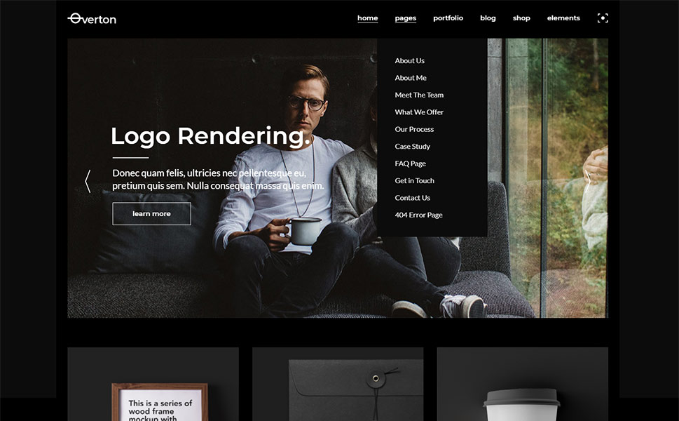
When thinking of navigation menus, most people will instantly think of a classic, horizontal main menu located in the website header. Most websites use their main menu to display links to some of the most common web pages, like About, Services, Blog, Contact, etc. But of course, the items and/or sub-items you put in your main menu will largely depend on the type of website you own, as well as your overall goal.
There are many other navigation styles you can incorporate into a horizontal menu. For example, there is a drop-down or expandable menu that opens by clicking on a menu bar item or upon hover. Also common is the mega menu, which is especially useful if you have a multi-layered website with a large number of products or services to sell. Its structure makes it easy to group menu items into categories to ensure a smoother browsing experience for your visitors.
Bridge theme with a mega menu
Many websites will also feature multiple other types of navigation menus. These include sidebar menus, fullscreen navigation menus, a footer menu, and a so-called hamburger menu, which is ideal for mobile navigation.
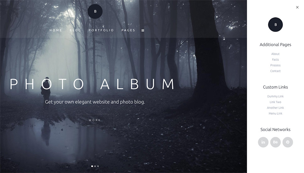
Photo Studio Bridge demo with a hamburger menu
Another highly popular UX element is a sticky (or fixed) navigation menu. As its name suggests, this type of menu is stuck in one place and remains visible as the user scrolls down your page. Sticky menus help speed up the navigation process since they allow a quick and easy access no matter how far down the user scrolls. For this reason, they work well on longer pages, especially if they contain more commonly visited website links or some call-to-action elements.

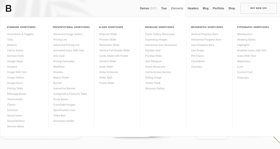
Finally, we have to mention that every WordPress theme comes with different widget areas and allows you to create a navigation menu that you can easily insert into these areas. Also, you will get to make multiple menus, create a mega menu, and even duplicate your menus, if you need to. And if you want to have even more features at your disposal when building your menus, you can always use the help of a suitable plugin.
Other Navigation Elements
Aside from navigation menus, there are other handy types of navigation elements that contribute to better user experience.
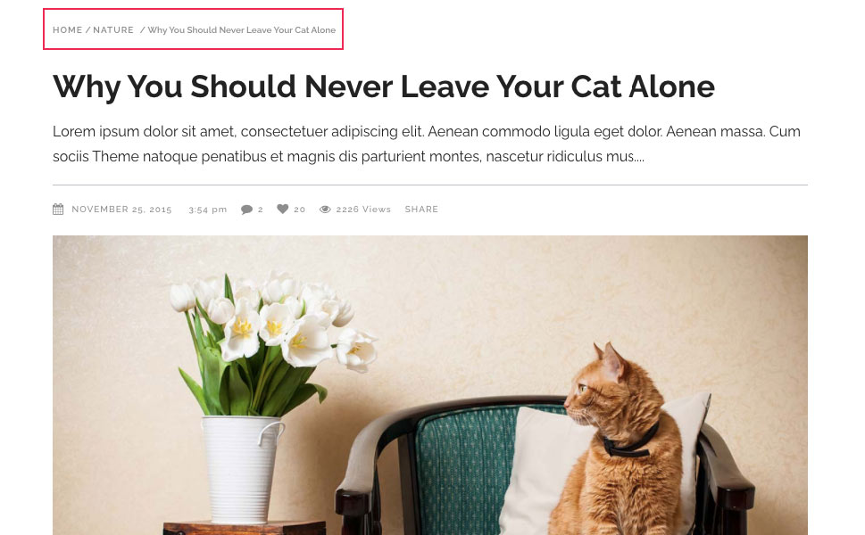
These include breadcrumbs, or a text path that shows the visitors all the steps they took to get to the page they are currently on. Breadcrumbs can be pretty useful as they allow users to be aware of their exact location and to easily navigate between pages.
There are also navigation buttons that lead users to different pages on your website and can urge them to take some type action, such as Sign Up and Subscribe, or Add to Cart and Checkout (the latter two can usually be found on shop websites).
While we’re on the topic, we shouldn’t miss the opportunity to mention anchor links. Namely, anchor links represent special types of links that lead users to a specific section on a page when clicked on. They are great because they let your visitors jump to another area of your page immediately, allowing them to find all the information they need quickly and with ease.
Global, Hierarchical and Local Navigation
Now, as for the website navigation itself, it can be divided into three main types – global, hierarchical, and local.
Global or site-wide navigation usually contains menus and links that are identical, i.e. remain the same on every page of a website. This type of navigation usually lists some of the most essential website pages, and it can also include your most important pieces of content. Naturally, most websites will have global navigation in one or multiple fixed sections on their website, like in the header or footer.
On the other hand, hierarchical navigation allows you to change your menus depending on the page you’re using. For example, websites that are heavily content-oriented (like news sites, blogs, or magazines) can make good use of this type of navigation, since they will most likely have various category pages that might require a more specific approach to navigation.
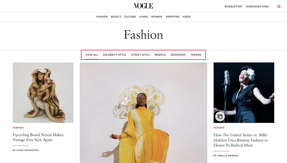
A great example of a website that successfully mixes global and hierarchical navigation would be Vogue. This well-known fashion and lifestyle magazine is one of the many global brands that use WordPress as their website platform.
On the Vogue magazine’s homepage, you can see a top menu with main categories that stays consistent on every page.
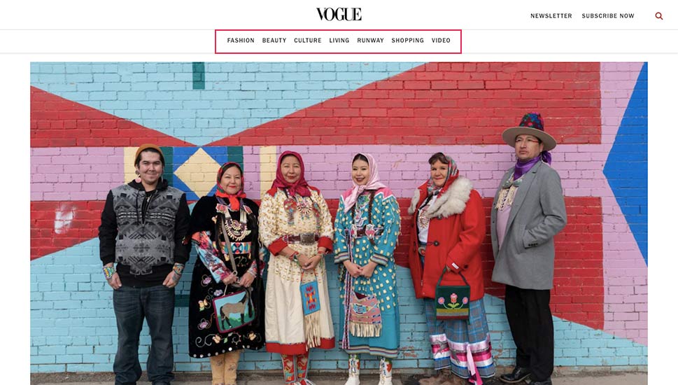
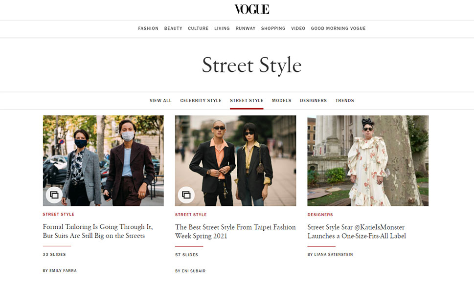
Clicking on a specific category in the main menu will lead you to a category page that contains a secondary menu with links to its subcategories.
Each one of these category pages has a different menu with corresponding subcategory links.
Last but not least, local website navigation basically represents internal links that link to other pages of your website. These links can be found within the content itself, and are usually relevant to the page they are on in some way. This is a more indirect type of website navigation compared to the other two, but it is also highly effective when it comes to keeping your visitors engaged and making certain posts and pages of your website relevant to search engines. In fact, most content-based websites rely on this strategy, including our own.
No matter if you plan to do a complete overhaul of your website navigation, or just want to change a thing or two here and there to improve your website’s UX, there are some general rules you can stick to during the process. Without further ado, here are some of the best web navigation practices that are known to work.
Think About Users First
One of the most important rules you should abide by when creating your website navigation is to make sure that it’s practical for your users. This means that no matter how many navigational systems you build within your site, your navigation should always be made with your users’ needs in mind. For example, the names of your navigational links should be the closest to the terminology your target audience is using. This practice is closely linked to keyword research, the practice of trying to find the best keywords in your niche used by your target audience to find what they need online. Once you build the pages that contain information that your users are searching for, you should also make sure that your navigation links contain phrases and keywords your users would most likely search for on Google. In turn, this will be great both for your website’s SEO and user-friendliness of your site.
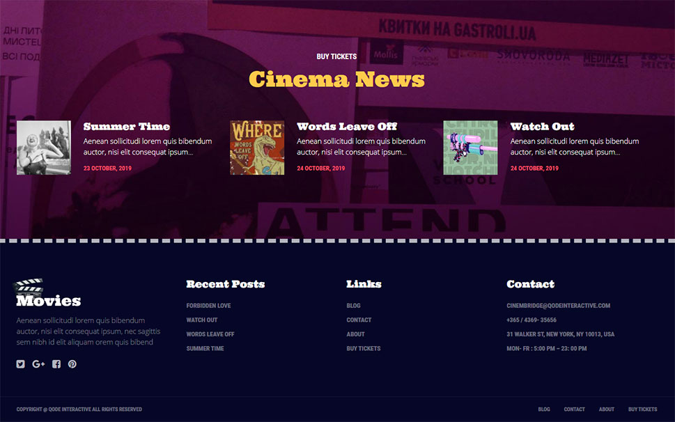
Create a Footer Menu
Like we mentioned before, WordPress comes with multiple widget areas by default. Depending on the theme you’re using, these areas will be predefined in various ways, allowing you to add widgets according to your preferences. You can take advantage of this and include navigation links when creating your WordPress footer. Users frequently scroll down to the footer area, expecting to find the most important information about your site and your business, including links that lead to the most significant pieces of information.
Of course, what you will add to your footer menu also depends on the type of website you own. For example, if you’re an online store and you have products to sell, it might do you well to include links to some of your most popular product categories here. Also, if you’re a blog, a magazine, or an online news publication, providing links to your most frequently used article or news categories can prove to be quite useful for the user experience of your visitors and may bring you more engagement. You can even include some of your most important website pages that you couldn’t fit into your website’s header, for whatever reason. For example, you can add some useful links like About, Privacy Policy, Contact, Terms of Use, and so on. These are precisely the types of pages users expect to see in the footer.
Make Your Navigation Visible
You can (and should) try and take advantage of your website’s design to ensure that all your navigation menus are easy to spot. For example, you can add a tertiary font to the website fonts you’re using on your site and use it for your navigation menus only. You can also change the color of your menu items, add a different background color to your menu, separate your menus from other website content by using white space, etc.
That being said, your navigation shouldn’t stand out too much compared to the rest of your website design either. For the most part, you should keep it harmonious with your website’s aesthetics, but also make sure that it is clear where your website navigation starts and where it ends.
Use Intuitive and Consistent Design
With the internet being a constant presence in everyone’s lives nowadays, user navigation on websites should occur based on some intuitive rules. Usually, the most user-friendly website navigation is the one that follows some well-established practices. And while it’s totally fine (and even necessary, depending on your needs) to include various types of navigation into different pages of your site, we do advise you to keep it as consistent and intuitive as possible.
This means that the general way your navigation appears on your site as well as its location should not vary too much from page to page. Use the most common areas to add your menus, like your website’s header, sidebar, and footer. If possible, try and keep the navigation in your header and footer global most of the time. Or, if you add different types of menus to multiple pages, make sure that their overall design and position are identical on every page. In short, make things as logical and practical as you can for your visitors so they can quickly find what they need. They will surely appreciate it.
Keep Things Simple but Informative
Being creative is great most of the time, but when it comes to your navigation, it’s best to keep things simple and user-friendly. This means applying some standards that are known to work, such as adding three stripes (otherwise known as a hamburger icon), or three dots for your expandable menus so that your users know they’re supposed to click there, or using fonts that are clean and easy to read. Also, short descriptions of some of the most commonly used website pages are considered to be standard for a reason. Whenever you can, stick to short and simple names for navigation links that lead to your pages like “About”, “Contact”, and “Services” – they’re clear, straightforward, and easily recognizable.
That being said, you shouldn’t hesitate to describe your pages in the most precise manner possible. Your ultimate goal is to give users accurate information about what they can expect if they click on a specific item. This is the only way they will be able to know if a page has exactly what they need, after all.
For example, if you have pages that provide more information about your company’s inner workings or describe your overall purpose in more depth, you can still keep things short but informative with names such as “What We Do”, or “Our Process”. Sometimes, adding just one word to your menu item is enough to provide all the context that your users need. So, if possible, we recommend using no more than 3 words to describe what your page is about.
Take Advantage of Your Buttons
While adding buttons can greatly contribute to more conversions and sales and improve your overall navigation system as a whole, you should make sure to use their power wisely. Of course, you can (and should, for that matter) make your buttons stand out and ensure that they look clickable to your users. When designing your buttons, you can highlight them using different colors, add some eye-catching hover or interaction effects, and even incorporate some cool animations if you want to. However, you shouldn’t cram too many buttons into your pages. Using a few striking and actionable buttons in different areas of your page (including the navigation menu in your header) should do the trick. Finally, make sure that your buttons contain a clear call-to-action, with words such as Buy Now, Download, Subscribe or Sign Up.

Add Breadcrumbs (Where Needed)
Like we mentioned in the very beginning, implementing breadcrumbs is a great way to drastically improve your website’s UX. It will allow your users to be aware of their precise location at all times and easily navigate your pages while preventing them from getting lost.
So, if you have a website with plenty of content, it might do you well to add a breadcrumb trail. You may find breadcrumbs especially useful if you own a blog website or an online store with many products. Also, if you’re a WordPress user, you’ll be pleased to hear that adding breadcrumbs to your WordPress website is quite easy.
Use Anchor Links
Anchor links can be another great addition to your navigation since they can help users navigate long pages and quickly take them to the section they are interested in. You can use them to break your articles into different segments, send users to a specific answer on your FAQ page, lead them to one of your services, and so on. If you want, you can even create an actual anchor link list or table of contents. Anchor links can be particularly useful if you own a one-page site or have any long pages or posts that require plenty of scrolling.
Make Sure Your Menus Are Responsive
With more and more people using mobile devices to browse the internet, creating responsive menus with mobiles in mind is absolutely mandatory. It’s the only way to ensure that your website looks good even on the smallest devices. And since most premium WordPress themes come with fully responsive menus out of the box, adding such menus to your WordPress website will be quite easy to do.
Wrapping Things Up
Website navigation is a key component of your design, and one that can make or break your website when it comes to user engagement and the overall visibility on search engines. By taking advantage of the predefined widget areas and with the help of the right theme, you will be able to add different types of menus to your WordPress site and ensure that they all look clean, practical, and user-friendly to your visitors.
All in all, whatever type of navigation you end up using on your site, just make sure that it’s easy to spot, that it’s as consistent as possible, and that it contains navigation elements that are of actual value to your audience. No matter what, always keep your visitors’ interests in mind, and the results will naturally follow.
