How to Design a CTA Button that Converts
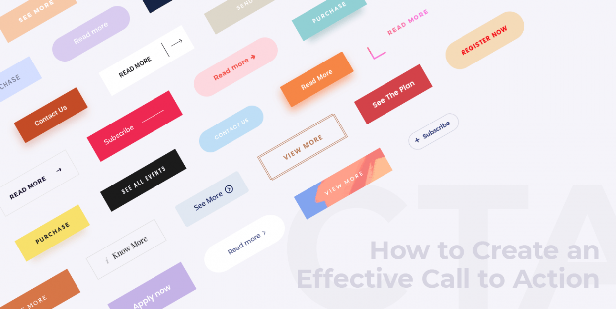
What should a CTA button look like? Where should it be placed? How to avoid annoying CTAs? These are just some of the questions that bother everyone from copywriters and marketers to web and UX designers. Today, we’re going to sort them out.
What is a CTA?
The abbreviation “CTA” stands for Call to Action. A Call to Action is any piece of design (usually a button) that prompts the visitor to perform an action. This can be anything – from exploring the site to filling in a contact form or adding a product to the cart.
When designed well, CTAs perform a twofold function – they help user navigate a website, and they represent a crucial element in your conversion flow. Ultimately, their role is to get visitors to do what you want them to do. Like a discreet tour guide, leading a user gently through your digital environment.
Technically speaking, any button can be a CTA button, as long as it contains copy that transforms the visitor from a passive observer into an active user of a website. But one of the main things that separate CTAs from the rest of the buttons on a website is that, in addition to the aforementioned copy, they need to have certain features (color, shape, position) that attract the users’ attention and influence them to perform an action.
It’s clear that CTAs are of enormous importance for good user experience and for your business’s bottom line, so in this article we’re going to share some things to keep in mind when creating your CTAs.
Let’s start with the button text.
How to Write CTA Copy

As the effectiveness of CTAs greatly depends on the quality and structure of its copy, it’s clear that this text has to be well thought out. CTA copy needs to perform two functions: to engage the visitor and to make it crystal clear which action the visitor is expected to take.
To achieve the engaging value, the text must be direct, clear and likeable, if not downright charming. Because it can only contain so many words, the message of the CTA copy should allow the user to intuitively understand the needed course of action.
In many cases, the ideal CTA copy will simply state the website’s conversion goal. If your goal is to get people to read your blog, the button should simply say Read Now or Read More. If you want them to interact with the website, a button with the text Get in Touch Now or even simply Message Us will do the trick just fine.
Still, it’s not enough to just be short, clear and (if possible) entertaining. There’s a bit of psychology to be taken into consideration here. In fact, a great deal of research and testing has been carried out to determine the kind of copy that users find the most appealing, and which CTA text converts the best.
Most experts agree that creating a sense of urgency is a necessary condition for successful CTA copy. Luckily, this can be achieved rather easily, simply by inserting a word or two, such as “Now” or “Today,” perhaps combined with “Only.”
Buttons saying Get Your Free Copy Now or Register and Get 50% Off Today Only! are highly converting, as users don’t want to miss out on a special opportunity to gain something that, come tomorrow, will no longer be available.
Another thing to pay attention to here is how you address your visitors. Some experts consider the use of first-person pronouns (Create My Account, Get My Copy) the most effective, while others opt for the use of second-person pronouns (Get Your Copy, Claim Your Free Trial). To make things more complicated, the two techniques seem to have an equal number of supporters and arguments in their favor.

Either way, it’s clear that some degree of personalization in addressing the visitors is required in CTA copy, as it makes users feel more personally involved with the product or service. And personal connection is essential for conversions.
How to Design Your CTA Buttons
The strictly visual aspect of the CTA buttons is just as important (if not even more so) as the copy itself. The rules sound simple – the buttons have to draw attention and invite users to click. But that’s not always easy to achieve. In order to stand out on the page, the shape, size, color, and placement of CTA buttons have to be in clear contrast with the rest of their environment.

The Shape of CTA Buttons
You have probably noticed that most CTAs (and most buttons on the web, for that matter) are rectangular. Sure, there are some great examples of CTAs that are circular, square or some other, even less common shape, but the majority of them are rectangular. Why is this?
Rectangles and squares are the shapes we come across the most, be it on the web or in our everyday life. Rectangles, in particular, make us feel comfortable as they convey a sense of stability and assurance.
On the other hand, it’s been proven that humans have an affinity for curves. Round shapes are simply more pleasing to the eyes than sharp, edgy ones. Not to mention that the circle is a shape that exudes a sense of peace, completeness and harmony.
Considering these two facts, it’s logical that the most efficient shape for CTA buttons turned out to be a rectangle with rounded corners. This shape became wildly popular among marketers and can be found in a huge number of sites and apps.
Of course, these are just general guidelines derived from experience and some well-researched best practices in UX. There are CTA buttons that come in all sorts of unorthodox shapes, but those are generally part of a design environment marked by experimentation, highly specific aesthetics, and so on. In other words – they do not represent the norm.
The Importance of Color for CTA Buttons
The role of colors in shaping our perception and experience of all visual content has been researched for decades. Psychologists today agree that we tend to interpret and emotionally experience colors according to certain patterns, and this is something that marketers have been exploiting for a very long time.
Specific colors can be associated with specific messages, conveying them automatically, on a subconscious level. Just think of traffic lights – the colors themselves communicate the desired message. Green – go, red – stop.
But when it comes to these two colors and their use in CTAs, the situation is not as clear as it seems. You’d think that the color red, as a color of alarm, caution and warning, would ward people off and lead to fewer clicks. But in several independent a/b tests, red was a clear winner over green. So, when it comes to communicating via colors, it’s best to take all advice with a grain of salt and do your own tests to get actionable insights.
Bear in mind, though, that even after you find the high-converting palette for your visual messages, your work is far from over. The color of the button will be at its most effective only when it is in synergy with its visual environment. The relationship between the button and the rest of the layout should be harmonious and balanced, but also contrasting enough to draw the users’ attention. Complementary color combinations are also worth considering – they are pleasing to the eye, and they provide the necessary contrast.
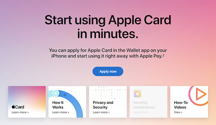
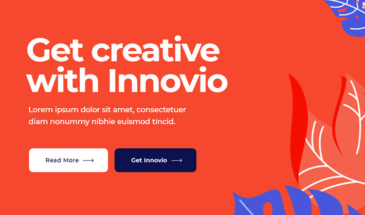
The importance of colors in designing CTA buttons becomes even clearer in situations that warrant for two buttons, one of which is a classic CTA and another that leads to additional information on the subject.

In this case, the strictly CTA-type button has to be highlighted and accentuated, so that the users focus on it first. This can be achieved with a bold signaling color, such as red, orange or any variation thereof.
In the example above, you will notice that the other button, the one inviting visitors to learn more about the service in question, is much more subdued (in this case, just outlined), making sure the CTA gets all the attention.
Animation and Details on CTA Buttons
The third aspect of CTA design is the button animation. Along with icons, discrete illustrations and other graphic elements, animation can bring another layer of visual and communicative value. When used properly, functional animation as a UX tool can make buttons more intuitive and direct, and therefore greatly enhance their effectiveness.
When designing CTAs, animation is mostly used for hover effects. These animations shouldn’t be too interactive or loud, as we don’t want them to take the focus away from the message. Too much animation can confuse the user and create a negative emotional effect.
However, subtly animated buttons are always a great contribution to CTA design, enriching it and making sure the focus is clear.
In addition to animated hover effects, designers sometimes opt for additional elements and icons, especially for buttons that invite users to Add to Cart, Download, Upload, Delete, and so on. In this case, it is essential to make sure there is enough empty space between the text of the button and these additional elements, as well as between the elements and the borders of the button. The button, above all, needs to be easy to read and must not appear cluttered.
Top WordPress Themes for All Creatives
View Collection


The Positioning of CTA Buttons
The final aspect that determines the success of a CTA button is its timing or, more accurately, its positioning. While there is no “golden rule” as to where to actually put the button, one thing is clear – it should be served to the visitor at the right time.
What this means is that you need to think very carefully at which point during the visitor’s stay on the page he or she should see the button. When the visitor is well-prepared for the action using visual and textual content and information, the chance of performing the desired action becomes real.
The entire page – its design and its content – should therefore be structured and devised in a way that leads the visitor to the final goal (action), be it a subscription, a purchase or something else.
Placing a CTA above the fold (the portion of the page that is first visible upon loading) used to be a standard, but since scrolling is an action that we now perform so naturally and automatically, the “above the fold content” has lost some of its “prestige.” In fact, putting a CTA right there at the top, before the user even has the chance to settle in and explore the content can often be counterproductive.
If you place the button below the fold, it means that the visitor has to complete a path to reach it. If you planned your page structure right, that path will be full of visual and textual cues that gently push the visitor down, making him ready for the action.
Once you find the perfect spot for the button, you have to make sure it remains in focus. To do this, you must ensure there is enough negative space around it. This lets the visitor “rest their eye,” and allows for the button to be clearly visible and its message to be understood.
Final Thoughts
Clean, straightforward, focused and engaging – these are the primary qualities of a good, converting CTA button. We saw that a lot of these qualities come from the design. While the general guidelines and suggestions for designing the perfect CTA button are clear, an individual approach is always advised. Sure, the color red might be proven to work great, but if it clashes with the tone and palette of your website, you shouldn’t use it. The same goes for guidelines regarding the shape, size and the position of the button. Once you design a button that fits your visual branding and find a great place for it, make sure to test it with a couple of slightly different versions. And don’t forget to back your CTAs with some strong value-driven content and great copy.
