5 Tips to Boost Sales Using Smart WordPress Navigation

Having a well-designed website that is properly optimized for search engines and actively promoted on social media is mandatory for creating an online business that will thrive. Still, it takes more than that to be able to build the trust of your customers and make your sales grow. Namely, when people access websites intending to make a purchase online, they want to be able to do so quickly and effortlessly. Not only do people have little time in general, but they also don’t want to have any trouble finding what they came for in the first place, as this more often than not results in them abandoning a site altogether. Therefore, you want to create a WordPress website navigation that is clear, well-organized, and nothing short of perfect to prevent this from happening.
But what does it take to create smart navigation on your WordPress site that will also provide the best possible user experience for your potential customers and help them find what they want fast? In this article, we will talk about different steps and strategies you can take to do just that. In addition, we will also talk about some of the benefits seamless navigation can bring to your online store, so stay tuned:

Like we’ve mentioned in the very beginning, if your potential customers can’t find what they came for in the first place fast, there is a high chance they will give up and search for similar products someplace else. This can happen if your site navigation is too complicated, disorganized, or simply not intuitive enough. On the other hand, having a navigation system that is clean, logical, and overall well put together can be one of the core reasons why you’re making those sales. And of course, by website navigation system we mean a mix of different navigation elements like navigation menus, a footer section, buttons, and more.
By properly implementing all these different navigation elements on your site, you will allow your visitors to access all products and product categories quickly, efficiently, and with utmost ease. Naturally, this will enhance the user experience of your customers, which will eventually boost your sales and lower your bounce rate. By extension, you will also be able to gain the status of being a reliable and trustworthy business in your niche, which will make it more likely for your customers to come back and shop on your site again.
With that said, let’s see some of the main principles you should stick to if you want to have better navigation on your site and level up your sales game.
This should be a no-brainer, but to ensure that your customers can find a product they are interested in fast, you need to create a comprehensive navigation menu that will be user-friendly, well-organized, and informative all at once. A menu is the first thing visitors will turn to when clicking on your site, after all, so you want to make their browsing experience as smooth as possible by making sure your menu has links that lead to your most important product pages and categories.
Now, the more products and product categories you have, the more difficult it will be for your potential customers to find them. Therefore, if you own a large store with plenty of products, product categories, and subcategories, your best bet is to include most, if not all of them into your store’s main menu. Your menu will most likely be the first thing your visitors will use right after they enter your website, so you want to provide them with the ability to quickly access all your products.
We recommend creating a mega menu that will be able to fit all your categories and any of your relevant subcategories in a neat and orderly fashion. Namely, this type of menu falls under a drop-down, or expandable type of navigation menu which usually appears when users click on or hover over or a menu icon. This allows you to easily group different menu items into categories and/or subcategories which will allow a smooth and intuitive browser experience for your visitors. You will be able to list your items vertically, horizontally, and even include rich-media types (like images and videos) to further describe the content of your menu links.
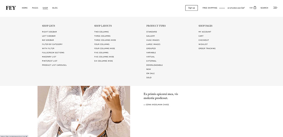
Fey WordPress theme
Plus, mega menus can be great for customers that are indecisive and want to browse your categories for some inspiration. For example, if you own an electronics store, you can include some specific categories such as desktops, laptops, and tablets and then split them into further subcategories. For your laptop category, you can then add subcategories like Windows, Macbook, other laptop equipment, and “laptop bags, cases, and backpacks”, for example. By being so specific, you will surely make it much easier for customers to find what they’re looking for and ultimately make a quicker decision.
In case you don’t own that many products but rather have a shop that sells items from one or a few specific categories (like craft jewelry, for example), you can always add product filters into your navigation. For example, you can group your menu items by color, size, material type, and so on – these can serve as your categories instead. Of course, whether you’ll use a regular menu with top-level items and a few sub-items or use a full-blown mega menu is completely up to you and depends entirely on the level of detail you’d like to present to your potential customers.
Pome WordPress theme
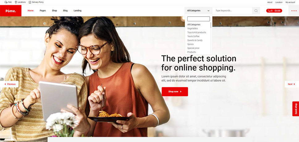
While WordPress does come with a built-in search feature, it does not offer many options to improve the overall search experience. So instead, we recommend trying out one of the available search plugins to add search functionality to your site that will be able to offer more specific results to your potential customers. By adding a search option that is more “polished” when it comes to offering results to visitors, you only make their purchase process that much easier and user-friendly as a whole. For example, users will get to define the way your content is displayed (by date, price, etc.), search by title, description, category, tag, use category filters to include or exclude a specific category, and more.
Also, you should make sure that your search bar is placed somewhere where it’s easily visible and accessible on your site, like at the top of the page, as this is typically where users will look to find a search bar in the first place. In general, adding a search bar to your WordPress menu might be your best bet.
Konsept WordPress theme
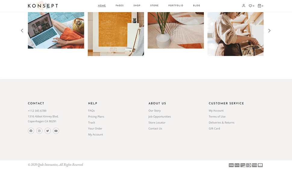
Many people expect to find some of your most relevant links in the website footer. Usually, they will turn to your footer if they don’t manage to find what they’ve been searching for in your main navigation menu, or even if they don’t want to scroll all the way back to the top. So, you should keep this in mind when creating and adding elements to your WordPress footer.
Aside from providing some other useful bits of info like your contact information and social icons, you should make sure to include some of the most important links, such as some of your most popular product categories, links to your About page, and FAQ section (if you have them), a Privacy policy page, shipping info and return policy, etc.
Luckily, most of the quality WordPress themes out there come with a ready-made footer widget area and the ability to create a footer menu with ease. The only thing you have to do is insert your desired menu items and you’ll be all set. Alternatively, you can always use the help of one of the available footer plugins.
Pome WordPress theme
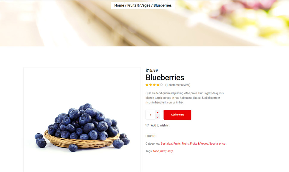
Breadcrumbs are great for boosting the overall effectiveness of your site navigation. When implemented properly, not only can this handy navigation element save much valuable time for your users by helping them quickly find what they need on your site, but they can also play the main role when it comes to preventing them from getting lost. As such, breadcrumbs are especially useful for huge online store websites with multiple categories and tons of product pages.
Plus, on top of giving your visitors a sense of location and helping them browse through your products more quickly, breadcrumbs are also great for your SEO as they help search engines get a better idea of how your website is organized.
Here is an example of a typical breadcrumb path:
Home >> Product Category >> Product subcategory >> Product
For example, if you own a shop that sells technology products, your breadcrumb menu could look something like this:
Home >> Audio and Video >> Headphones >> Sony Headphones GHJ200, black
In general, adding breadcrumbs to your WordPress site is easy if you use the help of a suitable plugin, like Breadcrumb NavTXT or Yoast SEO, for example. Also, there are many WordPress themes that allow you to set up breadcrumbs in a rather simple way. So, if you don’t want to use a plugin for any reason, see that you use a theme that has an option that enables the use of breadcrumbs on your site.
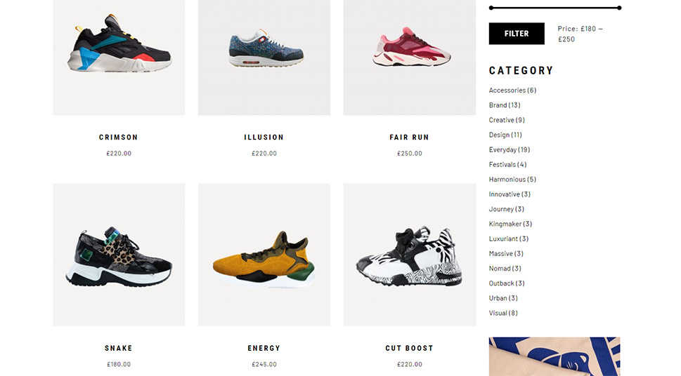
Haaken WordPress theme
Last but not least, you can always add some additional filtering options by making them appear on a page after a customer selects a specific category (or subcategory). Not only will some advanced filters accelerate their search process, but they will also make it more likely that they buy your products in the end. After all, filtering will let visitors see only those products that meet their specific standards, which will ensure that they reach the products they want to buy with complete ease. Some of the filters you can add include things like color, size, material type, pricing, age, brand, and the list goes on.
If you’re using WooCommerce to power your online store, we recommend looking into some of the available WooCommerce product filter plugins, such as Advanced AJAX Product Filters, for example. This plugin is great as it allows you to add unlimited filters for your products all with one widget.
Wrapping Things Up
Having smart website navigation can not only directly influence your customer experience and increase your sales, but it can also help you build a solid reputation in your niche, which can result in first-time customers becoming your regulars. Try using some of the suggestions we listed above to build a website with a navigation that your visitors will surely appreciate and ensure that they get to that shopping cart fast. And hopefully, this will help you gain many returning customers along the way as well.


