7 Tips for Formatting Your WordPress Posts the Right Way

Apart from ensuring that you always write relevant and high-quality blog posts, good formatting can also go a long way when it comes to making your content readable, popular, and engaging. After all, no matter how well you write your articles or how much of an expert you are in your field, unless you make sure that your audience can easily digest said content and even skip through different bits of text, all your hard work will be for nothing. Luckily, that’s exactly where WordPress formatting can help.
The default WordPress Gutenberg editor makes it quite easy to add appropriate formatting in your posts. That’s because it has blocks that will allow you to add all sorts of formatting styles and techniques with complete ease. This time around, we will focus on different things you can do to format your WordPress posts in a way that will make them easier to read and help you stand out among your competitors.
Here they are:
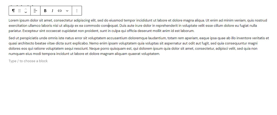
As we’ve already mentioned, formatting your posts largely aims to make them appear neater, cleaner, and more readable in general. And there’s no better way to make this goal a reality than to make sure your paragraphs aren’t unreasonably long. Not only are huge paragraphs visually unappealing, but they can also confuse readers and make them feel overwhelmed when browsing through your articles – especially if they’re reading about a subject they’re not familiar with.
To make things easier for readers and to prevent them from potentially abandoning your posts altogether, we advise you to create short and concise paragraphs with no more than 3 to 5 lines (if possible). You can also try talking about one subject per paragraph only, and see that your paragraph contains no more than three to five sentences with mixed length (some sentences can be longer, others can be visibly shorter, etc.).
Of course, you don’t have to stick to overly trimmed paragraphs all the time. After all, their length can also depend on the subject at hand and its overall requirements (i.e. if you need to be more thorough). Still, by combining most of these strategies and keeping things moderate, you can ensure the best possible results.
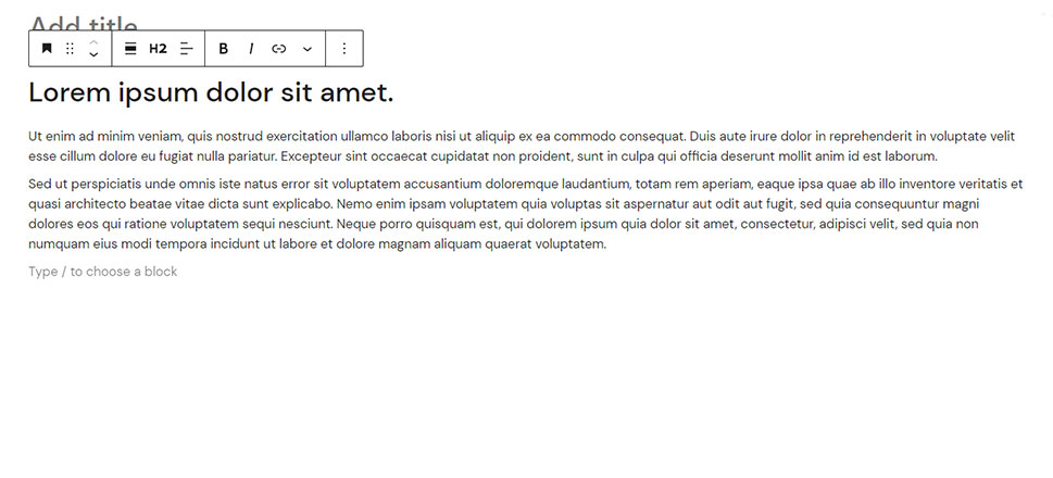
Headings and subheadings (H1, H2, H3, etc.) are great as they help break your content into neat sections and get users to understand your posts better. Also, they can help make your blog content scannable and easier to read or skim through. These headings indicate to both users and search engines what your posts are about and emphasize some of their key points, helping them appear more search engine- and user-friendly all at once.
For this reason, you should make sure to introduce headings and subheadings throughout your text whenever (and wherever) you deem them necessary. The general rule of thumb is to try and add them after every 300 words, but this rule is not necessarily set in stone. It’s more of a benchmark you can use to make your text appear cleaner and more readable in general. But if it seems natural for you, you can add headings even before (or after) you hit the 300-word mark. Alternatively, you can add images (or other forms of visual content) to break the monotony, but more on that later.
Keep in mind that headings such as H1 are used for post titles, H2 is generally used for main post sections, while H3 is usually reserved for subsections and are meant to further divide your H2 tags. Luckily, using header tags to improve your SEO and overall readability is easy in WordPress. To learn more about these tags, their importance, and how to incorporate them into your WordPress content to indicate different kinds of headings and subheadings, we suggest that you check out our article on the same subject.

Adding bullets or lists to your content is a tried-and-true way to summarize your content in a tidy manner.
We will use bullets in this section to explain the benefits of using them (and to show you how useful these can be in action):
-
Bullets and/or lists can make your content appear cleaner, more polished, and more readable.
-
Using them can help you drive attention towards relevant bits of information with complete ease.
-
As a result, bullets and lists allow your content to stand out better and make it more digestible and easier to understand by readers.
So, when you want to provide some relevant facts, data, or statistics to users, or you simply want to list certain characteristics about a topic at hand (for example, pros or cons of a certain method, product, strategy, etc.), lists or bullet points are the way to go. Just make sure to keep all the information you share concise and that each point provides value to your readers.
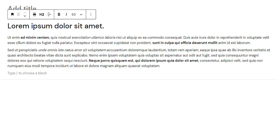
Another great way in which you can accentuate the most important points of your content and improve its readability is to introduce bold and italics. By using this formatting style in your posts, you can break the dullness of the same-looking paragraphs and make your text appear a bit more dynamic, so to speak.
There are many different ways in which you can use bold and italic formatting in your paragraphs. For example, you can select certain words, phrases, or even entire sentences and turn them bold. This can be done to emphasize important and/or unfamiliar terms and definitions, highlight some key steps in tutorials, clearly mark specific features of a product, draw attention to different tips and advice, and the list goes on.
Similarly, italics are great for highlighting quotes, foreign words, various titles (books, movies, etc.), for accenting certain steps in how-to articles (eg. “Click on X”, or “Choose the option named “Y”), and more.
All in all, there are no limitations in how you can use these two types of formatting to emphasize certain points and areas in your blog posts. The only thing you have to remember is to use both bold and italics moderately since overusing them can have a countereffect and become plain irritating to readers.
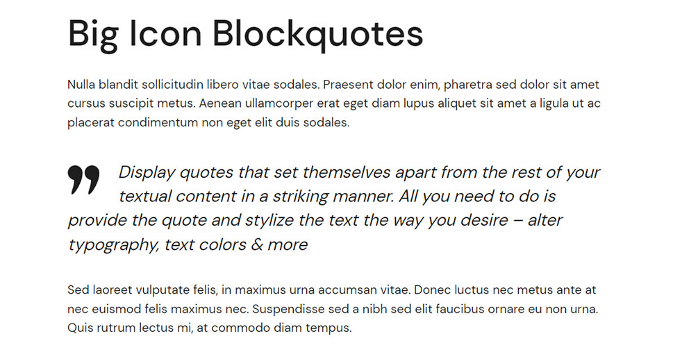
Adding a blockquote tag to your text can either serve as an important quote or as an emphasis on a key piece of information you want to share with your readers. On top of that, blockquotes can help you mix things up and add some variety to your text to make it appear more visually attractive and captivating. This way, readers will differentiate quotes from the rest of the text, which can only help them “store away” that particular information and remember it more easily.
Just like all types of WordPress formatting so far, the blockquote feature is easy to use. The only thing you have to do is hit the Add block (+) button, find a Quote block, and then add it anywhere you deem appropriate. If you want to have even more options at your disposal and create unique and stylish blockquotes, you can use our plugin called Qi Addons for Elementor and its versatile Blockquote widget. To find out more, we suggest that you check out our article on adding blockquotes in WordPress.
Finally, make sure not to go overboard with using blockquotes to not disrupt the reading flow of your audience too much. Of course, this can also depend on the length of your text, but try not to use more than two to three block quotes per article.

Aside from the above-mentioned formatting strategies, you mustn’t forget to include some appropriate images in your blog posts. Some studies show that people remember 20% of things they read, but remember up to 80% of what they see – which is exactly why adding relevant imagery can play a key factor in making your content more readable and well-formatted as a whole. This is also why many marketers make sure to include quality and relevant images in their posts.
While there are great stock photo websites out there that can help you find beautiful images to incorporate into your articles, stock photos are not the end-all-be-all of your visual content strategy. Images can include anything from screenshots or photos you (or your team) took that are relevant to the subject at hand. These can also include different charts, graphs, maps, and diagrams that all have the purpose of further explaining different sections and subsections and visualizing them to your readers.
We suggest that you add and scatter images throughout your content in a way that appears most logical. For example, you can introduce your stock photos below headings and subheadings (like we did), or add a picture between paragraphs or in the middle (if it makes sense). Just make sure that the pictures you add make sense and that they serve the purpose of enriching the content you are presenting to your audience.
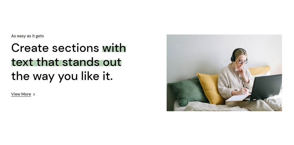
With WordPress being a user-friendly CMS, its capabilities of adding attractive and appropriate formatting to your content are pretty much limitless. So, aside from some of the more standard ways of WordPress formatting that we’ve mentioned until now, you can also incorporate things like indenting paragraphs, for example. Using paragraph indentation can help emphasize specific paragraphs in your articles and it can also provide certain visual quality by making the rows appear shorter than they are.
Another thing you can do is to accentuate important parts of your text using the highlighting feature. While highlighting text in WordPress can be done by simply using Gutenberg’s Paragraph block, we recommend trying out the Qi Addons for Elementor plugin’s Highlighted Text widget for this task. This widget comes with some great customization and styling options that will help you make the most out of this formatting technique. These include the ability to change the text and background colors in full detail, set the typography, adjust the paddings, and plenty more.
Format Away!
While there are many different things you can do to influence how readers see your posts, the way your content is formatted can play a major role when it comes to making a lasting impression. We highly suggest that you incorporate most, if not all of the WordPress formatting tips and strategies we mentioned above to make your blog posts stand out. So remember – create smaller, concise paragraphs, introduce bolds, italics, and block quotes (but don’t overdo them), use bullet points and lists, and remember to separate sections using different types of headings and subheadings. Also, don’t forget to insert high-quality imagery throughout your content wherever it seems appropriate. And remember – balance is key.


