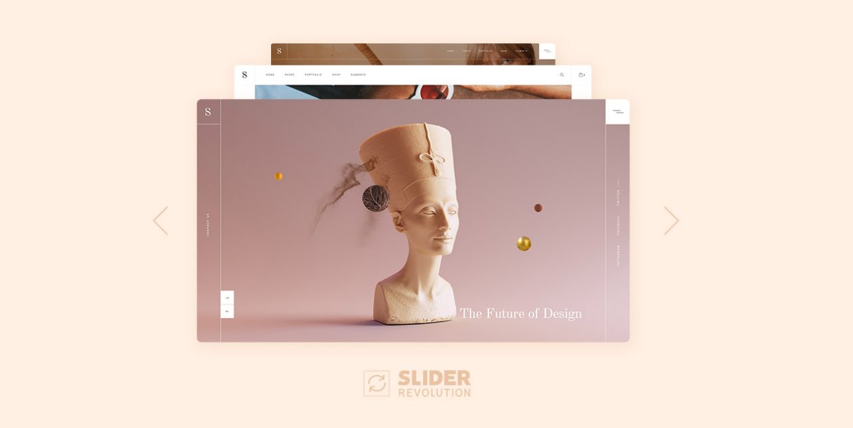
Getting Started with Slider Revolution: A Comprehensive Guide for Beginners
* If you’re using an older version of Slider Revolution (prior to v6.0.0), check out our tutorial at this link.
If you want to create beautiful sliders for your website, you can’t go wrong with Slider Revolution. A plethora of powerful features have made this plugin the #1 choice for thousands of WordPress professionals. However, if you’ve never used Slider Revolution before, you might be a bit confused by all the options it has to offer.
Since Qode Interactive has a large number of WordPress themes with Slider Revolution, we’ve created this comprehensive guide to help you get started. We’ll cover everything from the plugin’s installation and basic setup to adding layers to your slides, creating stunning animations, and more.
But before we hit the ground running, we should mention that Slider Revolution isn’t a free WordPress plugin. It can be purchased on CodeCanyon for $109. However, all Qode Interactive themes that come with Slider Revolution include the plugin completely free. So when you purchase a theme from Qode Interactive that has Slider Revolution included, you also get a copy of this awesome plugin with no extra cost.
We’d also like to mention that there’s a simpler, more customizable and definitely more elegant alternative to the popular Slider Revolution: our own Qi Addons for Elementor plugin. With 100+ flexible, easy-to-use Elementor widgets, this plugin is an all-around solution for basically any page element you can think of, sliders included. And it packs a stunning variety of slider widgets, too many to list here in detail, but let’s just say that with Qi Addons you get to create advanced slider elements like the Divided Slider Reveal, Hover-Aware Slider or even a Vertical Circled Slider.
If you prefer Gutenberg for editing your website, you’ll be happy to hear we have some terrific slider blocks as part of our Qi Blocks for Gutenberg collection. There’s a simple yet stunning Image Slider and the engaging Before/After Comparison slider. Then there’s an interesting Cards Slider and Device Frame Slider, plus several other modern and strikingly designed slider solutions for your content that will liven up your pages and engage your visitors.
These plugins may even be a better solution since they are cheaper than Slider Revolution and pack much more functionalities besides sliders. Still, we’re here today to walk you through the Slider Revolution setup and use, so let’s get back to it.
In this guide, we’ll cover the following topics:
First, we’ll show you how to install Slider Revolution on your WordPress website.
Installing Slider Revolution with Qode Interactive themes
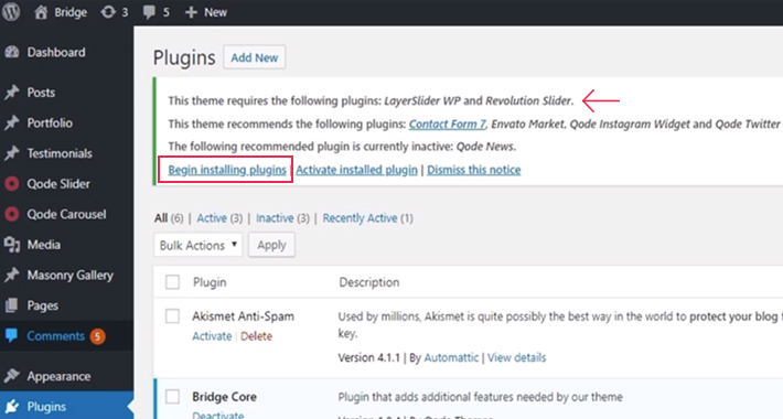
If you have purchased one of the Qode Interactive themes with Slider Revolution, below are the required steps for installing and activating the free version of Slider Revolution that comes included with your theme.
Navigate to Plugins. At the top of the page you’ll see a notification with all the recommended plugins you should install with the theme. One of these plugins is Slider Revolution.
Click on Begin installing plugins.
In the list of plugins, check the box next to Slider Revolution and click the Install button.

Once the plugin has been installed, you will see a notification that says Plugin installed successfully. It’s time to return to the required plugins installer.
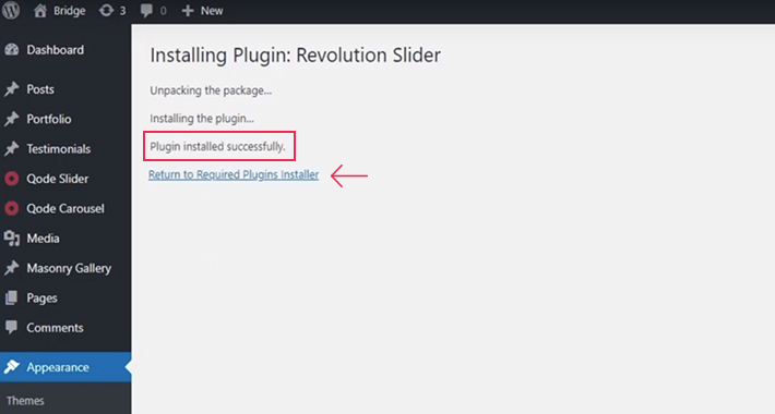
Now select the plugin again, and this time click on Activate to activate it.
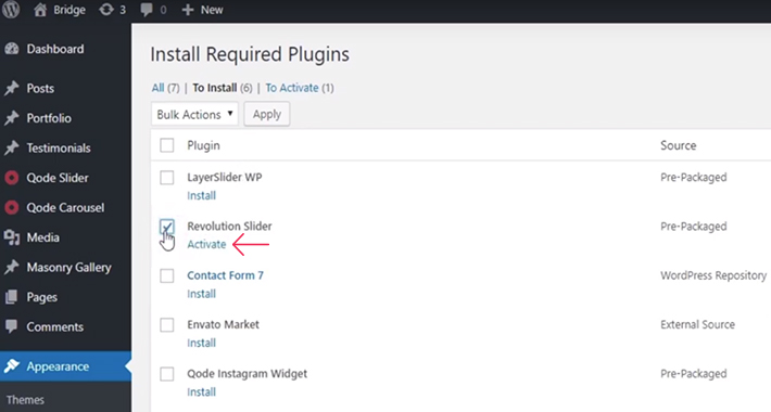
Your free version of the Slider Revolution plugin is now installed and activated. Once you refresh the page, you’ll see it in the sidebar of your admin panel.
Installing the paid version of Slider Revolution
The process of installing Slider Revolution is not much different from installing any other plugin. Still, it won’t hurt to go through the specific steps.
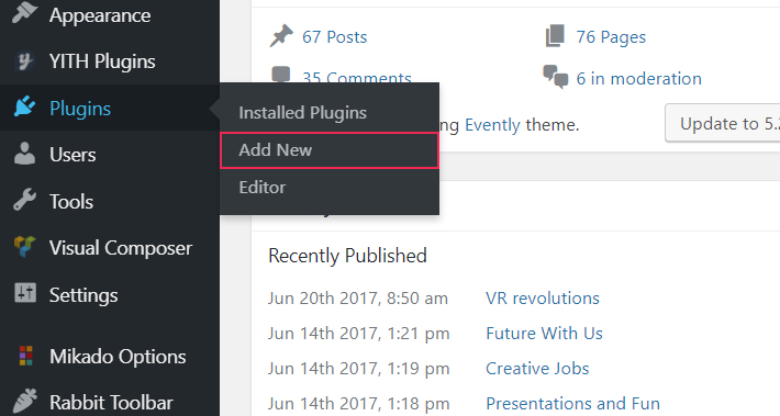
The first thing you should do after purchasing the plugin is download its file from CodeCanyon. Then, go to your WordPress Dashboard and navigate to Plugins – Add New.
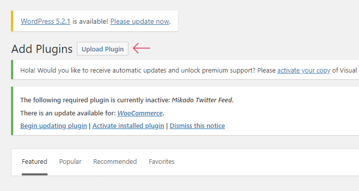
Click the Upload Plugin button near the top of the screen.
Find the file you downloaded from CodeCanyon and select it. Then click Install Now.
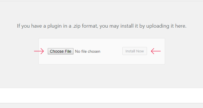
Once the installation process is complete, all you need to do is activate the plugin, and you’re good to go! That was easy, wasn’t it?

Now that you’ve installed and activated your Slider Revolution plugin, you’re ready to create stunning sliders. But before you start making your own magic with this wonderful plugin, there are some basic settings you might want to change.
Basic Responsiveness Settings
You probably know the importance of responsiveness by now. The bottom line is that most website traffic these days comes from mobile devices. So, you want to make sure your slider looks equally good regardless of the device it’s viewed on.
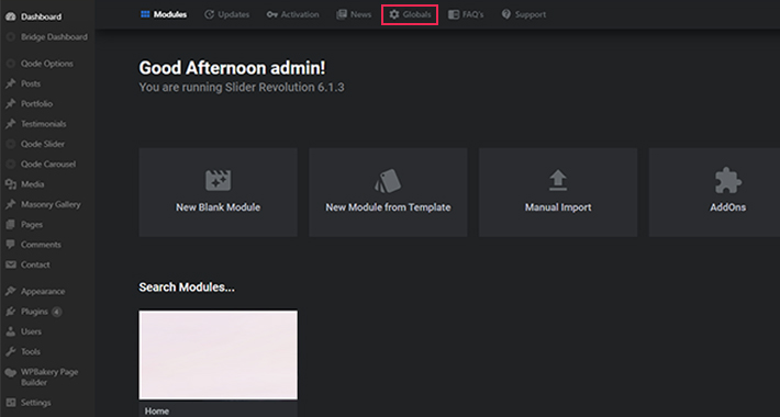
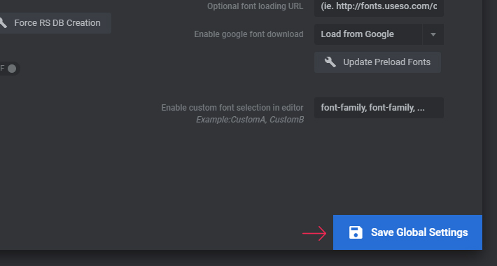
To set up the basic responsiveness options for Slider Revolution, navigate to Slider Revolution > Globals from your WordPress dashboard.
You will find a lot of settings here, but we’ll only focus on the ones related to making your sliders responsive:
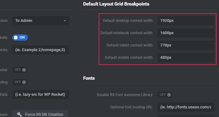
If you already know all about responsiveness, feel free to skip the next section. Just make sure to copy the numbers from the image above into their respective fields. Otherwise, read on to learn what those numbers actually mean.
Devices and Their Sizes
Every single device has its own size, represented in pixels. Standard Desktop monitors have a width of 1920px. So, we enter that number into the Desktop Grid With field to ensure that is the maximum width we are working with.
The next field is for Notebook devices, which include all laptops, MacBooks, and horizontally oriented tablets. To make sure you have them all covered, you should insert the maximum width you expect laptop users to view your site from. Let us assume that it’s 1600px.
Now it’s time to set up the width for Tablets, or more precisely, for vertically oriented tablets. Here, we are assuming that the maximum width won’t be above 778px (the width of an iPad).
Quick note – if you want, you can use one width for both horizontally and vertically oriented tablets. In that case, the number you should enter into the Tablet Grid Width field is 1025. Personally, I find that separating widths for these two categories works better. This is because laptops and horizontally oriented tablets have more similar proportions than horizontally and vertically oriented tablets.
Last but not least, you need to set up the width for Mobile devices. This can be tricky since mobile phones come in all sorts of sizes. Entering a number too large or too small can create all sorts of issues. My advice is not to go above 500px here (I usually go with 480px, which is the default setting). For example, if you decide to go with 600px, and you have text or images that span the entire width of the screen, someone who has a mobile device with a smaller screen might not see the whole page. You need to make sure that your information is visible for all users, especially those on mobile. According to statistics, in 2018, 52.2% of all website traffic worldwide was generated through mobile phones.
Once you have filled out all the fields, don’t forget to save your changes.
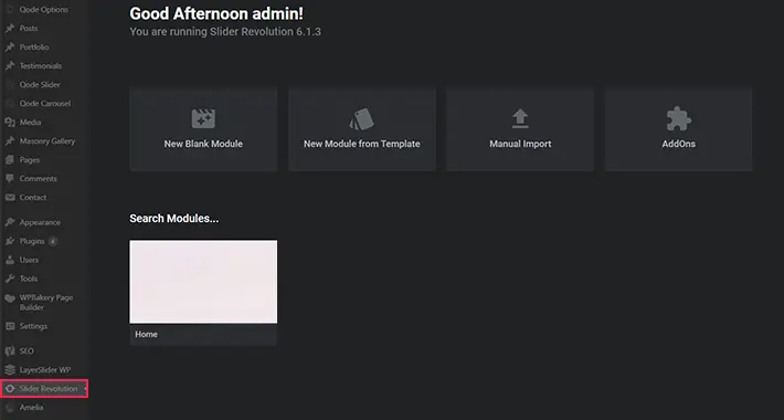
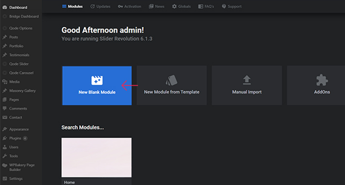
Now that we’ve configured the global responsiveness settings, we’re ready to create our first slider. Navigate to the Slider Revolution tab, and click on New Blank Module:
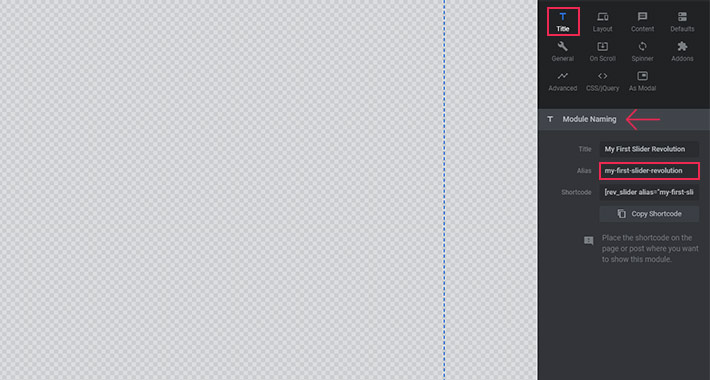
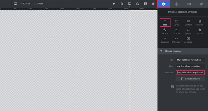
Naming Your Slider
Now that you’re in the workframe, the first thing you should do is give your slider a name. Look for the Module Naming section on the right (under the Title tab). We’ll name our first slider ‘My First Slider Revolution’ – that’s what you need to enter in the Title field. The field below it is reserved for the ‘Slider Alias’. The name of the slider should also go here, only in lowercase and with dashes between the words instead of spaces. You will later use this Slider Alias to add your slider to a page on your website.
Choosing the Right Type of Slider
The next thing you need to do is choose the type of slider you want to create. Take a look at the image below.
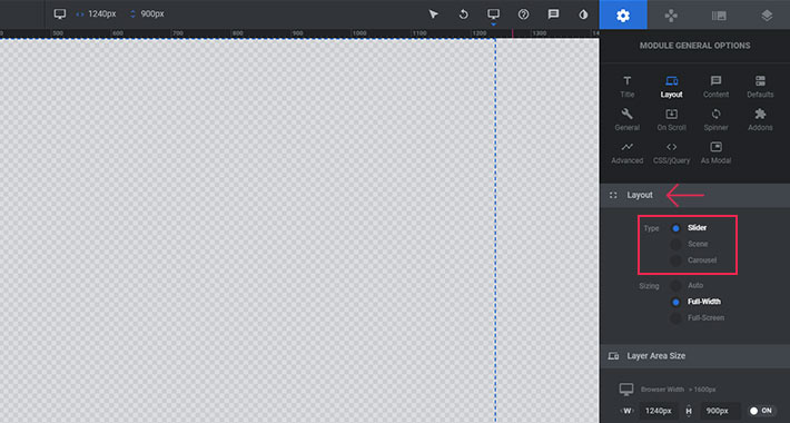
There are three types under the Layout tab – Slider, Scene and Carousel.
Slider – you should select this type if you have more than one slide.
Scene – you should choose this type when you have only one slide. If you select the Scene, navigation bullets and arrows will automatically be hidden.
Carousel – choose this type if you want to display multiple slides at the same time. Slides will be rotated radially and with a 3D effect (using distance and depth of field).
I usually work with the first and second type of slider. In fact, I can’t even remember if I’ve ever needed the third one.
Now that you have chosen the type of slider you’d like to create, there are a few more settings you can customize to make Slider Revolution easier to work with.
Themes with Slider Revolution
View Collection


Setting a Slider Sizing
The second option under the Layout tab lets you choose a default size for each individual slider. First, you need to decide what you’re going to use your slider for. If you plan on creating a small slider, or if you want to animate some specific part of your page, you’ll probably want to choose the “Auto” option. On the other hand, if you want to create a large slider (usually displayed at the top of the page), you should choose either “Full Width” or “Full Screen”, depending on your specific needs.
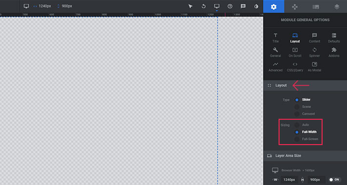
Here’s a breakdown of the three available options:
-
Auto – the slider will inherit the width of its container. This is the perfect option if you want to animate some smaller part of a page.
-
Full Width – the slider will always take up the full width of the screen. The height of the slider will automatically adapt, depending on the screen it is viewed on.
-
Full Screen – the slider will always fill the entire screen, regardless of the size of the screen it is viewed on.
As you can see, Slider Revolution is not reserved just for the top of the page. On the contrary – you can use it to animate every single part of your page. Just please be aware of the weight of your page. The more sliders you add, the slower your page will load. So don’t go overboard, as it can reflect on your SEO ranking.
Fine-tuning the Responsiveness Options
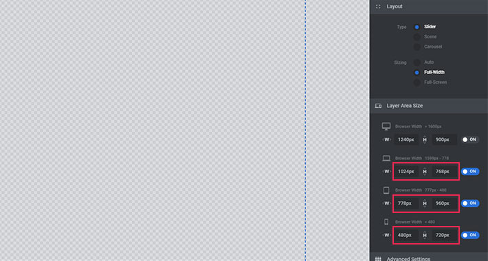
When it comes to responsiveness, we are not quite done yet. To make sure your slider looks perfect on absolutely all devices and screen sizes, there are a few additional options you need to fine-tune before you start adding slides to your first Slider Revolution.
You will notice that the layer grid sizes are set to Auto Sizes by default for all devices, except for Desktop computers. I recommend changing all of these options by clicking on the switch next to each device.
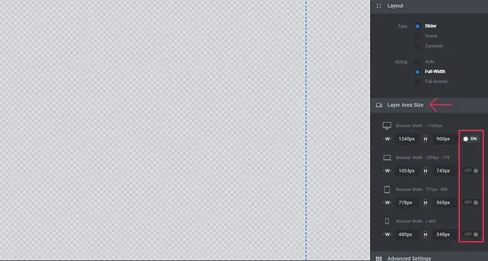
Now, instead of the auto sizes, you will see grid sizes from the global settings displayed for each separate device. The grid is the area in which your slider layers (text, buttons, etc.) will be displayed. The first field shows the width of the grid (which you already defined in your Global Settings), and the second shows the height.
Let’s assume that you are working with a Full Screen slider. Your slider background is always going to take up the entire visible space on the screen, no matter what you enter in the fields above. However, these fields will limit the size of the grid in which your layers will be shown. They ensure you have a margin between the edge of the screen and any elements of your slider which are not the actual background image.
As you can see in the image below, I’ve set the grid for desktop devices to 1920px x 1100px. Since 1920px is the full width of the desktop, this means that the layers in my slider (images, text, illustrations, etc.) can go from edge to edge if I want them to. If I entered, for example, 1820px for my width, I would have limited my layers to that size.
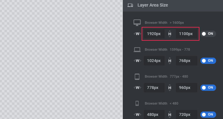
I have to note that there is no strict definition for what you should enter in these fields. You will find out what works best for you as you use and explore your options. For now, feel free to copy the settings I used.
Now that you are all set, don’t forget to click “Save”.
Please make sure that you have filled all the required fields. Otherwise, you won’t be able to start editing the slider.
New Themes
VIEW COLLECTION
A Few More Useful Settings
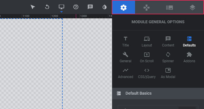
You can now head back to the Slider Options panel of your slider on the right. Here, you will see a number of neatly arranged icons containing some more useful options. There are too many settings here to cover them all, so we’ll only go through the most convenient ones.
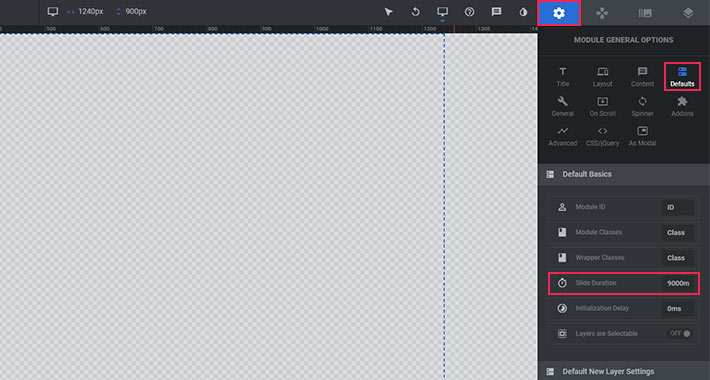
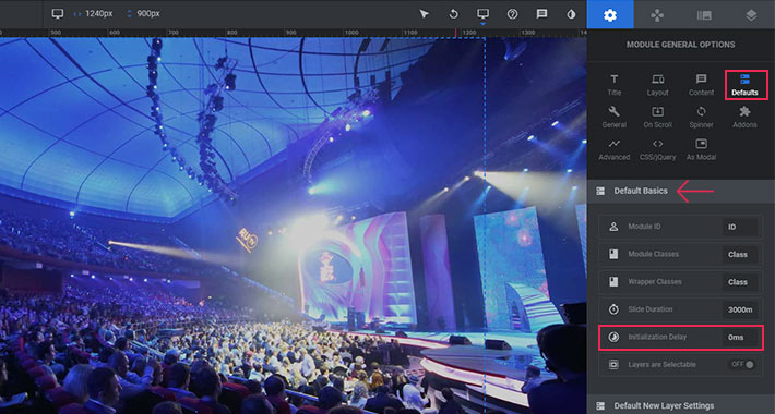
Under Module General Options > Defaults, you will see that the default slide duration is set to 9000ms. That means that every single slide in your slider will last 9 seconds before switching to the next slide. I personally think that’s too much, and that the slide duration should not be over 4000ms. Otherwise, your users will most likely only see your first slide. I mean, come on, who’s going to wait 9 seconds for a slide change?
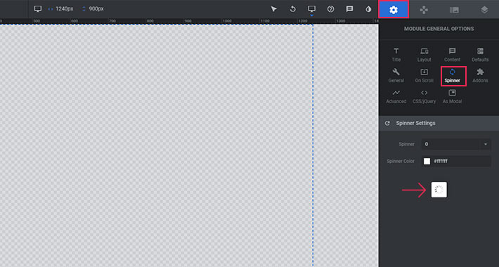
Under Module General Options > Defaults > Spinner, you can change the default spinner (or you can turn it off completely). The spinner will be displayed while your slider loads.
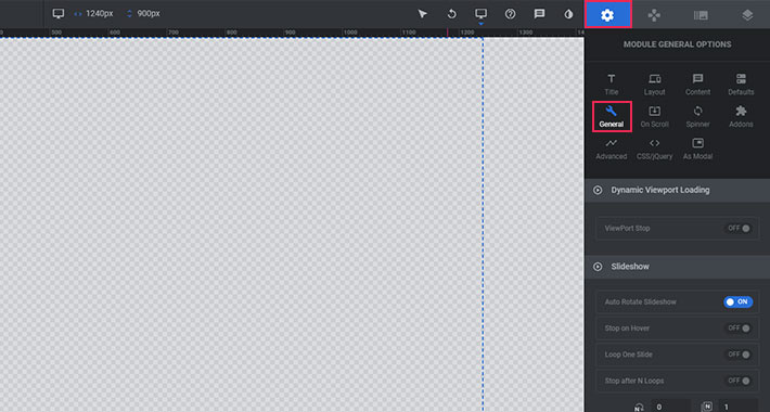
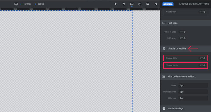
Under Module General Options > General > Disable On Mobile, you can prevent your slider from displaying on mobile devices. You can also disable the KenBurn effect from displaying on mobile devices, (and thus greatly improve the performance of your page).
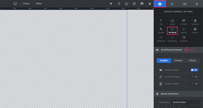
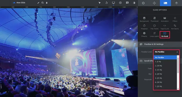
Under the Module General Options > On Scroll > Scroll Based Features, you can turn on parallax and/or 3D effects for your background images and individual layers. You can also set the mouse sensibility for Parallax, as well as its various levels of depths.
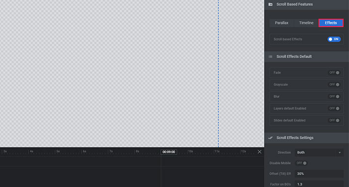
The Scroll Based Effects dropdown contains a number of interesting effects that you can apply to your slider when your user starts scrolling down the page. I suggest you play around with these and try them all out.
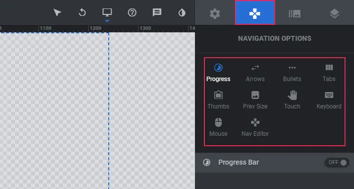
If you plan on having more than one slide, you can set your navigation in the Navigation Options. Here, you can customize settings for arrows, bullets (mostly used for mobile devices), etc.
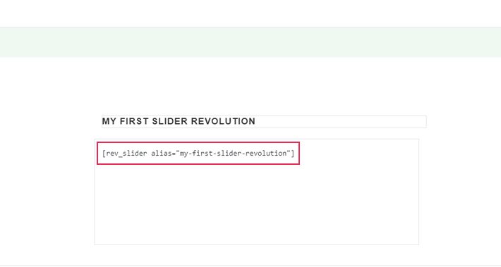
Now it’s time to decide where you want to display your slider. To add a slider to a page, you first need to copy the slider shortcode from Module General Options > Title. In our case, the shortcode is [rev_slider alias=”my-first-slider-revolution”].
Next, head on over to the backend of your page and paste the shortcode wherever you would like to display the slider. Update the page afterwards, so you can immediately see a live preview of your slider. Once you’ve added the shortcode to a page, every change you make to your slider will be visible on that page. Just don’t forget to hit the Save button every time you make a change!
My slider is still blank, since I’ve not added any slides to it yet.
Once you’ve defined and saved all your slider settings, it’s time to start creating your individual slides. Let’s head over to the Slide Options panel.
You’ll see a lot of options here, but don’t let that scare you off! I’ll go through the most useful ones, so stick around!
If you scroll down your page a bit, you’ll see the slide frame. Your slide and all its contents will be displayed within it. Currently the frame is empty.
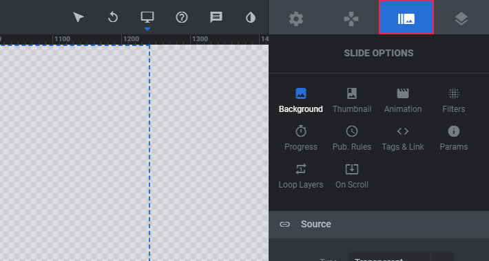
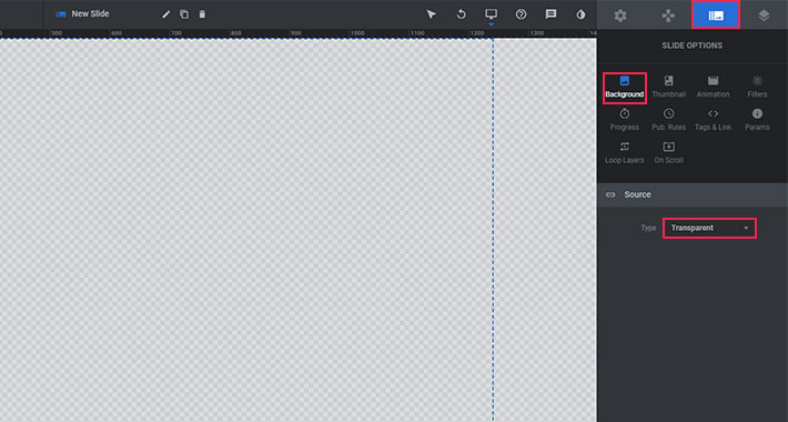
Adding a Background Image
If you don’t want your background to stay transparent, you can easily add a background image. In the options panel next to the frame there are many different tabs. One of them is titled Background, and it is selected by default. The Transparent option is also chosen by default.
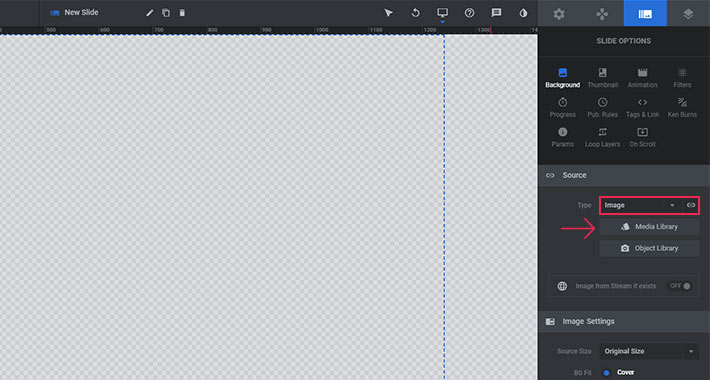
To add a background image, all you need to do is select Image from the dropdown, and then click the Media Library button. Now you can either upload a new image or choose one from your Media Library. Just make sure to choose an image that corresponds to the size of your slider. I’ve created a Fullscreen Slider, so the size of my image will be (at least) 1920×1100 pixels in order to fill the entire space of a desktop screen.
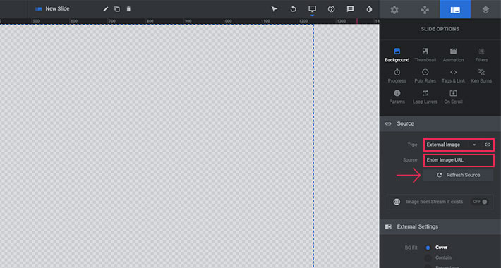
You can also add an image from an external source by choosing External Image from the dropdown. You should enter the image URL and click the Refresh Source button.
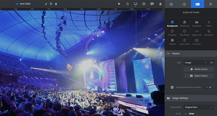
Once you choose an image, it will appear within your work frame.
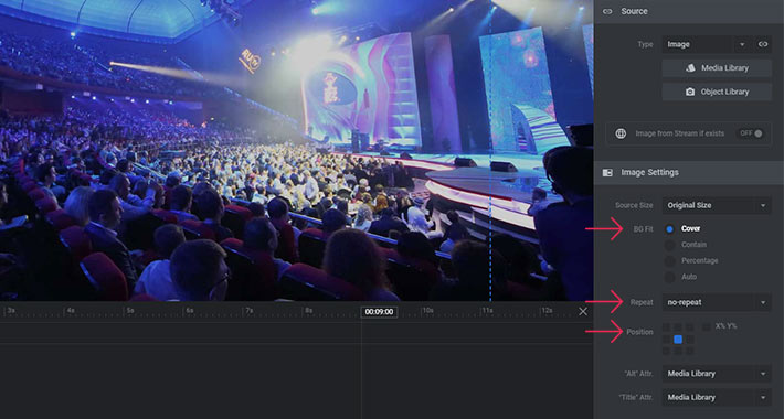
Below the Source section, there are Image Settings. The first thing that should be set is Source Size. There are different sizes to choose from – our recommendation is to leave the original image size, if you want it to look good.
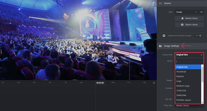
Next, under BG Fit, you can choose how you want the image to be displayed within your slide – we wanted it to be an actual background, so we chose Cover. You can also choose if you want it to repeat or not – this is useful if the image is smaller than the size of the slider, but is not recommended. The next option lets you choose the position of your image – it is centered by default.
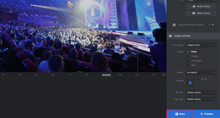
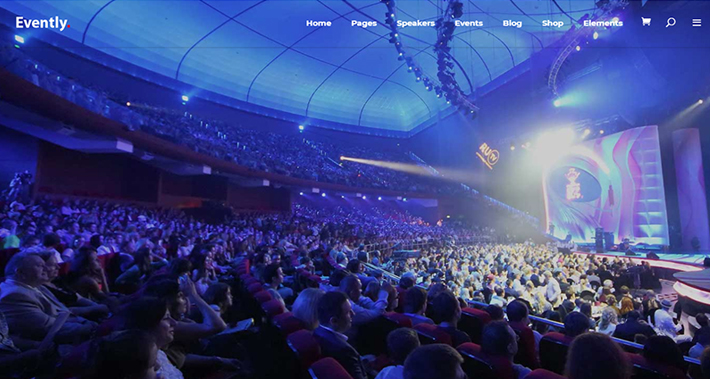
You can now hit the Save button and head back to the page you added your slider to. You’ll see that the image is now displayed in the position you set for the slider.
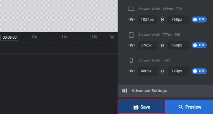
Don’t forget to press the Save button each time you make a change to your slide! Just to be absolutely clear which button we’re talking about, take a look at the picture below.
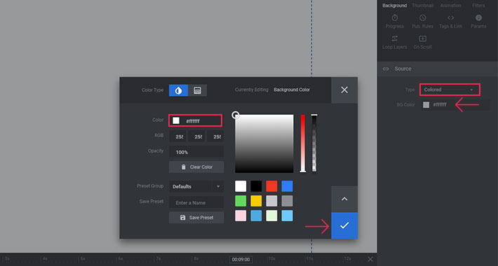
Setting a Background Color
If your slider design requires a color for the background instead of an image, you can set that up pretty easily. Just select the Colored option from the Type dropdown in the Source panel, and then click the BG Color button to choose your color. You can choose the color using the color picker tool, or you can simply input the hex value into the Color Hex Value field. You can also play around with the opacity if you like. Setting Opacity to 100% will give you a fully saturated color, while lower values will result in a semi-transparent background. Once you’re done, just hit the blue check mark.
Other Useful Options
There’s truly a plethora of options for customizing the background of your slides. You can add YouTube Video slides, Vimeo Video slides, etc. Adding a video to Slider Revolution requires a whole separate article, so I’ll skip it for now. But I’ll be back with more on that in the near future.
Under On Scroll > Parallax & 3D Settings you can customize the parallax effect for each slide. Just make sure Parallax is enabled in your Module General Options.
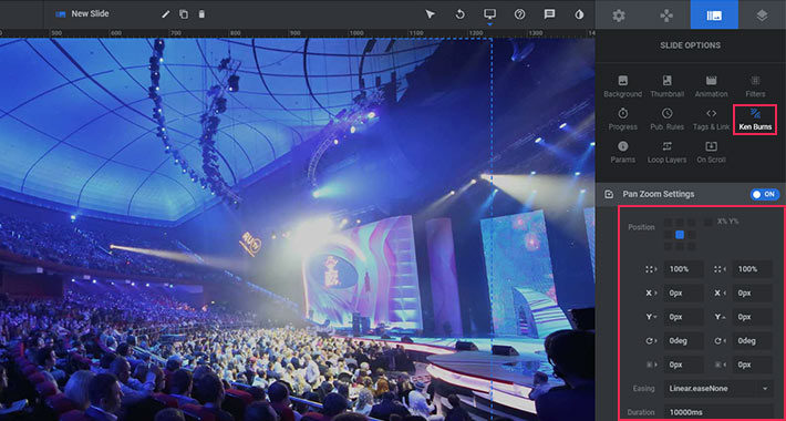
If you’d like your background image to zoom in or out, the experts from Slider Revolution have made the Ken Burns effect, which you can turn on and customize in the dedicated Ken Burns panel.
Besides the Slide Options tab, you will also find a number of other settings for customizing your background. In the Module General Options tab you have a variety of options regarding your slide behavior and visibility. Just be aware that if you insert a value in the “Initialization Delay” field, there is going to be a delay before the slide’s background image appears.
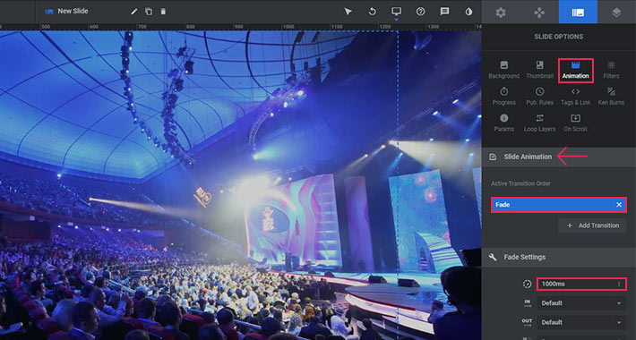
You can change the way your slide enters the screen under the Slide Options > Animation > Slide Animation tab. The default animation is Fade. If you leave the default Fade option, your slider background will simply fade in. Here, you will also find a field for configuring the animation duration, which is set to 1000ms by default.
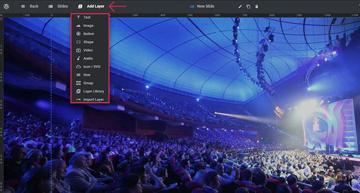
Adding Layers to Your Slides
Now that we’ve gone through the basic slide options, we’re ready to start adding layers to our slide. Hop over to the work frame and hover the Add Layer button with your mouse cursor. You’ll see a dropdown with different layer options.
Now let’s add a new image layer. You may wonder why we’d add an image and not text, to begin with. Truth be told, it’s actually a lot easier to work with image layers than with text layers. But don’t worry, I’ll tackle text layers in a separate section below.
So, when you want to add an image layer to your slide, simply click on Image in the Add Layer dropdown. Then proceed to upload the desired image. I’ve uploaded a random free vector image of a circle as a .png file with a transparent background.
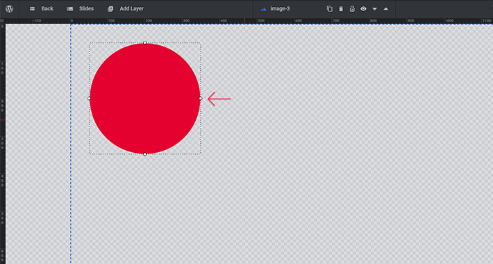
Now you can save your slider and check if the image is displayed on the page you added the slider to. I’ve just checked my page, and yes, there’s definitely a circle there now.
Layer Settings
Now, we’ll go through some of the options we have for each layer we add. Next to your frame, you’ll find a number of Layer Options (Content, Style, Size & Pos, etc.). I’ll just cover the basics of these options for now, but you can expect separate articles in the future in which I’ll go through them in detail.
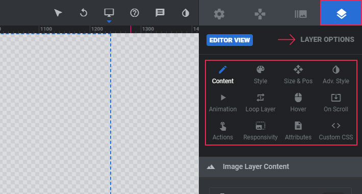
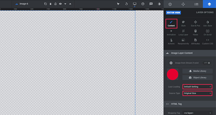
Image Layer Content
Here we have some basic information about the layer. We can set lazy loading and change its source type. Here you’ll also find the HTML tag option, but this setting is not of much importance for the image layer.
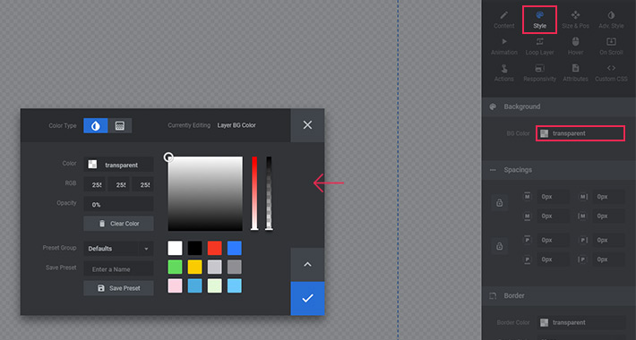
The Layer Style Options
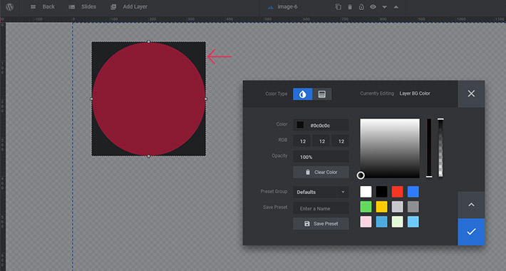
The first option allows us to add a layer background. When we click on it, we can choose a color for the background.
In our case, it would look like this.
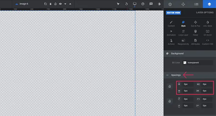
Next, there are Spacings settings. The first ones are for moving the layer – from up to down, from left to right, from down to up, and from left to right. They are marked with the letter ‘M’.
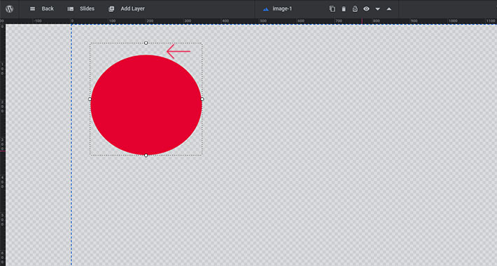
The next four fields are for transforming the layer. Every layer we add has four sides, and each side can be transformed. Let’s now add a value in one of the fields and see how our circle will react.

I entered 30px in the first field – the field that transforms the top side of the layer. The upper side of my layer moved 30px downward. And now it looks like this:
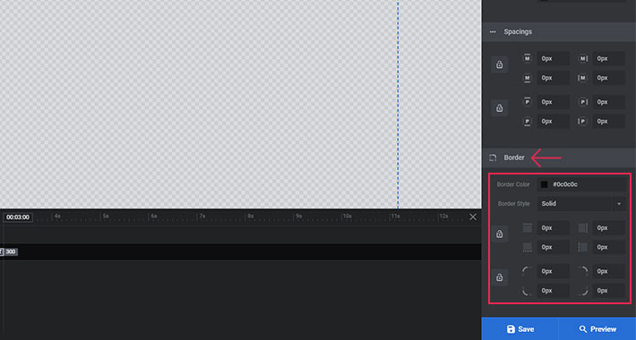
You can also add a border to your layer. It is transparent by default, but if you want to add it, you need to choose its color and its style, and set its thickness in pixels.
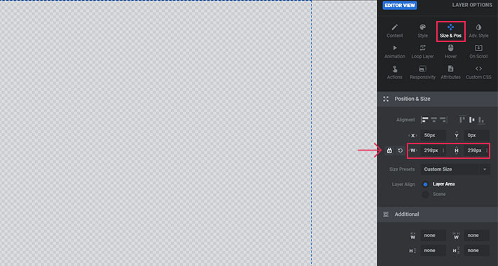
The Layer Size & Pos Options
In this section, you can set your layer’s Alignment, and change its Size. Our layer is by default placed on the upper left side of the screen. This means that the horizontal alignment is set to left, and the vertical alignment is set to top. Layers alignment, both vertically and horizontally, can be changed easily by clicking on one of the alignment icons. I will only change my vertical alignment to the center.
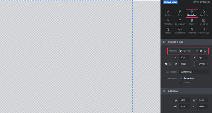
Once you’ve chosen the alignment, you can set the position of your layer more precisely using the Horizontal and the Vertical Offset from Aligned Position options. With the default horizontal alignment, your layer is stuck on the left side. This basically means that its horizontal offset (X) is currently 0. The same goes for the vertical offset (Y), which means that the layer is exactly in the middle of your screen. If you enter 50 for the X offset, your layer will move to the right by 50px. And if you enter -50 (yes, that is an option, too), your image will move by 50px to the left, and it will go outside the screen boundaries. I entered 200 for the horizontal offset, and 200 for the vertical offset. Let’s save this slide now and check how it looks on the page.
You can also change the layer’s original size. Just make sure the padlock icon is locked, so that your layer changes its width and height proportionally.
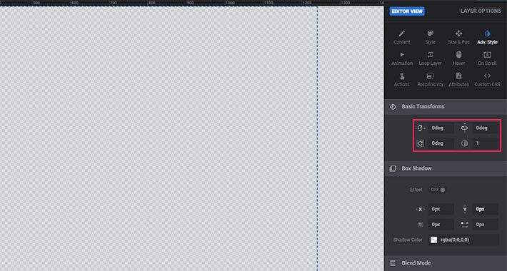
The Layer Advanced Options
These options allow us to Rotate a layer horizontally, vertically, and centrally.
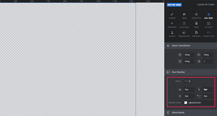
The other useful options here let us add shadows to the layers.
The Layer Animation Options
The Animation tab is where you get to animate your layers and set up your appear and exit animations. I always use appear animations, because I think they’re a great way to make the right first impression.
In the Animations tab, you will find two rows. The first is for appear animations and the second is for exit animations.
Each row has a dropdown menu with different types of animations. The default appear animation is Fade-In for all layers. I suggest you go and try some of the other animation effects to find one that suits you best.
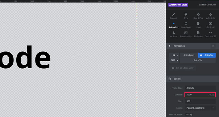
The section below is used for Animation Duration, Animation Easing and for defining animation Start. Animation Duration defines how long will it take until the animation is done, while Start defines the duration of time after which the animation will start after the slide loads. The recommended start value is between 100-300ms for the layer you want to appear first. Easing defines the speed at which the animation will progress (which is not the same as animation duration, which defines how long the animation will last overall), and different easing settings can result in different animation effects. Easing makes sure the animation has a natural, real-life feel to it. Go ahead and play around with these settings to get a better feel for them!
As you can see, there are a few more settings in this tab, but we’ll skip those for now, as they require a more advanced understanding of the principles of animation.
The Layer Loop Tab
The Loop tab, as its name suggests, lets you create looping animations. The settings here are pretty straightforward. You can choose an animation type, define the loop speed and easing, and set a start and end time for the loop. To be honest, I don’t use loop animations much, but you can play around with them to see if you find them useful. Just make sure to first switch the Enable Timeline Loops toggle on.
The Layer Hover Options
If you plan on having some sort of action when your layer is clicked or triggered in any other way, you probably want to define its behavior on hover. Enable the hover before you start setting it.
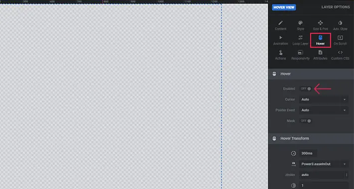
The first dropdown here lets you choose the Cursor look on layer hover.
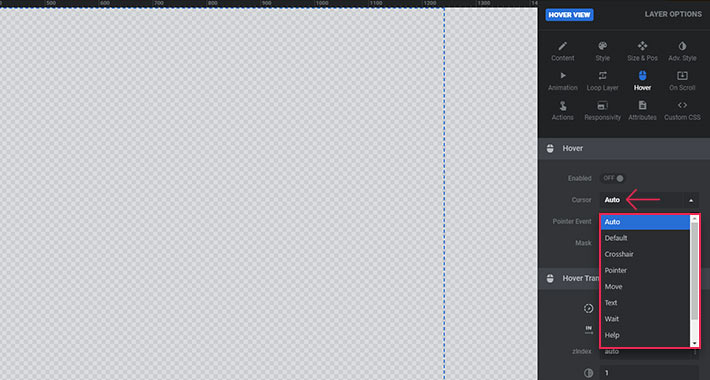
Below, you can set everything related to the layer behavior on hover. This is more useful when working with layers that you created by yourself, within Slider Revolution (e.g. text layers, shapes, etc., as opposed to images you simply uploaded into your slide). We’ll skip these settings for now, as they deserve an article of their own.
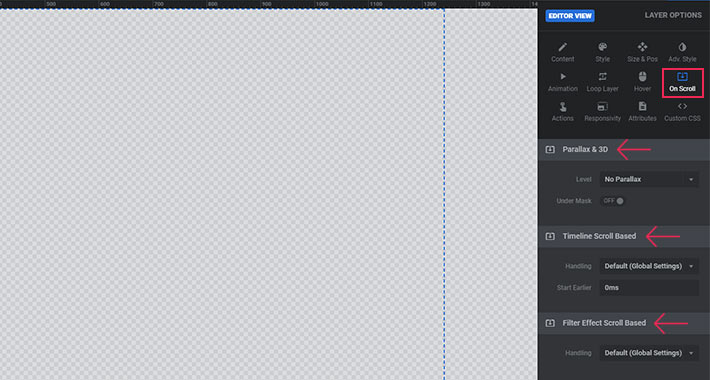
On Scroll Layer Options
If you want your layer to move on mouse scroll, you can enable that here. There are three options – Parallax, Timeline Scroll Based, and Filter Effect Scroll Based.
The Layer Action Options
This section lets you make your layers interactive. For example, you can make a layer open a link when a user clicks on it.
Click on the action icon to choose the type of action you need.
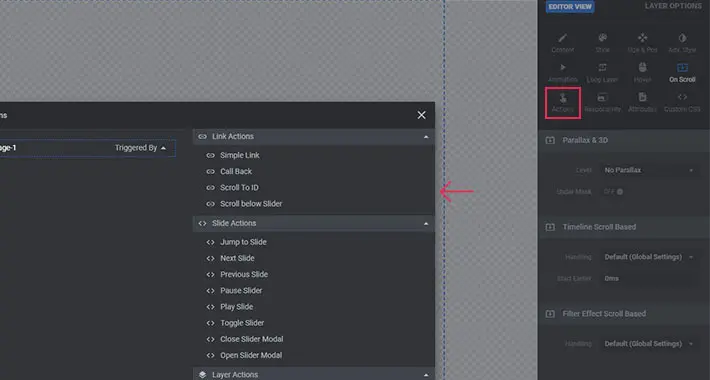
The first dropdown is where you can choose the type of action that you would like to occur. There are a lot of options here. I’m going to choose the Simple link option, which is located under Link Actions.
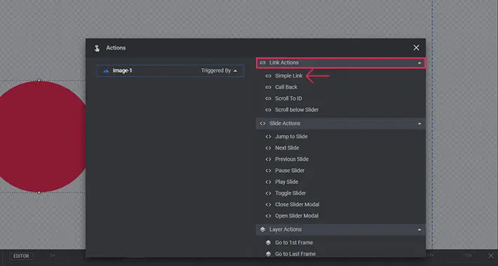
Now I can choose the interaction, enter the URL I would like my layer to link to, choose whether I want my link to open in the same browser tab or in a new tab, choose between a jQuery or a Tag Link, and select whether I want search engines to follow the link or not. I also have the option of setting a Delay time between the moment the user clicks on my layer and the moment the link is opened.
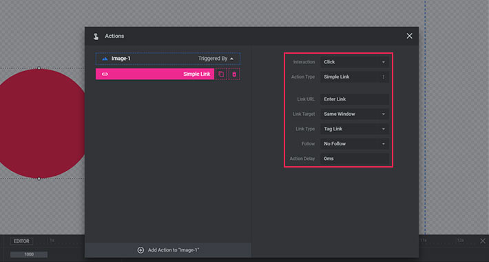
There are also a lot of other action types to choose from here. However, I mainly use this tab to add links to my layers. I suggest you try out a few of the available actions and see what you find useful.
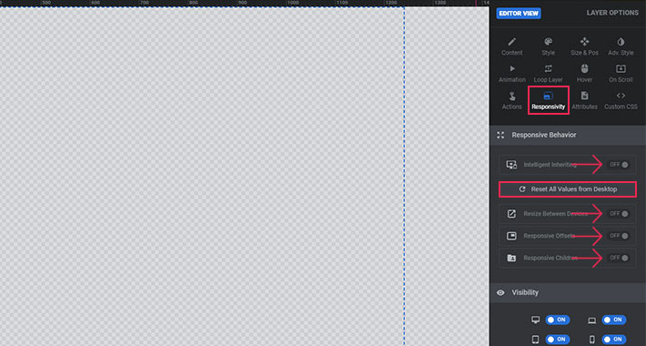
The Layer Responsivity Options
Let’s take a look at the Responsive Behavior section now. If you leave the Intelligent Inherit option on, your layer will become proportionally smaller on all devices with screens smaller than the defined desktop screen size. According to my experience, it’s always better to turn this option off, so you can manually define the size for every single device. That way it’s easier to manipulate not just the sizes of your layers, but also their position. The same goes for the Resize Between Devices, Responsive Offsets, and Responsive Children option, which applies automatic responsiveness to any additional content in the layer (raw HTML, other shortcodes, etc.). Once you turned off these options, don’t forget to click on Reset All Values From Desktop button.
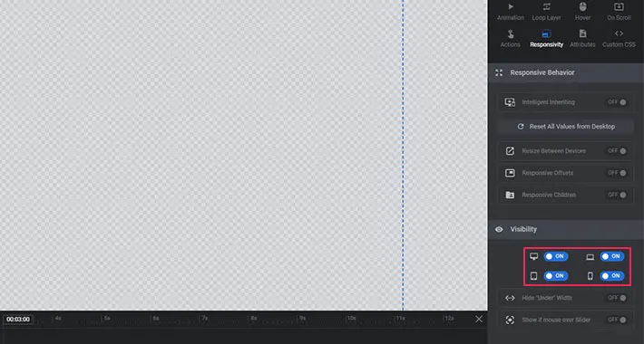
If you want your layer to be visible on all devices, then make sure the switches shown in the image below are all turned ON. The first one is for desktop, the second one is for laptops and horizontally oriented tablets, the third one is for vertically oriented tablets, and the last one is for mobile phones. If, for some reason, you want to hide your layer on any device, simply turn off the appropriate switch.
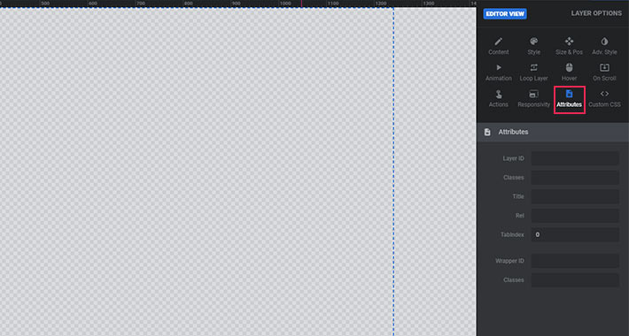
The Layer Attributes Options
The Attributes tab lets you add custom IDs and classes to your layers. This then enables you to manipulate your layers via custom CSS. You can also use certain options in the Attributes tab (Rel, Title, Tabindex, and Alt) to enhance the accessibility of your slider and its layers.
Since working in the Attributes tab requires some basic HTML and CSS knowledge, we’ll skip it for now.
Working With Text Layers in Slider Revolution
Now that you know how to add image layers to your slides, let’s take a look at the available options for text layers.
Before creating your first text layer, you should make a few decisions. For starters, you need to decide on one of the most important factors – the font you will be using. In combination with the right visual, a well-chosen font can do wonders for your online presentation. So, give yourself enough time to find a font family that will perfectly fit your needs and the style of your website. Then, you need to decide on a font size for desktop devices. Also, think about the text color. I suggest you keep it simple. Vibrant colors are great, but only when combined with similar elements. So unless you’re sure of what you’re doing, don’t take too many risks regarding color.
Once you’ve chosen a font and determined its basic style, you are ready to add your first text layer.
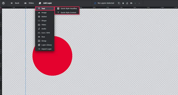
First, go to Add Layer, and click on Text. If you want to add a ‘title’ text choose Quick Style Headline, and if you want to add a paragraph choose Quick Style Content. I’ll choose a headline.
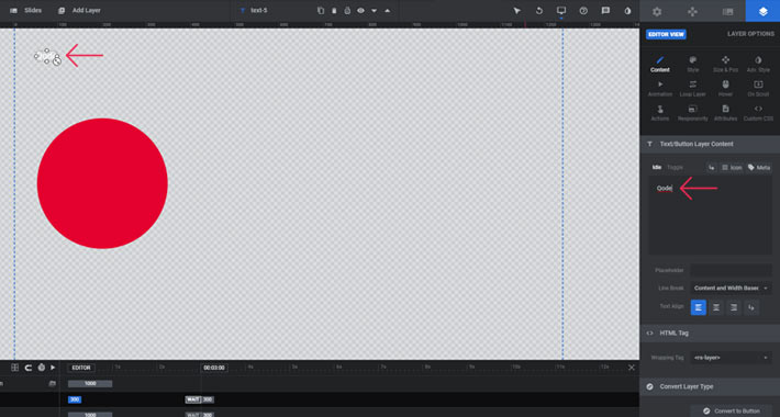
A black box will appear. This is where you should enter your text. Everything you type will also be visible in your work frame.
Before you change your text layer’s default settings, hop over to the Responsivity options tab to turn off Intelligent Inherit.
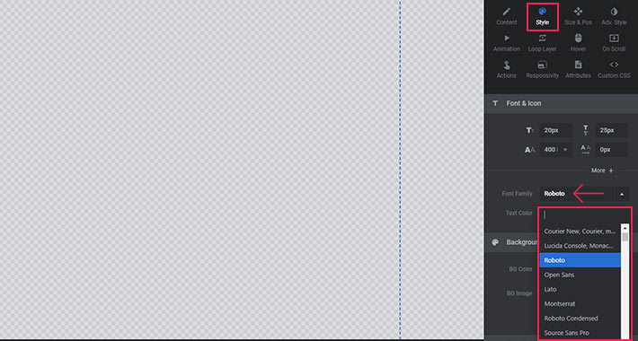
Now take a look at the Style tab. You can see that Roboto is the default font family for every text layer you add. You can choose your preferred font from the dropdown. Just a quick reminder – in order to edit the text layer, you first need to make sure it’s selected.
Besides choosing a font family, you can also determine the font-size, line-height, font weight, and letter spacing in the Style tab. Each of these options will alter the look of your text. So don’t hesitate to play around and find the combination that works best for you.
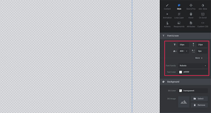
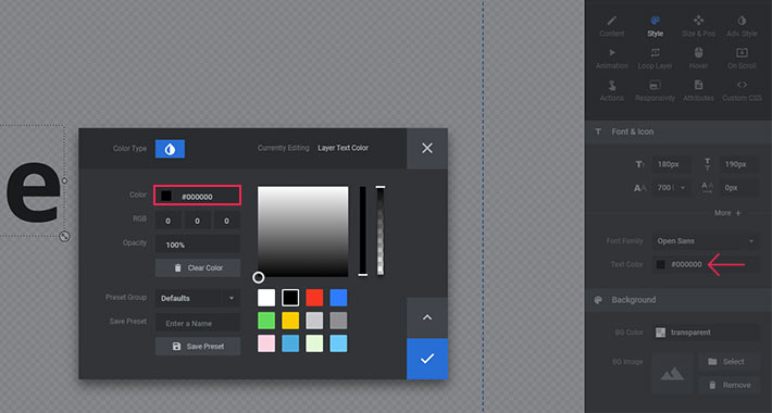
Now it’s time to change the color of your text. Click on the Color filed to open the color picker tool. It’s up to you to choose the color that fits your visual perfectly.
Once you have determined these basic values, save your slide and see how it looks on your page.
The next thing you should define is the horizontal and vertical alignment of your text layer. A page ruler extension for your browser can help with setting the offset values for your text. If you don’t already have a ruler extension, you can find a great one for Google Chrome here.
Let assume that your text should start 200px from the left edge of the screen, and 200px from the upper edge. In that case, your horizontal alignment should be set to left, and your vertical alignment to top. The X and Y offsets should both be 200px.
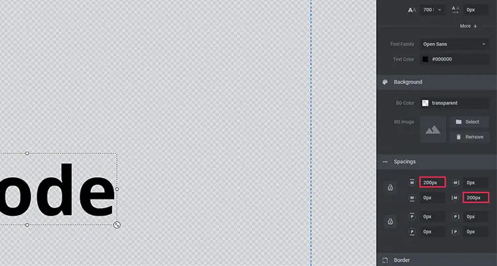
When you fill in these fields, save your slide and go check it out on your page. You can use your ruler extension to make sure the offsets are precisely set. Sometimes, the 200px you set in the backend is not going to display as 200px on your page. That’s why it’s smart to measure it with a ruler extension.
Now you can start customizing your text layer using all the same options we went through when talking about image layers. You can add animations, define the visibility, create actions, etc.
It’s interesting to note that you can also input HTML code into your text layer field. Thanks to this option, you can insert different shortcodes and create your own HTML elements using text layers.
One of the first things we did when setting up the Slider Revolution plugin was define the global responsiveness options. Then, we enabled custom responsiveness for our slider. However, these options merely make it possible to create a responsive slider. They don’t guarantee full responsiveness. For that, you also need to make sure that each layer in each of your slides seamlessly adapts to all devices and screen sizes.
So, once you add all your slides and layers to your slider and confirm they all look nice on Desktop devices, it’s time to fine-tune them for all the other available devices. Luckily, not all your layers will need editing for all devices. Some of them will look good by default. But we’ll now cover what you can do for those that need to be tweaked.
Desktop Devices
When editing slides in the work frame, you’re primarily setting them up to look good on desktop devices. When you’re certain everything looks perfect on desktop, you can start playing around with layouts for other devices.
To show you how you can make your layers adapt to various devices, I have added all my layers to my slide. Let’s say I want them to look like this on desktop:

Notebooks
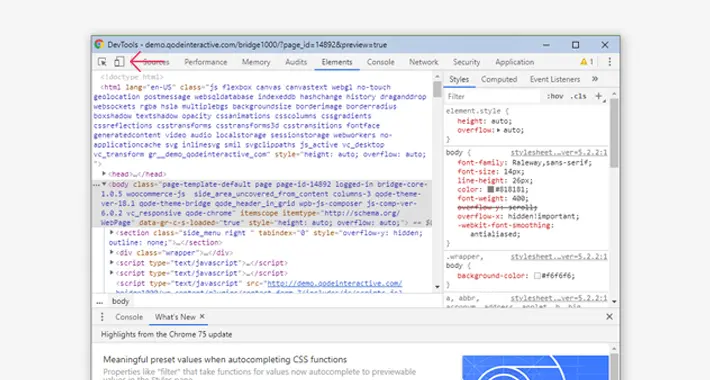
There are two ways to check what your slider looks like on other devices. The first (and better) way is to view your website from an actual device. However, if you don’t have access to at least one device of each type, you can also use the Device Mode option in Google Chrome DevTools.
To activate the device mode, simply press F12 while in Google Chrome and then click on the icon shown below:
Now you can choose the device you would like to emulate from the dropdown. If you can’t find a certain device, you can click the edit button and then select the check mark beside the devices you would like displayed in the dropdown.
I already have some custom devices set up, so let’s see what my slider looks like on those devices.
Here’s how my layers will be rendered on a Mac:
And here’s what they look like on a horizontal tablet:
I think that the layers look a bit big for these smaller screens. Whether you agree with me or not depends entirely on your personal preferences. If you want your layers to be displayed in a bigger format on smaller devices, that’s perfectly fine. But, if you want to change how they render from device to device, you can do so easily. It’s pretty much the same as changing settings for the Desktop. You can modify everything for every single device. For example, for text layers you can set a different font size, line-height, font-weight, and color, all depending on the device your slider is viewed on.
To start editing the responsiveness settings for laptops, notebooks, and horizontal tablets, you need to select the icon shown below:
As long as this icon is selected, you are in the editor for notebook devices. Any settings you modify will only be displayed when your slider is viewed on notebooks.
To change the size of the image layer, you can simply add a different width. The height of the image will automatically be adjusted to fit the width you set.
Now save your slider, and check out how it looks live. If anything looks out of place, just go back to the work frame, make sure the notebook view is selected, and customize the settings to perfection.
Vertical Tablets and Mobile Devices
Now that you know how the layer responsiveness settings work, you can easily tweak the settings for all devices. To start editing your slide layout for vertical tablets and mobile devices, just make sure the appropriate icon is selected above the work frame.
Note the blue grid borders. These define the edges of the device you are currently working with. So, if any of your layers extend outside of the borders, make sure to change the settings for those layer until they are safely within the borders.
In my case, I just adjusted the size of the image layer until it was visible on mobile:
Once all your layers are adapted to all devices, I assume you don’t want them to just to stand there, motionless. Read on to learn about creating your first animations with Slider Revolution!
We’ve finally come to the most powerful functionality of Slider Revolution – animating our layers. This is where your get to show off your creativity to the fullest.
The Animation Timeline
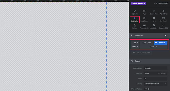
We can probably agree that it’s not ideal for all layers to appear onscreen at the same time. We want to add a bit of variety to our slides. Luckily, Slider Revolution provides a great animation tool called the Animation Timeline. It can be found right below our work frame.
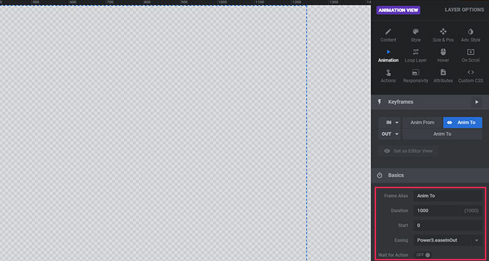
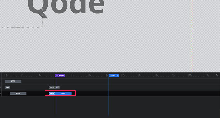
You’ll see that the default frame start value for each layer is set to 0 milliseconds. This means that each layer will appear onscreen 0 milliseconds after your page loads. The default appearing duration is 300ms, which means that it will take the layer 300ms (or 3 seconds) to go from invisible to fully visible. To change these default options, choose the layer you want to edit and simply insert a different value.
Now, you want to make sure that it doesn’t take too long for your first layers to appear. My recommendation is not to go above 300ms for the frame start value. Also, if you don’t want all your layers to appear at once, make sure to set a different frame start values for each of them. For example, if you set the first layer to appear at 300ms, you might want to set the next one to 500ms, the third one to 700ms etc. When it comes to duration, it’s up to you, but I usually work with values between 500 and 800 milliseconds.
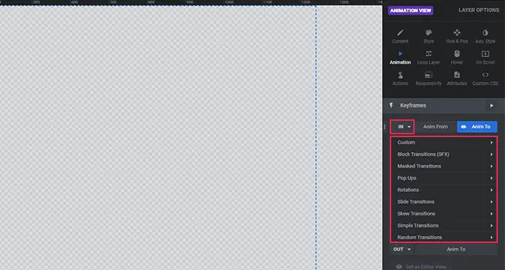
Incoming Animations
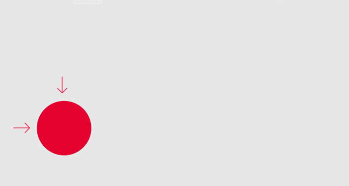
Once you have set the frame start and duration values for all your layers, it’s time to choose the type of incoming animation for your layer. To do this, we need to go back to the Animation tab above our work frame. As I previously mentioned, the default animation is Fade-in. But for the purposes of this tutorial, let’s assume you want your image to enter from the left to the right side of the screen. In that case, the animation you want to choose is Short-From-Left. You can also use Long-From-Left, but I’m afraid it is too long by default and doesn’t look so nice unless you edit it with custom settings. So let’s go with Short-From-Left for now.
Now that you’ve chosen your preferred animation type, you can change its easing from the Animation Easing dropdown:
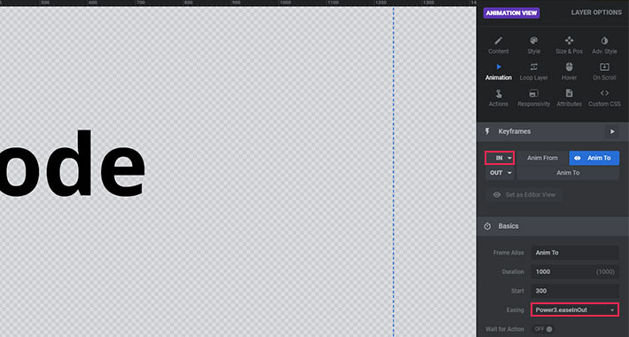
Different easing presets will create different effects, so I suggest you try out a few and see what best fits your needs.
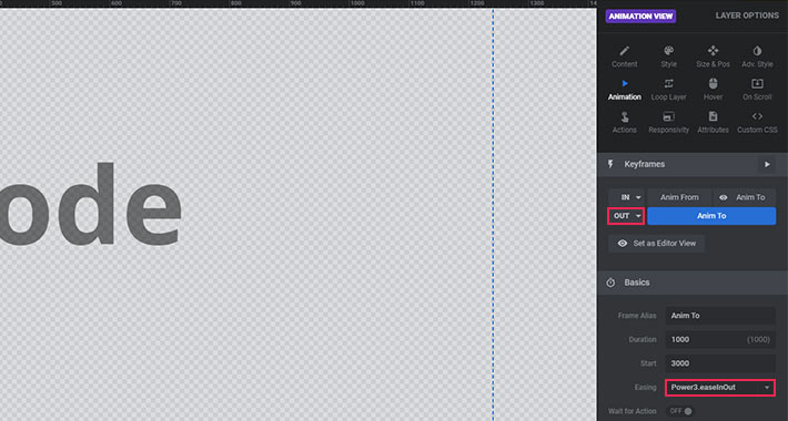
Outgoing Animations
Adding incoming animations is almost a no-brainer, since they help create a great first impression. But, what about outgoing animations? Well, I suggest you approach these with caution, since they make your layers completely disappear from your slide. Choosing outgoing animations all depends on the purpose of your slide and the last impression you want it to make on your viewer before it leaves the viewport.
The options available for outgoing animations are fairly similar to those for appearing animations. However, to edit the Frame Start and Duration values for each layer, you now have to click on the edit button toward the end of the animation timeline.
Right now the Frame Start is set to 9000ms. This is because the duration of your slide is 9000ms by default. With the Frame Start set to 9000ms, your layer will be visible on screen until the slide changes. To make it disappear before the end of the slide, simply enter a lower value into the Frame Start field.
Now you can choose the type of outgoing animation you would like to use, as well as its easing. This is done in the Animation panel, and all the options are pretty much the same as for incoming animations.
Advanced Options
If you want to customize the default animation presets, you can check out the Advanced section settings below. So, for example, if you think the starting point for the Short-From-Left animation is too short, you can easily change it. Let’s say we want it to start 80px further to the right: all we need to do is input 80px into the X axis field.
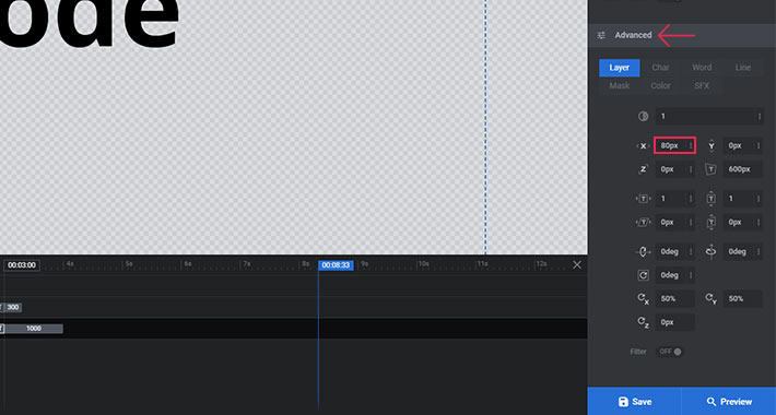
If you are wondering what the “Y” field is for when our animation has nothing to do with the y-axis, here is the explanation: If, for some reason, you want the animation to appear from the left and diagonally, you just need to insert a value in the Y axis field. If you insert a positive value, your layer will move diagonally up and to the right. On the other hand, if you decide to enter a negative value, the layer will move from down and to the right of the screen.
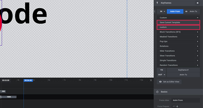
As soon as you edit one of these fields, you can save this animation as Custom Animation.
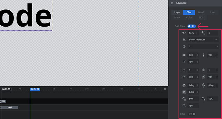
Now take a look at the tabs below.

These are useful only for text layers. You can use the Char, Word, and Line tabs to split the animation applied to your text by letter, word, or line.

The best way to see how this option works is to try it out.
The fields that open after enabling one of these let you customize the animation. For now, I just want to change the direction of the split animation. So I’ll choose the Backward option from the Split Animation Text Direction dropdown. This will make my text appear letter by letter, and from the right side of the screen to the left (backward).
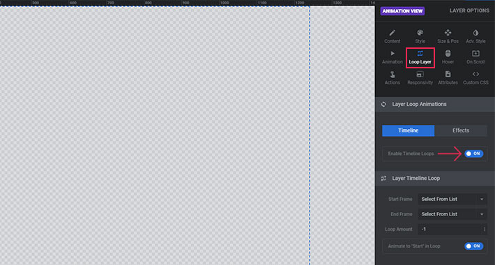
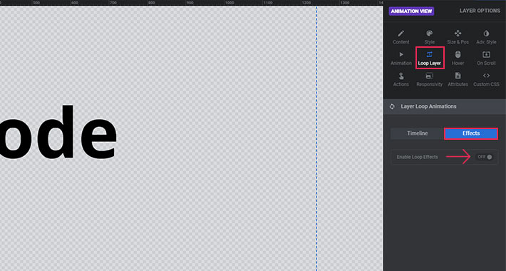
Loop animations
Slider Revolution also lets you create Loop animations. This is done in the Loop Layer tab. Here, you will see that Loop Effects are disabled by default.
You can choose from eight types of loop animations: Custom, Pendulum Loops, Effect Loops, Wave, Wiggles, Rotating, Slide and Hover, and Pulse. Besides the Loop Speed and Easing settings, each loop animation has its own set of options.
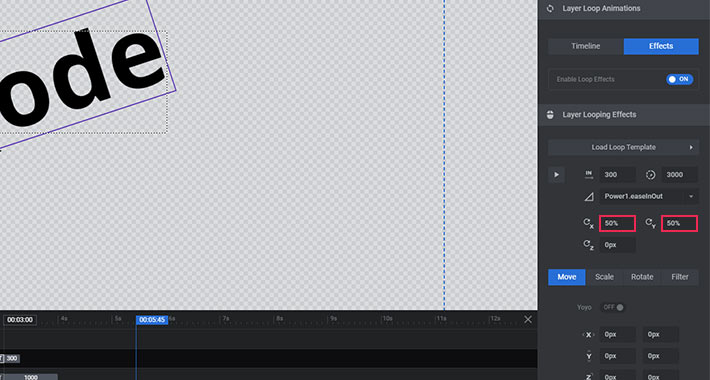
The Pendulum animation makes your layer swing from side to side. You can set a start and end degree, as well as an X and Y origin point. The start and end degree determine the degrees between which the animation will occur. The X and Y origin points determine the axis point from which the layer will rotate and are expressed in percentages. If you want the axis point to be in the center of the layer, you should set both the X and Y axis to 50%.
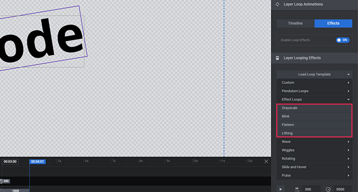
Effect Loops let us choose from a couple of effects for our layer – Grayscale, Blink, Flattern, and Lithing. Each reflects differently on different layers, so you should try them all and see which one fits your layer the best.
The Wave animation makes your layer rotate in a wave like motion. In other words, it doesn’t rotate around its own axis, but instead around an axis outside the actual layer. You can set a Rotation X and Y Point which determines the position of the axis around which the layer will rotate, a Start Angle which determines the starting position of the circular animation, and a Radius, which determines the orbit of the rotation.
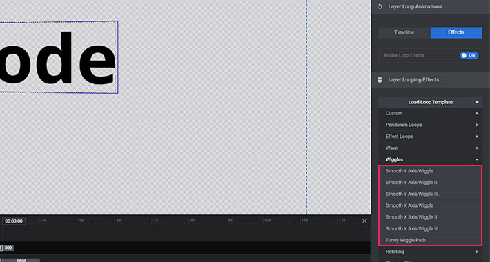
The Wiggle loop will make your layer wiggle from side to side – from up to down, from left to right, and vice versa. You can choose the way you’d like your layer to wiggle from the dropdown.
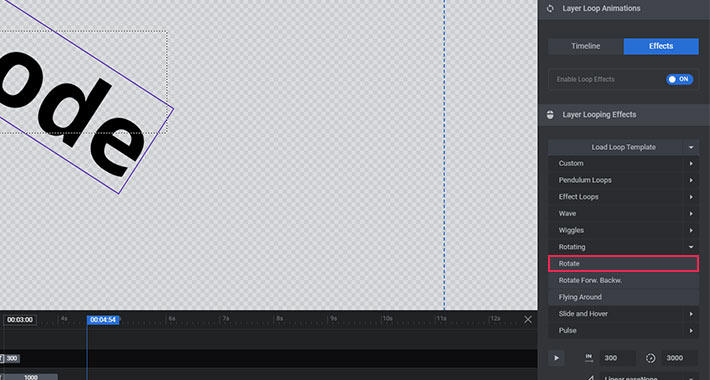
As its name suggests, the Rotating loop makes your layer rotate around the set axis point. However, your layer will not rotate by default. It will rotate and make a full circle if you choose the first item from the Rotating dropdown – the Rotate item.
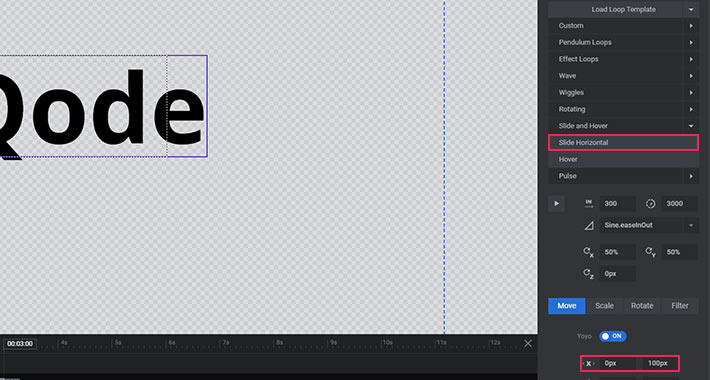
If you want your layer to move left to right, right to left, up to down, diagonally, etc. you can use the Slide and Hover animation. Here, you can determine a start and end position for the animation in the Start X Offset, Start Y Offset, End X Offset, and End Y Offset fields. If you want the animation to start from is the layer’s initial position, you should leave 0 in both the Start Offset fields. To make your layer move from its starting position, let’s say, 100px horizontally, you need to enter 100 in the End X Offset field. Its best to play around with the start and end offset settings, to get a feel for how they work.
The Pulse animation makes your layer continuously zoom in and out. You can determine the Zoom Start and Zoom End. The default values here are 1 for both start and end. This means that the layer will remain at 100% of its size. In other words, it won’t animate. If you enter 0.5 for the Zoom Start, your layer will start at 50% of its size and zoom in to 100% of its size, then back to 50%, etc. If you want your layer to zoom in above 100% of its size, just enter a value larger than 1 in the Zoom End field.
Final Thoughts
Well, that’s all for this tutorial. I hope you found it useful. There’s much more to Slider Revolution, and I’ll be back with more advanced tutorials in the future. But you should now at least be able to find your way around the basic settings and start creating spectacular sliders for your website.
If you have any thoughts or suggestions about this article, feel free to let me know in the comment section.

Alain Moulin
Very good tutorial. But I still have difficulty with the timelines and would like more details. How to be informed of the next publications on slider revolution?
Is there a book on this plug-in?
Thank you.
Très bon tutoriel. Mais j’ai encore des difficultés avec les chronologie et j’aimerais plus de détails. Comment être informé des prochaines publications sur slider révolution?
Existe t-il un livre sur ce plug in?
Merci.
Qode Interactive
Hello, thanks for getting in touch! For any more info regarding timelines, we suggest that you contact our support team: https://www.themepunch.com/support-center/. And if you want to stay up to date with our Slider Revolution article series, you can follow this tag: https://qodeinteractive.com/magazine/tag/slider-revolution/
Best Regards,
Qode
rac
Nicely detailed tutorial overall. The challenge I’m facing is that no tutorial seems to offer the basics. I just want to move the slides in the direction of the arrows the way a basic web slider typically works. See a common Bootstrap slider.
https://www.w3schools.com/bootstrap/bootstrap_carousel.asp
I want to use the Revolution Slider’s graphical design tools to build the slide, but I can’t seem to move the slide in the direction of the arrows.
I can’t find this capability anywhere in Slider Revolution. I haven’t found a single tutorial, including those by the plugin’s developers to show this.
I have the latest and am an experienced designer, animator and front-end programmer. It shouldn’t be this hard to slide an entire slide horizontally.
Any help would be greatly appreciated!
Qode Interactive
Hi and thanks for writing in. 🙂 To create a simple horizontally scrolling animation for your slide, go to Slide Options >> Animation >> Slide Animation and click on the settings icon to open different transition animations. https://www.screencast.com/t/SDxgazxxpgu
Now you can select the transition type and choose the animation from the additional dropdown. For the type you’re looking for, you should opt for the Slide Simple type, and for the way it appears you should choose Slide Horizontal. https://www.screencast.com/t/C8CYplK1ga
You can also customize the speed and easings of the animation.
Another thing you might want is to set the First Slide transition to Slide Horizontal. To do this, go to Module General Option >> General and scroll down to the First Slide section. Here, choose Slide Horizontal from the dropdown. https://www.screencast.com/t/JHxe1Zwwai
Hope this helps.
Best Regards,
Qode