The Benefits of One-Page Checkout in WooCommerce
An overly complicated checkout process is known to be one of the most common reasons for shopping cart abandonment. The more checkout fields your customers have to fill in, the more likely they are to change their minds about purchasing your items. Therefore, if you are set on reducing shopping cart abandonment and aim to keep your shoppers enthusiastic about their buying process right until the very end, it’s a general recommendation to keep the checkout process as simple as possible. And one great way to do this is to implement a one-page checkout into your WooCommerce store.
This time around, we’ve decided to talk more about the subject of one-page checkout and share some of the benefits that come with one page checkout WooCommerce feature. In addition, we will show you an example of how you can set up a one-page checkout by using a one-page checkout plugin, so make sure to stick around:
Simply put, a one-page checkout refers to a smoother and overall more simplified checkout process that allows the users to finish their purchases faster. This usually means having fewer unnecessary forms for them to fill, simplifying the layout of the checkout page in general, or allowing them to fill in the details that would otherwise require multiple steps – all on one single page. And while there are certainly benefits to multi-step forms when it comes to increasing conversions, a one-page checkout generally requires only the necessary information from the customers, using one page only. This includes information such as billing and/or shipping address, payment info, and any other info such as coupon codes and order notes, for example. The idea is not so much to reduce the required info, though, as it is to keep it all on one page, instead of dividing it in several pages, each one with its own loading time. This should reduce cart abandonment rates, as people often get annoyed when they have to watch page after page load.
Oftentimes, the ideal one-page checkouts are the ones that also provide the users with the ability to skip the cart page and include the cart options together with the checkout fields instead. This way, your customers can have the convenience of completing both on the same page. In turn, this can only make the entire shopping process simpler, faster, and more intuitive as a whole.
Now that we’ve explained what one-page checkout stands for and how it works in general, it’s time to go through some of the benefits of using this type of checkout on your WooCommerce site.
-
It speeds up the checkout process. We’ve already mentioned this in the beginning, but one of the main benefits that one-page checkout brings is its ability to make the entire buying experience much faster. The mere fact that users will be able to insert all the required information on a single page makes one-page checkout faster than a multi-page system would. It’s quite simple – it doesn’t require any new pages to load, thus saving the users’ time significantly. All your customers need to do is simply add and edit all the required info using the same screen, and then they need to hit one button to make their purchase.
-
It reduces shopping cart abandonment. According to some shopping cart abandonment statistics, 17% of people end up abandoning their carts due to long and complex checkouts. Therefore, by having the length of your checkout reduced and having all the required fields on one page, you can work towards reducing the overall cart abandonment and boosting your conversion rates – which brings us to our next point.
-
It can boost your conversion rate. According to Okendo, having a smarter design of a checkout page can increase a conversion rate by 35.26%. Generally speaking, simpler one-page checkout pages convert better than more complicated, multi-page ones. So, creating a one-page checkout with only the necessary steps and/or fields may be a good place to start when it comes to creating a more streamlined checkout experience and improving your conversion rate in general.
-
It makes the checkout easier and more user-friendly by default. This maybe goes without saying, but given that all the required info will be contained within one single page, one-page checkouts tend to be much simpler and more user-friendly in general. All the steps and their respective fields are usually listed in a streamlined fashion, helping make the entire process smoother and easier to understand as a whole.
-
It works excellent on mobile. Nowadays when most people browse websites and even shop for products using mobile, making sure your WooCommerce store is mobile-first ready is practically mandatory. Luckily, a one-page checkout tends to work quite well on mobile since users aren’t required to click on any extra pages or switch between tabs to complete their checkout. Plus, by having everything fit on a single page, your checkout will be much easier to optimize for mobile devices to begin with.

While there’s no denying the multiple benefits a one-page checkout can bring to a WooCommerce store, there are instances where using this type of system is practically mandatory. Namely, one-page checkouts work particularly well if you don’t require the users to fill in too many fields during their purchase. This is especially true if you sell downloadable/virtual or digital products in your store, as in that case users don’t need to insert any shipping or billing info.
That being said, if you have physical products to sell but simply find that having fewer fields – or having them all neatly organized within a single page – works well for you, then, by all means, you should opt for having a one-page checkout on your store.
The default WooCommerce checkout page is pretty basic and comes with some standard fields required for the user to complete their purchase. That being said, it does not do much in terms of user-friendliness as its main purpose is only to lead a customer through the payment process. Therefore, it doesn’t really help improve cart abandonment or boost conversion rates by itself. Also, the cart and checkout pages are separated by default, without the option to have cart options show up in checkout so users can edit both at the same time.
In short, it’s your job to find a way to enhance the entire checkout experience of your customers and ensure that they complete the process by making it as simple, practical, and user-friendly as possible. And if you ask us, one great way to do so is to use the help of a suitable one-page checkout plugin.
This time around, we’ve decided to show you how to create and customize a high-quality one-page checkout for your WooCommerce store using a plugin called One Page Checkout and Layouts for WooCommerce. This freemium plugin is quite simple to configure and has everything one needs to create a fast and intuitive one-page checkout experience for your customers. It allows you to combine the features of cart and checkout on one single page and lets users skip the cart page altogether. In addition, it provides users with the ability to change the number of products and remove the items from the cart at checkout without having to reload the page using Ajax. Also, you can use one of the many predefined layouts to make the design of your checkout page appear even more user- and mobile-friendly in general.
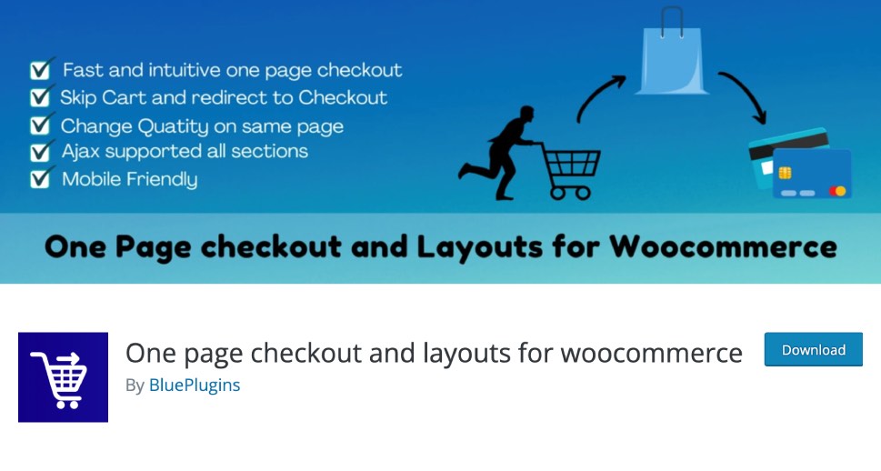
The premium version of the plugin (which costs $21) offers some additional options that will help you enhance the look and functionality of your one-page checkout even further. These include even more layouts, additional order designs, the ability to hide or show shipping and billing fields, and more.
Once you install the plugin and activate it, you should head to the Checkout Layouts page (the link to it is going to be available in your WordPress dashboard). Once there, you will have access to three different tabs – General Settings, Advanced Setting, and Replace Text.
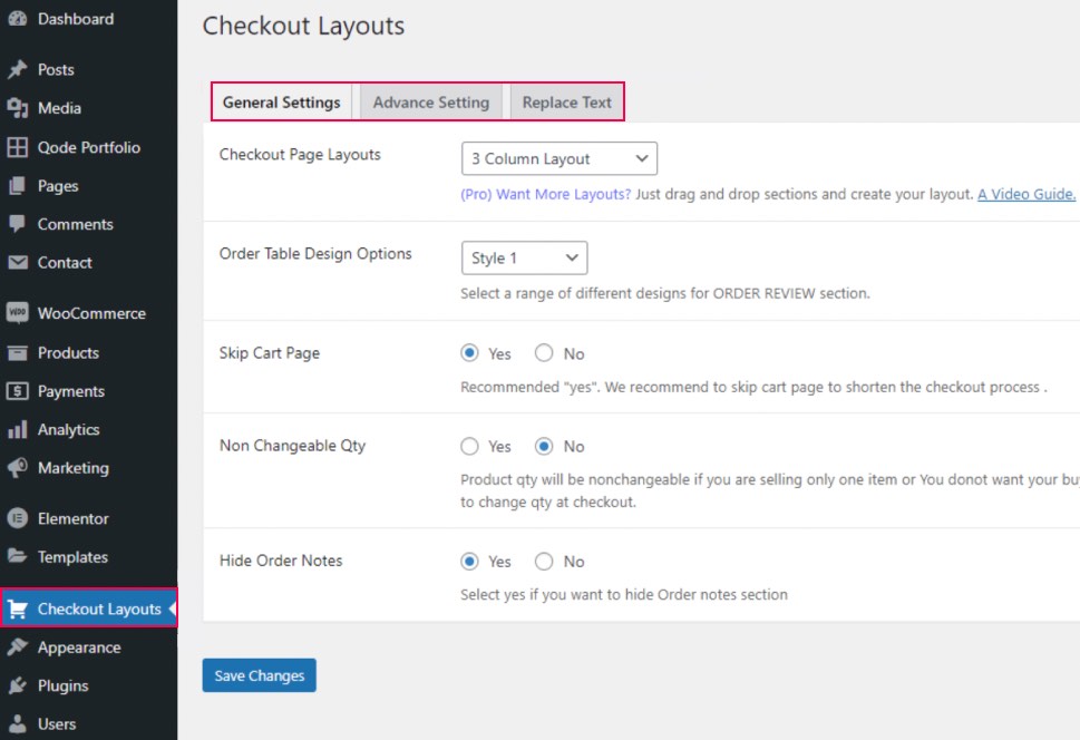
In the General Settings tab, you will find the options to select one of the four available checkout page layouts (1 Column, 2 Column, 3 Column, and Cart + Checkout) and change your order table design. Also, you can choose whether you want to skip the Cart page or not, set the product quantity to be changeable or non-changeable, and show or hide order notes.
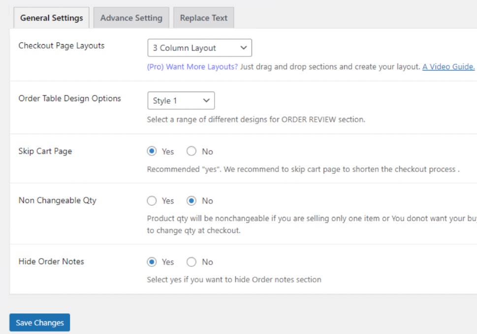
Hit the Save Changes button once you are done with adjusting your settings to have them take effect.
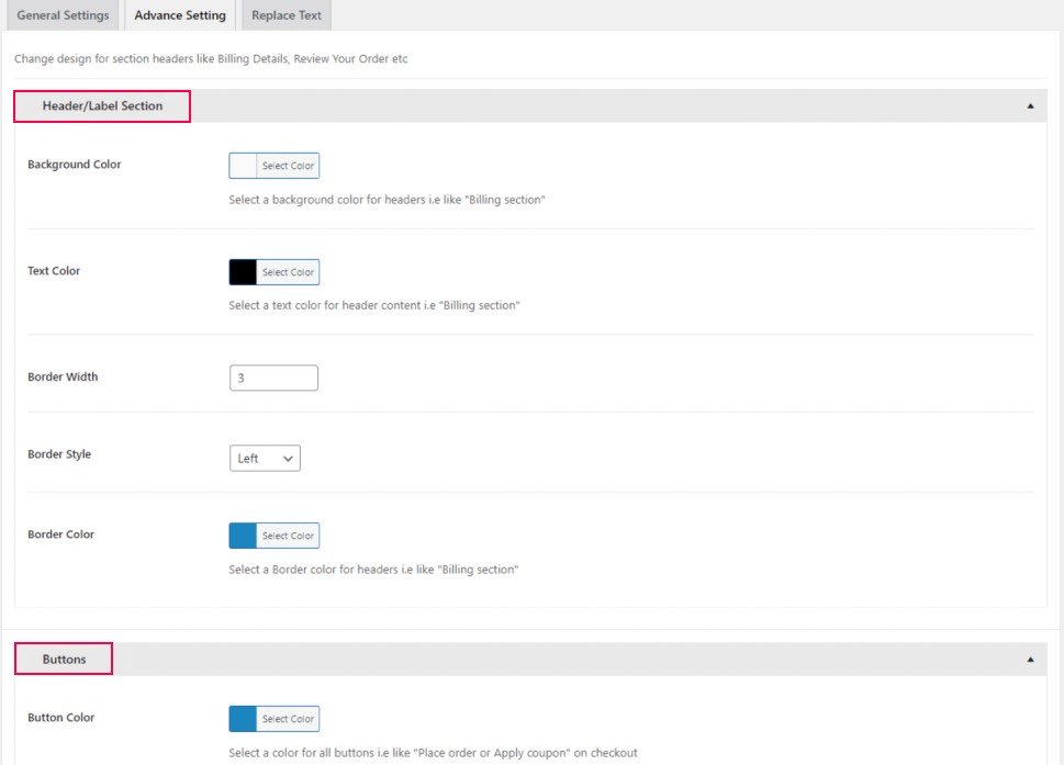
The tab with advanced settings will allow you to set the design of the header/label section (border design, background, and text colors) and do the same for the buttons.
Last but not least, the Replace Text section lets you replace some of the standard WooCommerce text phrases with anything you like. This includes Add to cart, View cart, Place Order, Continue Shopping, Billing Details, etc.
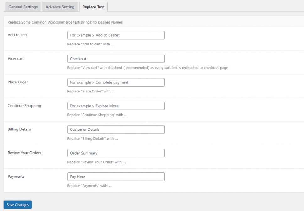
Of course, you should make sure to hit the Save Changes button every time you make any changes in one of the three available tabs.
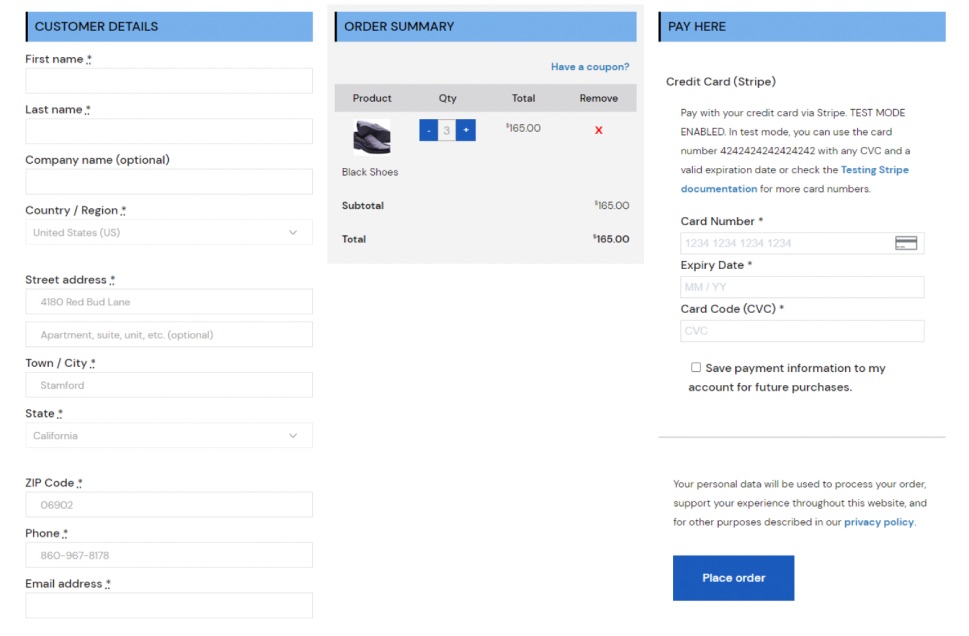
Finally, here’s what our one-page checkout page looks like after adjusting the plugin’s settings.
Wrapping Things Up
One-page checkouts can be beneficial for most WooCommerce store owners who want to create a faster, smoother, and more user-friendly experience for their customers. What’s great about creating one-page checkouts is that they usually allow you to place all important information within one single page, including the customer details that need to be filled, as well as the payments and order summary. As such, they have the potential to reduce cart abandonment and increase the overall conversion rate all at once.
We’ve used the freemium plugin One Page Checkout and Layouts for WooCommerce to demonstrate some of the things you can do to enhance the look and overall functionality of your checkout page. We think this plugin does its job well as it’s very simple to set up and comes with plenty of options that will allow you to play around with the layouts, adjust the label and button design, and even change the text of your one-page checkout to adjust the page entirely to your preferences. That being said, there are many other great plugins in the same category that provide an even wider range of options, so feel free to go with the option that best works for you.


