20+ Best HTML Fonts to Use in 2024

Selecting and using fonts is a huge part of web design: a lot can be inferred about the business from the fonts in their logo, but also the fonts their website uses. And when it comes to fonts, it‘s easy to fall down the rabbit hole of downloading and using whatever feels good at the time. However, fonts, like other pieces of software, come with their own issues, and aesthetics is just one part of it. In this article, we would like to talk about some of the best HTML fonts, but also fonts in general. If you feel you already know all the basics about HTML fonts, feel free to select the best fonts section from the table of contents below.
Here‘s what we‘d like to talk to you about:
A font is a displayable or printable set of characters. The characteristics of a font are style and size. Style can be further broken down into typeface – the design of the characters, and the variations, such as italic or bold. Size is measured by points, or pixels. So, Times New Roman is a typeface, while Times New Roman italic 12-point is a font. A typeface‘s variations are also called a font family.
However, note that typeface and font are used interchangeably, with font even being the more frequent of the two, even though it‘s technically incorrect.
Fonts are stored in their own file standard, usually .ttf. These are actually vector graphics – scalable graphics arranged into sets containing, most commonly, letters and numbers. There are, of course, icon fonts and dingbat (or symbol) fonts, such as, for example, Wingdings.
Other words used to describe fonts – or typefaces – include:
-
Monospace: with monospace fonts, each character takes up the same width on the screen or in print, be it the period or, say, the W. Monospace fonts have a sort of a technical and even retro feel.
-
Serif: the serif is a stroke on the edge of the main strokes which describe letters. Serif fonts are often considered formal, ornate, or elegant.
-
Sans-serif: sans-serif fonts are fonts that do not contain serifs. These are usually considered more legible, minimalistic, and modern.
-
Script: also known as cursive or handwritten (though there are differences between all these terms, they all fall into the same broad category), the script fonts tend to emulate handwriting, and they range from calligraphic to casual and playful, depending on the style. They are not meant to be used for the main body of text.
-
Display: also known as decorative, is a diverse group of fonts not designed to be used for the main body of the text, but rather for titles and accents.
Web safe fonts are fonts that typically come preinstalled as part of all or most operating systems. When a font is needed, but its file cannot be accessed, the browser (or word processor) will replace it with another, fallback font. This may make a website appear poorly designed or unsafe.
Some of the most common web safe fonts include Times New Roman, Arial, Helvetica, Tahoma, and others.

Google Fonts is a library of over one thousand free, open-source fonts. Apart from being free, they are also optimized for web compatibility. With over a thousand to choose from, they are extremely versatile, and this makes Google Fonts very popular with designers. There are plenty of ways to combine Google Fonts in order to achieve various effects. Google Fonts don‘t even need to be installed on your website in order to be run – they can be loaded from a different server. There is a case to be made, however, about hosting Google Fonts locally.
It would be wrong, however, to assume that all the fonts found in the Google Fonts library are web safe. Google Fonts are not all generally pre-installed with most operating systems, as they rely on being loaded from elsewhere. If you are looking to make your website easily legible by most browsers, be wary of overreliance on Google Fonts.
Arial
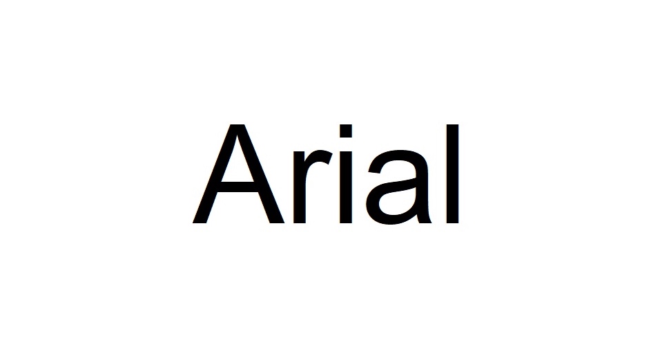
Arial is most definitely one of the most widespread fonts there ever was. Its clean, sans-serif style makes it a great fit for screens – it is, in fact, the default Google Docs font. This ubiquity is its main drawback, though – while great when you want to achieve a familiar look, it is anything but unique and interesting.
Calibri
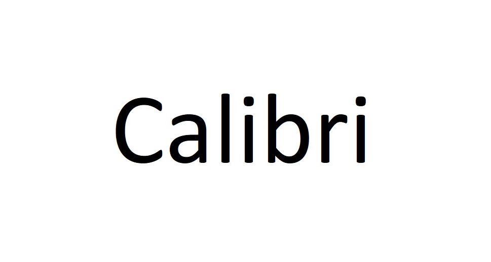
Calibri is Microsoft‘s standard sans serif font, and it brings a more rounded look to the style of font dominated by bold geometries. Can work both for titles and the main body of text.
Cambria
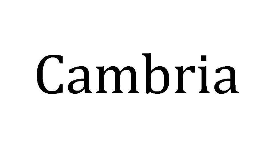
A versatile and very legible serifed font, Cambria‘s discrete decorative elements and clean lines lend themselves readily to both printed media and web design. While it is easily legible in small sizes, its thin lines make it possibly not the best choice for titles.
Comic Sans
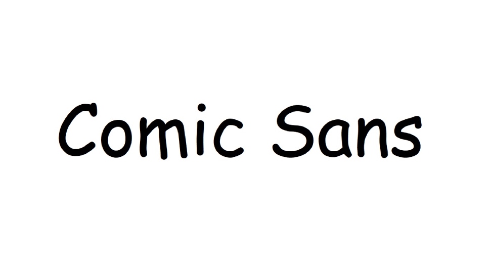
Often considered an “ugly“ or “joke“ font, Comic Sans is inspired by comic strips. You can nonetheless make use of its informal style, but it has one other advantage – it is known to be a very accessible font for people with reading difficulties.
Courier New
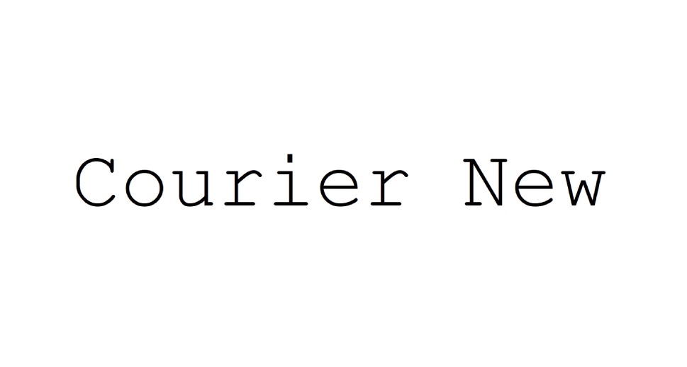
Courier New is a thin, serifed, monospace font that boasts great legibility on screen and in print: it has an instantly recognizable typewriter style, making it a good choice if you are trying to achieve a certain retro look.
Didot
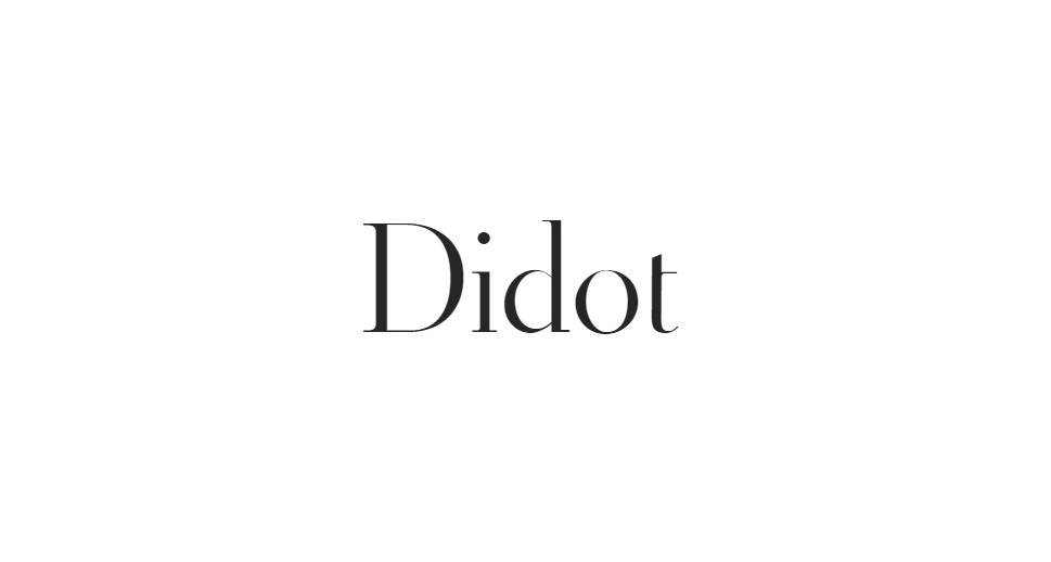
If you are looking for a narrow serif style, Didot might be a great choice for you. It is based on 19th-century print typefaces, and is found on most Apple devices.
Franklin Gothic
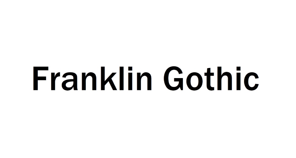
Franklin Gothic is both a sans-serif and an old-style font, characterized by thick vertical lines. This makes it interesting for heading titles, with its printed newspaper style, but not easily legible in the main text role.
Garamond
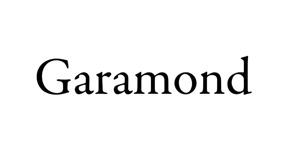
A very old-fashioned font family, Garamond evokes elegant baroque engravings and old-style print media. Great for conveying a classic look. Not the best choice for the main body of text, but potentially very impressive in titles and logos.
Georgia
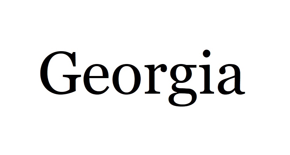
If you are impressed by Garamond, but looking for a rounder, thicker style, consider Georgia. It is very widespread and carries a certain stylishness characteristic of serifed fonts.
Goudy Old Style
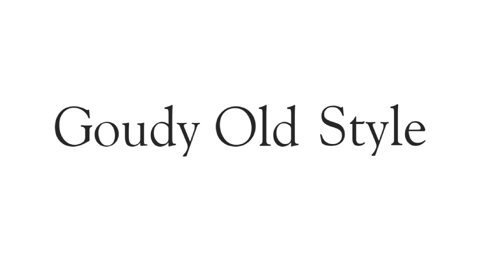
Another very old-fashioned serif font, Goudy Old Style is a great choice for logos and titles if you want to convey a certain elegance. Not great in terms of screen legibility, and positively antiquated in print.
Helvetica
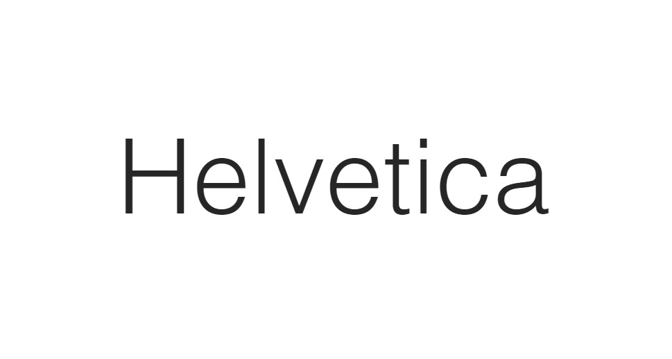
A popular sans-serif font, Helvetica boasts great legibility even in small sizes, and that means small screens, too. Crisp and clean, it can be used both for titles and the main body of text. It is the default font for Apple devices.
Impact
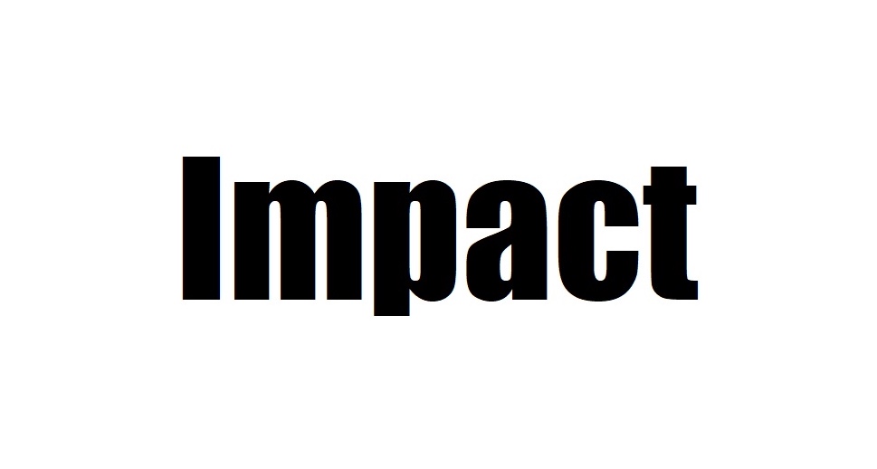
Impact is not a bad choice if you are looking to make a bold statement or design an eye-catching call to action. You will have also seen it in meme graphics, so it‘s best to avoid relying too much on it if you are looking to appear serious and formal.
Microsoft Sans Serif
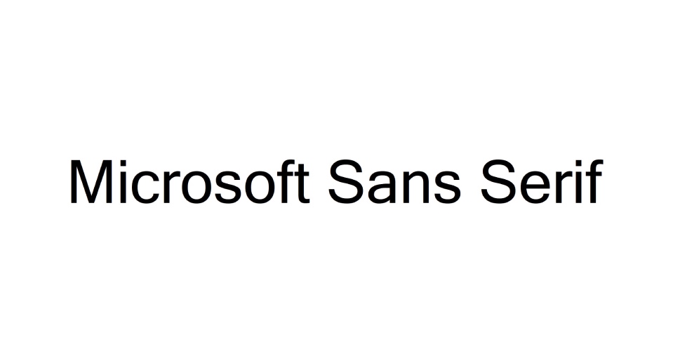
If you want to lend your website a professional, corporate look, you could do worse than go with Microsoft Sans Serif. Inspired by Helvetica, it is characterized by even and clean lines, making it great for most screens.
Monaco
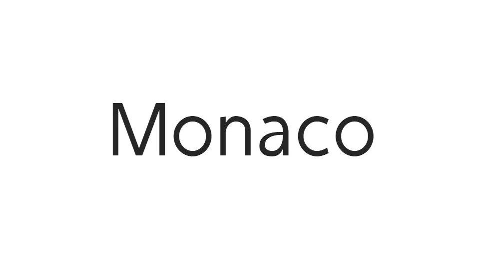
While a font‘s main advantage is that it does not lose quality (sharpness) when enlarged, if you want to achieve the pixelated look of old, low-res terminals, Monaco might be just the thing for you.
Optima
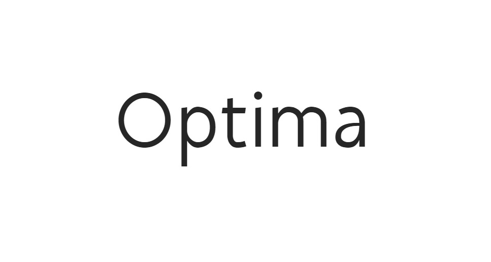
Optima brings together the classic feel of old-fashioned styles and the easy legibility of modern sans-serif fonts. Its elegant lines make it a great display font, often used in logos and titles.
Perpetua
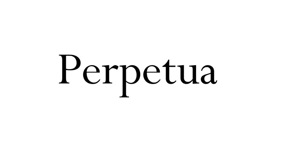
If you are looking for a light but serifed font, take a look at Perpetua. It has broadly varying stroke weights, lending it a classic and elegant but nonetheless playful feel.
Rockwell
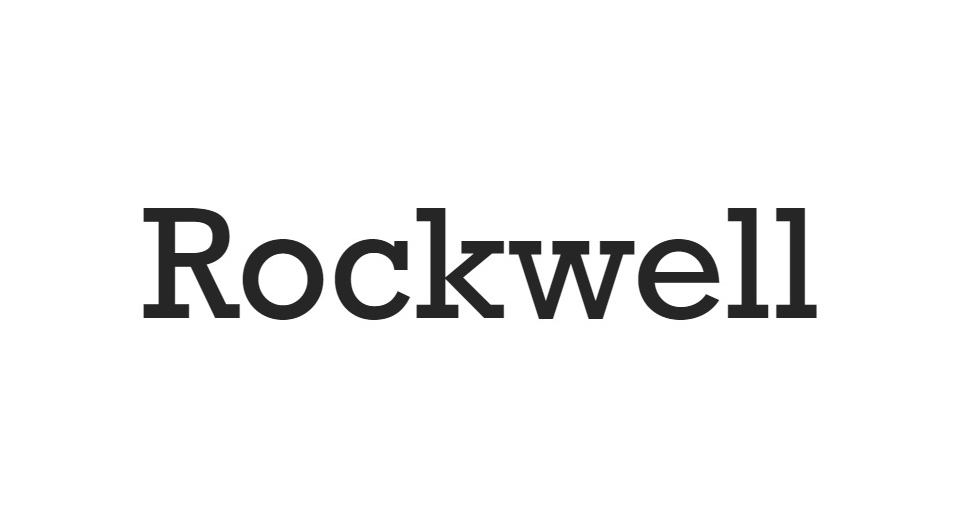
Rockwell is a bold, serifed font made in a very distinctive style, reminiscent of the golden age of print. Depending on its use, it can evoke old signage, typewriters, headlines, or logos.
Tahoma
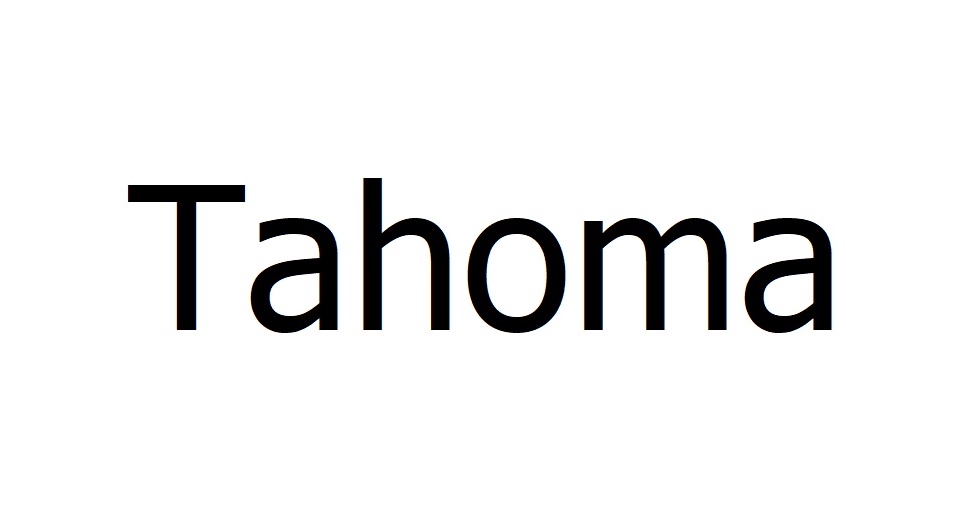
Tahoma is a bold sans serif font characterized by square periods, making it a good choice for both the main body of text and elegant but sober titles. Developed by Microsoft, it is one of the most broadly used fonts of all time.
Times (and Times New Roman)
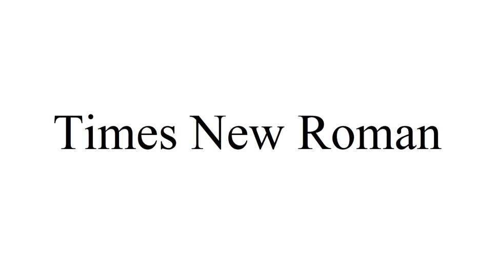
Times, and its very popular variation Times New Roman, is a serif font family originally designed for print media. This is what lends it the familiar retro quality, making it a good choice for news and educational content.
Trebuchet MS
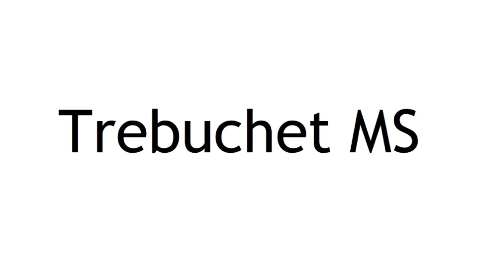
Trebuchet specifically is a slim, sans-serif font that looks good both in titles and in the main body of text. By the by, the MS stands for Microsoft, in the name of Trebuchet as well as other fonts. Most of those are very widespread across operating systems.
Verdana
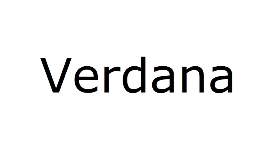
Verdana is a very clean sans serif font with a lot of spacing between the characters, making it a good choice for low-resolution screens and small-size print.
In Conclusion
The choice of fonts available to a web designer is staggering, and yet the pitfalls are there. The meanings, moods and feelings sometimes feel almost hard-coded into a font, and associations – positive or negative – can be very strong.
Whatever style or mood you want to convey, we are sure you will be able to find the right font – or at least a good starting point – on our list. Once you have a good handle on the kind of font you want, finding and downloading fonts, as well as installing new fonts is easy.
