10 Google Font Combinations for Inspiration
Typography is an essential part of web design. In fact, it’s just as important as colors and images for shaping up the aesthetics of a website. Microsoft and MIT University have even conducted a study which confirmed that good typography is so powerful that it can affect the viewer’s mood. So why not use this to your advantage?
Making optimal typography choices is a crucial part of the design process. But with so many Google fonts to choose from, how can you ever make up your mind? If you checked out our selection of the best Google fonts for 2023, it probably didn’t make the choice any easier, as they’re all so good. To help you decide more easily, we’ve made a list of 10 Google font combinations for inspiration. You’ll discover which fonts from the Google collection go well together like peanut butter and jelly, which combos can ensure a positive user experience for your website visitors, and where to download fonts from.
Before we start, let’s see what the design process typically looks like and how typography fits into it…
Where to Start
Most designers use a variety of online resources as a starting point. They scour sites like Dribbble, Pinterest, Behance, and others for inspiration, until they get the general idea of the style they want to create in and the vibe they want to infuse their work with. While browsing the web, they often stumble upon fonts that match their desired aesthetic. Thanks to some practical tools for identifying fonts, they can easily discover the name of the typeface that caught their eye and obtain it in their work.
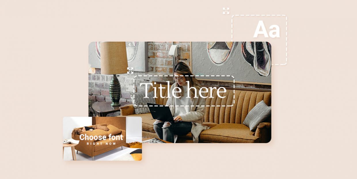
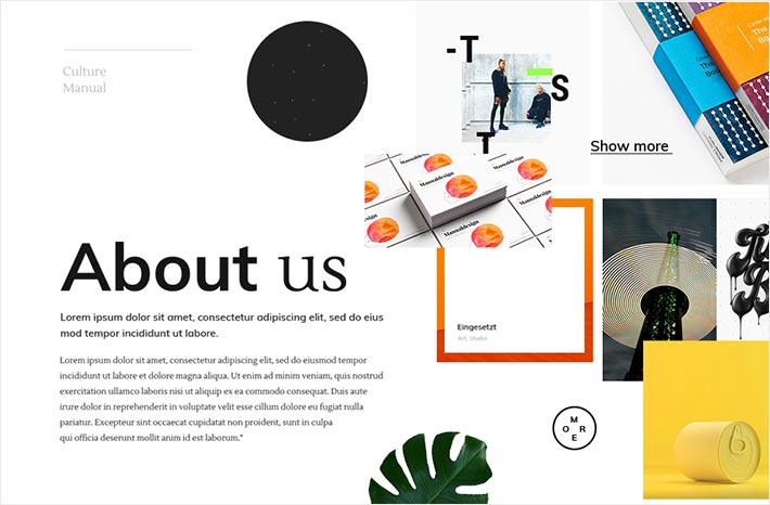
When it comes to choosing a Google font combination for a project, designers usually get inspired by pictures.
Take a look at the image displayed below. How would you describe it? You could say that it’s modern and vigorous, right? So, the typography that accompanies the image should have the same feel.

What matters most is to ensure consistency. You want every piece of content to fit perfectly within the finished design. Every font should be visually in tune with the images as well as with the purpose of the website.
For example, Oswald looks great when combined with google fonts like Roboto, Open Sans, and Merriweather, to name a few. If the letters are in all caps, these fonts can give off a very urban vibe that fits well with pizza places or restaurant businesses. But if you’re making a website for a law firm, you might want to search for another typeface, a more straightforward one that might work better with the law-related content.
Typography SOS
If you’re stuck for inspiration typography-wise, there are several places you could turn to for help. Websites like Fontpair and Canva Font Combinations are great resources that offer interesting font pairings. You might also want to check out the Typography Resources website, which is brimming with typography-related content. You can use it for inspiration, but you also have the option to purchase fonts, or even download some for free. And as far as top-quality free fonts go, the Google Fonts database is the definitive go-to resource.
If you’re not a designer or web expert but have decide to build your website on your own, you might want to consider getting a premium WordPress themes. That way you’d save yourself a lot of trouble, and you wouldn’t have to download any fonts on the side. Instead, you’d get a fully equipped, ready-to-go website with impeccable fonts combinations already laid out for you.
The Art of Combining Fonts
Regardless of the nature of a project, whether it’s a blog, logo design, or any other type of graphic work, in most cases designers will opt for more than one font (or at least go with variations of a single typeface). Now, each font is different. Some look serious, or powerful, others are elegant, playful, etc. The goal is to find the ones that best suit the overall design of a project and also complement each other perfectly. In most cases, the best option is to go with two fonts per project, as more can easily become overkill.
For starters, it’s important to determine which font is going to be the main one. From there, you can work on deciding on the font you’re going to combine it with. For instance, if the main font is curvy and distinctive, the best choice is to pair it with something simpler. That way you won’t distract anyone from looking at the text you wanted to highlight, but the complementary font will still be prominent enough to be read.
Make several combinations and see what they look like next to images and buttons. You’ll be able to decide more easily which pairings work best within the context of your design before you download any fonts.
New Themes
VIEW COLLECTION
Stellar Font Pairings
1. Fonts for Software Websites
When it comes to software and tech websites, we’d recommend using Montserrat. It looks very contemporary, and it’s also super readable. At the same, it enables you to deliver your message in a crisp and urban manner. This geometric font works the best with Open Sans, Crimson Text, Source Sans Pro, or Roboto fonts. You can also use it on its own, in case you’d like to tone things down and apply one font only on the entire website. Just take a look at the image below to see it in use. Doesn’t it look super sleek?

Montserat in use
2. Fonts for Elegant Websites
When you’re going for an overall elegant look, your best choice are sans serif fonts. They lack the stroke at the end of each letter, which makes this sort of typeface look refined, simple, and sophisticated. Whichever sans serif fonts you choose to combine, you simply can’t go wrong, regardless of the type of website you’re making. Notice how in the example below the pastel colors and the soft-looking images fit like a puzzle piece with the style of the typeface. Old Standard TT and Muli together create a perfect harmony and covey a distinct artistic style that’s sure to leave a lasting impression on anyone who visits your website. Another great combo for that elegant look are Muli and the Ovo font.
An example of the Old Standard TT and Muli text pairing
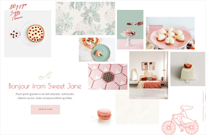
3. Fonts for Bakery Websites
When you’re building a website for your bakery, you want to make it look as craving-inducing and delicious as possible. The pictures you decide to use play a big part in crafting the mouthwatering style you’re going for. But so does the typography. Take a look at how Cormorant contributes to creating an overall modern, but at the same time traditional vibe in the example below. Just by glancing at the image and its content we feel as though this bakery has been a local favorite for ages. As you can see, Cormorant looks great when you combine it with Muli, but you can’t go wrong with combining it with Proza Libre either.
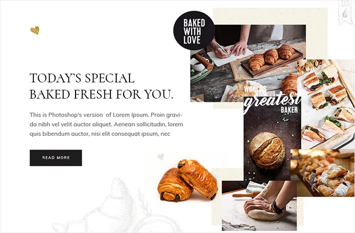
An example of the Cormorant and Muli text pairing
4. Fonts for Business Websites
Montserrat is a universal font that goes well with almost any kind of website. The vibe it gives off pretty much depends on the imagery you decide to pair it with. When you’re building a website for your business, regardless of the niche, you almost certainly can’t go wrong with Montserrat. It feels techy and sort of futuristic, which is just what every modern business needs. When you combine it with the Open Sans font, which is probably one of the most popular sans-serif fonts, you can easily set a businesslike yet at the same time warm tone for your website. On the other hand, you could also choose Open Sans as your main font and combine it with something like Playfair Display or Poppins to get that modern “serious but approachable” look so many businesses strive for.
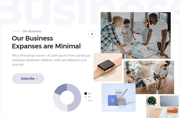
An example of the Montserrat and Open Sans pairing
5. Fonts for Sports Websites
When it comes to sports-related projects, designers usually opt for a typeface that looks powerful, yet simple. The goal is to generate excitement by using appropriate fonts with attitude. You don’t want to go too crazy though, as the text needs to be easy to read. The ideal choice would be the Teko font. You could go with the semi-bold version and slightly manipulate the letter-spacing, which doesn’t have to be too large to achieve the maximum effect. The font alone is quite heavy, with letters in square proportions that look quite simple and easy on the eye. You can complement it with Ubuntu, which is quite hip and works great with sports-themed projects.
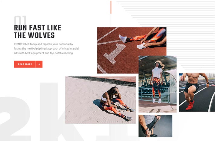
An example of the Teko and Ubuntu pairing
6. Fonts for Education Websites
Montserrat for the win! All jokes aside, this typeface is just so versatile and it looks amazing regardless of the type of graphic design or the media content it accompanies. If you want to build a website for a kindergarten, a high school, or any other educational institution, Montserrat is certainly your safest bet. Pair it with Crimson Text, as in the example below, and you got yourself a killer combo. Of all fonts, we feel Montserrat works best precisely with Crimson Text. This old-style typeface fits the modern look of Montserrat like a glove, and together these two significantly contribute to making web pages more appealing to all scholars.
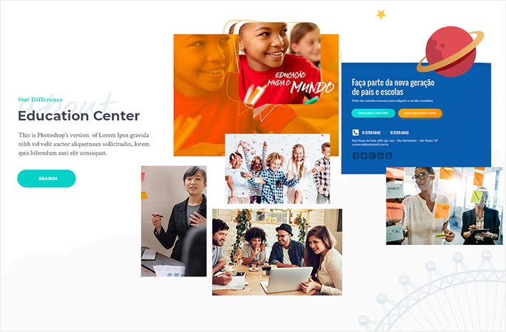
An example of the Montserrat and Crimson text pairing
7. Fonts for Urban Websites
Would you like to give your website an urban typographic personality? If so, then Oswald is your best choice. This widely used sans-serif typeface makes letters look striking and bold, which is why you’ll most likely see it headlines. It blends beautifully with other fonts as well and makes for winning combinations with Roboto, Arial, Merriweather, Oxygen, Quicksand, and in particular with Open Sans. If you decide to go with Open Sans in your subheadings or your copy, there’s no way you can go wrong. That’s a match that is sure to make every page look distinct and contemporary.
An example of the Oswald and Open Sans text pairing
8. Fonts for Pastry and Cake Shops
If you’re good with food and want the world to know it, a professional-looking website is a must. Aside from using alluring images, your typography needs to be good enough to eat as well. A good choice of font is Poiret One which, as geometric as it is, also appears delicate and enticing at the same time. That makes it very fitting for cake shops and patisseries in particular. Pair it with Open Sans, and you’ll get a delicious combo that’s impossible to resist.
An example of the Poiret One and Open Sans text pairing
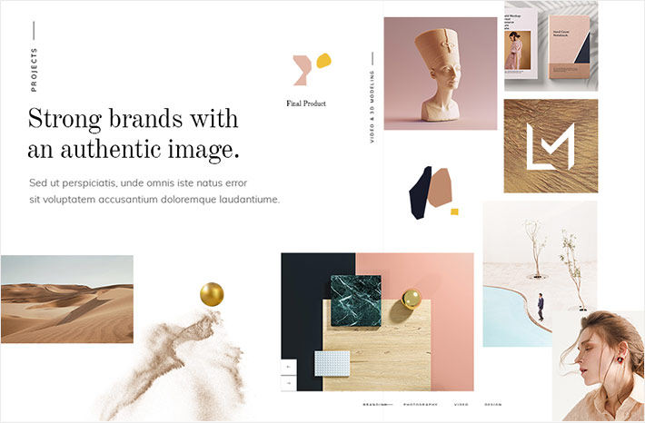
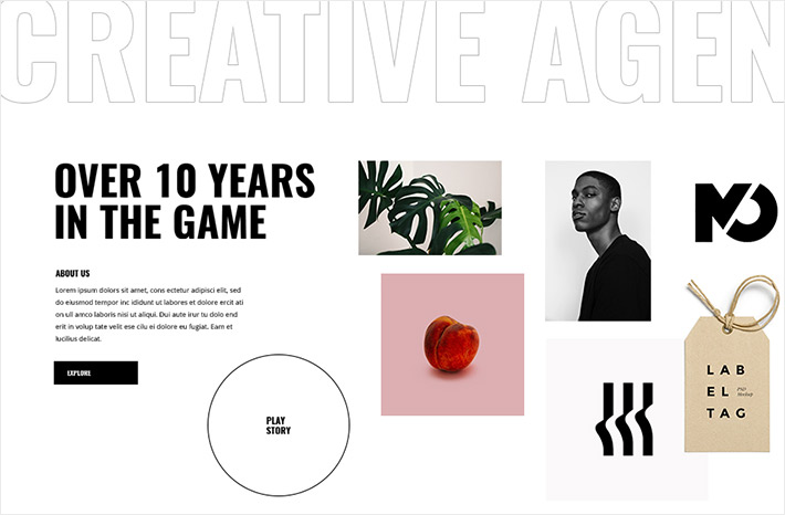
9. Fonts for Portfolio Websites
An online portfolio is a great way of reaching crowds on a global scale and for showcasing what you’re capable of. To land yourself as many clients as possible, every element of your website needs to be well thought out, including typography. Fonts should exude the same as the remaining content of your website. You don’t even need to go too crazy typeface-wise to achieve the maximum impact. For instance, using a combination of bold and regular versions of a single sans serif font will surely do the job and capture the attention of your visitors. Muli, a sans-serif typeface, is a great choice for both headlines and body copy. But if you want some diversity in your design, you could easily pair it with the Lustria serif typeface.
An example of the Muli and Lustria text pairing
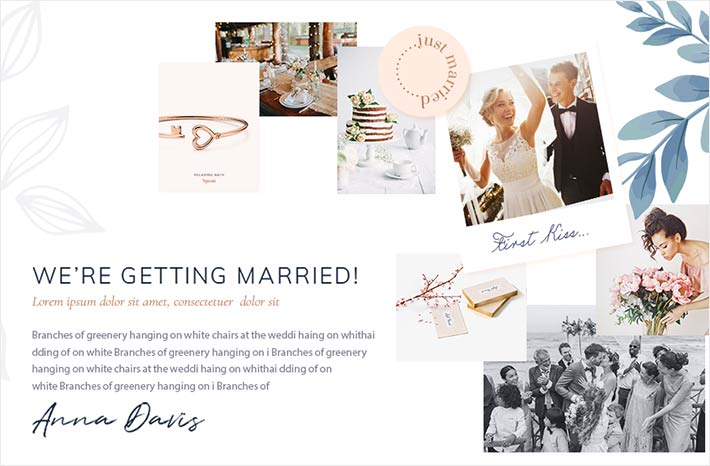
10. Fonts for Wedding Websites
Muli is a highly versatile font that suits a myriad of websites. Of all possible font pairings, we feel it works best with Cormorant. Together, these two are a match made in typography heaven, perfect for all wedding websites. The light version of Muli in all caps looks super elegant, while Cormorant in italics gives the entire website an overall romantic vibe. Feel free to play around with your font colors, just make sure everything’s in tune with the wedding aesthetic you’re trying to achieve.
An example of the Muli and Cormorant text pairing
Conclusion
Typography shouldn’t be treated as an afterthought. Nailing it requires a lot of time and effort since your work doesn’t just end with choosing the appropriate typeface combination. You also have to decide on the perfect font size and weight, as well as the spacing, kerning, and much more. All of these elements combined greatly impact your design and the way your work is perceived.
What’s great about fonts is that they let you both express yourself and create a unique experience for your visitors. You get to craft the atmosphere to your liking all the while managing to conserve your audience’s attention. The typography playfield is so vast, with a whole bunch of websites for downloading fonts that are pleasing to the eye. It’s good to try out as many combos as you can, just remember not to lose track of what truly matters, and that’s to maintain readability and ensure the typography reflects the true nature of your business.
