How to Style Contact Form 7 Forms in WordPress

Even though contact forms are an essential method for engaging with visitors, most WordPress webmasters struggle to properly style them. In most cases, forms have a default styling, which is provided by the browser. Those forms tend to be sparsely stylized and can differ a lot from your site design. On the other hand, the WordPress theme you’re using could contain CSS code that stylizes the forms, which can help with your stylization problem. But, even a theme-specific style might clash with your website’s brand.
Therefore, it is up to you to properly style Contact Form 7 and make yours stand out from the crowd. And this article is here to help you do that. Within it, we will cover various aspects of creating the code necessary for form stylization. We focused on using a contact form created by the Contact Form 7 plugin as the showcase, but most of what we discuss can be applied to any form. Also, depending on your existing knowledge of CSS, you might need to do some additional reading to understand the code fully.
However, before we show you the CSS way of doing it, we would like to talk about two newbie-friendlier ways of styling a Contact Form 7 form using a plugin: our own Qi Addons for Elementor, and Qi Blocks for Gutenberg plugins.
Our very own Qi Addons for Elementor plugin contains a wealth of beautiful, professionally designed widgets, and a Contact Form 7 widget is just one of them, available even in the free version of the plugin. To use them, you need to install the latest version of Elementor and the Qi Addons plugin, and you’re good to go. Elementor is a must; Qi Addons will not work with any other page editor. It will work with the free version of Elementor, though, so the whole package doesn’t need to cost you a penny.
You can see all the widget’s options in action in the video below. If you prefer your tutorials in text form, we will give you a brief overview below.
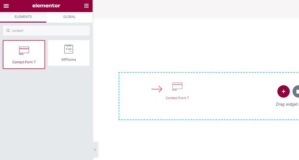
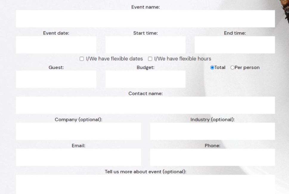
Qi Addons Contact Form 7 Placement
To create a form, simply drag the Qi Addons widget from the left hand side menu to where you want the form on the page.
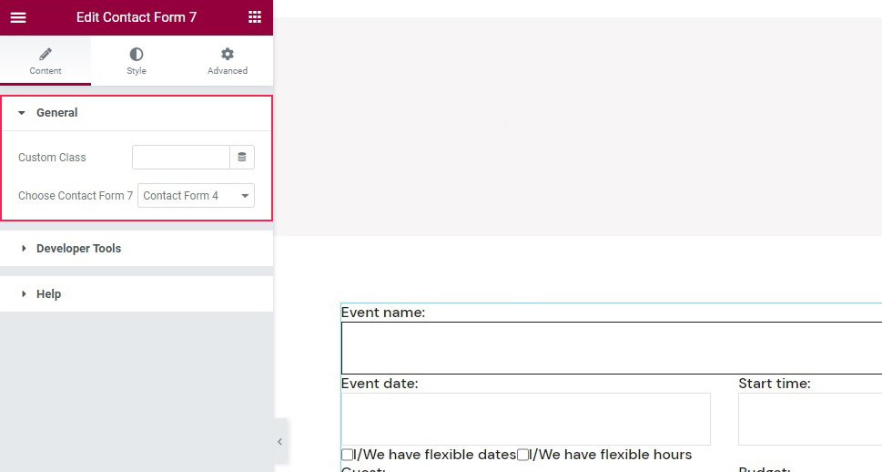
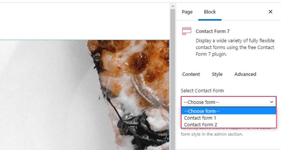
The content field, which should be open by default, lets you choose which of the forms you have saved will feature in the widget.
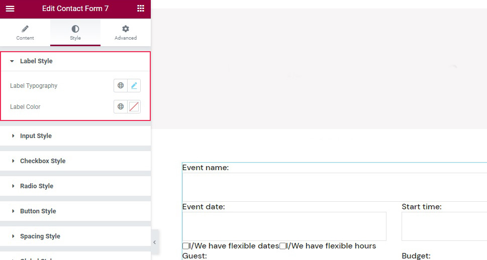
Qi Addons Contact Form 7 Label and Text Styling
As far as styling goes, you need to switch to the Style tab of the widget. Once there, you will find styling controls organized into several sections. In the Label Style section, you can change the label typography, if you want to use a different style, as well as the label color.
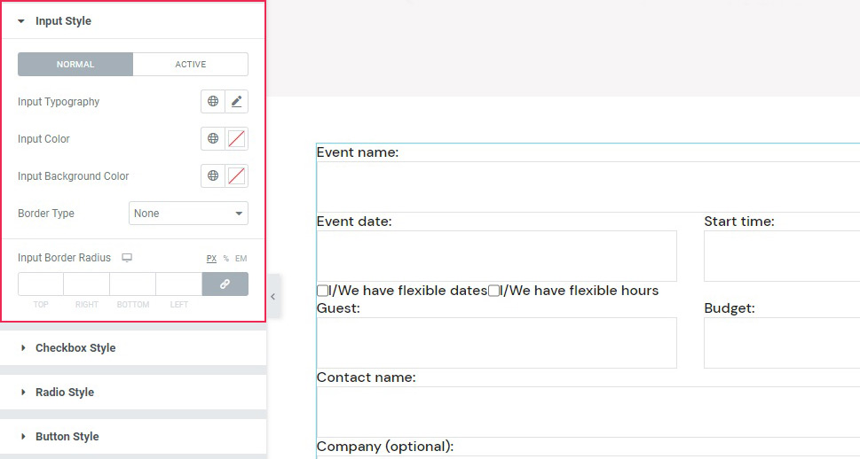
The Input Style sections has controls for input topography, text color, background color, and borders, and a Normal/Active tab which you can use to create different settings for the active and inactive fields, in case you wish to, say, choose a different background color for an active field in the name of accessibility and make it easier for your visitors to see which field they are entering text into.
Qi Addons Contact Form 7 Checkbox, Buttons, and Spacing Styling
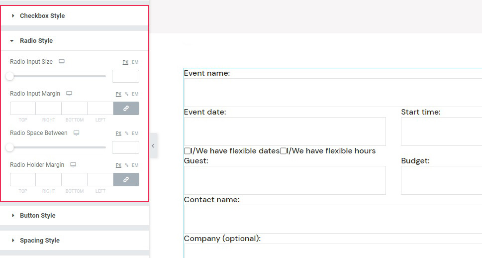
If you are using checkboxes or radio buttons in your form, you will find the controls to style them in the Checkbox Style and Radio Style sections of the Style tab. There, you can tweak their size and margins.
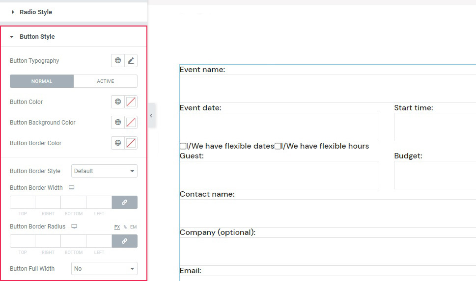
As for the buttons, you can find their styling options in the Button Style section. The buttons can be styled in the same Normal/Active modes, but also in terms of color, background color, size, and style.
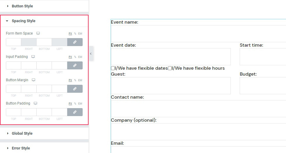
As for the Spacing Style, this section holds the controls for the margins of the widget as well as some parts of it.
Qi Addons Contact Form 7 General Styling
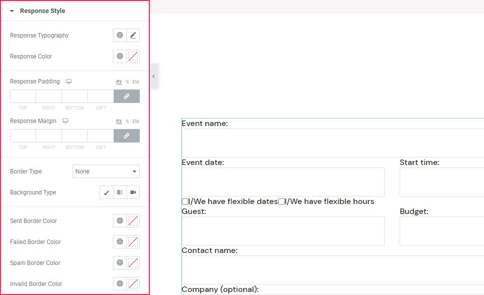
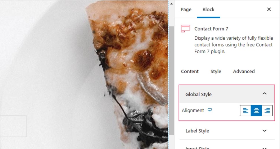
The Global Style section of the Style tab merely sets the alignment of the widget, between left, center and right. The Error Style section governs your settings of the error messages in case a visitor gets something wrong when filling out the form. Finally, the Response Style section is used to style the okay message that your visitor should get after filling out and submitting the form.
Now let’s see how you can style your Contact Form 7 forms using another one of our plugins, Qi Blocks for Gutenberg.
One of the things that make contact forms such a great tool is their versatility. Whether you’re adding them as popups or using them to express some innovative design ideas, they can easily find their place on any type of website and do their job well. And if you like to edit your website using the Gutenberg block editor, then Qi Blocks for Gutenberg should be your go-to choice for styling CF7 forms. The plugin features 81 different blocks, over half of which are available in the free version – including the Contact Form 7 Gutenberg block.
Before getting started, keep in mind that you’ll need to install the Contact Form 7 plugin, as well as Qi Blocks for Gutenberg. The Contact Form 7 Gutenberg block lets you add different forms you’ve created in the Contact Form 7 plugin – we’ve created the one we’re using in this example. We’ve also set up the page using the Advanced Columns and Section Title blocks, both of which are available with the free version of the plugin.
Adding the Contact Form 7 Block
We started by creating a new paragraph below the section title we’ll be using as a title for the contact form. The simplest way to add a new block would be to click on the “+” button on the right edge of the paragraph block and search for the Contact Form 7 block. Once you add the widget, the right-hand side block options menu will automatically open on Content options, where you choose the contact form you want to load with the block.
Contact Form 2 is the one we’ve made in the CF7 plugin, and choosing it loaded it in the block without any settings. To style the form, we went to the Style tab in the block options menu.
Styling the Form
The first two styling options are the Global Style and Label Style options. The first one lets you choose the alignment of the label text, while the second gives you all the typography and color options you need to style the label as you see fit. For our contact form, we only changed the alignment to center in the Global Style options.
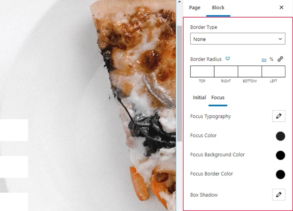
The next set of options, Input Style, lets you set up the border, as well as the style of the input fields and the text. You’ll get to choose typography, colors, and background colors, and you’ll be able to do it for both the initial state of a field and the one when the field is selected.
Our first step was to remove the border by choosing None under Border Type. For the Initial text color, we chose #c4c4c4, and we chose #ffffff as the background color. Under the Focus options, we again changed the text color to #1e1e1e.
Styling the Checkboxes and Radio Buttons
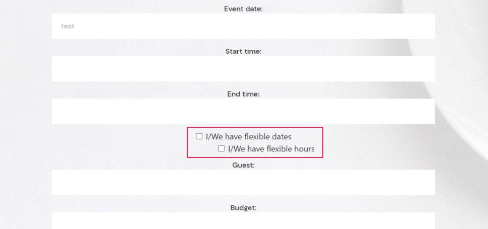
The Checkbox Style and Radio Style options let you style the checkboxes and radio buttons in your form. You can choose their sizes, margins, and spacing, and you can also set up custom typography options for the checkbox.
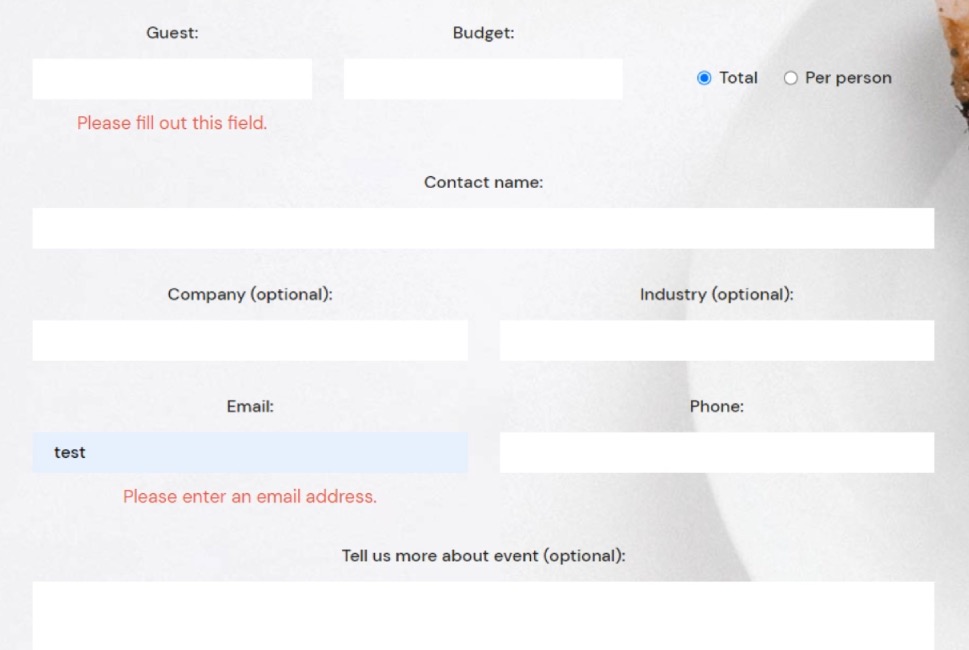
The one thing you should keep in mind is that the changes when styling the checkboxes and the radio buttons are only properly visible when you preview the page. In our case, the checkboxes and radio buttons were stacked vertically, while in the preview they appeared horizontally. Here’s what you’ll see in the editor.
And here’s the preview that shows you what your website visitors will see.
The settings we used for the checkboxes were 7px for the right checkbox input margin, 50px for the checkbox space between, -4px for the top checkbox holder margin and 5px for the top checkbox holder margin. For the Radio Style options, we used 7px for the right radio input margin, 24px for the radio space between, and 28px for the top radio holder margin.
Styling the Buttons and Spacing
Among the Button Style options, you’ll find the options to set the button typography, color, border, and shadows. You’ll also get to style the initial and the hover versions of the button separately.
We set the Initial color for the text to #ffffff, while we used #333333 for the background color. We also set the background color to #000000 on hover.
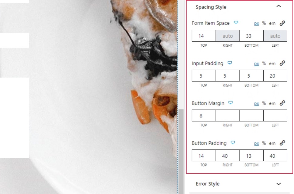
The Spacing Style lets you set all the various spacing, padding, and margins within the elements in the form. To make our form just right, we set 14px for the top and 33px for the bottom under the Form Item space. Under Input Padding, we set 5px everywhere except the final, left, value, which we set to 20px. We set the top Button Margin to 8px, and for the Button Padding, we used the following values: 14px, 40px, 13px, and 40px.
Styling the Error and Response Messages
For the Error Style, you’ll get to choose the alignments of the messages, their typography options, color, and margins. Under the Typography options, we set the font size to 17px and the line height to 26px. We set the Color option to #e54848, and the top Error Margin to 9px.
With the Response Style options, you get to style the message that appears after submitting the form. The options you have at your disposal include typography, color, padding and margins, border, and background options.
Under the typography options, we set the font size to 17px and the line height to 26px. We entered the following values under Response Padding: 16px, 25px, 19px, 25px. For the top Response Margin, we set the value at 40px. We choose the Solid border type and set the Border Width at 1px.
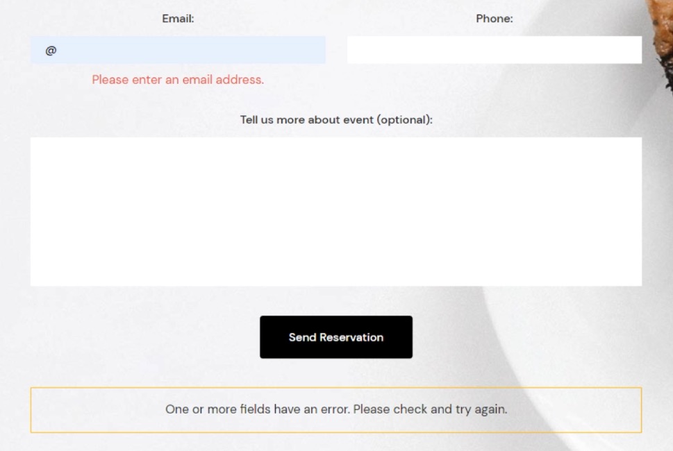
The block also lets you choose different border colors for different messages. We picked #61a73a for the sent border color, #f58e32 for the spam sent border, and #f1ce41 for invalid border color. And with that, we’ve finished styling our form.
Of course, there is a way to style your Contact Form 7 forms using CSS, and, to learn that, all you need to do is scroll down to the next section.
If, for whatever reason, you don’t use Elementor or don’t want to use our plugin (and we can’t think of a way why you wouldn’t want to), don’t fret. We got you covered. We will also cover how to create styles applicable to all your CF7 forms, as well as how to stylize a specific form using CSS. To follow along with this article, you will need to have the Contact Form 7 plugin installed and have at least one form on your website created with this plugin. Then, you will be able to use that form to apply the methods we discuss below.
Before we begin
In this article, we will cover how to create styles applicable to all your CF7 forms, as well as how to stylize a specific form. To follow along with this article, you will need to have the Contact Form 7 plugin installed and have at least one form on your website created with this plugin. Then, you will be able to use that form to apply the methods we discuss below.
Please note, the CSS you create during this process should be added inside Appearance > Customize > Additional CSS. If you aren’t comfortable with your current CSS skills, you should brush up on them beforehand as some CSS knowledge is necessary for grasping the topics in this article. Once you’ve done that, you can proceed to the main part of the article below.

Creating site-wide form styles
For this article, we created the following CSS, which would apply a specific style to all Contact Form 7 forms on your website.
.wpcf7 {
background-color: #6ec1e4;
padding: 30px;
}
.wpcf7 input[type="text"], .wpcf7 input[type="email"], .wpcf7 textarea {
font-size: 16px;
color: #000000e8;
background-color: #E9ECF5;
border: 1px solid #E9ECF5;
border-radius: 10px;
}
.wpcf7 .wpcf7-submit {
background-color: #E9ECF5;
border: 1px solid #E9ECF5;
color: #1f1f1f;
width: 100%;
}
That code would produce the following output.
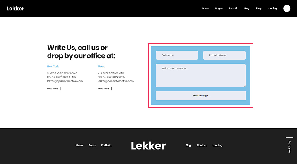
However, this is merely an example of CSS you can use. So, you shouldn’t rush to copy and paste it to your website without understanding how it was made. Since the CSS for styling forms should be made on a case-by-case basis, you will most likely need to adapt this or create one from scratch to use on your CF7 forms. To help you do that, we will explain why and how we created the code above, going one part at a time.
One of the most important requirements for creating CSS code, in general, is knowing how to inspect an element using your browser’s developer tools. As such, we will cover that step first. There are several ways you can access the developer tools (e.g. using keyboard shortcuts) but the most universally applicable way would be using mouse clicks.
To inspect a certain element, right-click on it and select the Inspect option from the menu that appears. In the case of a Contact Form 7 form, clicking anywhere within the form will work.
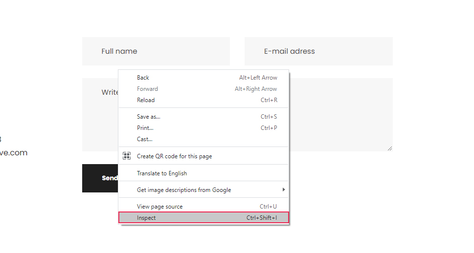
This will open your browser’s developer tools and place you within the Elements tab, where the HTML code of the element you clicked on will be highlighted. We will reference this process many times during the article, so you should get comfortable with inspecting page elements.
Once you’ve opened the developer tools, the first thing you should do is to look for the HTML element that corresponds to the whole form. Since Contact Form 7 forms have a well-known structure, you will be looking for an element that has the following starting HTML code:
<div role="form" class="wpcf7"
Also, when you hover over the HTML, the entire form should be highlighted.
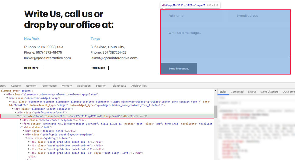
Furthermore, as you can see on the screenshot, the contact form element has a custom class and a unique ID. We will only use the class in this section and will touch on the ID later in the article. For now, we’re using the class because all Contact Form 7 forms share the wpcf7 class and, with it, we can create CSS code that will affect all your site forms in the same way.
.wpcf7 {
// CSS code goes here
}
You might recall that this is how the CSS we created for this article starts. The period used before the class name signifies that this is a CSS class selector. This means that the code that follows it will affect all of the CF7 forms on the website since they all share the same class.
In the code we created, the wpcf7 class is followed by CSS that will give your forms a background color and a padding of 30px on all sides.
.wpcf7 {
background-color: #6ec1e4;
padding: 30px;
}
Now let’s take a look at how corresponding CSS selectors for all the form fields were created.
To create the CSS selector for the text field, inspect a text field as described above. In the screenshot below, you can see it is a simple textual input field.
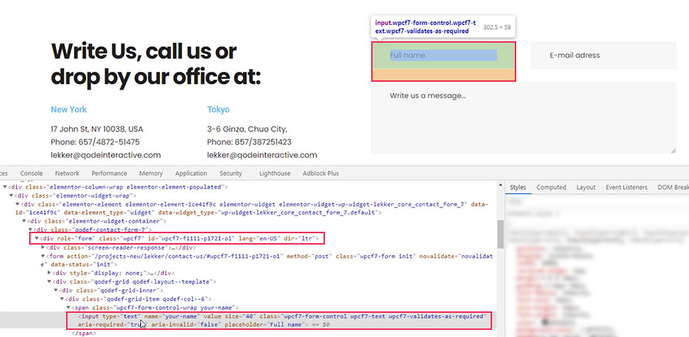
To reference it, you can use the following CSS selector – input[type=”text”]. However, this will select all textual inputs, including the ones that don’t belong to the form. To avoid that, you need to put the class selector for Contact Form 7 forms we previously mentioned before this. Meaning, you can create CSS code for textual form inputs in the following format:
.wpcf7 input[type="text"]{
// CSS rules go here
}
Similarly, you can find the equivalent pseudocode for email fields.
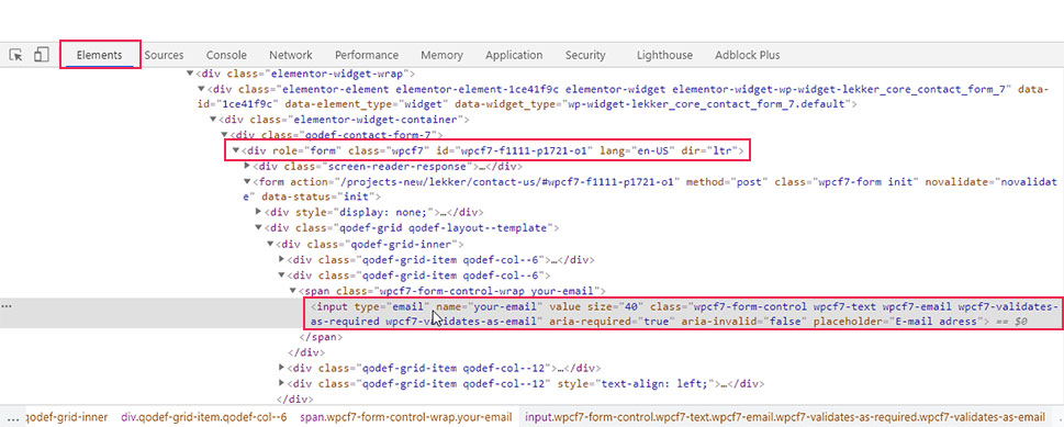
.wpcf7 input[type="email"]{
// CSS rules go here
}
As for the textual areas, they are simply referenced by their HTML element—textarea, preceded by the form class name.
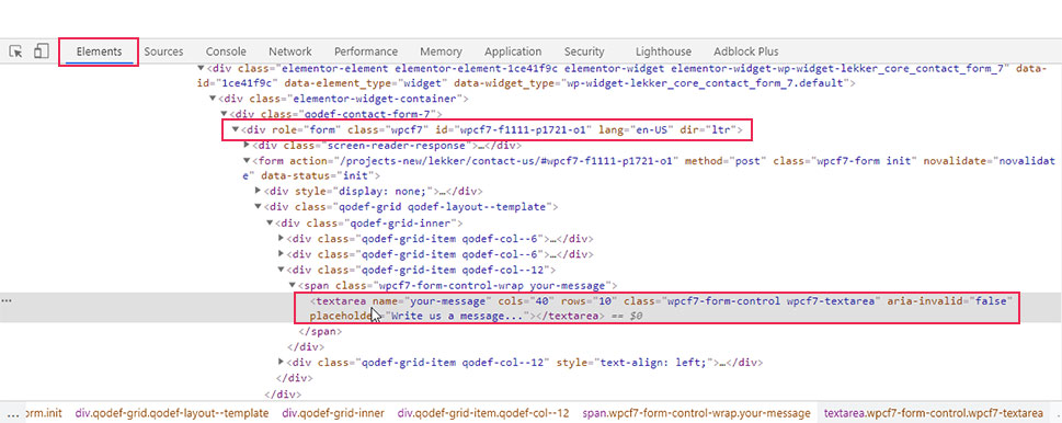
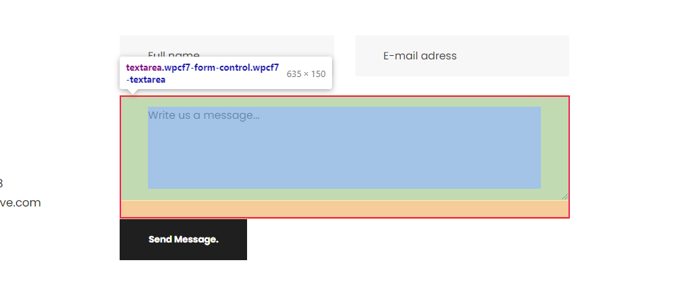
Meaning, if you want to target all CF7 form text areas, you can use the pseudocode given below.
.wpcf7 textarea{
// CSS rules go here
}
In our case, since we wanted to apply the same styles to the text and email fields, as well as the textual area, we used a compound CSS selector. This is done by using all three selectors separated by commas (.wpcf7 input[type=”text”], .wpcf7 input[type=”email”], .wpcf7 textarea). The styles that we added include setting a font size, and color for the text within the fields, as well as background color, border, and border-radius to the fields themselves making them slightly rounded on the edges.
.wpcf7 input[type="text"], .wpcf7 input[type="email"], .wpcf7 textarea {
font-size: 16px;
color: #000000e8;
background-color: #E9ECF5;
border: 1px solid #E9ECF5;
border-radius: 10px;
}
Finally, to figure out the appropriate CSS selector for the Send Message button, you need to inspect it.
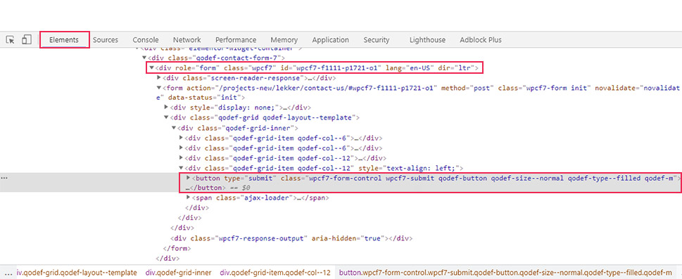
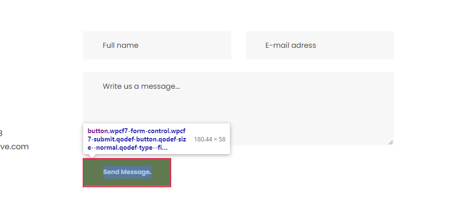
As you can see in the screenshot, this button has a custom class called wpcf7-submit, which is a Contact Form 7 specific class that you can use to reference the button. To make sure your CSS is highly specific, we advise using the form custom class—wpcf7 beforehand, as well. In that case, the pseudocode for targeting all CF7 form submit buttons could look like the following:
.wpcf7 .wpcf7-submit {
// CSS rules go here
}
In terms of the CSS we created for this article, we stylized the button to have a background and border, set the color of its text, and made it stretch across the full width of the form.
.wpcf7 .wpcf7-submit {
background-color: #E9ECF5;
border: 1px solid #E9ECF5;
color: #1f1f1f;
width: 100%;
}
With that being said, there are several other elements that can be used inside a contact form, which we chose to omit from our example. But if you decide to use them, you can create the appropriate CSS selector for all of them the same way we’ve described above.
Creating form-specific styles
In most cases, creating one type of CSS code to stylize your CF7 forms won’t be enough. Forms with different purposes will require different styles to stand out on your pages. As such, you will need to create additional CSS code for specific forms.
In this section, we will explain several tips on how to create form-specific styles. Since the hardest part in creating these styles lies in finding the appropriate CSS selectors that target specific forms or form fields, we will focus on that aspect the most.
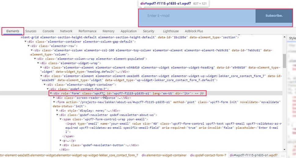
The easiest way to create form-specific styles is to use the specific ID every form has instead of the custom class that is shared by all CF7 forms.
To find out the specific ID of a CF7 form, inspect it and navigate to the HTML element that wraps the form. The element will have the following HTML part:
<div role="form" class="wpcf7" id="form-ID-is-here"
You will find the ID within the quotation marks of the id attribute.
Then, to stylize a specific form with that ID, you will need to use the CSS code in the following format:
#form-id {
// CSS rules go here
}
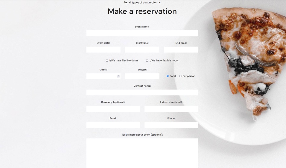
For example, if we wanted to stylize the form shown on the screenshot above, we would use the following pseudocode:
#wpcf7-f1115-p1635-o1 {
// CSS rules go here
}
Furthermore, to reference the fields within that specific form, we would have to change the wpcf7 class with the wpcf7-f1115-p1635-o1 ID, as well. Meaning, if we wanted to apply the previously created CSS to this form only, then the code would look the like this:
#wpcf7-f1115-p1635-o1 {
background-color: #6ec1e4;
padding: 30px;
}
#wpcf7-f1115-p1635-o1 input[type="text"], #wpcf7-f1115-p1635-o1 input[type="email"], #wpcf7-f1115-p1635-o1 textarea {
font-size: 16px;
color: #000000e8;
background-color: #E9ECF5;
border: 1px solid #E9ECF5;
border-radius: 10px;
}
#wpcf7-f1115-p1635-o1 .wpcf7-submit {
background-color: #E9ECF5;
border: 1px solid #E9ECF5;
color: #1f1f1f;
width: 100%;
}
As we’ve mentioned before, the CSS in this article isn’t meant to be simply copy-pasted. CSS for form stylization should be created on a case-by-case basis. Also, when creating CSS for a specific form, you wouldn’t use the same CSS that is used for all other forms because that will make them identical. Generally speaking, you might use a part of the CSS from one form and edit it to fit another form. The point you need to remember is to use a form-specific ID to narrow down the scope of your CSS. Now that we clarified that, we can move on.
There are two other tricks you can use for creating form-specific styles. The first is to edit the HTML structure of the CF7 form by inserting the appropriate wrapping HTML elements. By adding specific classes or IDs to these HTML elements, you should find creating form-specific styles much easier.
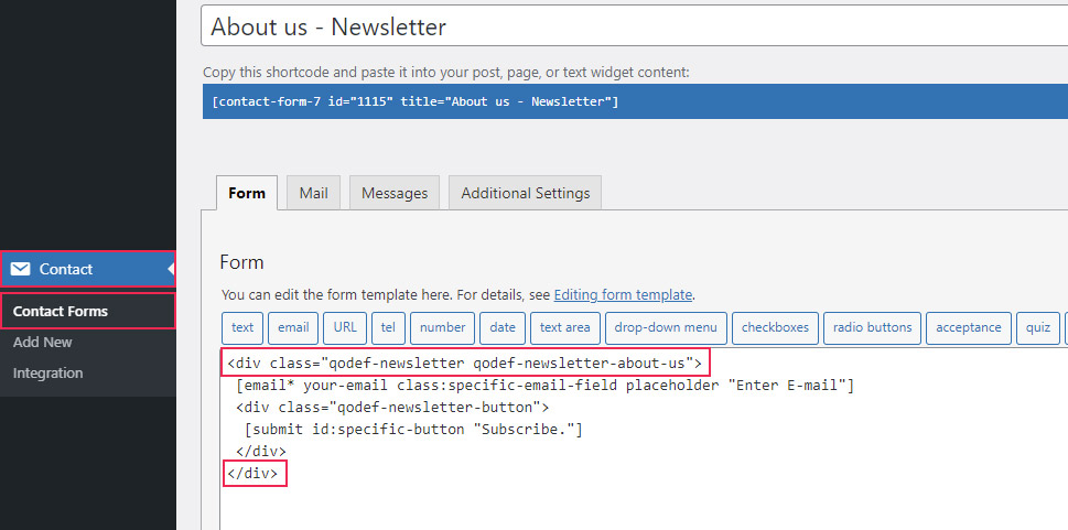
For example, we wrapped fields of a newsletter subscription form with a div element and assigned two custom classes to it: qodef-newsletter and qodef-newsletter-about-us. You can use either of those classes (or even both) to reference that specific contact form.
To add a new custom class, you need to edit the structure of the contact form. To do so, navigate to Contact > Contact Forms, select the form you wish to edit, and wrap it with appropriate HTML elements.
You can then use the assigned classes or IDs to reference that specific form. In the example shown above, we used two custom classes, so you can choose between the following CSS selectors:
-
.qodef-newsletter
-
.qodef-newsletter-about-us
-
.qodef-newsletter.qodef-newsletter-about-us
Additionally, you can even use them in conjunction with the CF7 form class selector we previously discussed—wpcf7 or the form ID, to make them more precise. Doing this can prove useful if you have conflicting CSS that comes from your theme or plugins.
With that being said, the second trick we wanted to mention ties directly into the first one. If you look closely at the screenshot above, you can see that we wrapped the submit button with a div element and assigned a custom class to it—qodef-newsletter-button.
This goes to show that the approach mentioned above isn’t limited to forms only. You can reference specific fields within a specific form by wrapping them with appropriate HTML elements and using the assigned classes or IDs as CSS selectors. For example, to reference the submit button, you could use the following CSS selector .qodef-newsletter-button .wpcf7-submit.
The final thing we want to mention is that you can also add classes and IDs to the form fields directly instead of adding them to the wrapping HTML element. This is done by adding the class:class-name-here or id:id-name-here attributes to the form fields, with the appropriate class and ID names inserted. An example of both can be seen in the screenshot below.
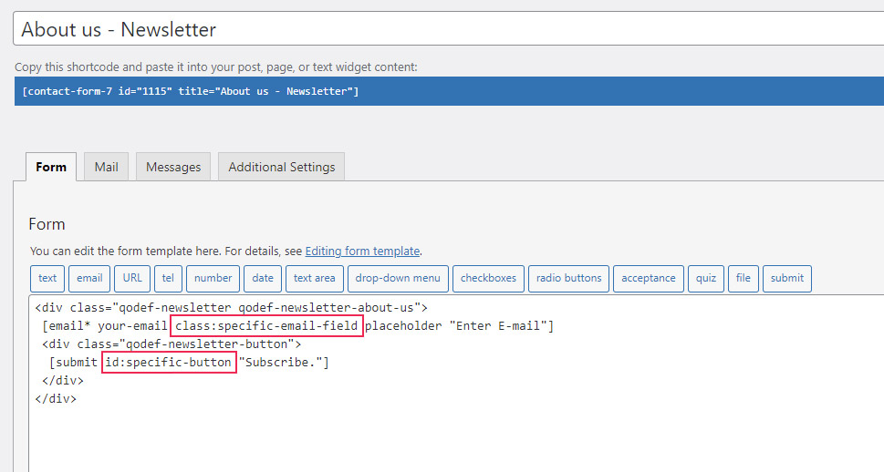
To reference those fields in your form-specific CSS, you would simply use those classes or IDs. For example, to reference the email field from the screenshot, you can use .specific-email-field as the CSS selector. To reference the submit button, you can use #specific-button as the selector.
This concludes the section on tips you can use to create a form-specific CSS selector. Now that you have a better grasp of this topic, you can style Contact Form 7 forms by applying common CSS rules to those specific selectors.
form-specific-selector {
// CSS rules go here
}
Qode Themes: Top Picks
View Collection


Final Thoughts
Having contact forms on your WordPress website is a crucial step in properly interacting with your visitors. However, styling those forms to seamlessly blend with your current brand is a challenge for any webmaster. This is where our article comes in—to provide you with the ideas needed to style any form. Within it, we explore how to use specific classes and IDs to target specific forms or form parts. As a practical example, we created CSS to style a Contact Form 7 form. Whether you’re using that plugin or any other contact form plugins, you will be able to use all the approaches we described to create a custom style for your form in a matter of minutes.
