How to Change and Customize Your WordPress Homepage

WordPress being nothing if not versatile, it is no wonder that options to tweak, change, customize and otherwise modify a WordPress website abound. This central tenet holds true for your homepage, too: with WordPress, you can change your homepage easily.
However, to borrow from the font of wisdom that is Jurassic Park, before you start changing things up, you better have a think about whether you should. In this article, we will be talking you through the ways of changing your WordPress homepage to better fit your style and desired functionalities. Before we do that, though, we’d like to take some time to expand on what a WordPress homepage is and why you might or might not want to change it.
The homepage is where your visitors end up after navigating to your domain name. By default, a WordPress home page will most times display your latest posts. This is a consequence of WordPress’s start as a blogging platform, and the solution by and large works for a blog. It is also known as a dynamic homepage, since it automatically displays newest posts without the need for a manual update.
But perhaps you want to showcase something different, such as your contact information or other important information, a manifesto or a mission statement, or create an arresting landing page for your latest product, or something else entirely. If you don’t feel like putting your posts front and center, you should redesign your homepage and display your posts somewhere more appropriate.
From a design point of view, the homepage is typically the entry point of your website and its central hub. It serves to set the mood and to offer paths to your content, if not the content itself. If your theme’s homepage doesn’t quite do it for what you’re trying to achieve, you should look into making modifications.
You don’t need anything apart from the basic WordPress functionalities to create a static homepage instead of a dynamic one. However, we suggest you put your website in maintenance mode when making major alterations such as this. For this demonstration, we will be using our free Qi Theme, but the basic steps should work for all themes.
Sometimes a theme will come with a predefined homepage. You may want to use it, or to change it for another page. Or, you may want to create a new homepage altogether. To create a page, select Pages/Add New from your WordPress dashboard.
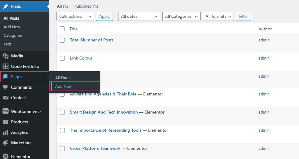
Give it a title and click Publish. We have named ours Static Homepage, but you can name yours whatever you like.
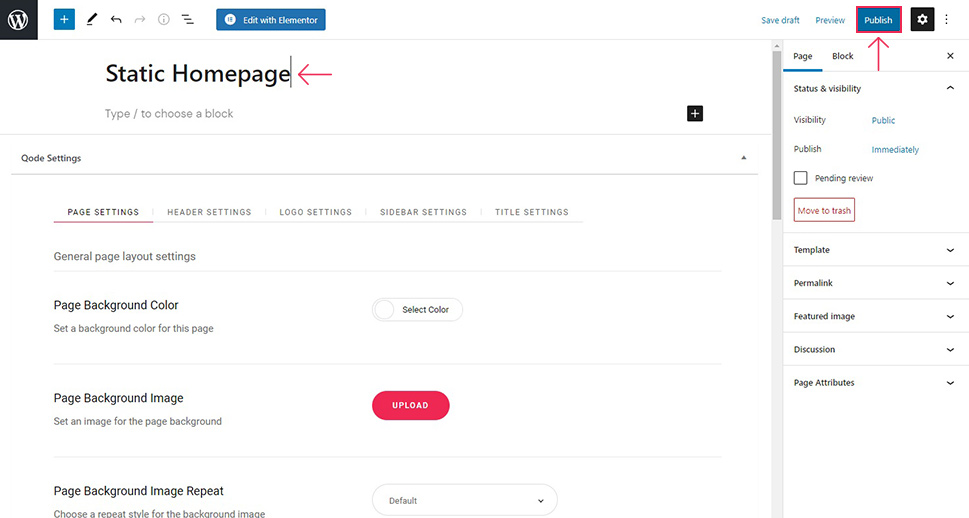
Do the same for a blog page. We have named ours New Blog Posts.
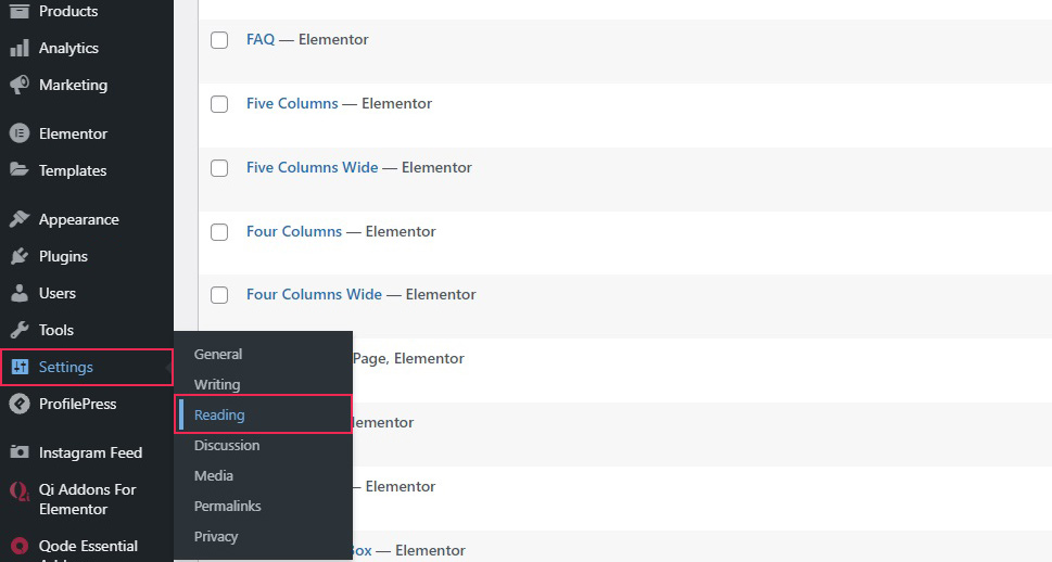
Once you have both pages in place, you need to set them up so your WordPress framework knows which is which. To do that, navigate to Settings/Reading from your WordPress dashboard.
To display your blog posts on a page other than your home page, select A static page from the Your homepage displays section at the top. Then, in the drop-down menus below, select the page you have created for your Homepage (in our case, it is Static Homepage) and for your Posts page (we have selected New Blog Posts). Click Save Changes when done.
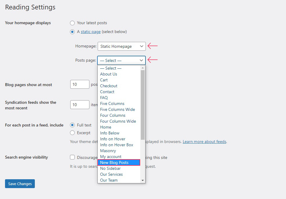
And, just like that, you have created and set up a static page for your homepage. We will show you how to customize it in the subsequent sections.
The theme customizer is a set of tools used to edit WordPress websites in a user-friendly way. It comes with your WordPress installation, and has many functions. Covering all of the functions of the theme customizer is well beyond the scope of this article, but we will go over the very basics of what you can do with your homepage. Note that this will vary depending on your theme.
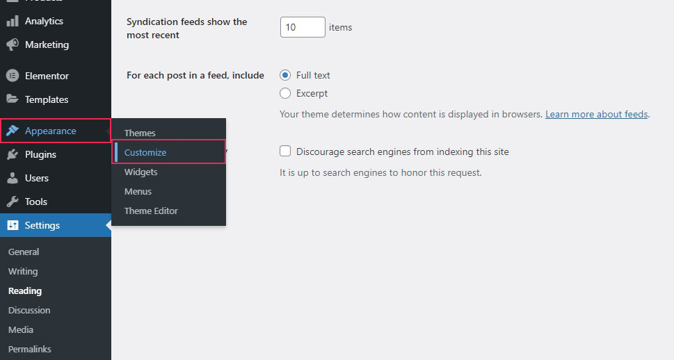
To access the theme customizer, navigate to Appearance/Customize from your WordPress dashboard.
Your page will now appear as it would to a visitor in the preview section, which takes up most of the screen. All changes will only take effect once you click the Publish button.
Editable areas of the page are marked with a blue pencil icon. There may be other editable areas which are empty or inactive. In the menu of the customizer on the left hand-side you can access your website’s functionalities.
To keep this short, we will draw your attention to the Menus section just to point out that this is where you can set up where your menus appear. The navigation menu is a very important part of any website, so we can’t address the creation of a navigation menu in this article, but we will say that this is where you can set it up for display. The number and location of the menu areas on your website is theme-specific, too, but most themes, like the one we’re using, will display a menu at the top of the page – at least for desktop devices.
The second important section of your customizer is the Widgets section. This is where you can distribute the widgets you need on your homepage. Again, the number and position of your widget areas is dependent on the theme you are using.
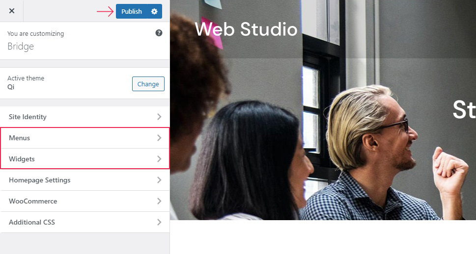
For example, say we wanted to add a widget to the left side of our footer, which is currently empty. We will find the area in the widget menu (Footer Top Area – Column 1), and click on it.
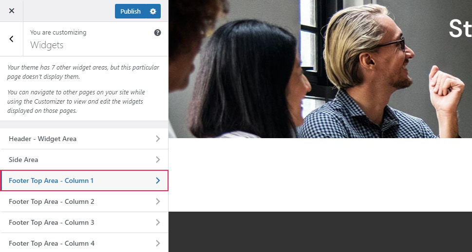
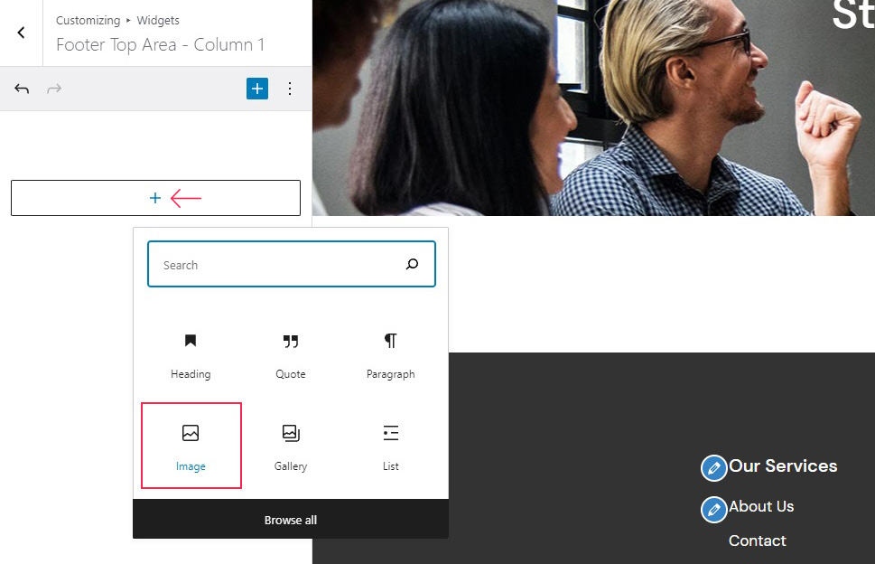
From here we can add a block to our widget. We will click on the plus sign and select an Image block for this area.
We will then choose an image from our media library to populate it – the logo for our Qi Theme.
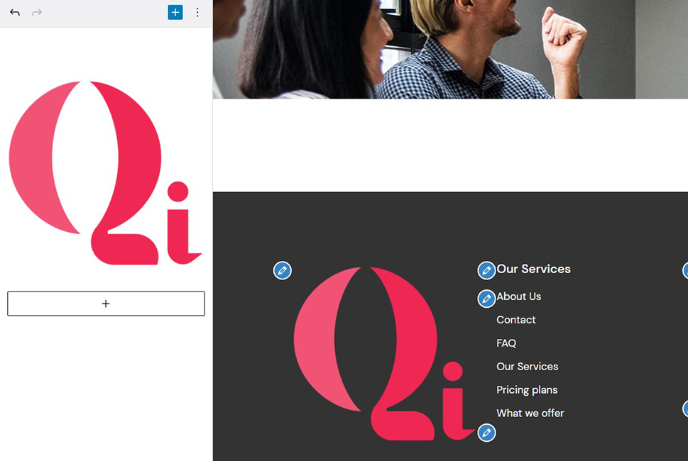
This way, you can locate and edit all the widget areas on your homepage.
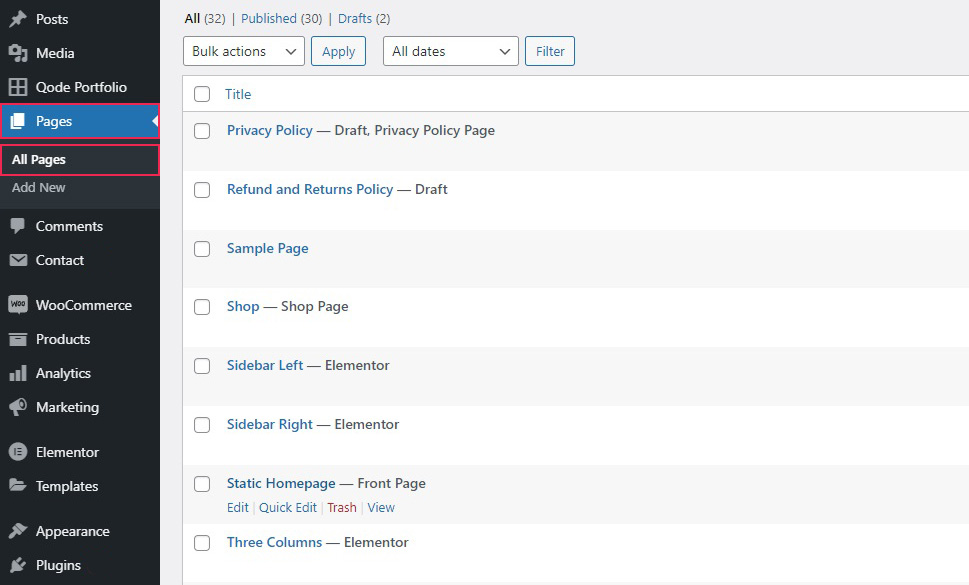
WordPress’s default editor, Gutenberg, allows you more flexibility than the theme customizer. In order to use the Gutenberg block editor to edit a page, simply select the page you wish to edit from the Pages/All Pages section of your WordPress dashboard.
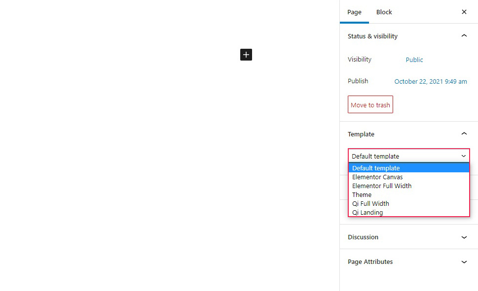
From here, you can simply edit a page as you would any other page or post. Of course, your theme will likely come with the basic layout (or template) of the home page, or, indeed several. You can select among those from the Template menu in the Page tab of the right hand-side bar. Advanced users may also choose to create their own page template and implement it.
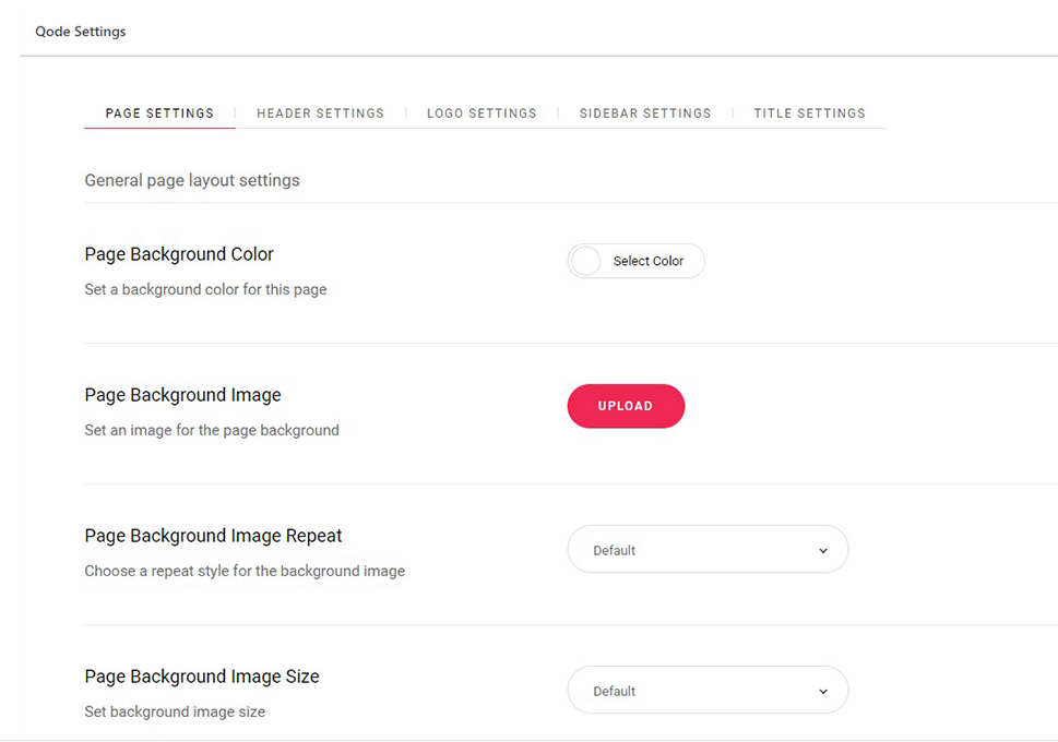
In the case of our Qi Theme, you can find a lot of layout settings in the menu below. These vary from theme to theme, and some themes don’t even have these settings at all, and pages need to be constructed from scratch.
The page we are working on has numerous settings distributed among various tabs, some of which are the same as the customizer settings, while others are specific to the theme. We can’t go into the details here, but a detailed overview of the Qi Theme is available, as well as a multitude of video tutorials.
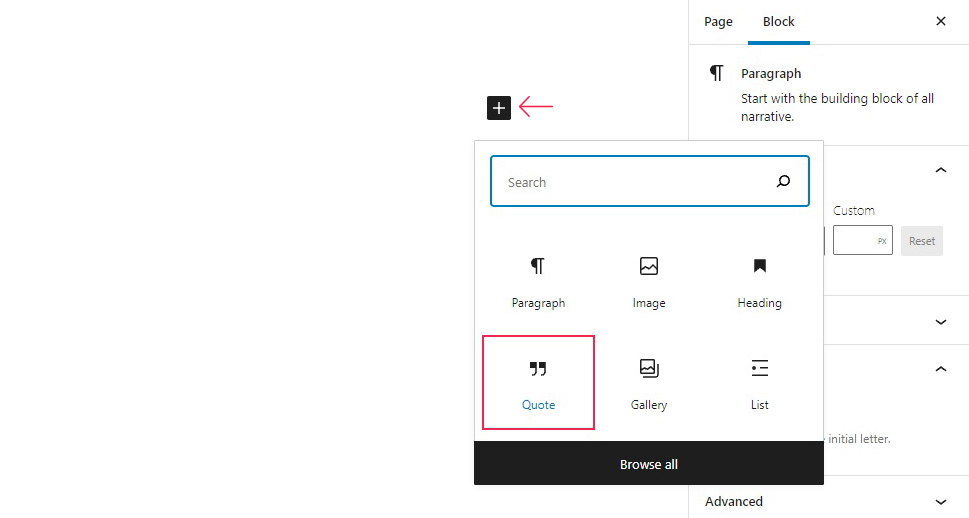
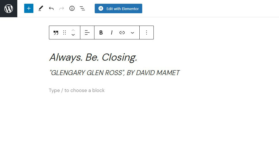
You can also add blocks as you would when creating a post in Gutenberg: simply click on the plus icon and select a block. We will go with a Quote block here.
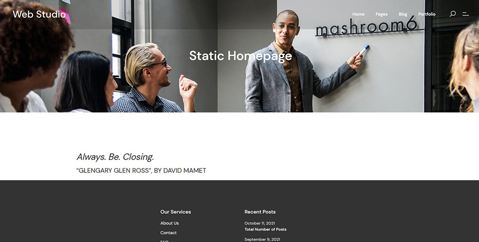
We will fill out the quote block fields with a quote we like, and the quote will appear on our page. Since the page has a header, and since this is the first block up, it ought to appear right below the header.
And this is what it looks like in the preview!
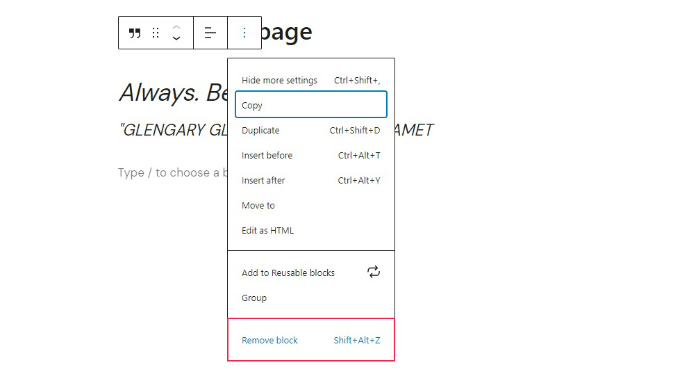
And if you want to remove a block, all you need to do is click on the ellipsis menu (···) which appears when you hover over a block, and select Remove Block from it.
There are blocks for text in various forms, columns, images and other media, as well as interactive features from accordions to buttons to tabs – if you include some of the free and/or premium addons. Combine them with your theme options for best results: pick the functionalities you need and the aesthetic features which fit your brand and your style the best.
If you prefer Elementor, the premier visual editor for WordPress, you probably already know you can edit your homepage, as well as any other page, using it, while previewing your work in real time.
We will be using our own Qi Addons For Elementor plugin to supplement the already great range of options Elementor’s free version comes with. With Qi Addons, you get 60 brand new beautifully designed widgets for absolutely free – all you need is the latest version of Elementor, and Qi Addons will work with the free version, too.
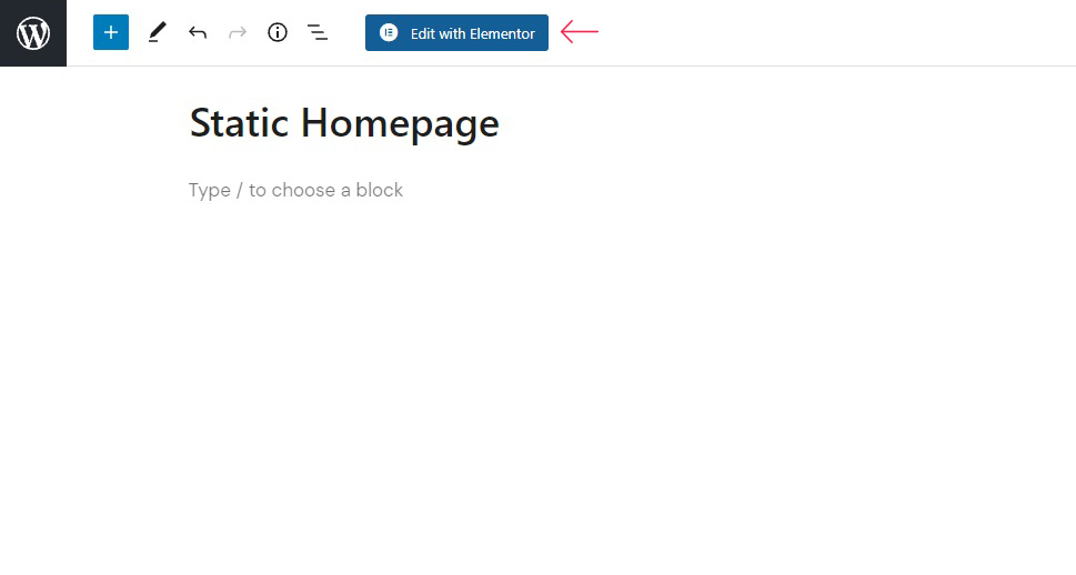
In order to edit your homepage with Elementor, you first need to have installed and activated Elementor (and, optionally, though we highly recommend it, Qi Addons). Open the page as you normally would, and click the Edit with Elementor button.
If your theme comes with page templates, you can activate them by clicking on the folder icon.
Your Elementor library contains ready-made solutions for a number of layouts and functions, which you can choose from the Blocks and Pages templates – and our Qi Theme offers a whopping 100 complete website layouts, images and all, for free. If you have created and saved a template earlier, you can choose one from the My Templates tab. Further on the right hand-side we find the Import, Sync, and Save buttons. We like this basic layout, so we won’t be changing it.
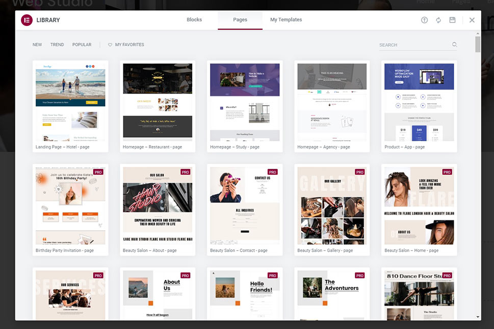
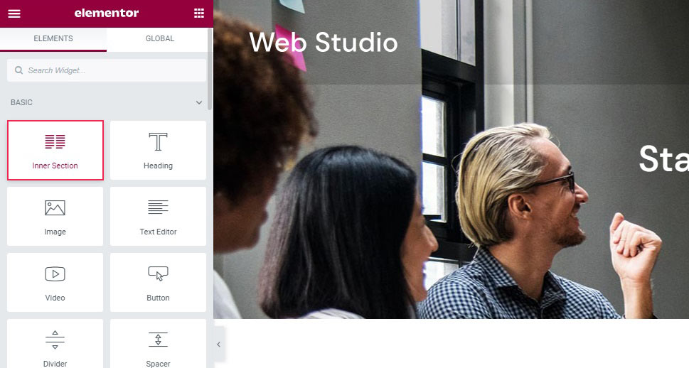
Now, say you want a two-column structure immediately below your header, with a video to the right and some Qi Addons-powered highlighted text, explaining what your video is about, to the left. The first thing you need to do is split up your active space into two columns. There are many ways to create columns in WordPress, and, in Elementor, you can do it easily by using the Inner Section widget.
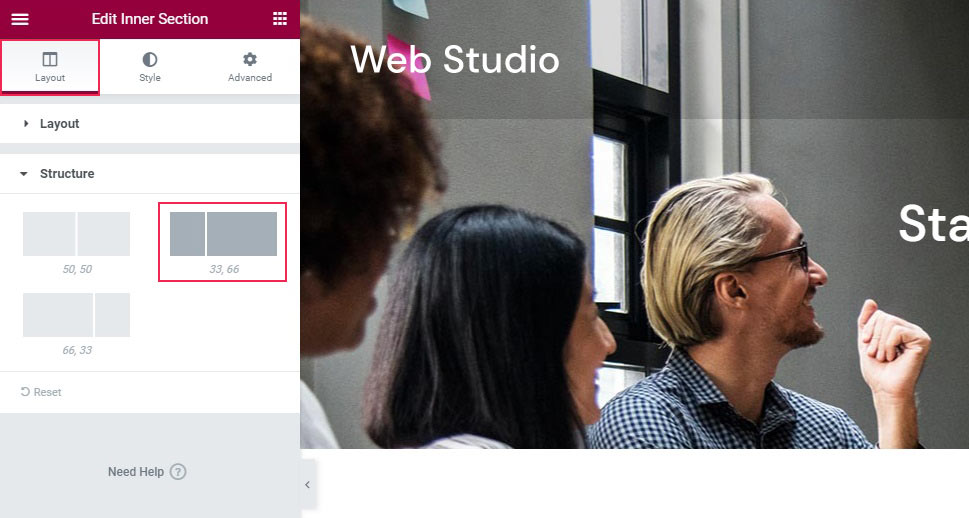
This creates a structure of two columns of equal width. To change that, we will select the structure section in the Layout tab of the section, and pick a different column ratio. We will go with 33, 66 to leave as much room for the video as possible.
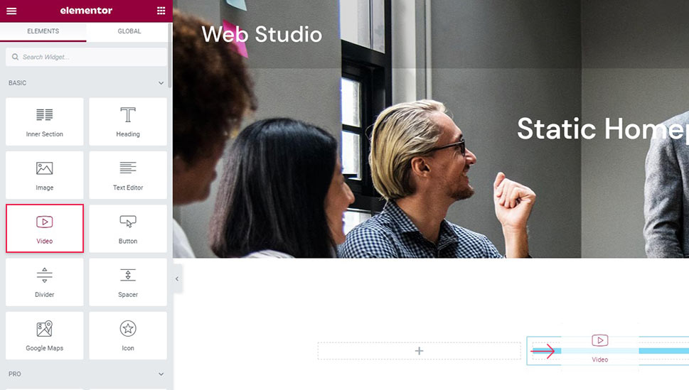
To add a video, you need a video element. You can simply drag it from the left-hand side menu.
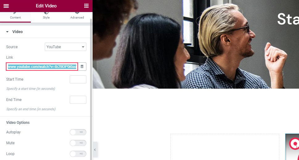
We have populated it with one of the tutorial videos on our YouTube channel simply by pasting the link into the Link field. There are several video options below which we won’t be going into, as they are pretty much self-explanatory and would take a lot of space in this tutorial.
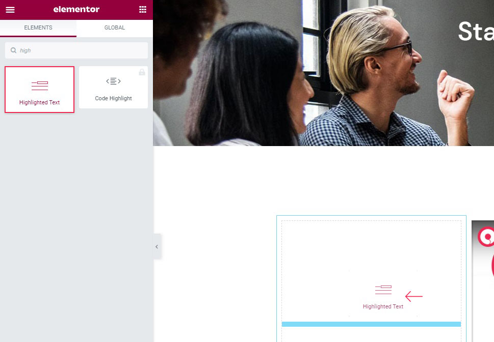
Finally, we will add our highlighted text. To start, simply find the widget and drag it to the smaller section.
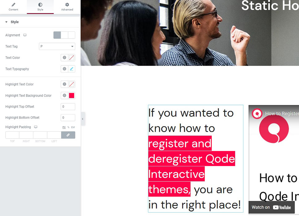
We have entered some text to replace the placeholder, and styled it to fit the space best. This took us about two minutes in real time, but, examining the widget’s many options in detail is beyond the scope of this article – we have a whole tutorial for the highlighted text widget. With some little effort, you have an eye-catching feature for your home page.
Of course, there is no shortage of useful and interesting Elementor features which you can use to their best effect with the editor’s WYSIWYG interface – especially if you supplement it with the Qi Addons widget.
Finally, you may prefer the Classic Editor. You can use it to edit your homepage old school style. To do that, you need to install and activate the Classic Editor plugin.
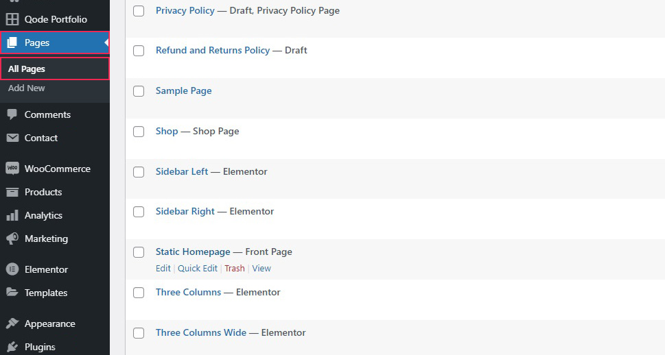
Once you have done that, simply access the page from the All Pages section of your WordPress dashboard.
The Classic editor was designed to accommodate HTML-savvy users, so we don’t recommend it for the general, coding-unsavvy population. However, some features are easy enough to use. To start with, we will populate our homepage with some placeholder text, as a homepage is typically not a bad place for an About text. You can find the text formatting tools in the header of the editor.
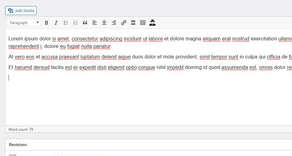
Now, say you want to add some media to your homepage. Using the Add Media button, you can easily add media from your media library. To add media not hosted on your website, the easiest thing to do is to simply paste the URL into the body of the page and hit enter and let WordPress do it for you.
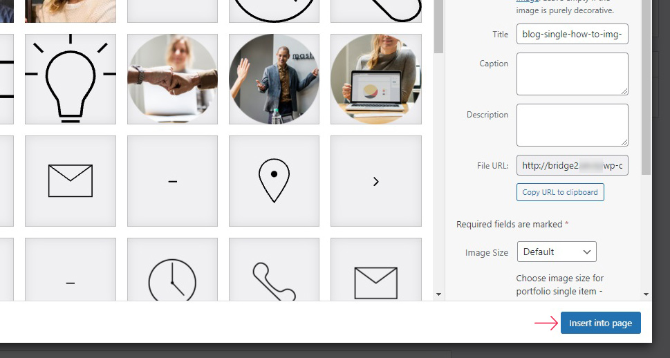
Having clicked on the Add Media button, all you need to do is select an image from your media library, add attributes such as image alt text, caption, and others, if needed, and click the Insert into page button.
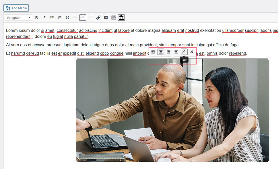
You can adjust the style and display settings for the image in the on-hover menu.
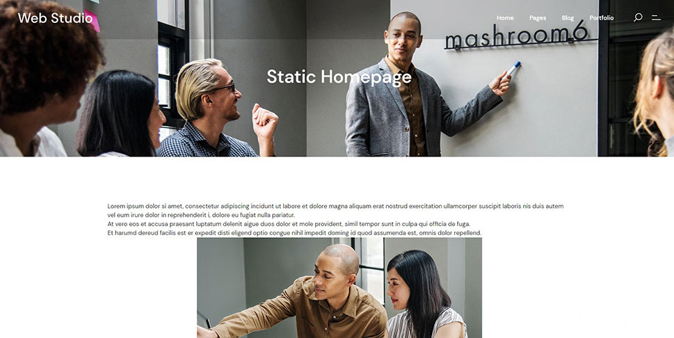
This is what the changes we made to the homepage look like in the preview.
If you are a tech-savvy user, you can switch to the Text view of the classic editor in order to leverage your HTML knowledge to full capacity. Remaining in the Visual tab, you get a better impression on what things will look like. If you choose to use the Classic editor, we strongly suggest you bone up on your HTML.
In Conclusion
As you can see, possibilities abound. With WordPress, anyone can make a website, and there are literally countless possibilities to choose from. Changing and customizing your WordPress homepage alone is virtually impossible to cover in totality, with its myriad choices of editors, features, widgets and styles. We do, however, feel we’ve given you a good head start.
