10 Examples of Imaginative Mouse Cursor Design
The invention of the mouse and implementation of the cursor led to a revolution in user interaction. Until then, data had to be entered and manipulated by using commands on a keyboard, which, at times, was quite time-consuming and tiring. But in the 1960s, Douglas Engelbart created the world’s first mouse, forever changing the way people interact with computers.
The first cursor was designed as a simple arrow pointing up. However, back in the day, computer displays had low resolution, which made the small vertical arrow hard to notice on the screen. Engelbart then decided to tilt the arrow at an approximately 45° angle. And the rest is history. Steve Jobs then used the angled pointer on Apple’s first Mac, opting for the all-black design with a white outline. Microsoft debuted a pointer on their Windows 98 operating system, but they inverted the colors, making the outline black and the inner part white.
From then on, designers began to experiment with the appearance of mouse pointers, sometimes using illustrations or even images as cursors. Depending on the site or the software, we’ve probably all operated watermelon and pizza slices, rockets, sharpies, and different hand gestures in place of the arrow.
Mouse cursors have an immense functional value, and because of that, it’s important their design is well-thought-out. They should look good, but also incite immersive hover and transition effects on a site to make the browsing experience more intuitive and enjoyable for the user. The following roundup illustrates how beautiful and effective mouse pointer design can be and just how much it can help enhance the appeal of the entire website. More importantly, these websites also demonstrate how cursors can vastly improve user interactions on a site and provide feedback about specific actions while simultaneously showcasing the creativity of its creators. The sites we will discuss include:
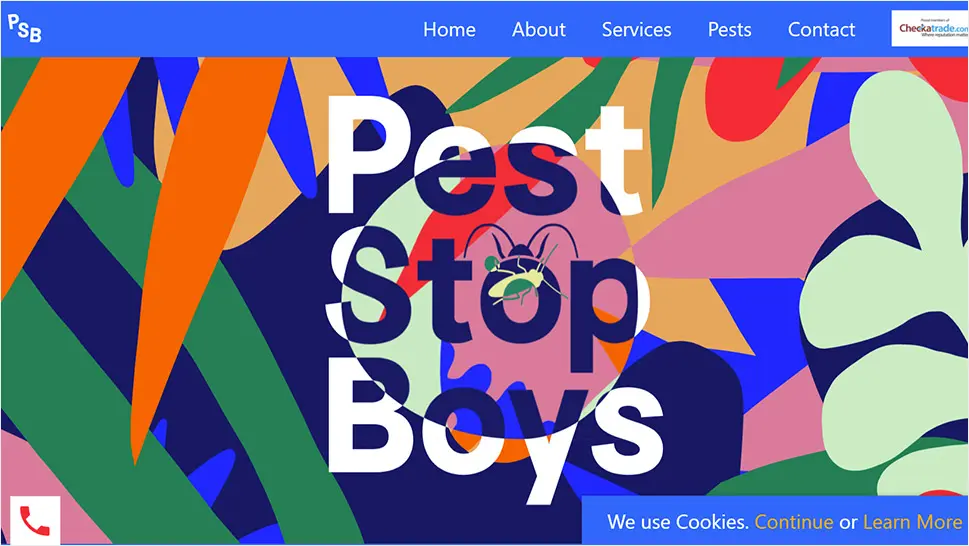
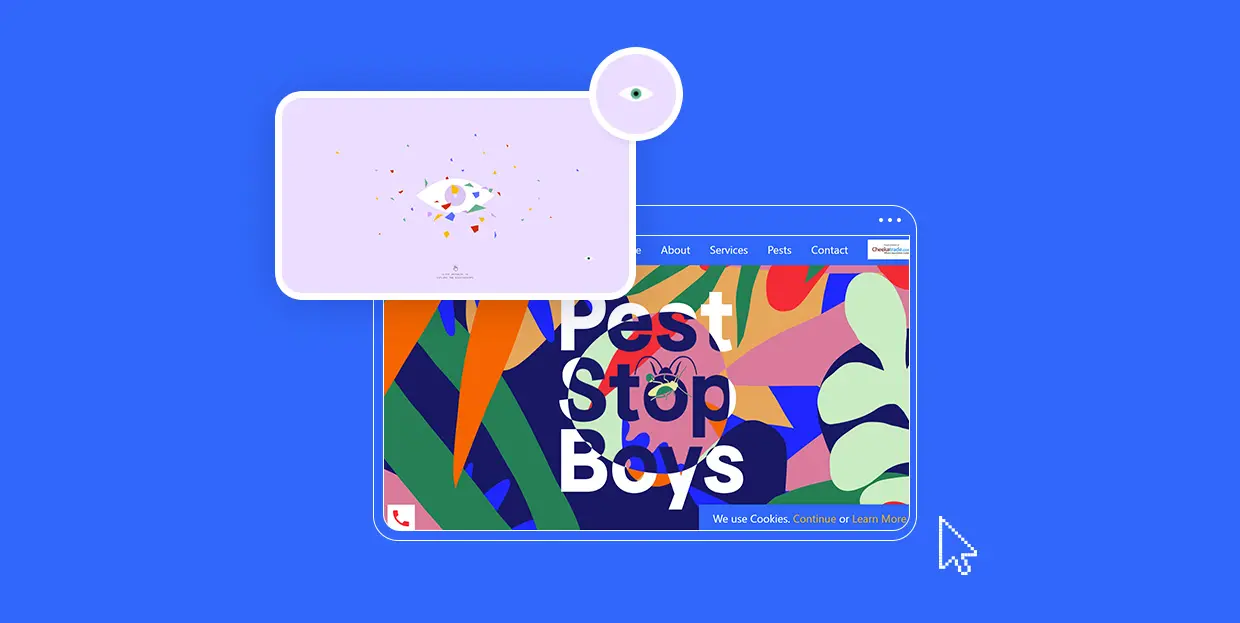
Pest Stop Boys is a holistic pest control service located in South England. Their website is a true rhapsody of colors. It is rich with stunning animation effects and microinteractions, introducing the pest control service in a highly imaginative way. Cool scroll-triggered effects bring various types of bugs into the viewport, making your browsing experience just a bit more interesting. The cursor is initially shaped like an undulating splash of color, but as you begin to move it around, it dissolves into several colorful splotches. What makes this pointer particularly fun is the mix-blend-mode effect added to it, defining how the hovered element will blend with its background. Even when the cursor breaks into a few smaller dots, each of them includes the blend mode. When you hover over several differently colored elements at the same time (e.g., you partly place the mouse over a letter but you also cover a portion of the background and another abstract element), the cursor colors all of them in different hues. The mix-and-blend effect is a great way of breathing new life into your content with one simple hover and presenting displayed elements in several different, creative ways.

Masters 1987 is an event production company based in Los Angeles. Their website beautifully exemplifies the power of uppercase sans serif typography which is used in various sizes on all pages. The background is black while the typography is mostly white, apart from some highlighted words in orange. The colors and fonts are simple, and that gave the designers room to implement a variety of effects and play around with the site’s elements, especially the cursor. The movement of the circular pointer mirrors that of a comet – as soon as you move it in any direction, it leaves an animated trail behind that fades away once the movement stops. The pointer includes the blend mode effect which makes it look like some sort of a spotlight. Not only does it invert the colors of the hovered elements, but it also enlivens them. This is particularly obvious when you place the cursor on images. On the “Portfolio” page, as you hover over portfolio categories, the cursor turns outlined letters white while the blend mode is also in full effect.

Qode Kaleidoscope is a carefully curated collection of Qode Interactive’s themes that highlights the importance of colors in modern web design. The loading screen includes an illustration of an eye and a myriad of tiny, colorful pieces that resemble the stained glass of kaleidoscopes. The cursor on this part of the site looks just like the aforementioned eye. But, when you move it around the page, the eye breaks into several pieces. The pupil remains the primary mouse pointer, with the cornea, conjunctiva, and other parts trailing behind it. As soon as the movement stops, all parts come together and form the whole eye again. The scattered glass-like elements magnetically follow the movement of your mouse, enlivening the page. You can click anywhere you want to access the vibrant website and enjoy its attractive visuals as well as the engaging motion and transition effects that let you experience WordPress through a different lens.

Le Cantiche 1320 is a remarkable Renaissance-inspired website. It was created to mark the 700th anniversary since Dante’s pivotal work, The Divine Comedy was completed. This whole site is a work of art in its own right. It is bustling with visuals that depict Dante’s journey through Hell, Purgatory, and Paradise. The featured animation and transition effects, along with the horizontal navigation effect, make the content appear all the more immersive and the journey more vivid. The cursor is very prominent and designed as a large, red circle. Within the circle, you’ll notice some text, encouraging you to take some sort of action, like scrolling with your mouse or dragging the pointer to explore more content. Inserting instructions into a cursor is an excellent way of making the website exploration more intuitive for the user and helping them find their way around with greater ease. Moreover, the cursor on the Le Cantiche 1320 website features the mix-and-blend effect. When you place it on images, the area that you’re hovering over turns into a negative.


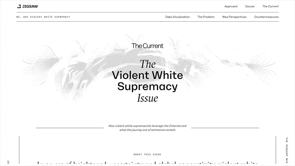
Jigsaw is a unit within Google that relies on technology to investigate global problems, such as human trafficking, terrorism, cybercrime, and many other societal threats. The Current is Jigsaw’s publication that ensures access to information, in particular to all those who live in oppressive societies. In their second edition, which has won the prestigious Webby award, they tackle the subject of violent white supremacy. At first glance, the top section on the homepage seems plain white. But as you move the cursor around, you will see an illustration of a child with their arms outstretched, along with several more pairs of hands. The pointer reveals parts of the image in its wake, but when the movement stops, everything becomes white again save for the area where you’ve stopped the mouse. This is the only section on the site where the cursor interacts in this way with the content, ensuring an impressive introduction to the issue.
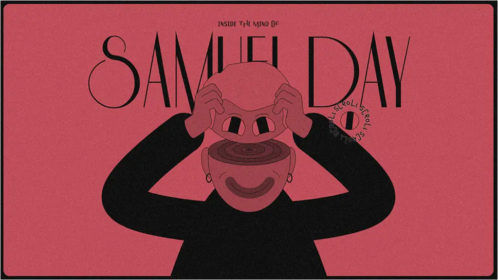
Samuel Day is a Berlin-based designer. His idiosyncratic website provides an immersive insight into his creative mind. The stunning scroll-triggered animations take you on a peculiar journey filled with stunning illustrations that tell you Samuel’s story. The cursor is shaped like an eye that occasionally even blinks. All the illustrated characters on the site have their eyes designed in the same way. When you reach the section with the train passing by, you will notice that the passengers actually embody Samuel’s projects. On hover, the eyeball turns into an animated logo of the company in question, inviting you to click on it and explore the project in depth. As the color of the background changes, so does the color of the cursor. This website is a great example of how good design can make a cursor a part of the creative story that illustrates a designer’s attention to detail as well as their skillset.
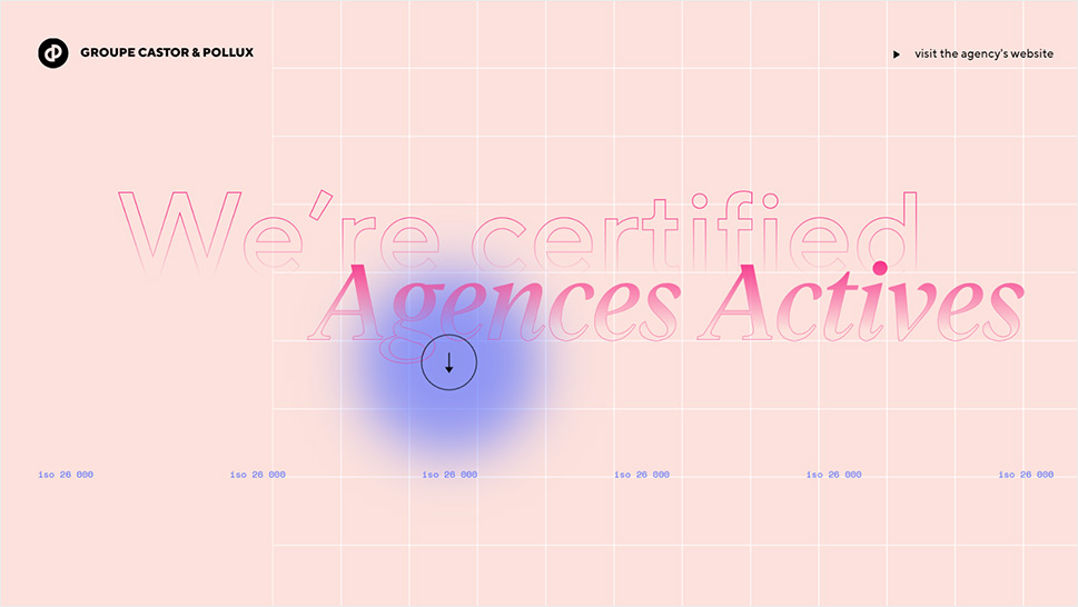
Groupe Castor & Pollux is a digital communication group. On the page where they discuss their CSRs (Corporate Social Responsibilities), you can see a beautiful oversized pointer in action. The round cursor is blue, but toward the edges, the intensity of the color slightly fades, making the pointer look like it has a slight gradient effect. When you place it on the hero text, it becomes huge and a down-facing arrow appears within the circle, instructing you to continue scrolling to discover more about the company’s CSR experience. In some other sections, the cursor colors otherwise black typography in vibrant pink and purple gradients. Again, text appears inside of it, inviting you to read more on a particular topic. By implementing these effects, the designers not only made sure they would direct the users attention to specific elements on the site, but also improved the overall UX by providing clear signals indicating what the user should do next. They also added some purely decorative interactions. For example, when the cursor is placed on imagery, the image shifts slightly, and then starts following the movement of the mouse. On some other pages of the site, the pointer’s design is equally interesting. For example, on the “Agence” page, the oversized cursor turns black typography into outlined lettering. It also reveals some background imagery that can only be seen within the borders of the cursor. Outside of the edges of the pointer, the background remains white.

The New Company is a strategic design agency based in San Francisco and Los Angeles. Their website is filled with beautiful imagery that depicts the studio’s creativity. Photos are thoughtfully arranged on the white background and their vibrancy breaks the calmness of the neutral backdrop. Another particularly prominent element on the site is the red cursor. Its color is eye-catching and intense, which allows it to stand out even when you place it on colorful pictures. The pointer is shaped like a circle, but when you move it around, you’ll see it split into two parts, with a smaller circle in front and a larger one following it with a very dynamic motion effect. As soon as the movement stops, the circles merge again. While located on the slider at the top of the site, the cursor will transform into triangular arrows as you move it to either edge of the screen, inviting you to explore all of the slides. This seemingly small interaction is, in fact, a great and unobtrusive way of making the website exploration more intuitive and ensuring better user experience on your site. The pointer is, by default, oversized. But in some sections, when you place it on the displayed images, its size decreases. On most sites, usually, the opposite happens, but the New Company decided to switch things up a bit and surprise viewers. Hover effects are engaging, with featured videos playing the moment you hover over photos.

Glenn Catteeuw is a multidisciplinary designer and art director. The background on his one-page website is designed as a grainy, grey canvas, giving off cinematic vibes. The content is in black-white. There are also lots of outlined geometric shapes that slightly move on hover, awakening from their default inactive state. The cursor is shaped like an arrow until you place it over an image. It then turns into a billowy shape that adds a negative effect to a small portion of the photo. As you move the cursor around, the negative splotch follows its movement. This unusual detail amplifies the site’s alternative vibe and makes project presentations more effective and eye-catching.

Julie Guzal is a freelance designer. Her portfolio website looks minimalist, starting off with Julie’s simple introduction on a plain white background. The peacefulness of the layout is gently shaken up by the cursor that leaves a bubbly trace in its wake, with animated dots slowly evaporating from the screen. The cursor trail is colored in an elegant deep green shade, breaking the monochromatic character of the opening slide. As soon as you start to scroll down the page, the dancing dots disappear from the view, leaving the plain white arrow on the screen. This entire site’s simplicity beautifully complements the vibrant examples of Julie’s works that appear in the viewport with each new scroll, allowing them to capture the viewer’s undivided attention.
Closing Words
Even though they are most often small in size, mouse cursors offer a lot of room for expressing your creativity and improving the user experience on your site. Sure, you can always go for the tried-and-true arrow or hand design option. But users are guaranteed to appreciate innovative pointer designs that can not only complement the aesthetic of a site but also make the entire presentation more memorable.
We recognized those qualities on the sites featured on our list and we enjoyed exploring their content using some truly terrific mouse pointers. As you can see, in a lot of cases mouse pointers become crucial elements of a site, ensuring an easy, intuitive, and interesting browsing experience.
We hope you will find these cursor designs just as amusing, cool, and beautiful as we did, and that you will use them as inspiration when coming up with an innovative mouse pointer for your own website or next project. You can go for interesting graphic solutions, use the cursor to ignite color changes on sliders, or add engaging hover effects to your content. The possibilities are endless. At the end of the day, a beautifully designed cursor is, on its own, a great addition to a project, but you can further enhance the appeal of your website if you manage to implement the cursor into the overall experience and use it to both amuse and guide visitors.
