10 Examples of Websites Inspired by Poster Aesthetics
Experimentation with the paper form in web design has been around for quite some time. From grainy or noise texture to hand-written text and calligraphic forms, more and more web layouts resemble actual, physical designs on paper, often so much so they make us want to touch the screen to feel the paper between our fingers. These designs sometimes resemble greeting cards or notes, sometimes watercolor paper or a page from a book, and sometimes they are crafted to resemble posters – which is the style we’re going to investigate today.
The poster technique emerged in the early 19th century and quickly became a widespread advertising and marketing channel. Visual representation was always just as important as the message, so graphic artists, painters and typographers soon started creating elaborate, high-quality poster designs, many of which have become art history classics – just remember the famous posters by Henri de Toulouse-Lautrec, Jules Cheret and Alphons Mucha, for example. Art Nouveau, Secession and early Modernism gave some of the most incredible examples of poster art, and the technique continued to develop throughout the century, giving birth to notable styles like Constructivism, Art Deco, Object Poster style and the International Typographic style, just to name a few. Then came the Psychedelic style, Postmodernism, the Memphis Group and, of course, the 1980’s and computer graphics.
So, where are we today when it comes to posters? First of all, it’s vital to remember that the original purpose of the poster – to inform, advertise and propagate – has moved from the physical to the digital form. Today, we hardly even need actual paper posters. We have LED marquees, digital billboards and the internet instead. Poster art moved, to a large extent, to the web. And there isn’t a particular new style to speak of. Instead, what we are witnessing today is a glorious conglomerate, a melting pot of poster styles that reference the celebrated styles from the past, giving it a fresh polish in line with the times. Historical recontextualization of styles is present throughout all visual art forms, and the poster is no exception. More or less direct references, inspirational points and homages, combined with new design techniques and contemporary styles – this is the gist of the poster style in web design today.
So let’s take a look at some of the websites that incorporate the poster style in one way or another. We will be visiting:
Top Themes for Creatives
View Collection


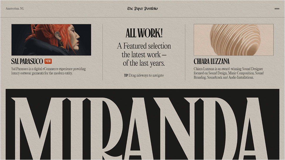
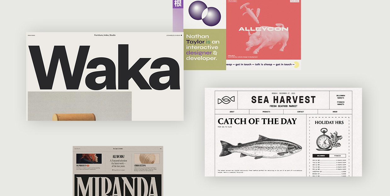
Niccolò Miranda is an Amsterdam-based Italian designer and developer working in art direction, branding and motion design. He has received numerous accolades for his work and has worked with high-profile clients like Prada, AKQA and Awwwards. His portfolio website is an impressive display of design innovation, skill and imagination, and also a wonderful step out of the contemporary trends in web design. Conceived as a “paper portfolio” in digital form, the website looks and feels like a newspaper, with a distinct paper texture, newspaper-like columns and typography, and a lot of illustrations bearing a distinct poster quality. The style is a nod to fictional newspapers, most notably The Daily Prophet from the Harry Potter movies and The Daily Planet from Superman, a choice which dictated the sort of grid he used, as well as the typography. Miranda opted for illustrations rather than for photography in order to maintain the old newspaper aesthetic. The Work section explores the potential of tab based navigation and features reversed UI in a bookshelf style. The items are listed vertically and open sideways, allowing for horizontal scrolling, and the transition animations feature a torn paper effect.
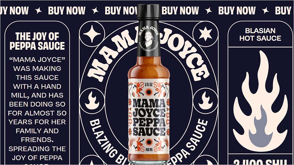
Hot sauces have been all the rage for the last decade or so, and sauce brands are literally impossible to count. With all that competition, it is vital to stand out, which is precisely what Peppa Sauce from Guyana set out to do with a fun, loud website that promotes a single product – Mamma Joyce Peppa Sauce. The dark blue background coupled with a very light pink for typography makes an excellent base for bold, almost flamboyant design that resembles old-fashioned posters for circuses and fairs, or perhaps, more fittingly, cure-all tonics that were sold door-to-door. To contribute to the poster quality of the page, the designer opted for oversized lettering, large icons, sections with text boxes with round edges and, most of all, the portrait of the originator of the sauce, the famous Mama Joyce, in a stencyl style, winking playfully and lovingly at the visitor. The website has a lot of movement going on, with different marquee sections scrolling in different directions, and it’s all topped with a photograph of the Mamma Joyce Peppa Sauce bottle just moving in and out of view.
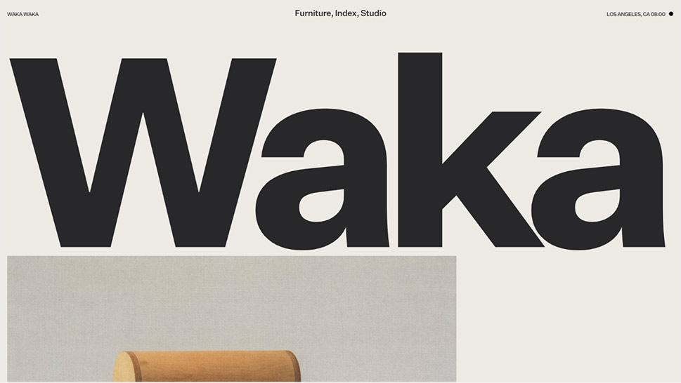
There are websites that only hint quite discretely some of the elements of the poster style, which, in itself, is quite diverse as it is. For instance, the Los Angeles-based wood furniture studio Waka-Waka opted for a layout dominated by a logo in the custom-made Waka Sans typeface reminiscent of the International Typographic Style, aka. the Swiss design. The website opens with a loading animation that features poster-like design, or perhaps the first page of a newspaper or a catalog, which then zooms in and takes up the entire page. To contribute to the style, the designer opted for a highly reduced grayscale palette, interrupted only by the colors of the featured furniture. Inner pages, of course, are more conventionally designed and more practical, although those, too, feature certain poster features, such as flat, geometric color surfaces.
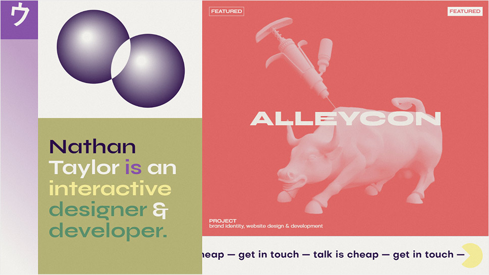
In another excellent example of the diversity of poster aesthetics, the interactive designer and developer Nathan Taylor aka Nathan Tokyo created a wonderful, heavily referential portfolio website inspired by modernism in web design, with hints of the brutalist aesthetics. The muted color palette with noise texture makes one think of paper posters from the modernist era, and the Syne typeface, in bold style, which we discussed in our review of the best Google Fonts for 2022, also contributes to that character. The page is replete with little interactive sections, densely arranged in a geometric fashion, ranging from on-hover animations, to text reveal (also upon hover), objects that follow the cursor, and so on. Speaking of cursor, it’s one of the decisively brutalist elements in this design – a slightly oversized arrow with bold outline turns into a Mickey Mouse hand when it touches certain sections, and in some it even turns into the playful surfer “Right on!” hand gesture. The vintage quality of the design is based not just on the palette and the lettering, but also in details hinting to iconic objects from pop culture’s past, such as analog synths.
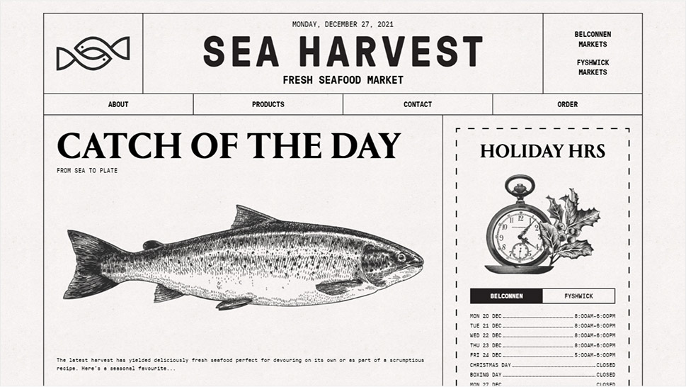
Fishing is one of the oldest trades in the world, and one that has often been associated with hardship, impoverished oceanside communities and simplicity. These days, however, fishing is far from a poor man’s industry. Still, a lot of the aesthetics associated with the trade have been maintained, as we can see in the brilliantly designed website for the Australian fresh seafood market, Sea Harvest. The homepage is designed in a minimalist manner, with thin lines dividing the layout into geometric sections, bold, headline-like typography, hand-drawn illustrations of fish and a light background with a paper texture. The entire layout feels like a simple paper poster taped to a telegraph pole in a remote seafront village, or, better yet, like a paper newsletter handed out in ports, as the paragraphs invite the user to “Read more on page 3.” This is subtly contrasted with certain modern interventions – for instance, the typography changes color from black to blue upon hover, and a marker-style drawing animation circles the menu items, also upon hover. It’s a masterfully executed, simple yet striking design that successfully unites hints to the trade particularities with modern web design demands.
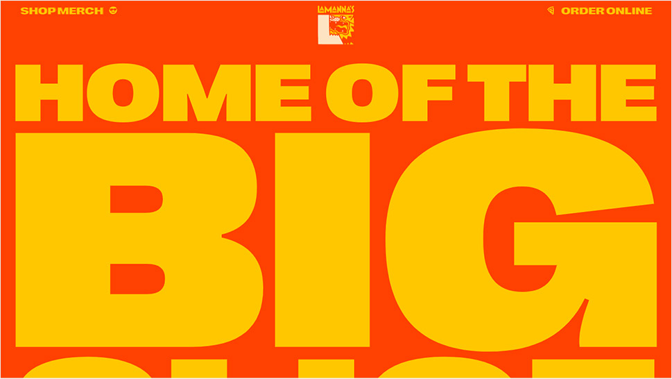
Now, let’s revisit one of our old acquaintances which we discussed in our article on innovative hero typography. Toronto’s famous Lamanna Bakery is known for extravagant menu items, such as the Big Slice (which is an euphemism as the slice is not big but ginormous), as well as an array of decadent, indulgent desserts that combine Italian and North American culinary traditions. But enough with the munchies – let’s take a look at the inspiration behind the Lamanna website. Resembling a poster announcing a big game or perhaps even a circus, the design bears a playful, fun character imbued in humor and exaggeration. Huge yellow typography on the bright red background references the colors of the basic pizza ingredients – tomato and cheese, and an array of icons and illustrations reference that fun, exciting period of the late 1980’s and early 1990’s, bringing in mind some of Spike Lee’s visual iconography. Some of the sections feature a background in two shades of pink in wavy, psychedelic forms, which may be a hint to the classic psychedelia posters, and also a reference to cake frosting or ice cream. The poster-like design is occasionally broken with fullscreen photographs of food, just to remind the visitors exactly what sort of indulgence they’re in for.
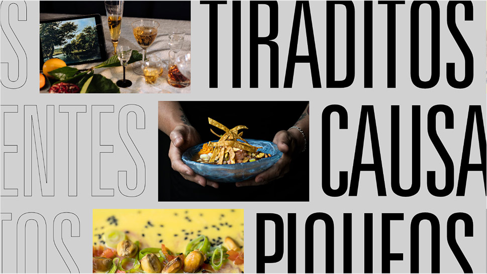
Cevitzef Bilbao is a true mix of Hispanic and Latin cultures in one pot – a team of Venezuelan chefs preparing seafood Peru-style, in Bilbao, with the name and a lot of identity in the Basque language. Their main focus is ceviche but they also offer superbly cooked scallops, shrimp, fish and soups. The website is a poster-like celebration of typography and images, with fonts in an array of different styles and sizes. The Univers Light Condensed and Warnock Bold typefaces are used in both filled and outlined versions, in small, medium and large styles, occasionally in marquee, or with hover animations. This bold combination of fonts brings to mind design created for print, not web, which adds a distinct poster-like quality to the page. Motion and layout design with a variety of densely stacked sections, on the other hand, contribute to a supremely contemporary character of this website, which received the Awwwards SOTD recognition in 2021.
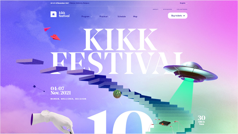
Using poster design for websites promoting events, particularly festivals, has been a huge trend for the last ten or 15 years. Smaller indie festivals first started tapping into the 1970’s psychedelic poster aesthetics, and major festivals and event organizers soon jumped on the bandwagon. Today, we can see this sort of design for events of any kind, from food to tech gatherings. The website for the 2021 edition of the Kikk Festival, an annual event focusing on digital creativity and taking place in Wallonia, Belgium, also features a layout in a poster style, but without resorting to direct references or derivative visual elements. Instead, it is an imaginative, inspired and witty exploration of surrealist and vintage motifs scattered around on a grainy, paper-like background. The mood it sets is simultaneously retro and contemporary, and the main motif, a stairway that leads through the festival’s 10-year mark and beyond, to the future, communicates progress and a sense of optimism for what the future has to bring.
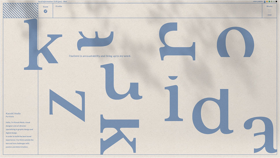
Kazuki Noda is a Japanese visual designer and art director, whose portfolio website is one of the shining examples of grid-based web design. And it’s precisely the grid lines that lend the layout a particularly poster-like quality. Drawing inspiration partly from the Swiss design style, Kazuki created a beautiful, meticulously designed website full of innovative, delightful details and interactions, from the round cursor and animated typography to the color switcher that changes the two main colors of the layout. The background features a grainy effect that resembles both the television static and the texture of a quality paper. Subtle moving shadows give the design a realistic, physical feel, and the Lato typography, sometimes hollow, sometimes vertical, along with sections with rasterized or hachure patterns contribute to the poster quality of the page.
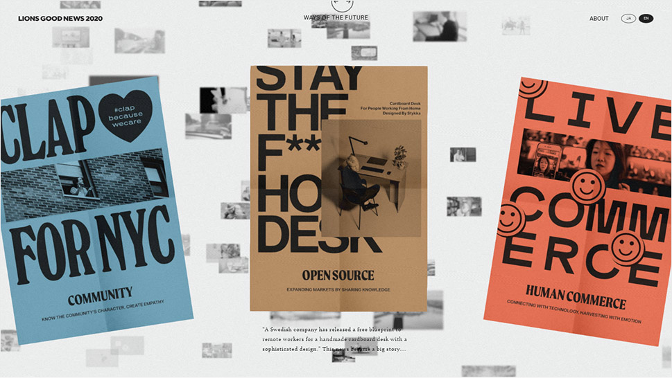
The poster inspiration for a web design sometimes comes in the form of subtle visual hints or select details, and sometimes it takes up the form itself – like in case of the Lions Good News 2020, a website created in order to celebrate 10 years of Cannes Lions, the prominent PR and digital marketing festival. The designers wanted to place a particular focus on the past, the history and the time itself, which dictated the choice of a nostalgic, vintage tone, achieved using monochrome contrasting and colors typical of flyers and newspapers from the 1950’s. The showcased projects are presented in the paper form, with noise and even folds and wrinkles, animated to mimic a wind effect. Whether they’re posters or newspaper pages flying across a cityscape, these elements carry a strong nostalgic quality, which was the initial concept behind this project.
Wrapping It Up
One of the biggest appeals of the poster style is that its mimicking of the physical quality of paper and paint, as well as design that is typical of print, rather than web layouts, basically transcends the medium – it reaches from one realm into another. For some, this transcending brings nostalgia for the past and simpler times. For others (typically younger audiences) it reflects the playfulness and the style experimentation typical of contemporary pop culture. And then there are all the references and familiar motifs that not only serve as visual cues but also spark delight that comes out of recognition of cultural and historic commonplaces. Finally, poster style in web design is also a testament to the designer’s good taste and knowledge of design history, which contributes to the appeal of the entire website and, by extension, the reputation of the brand.
We hope that this little trip to some of the best examples of poster style in web design has inspired you to dig deeper into this trend and perhaps explore its visual potential in your next project. If you do, let us know how it turned out!
