10 Captivating Examples of the Liquid Metal Effect in Web Design
There’s something about liquid metal that just mesmerizes. A steady flow of silvery, viscous fluid bears a distinct ASMR quality, with its pristine, spotless surface and motion that seems to confuse our brain – metal is supposed to be solid, right? Okay, we all know there are some not so solid metals, like mercury. We also know that many types of metal can be melted into a liquid form. So we can’t say it’s something supernatural or uncanny, and yet, we can’t take our eyes off it.
Our fascination with liquid metal isn’t a new thing, but it’s definitely an “it” thing at the moment. Flat and static designs have long stepped down and surrendered the throne to weird, experimental and innovative design solutions – just think of the acid graphics revival and all the microtrends that sprouted from it. The dissemination of content on social media is moving at the speed of light, pumping in hundreds of new concepts at a head-spinning rate, delighting users but perhaps putting designers in the awkward position of always having to churn out new, exciting, boundary-pushing projects. To do this, they often reach back into past cultural and artistic traditions looking for inspiration.
One possible source of inspiration for this trend is certainly the visual tradition of science fiction. Liquid metal can be seen on quite a few book covers from the genre, especially paperbacks, where designers really used to go wild. From spaceships to cyborgs, there was a lot of glimmering iridescence of the smooth, flowing metallic surfaces. The aesthetic was soon transposed to cinema – one particularly familiar example is T-1000, the bone-chilling shapeshifting assassin from James Cameron’s cult Terminator 2. The way he can turn into a puddle of liquid chrome only to assume human form again and brutally annihilate whomever is in his way remains for many the single most striking visual from the movie.
Then, of course, there’s metal music with its array of subgenres, some of which, such as progressive metal, continue to nurture a predilection for this sort of aesthetics, which, in turn, stem from comic books and graphic novels. And let’s not forget the 1990’s and the obsession with speed, power and technology.
Actually managing to trace the inspiration back to its origins is almost an impossible task. As is always the case in pop culture, there has been so much borrowing, recontextualizing and reinventing of certain motifs that the pathways are too difficult to untangle. Let’s return to the present moment instead.
A quick stroll around Behance looking for chrome-based design yields some remarkable results and shows that there are quite a few talented designers exploring this style. The Italian motion graphics designer Sic Est, for example, did a wonderful job with applying liquid metal textures and CGI for the Versace Timeless SS18 campaign, while the Beauty Alchemist editorial for Schön! Magazine explores liquids in the context of makeup. The liquid metal trend is so hot right now you can even get chromatic toolkits to use for your next design.
Instagram is a likewise rich source of inspiration when it comes to chrometype and liquid metal effects. The #chrometype hashtag has over 77k posts, there’s an account dedicated entirely to this style, and there are, of course, liquid metal filters you can apply to your stories for a weird, futuristic or cyborgian look.
Finally, it’s worth remembering that, in the last decade or two, mainstream pop music has been the single most influential herald of visual trends and aesthetics. As artists strive to offer cutting-edge, innovative visuals accompanying their material to help build their persona in a holistic way, a lot of what we see on album covers and in music videos is immediately picked up, emulated and reworked, often finding its way down to the most mundane levels, such as Hot Topic garment items and so on. When it comes to liquid metal, we have seen it around a lot, most notably in the artwork for Lady Gaga’s Chromatica, Rosalia’s single Aute Cuture and Rina Sawayama’s tour merch.
Today, however, we’re going to focus on some of the most successful examples of the liquid metal and chrometype trend in web design. Here are the websites we’re going to visit:
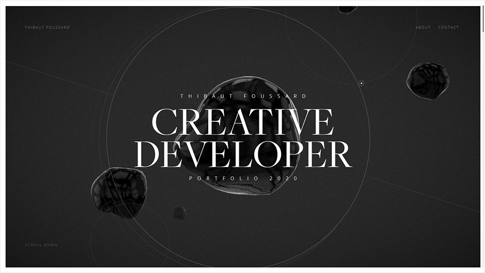
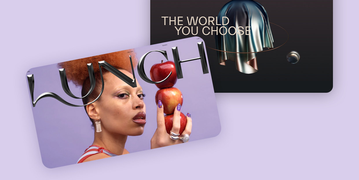
If Thibaut Foussard doesn’t move you to pursue a career in creative development, perhaps by signing up for a couple of online courses for the job, no one will. This French developer and JavaScript enthusiast created for himself a gorgeous portfolio website, a modern layout with geometric motifs and light that changes gradually, from dark to light, as we scroll down and explore the website. Thin, sharp lines and circles are counterbalanced by large, irregular drops of dark liquid metal, gently floating upwards. The entire page has a grainy texture, and some of the largest drops (or blobs) also have a surface that’s not perfectly smooth. This texture adds depth and a life-like quality to the design and wraps it in a distinctive, cinematic atmosphere.
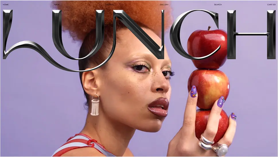
A brand that we already wrote about in our exploration of innovative hero typography, the concept store Lunch Concept opens with a stunning video section with huge metallic typography across. Despite mimicking cold, sharp metal, the type has a slight sensual quality to it, perhaps because of its matte texture and the curve connecting the letters L and N, or perhaps because of the underlying video that lends some of its atmosphere to the logo as well. Even more than fluidity, the matte black buff of the letters communicates tactility and texture, while the sharp point of the letter C adds a bit of an edge to the character. The letters look bendable and hollow on the backside, and the overall effect is a desire to touch, explore and play around with the logo.
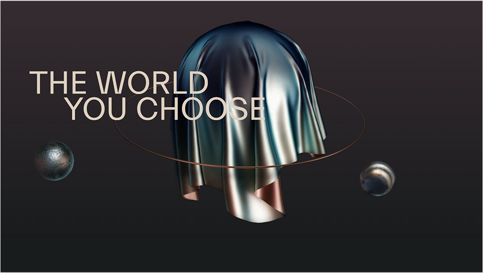
Marketed as a mixed reality social platform, Hanai World is set to deploy in late 2021 and is planned to involve a community of creators, developers and tech companies working together to provide synchronous physical and digital experiences, primarily in the field of entertainment. For now, the only glimpse into the platform (and the movement, as the creators call it) is the website calling for new team members, creators and developers. Judging from the design, it’s going to be one modern, future-oriented environment for creatives and developers to basically compete with each other in who can deliver a more innovative experience with a heavy emphasis on aesthetics. The dynamic background in a pastel gradient gives off a vibe of cosmic melancholia, a mood supported by a number of objects, mostly spheres, made in liquid metal, orbiting around each other or simply floating in and out of view. A pair of liquid metal hands reaches out from windows to some parallel worlds, welcoming new members. The entire composition supports the idea of creating new universes within our existing one and bypassing the walls between physical and digital realms.
Top Themes for Creatives
View Collection


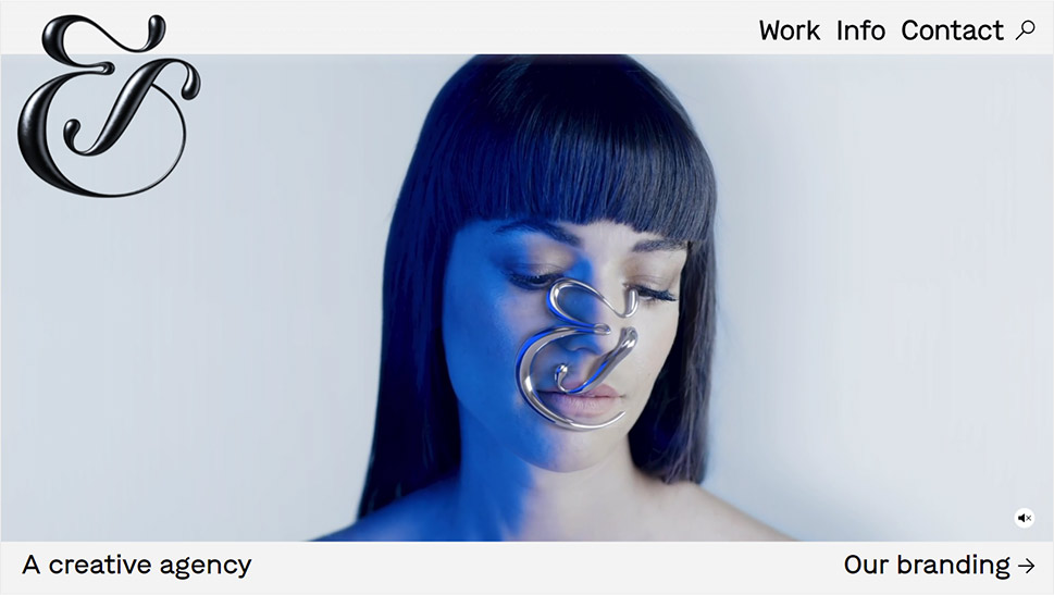
&Walsh is a New York-based branding and advertising agency with a distinct, modern vibe and a dedicated but playful approach to work. In addition to providing an excellent illustration of the liquid metal trend, their homepage also serves as proof of how important context is in web design. The agency logo consists of a large metallic ampersand in calligraphic style, with matte black surface. Alone, the logo could even be perceived as classic, as it appears to be made of wrought iron. However, certain elements of the type design here, the way the logo is nested in a modern layout and, most of all, the video section underneath it all give the ampersand a more contemporary feel, and its material and texture don’t feel as vintage as they would outside of this environment.
Speaking of the video section, it too represents an inspired investigation of the potential of liquid metal in design. The initial sequence features metallic shapes that flower and spread on a woman’s face, forming the ampersand, and then cuts to a sequence representing a sea of molten metal, from which a lava-like mass emerges, then forms, again, an ampersand, which then sinks back into the fluid, releasing a cloud of vapor and smoke. It’s a fine piece of branding that simultaneously shows the multifaceted nature of liquid metal, showing it doesn’t always need to be high-gloss and gleaming and doesn’t have to pertain to a dystopian, futuristic or high-tech narrative.
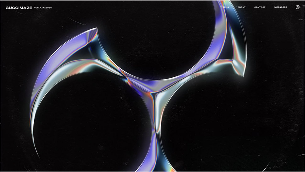
Yuta Kawaguchi is a Japanese designer with an unmistakable, edgy style. His work is known for 3D type forms that feel sharp as a knife, or perhaps a shuriken, as many of them feature forms inspired by this weapon. His designs are usually set in bold, ultra-vivid environments with soylent greens, radioactive yellows and post-atomic blues. The typography style borrows inspiration from the 1980’s and 1990’s B-production action movies and horrors, as well as from heavy metal iconography and hip-hop culture. It’s a radical, loud and aggressive mix of influences, with each piece carried out to perfection. His liquid metal designs are particularly striking, as they have a distinct physical quality – they look like they could cut right through the screen, and their gleaming surfaces reflect colors that speak of dystopian times.
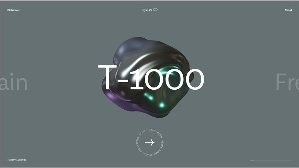
14islands is a Swedish creative design and development studio with a number of major projects and awards under its belt. The studio also creates fun, interesting projects for no apparent purpose other than to delight the users and, well, showcase its team’s skills. One such project is Blobmixer, an online tool (or toy, if you wish) for creating 3D blob shapes which can be viewed and interacted with in VR, as well as downloaded or shared with friends. The tool is extremely simple and intuitive, and can be used by anyone. In addition to the tool itself, the website features a showcase of some of the best blobs made with it. Some of them feature a liquid metal texture, and one is even named after the above mentioned T-1000. Other featured materials include water, plastic, lava, slime, liquid makeup, and so on.
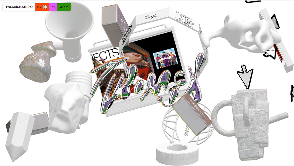
Here’s a design that seems to be all over the place and yet in some sort of weird harmony. The Twomuch Studio website opens with a cluttercore-ish mess of floating objects on a sterile white background, complete with a corner menu with what appear to be Patrick Starfish’s eyes. The assortment of floating objects includes a few screens, some bricks, a giant pencil, a megaphone, and several objects that are hard to identify. As they turn around, their surfaces transform from plaster-like white to liquid metal, first matte, then iridescent and shiny. And behind all this, the barely legible metallic logo of the studio, also shifting and changing color and texture as its metallic fluid flows and swells. Oversized, pixelated cursor arrows float alongside the 3D objects, too, and combined with the menu, add a brutalist touch to the design.
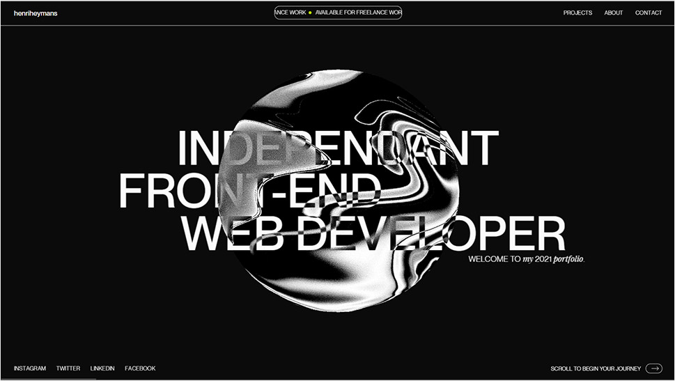
For his 2021 portfolio website, the independent front-end developer Henri Heymans opted for a page centerpiece that explores movement and texture using liquid metal as the medium. A planet-like metallic orb rotates around itself in the hero section of the website as its uneven, grainy surface flows and melts, resembling something between fine sand and TV static, while its sharper lines bring to mind smooth passages between colors in a gasoline rainbow. The orb is never still – it’s either turning around itself, or following the cursor movement. The page then proceeds to a rather conventional display of selected works, so the orb serves as an emblem of the author’s skills and also as a striking opening of the website.
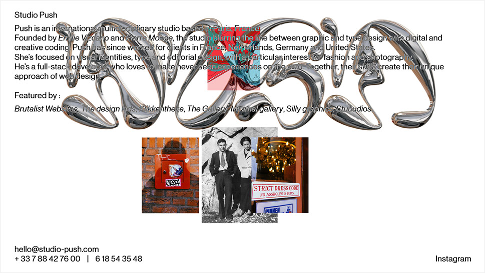
Brutalist design and liquid metal seem to be a particularly hip combination right now. It actually makes sense – brutalism is about exaggeration and irreverence, and chrometype, being not only flashy but often also hard to read, fits into the ethos perfectly. The international multidisciplinary Studio Push from Paris, working with creative coding to create boundary-blurring graphic and typography experiences, is a good example. The homepage features a stripped-down, basic layout with essentially just plain black text on white background and gives off a raw vibe reminiscent of the earliest web pages. This decisively brutalist aesthetic is contrasted or, better yet, complemented, by a large marquee featuring the studio logo in chrometype, combining the liquid metal technique with the graffiti style, and also giving off an impression of text that was made by dripping thick fluid from a paint tube. The logo somewhat interferes with the reading of the text, and the experience becomes even more unfriendly when the text is clicked upon – clicking basically anywhere on the page prompts an image from a project to open, and further clicking opens new images without closing the previous ones. The result is an unnerving heap of images and text, complete with the logo marquee that never ceases to move across the screen. It’s a cheeky approach to design that basically yells “I don’t care about UX” but, as such, sparks curiosity and, paradoxically, a degree of appreciation.
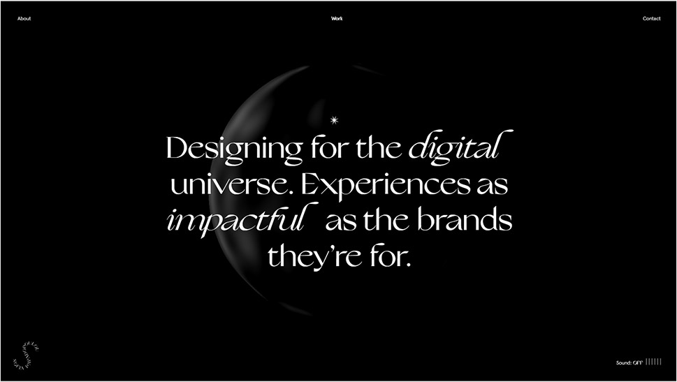
Sofia Papadopoulou is a Greek visual designer and art director who creates immersive, forward-thinking digital experiences. Her website embodies one of the principles she pursues in her work – to “uncomplicate and beautify.” It is a dark, elegant, modern design, featuring grey text on a black background, with a single star cursor that sheds light on the text it hovers upon, revealing that, despite the darkness, the sentiment behind the design is one of optimism and joy. The central, albeit discrete element of this single-page website is an animated 3D object, an irregular sphere with a wavy surface, made of a matte black material that resembles metal, perhaps iron, but it could also be a smooth piece of lava stone. As we scroll down the page, the object transforms, flows, morphs under a changing light, but never does its presence or its transformation take focus away from the main content – the text.
Wrapping It Up
Animated, static, chrome-like or matte, liquid metal is bound to add that extra oomph to a design. Sure, it can’t possibly be a good choice for just any website and any brand – as we saw, liquid metal needs a specific context in order to work. While many would automatically associate this style with futurism, it’s important to remember that at this point there’s really nothing futuristic about liquid metal. Retro-futuristic, then? Sure. Future-nostalgic? Definitely. The world we’re living in right now is in trouble and hauntological melancholia has been a pervading concept ever since we realized just how deep the trouble was, which accounts for so many derivative aesthetics and seemingly anachronistic references to past trends and concepts. But liquid metal in web design is more than just a nod to a cool past aesthetic. In web design, metal, or really any other matter, is free from the limitations of its physical form. It can shift, bend, drip and melt in any possible and impossible way and, as such, it’s an amazing resource for designers looking to imagine, construct and direct their own vision of the future, bright or bleak.
