Top 18 Free Elegant Fonts for Your Designs
The use and application of fonts plays a huge role in the intertwined worlds of marketing and design. Typography can have a significant psychological effect on viewers and influence the way they perceive a brand and its products. This is perhaps especially true on the web, where the choice of the right font can imbue a dose of credibility and permanence into the message that’s being conveyed.
The perfect choice of typography and font combinations greatly depends on the project type, but also on the designer’s skills. Web and graphic designers who use predesigned fonts in their daily work need to understand the nuts and bolts of typography and browse websites for downloading fonts in order to choose the best typefaces for each piece. On the other hand, professional type designers can create their own custom typefaces for specific projects, and adapt the style of each font to the project’s purpose.
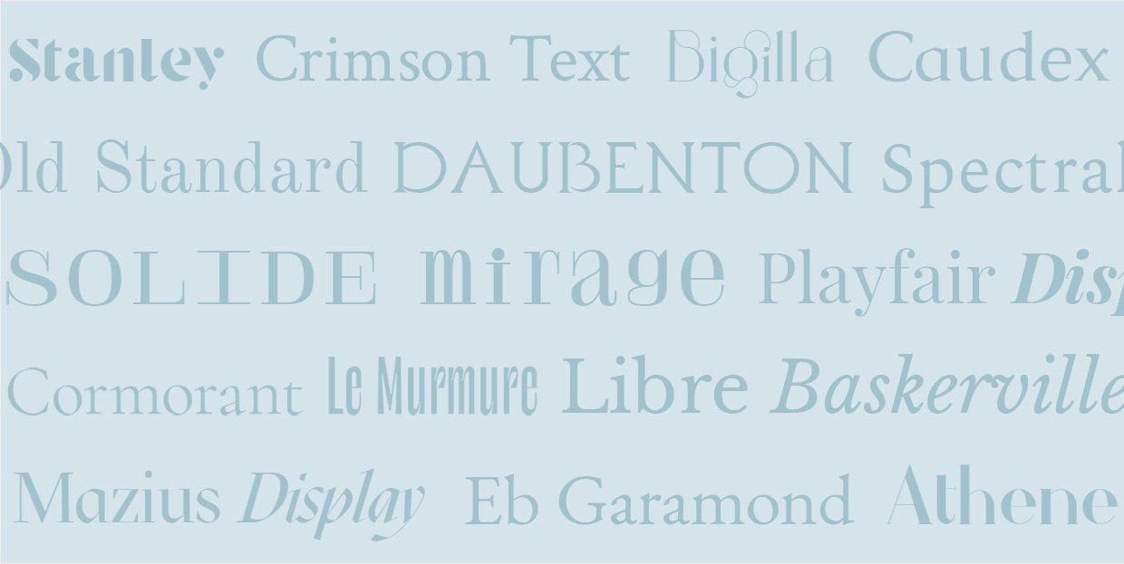
When we talk about elegant fonts, we usually mean fonts that are simultaneously sophisticated, luxurious, and classic. In this article, we’ll share a collection of elegant fonts that are free to use and that can be applied to a variety of contexts. All of these typefaces have a certain formal and luxurious feel to them. A style that can’t be easily replaced with some other, perhaps more common scripts. We’ve divided the fonts into serif and script fonts, so you can find what you’re looking for more easily. But if you’d like to jump to a specific typeface, just click on it’s link in the following list:
Serif Fonts
Serif fonts are mostly used for large chunks of text, especially in books and newspapers. Thanks to serifs a.k.a. small strokes at the ends of letters, this kind of typeface appears particularly traditional, refined, and sophisticated.
The following serif fonts will undoubtedly give an elegant appeal to your works, and best of all, you can download them free of charge.

Known as the most obvious representative of the French renaissance style of the 16th century and one of the key fonts of typography worldwide, the Garamond typeface can be easily recognized for its elegant forms and excellent readability. EB Garamond represents a revival of this style and relies heavily on the letter forms discovered in 1592 in an Egenolff–Berner specimen, hence its name.
Many type designers have lately tried to revive Garamond, but no font has come close to being as versatile as EB Garamond. In addition to the roman type, this font also features italic, Greek, and Cyrillic characters designed by Robert Granjon, a famous French typeface designer.
EB Garamond was released in 2011 by Georg Mayr-Duffner (an Austrian type designer) under the Open Font License. This means others can use, but also modify the font, and that’s how some OpenType features were added to this type, such as swash italic capitals, fractions, schoolbook alternates, etc.
Famous type designer Erik Spiekermann, who designed Berlin Grotesk, FF Meta Serif, Fira Sans, Nokia Sans, and many other fonts, has described EB Garamond as one of the best open source fonts. Its popularity comes as no surprise and many brands have opted to use it in their projects.
For instance, Studio Bonny, a creative agency, use EB Garamond in their body text, which gives their website a very elegant appeal.

Studio Bonny with EB Garamond
Here at Qode we also love this typeface. In our La Comète theme, we used it predominantly in headings, combining roman and italic characters, which allowed us to highlight the overall minimalism of this shop theme.

La Comète with EB Garamond
In the Fey theme, we achieved the modern, feminine look by playing with the heavier font weight and the combination of all caps in headings and bolder letters in the body of text.

Fey with EB Garamond

This transitional typeface was created by Claus Eggers Sørensen, a type designer based in Amsterdam. Playfair Display is one of the most common elegant fonts that designers use whenever they want to play things safe. When paired with some less bombastic typefaces, its high-contrasting letters with delicate lines typical of the 18th century become even more prominent.
The best way to use this font is in headings and subheadings, as we did in our Penumbra theme.

Penumbra with Playfair Display
It also works great on typography-heavy websites, such as Sacha Tourtoulou’s site or the Brynn theme, where typography is one of the key design elements.

Sacha Tourtoulou with Playfair Display

Brynn with Playfair Display
Whether you use it in its regular or italic variations (with the right letter-spacing thrown into the mix), the all caps version of Playfair Display highlights the sheer elegance of this font, as seen in the Attika theme.

Attika with Playfair Display

Inspired by the Garamond type, the beautiful shapes of old fonts, and the works of Jan Tschichold, Robert Slimbach, and Jonathan Hoefler, the best feature of the Crimson Text font family is its functionality.
You can use it in both headers and less prominent pieces of text – it’s easily readable and looks sophisticated, too. The perfect adaptability of this font family shines through in details, for example when italic and all caps letters are used, as seen on the Anecdote Candles website.

Anecdote Candles with Crimson Text
The combination of smaller italic letters and more dominant sans serif typefaces also looks very appealing, as our Roisin theme beautifully demonstrates.

Roisin with Crimson Text
Another website that wonderfully depicts Crimson Text in action (especially its use in smaller font sizes) is Triple Canopy.

Triple Canopy with Crimson Text
On the other hand, our Bard theme illustrates how this font family looks when used in large headlines, which is another testament to its flexibility.

Bard with Crimson Text

What makes Old Standard specific are the truncated and classic-looking letter shapes, typical of the late 19th and early 20th century. This typeface is not so commonly seen on the web, and it’s certainly a brave choice if you decide to use it in your projects.
Marcel’s website is an example of the Old Standard font used in the body of text and headlines (the bold variant).

Marcel with Old Standard
In the Sahel theme, we’ve opted for the minimal approach fonts-wise and have used it exclusively in headings.

Sahel with Old Standard
Because of its lovely forms, this typeface is popular in print design and branding. Gabriel Figueiredo has used it to create wedding invitations that simply ooze sophistication.

Gabriel Figueiredo with Old Standard

The Cormorant font family further proves just how much the Garamond group of typefaces influenced today’s typeface designers. It was a major inspiration for Christian Thalmann of Catharsis Fonts, who created the Cormorant type family which counts 45 font files, 9 different visual styles (Roman, Italic, Infant, Infant Italic, Garamond, Garamond Italic, Upright Cursive, Small Caps, and Unicase), and 5 weights (Light, Regular, Medium, SemiBold, and Bold). His main goal was to restyle Garamond and give it a new, modern look. He’s made it suitable for both print media and web, ensuring it looks timelessly elegant in all sizes.
Cormorant Garamond
Cormorant Garamond relies heavily on the letter shapes typical of the Garamond type family.
Calcaterra’s website is an example of how this neat font can contribute to the modern and fashionable appeal of the brand, even when just moderately used.

Calcaterra with Cormorant Garamond
We’ve also opted for this font in the ChapterOne theme, specifically in titles and paragraphs, and as you can see, it fits wonderfully with the theme’s sophisticated design.

ChapterOne with Cormorant Garamond
On the Dvi Tylos website, the authors have used Cormorant Garamond in the body of text, where it perfectly matches the rest of this marvelous, delicate-looking site.

Dvi Tylos with Cormorant Garamond
Platypus Press, Laura Sauchelli, and Creme Guides have all built their websites relying on this timeless, classic typography that’s also one of the most prominent elements on each of these pages.

Platypus Press with Cormorant Garamond

Laura Sauchelli with Cormorant Garamond

Creme Guides with Cormorant Garamond
In the Solene theme, the combination of titles in all caps and subtitles in italic creates a refined look, typical of wedding websites.

Solene with Cormorant Garamond
A more prominent, bold version of this font can be seen in the MindCare theme’s titles, giving the theme a truly professional appeal.

MindCare with Cormorant Garamond
Cormorant Garamond also looks amazing as the main typeface in a project, as the Banquet theme illustrates. Banquet is quite minimal, and so the italic version of the font marvelously complements its character and gives it a luxurious vibe.

Banquet with Cormorant Garamond
Cormorant Infant
What sets Cormorant Infant apart from the Garamond version of the font are slightly more stylized letter shapes. And because of these shapes, it’s almost a pity to use Cormorant just in the body of text, as they won’t be as prominent as they deserve to be.
By emphasizing the uniqueness and the elegance of the bird after which this font is named, the beauty of its letter shapes shines through and captures visitors’ attention on Vasantha Yogananthan’s website. The textual content here is unobtrusive and it flows wonderfully.

Vasantha Yogananthan with Cormorant Infant
Cormorant Infant is far more prominent on the Read Wildness website, where poems are displayed in a minimalist fashion. This emphasizes the finely shaped Garamond-styled letters that have been used just like in the old days – for writing poems, but this time round using modern-age technologies.

Read Wildness with Cormorant Infant

Dolcino with Cormorant Infant

Tiare with Cormorant Infant
Cormorant Unicase
Cormorant Unicase represents an amusing play of a lower-case font in combination with other lower-case letter shapes.
Here, the archaic Garamond shape now gains a futuristic form that’s mainly used in titles, as seen in the Eola theme.

Eola with Cormorant Unicase

Libre Baskerville is another Open Source typeface modelled after American Type Founders Baskerville from 1941, which is one of the most popular classic book fonts, known for its sophistication and readability. Libre Baskerville is optimized for the body text, it has a slightly taller x-height, and less contrast than ATF Baskerville, which ensures better on-screen readability.
Its elegant book-like shapes can be seen on the Typozon website where italic, graceful letters dominate the pages coloring them with the spirit of the times passed.

Typozon with Libre Baskerville


Spectral is created by Production Type, a famous French type design agency.
It’s well-readable, even when smaller letter sizes are used (e.g. the Polytechnic website), but also very effective and graceful when paired with sans-serif typefaces, e.g. the Querida theme. This visually appealing typeface comes available in 7 font weights, both roman and italic styles, and small caps.

Polytechnic with Spectral

Querida with Spectral
It’s suitable for print, too. To see more of it in action, check out the Kick website.

Kick with Spectral

Stanley and Bigilla are display serif typefaces made by Jérémie Gauthier.
Bigilla is a multilingual font that has two font weights – regular and bold, and it contains numerous ligatures and alternates. It is intended for personal use only, although you can use it for commercial purposes if you donate to the author. This font comes with wonderfully ornate shapes that work best for branding purposes, on posters, packaging designs, and in magazines. However, Bigilla can also look amazing on the web, as the Think Bear website demonstrates.

Think Bear with Stanley and Bigilla
Stanley, on the other hand, is a completely free typeface you can use for personal and commercial purposes. Its bold, cut, stencil shapes look incredible both in print and when used for web projects.

Le Murmure is an Open Source font that was created by the type designer Jérémy Landes of Studio Triple for the rebranding purposes of the Murmure agency.
Le Murmure is mostly a title font, with elongated, solid, sophisticated letters. But the calligraphic side of this typeface demonstrates the designer’s willingness to experiment, as well as his creativity. This is a semi-serif kind of typeface, meaning it lies somewhere in between the traditional serif letters and the modern sans-serifs. Hints of classic, elegant serif strokes are clearly visible, which is why we’ve included it on our list. It looks utterly effective, legible, and unique, as best seen on the La Septième Obsession website.

La Septième Obsession with Le Murmure
Relying on countless stylistic variations, the author has created a distinctive and refined editorial font that can also be used as a display typeface, like on the 100 Days of Poetry website.

100 Days of Poetry with Le Murmure
The font is available on the Velvetyne Type Foundry website, and to use it, you just have to credit the author.

Solide Mirage is another display typeface created by the same designer as Le Murmure, Jérémy Landes. It is inspired by the Didone genre and the music of the Frànçois And the Atlas Mountains band (the font was originally created to replace the band’s former name tag). This is a unicase font that contains a mix of lower and uppercase letters, where the former appear quite compressed and strong, while the latter look utterly classical.

Frànçois And the Atlas Mountains with Solide Mirage
This distinctive type is particularly suitable for large-sized texts, e.g. Yvette Borup Andrews’ website, where large Solid Mirage typography takes the center stage.

Yvette Borup Andrews with Solide Mirage

The Daubenton font, created by Olivier Dolbeau, is a typeface coming from the Velvetyne Type Foundry. This font represents a digital revival of the engraved letters on the façade of the Great Evolution Gallery of the Natural History Museum in Paris and it’s named after the museum’s first director. Daubenton is characterized by classic shapes that have gained a new, modern look, which makes the typeface suitable for branding and web design, as seen on the Anecdote Candles website.

Anecdote Candles with Daubenton

Athene Font is a free, slab-serif font known for its sharp geometric shapes and the contrast among them. As a display font of elegant proportions, this typeface is suitable for some specific projects, such as the creation of portfolio websites, e.g. Victor Work.

Victor Work with Athene Font

Mazius Display was designed by Collletttivo, a type foundry that makes free typefaces. The regular version of this font, combined with its two italic versions, looks very expressive and attention-grabbing. Mazius Display is characterized by high-contrasting old-style shapes and a pronounced calligraphic feel. To see it in action, check out the Sidebearings website.

Sidebearings with Mazius Display
All in all, Mazius Display is an excellent choice when you want to emphasize textual content, and it’s great for headlines. If you’re on the lookout for some more similar display fonts, check out other typefaces created by Collletttivo.
Top WordPress Themes for All Creatives
View Collection


Script Fonts
Script fonts derive from calligraphic writings. There are numerous type designers that specify in creating such fonts and there’s also a myriad of these typefaces online. You can get a lot of them for free, either on websites that promote this kind of font or directly from designers that wish to market their work.
Script typefaces are not as common and they usually come in just one or two font weights. They’re elegant, functional, and mostly used for describing smaller details on websites rather than for the extended body of text. The following script typefaces will give a sophisticated look to your projects and are available for free:

Miniver and Mrs Saint Delafield were both used in our Laurent theme, the former in headlines and the latter on sliders. We wanted to go with Miniver because this cut-out typeface can easily capture the visitors’ attention, while Mrs Saint Delafield was minimally used, considering the fact that too much of it could look illegible.

Laurent with Miniver and Mrs Saint Delafield
Both typefaces were created by Sudtipos, an Argentinian type foundry that modelled these fonts after old calligraphic and handwritten characters. In our Lumière theme, we also went with the Mrs Saint Delafield font and used it in a completely unobtrusive way. We opted for delicate colors, too, and this particular combination of letters and hues gave the whole theme an archaic vibe.

Lumière with Miniver and Mrs Saint Delafield

Herr Von Muellerhoff is a traditional and elegant font with lots of vintage features. The letters look serious and sharp, with larger upper strokes that make this typeface appear distinctive and unique. Herr Von Muellerhoff is primarily used whenever you wish to add bits of text that look as if written by hand. It’s just as good as some similar, expensive typefaces on the market, and looks beautiful when paired with strong sans-serif fonts as seen on Rosa’s website.

Rosa with Herr Von Muellerhoff

Quentine is a font created by the Get Studio that specializes in calligraphy and creating handwritten fonts. This font is characterized by rough strokes that look as if made with the dry brush, but the letters still appear natural, and so you can use this font for all kinds of purposes. Considering its signature style, it’s widely used for making social media ads and product packaging. It also looks amazing on websites, e.g. the Ophelie theme, and in combination with more delicate shapes, e.g. the BonVoyage theme.

Ophelie with Quentine

BonVoyage with Quentine

Tuesday Night is a signature typeface made by using handwritten letters. It was created by Font Forestry. The capital letters are large and prominent, which gives this typeface a distinct look. This font is very elegant and therefore can be used for wedding invitations, logos, decorative quotes, scrap booking, various web projects, etc. We’ve also used it in two of our stellar themes, Roslyn and Sweet Jane.

Roslyn with Tuesday Night

Sweet Jane with Tuesday Night
Let’s Wrap It Up
Fonts are a tremendously important aspect of every design and the choice of appropriate typefaces is often crucial to the success of a project. In one of our previous articles we introduced you to the tools that can help you identify fonts, so the moment you see a type you like, you can immediately discover more details about it. But if you’ve ever identified and then looked up elegant fonts before, you’ve noticed they can get rather expensive, which is why we wanted to facilitate your quest and offer you a selection of 18 stellar, elegant fonts you can download free of charge. Some of them may not be suitable for commercial purposes, but if you credit the author, or, in some cases, make a small donation to them, you’ll be good to go. By including examples from the web where each of these fonts were used, we wanted to show you how they look in action so that you can better decide which one of them might suit your project best. At the end of the day, no matter which one of these typefaces you decide to incorporate into your designs, you’ll surely leave a lasting impression on your audience.
