10 Web Design Mistakes to Avoid in 2024
Whether you’re looking to revamp your website design or you’re starting a brand new site from scratch, you’re probably aware of how tricky it can be to get the design just right. Good web design is so much more than just aesthetics. A website needs to be engaging, useful and pretty, and that’s a combination that’s not easy to achieve. It helps to be aware of certain mistakes that many make when designing a website, and to make sure to avoid them.
That’s why this time around we decided to give you a handy list of the most common WordPress web design mistakes you should avoid in 2024. We based it on insights related to usability, UX and current web design trends. Things change so fast in web design, so it can be hard to keep track of what’s hot and what’s not. Still, there are some things that can be considered evergreen, and which you should never ignore. Let’s dive right into the biggest don’ts of today’s web design.
Qode Themes: Top Picks
View Collection
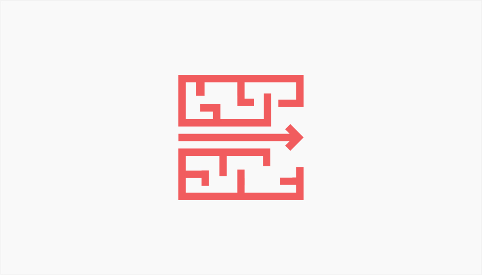
Website navigation is a lot like air quality. When it’s good, you don’t even think about it. When it’s bad, you can’t stop noticing it, and it’s incredibly annoying and off-putting.
Navigation is supposed to gently guide the visitor wherever he or she wishes to go on your website. It’s not something a visitor should have to look for, to try to figure out or to put any effort into. Whether we’re talking about menus, links, headers, footers or buttons, they are supposed to be located just where the visitors expect them to be. A bit of experimentation is always welcome, though, as long as it respects common sense and the best UX practices. And as long as it’s not too crazy, of course.
As we saw in our article that explores interesting menu designs, website navigation can and should be exciting and practical, beautiful and useful. It can be innovative, as long as it does not confuse the user.
Clean, intuitive, straightforward navigation will help you convert more and will reduce your bounce rate. And, thanks to elegant design solutions such as fullscreen menus that open through a hamburger icon tucked away in the header, side menus, interactive links and similar, your navigation can meet both the aesthetic and the functional criteria.
Remember: navigation must not be too complicated and/or hard to find.
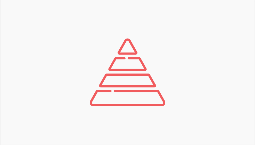
A sense of hierarchy is something inherent to all humans, psychologically speaking. We tend to organize things according to their relevance, size, importance, impact and relevance. We don’t approach everything at once. Instead, we follow a hierarchy and organize the information in our mind accordingly.
Good web design should always mind this fact. To create a smooth user experience, you need to organize the content of your website into coherent units that function just as well individually as they do as a part of the whole. Use headlines and subheadings to create the hierarchy and don’t forget the white space between the units. This way, the information will be presented in a coherent and hierarchical way that will allow your visitors to consume the information gradually and compartmentalize it according to relevance.
Don’t forget that the H-tag hierarchy is also vital for your SEO. The headings tell search engines what your page is about and how it’s structured. When crawled properly, with proper information, the page will have a better chance of ranking on SERPs.
Remember: your design should reflect the hierarchy of your content.
Every website has a purpose. A portfolio website serves to display your works. A blog is for sharing your thoughts or insights. A directory website serves to provide information. A business website serves to promote your brand and help you grow clients (and sales). And the purpose of the website needs to be conveyed clearly.
The message is conveyed through design just as much as it’s conveyed through copy. The two need to complement each other and the design should serve to highlight the message and serve it visually to the visitor in a way that leaves no doubt as to what the website is for and what the visitor is expected to do.
Unfortunately, driven by the dubious “more is more” trend, many designers feel like they need to fill the page with visual content – boxes, marquees, image sections, sliders and carousels. Oversaturated pages do not communicate anything except perhaps chaos.
One of the best design means to make sure the visual aspects of your website supports and communicates the message clearly is the white or negative space. It makes your pages breathable, sets different pieces of content apart hierarchically and otherwise, and highlights your message and your purpose.
Remember: let your design speak about your end goal.

Statistics show that in late 2022 well over half of global web traffic came from mobile devices. In mobile-first markets, that share is even larger. What this means is that more people are likely to come to your website on their phone than their computer. And this, in turn, means your website needs to be mobile-ready and responsive.
Responsive design is design that adjusts to various screen sizes. It means designing your pages in several variants so that the appropriate one is displayed according to the device it’s viewed on. Today, responsive design is a must, so if by any chance you forgot to take care of it when designing your website, make sure to do so right away.
Even if your design was optimized for mobile, you should check anyway. You can view the mobile version of your pages from your desktop and then tweak whatever needs to be tweaked.
Pay particular attention to your mobile menu. Your website’s mobile version may include a menu that is not appropriate for smaller screens and if your WordPress theme does not come with a mobile menu, you may have to create one.
Remember: if your website is not responsive, you might as well shut it down.

Even if creating a design that dazzles and stuns the visitor is in line with your (or your client’s) branding, that doesn’t mean it should be laden with tons of popups, banners, marquees, sliders and whatnot. The same goes for functional features that you don’t really need. For example, it’s okay to have a client carousel if it fits well in your design and does not contribute to clutter. Similarly, full-width sliders can be a great addition but they can also annoy the visitor by occupying the viewport and instilling constant movement.
Techniques like scrolljacking (in which the scroll doesn’t behave the way the visitor expects and instead moves too fast or too slow, or sideways) or immersive 3D experiences rarely work as intended. More often than not, they irritate the visitors instead of impressing them.
The bottom line is – never include elements in your design just for the sake of having them there, forgetting about the good UX practices.
Remember: good web design means applying good measure.
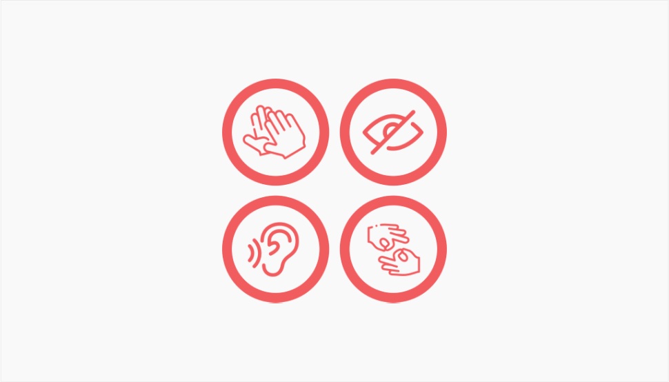
Accessible design is another contemporary imperative that you should never overlook. A lot of designers fail to understand the meaning of accessible design. It is not about catering to the differently abled, who may be a minority. It’s about creating a user experience that benefits all users and contains vital elements that everyone can access and consume.
There’s a lot to be said when it comes to improving your website accessibility but perhaps the simplest way to understand it is to remember that many of your visitors will be using assistive technology. This technology “reads” your website which means your design elements should include accessible labels that make this process possible. If your links or buttons, for example, are associated with visual components that complete the information, some visitors may not be able to use them as the accessibility tech may not pick up on that association. This particular case can be solved by providing more written information in the link or button.
Remember: design for everyone, regardless of the ability.
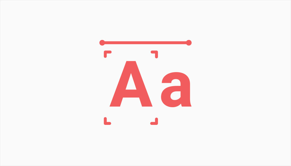
Choosing the right fonts for your website is never an easy job, considering the sheer number of fonts in various free and paid packs. However, what’s perhaps even harder is stopping after picking three or four types of fonts to use. The font libraries offer such a great choice of typography that we often feel tempted to use dozens of them for the content, elements like header and footer, sidebars, various widgets, forms and links. Before you go and treat your font library like it’s a tub of icecream on a depressing night, remember that having too many fonts is never a good idea.
Consistent typography is important for ensuring consistency and cognitive fluency. It also helps users maintain focus. Finally, when the typography is coherent, it helps convey your message more clearly.
If you’re not sure how many fonts is too many, bear in mind that no website needs more than two to four different fonts. Also, make sure to pick the fonts that match well with each other and also with your content.
Remember: then it comes to fonts, less is more.
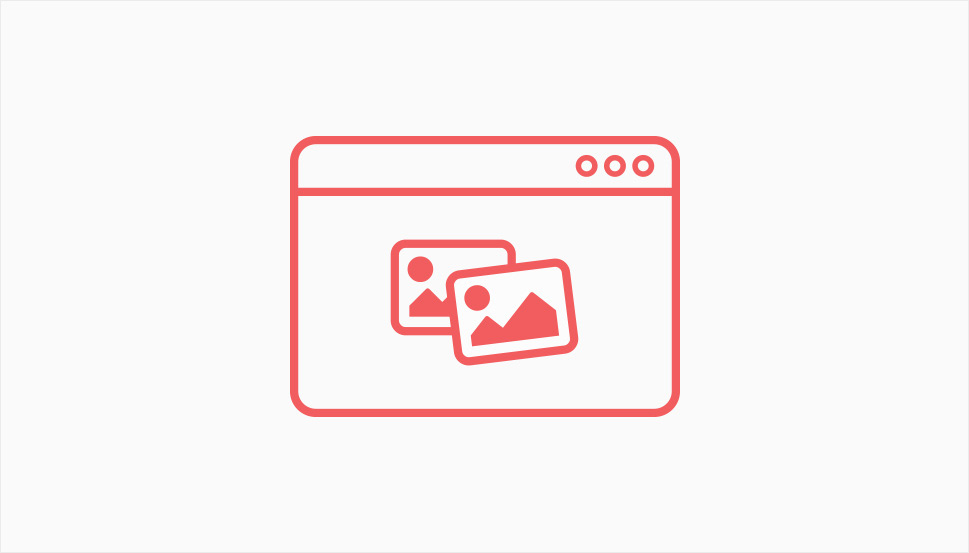
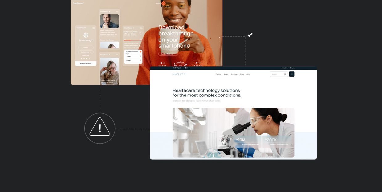
“A picture’s worth a thousand words” may be a cliche but it’s nevertheless true. According to HubSpot, visual content makes up to 93% of human communication. Whatever can be told with an image, should be told with an image. This doesn’t just mean pretty pictures. In fact, as we’ll see soon, too many pictures that don’t serve a clear purpose can be damaging for the UX and can impede clear communication.
Infographics, on the other hand, are a whole different pair of sleeves. A good infographic can substitute entire blocks of text, which a lot of people won’t even read. These days, anyone can add an engaging infographic element to their WordPress website, thanks to various addons for Elementor and blocks for Gutenberg.
Infographics shouldn’t be the only visual element in your design. Blocks of textual content can and should be broken up by appropriate imagery, photographs that illustrate and explain the content, as well as videos, animations and sliders. All these visual elements bring your design to life, add layers of meaning and when done right, delight the users with their aesthetic qualities.
Remember: let the visuals tell your story.
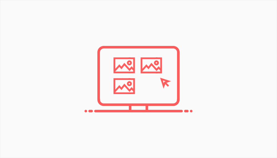
We saw that your pages need visual content. More precisely, a good amount of visual content. Too many pictures, illustrations, carousels and infographics can be just as bad as pages with just plain text. But, how to know how many visuals are too many?
There’s a simple and true rule that says – if your visuals do not support or enhance your message, you don’t need them. Slapping images on your website just for the sake of having them there can be disastrous from several angles.
First, they can oversaturate your pages, make them stuffy and cluttered. Your visitors need breathing space, and a dense collage of pictures and illustrations does not provide that.
And second, too many visuals obscure the message. While a good piece of visual content can be the message itself, too many visuals, especially if mismatched, will make it hard for your visitors to understand your narrative.
Finally, you should try not to use photos that are obviously free stock material, or too many stock photos. It just gives off a bad impression.
Remember: once again, less is more.
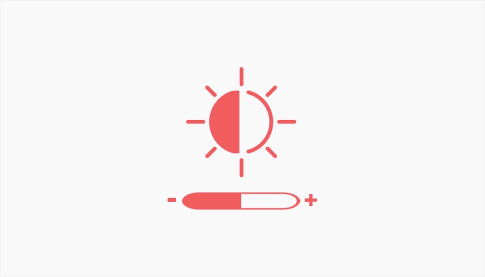
The question of contrast is, above all, an accessibility issue. However, poor contrast can affect UX regardless of the visitors’ abilities. Insufficient color contrast makes it difficult for people with visual impairments to consume the content of a page, as it is hard for them to distinguish between the background and the elements in the foreground, such as text, buttons and links. Obviously, an accessible website design needs to assure the contrast is appropriate for people with such impairments. But, as we said, poor contrast can affect everyone. No one likes to strain their eyes when reading. In addition to the typeface that is too small and with inadequate line spacing, poor color contrast affects the readability of the text and will definitely upset your visitors.
It’s understandable for brands to want to use their brand palette consistently throughout all channels, including the web. However, if your brand colors do not assure sufficient contrast, you need to tweak them so your content is easy to consume.
Remember: provide contrast that guarantees high readability.
Wrapping It Up
Design is something that greatly determines the success of your website. These days, we’re witnessing all sorts of design innovations, aiming to dazzle and impress the visitors with aesthetics and modern solutions, pushing the boundaries of web design as such. While this is a great thing by all accounts, it can also be risky, since designers sometimes forget the basic best practices and sacrifice good UX for innovation.
Hopefully, 2023 will bring yet new exciting things in the field of web design, with the rise of VR, AI, immersive storytelling experiences and who knows what else. But we have to think about practical things, too, which is why it’s a good idea to keep these common website design mistakes in mind and avoid them.
