11 Examples of Creative Page Transitions
Transitions are today considered a vital part of UX design. Flat and static design is no longer a viable option for any sort of website, let alone one that aims to increase its traffic and conversions. Interactivity has long stopped being merely a trend – today, it’s a must. Mobile web design, which, naturally, has its own set of rules due to its inherently different nature and build, has influenced a lot the way users perceive web as a whole. Even on desktop, we expect skeuomorphism, we expect motion, and we expect fluency. While definitely not the only factor, page transitions certainly play an important role here.
Why are page transitions so important? Why can’t we simply make a new page load without any “special effects?” The answer, to a great extent, lies in continuity. When designed and animated properly, page transitions assure a sense of fluidity in the journey between different site locations. No abrupt stops, no waiting for a page to load while we stare at an empty white space. With transitions, we are engaged, amused and, oftentimes, delighted. We are carried through the journey without having to bother about its steps and stops.
In addition to providing visual continuity, page transitions also keep the visitors engaged and entertained. Depending on what you’re trying to achieve and what’s in line with your brand and style, you can have your users go “Wow, that was cool!” or “Oh yes, that felt nice.” Because today the digital world and the online realm are so intrinsically connected to our “actual,” physical existence (and to an alarming point, some might add), what we experience online translates to what we feel IRL. Well, to an extent, at least. So, a smooth navigation experience, of which page transitions are an important element, guarantees positive feedback and work towards better retention and, ultimately, conversion.
Deciding on which exact sort of page transition to apply, what kind of animation, the duration, the movement to design – these can be tough choices. After all, not all transitions we see online are good. Some are over the top, some are inappropriate for their wider context, and some are poorly executed. Then again, there are page transitions that are designed and carried out perfectly and add enormous value to the overall design. Today, we’re going to go through some of them. Stay tuned as we check out:
Top Themes for Creatives
View Collection

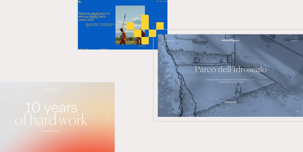
Lama Lama is a creative digital company from the Netherlands with a rather memorable online presence. The animated logo introduces the leitmotif of figures made of large pixel-like fields, repeated in the cursor effect, which leaves a trace of squares forming shapes. This reflects one of the pillars of the agency philosophy, and that is playfulness. Each page transition involves a rapid masking effect reminiscent of old-school arcade games, with a quick color fill consisting of a mass of enlarged pixels. The animation is simple so it doesn’t hamper the UX by slowing the loading times down and provides a quick and fun passage to the next destination.
The website of the digital creative studio Synchronized is a wonderful exhibition of the studio’s superb taste and technical adeptness. It is full of delightful elements and details, like the neon-green line that is drawn as we move the cursor around, not disappearing, but instead leaving a traced path of our movement. When clicked, each of the showcased projects expands in the form of a fullscreen popup, so it’s not necessarily a page transition, rather a page opening we’re looking at here. Still, the elegance of these pages, and the lovely fluid animation that accompanies the transition (resembling a piece of paper submerged in water, or perhaps a photograph dipped into the developing fluid), make it worthy of the appearance on this list. The animation is repeated, although in reverse, when the popup is closed as the “paper” softly falls back into its original position on the project list.
The website of the award-winning Greek creative director and designer Haritos Constantinos dons a minimalist, predominantly monochromatic layout with several interesting touches created to spice things up. For the page transitions, Haritos opted for a simple but striking SVG morph based on the contrast between black and white. The upward color fill usually ends at the top of the page, but here it softly bounces back down, like a gentle but powerful wave sliding in and out on the shore. At this point we’d like to note that the SVG morph transitions are quite popular these days and can be seen plenty. For instance, the Montreal-based agency Kffein employed a similarly reduced palette with both vertical and horizontal morph transitions, sometimes even in the same (or almost the same) color as the background of the current page.
Alessandra Zanghi is a destination wedding consultant based in Lago di Garda, Italy, whom we already talked about in our piece on pink websites. Her website is basically everything you’d want your wedding to be – tender, sophisticated, beautiful and smooth. What contributes the most to this sophisticated character are the page transitions, if they can be considered transitions, since the page (and its URL) remains the same, but elements go through a soft, elegant change of place within the layout, creating a sense of being on a different page. Alessandra’s story is told in chapters, so these transitions make a fitting choice, gently carrying the visitor from one point to another and then yet another.
Something similar, although with actual transitioning to a different page, can be seen in the online portfolio of the designer and writer Hoang Nguyen. The blog page consists of a list of posts that can be viewed as a grid or as a list, and both options include elegant page transitions with the edges blending into the background as the list item appears to expand to the point of taking up the entire page, in a fade to white transition.
The innovative (not creative – mind you) Lēonard agency is our old acquaintance from the piece on the stunning gradient websites, in which we focused on the chromatic merits of their wonderful website. Today, we want to point out the transitions, which, again, may not qualify as page transitions per se, and could be considered interactive links, in that they transform when interacted with, leading the user to the designated location. Links come with different transitions, fading out, sliding left, right or askew, always maintaining low contrast with the gradient background. The entire composition is therefore balanced in its subtle dynamicity, and the transitions give the website a distinct sense of fluidity.
The website of the Belgian multidisciplinary designer and art director Glenn Catteeuw bears a distinct geometric quality, with plenty of grids, cubes, sharp lines and triangles. The main page rolls between different sections as the user clicks on About, Work and other links, but can also be scrolled, of course, with the same effect. The Work section features select projects which, when clicked, burst open in a striking animation made of cloud forms and geometric forms on a dark background with a noise texture. The transition is smooth and in perfect line with the overall gloomy character of the website.
To support the SS21 collection, the fashion house Salvatore Ferragamo created a lovely interactive project, a game in fact, called The Metropolitan Enigma. The visitors are called to solve three mysteries, which consist of simple yet engaging little games presented through illustrated narratives. To pick a mystery, we are invited to click on one of the three maps. This prompts a gorgeous cloud-like transition, with the image gathering like clouds in front of the sun, and vice versa, but it also resembles the way paper burns, from the center to the edges. Combined with the illustrations, the music and the palette, these transitions help form a unique mood – elegant, classic and timeless.
Spatzek Studio is a web design and development company creating web solutions, most notably limited ready-to-go websites at affordable prices. The studio website unites boldness with simplicity, through big sections with large and very large typography and a simple palette reduced to black, white and a lovely shade of rust. And precisely this last color is the main protagonist of the page transitions on the studio website. When clicked, links to inner pages prompt a fullscreen blinds effect in the rust orange color combined with black. The effect is short and striking, and the color choice gives off a slightly retro mood, reminiscing the ‘60’s and ‘70’s design trends.
Something very similar can be seen in the website of the creative and branding agency C8, where the palette is also reduced to three colors – black, white and red, and the same blinds transition, but this time vertical instead of horizontal like in the case of Spatzek Studio. The folks of Design Canada have something similar on their website, with thicker, horizontal lines gradually filling the screen during page transitions.
We have already covered the wonderful project Disrupt by OuiWill in our piece on stunning deep green websites, but the San Francisco-based digital brand agency deserves another mention, this time on account of the wonderfully designed page transitions. Similarly to Spatzek, C8 and Design Canada, Oui Will opted for a transition based on linear sections. However, more than simple Venetian blinds effect, the transitions here involve wider, asymmetrical areas that open and close, moving from the diagonal to the vertical positioning. There’s something cinematic in these transitions, reminiscent perhaps of some older James Bond movies. The transitions are consistent with the rest of the layout in terms of the palette, being based on the same deep green, combined with black, guaranteeing a smooth and fluid visual experience.
Save Whales is a project created by the award-winning Red Collar agency with the goal of raising awareness about five endangered whale species and some tips on how we can help them. The project is very realistic, with 3D models of whales that can be moved around, as well as animations and sound effects. The list of species is given as a horizontal scrollable list but does not feel like a list at all – the animals are presented in their natural surroundings in fullscreen images, maximizing the immersive effect. When clicked, each item opens a new page, with illustrated transitions that represent waves or splashes of water. The transitions were made by hand, involving 66 rendered frames. The agency made sure the amount of animations on the website doesn’t overload the browser by transferring them to HTML5 Canvas and applying background media loading.
The Belgian Kikk Festival of digital creativity is known for crafting visually innovative and inspiring programme showcases for each year’s edition. We’ve talked about the 2021 edition in our piece on websites inspired by poster aesthetics, while the 2019 edition was featured in our list of the best pink websites. This time around, we’re going to check out the programme for the Kikk Festival 2018. The website dons a playful, beautifully balanced character based on a youthful, optimistic blue, with animated hand-drawn illustrations and a circular cursor in pink. But enough about the layout – we’re here to check out the page transitions. These follow the joyous, optimistic vein of the entire composition and consist of splashes of blue, coming from different directions for each link. The festival theme for 2018 was Species, which is hinted to both in the illustrations representing microorganisms and primitive vertebrates, and in the splashes and the overall fluid character of the site, reminiscing the primordial soup from which we all evolved.
Wrapping It Up
So there you have it. We have seen some truly terrific examples of page transitions – smooth and elegant, flashy and bold, organic and subtle. Some of them use the same or similar animation effects, some are innovative and unique. But did you notice they all have one thing in common? What would you say that is? It’s hard to put a finger on it precisely because it’s something that should be felt or intuited, not perceived explicitly. And that is fluidity and smoothness. A good page transition carries us away from a page, to our desired location, on tender, soft wings that glide smoothly through the ether, so to speak. Poetry aside, all the transitions we saw today are crafted to the most minute detail, and impeccable coded. No halts, no glitches, no stops, both visually and technically. Just an uninterrupted navigational flow. And that’s the gist of good page transitions.
If you know of other page transition examples that you think merit the attention and praise, don’t hesitate to drop us a line in the comments section.
