18 Best Travel Websites and Blogs Made With Qode Themes
The travel industry, as one of the most profitable, competitive, and successful businesses in the world, relies heavily on the Internet. It fully exploits its power, trying to anticipate the needs of the digital-age consumers who prefer to get the necessary information and book their trips online.
Travel agencies and tour organizers use websites to encourage and persuade clients to visit exciting locations around the globe. They do this by imbuing pages with picturesque visuals and fun, straightforward content about each destination. Another thing often found on travel sites are user testimonials, since social proof stands as one of the most successful marketing strategies that helps brands build a winning reputation and secure higher conversion rates.
Creating a beautifully designed website that flaunts every aspect of your business and inspires visitors to pack their bags and go on an adventure requires a high-quality travel theme. That is why many successful agencies and bloggers decided to trust Qode themes to help them craft professional sites. In this guide, we will walk you through a selection of some of the most memorable examples from around the web that illustrate how Qode themes can help you present your travel business and showcase all the services you provide. The websites we will talk about include:
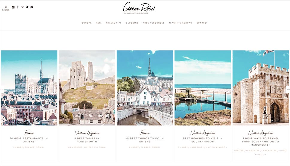
Glitter Rebel website made with the Backpack Traveler theme
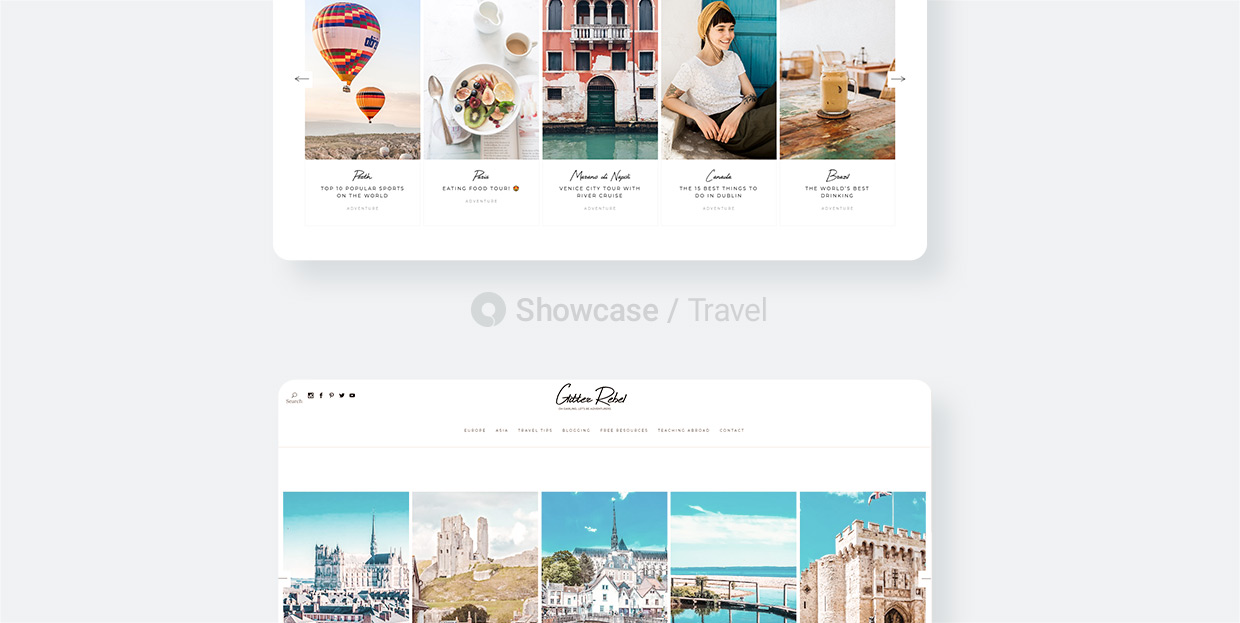
Glitter Rebel is a site run by a young couple who travels the world and shares its stories on this interesting travel blog. Backpack Traveler’s prebuilt blog templates allowed them to introduce their content in an exciting way and enrich their articles with vivid imagery and embedded videos. All of the theme’s elements are highly flexible and customizable, which enabled the Glitter Rebel duo to not only blog, but also share travel tips and advice on how to teach abroad. The theme integrates with all popular social channels, enabling readers to share the blog’s content on social media. The helpful search button is displayed in the header but you will also see it in the sidebar on blog singles, allowing you to quickly find entries on the topic that interests you the most.
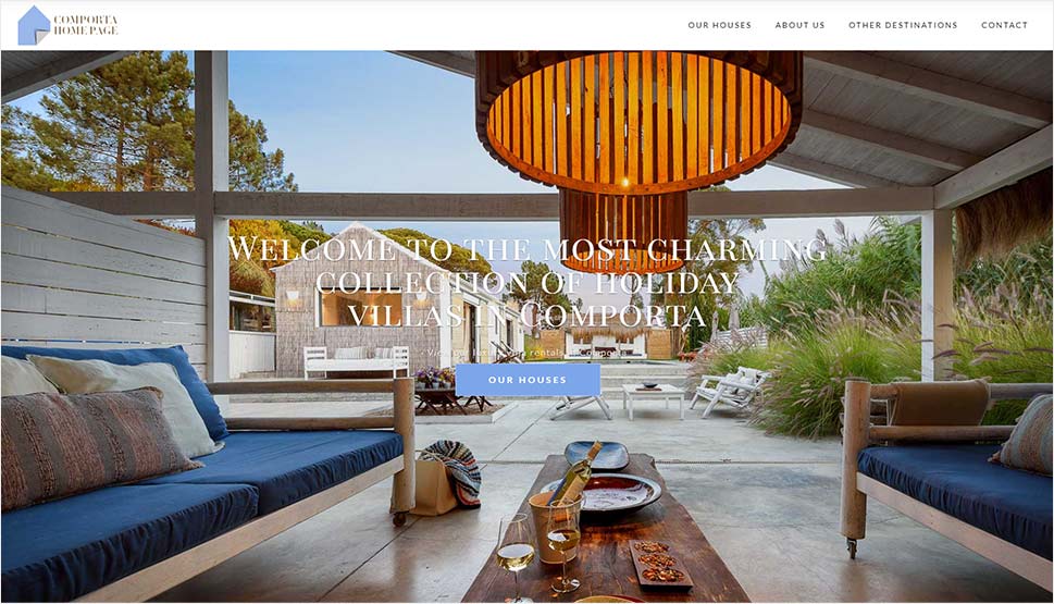
Comporta Homepage website made with the BonVoyage theme
Comporta Homepage has customized the BonVoyage theme to their requirements and created a website that showcases their villas and destinations in luxurious light. House lists include preview images, information about the number of guests each house can welcome, and the number of bedrooms. Single pages contain more details about the selected property, its key features, location on Google maps, and an extensive metro-style photo gallery. There is also a booking form with a calendar, allowing you to check the availability for the desired dates.
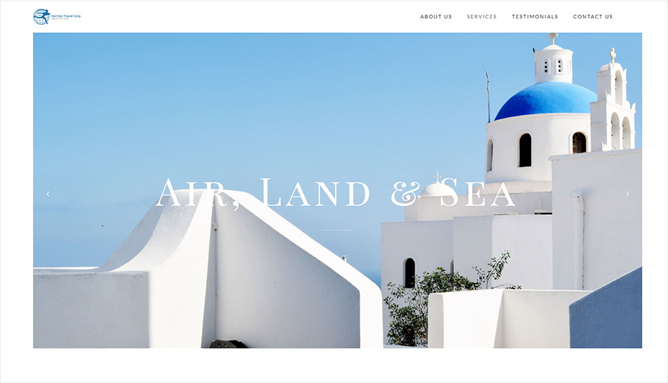
Hermes Travel Corp. website made with the BonVoyage theme
Hermes Travel Corp. created a contemporary and elegant presentation of their services using the BonVoyage theme. The homepage and inner pages alike are filled with eye-pleasing, large imagery, and information about available destinations. The parallax effect on tour singles enhances the users’ visual experience and gives a contemporary feel to these pages. To convince users that Hermes Travel Corp. is the right team for the job, the agency has created a page dedicated solely to user testimonials. They’ve also displayed their accreditations on the homepage, listing the certification they’ve acquired so far. Aside from their address and phone number, the contact page features a Google map, so you can easily locate their Astoria office in case you’d like to pay them a visit.
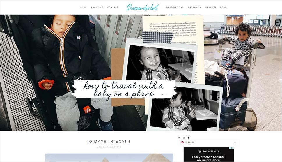
SheWanderlost website made with the Backpack Traveler theme
SheWanderlost is a blog filled with beautiful images that reflect the worldwide adventures of a mom and her little boy. The author shares tips on traveling, food, fashion, and maternity, with links to each of these sections displayed in the main menu. Articles about the duo’s travels are categorized by continent and country, but you can explore the content by using the practical tagging system or the handy search option. You also have the option to choose between two languages, French and English. The author has embedded her Instagram feed and added links to her social media channels in the sidebar.
Visiter Séville website made with the SetSail theme
The homepage on Visiter Séville’s website starts off with SetSail’s prominent, full-width image slider, flaunting the bright and vivacious landscape of the Andalusian capital. The tours and activities one can engage in around the city are strikingly displayed using the theme’s tours carousel shortcode. Tour singles are filled with information about the selected attraction and feature an image gallery as well as the possibility of purchasing a ticket and booking a private guide. Since the theme integrates with Google maps, each location is also marked on the map. Visiter Séville organization has customized SetSail’s predefined templates and made them fit its needs, creating numerous practical pages that will come in handy to all tourists. You can discover what is the best time to visit Séville, learn information about the city’s quarters and its airport, and more. Some quick and practical links are displayed in the footer as well, allowing you to easily prepare for your visit.
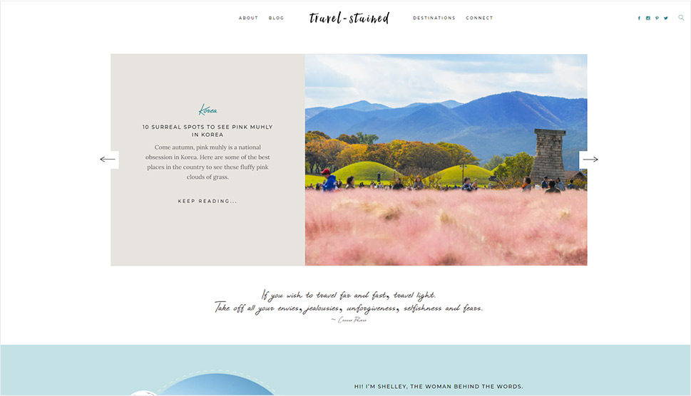
Travel-Stained website made with the Backpack Traveler theme
Travel-Stained is an interesting blog to explore. It was made with the powerful Backpack Traveler theme, which allowed the author to create a nice compilation of the pictures she took all over the world and share her personal stories with her audience in an eye-appealing way. The homepage starts off with an image slider that includes previews of several selected articles. When you hover over the photos featured in the slider, a huge “Pin It” button will appear over them, encouraging you to pin the pictures to your Pinterest boards. The theme’s practical options enabled the author to categorize her travels by continent and country, resulting in a well-organized and easy-to explore travel blog.
Passport Required website made with the Ebullient theme
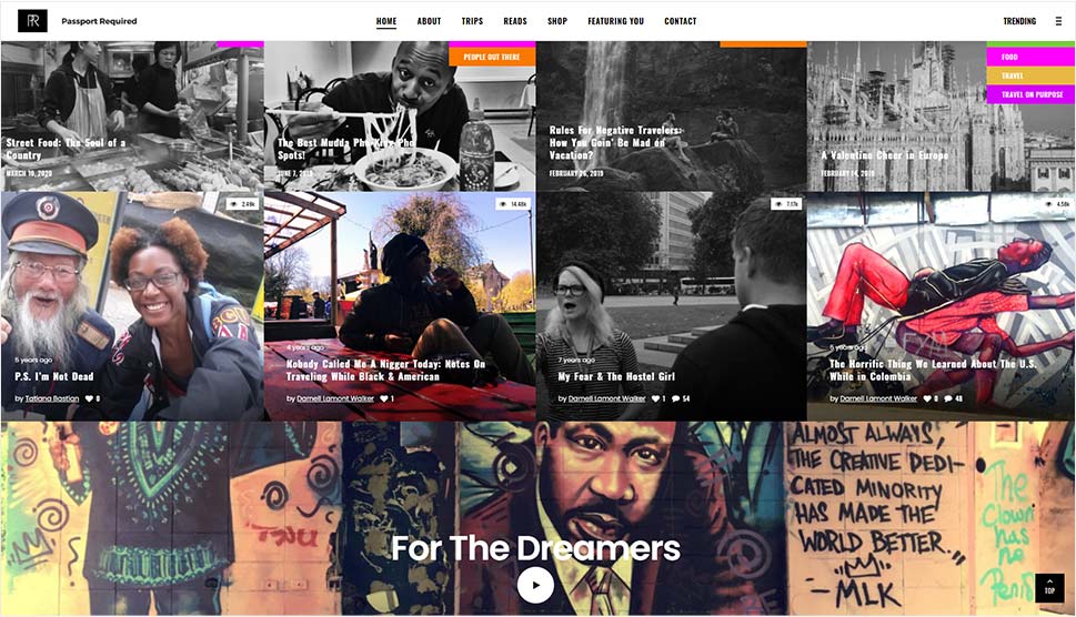
Passport Required is a memorable travel blog built with Ebullient. To make the navigation interesting from the start, the designers have used the theme’s mega menu to showcase a few blog categories and highlight selected blog entries by combining textual and visual content. The homepage looks like an irresistible concoction of photo and video sections that you can’t help but explore, while the parallax effect and blog carousels make the website even more eye-catching. Blog singles are equally fun and they include a list of that day’s featured posts and links to the bloggers’ social channels. And thanks to Ebullient’s compatibility with the WooCommerce plugin, they’ve built a practical online shop.
Jewel of Africa Safaris website made with the Wanderers theme
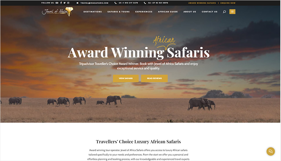
The Jewel of Africa Safaris website, built with the Wanderers theme, starts off with prominent fullscreen imagery, transporting you to the beautiful African continent. The hidden menu, displayed right next to the main navigation, includes links to the agency’s latest tour additions, their contact details, and social media icons. To narrow down the search for a destination to your liking, you can set a preferred price range and select a specific tour category. JoA Safaris have used the theme’s tour categorization option and organized their tours in several types, significantly facilitating your search. Tour singles include image galleries and extensive information about each journey, with each location marked on a Google map. While it is not possible to book tours online, you can send a form to the agency and enquire quotation.
Peru Mistico Travel website made with the SetSail theme
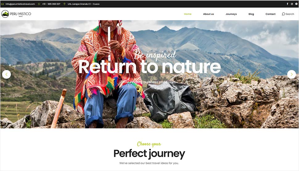
Peru Mistico Travel website makes the most of SetSail’s tour module and uses it to showcase the exciting journeys from their offer in a detailed and eye-catching way. Each tour presentation includes an image gallery, tour plans, and other informative content, along with a practical booking form, allowing visitors to purchase tickets right there on the site. Thanks to SetSail’s advanced search option, users can not only look for a specific region in Peru they wish to visit but also filter tours by price and availability. The site features user reviews that speak volumes of the agency’s service. They’ve embedded a video from YouTube on their homepage, creating an inviting visual experience for visitors and giving them an idea of what they can experience on these tours. The latest blog posts are displayed in the footer, along with a practical newsletter subscription form.
Odprawieni website made with the Backpack Traveler theme
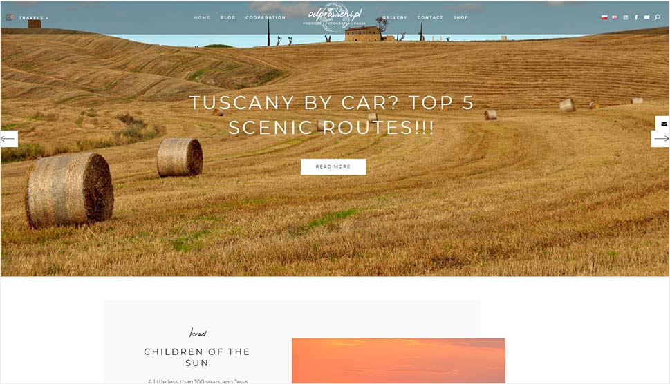
The Odprawieni travel blog was made with Backpack Traveler. The captivating fullscreen image slider contains links to several selected articles. It draws visitors in and encourages them to explore the authors’ passion for traveling. The pages are rich with images, letting you see the world through their lens. You can select the countries to read up on from the menu or by clicking on popular tags displayed in the footer. Alternatively, you can use the handy search option. Users can leave comments on blog entries and share them on social channels thanks to the theme’s social integration. Backpack Traveler also packs the Instagram feed widget, which allows the Odprawieni duo to display their feed in the sidebar.
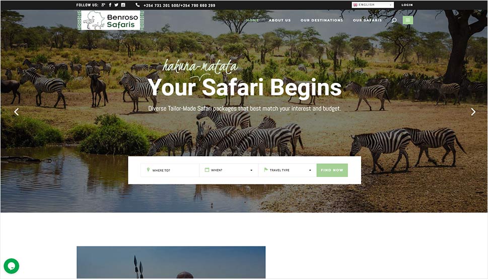
Benroso Safaris website made with the Wanderers theme
Using the Wanderers theme and its stunning tour templates, Benroso Safaris have created a striking introduction to the locations included in their offer. The homepage features a tours carousel shortcode, which offers an alluring overview of the available destinations. To facilitate the quest of finding an ideal trip, Benroso Safaris have adapted the theme’s advanced search module to the requirements of their users. You can search for a tour depending on the location but also according to the type of trip you’re looking for. For example, you can choose between cultural, historical, and adventurous trips, or you can go exploring the wildlife. The latter is possible because the agency has used the theme’s option to categorize tours by type, such as wildlife, self-guided, seaside, etc. Users can register on the site, leave reviews, choose between five available languages, and book tours online. Aside from the main navigation displayed in the top section of the site, there’s also a hidden menu. It includes links to the latest blog entry, information about the agency, as well as its social media icons which allow you to connect with them on Twitter, Facebook, LinkedIn, and Instagram.
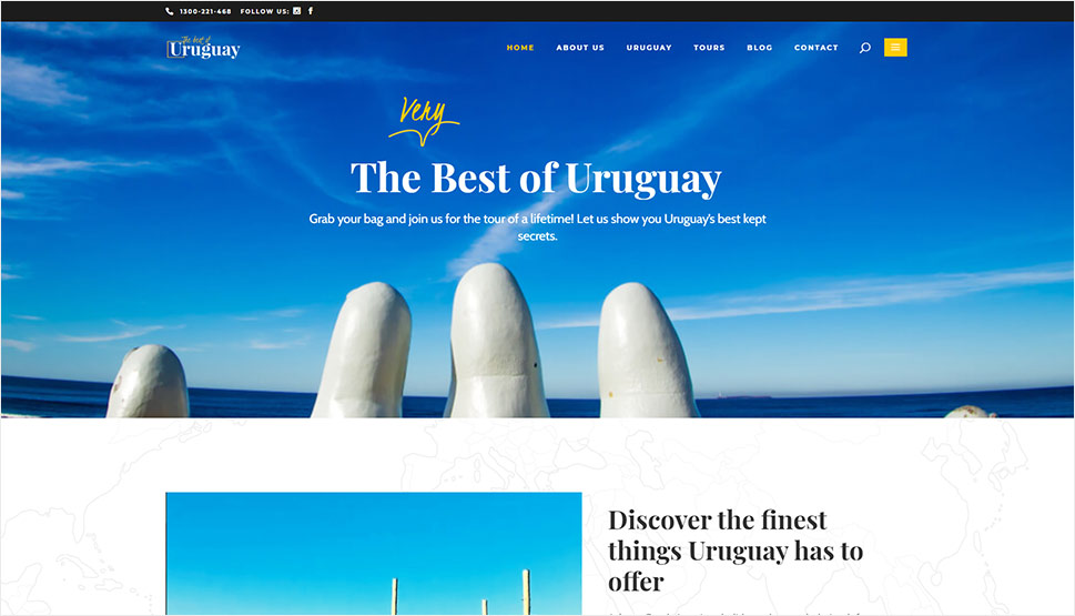
The Best of Uruguay website made with the Wanderers theme
The Best of Uruguay’s website was made with the Wanderers theme. It is filled with scenic imagery that elicits an emotional response in visitors, inciting them to press the call-to-action button, and book a tour online. The site includes integrated Google maps, helping users quickly find the geolocation of the selected city or region. Some inner pages include a short introduction of the Best of Uruguay agency, a link to its tour list, as well as an invite to like its Facebook page. There is also a blog section on the site with articles about Uruguay and why you should visit it. The sidebar on blogs includes a search option, as well as a list of latest posts and post categories. The footer is divided into four columns, one of which contains the agency’s Instagram feed and links to their other social channels. Users can also subscribe to The Best of Uruguay’s newsletter, and stay in the loop with the latest news from the agency.
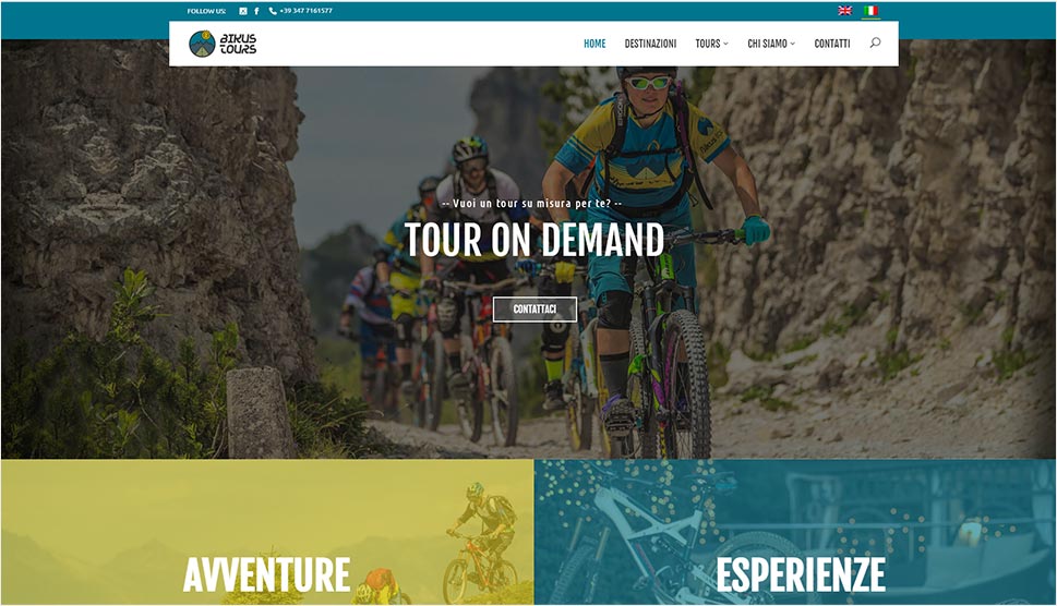
Bikus Tours website made with the GoTravel theme
Bikus Tours chose the GoTravel theme to craft a website that stunningly introduces their adrenalin-infused bike tours. Attractive image sliders and photo galleries as well as embedded videos give visitors an insight into what the tours look like. Aside from providing users with all the necessary information about tours, each location is displayed on Google maps. GoTravel enables you to customize maps however you wish to make them suit the aesthetic of your site, which is just what Bikus Tours did, opting for a design that matches the look of the surrounding content. The theme includes an integrated booking system and it supports PayPal, facilitating the reservation and payment process for visitors. Social media icons are displayed in the header along with the language switcher. The site features an advanced search system as well, letting users search for a tour based on name, destination, availability, and price range.
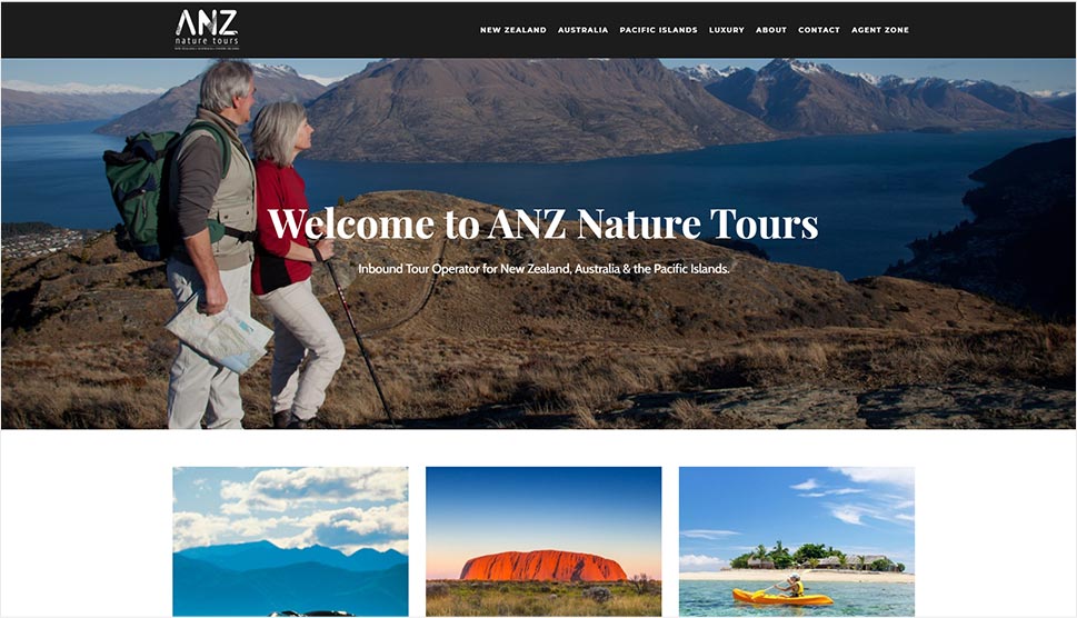
ANZ Nature Tours website made with the Wanderers theme
ANZ Nature Tours’ site was made using the Wanderers theme. You can explore destinations by selecting a specific location within the sticky menu or by browsing tour lists and carousels. Tour singles are informative and rich with visuals, prompting you to send an enquiry and book a tour through an agent. They also include a list of other tours offered by the agency, with the duration of each trip displayed below its name. The site features the “Testimonials” section and a collection of useful links that could be of great help for clients planning a trip to New Zealand, Australia, or the Pacific Islands.
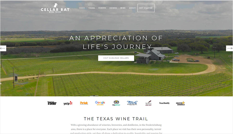
Celar Rat Wine Tours website made with the Backpack Traveler theme
Right from the very start, the fullscreen image slider on the Celar Rat Wine Tours’ site ensures that you get a taste of the alluring, wine-filled adventure and catch a glimpse of the poetic landscape. Beautiful image galleries, embedded Trip Advisor reviews, featured user testimonials, and informative copy all provide a detailed and inviting introduction to the wine tours and do most of the selling on this site. There are also local recommendations, information about tour guides, an FAQ section, a fun blog, a search option, as well as links to their social media channels, and a button that lets you subscribe to their RSS feed.
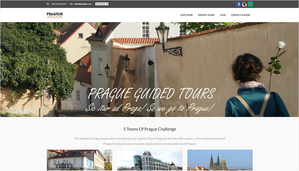
Pragitur website made with the Voyage theme
With the Voyage theme, Pragitur easily added a list of available tours, information about the team who organizes them, rich image galleries, as well as the possibility to buy tour tickets to their site. The header features the language switcher and links to Pragitur’s Facebook, Instagram, and TripAdvisor profiles. That helps users quickly connect with the agency on social channels and check out their reputation among other users. Tour singles contain details about the duration of each tour around Prague in both hours and kilometers, the exact route, the price, the booking form, and a few of the most helpful reviews from TripAdvisor.
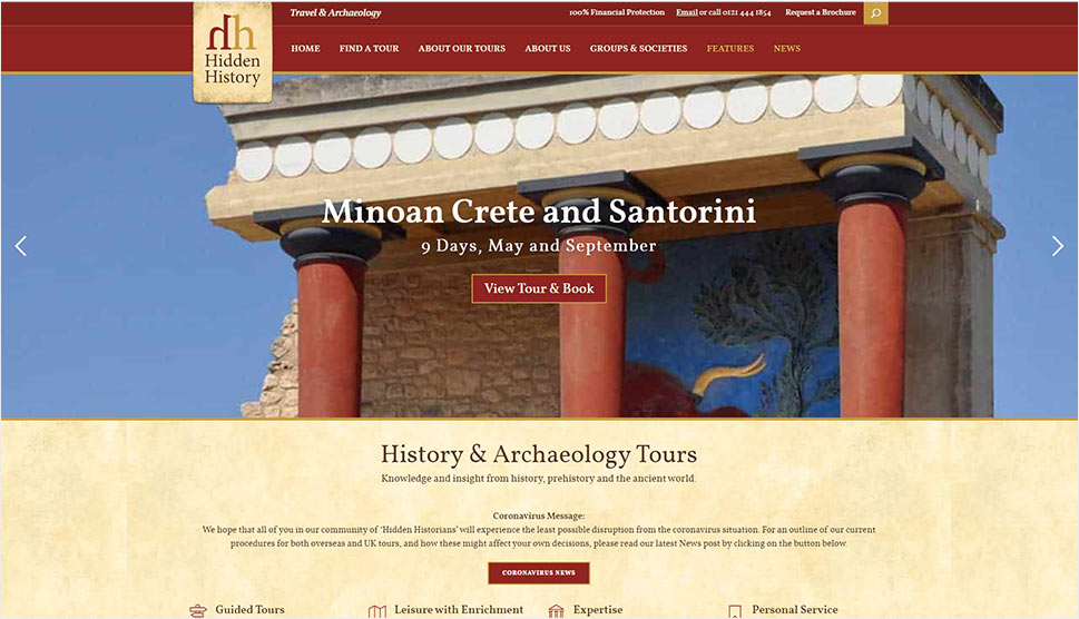
Hidden History Travel
Hidden History Travel website made with the Voyage theme
Hidden History Travel used the remarkable features of the Voyage theme to create a memorable presentation of their agency and services. The theme’s modern tour list and tour single layouts allow for an eye-catching and detailed showcase of all tours and itineraries. Visitors can book tours online, specify the number of people coming, select room types, and even get quotes for flights. User reviews are displayed in an interesting way with Voyage’s full width carousel slider. You can share the site’s content on Facebook and Twitter thanks to the theme’s social integration. And you can subscribe to HHT’s newsletter if you’d like to regularly receive updates from their end. They’ve also set up a blog to share exciting news with their audience and added a search feature to the site, so one can quickly find an article on the subject they’re interested in.
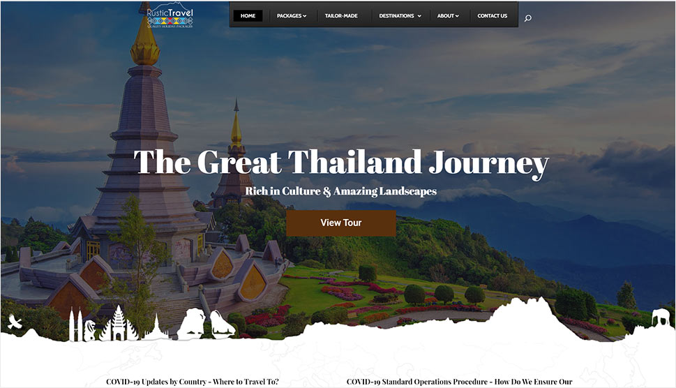
Rustic Travel website made with the Wanderers theme
Rustic Travel’s website exemplifies the undisputed power of the Wanderers theme. Using the attractive mega menu and mixing textual and visual content, the agency introduces users to the available packages and destinations from the get-go. This remarkable travel site includes fullscreen imagery, embedded videos, detailed tour showcases, user reviews, integrated Google maps, an online booking form, and a blog. Thanks to the Wanderers’ pre-designed and customizable layouts, Rustic Travel have created multiple inner pages telling users more about the agency itself, informing them about their privacy policy, terms and conditions, travel brochures, and listing job openings. The four-column footer includes social icons, a list of the most popular packages and destinations, as well as the agency’s contact details.
Conclusion
Thanks to the powerful travel module developed specifically for travel-related businesses and integrated into all of Qode’s travel themes, anyone can easily showcase their services and highlight every single aspect of their business. Online booking forms, advanced search options, integrated Google maps, user testimonials, and customizable blog and tour lists and singles are just some of the features our themes include. And as the sites from our roundup illustrate, no matter the theme you choose, you will be able to create in-depth presentations of any destination that’s sure to ignite people’s wanderlust and inspire them to travel with you.
