How to Add Navigation Arrows and Bullets to Slider Revolution

This article is part of our ongoing series of Slider Revolution tutorials. You can find all the articles from this series in our Comprehensive Slider Revolution Guide.
Intuitive and well designed navigation is the key to a good user experience. This is equally true for all the individual parts of your website as it is for the site as a whole. When it comes to your slider, navigation not only lets your users switch back and forth through your slides, but also lets them know at a glance that there are more slides to look at. So, today, we’re going to take a look at how to add navigation to Slider Revolution.
There are two basic types of navigation for a slider: arrows and bullets. We’re going to be using arrow navigation for bigger screens, like desktops and laptops. We’ll reserve bullet navigation for smaller devices like tablets and phones.
How to Add Navigation Bullets to Slider Revolution
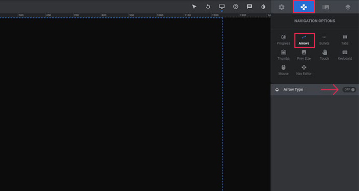
When using a horizontally oriented slider, it makes sense to add arrows to the left and the right side of the screen. To turn on arrows in Slider Revolution, go to Navigation > Arrows and switch Arrow Type to ON.
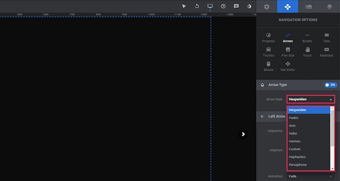
There are several default arrow styles. To change the look of your arrows styling, check out the Arrow Style dropdown to see what options are available.
Once you decide on the style of your arrows, you can go ahead and customize each arrow separately (left and right). There are quite a few things you can play around with here.
The arrows can be aligned to your slide (Module Dimensions), or to your grids (Content).

Next, you can set the arrow alignment and add horizontal and vertical paddings.

Arrows can also be animated. The default appearing animation is a simple Fade. If you want to change the way the enters the screen, choose a different animation from the dropdown.

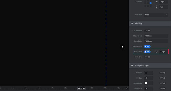
You can also change the speed and delay of the animation, as well as hide the arrows on smaller devices. The arrows will be always visible unless you turn ON the switch next to Hide Under. Then, all you need to do is enter the screen size below which you want the arrows to disappear. We normally use the value of 778px. By doing this, we hide the arrows on all touch devices (tablets and mobiles).
The style of the navigation can be customized with ease, and so much so that you can create an entirely original style of you own without any coding knowledge.

Adding Navigation Bullets to Slider Revolution
As we already mentioned, since bullets are smaller and don’t take up so much real estate on the screen, they are mostly used for navigation on touch devices. They serve as a nice, subtle indicator that there are more slides to view.
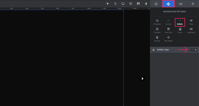
To turn on bullets in Slider Revolution go to Navigation > Bullets and switch Bullets Type to ON.
Just like navigation arrows, bullets also have a dropdown that lets you choose a variety of styles.

To define the spacing between bullets, simply change the Gap value.
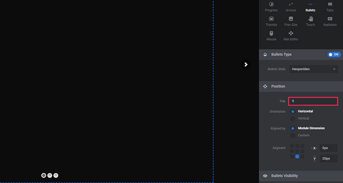
To set the direction of your bullets, choose between horizontal or vertical for the Orientation. You should use the vertical direction when you have a vertical slider. And, in that case, we recommend using only bullets, without arrows. In every other case though, we suggest you use bullets just for smaller devices, with their direction set to horizontal.

To hide bullets on desktop and laptop screens, turn on the Hide over Width option and set the width to 1024px.
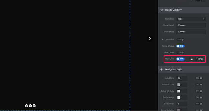
You can also play around with the navigation style of your bullets if you’d like to create an original look for them.
In Conclusion
And that’s all there is to it. Now you know how to add navigation to Slider Revolution. You should always try to do your best to customize your navigation arrows and navigation bullets to better fit the style of your website. But even by simply adding the default navigation elements to your slider, you will boost the UX of your site and make it more intuitive for your visitors. If, for some reason, Slider Revolution doesn’t work for you, there’s a perhaps even better option, and that’s Qi Addons for Elementor, our own collection of useful widgets for Elementor users. The collection contains a number of advanced slider widgets, such as the Hover-aware Slider, Animated Device Slider, Numbered Slider and many more.


