How to Create Accordions and Toggles in WordPress

When designing a WordPress site, there are many different things you can do to make it appear more professional and user-friendly to your visitors. And thanks to many available WordPress themes and plugins that come with the ability to extend WordPress in all sorts of ways, your options are pretty much limitless. One such option is adding an accordion to your WordPress pages or posts. No matter if you plan to create a FAQ section, a landing page, or simply want to give a more organized and uncluttered look to your site, this useful element is just what you need.
This time around, we’ve decided to help you learn to create and add accordions and toggles in WordPress. This is quite easy if you use the help of the right plugin. We will show you how to do this using the Accordions and Toggles widget from the Qi Addons for Elementor plugin. But first, we will talk a bit about what accordions and toggles are and also explain the main difference between the two.
So buckle in and read on:
In a nutshell, accordions and toggles are design elements used to organize various segments (or pieces of content) into one compact unit. This usually means building different sections separated with tabs that can be easily expanded. This makes them especially handy since they allow you to add plenty of content into these sections while saving space on the page.
Say that you want to create a FAQ page (a page that will contain answers to the questions your visitors or potential customers most often ask), for example. By using accordions and toggles, you will be able to organize questions and answers in a way that will show questions and uncover answers in an extendable tab. But regardless of what you need to use accordions and toggles for, it is a rather user-friendly strategy that will help save plenty of space on your page and make your content appear more organized as a whole.
Despite looking similar, accordions and toggles do have some differences. Specifically, when a section of an accordion is clicked, it expands, showing its hidden contents. When another section is clicked, the previous one closes automatically as the other expands. So, in an accordion, you can only have one section open at a time.
On the other hand, a toggle allows you to keep the previous section opened, even when another one is expanded. Of course, you can close each section manually, if you want to.
This is the core difference between a toggle and an accordion – they both have the same function (tucking away extra content and helping you organize it in a way that saves space and looks user-friendly) but they have different behavior when used on a page.
In short, accordions allow you to open one section only, while toggles allow multiple sections to be open at once.

As we’ve already established, accordions and toggles are great for saving space and organizing your content. Therefore, you can use them whenever you want to provide plenty of info on a page while keeping it tidy and organized for your visitors at the same time. For example, when you want to organize different bits of information about a product or service on your landing page or online store, or when you wish to create an above-mentioned FAQ page– be it for your business or even your online portfolio. You can even use them if you have to write any piece of content that has a complex set of instructions. In that case, you can use accordions and/or toggles to group different steps into different sections and thus make each step easier to digest by readers.
In general, there are no limits to when you should use accordions and toggles in WordPress. You just have to decide whether it’s something that’s going to be useful for you and whether it will fit with your overall site design.
No matter if you prefer to use accordion instead of a toggle or the other way around, by using our Qi Addons for Elementor plugin and its Accordions and Toggles widget, you will have access to both of these options. Stay tuned as we guide you through the process of adding accordions and toggles in WordPress. We will also show you some different design styles you can make with this useful widget while we’re at it.
In case you prefer to watch videos instead of reading, we’ve also got the video tutorial on the same subject, so make sure to check it out:
Coming with 60 different widgets, Qi Addons for Elementor is a great plugin that allows complete customization of your WordPress site. You can build beautiful sections that completely correspond with your website design in mere minutes, using no coding whatsoever. There are various types of addons you can use that all come with their own set of highly flexible features – from creative and business-oriented addons to infographics and typography elements. In short, if you use Qi Addons for Elementor, your customization choices are pretty much limitless – no matter what type of website you want to use them for.
One great widget that also comes packed with this plugin is a so-called Accordions and Toggles widget. Just like all other widgets in this collection, it comes with a set of fully flexible options that will allow you to create, customize and style your accordions and toggles in any way you like. You will get to set custom icons for opening and closing accordions and toggles, change fonts, use and combine different colors for your text, background, and icons, and plenty more.

Now, we will go through the widget settings in more detail and show you how you can change and combine different options to get accordions and toggles in various styles.
However, before we begin our tutorial, just a quick, albeit obvious note – Qi Addons for Elementor is a plugin developed for the Elementor page builder. So, you have to install the Elementor page builder first in order to use our Qi plugin and its widgets. And in case you need more information on how to use this incredibly user-friendly and feature-rich builder, you can always check out our Elementor tutorial.
Adding and Customizing the Accordions and Toggles Widget
First things first, head to the backend of your page or post and search for accordions and toggles in the Elementor sidebar. Our widget will come right up.

Then, simply drag it over to the right. At this point we will be doing most of the customizing in the Content tab of the widget, before we proceed to the Style tab.
The first thing you will notice here is that, by default, the widget has two items with some default Lorem Ipsum text.

You will also notice that when you click on one item, the other item will close – this is the Accordion type of behavior.

This behavior can be easily changed to Toggle using the Behavior option in the General section (Content tab).

After you do that, you will notice that both items will remain open once you click on them. In short, the Toggle behavior allows you to keep all your items open at the same time.
Aside from this core change, all the other settings for both Accordion and Toggle behavior are the same.
Now that we’ve demonstrated what the Toggle does, we will switch back to the Accordion behavior and go through all the other options, but you can, of course, use whichever behavior type you prefer.
Moving on to the Style option located underneath – by default, it’s set to Standard, but you can change it to Boxed (with each item having an underline), Border Top (a border will be placed above each item), and Border Between (a border is placed between the item titles). For our example, we’ve set this option to Border Top.

Next are the Open Icon and Close Icon options. Here you will be able to choose your open and close icons from the icon library or upload an SVG (like we did).
Hit the Insert Media button once you’re done with selecting your open and close icons.
Now your open and close icons will automatically switch when you’re opening and closing items (just like they should).
As for the Items settings, you will notice there are two items by default. You can easily add additional ones by clicking on Add Item. We’ve added one additional item so our accordion now consists of three items.


To replace the content in your items, click on the Item you wish to change and simply insert your title in the Title field. You will also be able to use the Content field to change the look of your text in more detail. In addition, you can pick between Visual and Text mode (the latter is great for anyone who wants to add any code or CSS to style the text).


For our example, we have turned our accordion into an FAQ section. We’ve changed the text for our titles as well as for the rest of the items (using the Content field) to match the titles. You will, of course, add your own content both for the titles and for the items text.
Styling the Widget
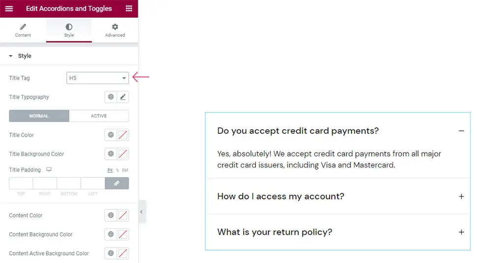
Now, in the Style tab, you will see plenty of options that will allow you to style your accordions in any way you like.

The first option on the list will allow you to set your title tag. It is set to H3 by default, but you can pick anything from H1 to H6 (we’ve changed ours to H5).
Clicking on the Typography section opens a new list of options that will help you set the typography of your accordions in full detail.

The Family option allows you to change the font family of your text – you can either enter its name manually or search for the desired font from the list in the dropdown (ours is set as default).

The Size option helps you adjust the font size. We’ve set ours to 21px.

Next, there’s the Weight option. You can set it to Bold or simply use one of the numerical values (we’ve left our weight on Default).

With the text Transform option, you will be able to make the title Uppercase, Lowercase, Capitalized, or Normal (that’s our default). As for the Style, you can make it appear Normal, turn it Italic, or Oblique.

There’s also the Decoration option that lets you set an Underline, Overline, Line Through, or use none of those (which is also our default setting).

The Line-Height option helps create more space around the title. The default value for this setting is in ems, but if you want, you can easily switch it to pixels.
Last but not least, the Letter Spacing option gives you more space between the letters.

And that’s it for the options related to typography.
Afterward, you will find settings that will let you choose between Normal and Active mode. The Active mode allows you to style the look of the accordion item when it’s opened, while Normal lets you style the look of other accordion items that aren’t active.

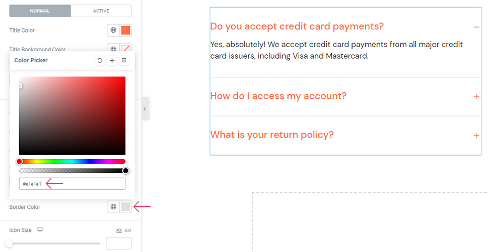
In Normal settings, there’s the Title Color option you can use to change the color of the item titles. Use the slider or a hex code to pick your desired color. We’ve used the hex code for ours (it’s #ff714a).

Now, you can see that the Active item title has changed its color along with the Normal one. That’s because we haven’t set the color for the Active title yet.
The Background color allows you to color the background of the title field in your accordion. We won’t be using it for our accordion, but we’ve wanted to show you a quick example of what it can look like nonetheless (we’ve changed the background color to default right afterward):

Right underneath, there’s the Title Padding option. By increasing the values, you will see that the space around the titles also increases evenly. In case you want to have different values on different sides, you can simply delink the fields using the delink button and reset all the values. From then on, you will get to add different values for each side.

We’ve added 27px for the top and 29px for the bottom padding, leaving the left and right padding at zero pixels.
Then, in the Active settings tab, you will see there is an identical set of options as those in the Normal tab. Like we’ve mentioned above, these settings will apply only to the opened accordion item.

We haven’t changed the Title Active Color as we wanted all item titles to have the same color, regardless if they’re active or not. The same goes for the Title Background Active Color – changes will apply only to the active accordion item. We’ve also left this field unchanged (for now).
The Title Active Padding allows you to set different paddings compared to the normal one. We’ve delinked the values for ours and set the top padding to be at 27 and the bottom at 13.

There is also an interesting effect you can create using these options – to be more specific, you can set them so that the color changes when an item opens.
Currently, we still have the accordion that has the same active and normal background colors. To differentiate them, simply change the background color of one (or both) tabs.
In the Normal tab, we’ve set the Title Background Color using the hex code (#d5e7f6) and used the same shade for our Content Background Color.

As for the Content Active Background Color, we’ve set it to a more intense shade of blue (#c3e0f8).

We’ve copied this code and went to Active settings once again where we pasted this code into the Title Background Active Color.

Now, once you click on the items, you will see that the background color changes depending on their normal or active state.

Of course, this is only one out of many setting combinations you can use when creating your own accordions and toggles. So feel free to experiment and pick the look that best suits your preferences and matches best with your website design.
Now that we’ve shown an example of what changing the background colors can do for the overall look of your accordions, we will revert the color options back to the original ones.

There is another color option you can use to style your accordion, called the Content Color. As its name suggests, it changes the color of the text within the items. We’ve set ours to default, black color. Of course, you can change yours to any color you prefer.

Then, there is the Content Padding option that allows you to change the space around the text (increase or decrease it). We’ve delinked our values and set different ones for each side (set the right at 30px, added 33px for the bottom one, and left the top and left padding at 0px).

The Border Color option will let you adjust the color of the lines between the items themselves. You can set any color you like for this border. We’ve added a hex code and made ours a light grey color (#e1e1e1).
Right below, the Icon Size option allows you to increase (or decrease) the size of the accordion icons. We’ve set ours to be 26px.
Finally, there’s another list of settings that have a switch – Normal and Hover. These are the settings that allow you to change the “normal” icon color as well as its color upon hover.
If you want the color to change when hovering over an icon, make sure to set the different color in the Hover tab.
We’ve added the hex code here that is a slightly paler shade of orange (#ff714aad). Now, our icon has a bit of a fading effect when we hover over it.
And that concludes most of the options available in the Accordions and Toggles widget. As for the Advanced tab, it contains some options related to the positioning and responsiveness, animations, etc. of your accordions. Still, this tab is available in all Elementor widgets and is not unique to our accordions toggles widget, which is why we won’t cover these options in this tutorial.

Hit the Publish/Update button to save your accordion once you’re satisfied with the way it looks.

Finally, even if you go back to the Content tab and switch your accordion behavior to Toggle, all the items will remain open once you click on them, with all the other customization and styling options remaining intact.

In short, it’s never too late to change any of the settings in your widget.
Wrapping Things Up
If you want to create accordions and/or toggles on your WordPress site to make it more organized and user-friendly, we suggest using the QI Addons for Elementor plugin and its Accordions and Toggles widget. Not only is this widget super intuitive and easy to use, it also comes with tons of options that leave plenty of room for experimentation and allow you to create and customize accordions in all sorts of ways.
Like we’ve mentioned before, these were just some of the examples of how you can combine the options you have available in the Accordions and Toggles widget. You can experiment with the settings to find the look that best fits your preferences. Or, you can go to the widget’s page and check out some of the style examples present there in case you need some additional inspiration. Whichever direction you choose to go in is completely up to you.
