How to Create a Custom Gutenberg Block in WordPress

Gutenberg has been the default WordPress editor ever since the 5.0 update. It was created out of the need for a more intuitive and user-friendly editor than its predecessor—the classic editor. And while the process of dragging and dropping blocks of content has made Gutenberg more appealing to users, this editor is not without its shortcomings. One of the main ones lies in the number of blocks that are available to the users by default. While there are WordPress plugins and themes that offer some additional blocks, even with that, it might be a struggle to add a unique feel to your website. This is to say nothing of adding custom functionalities.
Knowing how to create a custom block in WordPress is crucial for all users who decide to customize their website using the Gutenberg editor. As an added benefit to creating custom-tailored Gutenberg blocks, you could potentially get rid of any plugins that you used to add custom blocks to your website or extend their functionality. In this article, we’ll explain how you can create a custom Gutenberg block in WordPress using a plugin. Since the process involves several steps, we’ll be tackling them one at a time:
As with many other custom features in WordPress, there are two distinct ways you can handle the introduction of a custom Gutenberg block. One is to create it manually from scratch, using code, or to use a suitable WordPress Gutenberg plugin to do it. Since the former is very coding-intensive and time-consuming, we have opted to show you the latter. And the plugin we’ll be using for this showcase is called Lazy Blocks, and it allows you to create countless custom Gutenberg blocks. Let’s take a look at some of its features briefly before proceeding to the how-tos.
The Custom Blocks Constructor – Lazy Blocks plugin is a free WordPress plugin made for constructing custom Gutenberg blocks. It also has the option to show custom meta fields and build post templates for all post types. The primary purpose of the plugin is, of course, on how to create a custom block in WordPress. It offers a very intuitive UI for registering custom blocks and adding their control fields (e.g. text field, URL, checkbox, and color picker field) using a drag and drop editor. However, this plugin isn’t designed for novice WordPress users, as the block creation process requires users to write some custom code that will display the block content on the frontend.
With that being said, the plugin is very well documented, offering simple code examples for the implementation of each of the control fields. Therefore, we strongly advise reviewing the plugin’s documentation before starting to work with it. Furthermore, the plugin offers supplementary filters and hooks for additional customization purposes. All of this makes it well-suited to intermediate WordPress users who have some previous coding experience as well as advanced WordPress users. Having said that, let’s explore how to create a custom block in WordPress using this plugin.
After installing the plugin, navigate to the Lazy Blocks section within your admin dashboard. If you’ve already created a new Gutenberg block, you will be able to access and edit it from the Blocks subsection.
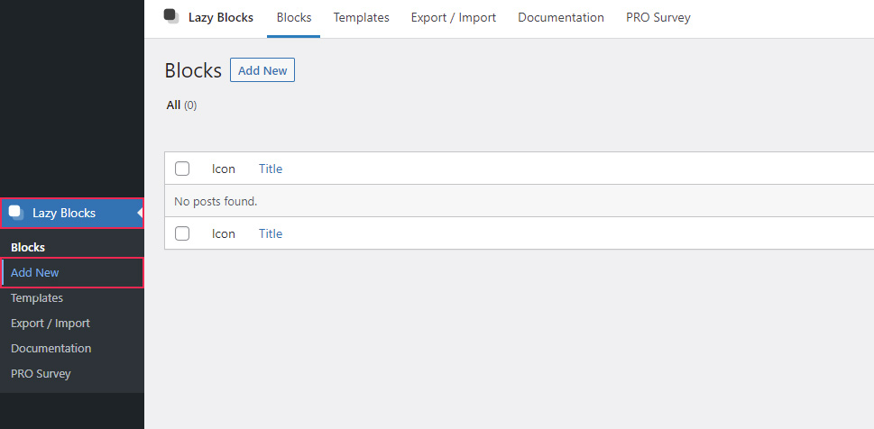
Otherwise, to create a new custom Gutenberg block, navigate to Lazy Blocks > Add New.
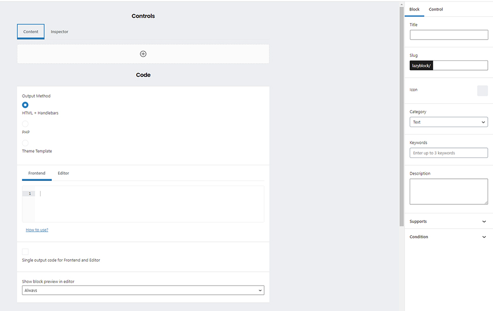
Once you’ve created a new block, you will see the screen shown further below. This screen can be roughly divided into three sections. The first section is the Controls, which enables you to add the fields that are part of your Gutenberg block (e.g. text fields, checkboxes, color picker fields, etc.) and is divided into two tabs—Content and Inspector. All fields from the Content tab will be displayed in the editor section of the page when you use your custom block. And the fields from the Inspector tab will be displayed in the right-side menu when the custom block is used. You will be able to see this in practice when we get to the custom Gutenberg block we have prepared as an example for this article.
The second section, located on the right side of the page, is used for specifying the options of the Gutenberg block, as well as its control fields. This is done using the two tabs available within the section, named Block and Control.
Finally, the third section is the Code section, where you need to add the code for displaying the Gutenberg block as a whole. It also has two tabs—Frontend and Editor. These let you code the output of your custom Gutenberg block both in the frontend of your website, as well as preview it in your page editor.
The plugin offers three possible coding techniques for the output: using HTML code with the handlebar notation, using PHP code (i.e. a mix of HTML and PHP code), or creating a separate template file with the code and uploading it to your server. If you opt for the last technique, you will need to make sure that your template file follows a strict WordPress file structure. More precisely, the file path has to be /wp-content/themes/theme_name/blocks/lazyblock-block_name/block.php. The theme_name and block_name parts should be changed to match your theme and custom Gutenberg block names respectively.
As you can see from the screenshot below, the default technique for creating the output is the HTML + Handlebars option.
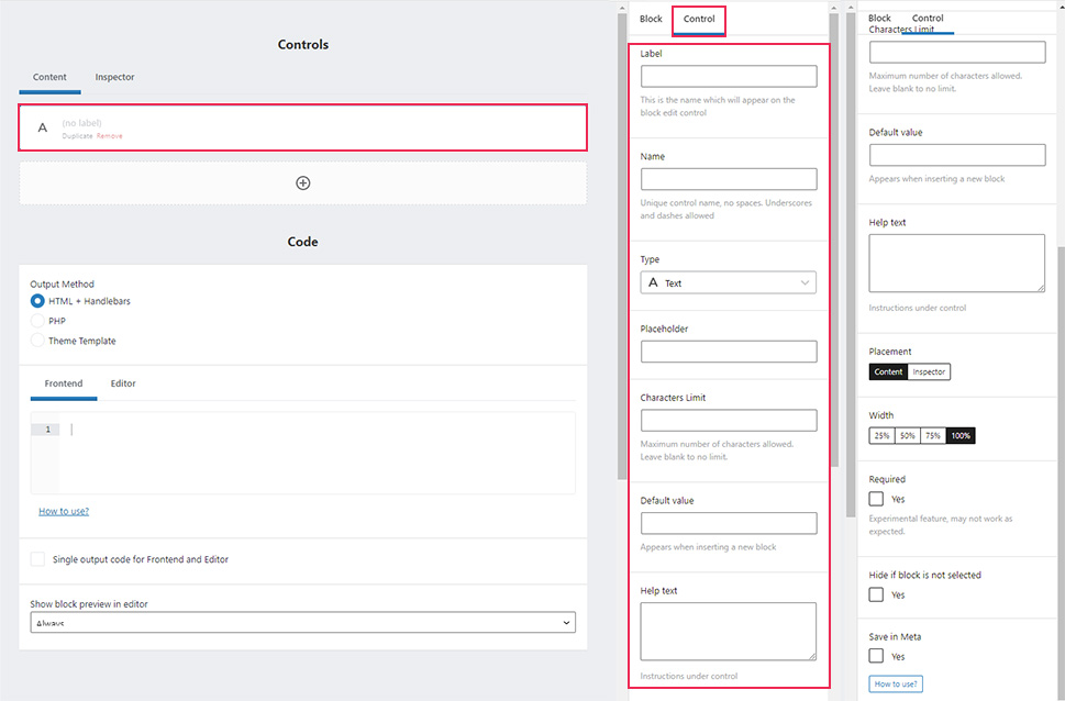
Now that we’ve covered the different sections, let’s examine how you can add the control fields and specify their options from those that are available.
By default, you will be placed within the Content tab of the Controls section. To add a control field in that tab, simply press the “+” button. This will create a text field by default, but you can use the options on the right to adjust that. More precisely, when you select a control field, you can set its options via the Control tab on the right. Some of the options are available for all control fields (e.g. Label, Name, Type, and Placement), while others could be specific to a certain control field.
Therefore, the first part of creating a custom Gutenberg block using the Lazy Blocks plugin is to register the block. Then add all the necessary control fields for that block and adjust their options, as well as the options of the block itself. The remaining parts of creating a custom Gutenberg block include choosing the coding method for the output and making the appropriate code. Then you’ll need to insert the block into the Gutenberg editor on a given page and create the additional CSS code for stylization purposes. We will further illustrate these steps using an example created for this article.
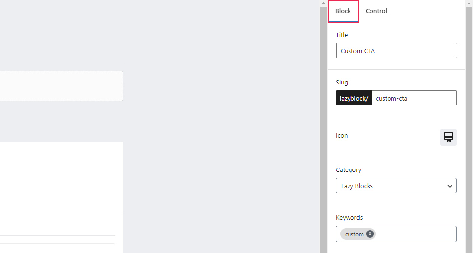
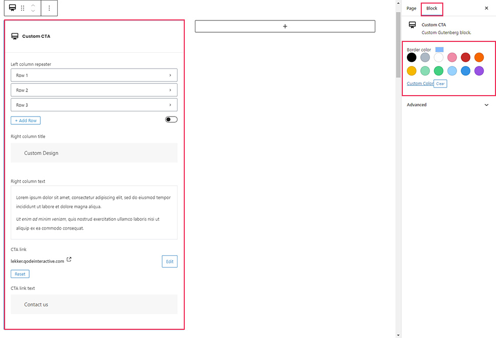
The block registration process starts after you access the Lazy Blocks > Add New screen. After selecting the Block tab on the right, you can specify some of the information and properties that your custom block will have, which will register it as a result. For this article, we decided to make the block Title Custom CTA, which automatically created a corresponding slug.
Other than the Title and Slug, you can also specify the Category, Keywords, and Icon properties. These are useful when searching for your custom block from the list of the available blocks that can be added to pages and posts. Another helpful property is the Description. It can help you find the exact block you wish to edit from the list of blocks, without having to examine their individual code.
As for the remaining three sections, we decided to tick all the options from the Supports section, but in the sections below it—Align and Condition—we left the properties set to their default values. You can review the plugin’s documentation, especially the page on creating blocks to learn more about these properties.
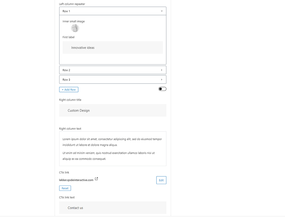
Once you’ve done that, the following step is to insert the control fields for your custom block. Using the Content tab, we added the following control fields for our example block, Custom CTA: repeater, text, rich text, URL, and text. And from the Inspector tab, we used the Placement option to add a color picker field. Moreover, we deliberately added a label and a name to each of the control fields. They are all shown, with their respective control names being highlighted, on the two screenshots below. Please note, the control names are the most important properties, as they are used in the coding section.
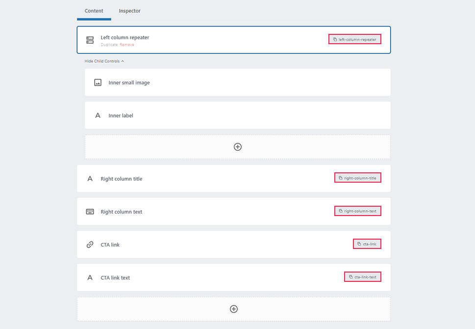
While most of these control fields are straightforward, the repeater control field might be confusing. This field allows you to add additional control fields within it. More precisely, the repeater and the content type within act like a row that can be repeated indefinitely, hence its name.
For our example, we chose to add an image and a text field, named inner-small-image and inner-label, respectively, to our row. Furthermore, we kept most of the options for the control fields that we added at their default values. The only exceptions are the 40-character limit we put on the inner-label text field, and that we made the right-column-text rich text field multi-lined. With that being said, let’s proceed to the code created for this article.
Qode Themes: Top Picks
View Collection


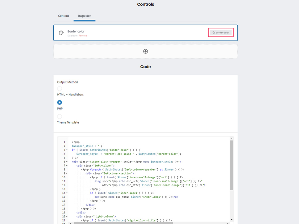
We opted to use the PHP output method within the Code section, but you can choose whichever of the three available methods you feel most comfortable with. If you choose to use one of the other two coding output methods that the plugin allows, we advise you to go through the plugin’s documentation beforehand.
Moreover, there are additional options you can set within the same section. You can choose whether you want to have a preview of the custom block when using it or not. We decided not to include this option by setting Show block preview in editor to Never. However, if you choose to enable the preview on your end, it is important to know that you can either choose to use the same code as the frontend output or create a separate code for it in the Editor tab. If you want to use the same code all you need to do is tick the Single output code for Frontend and Editor checkbox option.
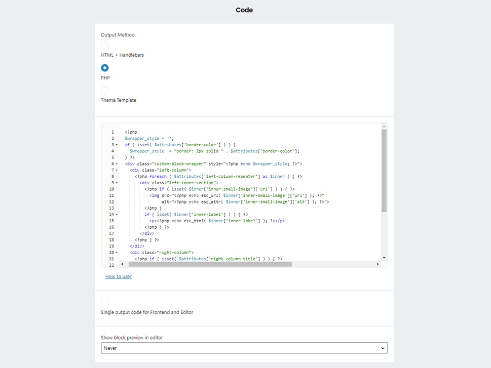
Having said that, the code that we created for this article is shown below.
<?php
$wrapper_style = '';
if ( isset( $attributes['border-color'] ) ) {
$wrapper_style .= "border: 2px solid " . $attributes['border-color'];
} ?>
<div class="custom-block-wrapper" style="<?php echo $wrapper_style; ?>">
<div class="left-column">
<?php foreach ( $attributes['left-column-repeater'] as $inner ) { ?>
<div class="left-inner-section">
<?php if ( isset( $inner['inner-small-image']['url'] ) ) { ?>
<img src="<?php echo esc_url( $inner['inner-small-image']['url'] ); ?>"
alt="<?php echo esc_attr( $inner['inner-small-image']['alt'] ); ?>">
<?php }
if ( isset( $inner['inner-label'] ) ) { ?>
<p><?php echo esc_html( $inner['inner-label'] ); ?></p>
<?php } ?>
</div>
<?php } ?>
</div>
<div class="right-column">
<?php if ( isset( $attributes['right-column-title'] ) ) { ?>
<h3><?php echo esc_html( $attributes['right-column-title'] ); ?></h3>
<?php }
if ( isset( $attributes['right-column-text'] ) ) { ?>
<p><?php echo wp_kses_post( $attributes['right-column-text'] ); ?></p>
<?php }
if ( isset( $attributes['cta-link'] ) && isset( $attributes['cta-link-text'] ) ) { ?>
<a href="<?php echo esc_url( $attributes['cta-link'] ); ?>" target="_blank" class="btn"><?php echo esc_html( $attributes['cta-link-text'] ); ?></a>
<?php } ?>
</div>
</div>
Let’s break this code down.
To do that, we’ll look at it in a more simplified form. As you can see below, the HTML structure of our custom Gutenberg block contains two <div> elements. Those elements represent the left and right columns of our block and have appropriate CSS class names to match each column. They are both wrapped with a div element with the class custom-block-wrapper, which serves to add a border around our Gutenberg block. By using the isset() function, we first check whether the border-color control property has been added to the plugin’s $attributes array, and then store the CSS for adding a border inside a variable called $wrapper_style. The content of that variable is, then, passed to the wrapping div in the form of inline CSS, which creates a 2px thick border around the block in our chosen color.
<?php
$wrapper_style = '';
if ( isset( $attributes['border-color'] ) ) {
$wrapper_style .= "border: 2px solid " . $attributes['border-color'];
} ?>
<div class="custom-block-wrapper" style="<?php echo $wrapper_style; ?>">
<div class="left-column">
<!-- Left column code goes here. -->
</div>
<div class="right-column">
<!-- Right column code goes here. -->
</div>
</div>
To obtain the border around the custom block, we had to access the border-color property of the $attributes array. Similarly, we will access any other control property that we defined, using the $attributes[‘control_name’] value while making sure to use the proper control name instead of the control_name placeholder. With that being said, let’s examine the content from both columns of our custom block.
Using the foreach loop, we displayed the content of every row of the left-column-repeater control element that we previously added. Moreover, the content is placed in a <div> element with the class left-inner-section, so that it can be easily targeted with CSS later. And each of those inner sections contains a small image, named inner-small-image, and a label, named inner-label.
<?php foreach ( $attributes['left-column-repeater'] as $inner ) { ?>
<div class="left-inner-section">
<?php if ( isset( $inner['inner-small-image']['url'] ) ) { ?>
<img src="<?php echo esc_url( $inner['inner-small-image']['url'] ); ?>"
alt="<?php echo esc_attr( $inner['inner-small-image']['alt'] ); ?>">
<?php }
if ( isset( $inner['inner-label'] ) ) { ?>
<p><?php echo esc_html( $inner['inner-label'] ); ?></p>
<?php } ?>
</div>
<?php } ?>
As for the right column, it contains the title, named right-column-title, which is wrapped with a <h3> tag. It also contains some text we inserted, named right-column-text, which is wrapped with a paragraph tag.
And, if both the link URL (cta-link) and link text (cta-link-text) are added, a link that opens in a separate tab will be displayed at the bottom of the right column.
<?php if ( isset( $attributes['right-column-title'] ) ) { ?>
<h3><?php echo esc_html( $attributes['right-column-title'] ); ?></h3>
<?php }
if ( isset( $attributes['right-column-text'] ) ) { ?>
<p><?php echo wp_kses_post( $attributes['right-column-text'] ); ?></p>
<?php }
if ( isset( $attributes['cta-link'] ) && isset( $attributes['cta-link-text'] ) ) { ?>
<a href="<?php echo esc_url( $attributes['cta-link'] ); ?>" target="_blank" class="btn"><?php echo esc_html( $attributes['cta-link-text'] ); ?></a>
<?php } ?>
Additionally, we sanitized the output of all control fields, using the following functions: esc_url(), esc_attr(), esc_html() and wp_kses_post(). We’ll conclude the explanation of our code example with this. The code itself, as well as the explanation, should help you cover the majority of the hard work for creating a custom Gutenberg block.
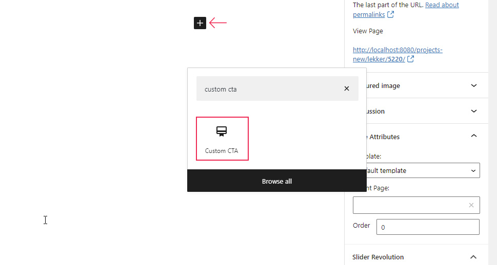
After coding your custom Gutenberg block, you will need to add it to one of your pages and display its output. To add your custom Gutenberg block to a page, press the “+” button for adding new blocks and use the search feature to easily find your custom block. Once you’ve located it, click on your custom block to add it to the page.
To further customize your page content, you can use the Columns block beforehand and place your custom block into a column made that way. This is what we’ve done by creating two columns with the Columns block and placing our custom block in the first one.
After that, you will need to set the options within the custom block you just added. The ones we chose to set are shown on the two screenshots below. Please note, we added the border color option within the Block tab on the right while the block was selected, i.e. in the Inspector, as we suggested at the start.
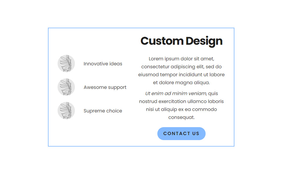
Also, we added three rows to the repeater field, each with a small image and label. We used the same small image, with the dimensions 60×60 pixels, in all three rows. You can use as many rows as you see fit and add different images, but if you plan on using our example Gutenberg block code, you should pick images with similar, smaller, dimensions for optimal display.
After adding the options, you should update the page and review the output of the custom Gutenberg block.
In most cases, that output will likely require additional CSS code to style it. Since such code is created on a case-by-case basis, we can’t suggest any that will apply to all websites. So, you will need to create CSS code tailored to your current website design.
To help you along, we’ve included the CSS code created for this article below. It serves to show how a version of the CSS for styling custom Gutenberg blocks could look. Please be aware that this code isn’t meant to be simply copied and pasted. Instead, you should use it as inspiration for similar code that would apply to your website.
.custom-block-wrapper {
display: -webkit-box;
display: -ms-flexbox;
display: flex;
-webkit-box-orient: horizontal;
-webkit-box-direction: normal;
-ms-flex-direction: row;
flex-direction: row;
-ms-flex-wrap: wrap;
flex-wrap: wrap;
width: 100%;
padding: 20px 30px 20px 10px;
text-align: center;
}
.left-column {
margin: auto;
}
.left-inner-section{
display: -webkit-box;
display: -ms-flexbox;
display: flex;
padding: 10px 20px;
-webkit-box-align: center;
-ms-flex-align: center;
align-items: center;
}
.left-inner-section img{
margin-right: 30px;
}
@media all and (min-width: 1025px){
.left-column, .right-column {
-ms-flex-preferred-size: 50%;
flex-basis: 50%;
}
}
.right-column h3 {
margin-top: 0;
}
.right-column .btn {
background-color: #7BB9FF;
text-transform: uppercase;
display: inline-block;
line-height: 2em;
letter-spacing: .125em;
border-radius: 3em;
font-weight: 600;
padding: 6px 20px;
margin-top: 10px;
}
Besides creating the CSS code, knowing where to place it is equally important. The recommended place for most WordPress users is the Appearance > Customize > Additional CSS section. But, our more advanced readers can place the code in a separate file, upload it to the server and enqueue it using the wp_enqueue_style() function. For more information on how to do that, we suggest taking a look at our article on enqueueing scripts and stylesheets.
After adding the CSS using either of the two ways mentioned above, the output of your custom Gutenberg block should be harmonized with your site’s design. Below, you can see the result we got after adding the CSS code we shared with you.
Final Thoughts
With the Gutenberg editor, you can add content to your pages and posts by inserting different blocks to different parts of your website. Even though they offer a wide variety of features, there is only so much that can be done using the default Gutenberg blocks. At some point, every WordPress user that utilizes Gutenberg to customize their website will need to add a new or extend an existing functionality. This is where knowing how to create a custom block in Gutenberg for your WordPress site comes in.
Custom blocks can be created with code or using a plugin. In this article, we focused on showing you the process of creating a custom Gutenberg block using the Lazy Blocks plugin. The process itself consists of steps that are done in the plugin’s UI as well as some coding steps. Be sure to carefully follow our guide and don’t forget to review the plugin’s documentation for additional information. Armed with this knowledge, we are sure you will be able to create your custom Gutenberg block in no time.
