How to Create a WordPress Login Popup Modal

Whether you are running a typical online store, selling courses, providing listings, or have any kind of membership-based content, you need a clear way for your users to register and log in to your website. While the WordPress login page can be used for this purpose, it isn’t very user-friendly since it redirects users from their point of interest onto a default login page. After logging into your website, the users are often left confused about how to access the content they were interested in, losing you potential conversions and revenue.
For that reason, a more user-friendly custom login option is needed. The best solution for this issue is adding a login popup modal which allows users to register and log in to the website without being redirected to other pages. Therefore, it improves the overall user experience on the website, leading to more sales. The login popup can be added to various parts of the website and proves to be a valuable asset in growing online stores and membership websites, as previously mentioned. In this article, we will explain how you can add such a login popup modal to your WordPress website.
Here’s what we will be covering:
Since membership websites are a well-known niche, there is a lot of WordPress plugins that offer custom login screens, popups, and similar functionalities. These functionalities could also be integrated into themes. Therefore, you should first inspect the functionalities of your current theme before resorting to a plugin. In this article, we will cover the plugin method only, explaining all the nuances of a plugin made specifically for this purpose, which we found while exploring WordPress.org’s plugin repository.
The Login/Signup Popup plugin is a lightweight plugin for handling registration, resetting passwords, and adding login popups that can be incorporated with WooCommerce. While the plugin offers additional premium features like social login, Google reCAPTCHA, custom registration fields, one-time password login, and email verification, the free features of this plugin are more than enough for this article.
The plugin itself is intended for intermediate WordPress users, as it requires quite a bit of prior WordPress knowledge to be used to its full extent. Nevertheless, we have done our best to explain all the nuances of the plugin below, so that it can be used by all WordPress users. That said, let us proceed to the main part of the article.
After installing and activating the plugin, navigate to the Login/Signup Popup section. The section has two subsections – Settings and Fields, where all the options regarding the plugin’s use are set. Both these subsections are divided into tabs which contain the relevant options. For this article, we will only focus on the plugin’s free functionalities. We will not be covering the premium add-ons in the Add-ons tab.
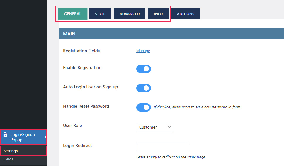
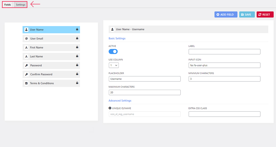
Having said that, let us cover the options. While they are divided into separate tabs, we find it better suited to divide them into two categories – those concerning login popup’s functionality and those which are used for its stylization. We will explain them that way as well in the following part of the article.
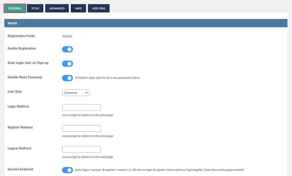
To set up the functionality of the login popup, we have to start with the General tab, located in the Login/Signup Popup > Settings section. In it, you can enable the registration process, set the default user role after registering, enable auto-login after signing up and the possibility to reset the password. Additionally, for the registration process to work properly, you also need to enable the “Anyone can register” option, found in the Settings > General section of your admin dashboard.
In the Main subsection of the General tab, you can also set up redirections after logging in, registering, or logging out, as well as if a successful login or register should be reflected in the URL by appending the following labels to URL – “login=success” or “register=success”, depending on the action taken.
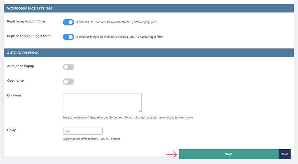
Following that, the forms provided by the plugin can also be used to replace the WooCommerce’s My Account page form and the login form on the Checkout page, if enabled.
Additionally, you can also set that the login popup provided by this plugin is automatically opened. This can be set for all pages, once or always, or only on specific pages. To specify the pages on which the login popup appears automatically, insert a page/post ID or page/post slug. Of course, using this option to its full extent requires you to know how to find page/post IDs and permalink slugs.
Finally, if you choose to open the login popup automatically, you can also choose the time delay for the appearance of the popup after loading a page. The delay is expressed in milliseconds, with 500ms, i.e. half a second, as the default value.
This concludes the overview of the options found within the General tab. Knowing their purpose, you can set them up according to your needs. After doing so, press the “Save” button at the bottom to save your choices.
We proceed to the remaining options which relate to the functionality of the login/sign up popup. More precisely, these enable you to customize the fields of the register form, i.e. the fields within the popup’s Sign Up tab.
Access them by navigating to the Login/Signup Popup > Fields section in the Fields tab, or by navigating to the Login/Signup Popup > Settings section and clicking the “Manage” link next to the Registration Fields option. Unfortunately, you can only edit the existing fields with the options provided for each of them. Extending the register form with new fields is limited to one of the premium plugin add-ons.
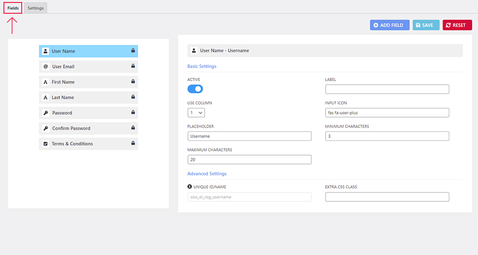
There are several different editable aspects of the fields within the register/sign up form. These depend on the field, of course, and include the fields label, placeholder text, icon, whether it should be included in the form and what percentage of the total width of the form it should take.
Also, for some fields, you can set the character limits, add extra CSS classes, add the privacy policy text and link, or even auto-fill the WooCommerce billing and shipping fields with their content of the First Name and Last Name fields.
Once again, these fields are part of the registration form found in the Sign Up tab and their properties should be edited according to your needs. After doing so, make sure to click the “Save” button in the top right corner of the screen to save your choices. Additionally, you should check the Terms and Conditions field and make sure that the link to your Privacy Policy page is properly linked, as it is added using an HTML anchor tag.
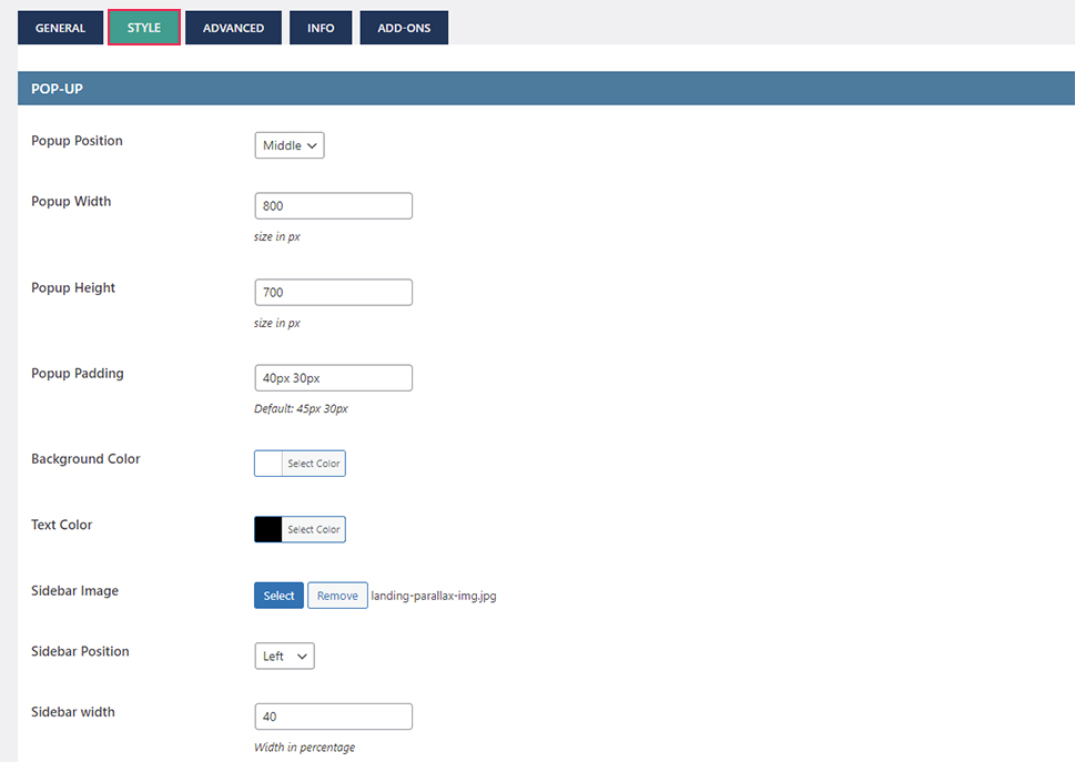
Having said that, let us touch on the plugin options intended for styling login popup forms. The first part of those options is located in the Style tab, in the Login/Signup Popup > Settings section. Here, you can set the following options: the position of the popup on the screen, its dimensions, the padding around the login and register forms that are part of that popup, the background color of the popup, the color of the text in the popup, the image that used with the popup, whether it is positioned on the left or right side of the popup window and what percentage of the total width it occupies.
All these options are straightforward, which is why we won’t delve any further into them. We will note that the sidebar image is only meant for wider screens. On smaller screens, only the Login and Sign Up tab will be shown. Since this is not obvious from the options presented, we thought it is best to specify.
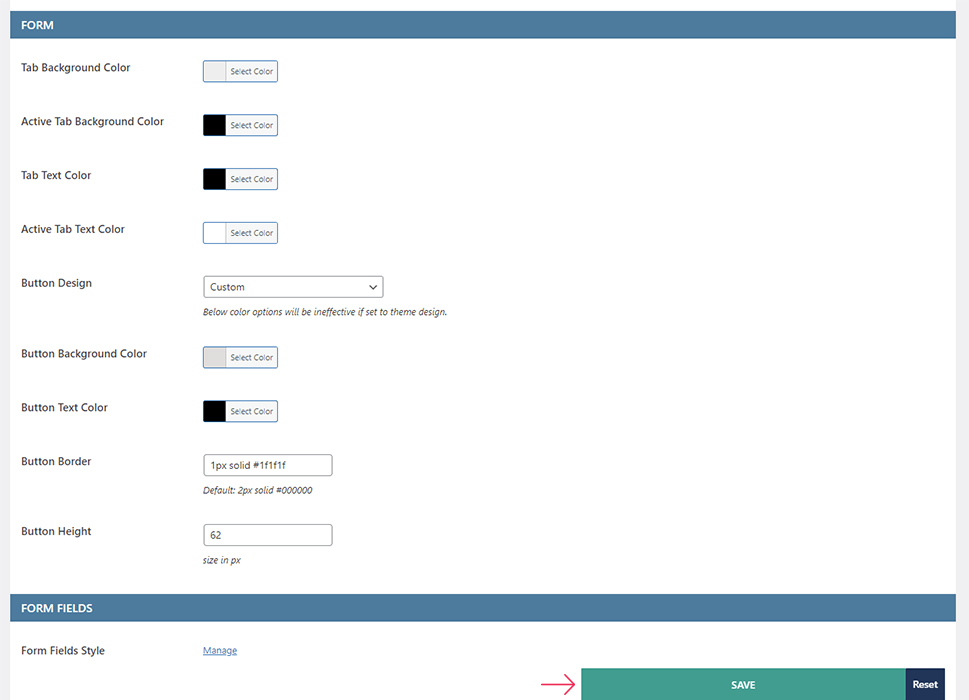
We proceed to the second part of the stylization options, which are related to the login and register forms of the login popup. From the Form subsection, you can adjust the propertiesrelated to the tabs and buttons in the tabs. These include the background color of a tab and the color of the text in it, both for the active and inactive tab. As for the buttons, you can set their background color, text color, height, and border properties.
Of course, do this only if you choose the Custom button design option. This is something that can be changed later, depending on your preference. But, make sure to click the “Save” button after choosing the styling options to save your choices and apply them on the website.
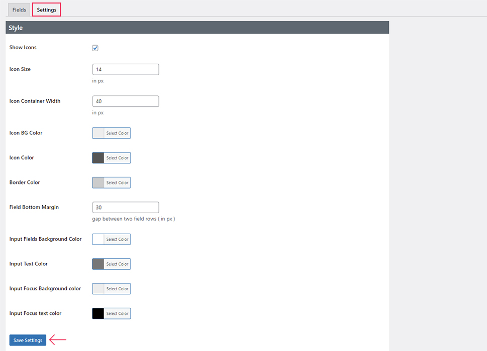
Finally, we come to the last part of the stylization options, found in the Settings tab belonging to the Login/Signup Popup > Fields section. Alternatively, you can access this tab by clicking on the “Manage” link next to the Form Fields Style option in the Login/Signup Popup > Settings section.
The Settings tab in the Fields section contains the stylization options for the fields of the login and register forms. These include whether to add icons next to the related fields, their size, color, container width, and the background color of the icon container. Also, you can adjust the border color of the form fields and their bottom margin. And, specifically for input fields that make the majority of every form, you can adjust its text and background color, both while focused and unfocused.
In a similar manner as before, you can adjust these stylization options at this point or later on, depending on your preference. But, if you choose to do so now, don’t forget to click the “Save Changes” button found at the bottom of the Settings tab.
This concludes our overview of the stylization options provided by the plugin. However, there are still two important tabs we have purposefully left for last. These are the Advanced and Info tab, found in the Login/Signup Popup > Settings section.
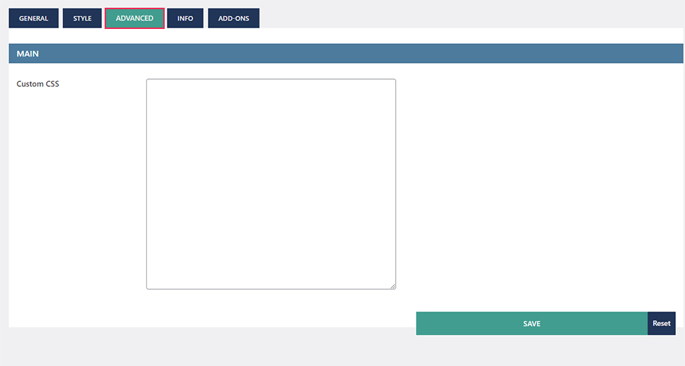
The Advanced tab is designed to store any custom CSS you might need to further stylize the login popup and its components past the options provided. While creating the article, we haven’t used this tab. Instead, we have used the Appearance > Customize > Additional CSS section, which is the default location for adding CSS code to a WordPress website.
As for the Info section, it displays all the possible ways of implementing the login popup available. Therefore, it is an instruction manual on how to add the login popup with this plugin.
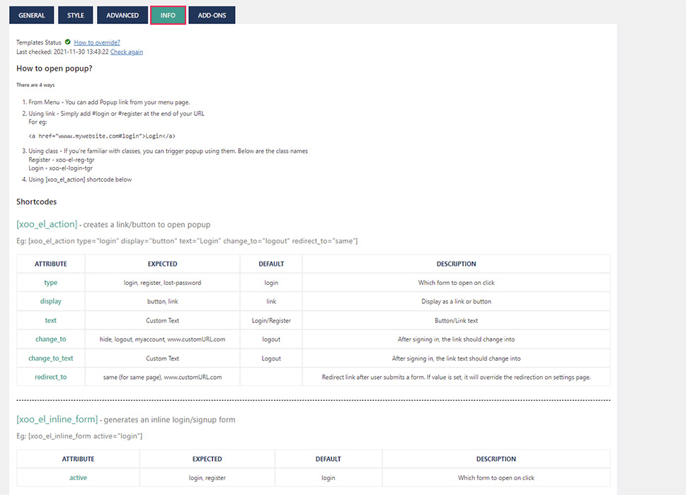
However, as most of these instructions aren’t friendly towards newer WordPress users, we have decided to specifically cover all these uses in separate subsections. We will try to cover them as thoroughly as possible so that they are understandable by most, if not all, WordPress users. Then, depending on your preference, you can choose the way(s) to implement the login popup that is best suited for your website. With that being said, let us begin.
Of the four methods mentioned in the Info tab, adding the login popup as a menu item is the most user-friendly and most frequently used. For this reason, we will also cover it first.
To add the login popup as a menu item, navigate to Appearance > Menus and select a menu you wish to edit. Locate the Login/Signup Popup type of menu items in the Add menu items section on the left. By expanding that subsection, you will see all the menu items that the plugin supports. These include login, register, lost password, logout, two hello menu items, and my account menu item. Of these menu items, the first three are only visible to logged-out users, while the rest are only visible to logged-in users. The first three are part of the login popup window and what we will showcase in this article.
If you want to add any of these items to the selected menu, tick the checkbox next to it and click the “Add to menu” button found below.
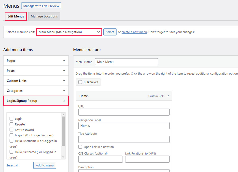
The selected menu item(s) will be added to the end of the menu, but you can drag and drop it in any other place within the selected menu. For this article, we have opted to add the Login menu item at the end of the existing menu. It will be added as a custom link with a custom CSS class xoo-el-login-tgr given by the plugin.
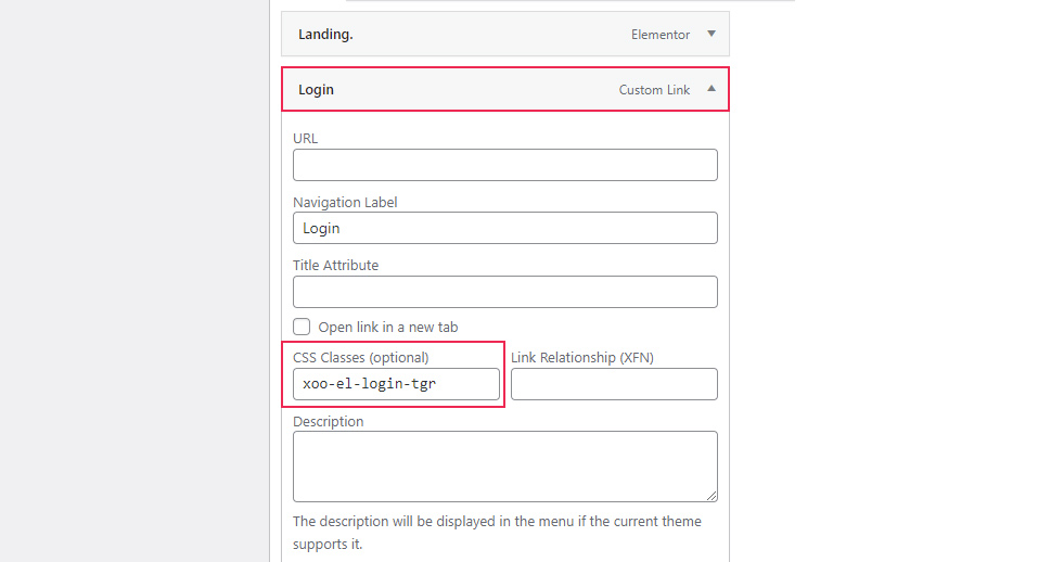
Of course, depending on the menu item that you add, you might see a different CSS class with the prefix “xoo-el-“. However, regardless of the CSS class, you shouldn’t remove it, as it is required for the login popup modal to work. Furthermore, the same CSS class will be mentioned in the following subsection on adding the login popup using links.
With that being said, you should click the “Save Menu” button at the bottom of the menu screen to save the changes you previously made and test the menu item and its functionality. In doing so, you should be aware of the visibility policies enforced by the plugin. More precisely, for the login menu item we used, it means testing the website while being logged out.

Having found the Login menu item, you only need to click on it to open the login popup modal. It will appear on the screen stylized using the previously mentioned options.
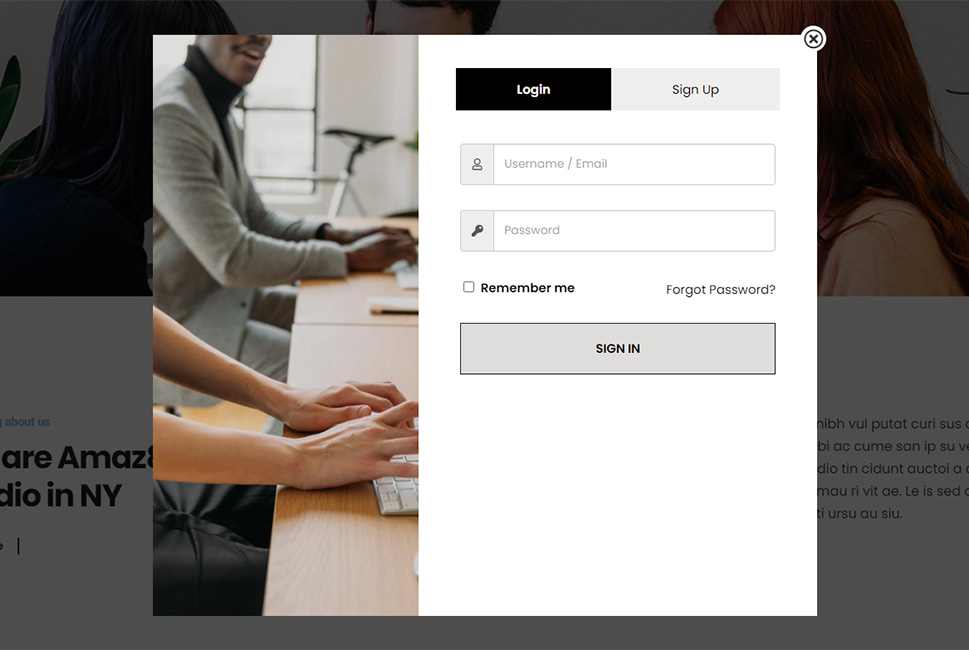
Apart from adding the link that opens the login popup in the menu, you can also add it anywhere else on your website. In doing so, you can add an anchor link with specific words as anchors or a regular link with the plugin-specific class. As these two methods are quite similar, we have decided to group them in this section.
Adding a link in WordPress can be done using any plugin editor: Gutenberg, Elementor, WPBakery, Classic Editor, etc. However, the process of doing so differs slightly based on which plugin you are using for editing pages. In this article, we will explain how it is done for Gutenberg editor only.
In Gutenberg, one way of adding any kind of links, including anchor links, involves adding the Paragraph block. In it, you can insert the text you wish displayed on a certain page. Then, by highlighting a certain part of the text, you can access additional paragraph options, including the ability to make that part of the text a link. To make that text into a link, choose the Link option. This will open a small popup window allowing you to specify the link URL and whether it should open in a new tab. For the link to open the login popup provided by the plugin, you will need to add a specific anchor link.
Depending on whether you wish the Login or Sign Up tab to be opened by default, you will need to make the URL “www.mywebsite.com#login” or “www.mywebsite.com#register”, making sure that the “www.mywebsite.com” is properly replaced with your actual website URL. Or, if you find this a bit confusing, you can simply input #login or #register, which will function just as well, since they will be interpreted as internal links.
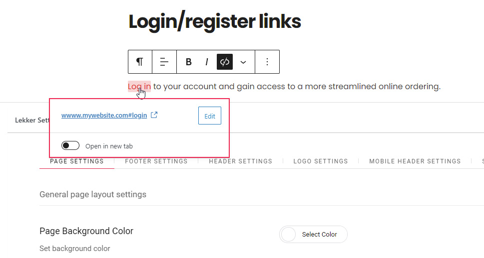
Alternatively, if you want to have a higher level of control over how the link is created, you can select the three dots option and select the “Edit as HTML” suboption from the menu that appears. This will convert the Paragraph block into HTML code, allowing you to edit the <a> tag within it as you see fit. For example, you can add a specific ID or CSS class to that link using this method. Of course, doing so requires a bit of HTML, CSS, and overall WordPress knowledge.
With that being said, make sure to update the page/post where you added the link and then test it on the front end.
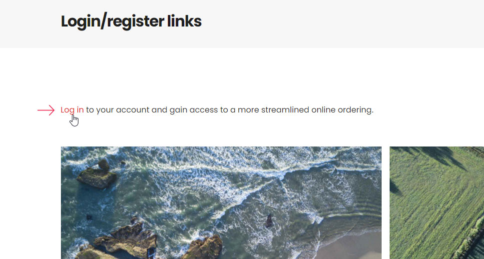
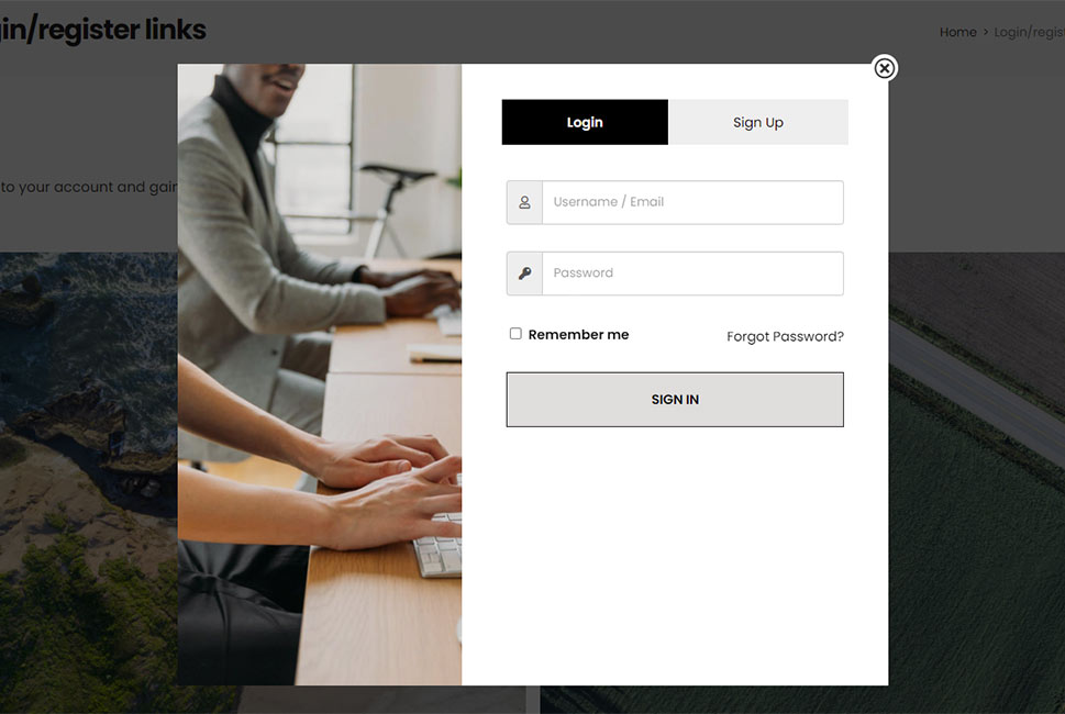
Of course, the same rules regarding the functionality of the login popup modal apply here. Meaning, even though the paragraph containing the corresponding link can be seen both while logged in and logged out, the login popup will only appear while a user is logged out of the website, as it is intended. After clicking the link, the same login popup we saw previously will appear. Needless to say, either the Login or Sign Up tab will be opened by default, depending on if you have added the #login or #register as the anchor link, respectively.
As mentioned, the login popup can also be added using a link with a specific class. To do so, use the Paragraph block converted to HTML, a custom HTML block, or a Buttons block. We will showcase the third option, as it is the most user-friendly.
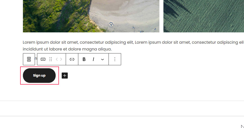
Add the Buttons block to your page or post. A button will already be added to the Buttons block after inserting it on the page/post. By clicking on the button, you will be able to add its text and change some of its properties using the options found in the right-hand menu.
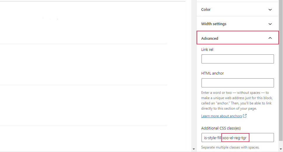
The most important option for this process is found in the Advanced section and is called Advanced CSS class(es). Depending on what type of button style you have selected – fill or outline – a custom class will already be present: is-style-fill or is-style-outline, respectively. These will be added by WordPress by default. What you need to do is insert an additional CSS class – xoo-el-login-tgr or xoo-el-reg-tgr, depending on if you wish that the login popup has the Login or Sign Up tab opened by default. Whichever of these you choose, make sure to separate it with a space from the CSS class inserted by WordPress.
For this article, we have opted to add the xoo-el-reg-tgr class, as seen in the screenshot below.
After updating the page, we have gotten the following result.
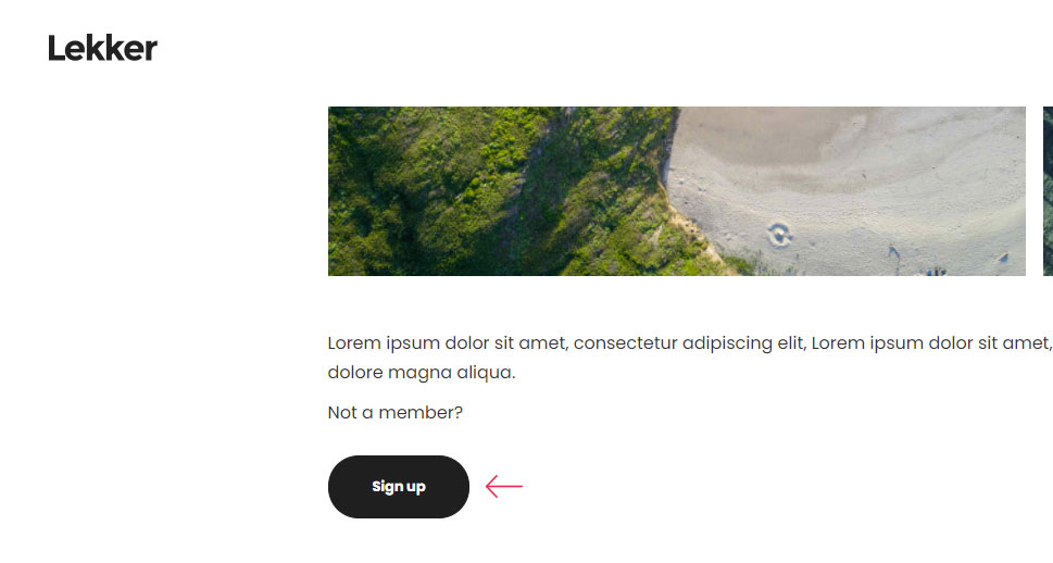
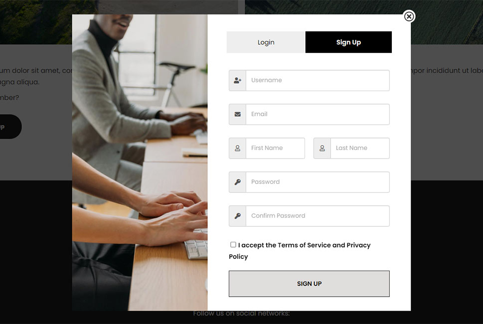
As mentioned previously, the login popup will only be displayed to logged-out users. But, in this case, both the button and the login popup will be hidden from logged-in users, as opposed to the Paragraph block method.
Finally, we have come to the most challenging method within this article – the shortcode. The plugin offers two shortcodes – the login popup and the login inline form shortcode. And while calling shortcodes seems frightening for most WordPress users, using the two provided by this plugin is made much easier thanks to the instructions left within the Info section. For each of the shortcodes mentioned, the plugin author has included a list of attributes, the expected and default values of those attributes, as well as what each of these attributes represents.
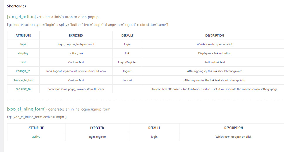
Moreover, you can also see examples of how these two shortcodes can be called. We have used them in our article as well. But, before we delve into how the shortcode calls can be added to your website, it is worth mentioning that this process depends on the page editor plugin you are using: Gutenberg, Elementor, WP Bakery, Classic Editor, and so on. As with previous examples, we will explain only the Gutenberg editor. Therefore, if you aren’t certain how the same process is done in your editor choice, we advise reviewing our article on the use of custom shortcodes beforehand to get a better grasp on this topic. With that being said, let us continue with our explanation.
To add a shortcode using a Gutenberg editor, you will need to use the Shortcode block. Add a Shortcode block to a page or post where you wish to display the login popup shortcode. Then, enter the shortcode call whose option choices best suit your website. Of course, to do so, consult the helpful overview shown above. For the article, we have used the default example:
[xoo_el_action type="login" display="button" text="Login" change_to="logout" redirect_to="same"]
With this shortcode, we made the Login tab open by default, while the login link is displayed as a button and with Login as the text. Furthermore, after logging in, the link text will change into logout, and after logging in, the user will remain on the same page, i.e. there will be no redirection to an alternative page.
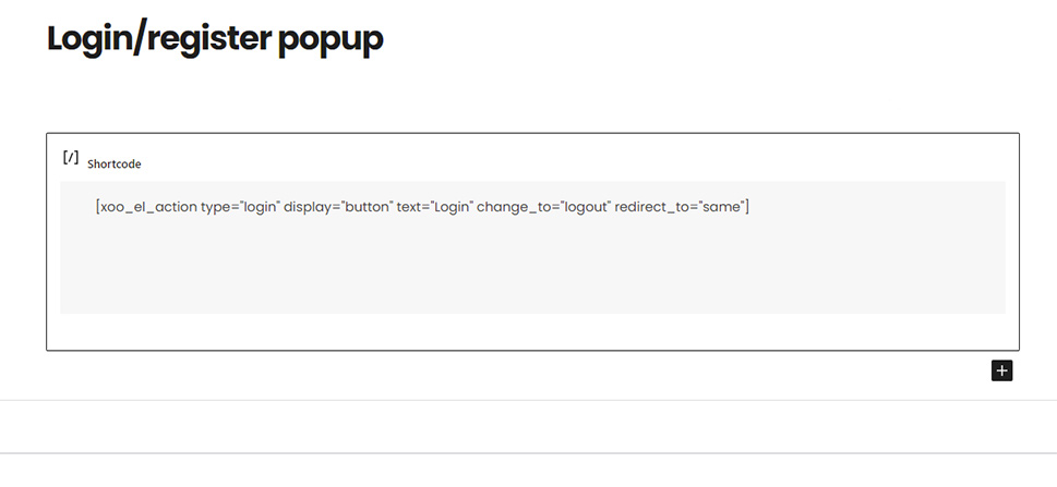
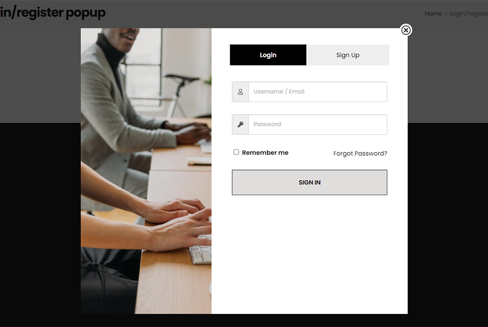
Having explained that, the only thing that remains is to update the page and test the login popup functionality on the front end. As stated before, to do so, you will need to be logged off. Since we have specified that “Login” is our link test, after clicking it, the popup will appear.
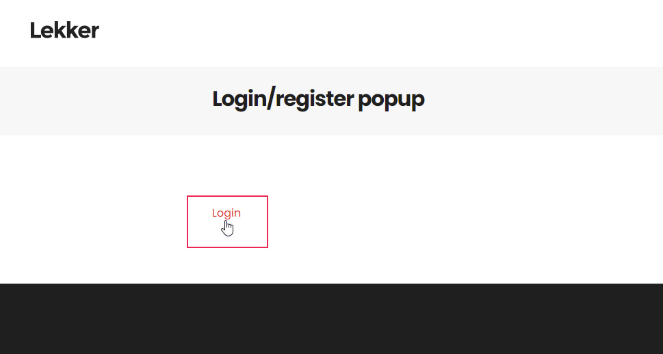
However, we must mention that in some cases, your initial login/register link won’t be displayed as a button, despite it being specified as such within the shortcode call. We have purposefully left that as an example in one of our previous shortcodes. Thankfully, such a minor issue can be solved quite easily using CSS code. This will be shown in the Additional tips section, later in the article.
Having said that, let us explain how you can display the inline form as well. While it is not the point of our article, it is an additional functionality of the plugin that we thought is worth showing to our readers.
To add the inline login/sign up form on your website, add a Shortcode block to one of your pages or posts and enter the appropriate shortcode call inside it. Of course, you can consult with the explanation provided within the Info section the inline form shortcode. In our case, we have used the following shortcode call:
[xoo_el_inline_form active=login]
meaning that we have specified that, of the two available tabs, the Login tab will be opened by default.
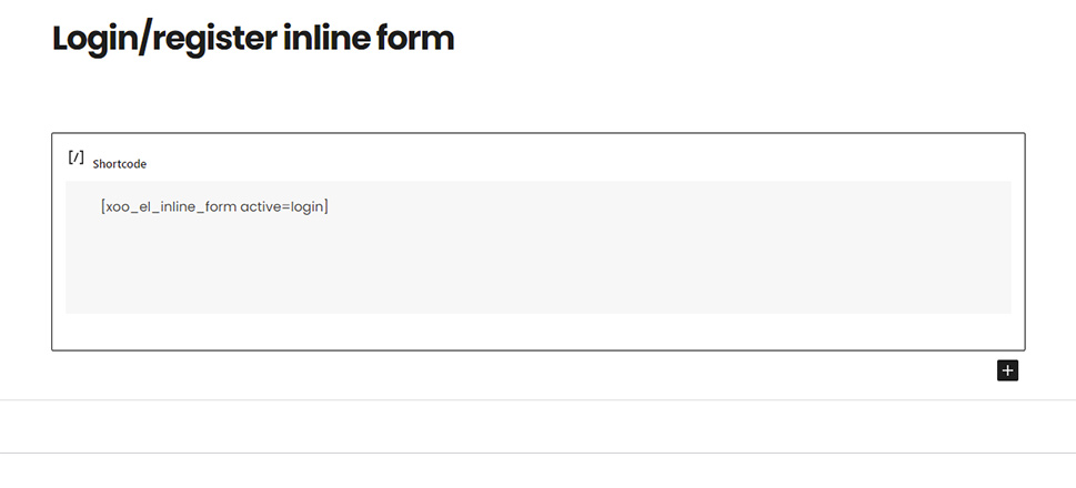
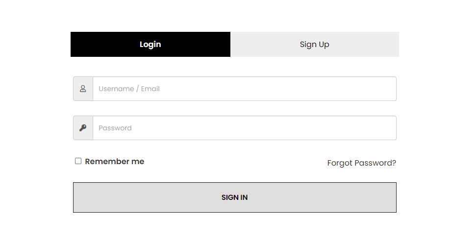
After inserting the shortcode call, update the page and test the inline form from the frontend. Similar to all other methods, to view the inline form, users must be logged out of the website. As seenin the screenshot below, the form will be displayed without the side image. This is the same display the login popup will have on smaller screens, which we already mentioned while discussing the plugin options above.
Finally, the plugin also has a Forgot Password form, which is not a part of the two prominent tabs. While we have mentioned it, we haven’t showcased it in the article yet. The reason for it is that it is accessed by following the “Forgot Password?” link found in the Login tab. Therefore, we thought it best to showcase the display of all the tabs with a suitable gif.
Even though the plugin we covered has its set of stylization options, knowing how to create additional CSS code to tweak some styling errors can be beneficial. For example, it can help you stylize the Login link as a button if it doesn’t appear that way. Of course, doing so requires a moderate amount of HTML and CSS knowledge.
Nevertheless, we will try to explain the code creation process below, as thoroughly as possible. If something remains unclear to you even after reading this section of the article, we advise brushing up your knowledge by reading our general overview of CSS code.
To create the CSS code needed for stylization, you need to know how to inspect a certain element using the developer tools of your current browser. To do so, right-click on the element you wish to change and select the “Inspect” option from the menu which opens.
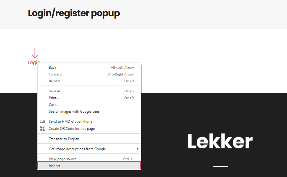
This will open the Elements tab of your current browser and position you on the element you right-clicked. Then, you will need to examine the HTML structure to figure out the appropriate CSS selector you will need to use for the code. You might need to scroll up or down the HTML structure to find the most appropriate CSS selector. Each time you do so, the current HTML element will be highlighted on the screen, so you can keep track of it easily.
In this particular case, we didn’t need to scroll up or down the structure, as the Login link was a simple <a> tag. Looking at it, we have noticed that it has the following four classes: xoo-el-action-sc, button, btn, and xoo-el-login-tgr.
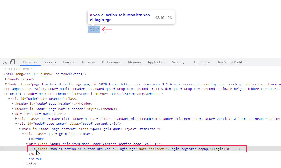
These classes are all added by the Login/Signup Popup plugin, but only the two with the prefix “xoo-el-” are used by the plugin. The other two – button and btn are added assuming that they will be used by your current theme to apply theme-specific button design. But, if they remain unused, the link design will remain unchanged.
To solve this, you will need to create a CSS code which targets the link specifically and apply the desired stylization. As one of the possible CSS selectors, we can use one or even all the CSS classes it contains. We have opted to use the following CSS selector: .xoo-el-action-sc.button.btn, i.e. only the three of the four available classes.
The only thing that remains is to add the CSS declarations which stylize the <a> tag such that it appears as a button while maintaining the same style as the theme we are using. This is expressed with the following pseudocode.
.xoo-el-action-sc.button.btn {
// Add CSS declarations here
}
Unfortunately, adding the right CSS declarations is not an easy task, since it needs to be done on a case-by-case basis. Therefore, we can’t suggest any code which can be applied to all websites. Instead, we will leave you with the code which was sufficient in our case. Of course, we have to note that it is not meant to be simply copied and pasted, but used as a starting point while creating code which best suits your website.
.xoo-el-action-sc.button.btn {
color: #fff;
background-color: #1f1f1f;
border: 1px solid #1f1f1f;
position: relative;
display: inline-block;
font-size: 13px;
line-height: 2em;
font-weight: 700;
padding: 15px 40px;
}
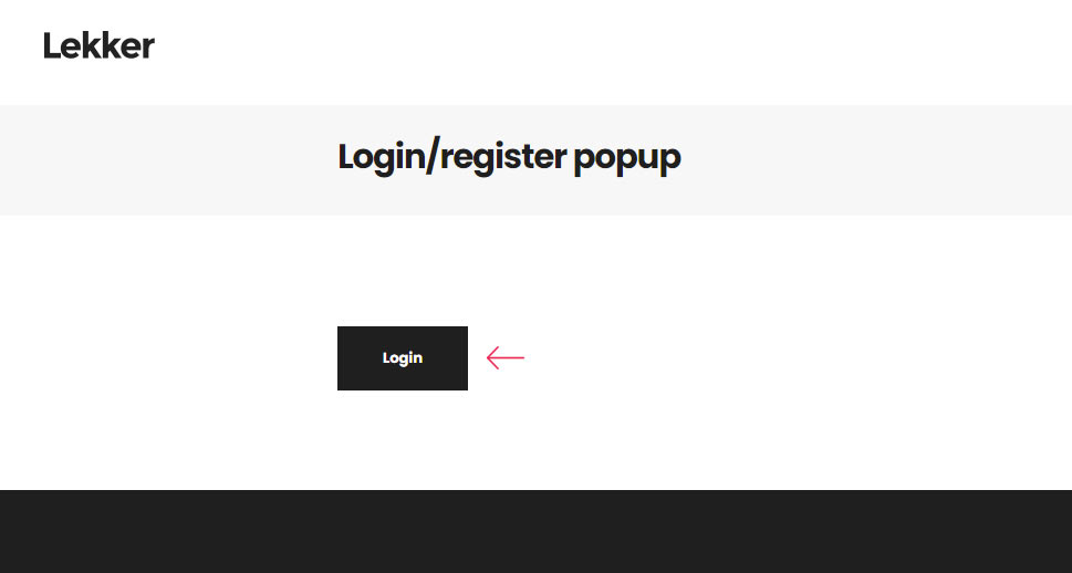
Such code can be inserted either in the Appearance > Customize > Additional CSS section or in the Advanced tab provided by the plugin. We have opted for the former, as previously stated. After inserting the above-mentioned CSS, we have gotten the following result for the login link which opens the popup. With it, we conclude the article.
Final Thoughts
A login popup modal is a great addition to any WordPress membership website or e-commerce store, as it provides a more streamlined user experience to your website visitors and customers. Adding it is relatively simple using a wide range of WordPress plugins that offer this feature.
In this article, we have covered one such plugin called Login/Signup Popup. Since it requires a bit of overall WordPress knowledge, we strived to explain all the steps thoroughly. We are sure that, by following our instructions, all WordPress users will be able to add a login popup modal to their website, be it either as a menu item, link, shortcode, or an automatic popup.
Furthermore, in the article, we have added some key points regarding CSS stylization which will be helpful to any intermediate users willing to learn more. Therefore, whether you need to add a WordPress login popup modal or simply want to brush up on your existing WordPress knowledge, this article is the one that you should bookmark and review at a later date.


