How to Make a Vertical Slider With Slider Revolution

This article is part of our ongoing series of Slider Revolution tutorials. You can find all the articles from this series in our Comprehensive Slider Revolution Guide.
When we think about sliders on websites, we usually think about the “regular” horizontal ones that scroll from left to right. However, more and more designers opt for less conventional solutions for their sliders. Today, we’re going to talk about an impressive, modern-looking type of slider that is actually quite easy to make – the vertical slider. These sliders often take up the entire page, rather than just its top part, like horizontal ones. This makes them even more impressive, as they make the page appear very dynamic, and yet provide enough room for other elements, such as text or buttons, as you can see from the example below, from our Goodwish theme.

How to Create a Vertical Slider
Thanks to Slider Revolution, the process of creating a vertical slider, even one that spans the entire page, is not at all complicated. In fact, it’s pretty straightforward, like most things in this excellent plugin.
One important note before we proceed: if you plan to create a fullscreen Slider Revolution vertical slider, make sure the size of the images you will use covers the full-screen span (1920x1100px).
To get started, head over to Slider Revolution from your admin dashboard. The first thing to do is, naturally, to choose the type of slider you want to create. Here, select the type called Slider.
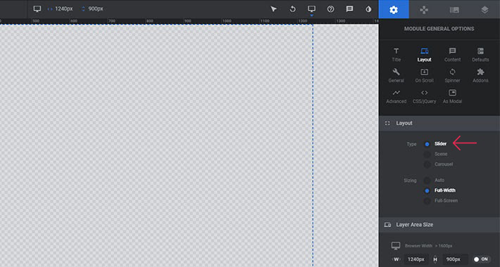
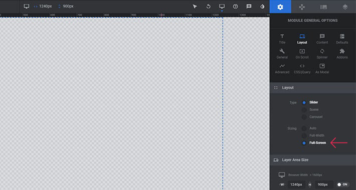
Under Sizing, select Full Screen.
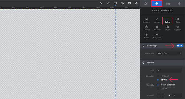
Your next move should be to set the mouse scroll direction. Head over to Navigation > Bullets. Turn on the Bullets Type switch first. Then, under Position > Orientation, select Vertical.
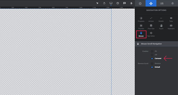
The next thing to do is to decide whether you want your slider to loop after it reaches the last slide. We recommend you go for this setting, as it will appear more dynamic, whereas the slider that just stops may look like there’s something wrong with it.
Go to Mouse > Mouse Scroll Navigation and select the option saying Carousel.
Also, vertical sliders don’t really have a need for arrows, so you can go ahead and turn those off under Arrows > Arrow Type.

Vertical Sliders on Smaller Devices
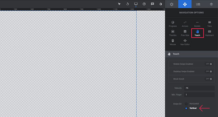
Now, you have to factor in the fact that a lot of people browse the web using their hand-held devices – most of all, their smartphones. If your website has a fullscreen vertical slider, you want to make sure it looks and works good on those devices too. The default swipe direction for sliders is horizontal: to get to the next slider, the user will swipe left and the slider will change. With vertical sliders the direction will, of course, have to be vertical (up and down), so you have to set that too if you want to assure your slider works properly on smaller screens.
To adjust the settings, head over to Touch > Navigation Options. Here, set the swipe direction (Swipe Dir) to Vertical.
And that’s all there is to it. Now you can start adding your slides and layers, like you would with a regular horizontal slider.
In Conclusion
With Slider Revolution, vertical sliders are easy to create and they can get you a long way in terms of the impression they’ll leave on your visitors. If you’re looking for inspiration, there are many premium WordPress themes that feature fully functional and beautiful vertical sliders, so make sure to check them out.
Furthermore, make sure to check out our very own Qi Addons for Elementor plugin, a collection of versatile and convenient widgets that includes the Vertical Circled Slider widget, or the Divided Slider Reveal. It’s an innovative, modern solution that you can easily implement on your pages, and there are plenty of other slider widgets in the collection as well.


