6 Things to Consider When Making Your Portfolio Website

Whether you’re set on launching your freelance career or simply want a place to showcase your creative work, a personal online portfolio can be your best ally. But making a great portfolio website requires way more than simply uploading your creative output to the web. Most of your clients will form their first impressions of you and your work through your portfolio, so it’s important that it looks clean and professional, and that it accurately demonstrates all your strengths.
No matter whether you’re a designer, photographer, architect, marketer or writer, there are certain decisions in terms of both content and design that can make your portfolio stand out and enhance your chances of landing more clients.
If you’ve already decided on all the specifics of your portfolio website and are getting ready to actually make it, you can find our in-depth video tutorial on how to create a portfolio website in WordPress below. However, if you’re still in the planning phases of your online portfolio, make sure you read on.
Here are some of the most important things you should consider when making your portfolio website.
1. Create a Showcase of Your Best Work
Naturally, when selecting which pieces to present in your portfolio, you’ll want to go for the best of the best. However, there are some things you might want to keep in mind both before and during this process.
-
Emphasize quality over quantity. It’s not necessary to fill up your portfolio with every single work you’ve ever done just to create an impression that you’ve got a lot of experience behind you. A select few powerful pieces will be enough to do the trick. And remember – your portfolio is only as strong as your weakest work in it.
-
Communicate your passion through your portfolio. When it comes to building an online portfolio, your passion and work ethics have the most potential to make it shine and set it apart from everything else on the web. That’s why you should aim to convey the creative passion behind your works in the best way possible.
-
Incorporate case studies into your work. Once you decide on the pieces you want to display, it’s time to provide some context. A huge number of creatives (especially those focused on visual arts) overlook the importance of writing blog content in the form of case studies to highlight their work. Providing a short account of your initial brief and the creative steps you went through to bring it to fruition will give your potential clients some insight into your thought process. You might even want to display some of your early drafts alongside the final work, to show the evolution of each piece. Regardless of how in-depth you decide to go, a combination of words and visuals is the best way to help your future customers learn about the innovative ways you approach your creative work.
Sticking to these strategies will help you create a cohesive, organized, and meaningful selection of your work. And when you add your unique style and expression to the mix, you’re sure to leave an instant impression on your potential clients and make the decision of hiring you that much easier.
2. Conjure up a Design Aesthetic That Complements Your Work
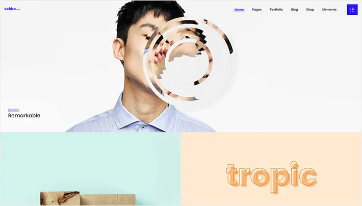
Making the design of your portfolio website harmonious with your works is something you should strive for. In other words, all the colors, patterns, buttons, and other elements on your site should be in tune with what you plan to display. Or, at the very least, you should carefully consider the relationship between your works and your website design while coming up with your portfolio.
Of course, that is not to say that your website design should distract your viewers from appreciating your works. Rather, it should aim to complement them. There are a few different ways you can achieve this.
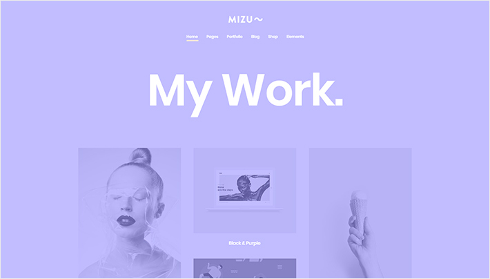
- Go for minimalism. Regardless of the nature of your work and the style you want to present, going for a minimalistic web design approach is an unmistakable decision. The reason for this is simple – if you incorporate minimalistic design into your portfolio, your works will be at the forefront, and your visitors will be able to easily navigate through them and get a comprehensive overview of your style and skills.
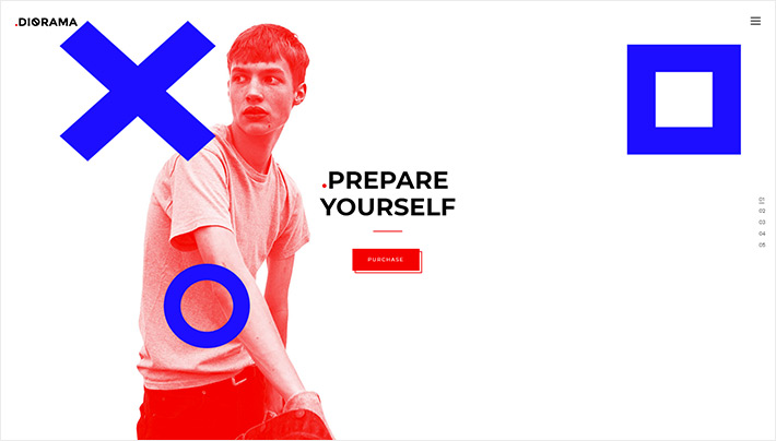
2. Strive for similarity. In case you want to be more daring with your design elements, colors and animations, it might be a good idea to try and blend all these elements with your works, i.e. to get them to have the same or similar vibe as the creative pieces you plan to display in your portfolio. Using this tactic, you can make your portfolio design “become one” with your works.
3. Create a contrast. Another way you can approach your portfolio design is to make it look different from your works. Depending on the nature of your work, this can actually make your portfolio pieces stand out even more.
As far as the structure of your portfolio goes, here are some things to keep in mind when figuring out how to compile your works and present them to the world.
Portfolio Lists
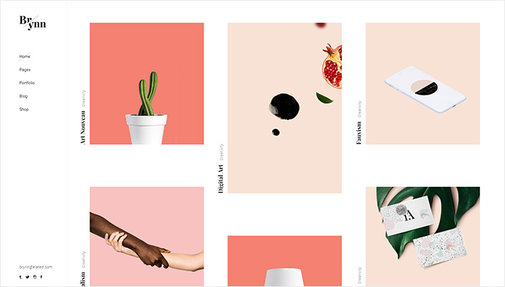
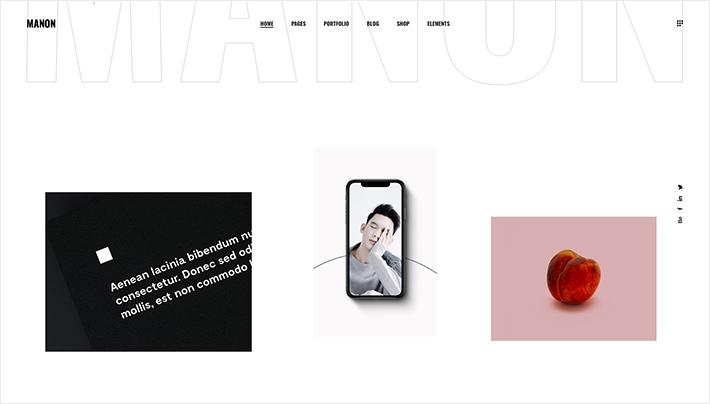
What we mean by portfolio lists is a collection of several portfolio pieces shown together on a single page. Depending on how you chose to organize your portfolio, a portfolio list can showcase your entire collection of works or just a few pieces from one category. There’s a number of ways you can present your portfolio lists to ensure each piece gets the attention it deserves.
For example, if you have works that are rich in color or detail, or if various pieces from your collection simply don’t go well side by side, you need to make sure they have enough space to “breathe”. To do this, you can create more free space around them, thus preventing your portfolio from becoming oversaturated. This can be done by:
- Using a slider to present your works one by one,
2. Creating a list with plenty of white space,
3. Showcasing a smaller number of works with more empty space around them,
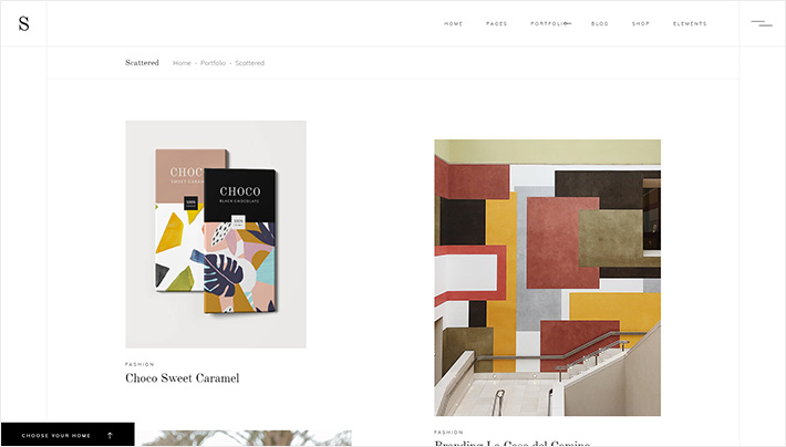
4. Using an asymmetric or “broken grid” type of list. This will let viewers rest their eyes as they go from one piece to the next, and you’ll still be able to showcase your works in all their glory.
If, on the other hand, your works are more minimalistic in their structure and/or fit well next to one another, then more compact list types such as a masonry or pinterest style list can work much better. By using a list that places your pieces closer to each other, the sense of unity and the consistent style in your works will immediately prevail, which can be a great advantage when used wisely.
Portfolio Singles
Portfolio singles are pages dedicated to each single piece from your portfolio. Depending on the type of work in question, singles can contain one or more images. For example, if you’re presenting a logo design or a piece of art, you can always add early sketches and drafts to your single, or even random things that inspired you while working on the piece. This is a great way to present your unique way of viewing things as well as the creative process that led to the finished piece of work.
When it comes to single presentations of your work, the same rules apply as for portfolio lists. Whether you’ll use small images, big images, sliders, masonry grids, or something else entirely depends on the material you’re showing off. You can try out a few different presentation styles and see which one seems to best suit your work.
Like we mentioned before, it’s always a good idea to include a description of the work. In some cases, you might even want to write up an entire case study. However, if you think that your works speak for themselves, then it may be best to keep things simple. This means including only your most effective work examples and adding only the most essential info needed.
Hover Animations
Hover animations are an essential part of the web and, as such, they must not be overlooked. The hover animations you choose for your portfolio should match both the style of your website and your works. There are a few paths you could choose when deciding on your hover animations.
One option is going minimal, almost without any changes in the way the works are displayed. Another popular trick is to switch the image and show a different picture when your visitors hover over each of your works. Or you could stick with a more classic approach and add a subtle motion animation or even simply display a few key pieces of information across the image on hover.
All in all, hovers can be another great addition to your portfolio presentation and can help further emphasize the uniqueness of your work.
In case you’re struggling with choosing a design concept for your portfolio, there’s no need to fret – plenty of portfolio WordPress themes have predesigned layouts which can help you set up your portfolio with ease. You just have to find the theme that best fits the general style you’re going for, and then simply customize to your liking.
3. Write a Thorough “About” Page
Impressing people with your technical skills and creative vision is one thing. Earning their trust and making them want to work with you is a whole other story. You can achieve the latter only if you provide your website visitors with enough information about the person behind the screen, so to speak.
While it’s perfectly fine to let your work sell itself, it’s always interesting to read about the person or team who created it. This is also a perfect chance to humanize your portfolio and give it another dimension, which might ultimately be what attracts others to contact you.
The key is to offer a compelling snapshot of who you are, both professionally and personally. And that’s what your “About” page is for.
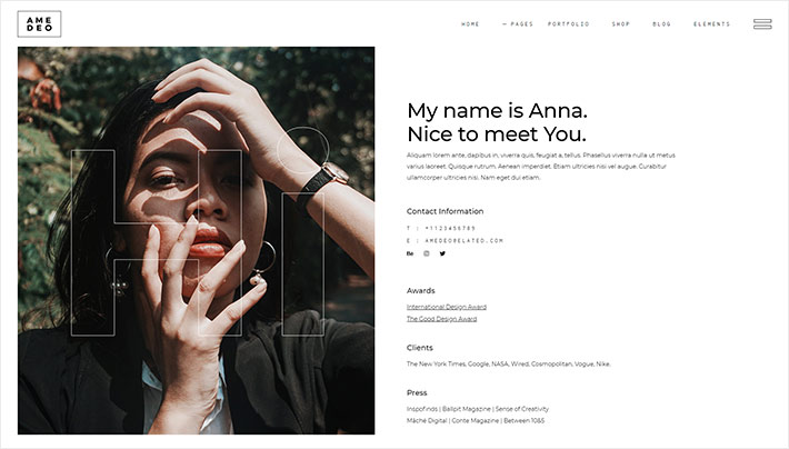
Besides the expected information like your education, previous work experience and major achievements, your “About” page should also have a personal touch to it. Include information that reveals your personality. Tell your story. Explain how you decided to do what you do. Describe the trials and tribulations you went through on your journey toward becoming the professional you are today. And don’t hesitate to throw in a picture of yourself – people like to know who they’ll be doing business with.
All in all, expressing your individuality will separate you from the crowd, which is always a good thing. But while this is a perfect chance to be yourself, just make sure not to overdo it. Similar to other parts of your portfolio, your “About me” page should be concise and to the point. It’s good to add a personal touch so that people know there’s an actual human being behind all those works, but your portfolio shouldn’t be a social network profile. At the end of the day, your goal is gaining clients, so stay as relevant as possible at all times.
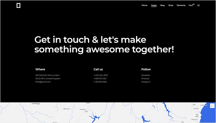
4. Make Your Contact Info Highly Visible
You should make sure your contact details are noticeable right away so that people who like your work, whether colleagues or clients, can contact you as soon as possible. Making it easy to get in touch with you will enhance your chances of scoring new clients. Naturally, you’re going to put your contact information on a dedicated “Contact” page, but you should also consider placing it throughout your website.
Don’t just rely on contact forms. Ensure that there are several different ways of communication available for your visitors. It’s a good idea to add your email address, telephone number, and links to all relevant social media channels to the footer of your website, as well as anywhere else you find necessary.
5. Implement Social Media Links
Nowadays, no matter what type of business you’re running, a lack of presence on popular social media networks is almost unthinkable. So including links to all your social media profiles on your portfolio website is not only common sense but mandatory. In fact, you can consider social media channels an extension of your website.
There is a concrete explanation as to why social media is so important – simply put, social media channels increase your online visibility. They also let you send out tailored messages to your followers and give both clients and prospects a familiar and easier way of getting in touch with you. The more social media profiles (Facebook, Twitter, Instagram, etc.) you have, the better. Just make sure to include only the ones relevant to your work.
Another great idea is implementing a “share” button on your portfolio pieces, so that visitors can share things they like from your portfolio directly to their social media platforms.
6. Other Ideas to Make Your Portfolio Pop
There is always something extra you can do to enrich your portfolio website and take it one step further. For example, adding hero sliders, page transitions, parallax effects and animations, or including relevant videos can bring a whole new dimension to your projects.
More importantly, though, you should think about your users and make sure the journey you expect them to take through your website is clear. A smooth user experience can do wonders for conversion. And of course, do everything in your power to enhance the speed of your website and ensure it looks pitch-perfect on both desktop and mobile devices.
The Bottom Line
A portfolio website is the ideal platform to showcase your skills in the best possible way and convince people to hire you. But to achieve this, your portfolio has to be unique so that your clients don’t end up thinking of any other alternative.
There are infinite ways to make your portfolio website stand out in the sea of creative work on the web, but these are some of the essential things to consider when building your own portfolio. So remember: be yourself, provide relevant information about your work, and make it easy for people to get in touch with you. If you manage to achieve those three simple things, your chances of success are sure to skyrocket.
And finally – don’t rush. While many entrepreneurs, designers, and other creatives want to put their portfolio online as soon as possible, it’s a good idea to sit down first and thoroughly consider what works for you and what will have the best possible impact when your site goes live.
Good luck!
