How to Create and Use WordPress Columns

While something as simple as columns may seem like the most pedestrian and, let’s be honest, boring element of any website, it’s really not. In fact, columns might even be the most important component when it comes to arranging your content into a harmonious whole. Without them, it would be a lot harder to organize all the other elements of your site, like buttons and images, or even shortcodes and widgets, into logical and, above all, aesthetically pleasing compositions. So, today we’ve decided to show you how to create and use columns in four of the most popular WordPress content editors. Here’s what we’ll cover:
To add a column to a post using the Gutenberg editor, first, open your post and click the plus sign in the post’s top left-hand corner to open the block selector. Now select the columns block, which you can find in the Layout Elements tab.

There are several column variations, but we will use a layout of two equal-width columns for the purposes of this tutorial.

You will see that your row has been divided into two equal parts. You will also see the block settings on the right-hand side. This is where you can edit the relative width of your columns.

To input text into any column, click on its plus sign and select a paragraph block, then type or paste your text.

Just as with text, you can add any other Gutenberg block to your column: images, galleries, videos, and anything else – including other columns. Let’s add an image to the right-hand side column.

In this case, we will upload an image.

Click on the Preview button to see how your post content looks arranged into columns.

In case you are using Elementor, adding columns works a little different. After opening your post in Elementor, you may introduce columns to an area in Elementor by clicking on the Add Section button.

You can now choose the structure of your section. We will choose a three-column section.

As you can see, the active area is subdivided into three sections. To add text to your sections, simply add the Text Editor widget to any of the subsections.

To add an image to a column, simply drag the Image widget to the subsection.

To fill the column up with an image, click on the Choose Image area in the Edit Image tab on the left-hand side…

…and then upload or select a file from your media library.

Deselect the column to return to the elements menu.
To add a video to your column, you need to drag the Video widget to the remaining column.

Remember to paste the URL into the appropriate field to embed the video you want.

Now, to edit this entire section, you‘ll need to go to the Edit Section menu.

The Edit Section menu on the right-hand side gives you several Layout options, governing the appearance of the columns on your page. This really depends on your layout preferences.

We will use the Content Width option to even out the text with the image column.

The Structure section is there to make it easy for you to change the width ratio for your columns. We will select the 50, 25, 25 layout and see how that affects the column width.

You can format each text block, add backgrounds, buttons, captions for pictures, audio widgets and countless other elements to any of your columns.
If your preferred WordPress editor is WPBakery, you can still create and use columns fairly easily.
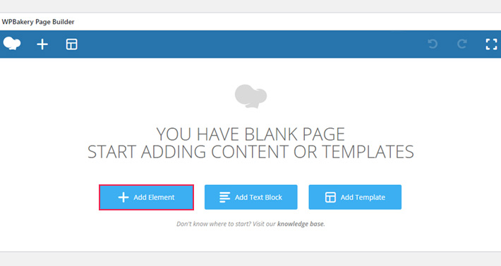
First, open the post in WPBakery and click the Add Element button.

Then, choose the Row element.

To split this element into two columns, hover over the columns tab. You need the Column Layout tab to subdivide your elements into columns. We will select two equal columns (1/2 + 1/2).

Your added row is now subdivided into two equal columns.

To add content to one column, click its plus sign and choose the appropriate element. For text, it is the Text Block element, for images you need the Single Image element, for a video, a YouTube (or other) element, and so on. We will add some text to the left-hand side column, and an image to the right. We have already discussed text, and now we’ll take a look at the Single Image element.

Here you see the various image configuration options. To populate the image element, click on the image button and select an image. If you don‘t want to use the media library, you may select other image sources from the Image source drop-down menu.

Since we already have an image in our library, we will reuse it.
Once you’ve set up your image, click the preview button to see what your content looks like in the post.
Your image, as configured, will appear in the right-hand side column.

Of course, you may prefer the classic editor. There is a columns solution for that, too.
Finally, to add columns in the classic editor you will need a plugin. We recommend the Column Shortcodes plugin. If you’re not sure how to do it, we have a tutorial on how to install a WordPress plugin.https://wordpress.org/plugins/column-shortcodes/
This plugin will allow you to create column shortcodes – tiny bits of code which will allow you to rearrange your text and other content.
We want to subdivide our post into two equal width columns. We will begin by switching to the text view before copying the appropriate shortcodes. You will find the shortcodes by clicking the brackets ( [ ] ) button.

To subdivide our post into two equal columns, we will first insert the one half column shortcode by clicking on it. Two tags will appear at our cursor position. These represent the beginning and the end of the left-hand side column.

Now, say we want to embed a tweet into our post’s left-hand side column. You will need to copy the embed code from Twitter. Click on the Embed Tweet command in the drop down menu on the tweet.

Twitter will link to a page with the requisite code. To copy the embed code, simply click the Copy Code button.

Then we need to paste it between the shortcode opening tag and the closing tag, making the tweet the only content in our left-hand side column.

To add the right-hand side column, we will place the cursor at the end of our post and select the appropriate shortcode from the brackets ( [ ] ) menu. Be mindful that this plugin needs your rightmost column to contain the (last) shortcode. We will therefore select the one half (last) command, and paste some text between the opening and closing tags.

In the preview, your content will appear like this.

And that is how you subdivide your content into columns using a plugin and the classic editor.
In Conclusion
So, whether you use an editor’s in-built options or l a plugin, arranging your content into columns is no trouble at all. It is up to you to see which column layout fits your overall website design the best. While your visitors are there for your content, there are things you can do to make that content more appealing without a great deal of effort or technical skill.
Whether you want to emulate newsprint or experiment with pictures and other embedded elements, you should try one of our suggestions for columns. With columns, you can easily make each and every one of your posts appear more easily legible, more user-friendly and more professional with just a few clicks.


