How to Create a Masonry Image Gallery in WordPress
No matter if you’re a freelancer or any other creative who wants to present their work online, or if you simply want to make your website or blog more engaging to your visitors, adding an image gallery is a great way to do so. After all, image galleries can be an essential part of your website’s design, especially if you have to depend on visuals to properly showcase what your brand or business is about.
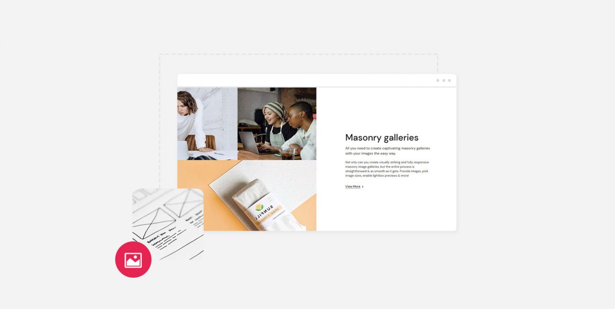
In your search for a perfect way to display different types of imagery on your site, you’ve probably run into a few different types of galleries as well – such as carousel image gallery, Pinterest gallery, and masonry, to name a few. And while each one of these gallery types is great in its own right, this time around, we are going to focus on masonry galleries in particular. Namely, these types of galleries allow you to arrange your images in a visually captivating manner by letting each image keep its proportions and also keeping the space between each image consistent and well-optimized, with no space left unused. As a result, you can have multiple images with different sizes organized together in one cohesive unit, making your gallery appear attractive and professional to anyone viewing it.
This time around, we will guide you through creating a masonry gallery in WordPress using our own Qi Addons for Elementor plugin, so make sure to read on.

Creating a Masonry Image Gallery With the Qi Addons for Elementor Plugin
With a set of 60 fully flexible widgets, Qi Addons for Elementor is a great free plugin you can use to build virtually any type of page imaginable. You will get to mix and match all sorts of addons to get the desired look for your page or section – from portfolio and business addons to WooCommerce and creative ones.
Now, the Masonry Image Gallery widget is another great widget in this collection you’ll be able to use to build gorgeous and captivating galleries for your site. The widget is completely customizable and allows you to add different images and pick their sizes with utmost ease. You will also get to adjust the spacing between images, add hover effects, and more.
We’re going to demonstrate some of the things you can do with this widget using its versatile options. Just make sure to have the Elementor page builder installed first to use the Qi Addons for Elementor plugin on your site. The free version of the page builder will do.
Also, in case you prefer to watch videos instead of reading, you should check out our video that covers the same subject:
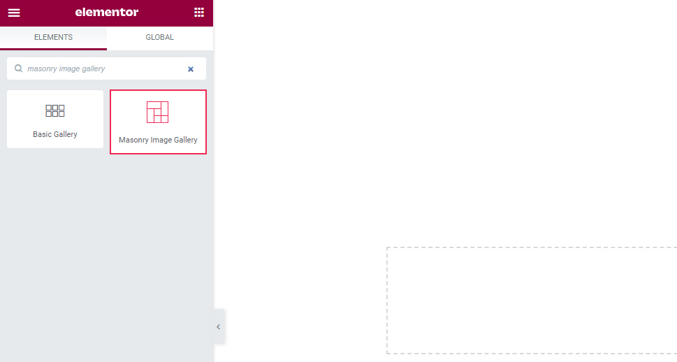
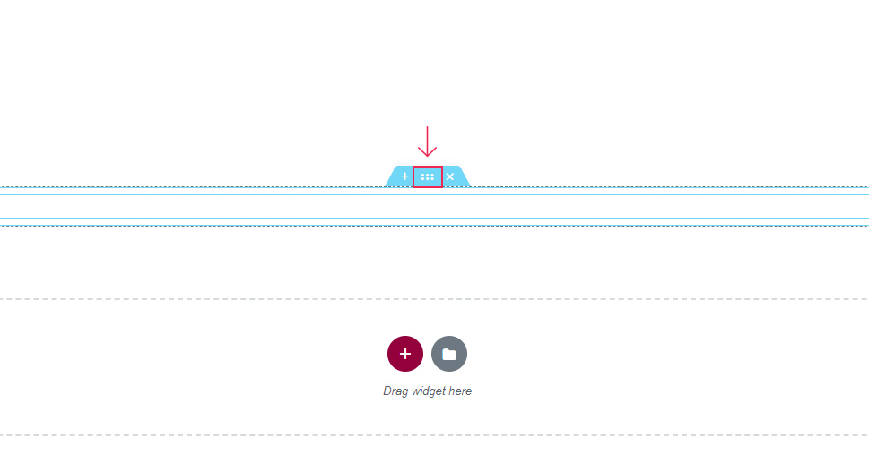
Go to the backend of your page or post and find the masonry image gallery widget in your Elementor sidebar.
Once you do, simply drag it over to the right side of the screen.
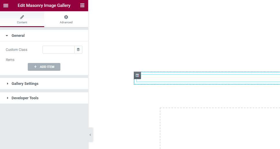
You will notice that the widget is empty by default. This is completely normal as you have yet to add any images.
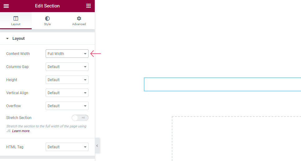
We should also mention right away that you need to set some additional options if you want your masonry gallery section to appear full-width, like ours.
There’s a chance that your gallery may be boxed by default. But if you want to change this setting, you can easily do so by accessing the Edit Section menu. Click on the button that appears at the top of your section, right in the middle:
Then, using the Layout section on the left, you should simply choose Full Width for your content width instead of Boxed.
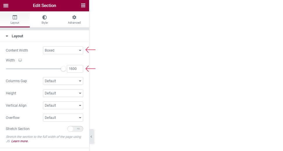
Of course, you can also use the “Boxed” option instead and then set the desired width using the slider:
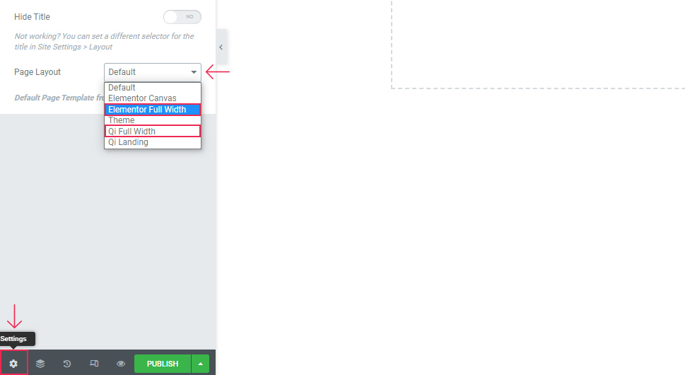
If you want to have no space whatsoever between the edges of the page and your gallery, you can change the entire page layout to be full width as well. To do this, go to page settings and choose the Elementor Full Width option. Alternatively, if you’re using the Qi Theme, you can also go with the Qi Full Width option.
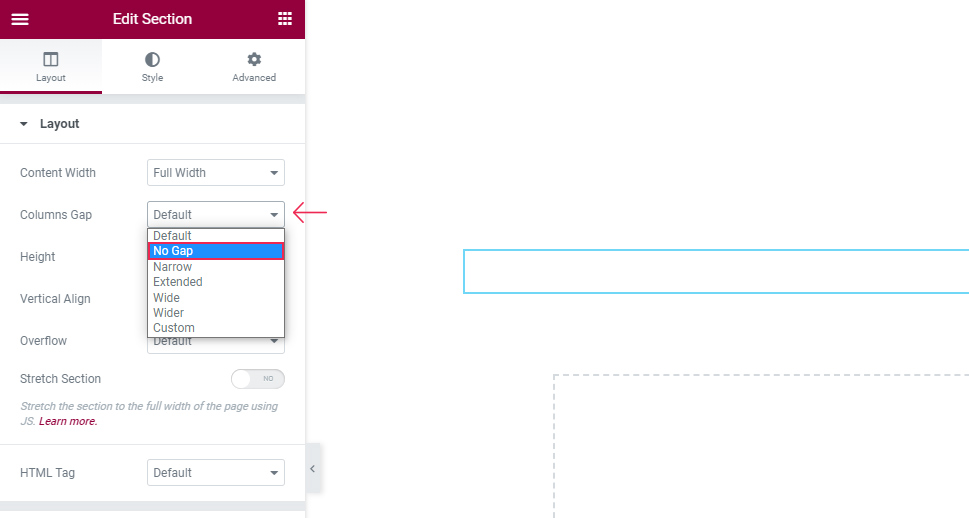
Finally, you can also set the columns gap option to No gap to create a gallery with no gaps between columns.
You can combine these settings in any way you like until you achieve the desired look for your gallery layout/section.
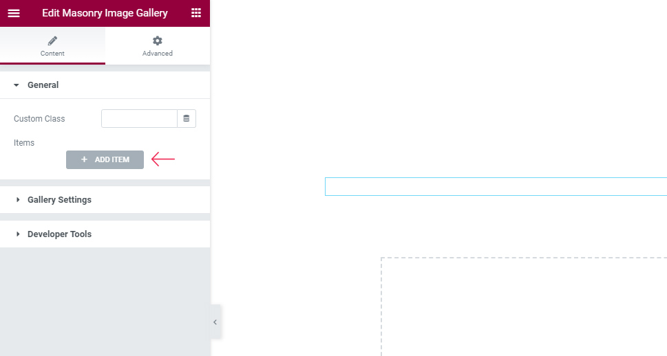
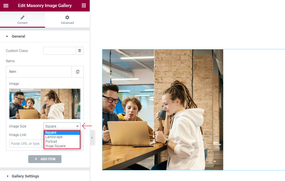
Now that you’ve set the preferred section and/or page width, you can proceed to add your images as items. Click the “+Add item” button and then hit the image field to choose your image.
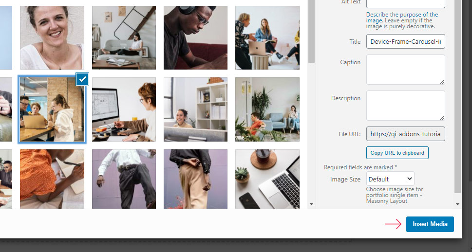
Then, click on Insert Media.
You’ll see the new field appear right below that will allow you to pick your Image Size. You can choose from Square, Landscape, Portrait, and Huge Square. We’ve opted for the Square option for our example.
From then on, you can keep adding as many images as you like by clicking on the +Add item button and then choosing the image from your media library.
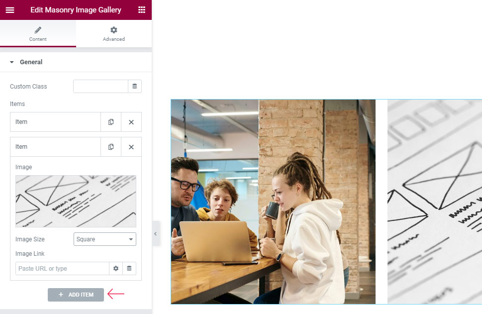
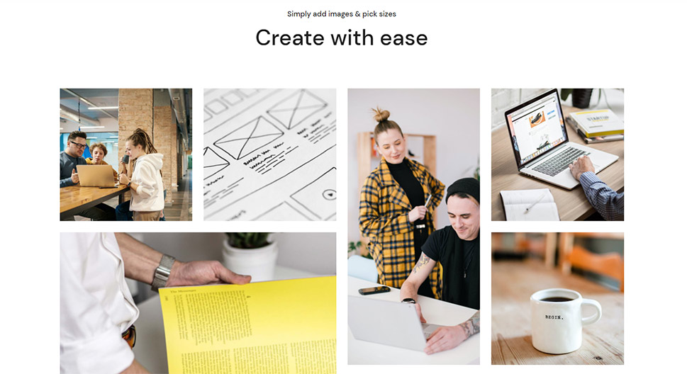
We’ve added a few more images to our own gallery in the same way, except for some variations in their sizes.
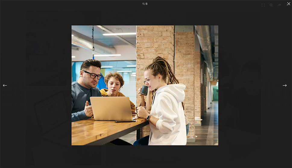
Here’s the look of our Masonry gallery after we’ve added all the images. We’ve added a total of eight images so we’ve also got eight different items in our options.

Now, in the Gallery Settings section, there are a few useful options you can use to further adjust the look of your gallery.
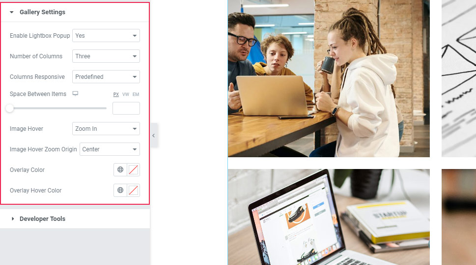
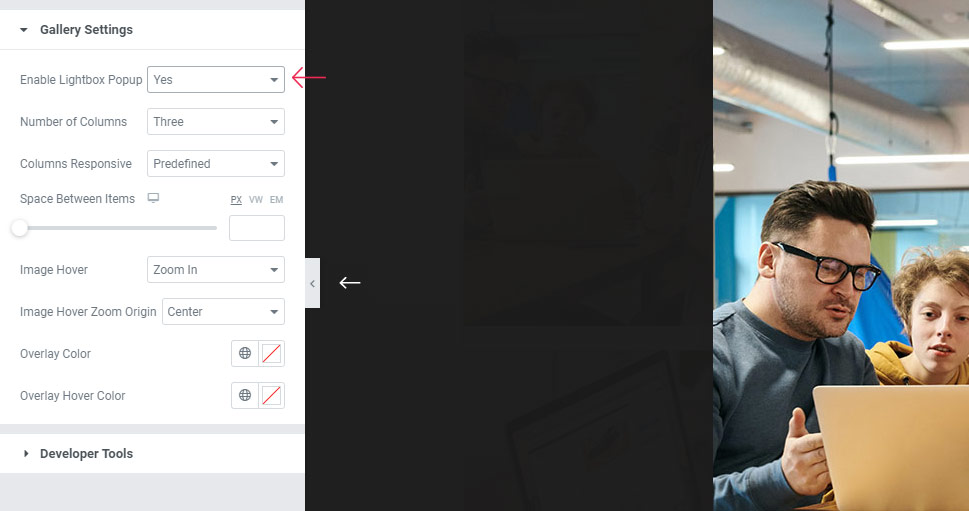
This includes the Enable Lightbox Popup option that opens the image as an overlay once it’s clicked on. Also, it allows visitors to browse through your entire gallery. We’ve enabled this setting for our example.
Next, you can pick the number of columns using the option with the same name. It’s set to three by default, but you can choose anywhere between one and eight columns. We’ve chosen four columns for our gallery:
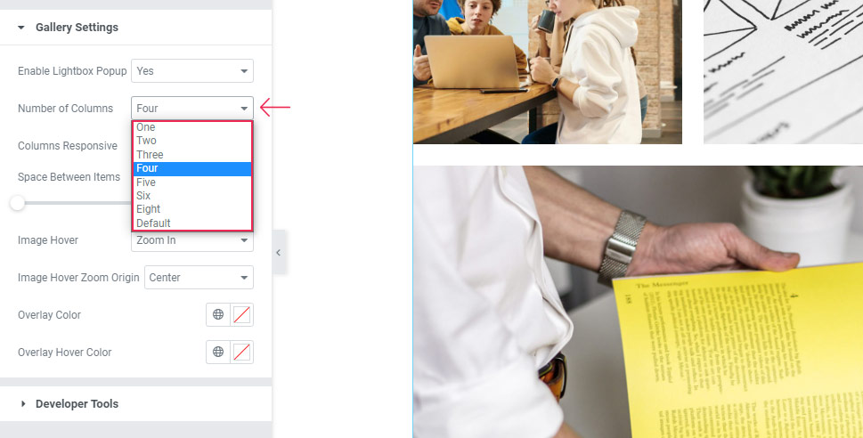

As you can see, the images have kept their original proportions even though they’ve adjusted to this new column arrangement.
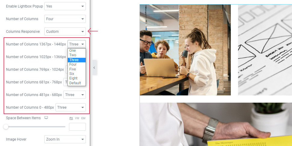
Then, you can set the Columns Responsive option to choose how your gallery will display on different screen sizes.
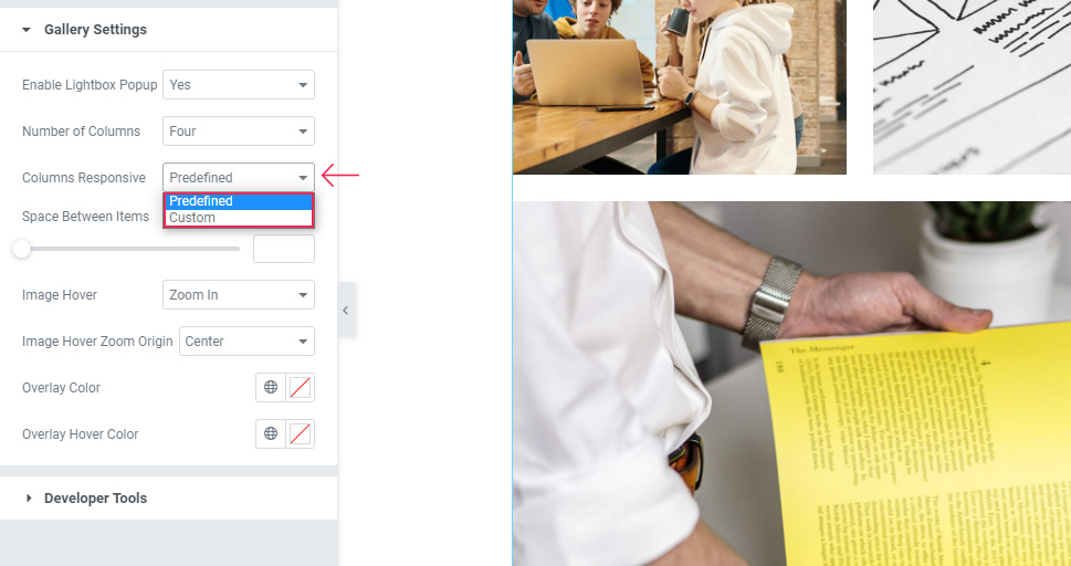
It’s set to Predefined by default, but you can choose Custom to select the number of columns for each screen size. You will be able to simply adjust the desired number using the dropdown next to the specific size you wish to change.
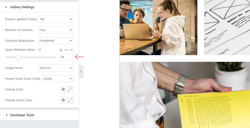
As its name suggests, the Space Between Items option allows you to adjust the space between your images. You can either do this by using the slider or by typing in a new value (we’ve added 26px for ours).
Now, the Image Hover option allows you to adjust the way your image will appear on hover. You will be able to choose Zoom In, Zoom Out, set it to Move, or opt for None.
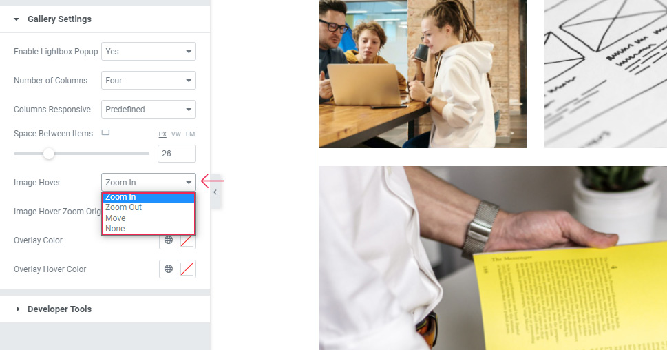
We’ve decided to go with the default (Zoom In) option:

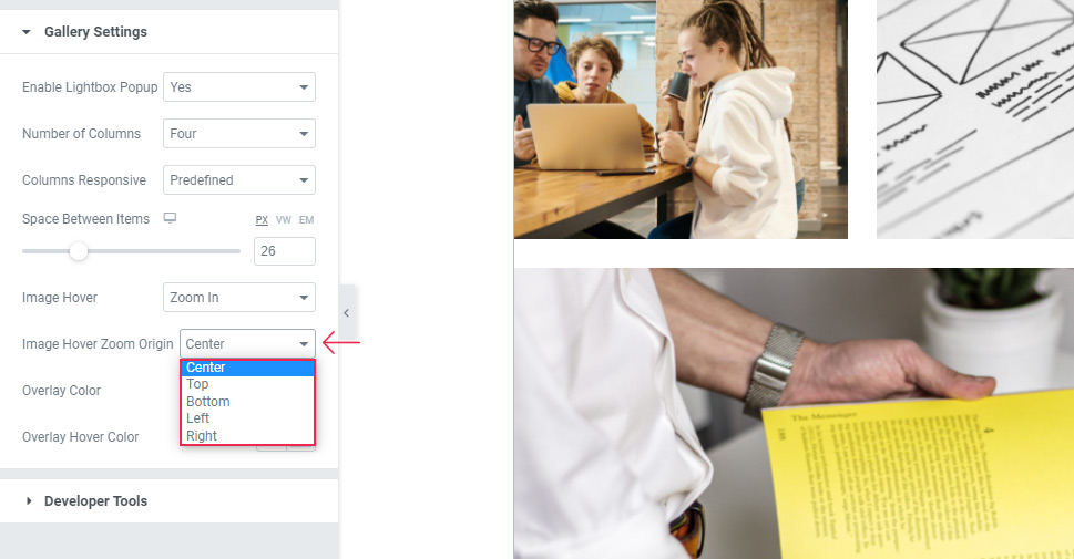
If you end up picking one of the above-mentioned zoom effects (Zoom In or Zoom Out), you will also be able to use the Image Hover Zoom Origin option. This option is particularly interesting as it lets you select the specific part of your image that will be zoomed in (or zoomed out). We’ve kept this setting to Center, but you can feel free to play around with it to see which one you like the most.
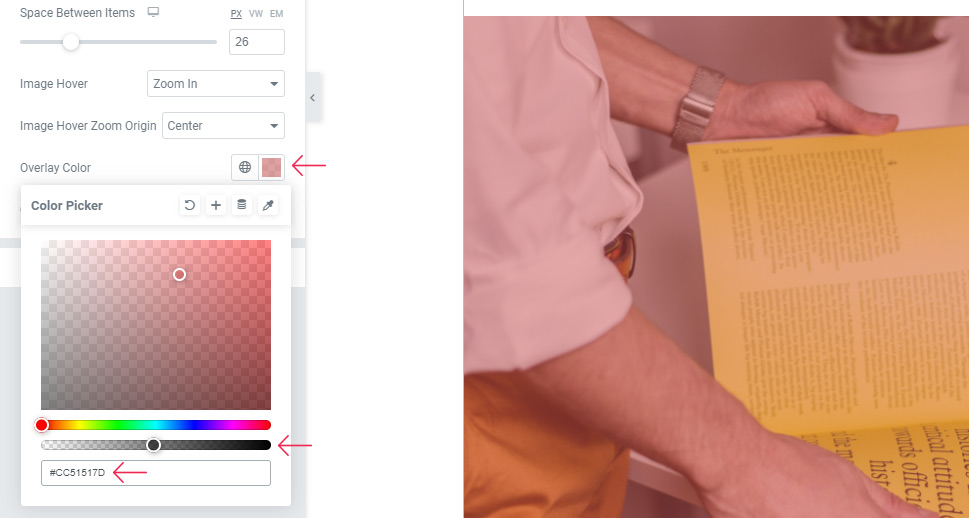
Next is the Overlay Color option. You can choose any color from the color picker and then set the desired transparency using the slider.
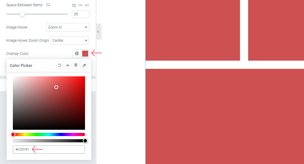
As you can see, this will reveal your images under the selected color.
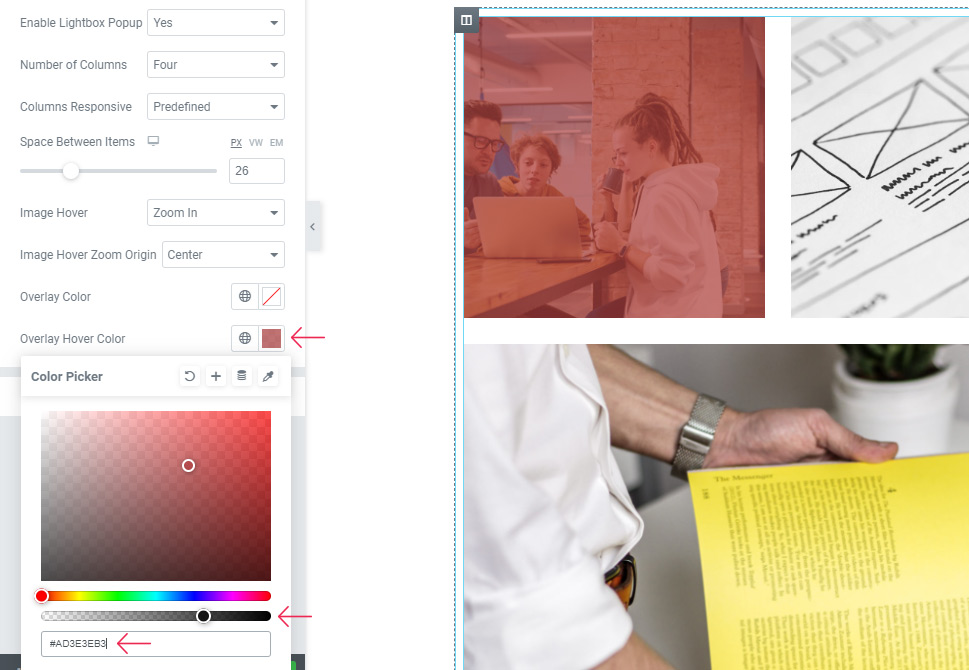
The Overlay Hover Color option works in a similar way, the difference being that your color will show on mouse hover.
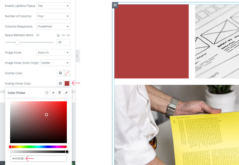
Once again, you also need to pick the transparency degree to make your images visible. Here’s what your gallery can look like if you use this option:
And that’s it when it comes to Gallery Settings. Finally, you can hit the Publish/Update button and then go ahead and see what your Masonry gallery looks like on your page/post.

Conclusion
As you could see from the example we showed you above, there are many different ways in which you can customize the look of your masonry gallery using the Qi Addons for Elementor’s Masonry Gallery widget. Depending on the specific options you pick, you can drastically change the look of your gallery and adjust it to completely fit your design. You can change the hover options, adjust the spacing between items, set image sizes, and mix and match any of the other available settings as well. No matter if you decide to copy our design or choose to go with something else entirely, the plugin’s flexible options will help you make visually striking masonry galleries and create a memorable experience for your website visitors. We highly recommend that you follow this tutorial and try out the widget yourself.
