How to Create a Clients List in WordPress
One of the best ways to establish brand authority in your field is to share a list of some of the most noteworthy clients you worked with. A reference to the people or companies that were once your associates can help give a more serious and professional image to your brand. In addition, it can highlight your credibility and reliability as a business partner to your potential customers. And if you ask us, there’s not a more effective way to display a clients list on your site than to use the help of the Qi Addons for Elementor plugin and its versatile Clients List widget.
Stay tuned as we show you how to add, customize, and style your clients list element completely from scratch using many of the widget’s flexible options. Here’s what we will cover:

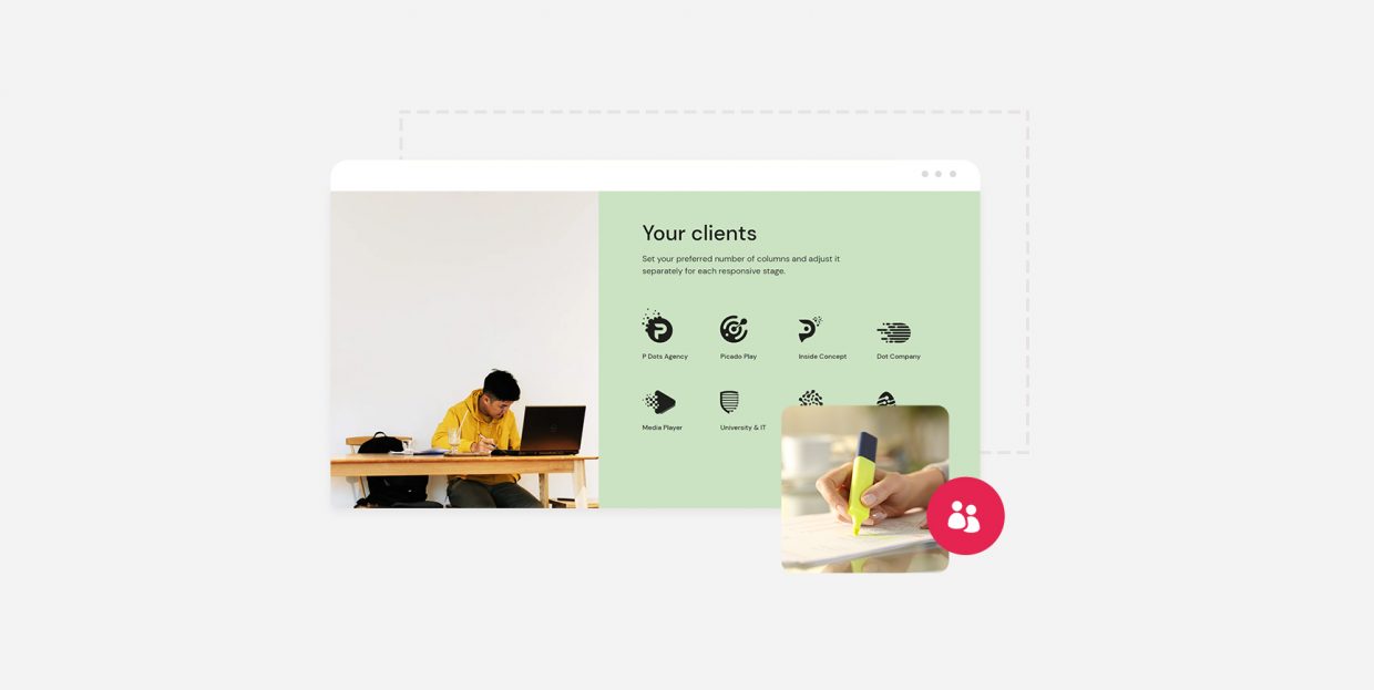
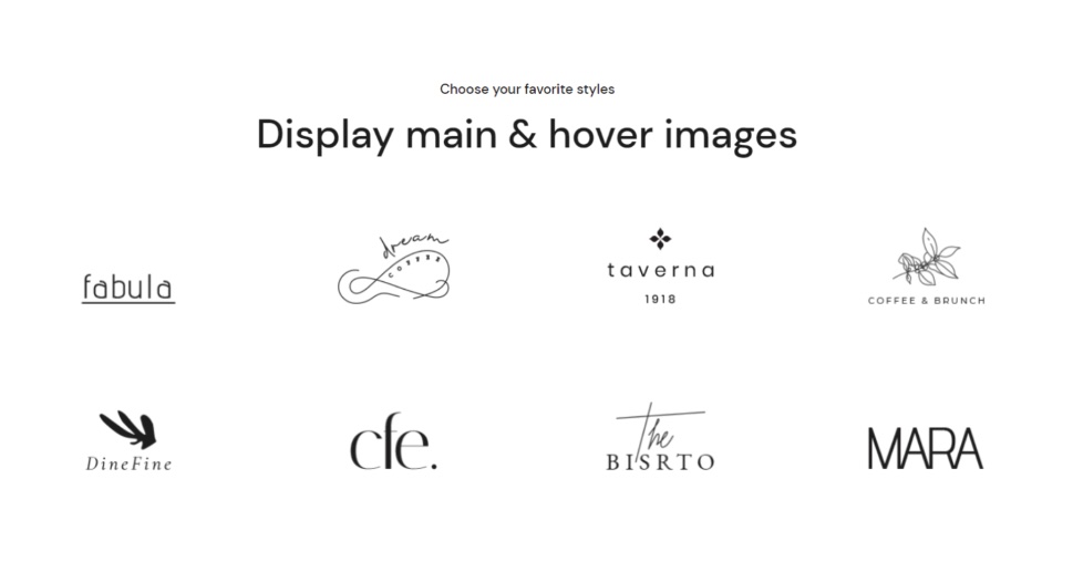
Coming with over 100 fully customizable widgets, Qi Addons for Elementor is easily one of the best freemium Elementor collections of addons you can find on the web. The Clients List widget in particular is available in the free widgets bundle. This widget provides you with plenty of creative ways to showcase a list of your business partners or any other notable clients you’ve worked with in the past. The widget’s flexible options will allow you to display separate main and hover images to create some additional cool effects when your visitors hover over the specific clients with their mouse. You can choose whether you want to create minimalistic presentations or provide more info by featuring some additional text. In addition, you can change image proportions, set borders, adjust fonts and colors, and the list goes on.
Make sure to stick around as we show you how to add and customize this useful widget. Then, you will be able to create beautiful and professional clients lists on your site that will help turn your casual visitors into actual working partners.
Also, we’ve got a video on the same subject if you prefer to watch videos instead of reading:
Once you’re in the backend of your page/post, type in “clients list” in the Elementor sidebar.
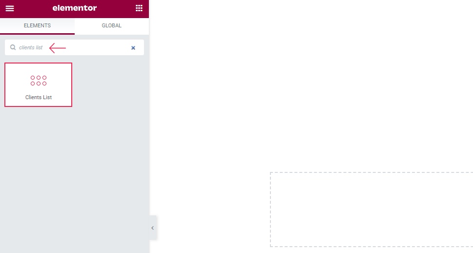
Drag it over to the right side of the screen. This is what the widget looks like by default:
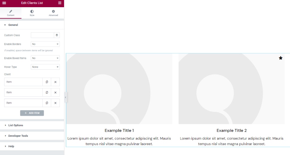
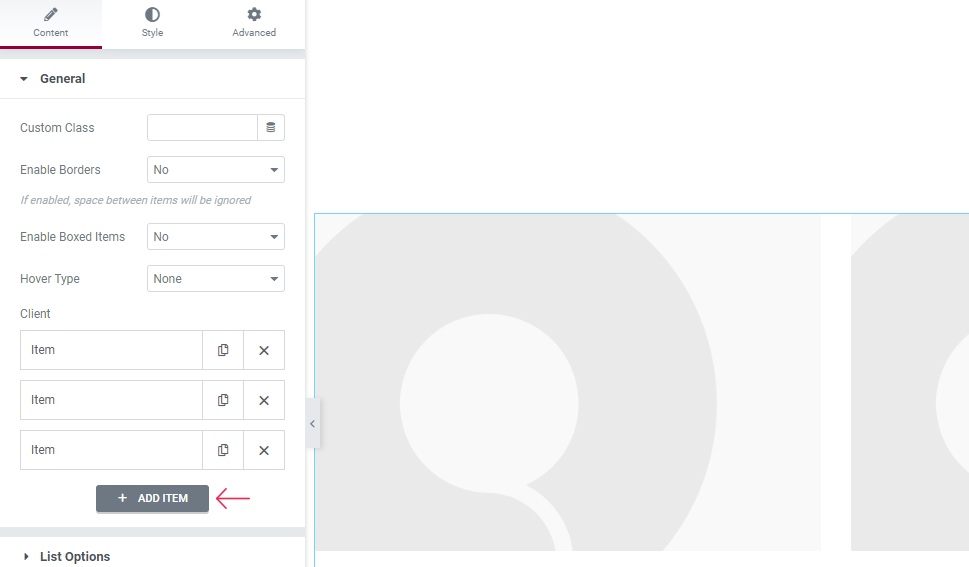
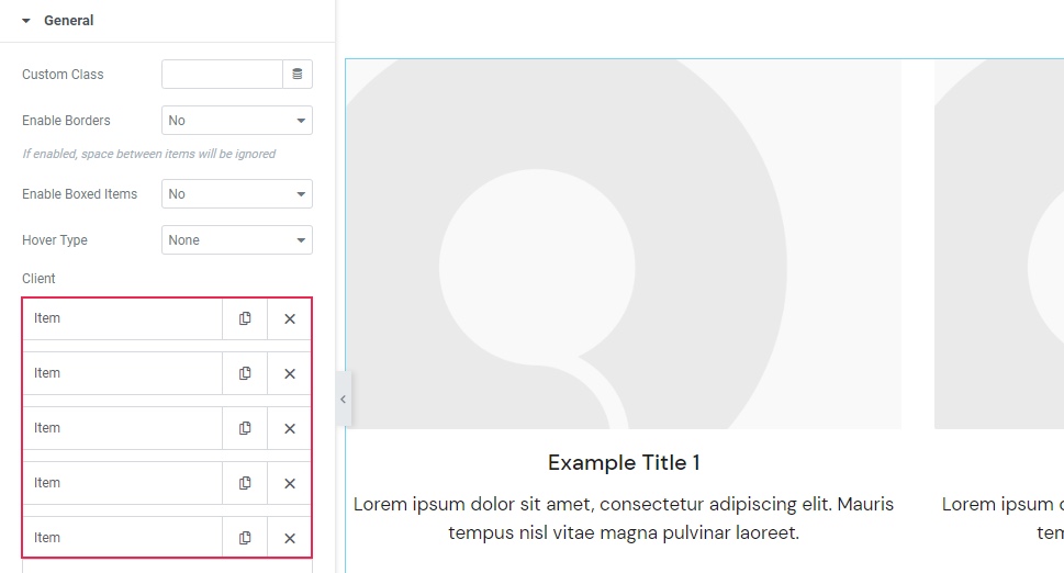
For our example, we will add two more items to go along with the existing three as we want to display five clients. You can add items by hitting the “+ADD ITEM” button:
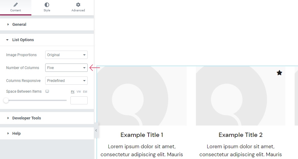
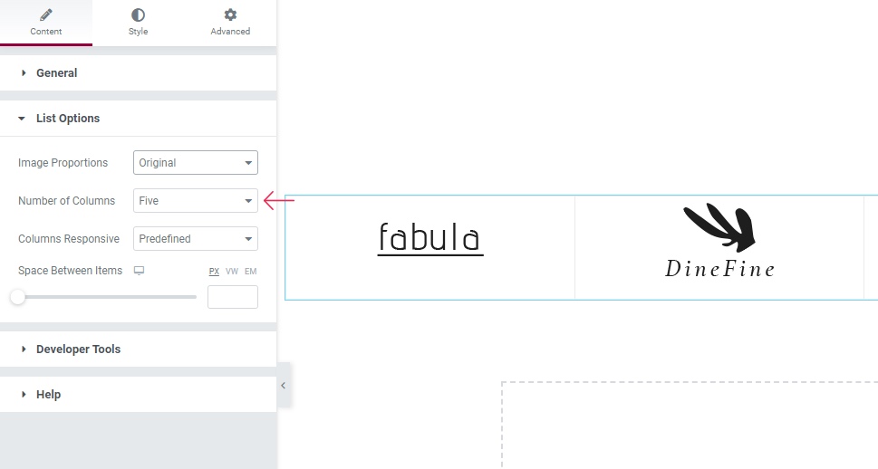
Now, we are quickly going to set the number of columns to five as we want to have all five items displayed in one single line for our example. You can do that by going to the List Options section and selecting Five under the Number of Columns:
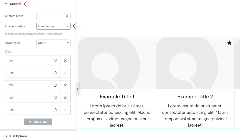
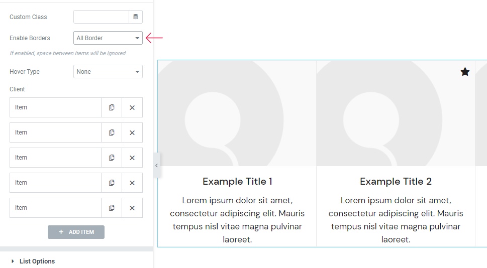
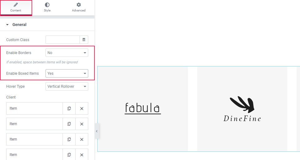
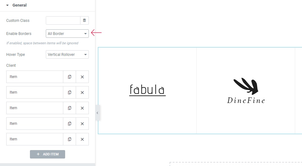
Now that we’ve got that out of the way, it’s time to go back to the General screen and start with our topmost option, Enable Borders. When enabled, this option overrides the Space Between Items option (which we will talk about a bit later). For example, if you select the Inner Border setting, the items will be next to one another, only with a thin border separating them.
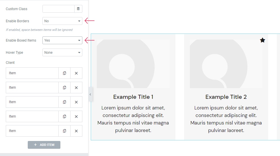
Now, we are going to show you an option you can use if the Enable Borders option is disabled (i.e. we switched this option back to No) – Enable Boxed Items. By switching this option to Yes, you will get the list type of layout with the items in boxes.
Before we continue, you should note that we’ve disabled boxed items and also gone back to the Enable Borders option. Then, we selected All Border for our example:
Now, the Hover Type option is set to None by default, but if you choose one of the available options, you will get different effects if you hover over the items.
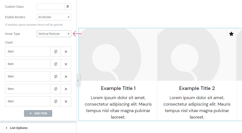
We’ve decided to go for the Vertical Rollover setting for our example.
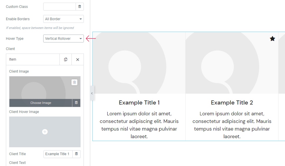
Now it’s time to begin uploading the images and customizing your items.
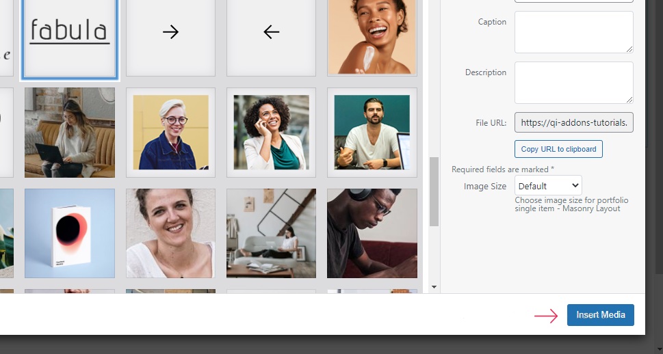
To open the first Item, simply click on it and you will get the options to upload your image. You will see two available fields for uploading the images – one that will be visible right away (Client Image), and another that will show up on hover (Client Hover Image).
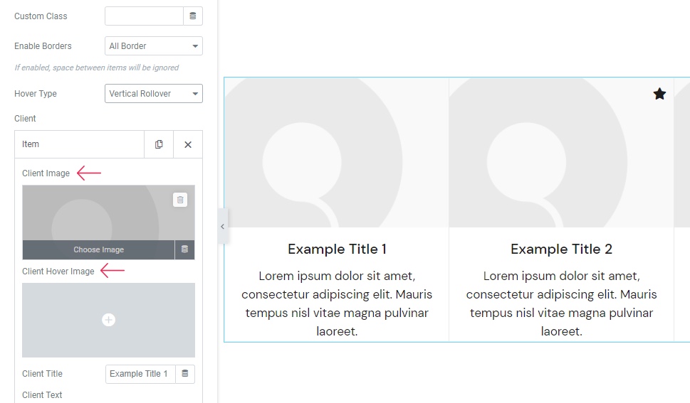
You should select your preferred image(s) using these fields, and hit the Insert Media button once you’re done.
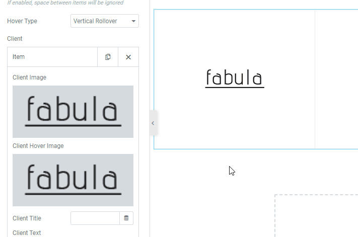
We’ve uploaded the same image for both Client and Client Hover Image – and this is the final result we got once we’ve hovered over it:
The Client Title option serves so you can insert the title that resides right below the image (in our case, it’s “Example Title 1”). You can either type over this placeholder text or erase it altogether. The same goes for the Client Text. For our example, we’ve erased both.
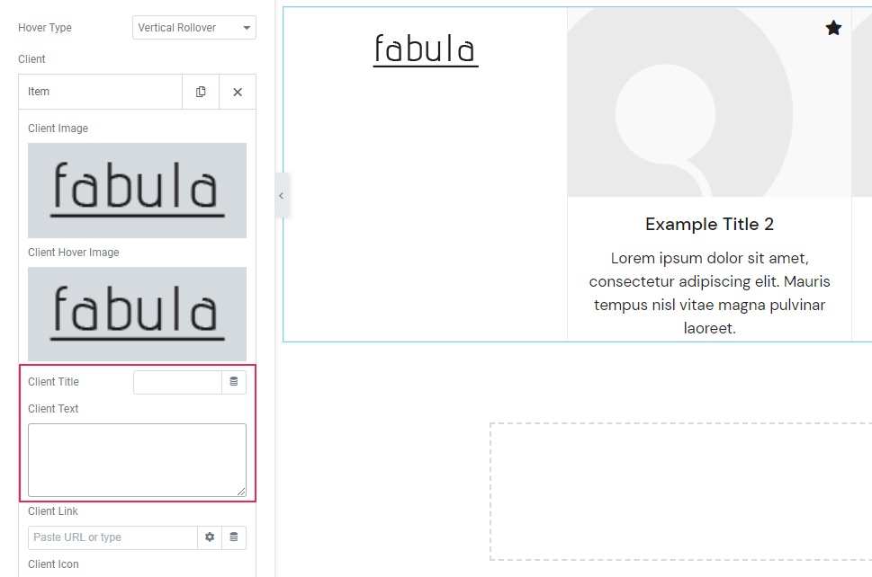
There’s also the Client Link where you can add the URL of your client. If you do so, your image will become clickable on hover.
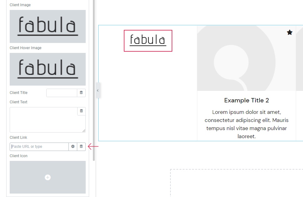
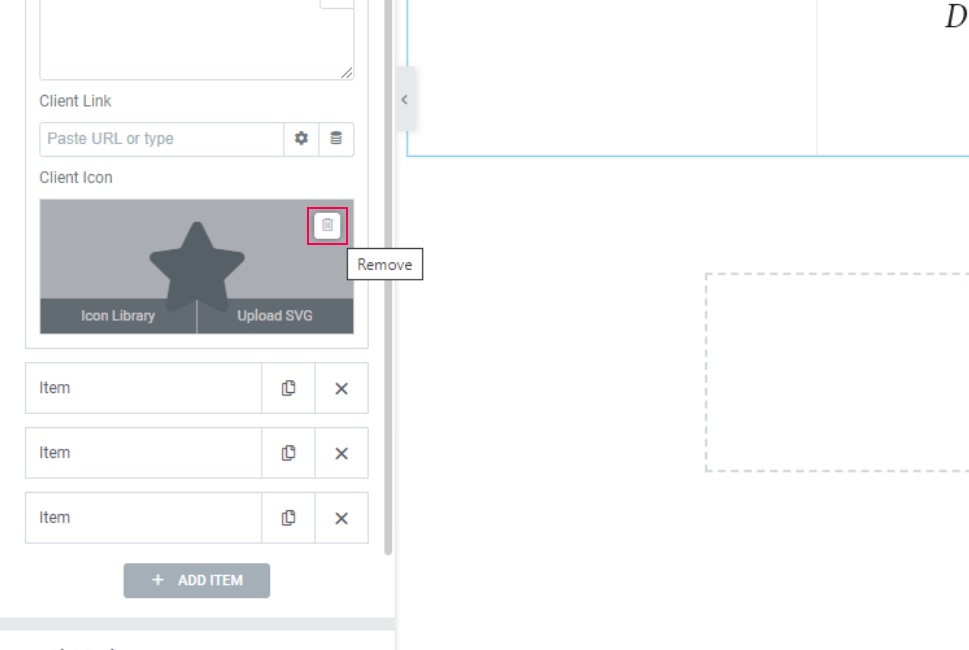
There’s also the Client Icon option that allows you to add an icon to a specific item on your client list. In the picture above, you can see that there’s a little icon with the shape of a star in the top right corner of the second item – this would be our client icon.
However, we won’t be needing the icon for our example, so we ended up clicking on the second item in our list and deleting ours.
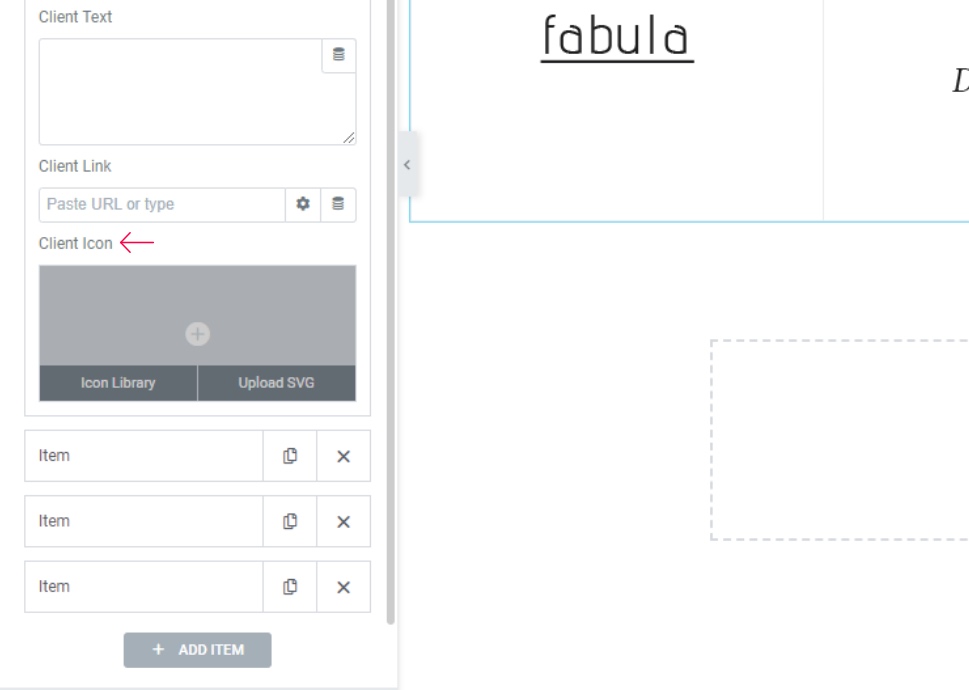
If you want, you can add an icon of your choice for one, more, or all your items. You can either pick an icon that’s already available in the library or upload one of your own.
That completes all the available options within the Item itself.
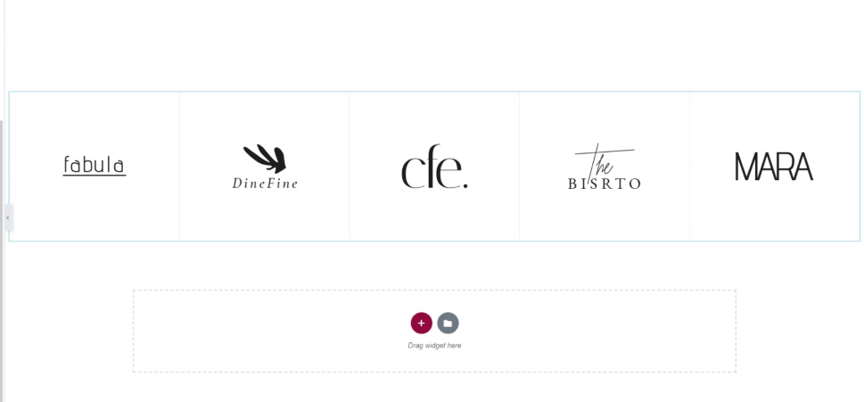
We’ve gone ahead and also replaced the other item images and the text content in the same way we did with the first item.
And this is the look of our client list so far:
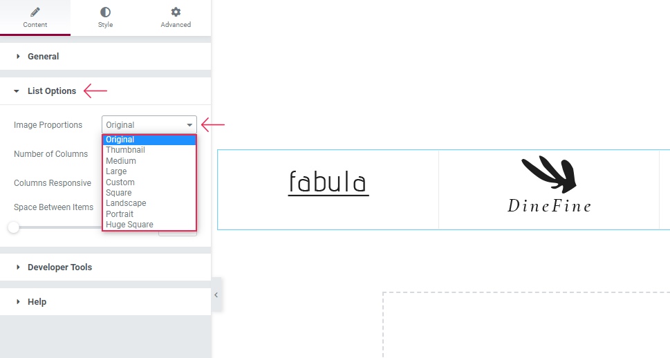
In the List Options section, there is a whole other set of options related to the look of your list. The first option in this section is called Image Proportions. This option will allow you to choose the way you want your image to be displayed (Thumbnail, Medium, Large, Square, etc.). We are going to keep it at Original.
Then, there’s the Number of Columns option that allows you to choose anything from one to eight columns for your widget. We’ve already set ours to five at the very beginning so that all our clients could be placed in one single line.
Next is the Columns Responsive option which serves to help you decide how many columns will be displayed on a specific screen size. You can either keep it Predefined or choose Custom (which is what we’ve chosen) to set the column number for each individual screen type:
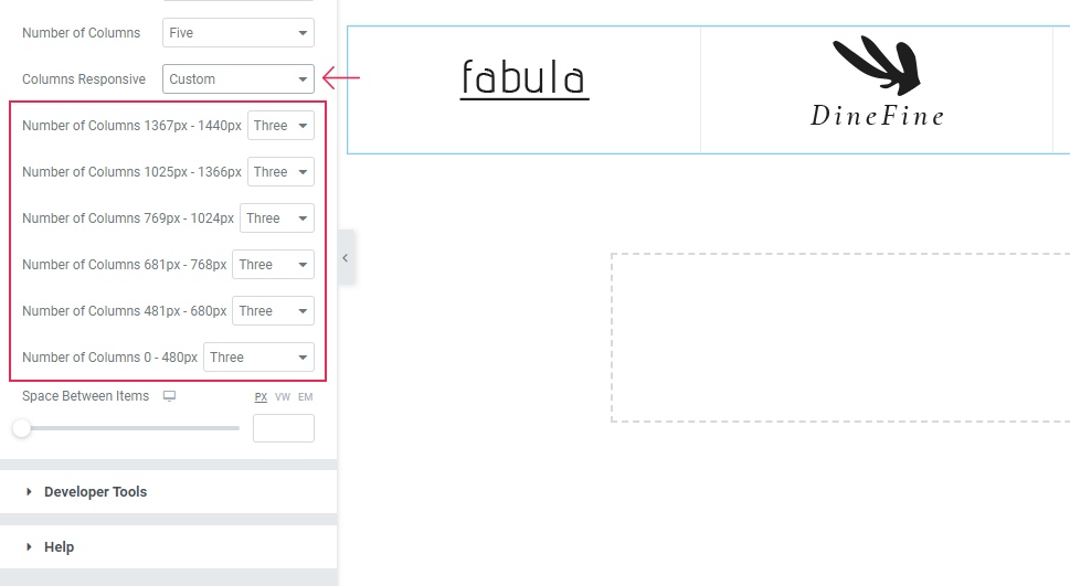
The first two screen sizes represent laptops, while the largest screen option (1920px wide) is already determined by the Number of Columns option predefined earlier.
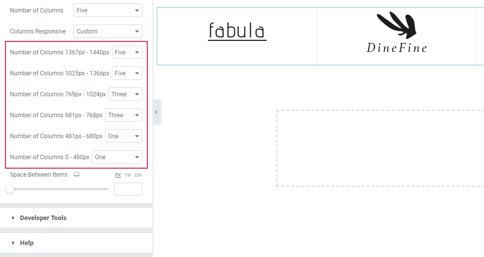
We’ve changed the first two options to have five columns as well, while for the tablets (landscape and portrait options) we’ve left it at three. For the last two options (mobile screens), we’ve chosen one column.
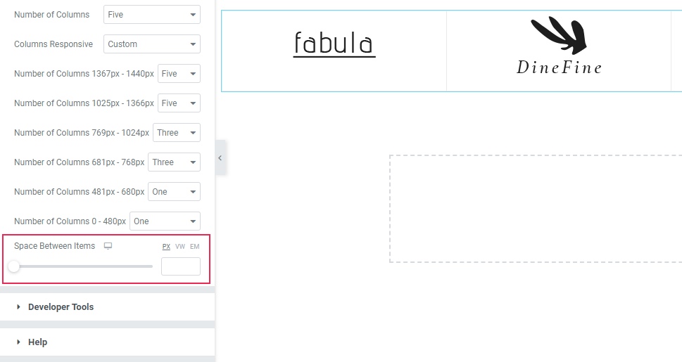
Finally, you can use the Space Between Items option to adjust the amount of space you’ll have between the separate clients. For our setting, we’ve kept the default value.
Now, it’s time to access the Style tab.
Under the Style section, there’s the Alignment option (for adjusting the content alignment), Title Tag (for styling any text content you may want to use), Title Color, and even Title Typography.
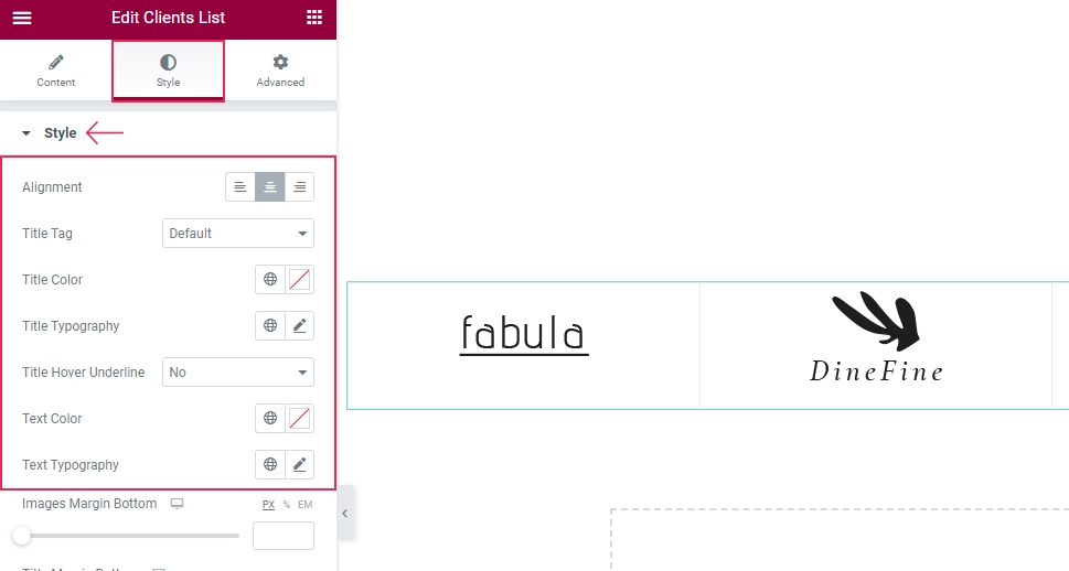
We’re not using any text for our clients list, so we’ve skipped these options for our example.
Moving on to the Images Margin Bottom option – this option simply allows you to insert more space underneath your client images.
The Title Margin Bottom is another similar option that allows you to add space under the title text.
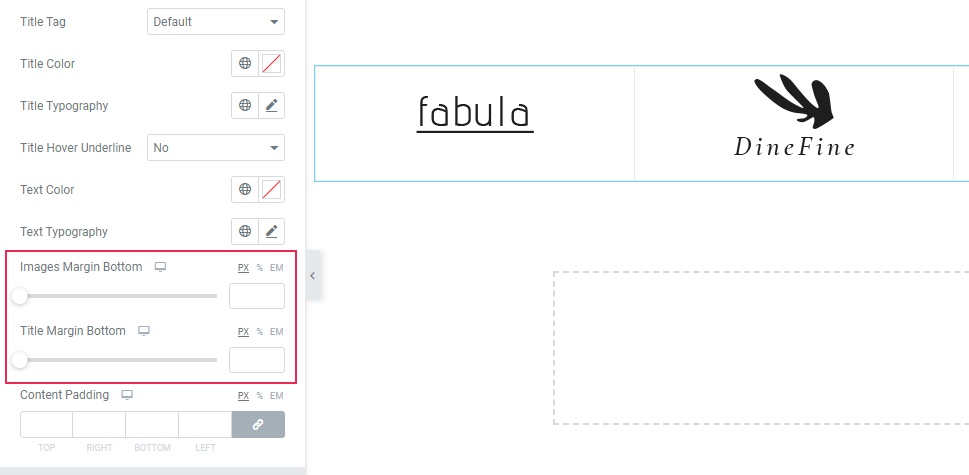
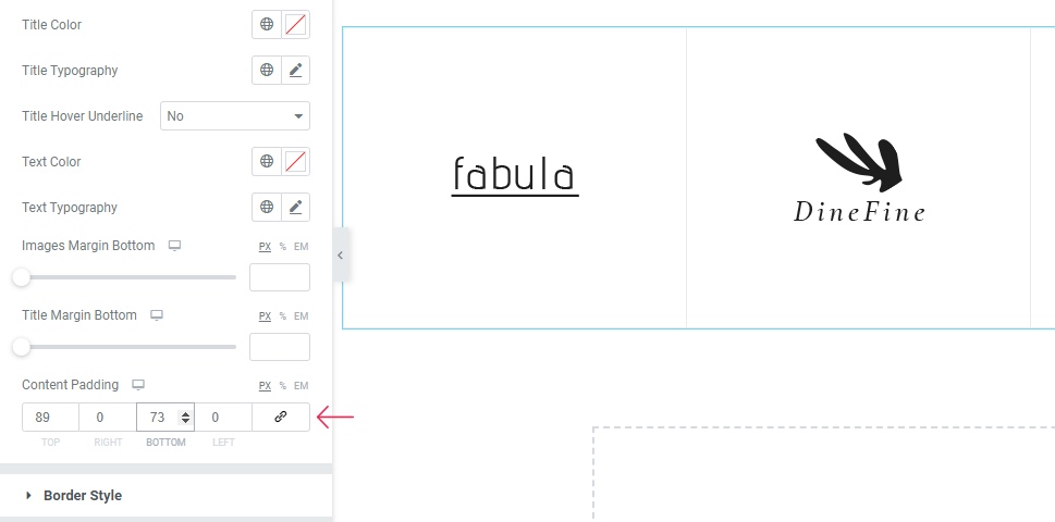
Last but not least, the Content Padding option allows you to increase the space around the entire content.
We’ve delinked the fields here and entered 89px for the top and 73px for the bottom.
Border Style Section
The second section here is related to the Border Style. Just a quick note, however – if your border option isn’t enabled, then this section won’t show any options. That being said, we do have a border for our example, so there are options available here.
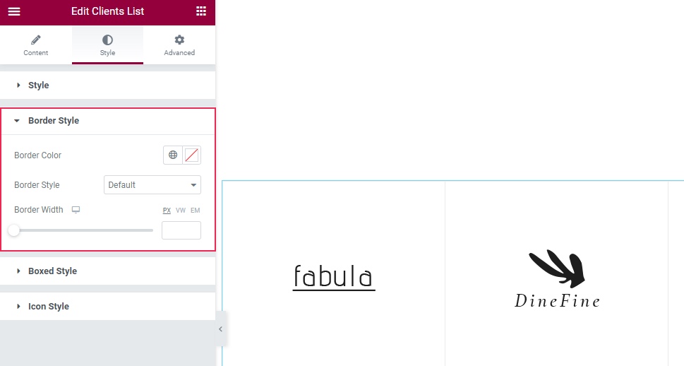
The Border Color option contains the practical color picker you can use to easily choose the color of your border. Next is the Border Style which has Solid, Dashed, and Dotted variants. Ours is set to Solid.
Once we increase the Border Width, the changes will also be more visible:
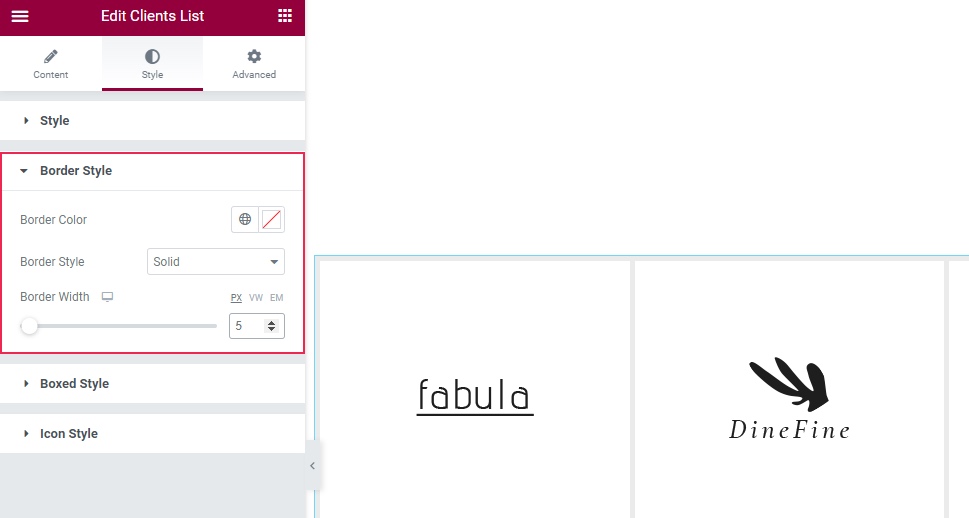
Now that we showed you what the border can look like, we are going to clear the border width to keep it subtle.
Boxed Style and Icon Style
There is also the Boxed Style section. In our case, this section is empty as we aren’t using the Boxed Item layout for this widget.

To make these options show up, you need to head to the Content tab first and then choose No in the Enable Borders option (to reveal the option to enable boxed items).
Finally, access the Boxed Style section under the Style tab once again.

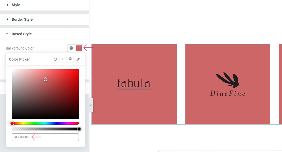
First, you will be able to change the Background Color of your section. Feel free to add any color you like here. We’ve chosen the color with the hex code #CC6666 just to quickly demonstrate what adding color can do for your boxed items (we’ve cleared this setting right after).
You can also set the Item Padding which will allow you to adjust the space around the content in your box.
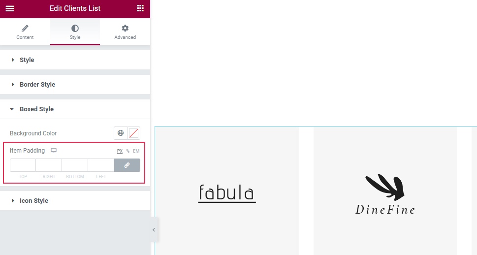
And that’s it for the options available in the Boxed Style section.
We’ve restored the previous Enable Borders >> All Border options to roll back the previous look of our clients list.
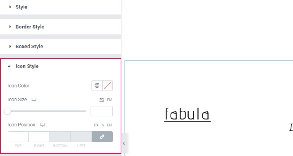
Last but not least, the Icon Style section allows you to customize the look of your icon (if you have one). This section contains options that let you change the icon color, icon size, and position.
We’ve deleted our icon in the first part of our text so we won’t be using these options, but if you’ve chosen to have an icon for your item(s), this is where you can style it.
Make sure to hit the Publish/Update button once you’re satisfied with the look of your widget.
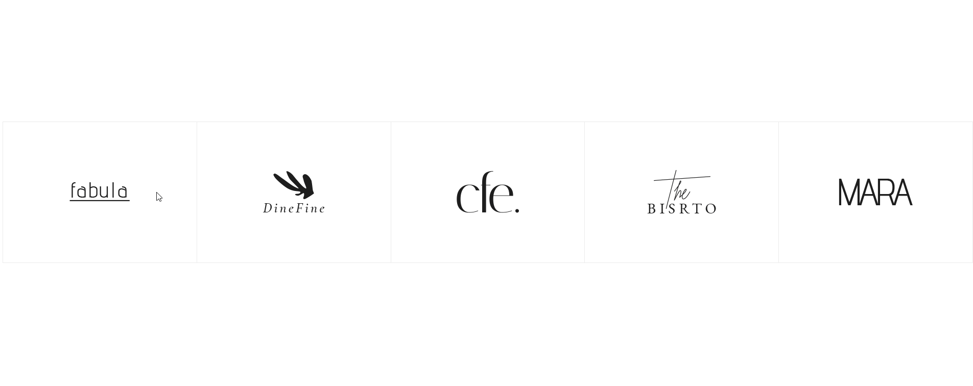
This is the final look of our list with all the images, style, and hover effects we’ve set up for it:
Wrapping Things Up
That completes our tutorial on how to make the most out of the Qi Addons for Elementor’s beautiful and practical Clients List widget. You can use many of the widget’s flexible options we presented above to fully customize the look of your list and make it much more than a simple row of text. For example, you will be able to upload different images and brand logos to your list, add different stylish effects by using separate hover images, change the style of your items, add colors, adjust border options, and more.
You can go with the example we used above, opt for one of the design examples available on our widget page, or create a completely unique look for your Clients List element. If you feel like experimenting, we encourage you to go ahead and play around with the widget’s options until you find the design that best suits your own brand’s needs.
