How to Create a Cards Gallery in WordPress
Today’s internet users are spoiled for choice, and a poorly designed website is unlikely to find any favour with the audience. That is part of the reason why aesthetics is growing more and more important: you need to hook your visitors not only with your excellent content (creating which is hard enough), but with how it’s presented.
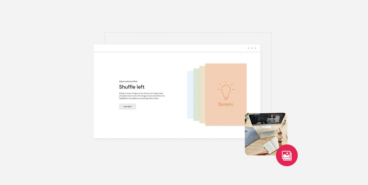
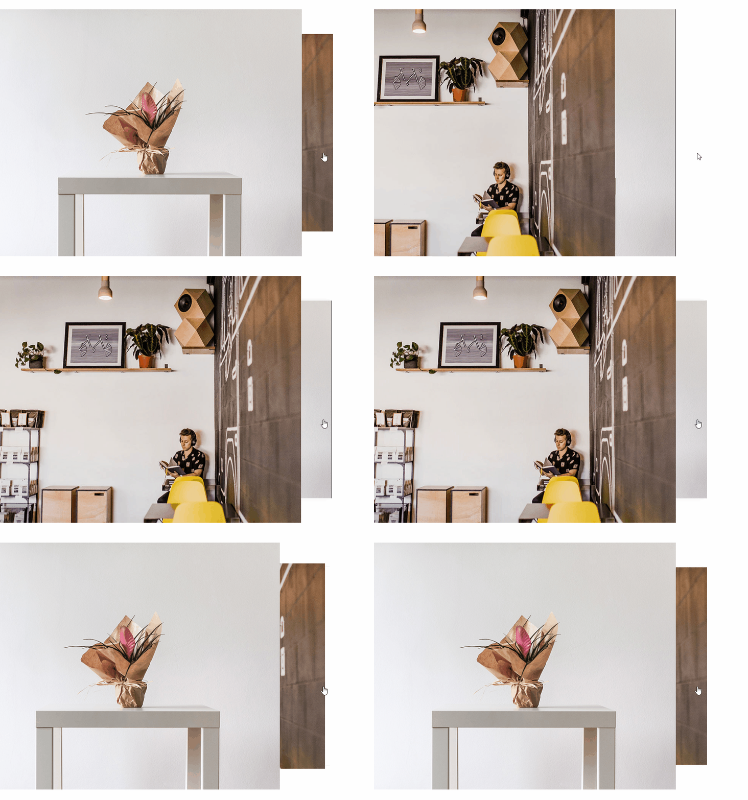
In this tutorial, we would like to show you a way to present your image content: the cards gallery. A cards gallery is simply a gallery which “shuffles” sort of like a deck of cards. It looks something like this:
Adding a cards gallery to your WordPress website is easy and free, so if you think it could improve your website, there is no reason to hesitate. But how do you know if you could use a cards gallery? Is it just an aesthetic choice, or is it also a functional design element? We would like to address these issues and answer some questions you might have before we get to the nuts and bolts of the how-to.
Here’s what we’ll be talking about:
A cards gallery has multiple uses, but mainly it is a gallery: a showcase for photos or other images your visitors can browse at their leisure.
Each of the images in a cards gallery can also be used to link to another page. This way, you can use your cards gallery for navigation to other websites or your own website. You could, for instance, create logos for your projects, present them as cards, and make them link to individual project pages, making cards galleries ideal for portfolios. Or you can use them instead of team pages, whereby a visitor could click on a thumbnail image of a member of your staff and have it link to their bio page.
However, even if it’s not used for navigation, a cards gallery is a clickable animated element. Your users will feel more engaged when given something to do, rather than simply look at images, making the user experience better overall.
The thing about image galleries is that they necessarily contain images, and, of course, the cards gallery is no exception. This means that, when a page containing a gallery is loaded, it can take perceptibly longer to load than loading a page without many images.
If you are using high-resolution images for your galleries, this might mean long loading times, which can in turn affect your bounce rate and your SERP rankings adversely. If this is a concern of yours, use graphics sparingly.
Of course, certain websites (artist portfolios, tattoo parlours, and photo studios come to mind in particular) have to go heavy on the images by their very nature. This is why you should look into image optimization if you want to improve the user experience.
We will show you how to add a cards gallery using our very own Qi Addons for Elementor plugin. Before you can use it, though, you need to install and activate the latest version of the Elementor visual editor (the free version is fine), and then install and activate Qi Addons. Qi Addons is a completely free plugin, so the whole setup doesn’t need to cost you a penny.
Qi Addons for Elementor expands Elementor’s already impressive array of design elements with 60 brand new professionally designed widgets. It includes a wide variety of gallery options, and the cards gallery widget is only one of them. We will show you how to add the widget to a post, but you can add it to any widget-ready area of your website. We will be using our free Qi Theme, but the plugin should work fine with any theme you might be using.
With Qi Addons for Elementor, creating a beautiful and functional cards gallery takes only a couple of minutes of fiddling with some simple widget settings. You can watch how it’s done in our video tutorial:
But if you prefer your tutorials in text form, we have you covered: just keep on reading.
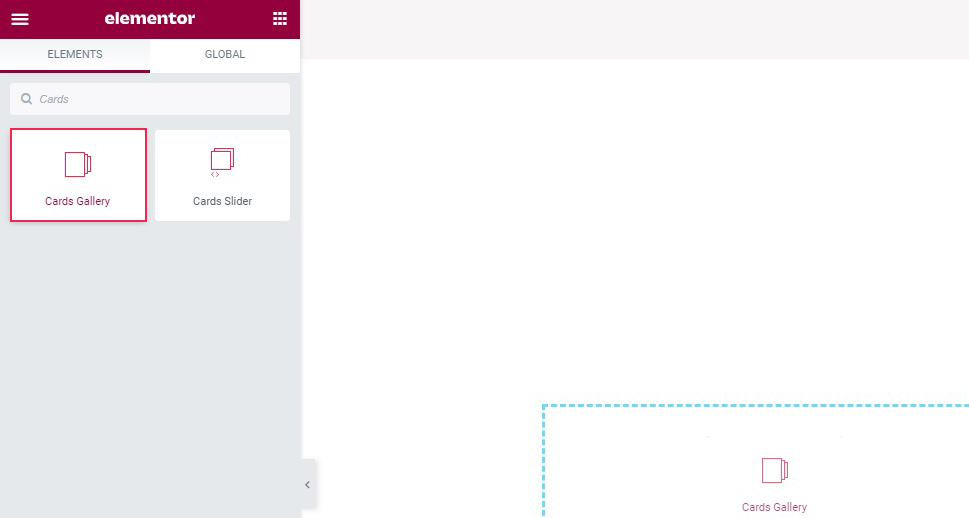
Adding a Qi Addons cards gallery to your WordPress website begins as with any other Elementor widget: find it in your left hand-side menu and drag it to where you want it.
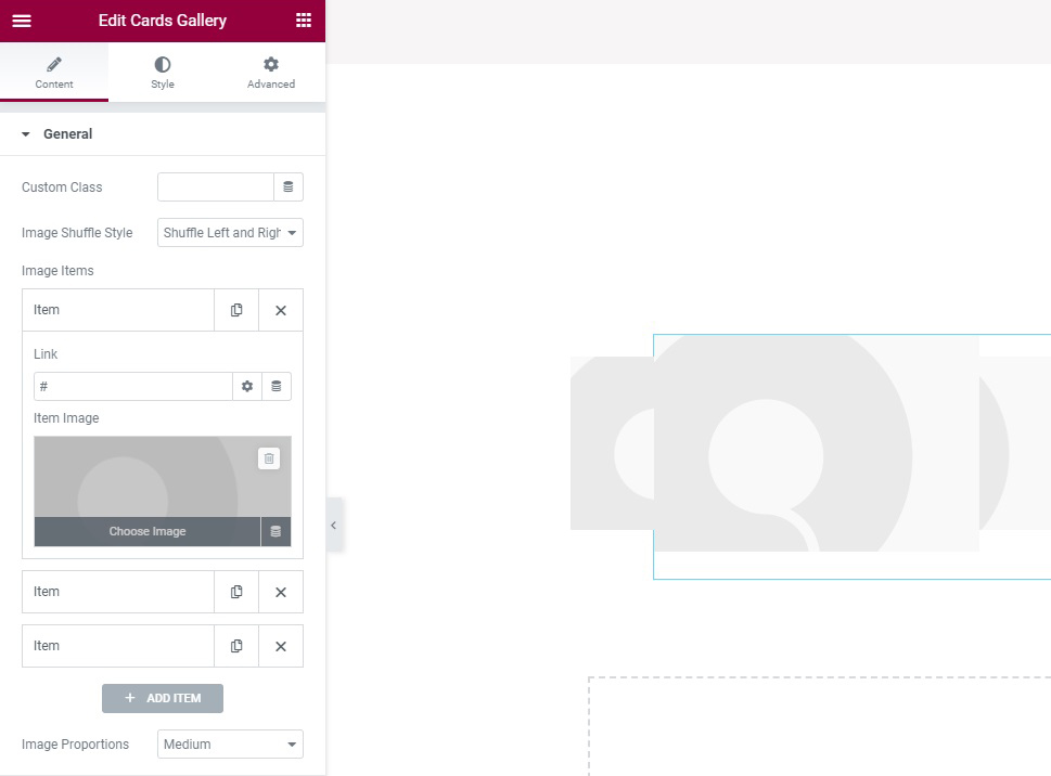
The default version of the element contains three placeholder images. Using the General section of the Content tab, you can populate your cards gallery with your own images.
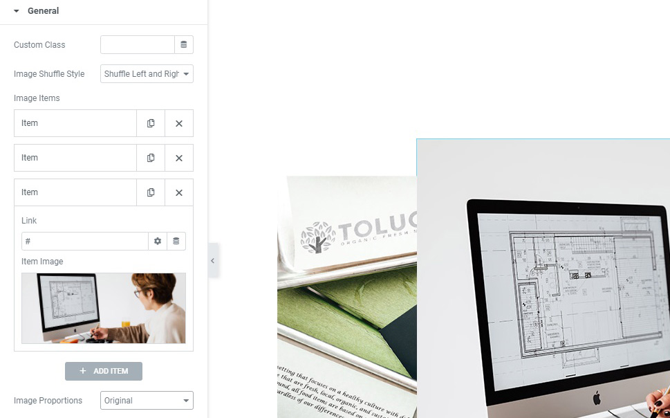
The first option is the Image Shuffle Style, which is set to Right by default, meaning that the clickable cards are to the right . You can also have your cards shuffle from the Left, or Left and Right, which is what we have selected.
Next down, we find the Image Items section. This is where you can add whatever images you want to your cards gallery. The widget’s default version contains three images, and that’s how many we need, but you can add more by clicking the + Add Item button.
To add an image to an Item, click on it. An Item has two controls: Link and Item Image. The Link field can be used to link to a page when an item is clicked. We will set ours to #, linking to the same page the element is on, so you can see how it will look and behave when linked. Leaving it blank means that the page item will not link to anywhere.
To add an image, click the Item Image box. The Choose Image button should be visible on mouse hover.
You can choose an image from your media library or upload a new one. Once you have selected an image, click Insert Media.
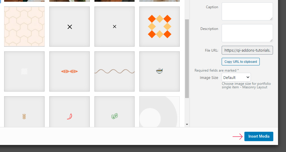
We have input the # in the Link field and selected an image for each Item. The last control in the General section is the Image Proportions menu. This governs the size and proportions of the image for all items. You can choose between Thumbnail, Square, Landscape, Portrait, and several other options. We have gone with Original, preserving the size of our images.
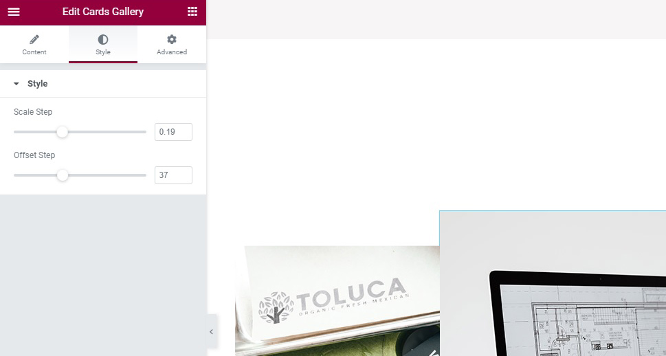
Moving on to the Style tab, you will find that there are only two sliders. The first one up is Scale Step. You can use this slider to scale down the inactive (clickable) images to a percentage of their original size. Setting this slider to 0 would keep the images’ original size. We have chosen 0.19 for our scale setting, making the inactive images 81% of their original size.
The Offset Step slider is used to offset the inactive images in relation to the active one, that is, how much of the inactive (clickable) image is shown. Setting this slider to 0 would hide them entirely, making them unclickable and rendering the entire widget useless. We have set ours to 37.
And there you have it, a simple, elegant and effective animated cards gallery, done in minutes.

In Conclusion
As you can see, with Qi Addons for Elementor, you can add a beautiful, eye-catching, and engaging widget to your WordPress website within minutes and completely for free. If a website you are designing can benefit from this arresting showcase, it is now a part of your WordPress toolkit. And if this is the first time you’ve encountered Qi Addons for Elementor, take note that this is just one of its many possible uses.

