19 Examples of Online Case Studies Done Right
Designers generally don’t like writing. After all, creative problem-solving through design uses visual, not verbal tools, right? But, sadly for many, case studies are supposed to contain text, too. This is where a lot of designers and art directors stumble, ending up either with poorly crafted case studies, or no case studies in their portfolio at all. And that’s a huge mistake. Online case studies (because these days, if it’s not online, it’s not there at all) are immensely important as they provide a compact, informative display of not just your skills and expertise, but your professionalism too. A good case study shows that you understand the concept of focus, that you can distinguish between different layers of relevance and also sheds some light on your creative process. As such, case studies are an indispensable hiring tool.
That being said, let’s see how the visually-oriented folks can craft a case study that ticks all the right boxes.
Quick Tips for Designing Perfect Online Case Studies
If you’re in doubt as to where to start with your case studies, here are a few things to keep in mind:
-
Stay focused. Don’t use case studies as an opportunity to channel your revolutionary ideas, but don’t delve in conventionalities, either. Don’t try to tell everything about the project at once, or at all. Your clients don’t need to know everything you did for a project. But they do need to know the relevant bits.
-
Provide a solid structure. Scannable content is the form that works the best, whatever the format. Separate your key information in tidy, well-rounded units. These include, but are not limited to: project target/goal/outcome, background, evaluation, concept, implementation, conclusion.
-
Provide essential project information. Viewers need the who, the what and the when.
-
Treat the page as a gallery wall. Consider your own portfolio style and create case study pages that are in line with it, but also convey the character and the spirit of the project, too. When displaying visual material, don’t just scatter it around the page – it won’t impress anyone. Try exhibiting it in engaging, interactive frames, add interaction for better immersion, and display the material in their intended environment – various device screens, etc.
-
Maintain good measure. You want to dazzle the visitors, not blind them. If your case studies are too cluttered, flashy or visually saturated, they might create an undesired effect. Go for minimalism, but avoid making your pages look poor.
Sure, things like these are sometimes easier said than done. That’s why we prepared a curated selection of the best, most inspiring online case studies we handpicked around the web, hoping to give you some cues and ideas for your own cases. Here’s what we’ll talk about:
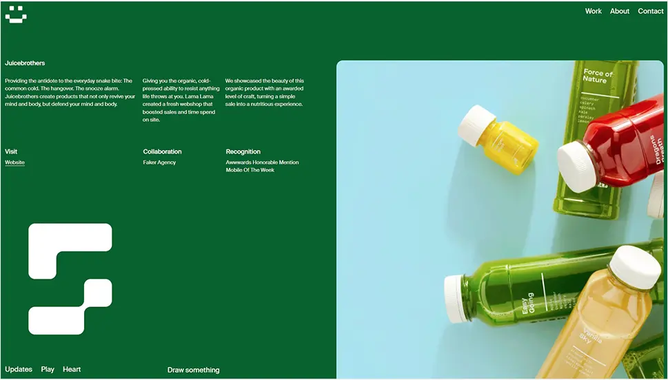
If you read our piece on creative page transitions, you probably remember Lama Lama, a creative digital agency from Amsterdam, and their Juicebrothers project. The case study for the project (the organic, cold-pressed juice brand from Netherlands) is presented in a combination of playfulness and youth typical of Lama Lama, and a high level of professionalism, also typical of the agency. The main visual motif is the beautiful deep green color that communicates health and vitality, featured extensively in layouts for the Juicebrothers website. Small white typography conveys just the right amount of information about the project and allows the imagery to take center stage. The case study page opens with a sort of split screen between bits of text on the left and a vertical image gallery to the right, and then proceeds with larger image and video sections displaying selected bits of visual content for the brand. All the while, we also get to play with the cursor effect – an oversized, pixelized snake trail that follows the mouse movements.
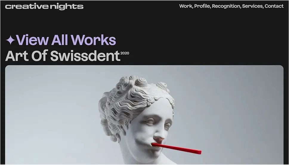
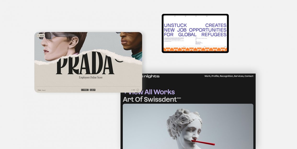
Creative Nights is a UX design consultancy and creative studio headquartered in Prague, with an impressive roster of international projects. One of these projects is the website for the renowned dental products brand, Swissdent. Art of Swissdent is designed as a crossover between an eCommerce website and an online presentation of the brand. The case study, available at the agency’s website in their Works section, follows the style and the look of the agency’s branding and design, and the selected imagery from the project is given in beautiful frame sections with round edges. The entire page is perfectly balanced in terms of atmosphere, colors and dynamics, and makes the displayed work appear as an integral part of the agency’s own aesthetics, even if that may not necessarily be the case. The page ends with three fun, oversized buttons that the visitors can use to share their impressions with the agency.
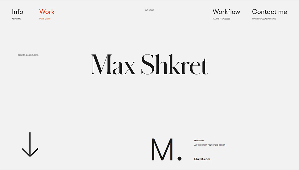
Zhenya Rynzhuk is an architect-turned-art director with a solid industry experience and quite a few awards under her belt. Her website, which has received accolades for overall design as well as for mobile excellence, features some innovative design solutions, plenty of interactivity and just the right amount of brutalist details to keep things exciting in a minimalist environment. The Work section features several case studies for the projects Zhenya is most proud of, including art direction and interface design for Max Shkret, an award-winning digital artist creating 3D digital models. After an airy, minimalist and monochromatic section introducing the project, the page proceeds with a scroll-animated gallery of select project imagery. The images of Shkret’s digital models of animals (for which he hopes to raise enough money to turn into actual physical objects) are presented in successive full-width sections, each with a background that matches the object chromatically), resulting in an interesting, exciting stroll through Shrek’s imaginary world. This layout also adds a welcome touch of color to Zhenya’s generally monochromatic ambient.
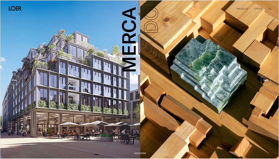
Loer Architecten is a Dutch architecture studio with a beautiful, airy, dynamic website based on full-screen imagery, interactivity and interesting navigational solutions. The Projects section includes an interactive links list from which we get to navigate to the projects that interest us. We picked the Mercado project, which has the goal of transforming an abandoned backalley in the center of Groeningen into a thriving commercial and urban hub. Just as it would be expected from an architecture studio, the case study is clean and precise, opening with the most essential information, such as status and location. It is the page layout, however, that gives it a welcome kick and saves it from being plain and dull. The project name is displayed in vertical letters to avoid occupying precious space on the page. Thin straight and curved interface lines give it dynamicity, and so do animations in individual pieces of visual content, as well as animated scrolling effects. There isn’t a single full-width or full-screen image in this case study which, combined with ample use of negative space, gives it a very clean, breathable character.
New Themes
VIEW COLLECTION
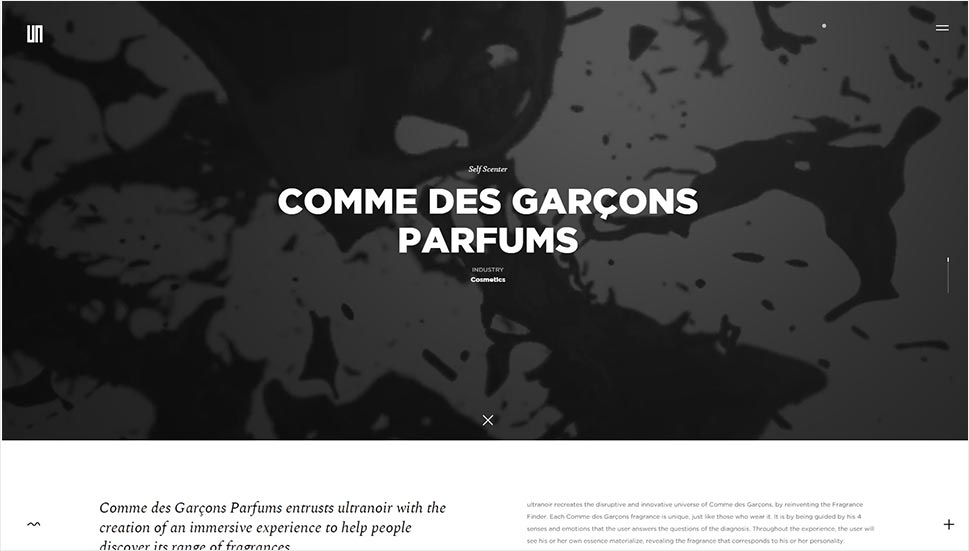
Commissioned by Comme des Garcons to create an interactive digital experience helping customers discover their fragrances, the French digital agency Ultranoir came up with Self Scenter, a Web GL-based reinvention of the brand’s Fragrance Finder so that it dynamically creates user-specific shapes. The case study shares some of the immersiveness of the project, especially in the hero section with a video and a large title. The case study, however, assumes a cleaner, more informative and practical character later on the page, sharing some of the visual pieces that best convey the atmosphere of the project – videos and select imagery. And the project is truly stunning, too – a beautiful dark interface with a somewhat mysterious character is graced by superbly designed elements with utmost attention to detail and aesthetic coherence. These dark visuals are contrasted by a light background, complete with the cursor shaped like a dot that changes from black to white and vice versa, depending on the surface it hovers upon.
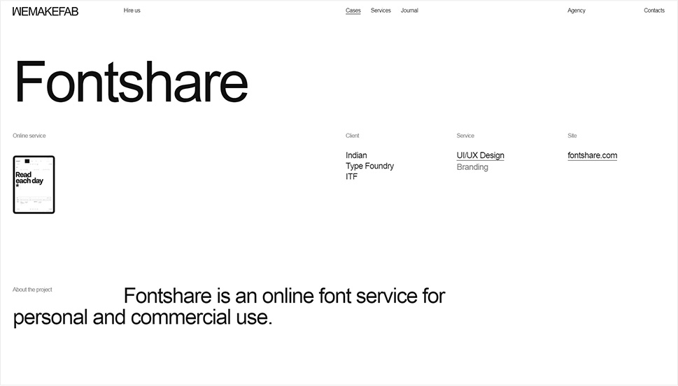
Wemakefab is an old acquaintance from our exploration of the power of interactive links in web design, and today we want to take a look at the case study for the project they developed for the online font aggregator Fontshare. As we get to learn from the case study, the project involved complete visual rebranding, interface design and even the logo redesign. And we have to say, this is a proper case study here, the one that ticks all the boxes as to how a case study should be done and what it should include. Each element of the project is listed and illustrated in a logical, sequential manner, on a clean, high-contrast black and white page. It starts with the project blurb, and then moves to font cards, internal pages, mobile view, the palette and select details. All visuals are given in a manner that follows the principles of usability and clean design – they are large (occasionally oversized), clean, carefully arranged, with occasional thin lines, both vertical and horizontal, that sequence off the sections. Several elements give off a spirit of playfulness and humor – like the section that switches from white ot black when hovered upon, oversized typography and the blinking cursor. The case study is stylistically coherent and tight and very well matched to the nature and the purpose of the project.
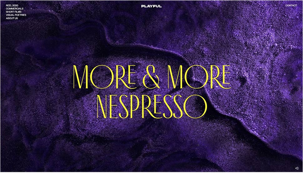
Playful is a collaborative collective of digital creators specialized in art direction and moving picture campaigns. More & More Nespresso is, by their own admission, one of the most challenging and rewarding projects the agency has worked on. The case study for the project is just as complex and rich as the project itself. It opens with an impressive hero slider introducing some of the textures that played a central role in the project, in a deep, sultry purple. Carefully curated images and videos from the project are skillfully arranged along the page, contrasted with large empty spaces with light backgrounds and text, offering a welcome pause from the visual feast. The color play is particularly striking – the project itself features a delicate interplay between rich, deep burgundys, greens and blues on one hand, and fine, elegant pastels on the other. The same interplay is repeated in the case study, and the elegant, sophisticated character of the project is underlined by the use of the lovely Antiga typeface throughout the page. The page features a director’s cut video, which is the centerpiece of the project, but doesn’t take over the case study, as it is after all exactly that – a case study in which the agency explains the creative process and pinpoints main visual cues and motifs.
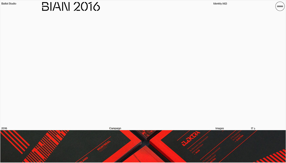
You may remember the Baillat Studio from our piece on inspiring menu design, in which we praised the studio’s modern, interactive fullscreen menu. Today we’re going to check out the Project section of the website, specifically the case study for the 2016 edition of BIAN (the International Digital Art Biennale). The visual identity for the festival was based on black and red, a color combination that creates a lovely contrast with the page’s light gray background and black interface typography. A short text about the target and the main identity elements (Swiss style-based aesthetics, right-angle frames, repetition, lines and precision) follows the opening hero section with a full-width visual from the project. After this introductory section, we get to explore the visuals from the project, presented in the form of photography, video and images of project material in real life, in its designated ambience. The agency, therefore, decided to let the images speak for themselves, without excessive explanations and textual narratives. And it was a good call, too – the page is compact and informative, just what a case study should be.
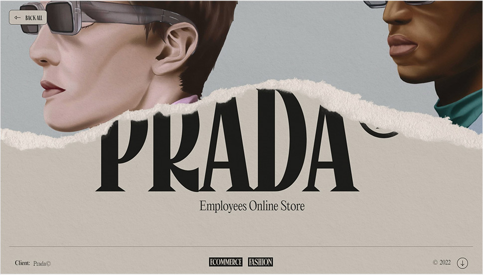
Here’s a designer we love to feature in our articles – we’ve written about Niccolò Miranda in our pieces on poster-inspired web design and on great examples of footer design, to name a few. This time around, let’s take a look at how this talented Italian designer and developer with a penchant for illustration decided to present his featured works on his website, using the case study for Prada Employees Online Store as an example. The first thing we notice is that the project pages are completely in line with the overall style of Miranda’s portfolio. By that we mean the paper-like texture, the torn paper effect, the columns and sections resembling newspaper layouts, and, of course, illustrations. The page opens with a hero section that holds a lovely illustration from the project he did for Prada (an online store that sells the brand’s previous collections). We then move on to a section explaining what it was that Miranda was commissioned to do, and sections explaining how he did it. What’s interesting (in addition to the distinct and idiosyncratic style) is that the imagery from the project is presented not in the main page content, but instead in a sidebar that opens to the right when we click on the appropriate icon. The page also features a big oval button that leads to the project’s live site, and that’s about it. It is basically more of a project blurb page than a case study per se, but considering its unique style and Miranda’s amazing talent, we figured it deserved a mention here as well.
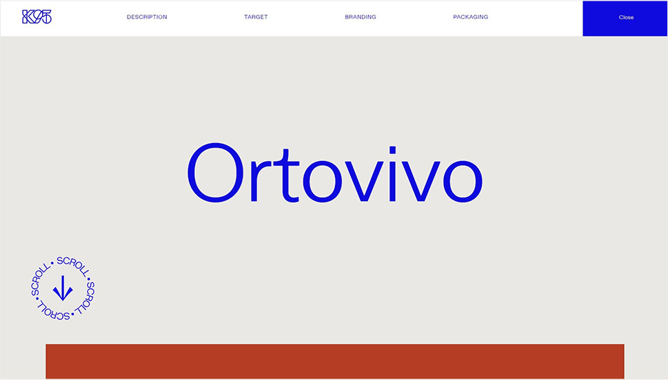
K95 is a design, branding and communications agency from Catania, Sicily. They work with mostly Italian clients but have a few international names on their roster as well. Their website features a neat list of projects in the form of an interactive link carousel, each link leading to the appropriate case study. Today we’re going to check out the one for Ortovivo, a Sicilian organic food production company. Each project is neatly divided into sections that include description, target, branding and packaging, linked in the header (from which we can also turn off the case study and return to the homepage). The layout is airy and clean, with plenty of empty space around each piece of visual content, and a large circular animated button inviting us to scroll to explore the project. Sections with empty space are combined with full-width interactive ones, moving and expanding as we scroll. It is a dynamic, modern and skillfully designed page that unites good UX, usability and efficiency with modern design practices that speak volumes of the agency’s expertise and taste.
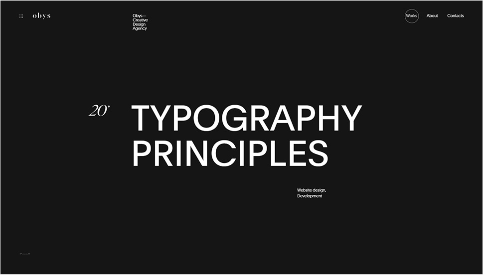
Obys Agency is a creative design agency from Ukraine with a focus on UX/UI design, animation, graphic design and development. Their website is a modern, streamlined and fluid display of their works, principles, accolades and much more. As an agency that flaunts a serious approach to everything they do, Obys wanted to share some of their ethos and the artistic and design principles they follow in their work, and that’s why they created a standalone website on Typography Principles, while the main website has a page that serves as a case study for it. The site includes three sections explaining how the agency uses fonts, how it combines them and what rules it follows when it comes to typography. The page follows the white on black aesthetic line of the rest of the website, with sections that roll up or down revealing underlying content. Navigation is particularly interesting here, as we get to explore the visual content through scrolling, clicking on oversized interactive buttons, and play videos. Numbered sections and diagonal arrows hint to physical navigation signals (like traffic or airport ones), and the part of the study that deals with animation is presented in a separate unit. The website itself is rather impressive and the case study does an excellent job at conveying its complexity and elegance, both design-wise and in terms of UX.
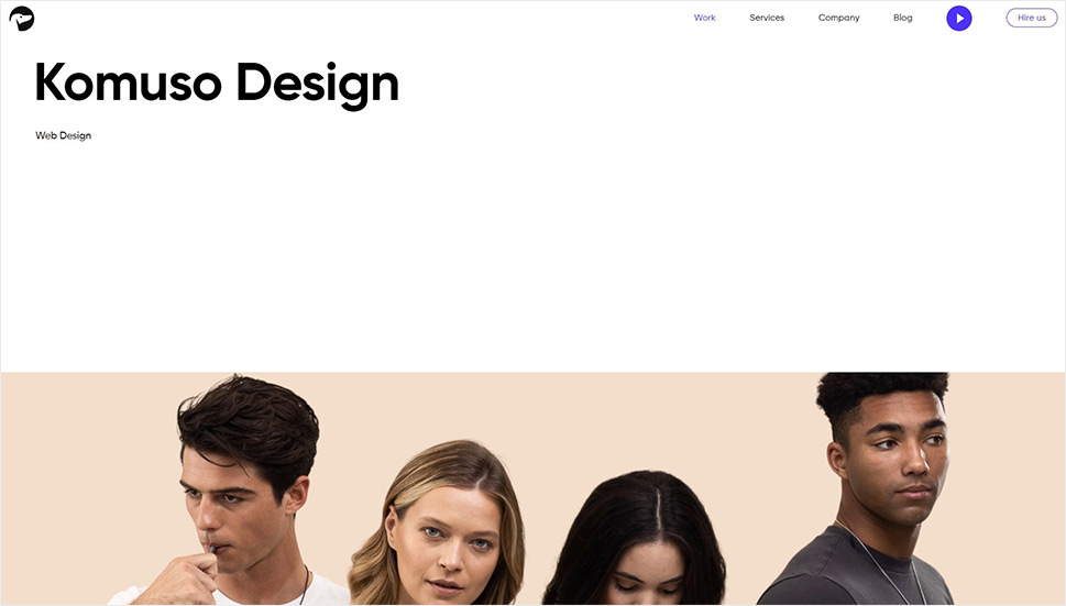
Tubik Studio is a full-stack digital service agency with a focus on UX and UI design. Their website offers a rather no-frills (but nevertheless striking) display of services and works the studio is most proud of, with a gallery of images leading to specific projects. The page for Komuso Design project, for instance, offers an informative and hands-on overview of the project. It opens with an intro hero image, followed by brief project info presented in a simple, readable form, with comfortable black Gilroy typography on a white background. The visual content is presented in the form of videos on a lovely marble-like background, combined with screenshots from the project arranged on a beautifully combined palette of pastels. A particularly well-designed section is the boxed split slider gallery that offers a dynamic and convenient way of displaying several instances of content without cluttering the page or making it too long. The study ends with the visual system: a color scheme with HEX codes, some representative samples of typography and the mobile layout. The entire page bears an airy, pleasant character, perfectly aligned with the client’s brand and product (a wellness tool designed to help people relax through breathing).
Humana Studio is a Portuguese agency that helps build brands with a social and environmental impact. They were commissioned by the 92 Group, a design studio that challenges traditions in media and entertainment through irreverence, unconventionality and youth. Obviously, this was an excellent fit as the Humana Studio has a distinctly disruptive approach. The case study for the 92 Group brand identity and communication strategy partly follows the same disruptive principles – especially in terms of visual communication – but also some more conventional ones, specifically when it comes to UX. The visual content is saturated, loud and bold, with strong, deep colors on a black background, but the way it is arranged on the page guarantees proper navigation, readability and ease of consumption. The sections are topped with a subtle zoom-in effect and a yellow round cursor that shrinks and expands and the text is short and to the point. The study is brief but concentrated, informative and practical, coherent in character and atmosphere.
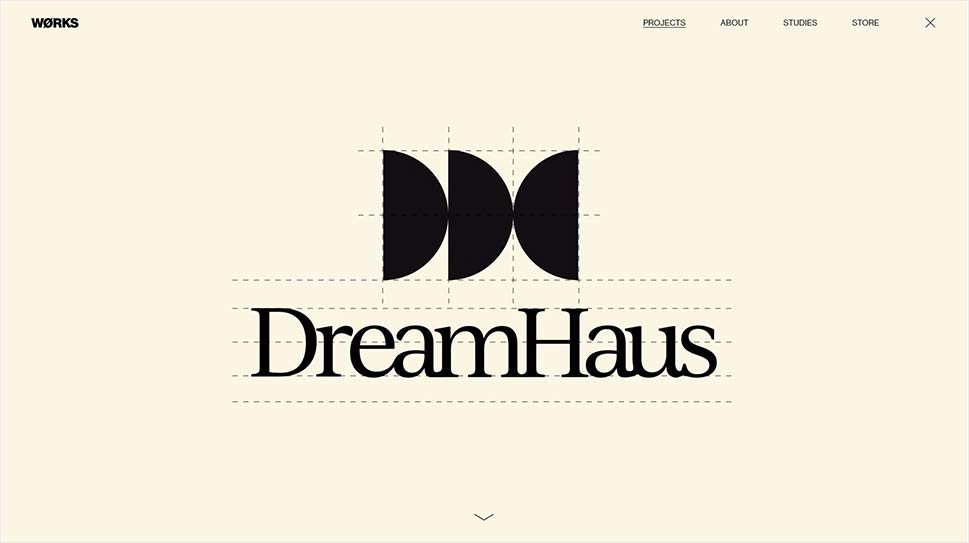
WØRKS Studio is a New York-based consultancy specializing in creative direction, strategy and design. Their main website is an exciting showcase of both the agency ethos and their projects, and is marked by a distinct cinematic approach, with a lot of information and content being handed in form of immersive fullscreen videos and animated sequences. The DreamHaus project is presented as an animated study of the pillar design elements used for the project – with the main focus on typography and the palette. The fullscreen hero section opens with a large animated logo of the project, proceeds with a palette of beautiful pastels, with names and hex codes, and ends with a sequence that showcases the typography used for the project, and the main layout style, as well as textures. The visitor can scroll to learn more about the project and its goal, as well as the main guidelines that the agency followed in the creative direction of this project. The images related to the project, or the products of the direction, if you will, are presented with animation effects that feature a brief flash of yellow, which is the agency’s signature color, thus providing a continuity between the project and its creator and, of course, reinforcing the agency’s own branding.
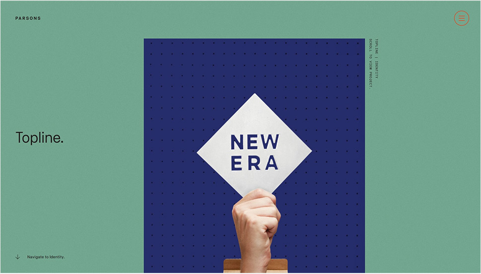
Our most frequent readers might remember Parsons Branding from our piece on inspiring creative agencies and designers, in which we praised the agency’s beautiful UI design and interesting navigation solutions. Today, we want to check out one of their case studies, specifically the one for Topline, the South African tool manufacturer. The case studies all feature unique page navigation – the left portion of the screen contains a numbered section with jump links to specific parts of the case study: Overview, Identity, Packaging and so on, and of course we can simply scroll down and explore the entire study in its intended order. The background is in the agency’s signature green and gray, with a very subtle paper-like texture, giving the entire interface a lifelike quality. The left side, the one with the table of contents, remains static as we scroll, assuring easy navigation and orientation on the page, which is, in itself, quite rich in content, both visual and textual. Certain sections are given in horizontal scroll sliders, so we get an impression that the page expands in all directions. This is an extremely well thought-out case study, brimful of information for those interested in exploring the project in great detail, but at the same time simple and informative for those looking to just skim the content.
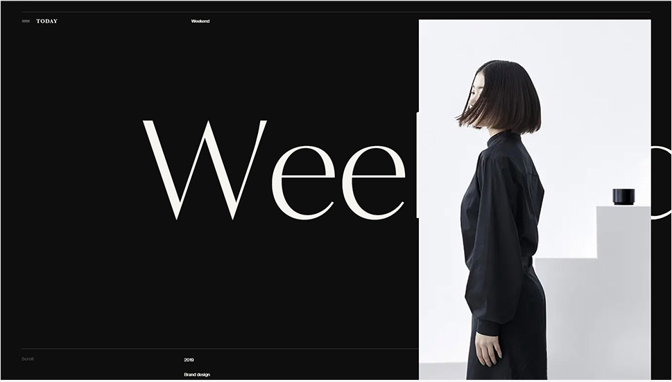
The Japanese Hello Today did a quite complete agency work for the home appliance manufacturer Weekend, from strategic planning and branding to graphic design, web design, photo and art direction and even copywriting. The Weekend case study on the agency website is a modern, elegantly dark showcase of everything the agency did, from the first steps to the completion of the project. Discrete white typography on a black background introduces basic project information and brand philosophy, both in English and in Japanese, before we scroll down to visuals. These are presented in a typically Japanese, dignified manner, gently floating on the black background, creating a beautiful contrast and a strange sense of calm. Thin, subtle interface lines provide some framework for the visual content and communicate rather successfully with the overall aesthetics of the website – minimalist and stripped-down.
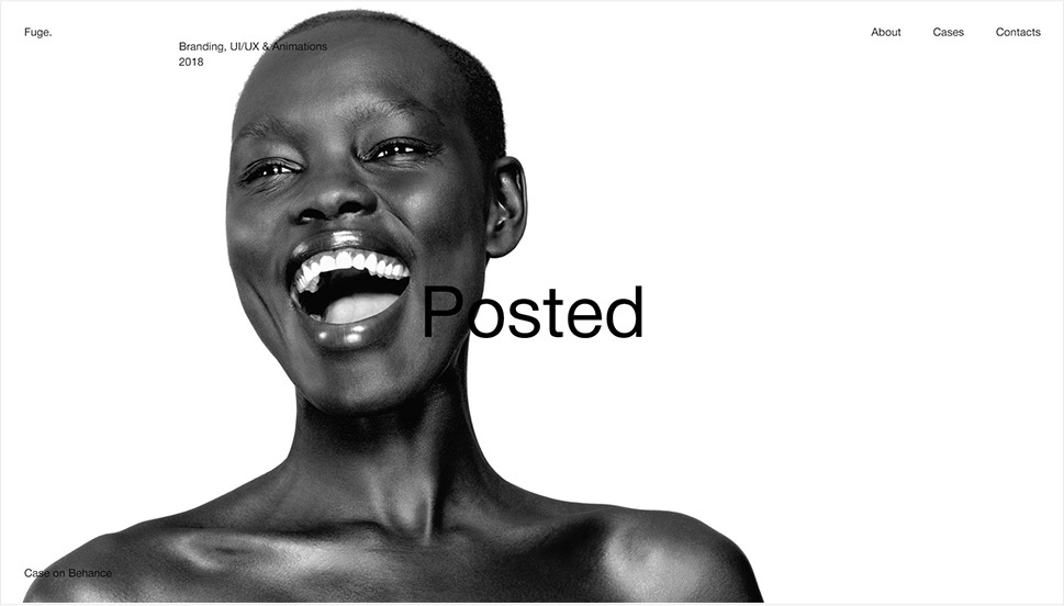
Fuge is a Moscow-based design agency delivering UI, branding and digital solutions. The agency website is minimalist, in a very reduced palette, with small typography and on-lover grid patterns, resulting in a modern, serious look. This character is repeated throughout the website, including the individual case pages. Our favorite one is the case study for Posted, a design magazine for which the agency did branding, as well as UX and UI services and animations. The case page starts rather minimalistically, with a large image on a light background and just a few bits of text. As we scroll, more and more pieces of content appear on screen, in an interactive and rather fluid way. The case study is divided into sections – logo and elements, desktop and mobile versions of the magazine website. Each image can be expanded in a popup, with smooth and modern transitions, giving the page a dynamic and modern look. This atmosphere is reinforced by a modern, minimalist palette reduced to grayscale, black and red, which is the Posted brand palette. The images (or rather previews) are alternately arranged on the page, creating a lovely balance, and the entire composition appears to be held in place by the grid lines that appear as we hover over certain areas.
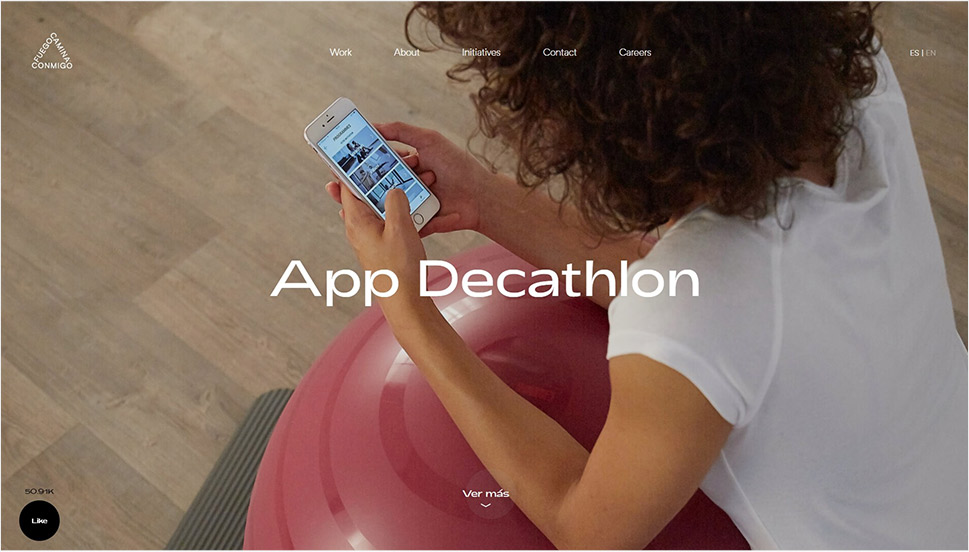
Decathlon has long planned a redesign and a relaunch of its app for the Spanish market but the Covid-19 pandemic put a halt to those plans for a while. As soon as the pandemic loosened, the sports goods company reached out to the Barcelona-based, Twin Peaks-named agency Fuego Camina Conmigo (Fire Walk with Me) for a range of services from digital strategy, art direction and concept, to copy, audiovisual content and social ads. The Decathlon App case study is available at the agency website, and it’s one of the most successful, detailed and complete studies we’ve seen in a while. it ticks all the boxes in terms of what a case study should contain – the context, the target, the implementation, and so on, but it does so in a way that is by no means dry or technical. The agency achieved this by skillfully alternating light and readable text sections with fullscreen sections with the visual material from the app, which can be viewed either as images or clicked to play a video. All the while, the agency maintains its own visual identity, present in typography, layout styles and elements such as the round cursor, buttons and icons.
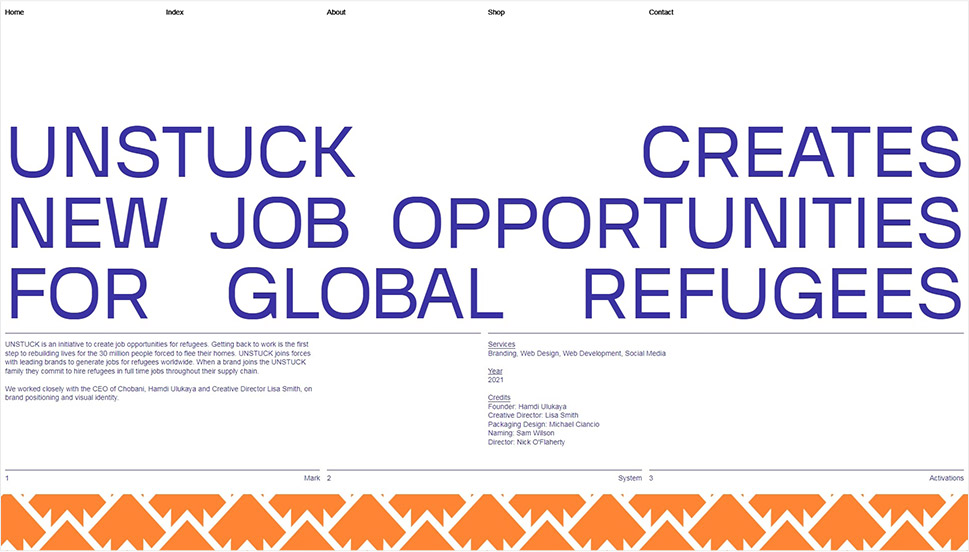
Here’s a project that is as noble as it is well-carried out. Unstuck by Violet Office is an effort started by the CEO of Chobani and several other stakeholders with the goal of helping refugees find full-time jobs in partner companies and their supply chains. Chobani was the first to join the project, of course, and it was soon followed by other major brands like Ben & Jerry and Dole. Violet Office did the branding, web design and development, as well as social media. The branding part is perhaps the most impressive – the agency created a logo and wordmark that can easily fit any brand partner’s logo, and the first part of the case study focuses on that particular effort, complete with rich visuals proving the efficiency of the design. It then proceeds with an analysis of the Unstuck visual system (colors, patterns, typography), and ends with examples of brand activations, complete with the launch video. The high-contrast visuals are displayed full-width, either in galleries or individually, which creates an immersive effect on the visitor, who ends up being completely drawn into the narrative of this commendable project.
Wrapping It Up
As we saw from the examples we visited today, while a good case study may not necessarily have to strictly adhere to a formulaic structure, it’s still a good idea to give it some structure and to conceptualize it in a way that communicates clearly and directly with the viewer. And since the viewers are also potential clients, it’s needless to stress how important this is.
We’ve seen some “proper” case studies with neatly divided sections and a tight structure repeated throughout each study. We’ve also seen some more “relaxed” ones, and some that perhaps don’t really qualify as case studies in the strictest terms but that due to their quality and supreme design elements deserve a mention.
Hopefully we managed to inspire you by showing a variety of styles and methodologies you can follow in creating your own case studies. Feel free to share with us your own favorites or, even better, your own work!
