14 Inspiring Creative Agency and Designer Websites
Designers and creative agencies often find it challenging to explain their work philosophy and define their aesthetic values. Their portfolio offers a glimpse into their creativity and skillset, but if they wish to introduce people to their way of thinking and ethos, have a voice in the art community, and build credibility, they often need a full-fledged website.
The NYC-based designer Frank Chimero once said that our use of the word “home” in web design implies that we strive to craft a space that will make people want to take their shoes off and step inside. It also implies a space in which we can set our own rules, a space in which we can create our own logic, regardless of whether it “fits in” with generally accepted norms.
In this article, we will introduce you to several inspiring websites created by some of the world’s most popular designers and creative studios. Some of them ooze elegance and reflect a refined design style typical of an artist or an agency. Others seem cold and demure, putting functionality and project presentation above all else. Some studios have made interactive sites, taking people on exciting journeys to introduce them to their story. But what all these websites have in common is their striking and recognizable appearance and a clearly defined style that speaks volumes about the creativity of the team behind it. The artist and agencies we will talk about include:
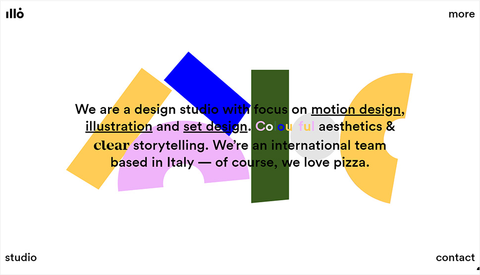
Illo is an Italian design studio that specializes in motion design, illustration, and set design. Their style is all about using bright colors and impressive motion graphics. Every element on their site is large, from typefaces and interface elements to visuals. The interface itself is minimal – it’s black, adorned with some specks of color here and there. They’ve managed to showcase their extensive projects list in a compelling way by relying on attractive animation effects. However, Illo’s portfolio presentation is essentially quite simple, and that simplicity is what makes it look all the more effective. From one scroll to the next, every pixel of their eye-pleasing website is bursting with life, joy, and feel-good vibes.
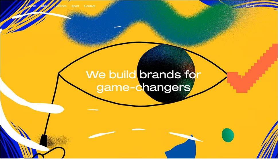
The moment you visit studio Firma’s website, you will immediately connect with their story, vision, and style. They expertly blend contemporary, conventional elements with authentic creative ideas. This modern-looking site is imbued with illustrations and animation effects oozing Spain’s visual arts heritage. There are large chunks of text throughout the homepage and huge headlines written in a wide sans-serif typeface. Firma has attractively mixed authentic elements typical of Spain with a conventional visual style, resulting in a winning combination that looks both unique and universal at the same time.

Estudio Pum is a graphic studio based in São Paulo and Barcelona with a website that resembles an exuberant portfolio list arranged in the Pinterest gallery style. The majority of featured projects look like cut-outs, which adds to the overall effectiveness of the studio’s portfolio showcase. The rich visuals and appealing animation effects capture your attention from the very first scroll, introducing you to the aesthetic and visual values of Estudio Pum. Red and blue colors, fluorescent hues, and motion graphics mirror the studio’s character, energy, and design values.
Top Themes for Creatives
View Collection


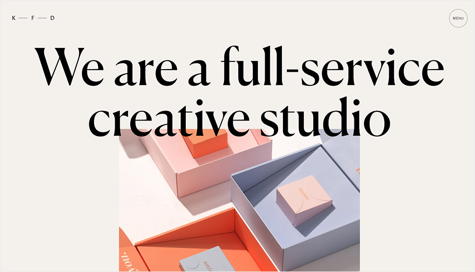
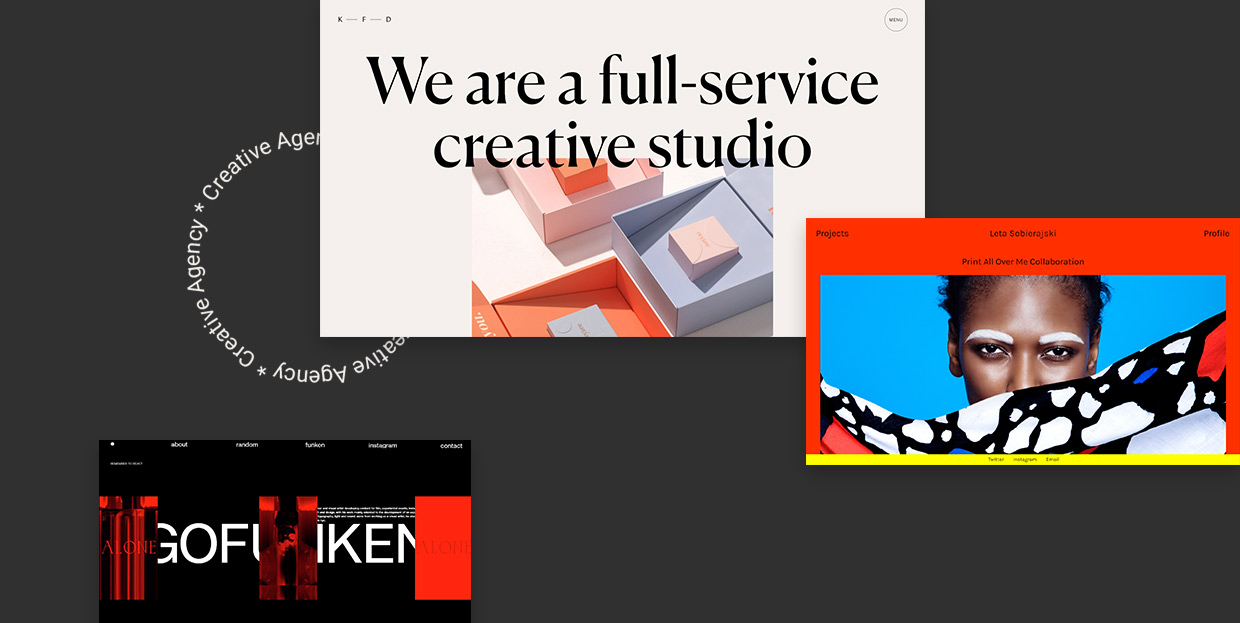
Kati Forner is an LA-based creative studio specializing in branding, packaging, as well as visual and interactive design. Their website looks refined, with lots of soft, pastel hues that make it look as if hand-made. They opted for black, elegant typefaces, with sporadic blue, italic fonts breaking the monotony of regular letters. The designers have also added tiny images next to some words, making the descriptions and large chunks of text all the more interesting to read. This entire site is a beautiful reflection of Kati Forner’s approach to design and a great showcase of the studio’s creativity.
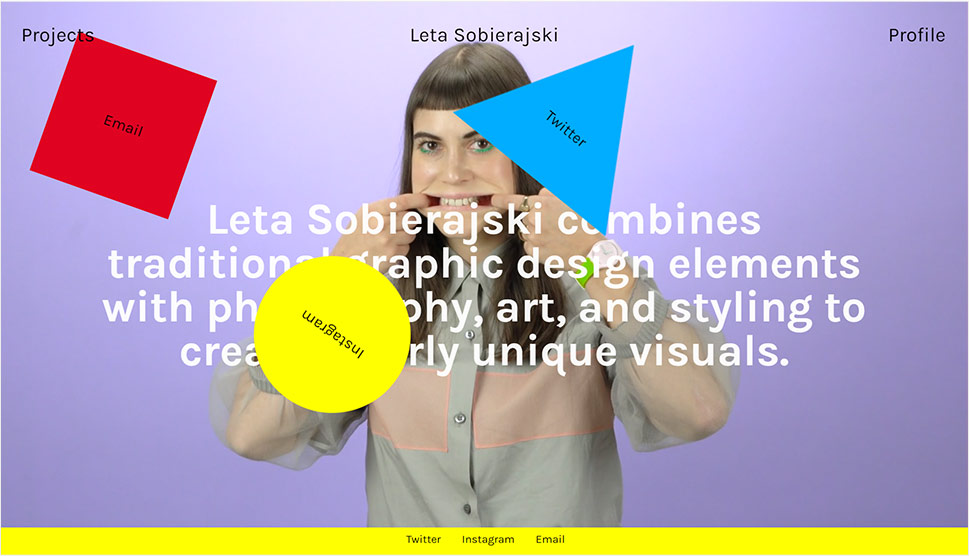
Leta Sobierajski is known for her unique and striking visual expression. She combines traditional graphic elements with photography and art, creating projects of impressive visual values. Leta’s work ranges from commercial and conventional graphic design to art pieces that can be best described as bizarre. She’s no stranger to using video, which is evident on her site. Her entire online presentation is filled with boldly-colored content and picturesque visual details that reflect her intriguing character. Each portfolio piece has a featured image, indicating what the project is about. To make the browsing experience all the more interesting, Leta has peppered her portfolio website with fun animation effects. Three perpetually rotating objects stay on the screen no matter how far you scroll – a circle, square, and triangle that contain links to her social media and email pages.
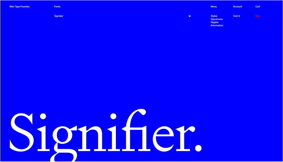
Type foundries require clear, functional, and informative websites, containing all the necessary details about the showcased fonts. And the Klim Type Foundry site is a perfect example of just that. The beauty of the typography is at the forefront, with other elements complementing and highlighting the fonts’ features. The moment you start exploring this commanding website, the first thing that catches your eye are the attention-grabbing vertical sliders with powerful animation effects. They lead you into the story about the foundry’s fonts but also highlight the importance of the Klim Type Foundry as a whole. Besides showcasing the typefaces, the homepage also features blog and shop lists, making the site more practical.
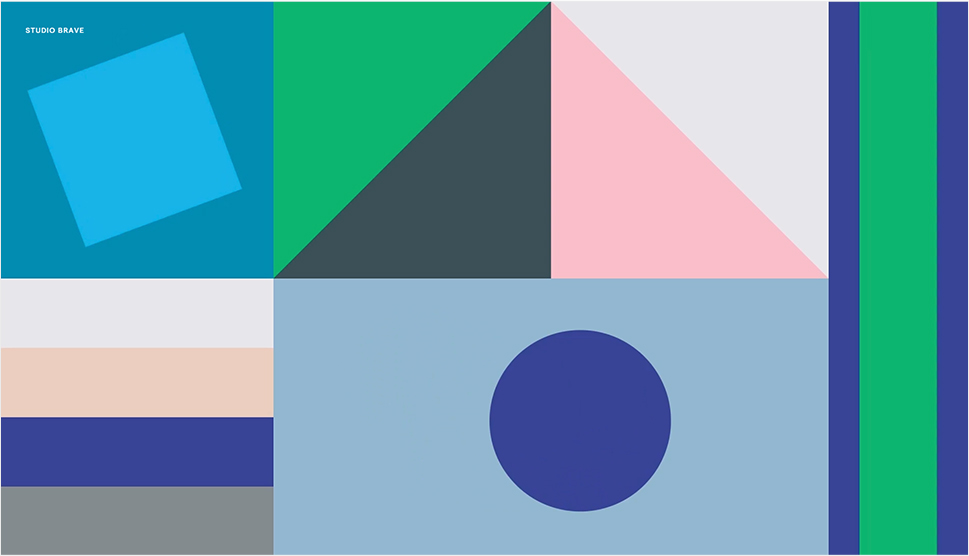
The Australian Studio Brave’s website is characterized by an asymmetrical layout, powerful design, and dark hues paired with a vibrant color palette. The captivating presentation, exciting fullscreen video content, and abundance of action on the site are guaranteed to win the visitors’ attention from the get-go. This site is all about the rhythmic movement of its visually-appealing elements. Project titles are fixed, giving a sense of depth to the homepage, while the different-sized letters, large buttons, and short textual details form an unexpected cohesive unit.
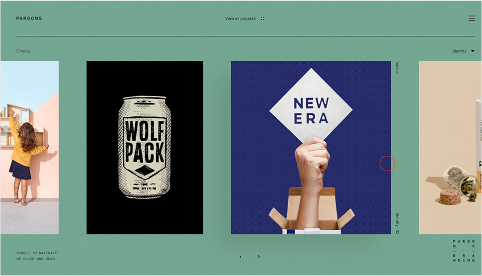
Parsons Branding is a South African design studio that specializes in branding and creating visual identities. Their site’s homepage includes a portfolio list with a horizontal scroll effect, making it fun to explore. Moreover, it is possible to navigate the site by performing the click-and-drag action with your mouse. The interface design and typography are minimal and demure, contrasted by striking animation effects. While this site might appear simple at first sight, its well-thought-out design, beautiful effects and user-friendly navigation give it a lot more depth than one may initially notice. A collection of their works is displayed in the “View all projects” section, and the projects are displayed with an infinite loop effect. Gorgeous imagery with a slight vintage feel and a neutral background are a great choice for showcasing a manifold of the studio’s projects with multiple different aesthetics and styles. You can move your mouse in any direction you want, and once you place the cursor on a featured work, the preview image will go from black and white to full color.
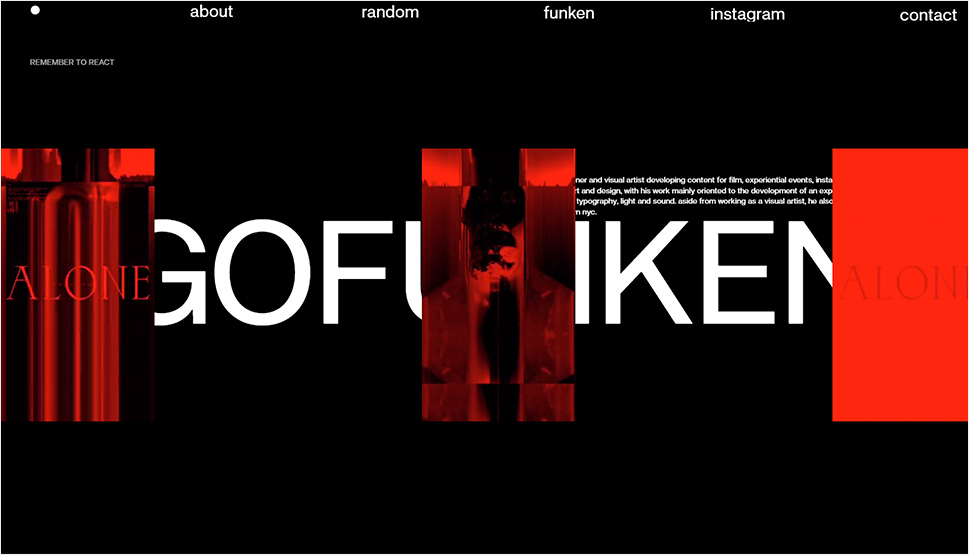
Diego Funken is a Chilean motion designer and visual artist best known for his work in the film industry, as well as on experimental events and installations. His recognizable audio-visual language represents a mixture of typography, video content, lights, and sounds. Funken’s projects ooze brutalism, and so does his site. Large, black typefaces dominate the homepage, and as you hover over certain words, you can see a preview of some of his works. This site perfectly exemplifies the importance of typography and its power to define the style of a project and reflect the artist’s attitude and ideas. The visual content is appealing and powerful, just like Funken’s style, leaving a strong first impression on a visitor.
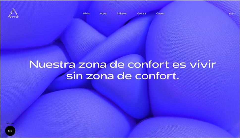
A modern, wide sans-serif font, beautiful imagery, and short, simple pages are the most prominent elements of Fuego Camina Conmigo’s website. The homepage is quite short. It contains brief, informative texts about the agency, and there is a wonderful, irregular rhythm to it. The inner pages are designed as horizontal sliders, so their content looks well-organized and is easy to explore. They feature stunningly-animated fullscreen imagery and look as attractive as the homepage, which shows the agency’s attention to detail and their dedication to creating an all-around attractive website.
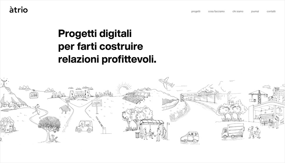
The website of àtrio is minimalistic, uniting simple typography with interesting black and white line drawings. The monochrome top section of the site is followed by a colorful portfolio list, and the contrast between the two puts the studio’s projects at the forefront. Portfolio items appear with a slanted animation effect, which further highlights the featured works. And when you place your mouse on any of the displayed projects, the circle-shaped pointer enlarges. By mixing exciting illustrations, colorful visuals, and modern animation effects, àtrio managed to create an appealing showcase of their skills and introduce themselves in a memorable way.
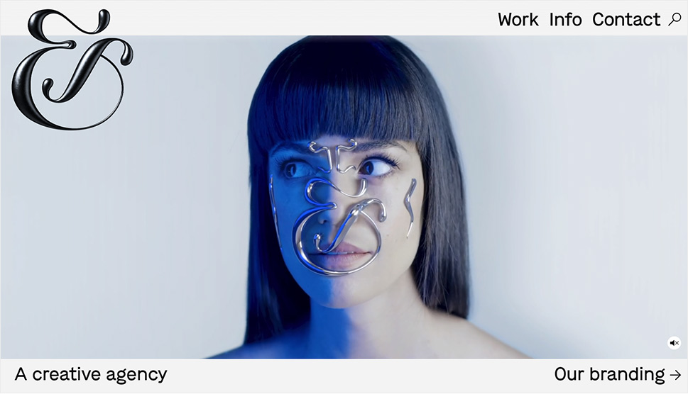
When it comes to the world-renowned designer Jessica Walsh, words are superfluous. Her works have been a hot-and-trending topic in the world of web design for many years. In 2019, she founded the independent studio &Walsh. The studio’s website illustrates the style typical of New York’s school of design. Everything is large, bold, in strong colors. There are a lot of different color palettes, but they all blend beautifully and look pleasing to the eye. Aside from using captivating imagery, the studio added amazing audio and video effects to the top of the homepage, luring you right into their astounding creative world. The ampersand found in the studio’s name is somewhat of a trademark. It is styled in a variety of visually-engaging and artistic ways on the site, contrasting the modern interface and typography.
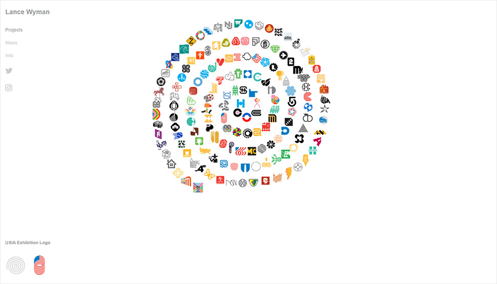
Lance Wyman is one of the pioneers in the field of environmental graphic design and visual identities. His website is a great example of a not-so-recent but still very fresh and unconventional way of designing a personal portfolio. He showcased the logotypes he created in the form of a spiral resembling the Milky Way. The spiral has no particular functionalities nor any special effects, but it represents a compelling example of an authentic design that could easily stand the test of time and outlive contemporary trends. As you hover over the logotypes featured in the spiral, you can see their preview in the bottom left corner of the screen. Wyman has created around 150 logotypes for numerous brands, associations, and events, but there’s still room left in the spiral for his new works of art.

Bedow is a design studio from Stockholm. Their website looks modest and warm. The asymmetric layout is simple and helps put the clear and functional project presentation into the spotlight. Below each project, you can find some basic information, including the year when it was created and its name.
The Bedow studio crafted two typefaces specifically for this website – one is a modern, well-readable sans-serif font used sporadically throughout the site, while the other one is an authentic display font. The latter is a typeface that looks hand-crafted, resembling wood engravings. This particular quality makes it appear warm, as if it were made of natural materials. It also makes it seem like something that was created in complete harmony with the rules of nature. The connection between the two fonts is evident in the fullscreen menu. As you hover over menu items, letters morph from one font to the other. As far as colors go, the designers have opted for earthy tones and have adorned the pages with vintage-looking photographs that best represent their work and skills. The final result is a contemporary site that users will undoubtedly enjoy browsing.
Conclusion
The websites featured in this roundup not only introduced us to the agencies’ and designers’ portfolios, but also to their individual characters and their stories. Each site perfectly demonstrates the beauty and boundless potential of the creative work, and brings the artists closer to their audience.
As in life, the most important thing when creating a website is to stay true to yourself and be honest. You may come up with something simple yet remarkable in the spur of the moment, or you may need more time to create a more complex website. Just make sure the final product faithfully mirrors your values and philosophy, which is something visitors will instantly recognize and appreciate, like we did on all of these sites.
