60 Best Examples of Brutalism in Web Design
Brutalism is an architectural style that emerged in Europe after World War II and reached its heyday in the 1950s and 60s. Its name comes from the French “béton brut”, meaning raw concrete – an expression that perfectly complements the ideas and characteristics of this style.
Brutalism unapologetically strips things down to their very essence and is known for its industrial, raw look and use of simple geometric shapes. Bare as it is, brutalism leaves a strong impression on the observer and communicates directly with them.
However, brutalism offers more than just pure functionality. It also provides us with highly enjoyable aesthetic experiences. This quality has been recognized in many creative fields, including web design.
Brutalism in web design is characterized by its raw appearance and experimentality. This is a nonconforming style that rebels against the established web design trends, and is known for the use of primary and web safe colors, gradients, and shadows. The works are filled with raw interactions and micro-interactions that usually appear on hover. Typography is heavily present on sites, so font choices and letter sizes have a great visual impact on the final result. The use of straight lines, divided screens, the lack of clear hierarchy, the use of 90s inspired web graphics and motifs from pop culture are all typical of brutalist projects. Designers rely on hand-coded HTML (often with minimum amounts of CSS) and they prefer to use simple navigation. On some sites, there is no navigation at all, and their layouts often make zero sense. There are no clear rules, which results in the creation of authentic designs.
Some web designers push brutalism to the extreme, so much so that they purposefully ignore the widely accepted web design practices established over the last 20 years. As a result, they create works that often become a total opposite to that which is beautiful, sensical, and functional (as often seen in architecture). In the world of web design, such works could even be described as ugly, trashy, and even pompous, since in the most extreme cases, they completely neglect functionality and the users’ needs.
In web design, brutalism is still being developed and experimented with. Creatives are modifying it and exploring which elements to use and in what amount. You will come across extreme examples with all characteristics we’ve mentioned earlier, while others will be practical, refreshing, intuitive, and user-friendly, with a simplified layout and a logical UI and UX.
In this article, we will introduce you to some of the finest examples of brutalism in web design. All of these sites are boundlessly imaginative and they stand as a lovely illustration of the unparalleled brutalist creativity:
For more examples of brutalism in web design, you can check out these demos from our Qi Theme for Elementor:

In 2014, Pascal Deville founded Brutalist Websites with the idea of cataloging and showcasing examples of brutalism in web design. When it comes to deciding which examples to feature in the directory, one of the factors Deville takes into consideration is that “It’s not only what you can see, it’s also how it’s built”. This point of view is typical of architecture. When applied to web design, the essential role of concrete is replaced by the importance of good HTML and CSS.
Brutalist Websites was launched just as brutalism was becoming a popular style in web design. The website is essentially very simple, with image previews of all the examples. Considering the number of sites listed in the catalog, it’s clear how important Deville’s resource-abundant project is and how inspiring it can be for web design beginners who wish to understand the possibilities of brutalism and its influence on web design.

While the studio Hawraf no longer exists, their intensely brutalist website serves as a true reflection of their boldness and creativity. Navigation and hierarchy don’t exist on the site. What we see is a heterogeneous mixture of fonts and seemingly handwritten words, images, simulations of computer screens, and social media icons. The site is also interactive, allowing you to doodle all over it. And as you hover over some words, their definitions pop up on the screen and so do related images and videos. Our prior knowledge about websites and how to best experience them doesn’t seem that relevant on Hawraf’s site. It’s almost as if they wanted us to feel confused, which is probably how people felt when they first started using and exploring the Internet. One thing that is evident from the get-go, though, is how creative this site is. That creativity was probably what kept visitors engaged in the first place and turned them into potential customers. Even though the studio isn’t active any longer, luckily, we can still have fun on the site, like drawing a smile onto the emoji’s face.

PW-Magazine is the perfect example of how striking a brutalist magazine can be. Arresting preview images dominate the site. Its interface is well-thought-out. It relies on common web design principles, resulting in a user-friendly brutalist website. If we were to take a look at magazines and newspapers published throughout history, we would notice that they’ve all adhered to the principles of brutalism to some extent. And since we’ve already become used to seeing brutalist elements in print, their use in web magazines isn’t so shocking to our eyes.

Studio Otto’s website combines brutalism with minimalism, which isn’t so rare to see. The screen is divided into two large horizontal parts. The studio’s projects are displayed in the lower section with an animated scroll effect. As you hover over them, their previews show up in the upper half of the page. This website looks simple yet bold and contains just essential information. Aside from linear layout separations, which are typical of brutalism, elements that make it even more brutalist are the lack of navigation and no clear hierarchy, which is why we don’t have a clear idea about where we are on the site.

Butt Studio is an art direction and animation studio with a website that introduces you to their projects from the very first scroll. In fact, the whole site looks more like a portfolio rather than some studio’s website. It’s rich in visual content which is accompanied by simple-looking fonts. Save for their contact details and the clients list, we can’t discover anything else about Butt Studio. There’s no doubt that’s intentional. They added a “Studio” button at the top of the page, but as soon as you place a mouse pointer on it, the unclickable button moves elsewhere. Since it’s impossible for us to learn more about the studio, the only thing we can do is contact them. Their clients list speaks volumes of their skills, and it shows that, even though the site seems illogical at first, it actually helps filter out clients. The ones that recognize and appreciate the studio’s creativity are the ones who will stick around.

Typical Organization’s website is created in the form of a list, emanating the very essence of brutalism. The screen is divided into several columns with the title of each column placed at the top of the page. When you click on any of the titles, the portfolio list is then arranged according to the selected criterion. The final section, “Control”, allows you to explore their portfolio by selecting a specific category. It is also the place where you’ll find the studio’s contact information. Upon clicking on any project name featured in the list, the otherwise white background turns to black. Then, a page pops-up in the middle of the screen, containing information about the selected project and accompanying visuals. This website is so simple and devoid of any redundant details. Thanks to this simplicity, we can enjoy the functionality of the site even though it lacks a typical UI.

Dublab is a non-profit radio station dedicated to promoting music, art, and culture. The website’s structure and aesthetic are brutalist, but this style becomes even more prominent as you start exploring radio’s archive, schedule, DJs, events, and other inner pages. They all exemplify a flat design style and include minimal “old-school” transitions. The links displayed on these pages turn to blue as you hover over them, which was a common practice at the very beginning of web design.

Department of Presence is a new public program of Warsaw’s Museum of Modern Art. It is an experimental research and educational platform deprived of hierarchy that relies on various forms of artistic expression to start a discussion on political, social, and economic matters. There are large, interactive blocks of cement all over the screen that can be moved in any direction you like. They stand as a clear parallel to brutalism in architecture. On some sections of the site, these blocks are placed in the middle of the screen. They also rotate, blocking your view and preventing you from exploring the content. Luckily, you can move them away by clicking on them and dragging them to corners of the page. The site is in black, white, and grey hues, save for the blinking, bright-green circle placed in the bottom-right corner of the screen. On hover, the circle transforms into the museum’s logo. If you click on it, the site inverts into a negative. At the bottom left side of the screen, you will find links to the museum’s social media channels and their address. When you place the cursor on the address, a GIF appears in the middle of the page, showcasing what is probably the interior of the museum. The use of GIFs has been popular in brutalist web design since its early days.
New Themes
VIEW COLLECTION
CycleCraft
Bicycle Shop and Bike Parts WordPress Theme
Aestheta
Print Shop & Printing Company WordPress Theme
NeoTek
SaaS and Software Company WordPress Theme

Even Flom’s website resembles that of Typical Organization, which we discussed earlier in the text. It is simple to the core and extremely brutalist, but thanks to your prior UX knowledge, you can easily find your way around it. When the site loads, you only see three words – “archive”, “contact”, and “instagram”, a white background, and two black horizontal lines. To discover information about Flom, just go from one section to the next. Upon clicking on “archive”, a dropdown menu will appear, listing areas of Flom’s expertise. The “contact” section not only includes details about how to get in touch with the designer, but also a link to his portfolio page. You can also explore his works by visiting his Instagram page. This site is devoid of any visuals, and its clean and sparse design style is typical of brutalism.

Us by Night is a three-day festival of design and creativity. Designers and creatives from all over the world turn into true rockstars for the duration of it, so Us by Night looks almost like a music festival. Some people have even said that “It’s like a Ted talk if Ted was gonna hit on you”. The team who created the site has managed to translate the festival’s strong character and its bold aesthetics onto these online pages. It oozes brutalist vibes and helps visitors feel the unforgettable festival atmosphere. The header is divided into several blocks, each being home to one section of the website, while both the colors of the background and fonts vary from one page to the next. The site is rich in interesting hover effects and its pages are filled with heaps of pictures and links. It is highly functional and designed in a true brutalist fashion.

H. Lorenzo’s website is the perfect example of how well brutalism and online shops work together. The homepage embodies the brutalist style – it looks raw, experimental, with no form whatsoever, as if it were made in juxtaposition with the current design trends. It seems that the more time we spend on it, the more it falls apart. Using your mouse, you can grab clothing items floating around the page and move them wherever you want. In fact, even the elements of navigation and the brand’s logo are interactive and can be moved so as to collide with one another. After you spend some time playing around the site, you might have trouble finding some basic interface elements, such as the logo and the links. On most sites, they are usually displayed in the header or footer, but here, the more you play, the more messed up their order will be. Inner pages look far tamer in comparison to the homepage, but they’re still unmistakably very brutalist.

Balenciaga’s shop exemplifies the use of an extremely simplified interface. The page is divided into several sections using simple, black lines. There is no visual content. Each block contains just one word, informing visitors what the sections are about. Upon clicking on any title, filters related to your choice will appear over the entire screen. Once you find what interests you the most and select that option, a new page opens up, with product images all over it. On hover, you can observe products from different angles and read more details about them, such as their texture, size, and color. While this is typical of any online store, here it is presented in a true brutalist style, as are the product single pages, the shopping bag, and the check out page. When brands try to blend their own aesthetic with that of brutalism, they can go to extremes while mixing the two but still manage to create a practical, refreshing, intuitive, and user-friendly website that helps them stand out from their competition. And that is exactly what Balenciaga managed to do with their site.

Han Kjøbenhavn’s website is wildly brutalist and it mimics the appearance of a Microsoft Excel sheet. The name of the brand is written at the top of the page, with each letter placed in a single column. On the right side of the screen, you will find the search option, the link to their online shop, and the cart. The main navigation is placed at the bottom of the screen, with links looking like Excel tabs. The pages are filled with images showcasing their collections and simple typefaces. Product names are written in bold, blue letters. The vision of this brand is “to create an uncompromising and unconventional universe, built upon creativity”, which is exactly what their website embodies. They also understand well who their target audience is, and this unusual and authentic design helps deepen the connection between the two.

Hanger’s website is another example of a brutalist shop. It looks bold, uncompromising, raw, and recognizable, just like their products do. All you see are product images, with essential product details displayed below in a monospaced font. The main navigation is easily noticeable in the header. There are no superfluous details around the page, only what’s essential for visitors. Everything is subordinated to the functionality. Hanger’s site wonderfully illustrates how less is unquestionably more, and how, even when you design your site in a seemingly effortless style, you can still create something powerful and distinguishable.
![AB[Screenwear]](https://qodeinteractive.com/magazine/wp-content/uploads/2021/01/ABScreenwear.jpg)
AB[Screenwear]’s brutalist website looks pretentious, so much so that you can hardly find your way around it. There are some links displayed on both the left and the right side of the screen written in the HTML style, inviting you to discover more about the brand. On click, visual content related to the selected link shows up on the screen, fully immersing you in this peculiar web experience. Their online shop looks less wild in comparison to the rest of the site, but it’s still quite extreme and very brutalist-looking, with bold typography and striking visuals. AB[Screenwear]’s in-your-face approach to web design undoubtedly helps them capture the attention of every visitor and allows them to stand out from other fashion brands.

Kevin Moll’s site contains basic information about this graphic designer as well as links to two creative platforms he founded and an online shop where he sells books made “with love for lovers”. There is also a “request” button you should use if you wish to see Moll’s portfolio and a “daily” button that takes you to his Instagram profile. This site looks really raw. That is evident in the background and letter color choices, in the structure of the site, and in the way the cursor leaves a trace as it moves. The faster you move the mouse, the larger the trace will be. Perhaps the most brutalist characteristic of all is that the color of the cursor matches the hue of the typefaces, so while you move the pointer across the page, the text becomes illegible. The only elements visible at all times and unaffected by the cursor’s colored trace are the mentioned five links, as well as another three links placed at the bottom right corner of the page (“Information”, “Chat”, and “Contact). This way, Moll manages to keep our attention focused on those buttons and nothing else, inviting us to explore them and learn more about him.

Max Sidentopf’s portfolio is an example of a brutalist-minimalist website. Its interface successfully mirrors the absurdity present in most of his works, so it’s not surprising that the mouse pointer is shaped like a fish. The main navigation and project names are written in all-caps, sans-serif letters, while featured images take up the rest of the screen.

The cursor on PART Architects’ website looks very unusual and it would be hard to picture it on a non-brutalist site. There are two fullscreen lines, horizontal and vertical, and the cursor is placed at the point of their intersection. The rest of the site is designed just as strikingly. They’ve created a linear perspective, which is a nice touch since this site is about architecture. Anchor links are placed on the left-hand side of the screen. The agency’s work is organized into several categories that are displayed on the right side, helping you browse their work more easily. As you scroll down the page, you will notice that it’s designed to resemble the inside of a box and that the content becomes distorted in the top and bottom part of the screen as it follows the perspective angles of that box. This detail makes you feel as if you were exploring a 3D environment instead of a 2D site. Project names are written using an eye-catching font, and as you move the mouse over them, a hover image appears, giving you a sense of what that work is like. All of these elements together create a fantastic brutalist website that breaks stereotypes and stands out.

The Stedelijk Museum Amsterdam is dedicated to modern and contemporary art. Their website is designed in an entirely brutalist style. The pages are divided into multiple rows using straight, horizontal lines. Each section is clickable and it leads you to a single page dedicated to the content previewed in the row. When you place your mouse on the right or the left side of the row, its content will start to move in the opposite direction of the mouse movement. That way, you can see all that’s featured in any section. When you place the pointer in the middle, the movement stops. This site looks sharp and clear, and its strong character is noticeable on all of its pages.
Top Themes for Creatives
View Collection


Lucas Hesse’s website looks somewhat similar to that of the Stedelijk Museum. The screen is split into several large, horizontal sections, each containing the names of his projects written in bold, all-caps letters. As you hover over rows, video previews of featured works appear while the letters in rows become outlined. Basic information about Hesse is displayed in the red bar placed at the top of the screen, whereas the links such as “About”, “Work”, “Shop”, etc. can be found in the bottom red bar. Project single pages contain detailed descriptions about each of Hesse’s works, links to the websites of his project collaborators, and imagery that offers you an in-depth look into the artist’s creativity. At the top and the bottom of product single pages, you will notice three arrows that look the same as the call-to-action button on the site, except that they’re turned in the opposite direction, allowing you to return to the homepage.

From the very first scroll, the Twomuch.Studio’s website gives us an insight into their creative and experimental world. A number of animated and interactive objects appear on the screen, following the cursor’s movement. The structure of the website is very simple yet so effective. They’ve listed their projects as accordions and added their names, the year when they were created, the medium they were made for, the number of people who already saw them on the site as well as the number of those currently viewing them. Some projects also contain a link to their respective sites, where you can see the chosen work in action. Upon clicking on accordions, you can get more information about projects and explore the accompanying visual content. Twomuch.Studio has worked on a lot of interesting projects, including the Butt Studio’s site, which we’ve mentioned earlier in the article.

design.byForm is the portfolio website of Dan Flynn and another beautiful example of the brutalism-meets-minimalism design style. It looks very simple and it’s highly functional. The screen is divided into two parts. Information about Flynn and the list of his works are displayed on the left side of the screen, with each project placed in a separate row. As you hover over the list, project previews pop up on the right side of the page. They don’t disappear from view while you move from one work to the next. Instead, the more you move the mouse, the more images pop up on the right side. The password-protected content is blurry, but the unlocked projects are displayed in full color, without the blur effect. Using your mouse, you can move images all over the right side of the screen. And when you select a project from the list, the visuals created for it and the information about it show up on the right-hand side of the screen.

WordPress themes have reached impressive design levels, closely following the latest trends. One such theme is Zermatt, which embodies all of the brutalist principles. It looks raw, experimental, and in contrast with modern design forms. It’s all about functionality and practicality, which are evident on all 12 of Zermatt’s premade homepages. This theme is especially appealing to all those who appreciate the brutalist aesthetic and are looking for functionality and compelling animations that unapologetically enhance the brutalist style.

Breton is another WordPress theme that blends together brutalist roots with modern trends, creating a raw, user-friendly visual character. The use of straight lines, color combinations, and experimental-looking pages are some of its most-obvious characteristics. Using a color switcher that, with just one click, inverts the color of the background and that of typefaces, lines, and all other UI elements, you can instantly change the atmosphere on the entire site. There is no need to apply special effects to achieve such results, and their absence is at the very core of brutalism. The brutalist aesthetic is obvious on all of Breton’s templates which are particularly interesting to anyone who appreciates this impressive style.

Hito Steyerl Van Abbe Museum’s website is actually a digital invitation to Hito Steyer’s exhibition. The words written on the site become automatically highlighted one after the other, with their Wikipedia definitions, explanations, and events related to them displayed in the background. Steyer herself explores the impact of the Internet and digitalization on our lives, and this conceptual invitation perfectly complements her work. Here, brutalism shines in all of its experimental glory. In fact, the style is further enhanced by the use of Wikipedia’s pages in the background, since the world’s largest open-source encyclopedia was also created in the brutalist fashion.

Candy Chiu’s portfolio website mirrors the interface of operating systems. For example, if you click on “projects”, you will see Chiu’s works displayed in the form of overlapping computer windows. You can move them in any direction you please to reach the work of your interest. Other brutalist elements on the site include the large, perpetually-rotating circle placed in the middle of the screen, the color and font choices, as well as the white background placed behind the content of “about” and “contact” pages to make them more readable. The final result is a bold, aesthetically-striking website that is fully functional and easy to navigate.

Cine 365 Films is a platform used for discovering talented first-time directors from its Short Film Festival. The way that movies, trailers, and information about features are displayed is purely brutalist. The layout is unusually simple and easy to get around. There are lots of straight lines splitting the screen into several sections. The most interesting block is probably the one with the names of recorded movies and the ones currently in production. On hover, the letters become outlined while movie-related GIFs take up the entire section.

Folder Studio’s site is another example of the screen divided into several parts. On the left, you will find the list of the studio’s projects. On hover, they become colored in red, and upon clicking on them, you will see brief information about the chosen work displayed right next to its name. The absence of hierarchy, which would help differentiate the names of projects from their details, is typical of brutalism. Here, that problem is solved with the use of black bullet points. They stand in front of the name of every project and you can easily notice them on the list. To help you better navigate the projects list, you can spot some smaller text placed in two rows, right next to the information about each of these works. That text explains what kind of work the studio did for their clients. The visuals created for all projects are displayed on the right side of the screen. As you scroll from one project to the next, the transitions are mirrored on the left side. There, project names turn to red as soon as you reach the visual content created for them.

Indiecon was a festival and a fair held in 2018 to celebrate independent publishing. The website created for the occasion exudes brutalism. The screen is divided into two equal square parts. The left one is further split into three rectangles, each containing menu links (on most sites, navigation is usually placed in the header). The design of the site and the preloading animation mirror Indiecon’s logo. While the site loads, you will notice that the entire screen is divided into triangles. When the content is ready, the triangles spin from the right to the left, with the ones containing menu elements overlapping the empty ones. Upon clicking on menu links, their content will appear on the right-hand side of the page. Again, everything is simple, easy to understand, intuitive, yet interesting to explore.

In the City is an international conference on life-changing technologies in cities. To move through their geometrically-looking website, you have to either click on links that are displayed everywhere or rely on mouse dragging. In the top middle part of the page, you can see the name of the conference, which is displayed there at all times. Whenever you wish to go back to the start, just click on it. Other links are displayed on the sides and at the bottom of the screen, so you can easily notice them and use them to discover more about this conference. The excessive use of straight lines, simple animations and typefaces, angular geometric shapes, and the minimal use of colors all unmistakably ooze brutalism.

Both De Vlieg and Kaskad Project’s websites illustrate the beauty of brutalism’s boundless passion for the use of divided screens. On both sites, the pages are listed as if they were cards or pieces of paper you can scroll through with your mouse. The choice of colors and typefaces, the unusual UX, an interesting approach to design, as well as the contrast between this style and the popular web design trends reflect the principles of brutalist architecture. Aesthetically speaking, De Vlieg’s and Kaskad Project’s websites may seem to have little in common with brutalist architecture, but once you analyze their approach to design and pay attention to the elements used on these sites, the connection becomes more than obvious.


Under Consideration is a collaborative publishing project and a “container for an exchange of ideas between one another”. Every new entry on the site is a response to what another author previously wrote, so the conversation between authors never ends. The creative exchange is at the forefront, perfectly complemented by the minimal brutalist aesthetic. There are very few visuals on the site, placed next to the authors’ conversations. To move through the site, you have to use scroll bars. And if you wish to stick to the chronological order, read entries from right to left.

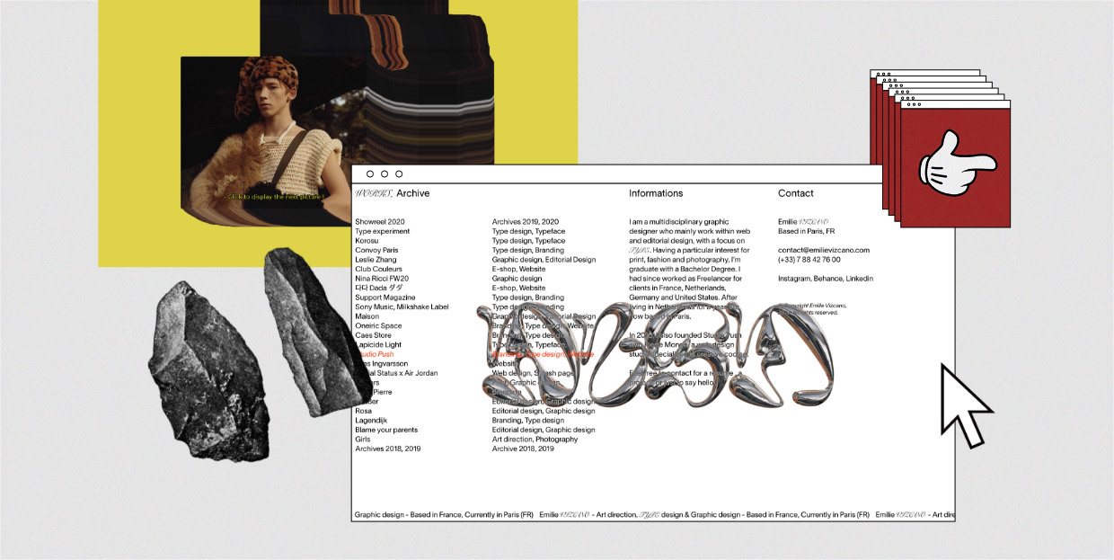
The homepage of Emilie Vizcano’s portfolio site is filled with textual content, containing information about the artist, her contact details, and the names of her projects. When you place the mouse on any project, its name turns to orange, the letters become italic, and a giant image on hover appears in the middle of the screen, giving you an idea of what that project looks like. Most of her works are in the brutalist style. When paired with a website that matches that aesthetic, they form a cohesive unit that reflects Vizcano’s style.

Vincent Tavano’s portfolio site offers a compelling showcase of some of his best projects. A page that particularly caught our attention is the one dedicated to Tavano’s work for Loewe. Selected products from their collection show up on the screen one after another (a new image appears on click), along with a few previews of Loewe’s site. Pictures follow the movement of the cursor, leaving a colorful, indelible mark behind. The site looks authentic and unpolished. And even though we can’t say that it’s exclusively brutalist, its bold creative solutions unmistakably ooze brutalism.

Lucy Ives is a writer, poet, and critic, and her website demonstrates how interesting a writer’s site can look when designed in a brutalist style. As we’ve mentioned earlier, the design of printed materials, newspapers, brochures, and even books mostly leans towards brutalism, so the decision to use that style on a site filled with poems, book excerpts, and interviews comes as no surprise. The content is organized by category and medium (they’re listed on the left side of the screen), and placed in horizontal sections. Each piece of text featured on the site is a preview of the fullscreen version of that page. The grey color palette, along with the eye-pleasing typography and imagery creates the same sense of serenity and silence experienced in libraries.

By dragging your mouse across the screen, you can explore the creative realm of the multidisciplinary studio Jugoceania. Their projects are splattered everywhere, winning your attention from the very first move. They’ve added a sense of perspective to the site and mixed it with some compelling visuals, masterfully complemented by a black background, creating a brutalist universe that lures you in and doesn’t let go. Whenever you refresh a page, your starting point will change, and no matter the direction you chose, you’ll feel like there’s no end to your exploring because of the infinite loop effect. In the top left corner, they’ve placed some X/Y numbers that change each time you visit the site. Main navigation links are also placed at the top. Upon clicking the “About” button, you will learn more about this interesting studio and find links to their social media. At the bottom of that section, you will see a call-to-action “get in touch” button, inviting you to reach out to them. Since most people find it challenging to pronounce the name of the studio – [югоциания], they’ve added a small image to the menu at the top. Upon clicking on that picture, you will launch a video of a man pronouncing the name with a Spanish accent.

What immediately captures your attention on Nelson Heinemann’s site is his name seemingly written using a mouse. It’s blurry, neon-green, very Microsoft-Paint-like, fixed in the middle of the screen. It’s entirely brutalist. This inherently simple design solution matches the character of Heinmann’s fashion creations, making the site recognizable and giving it a bold, contemporary character with a dose of retro style on the side. The homepage is minimalist and it includes just a few visuals and links to his inner pages, inviting you to explore his work both as a fashion stylist and an artist.

Cury Cafe’s website is proof that restaurants and canteens go great with brutalism, at least in the world of web design. Striking, rugged visuals, bright colors, a broken layout, beautiful call-to-action hovers, fun font choices, and attractive imagery are the elements that make this site as interesting as it is. At the top and at the bottom of the page, there are two bars filled with animated text, giving you more information about the Cury Cafe’s offer. The bars displayed on the right and the left side of the screen contain anchor links, redirecting you to various sections of the site. Cury Cafe’s site is as spicy as their meals are, vivaciously depicting the ambiance in the café and the flavor of its meals.

David Penuela’s portfolio site exemplifies the brutalism-meets-minimalism design style. All you see are some seemingly random, large letters scattered all over the page. When you place your pointer on any of them, the colors of the background and letters invert. You also realize that those are the initial letters of words that tell you who Penuela is and what he does. There are no details about his works nor their graphic illustrations, only their names. When you click on them, you will be redirected to the selected site, to see Penuela’s work in action.

Small Editions “supports new conversations surrounding contemporary art & artist books through book production, publishing, exhibitions and talks”. They’ve organized their site into these three categories – production, publishing, and exhibitions. Each can be explored individually, by scrolling through the content on the homepage, or by clicking on their names, which opens a page dedicated to that category, containing more information about it. The name of the organization is displayed in a playful way. The first word, “small” is in the top left corner, looking like any other word on the site. The second word, “editions”, on the other hand, is stretched across the header, with large spacing between letters. This design beautifully matches the aesthetic of the website and it helps bring the visitor’s attention to the studio’s work.

As we’ve seen on many examples on our list, divided screens are a common practice in brutalist web design. On Bad Studio’s site, the homepage is split into multiple sections, each dedicated to one creative category, including posters, editorials, record covers, videos, etc. There’s no hierarchy on the site, so the studio’s logo, category titles, links, and other textual content are written using one font only. The design of navigation arrows differs from the rest of the site, creating some sort of a visual division between elements. In the header, right next to the studio’s logo, there’s a link to the “books” section. It is written in the style of the navigation arrows, so some visitors might not even see it as a link. The question mark at the top right corner is actually a link to the about page, where you will learn that BAD stands for Bráulio Amado’s Design Studio.

The way that Stefanie Tam’s brutalist site is designed is enviable. The center of the page is a blank canvas. However, it will fill with details about the artist and her projects once you hover over the textual content displayed in top corners and in the footer. If you place your mouse on her name, you will discover who she is and what she does. When you move it over “Information”, links to her social media pages will appear. Her projects are featured at the bottom of the page. Below every project’s name, there are several numbers, each hiding one picture from the project. On hover, images appear in the middle of the page. Right next to each set of numbers, there are three letters – “ABC”, offering you more information about Tam’s works. If you click on projects’ names, you will be able to see more pictures and discover more information about the selected work. She stayed loyal to brutalism throughout the entire website.

Marrowbone Books is a second-hand bookshop that opted for a simple, brutalist design on their site. A straight, vertical line that divides the screen is a recognizable brutalist trait. It gives this website an interesting structure, splitting the large, mostly empty surface from the text. There’s only one image on the homepage, depicting the atmosphere from the bookshop, purposefully breaking the borderline and trespassing onto the white surface. This detail, along with the menu and the bookshop’s address in the corners of the empty space, breaks the sterile form and turns this site into an amusing piece of brutalist design.

Max Bittker’s website beautifully complements his artistry of making tools for play, creativity, and communication. The content on his site is predominantly textual, paired with a few animated ornaments and a GIF that shows someone’s hand plugging and unplugging an extension cord. All elements are framed by multiple sharp lines, but you can round them using a slide button. There are another few interactive elements you can play with. Bittker often changes the content on the site, so it’s possible you might see something different than us when you visit it. Each framed box has an “X” button in the corner, allowing you to remove any element you want.


Whitney Museum’s brutalist site is simple, divided into multiple sections using clean, straight lines. The background is white, adorned with colorful pictures, vibrant videos, and black typefaces. There are no wild elements on the site, which only enhances its sense of harmony and logic. And when you think about it, museums often embody brutalism. Pictures and textual pieces of art are hung on usually white walls, meaning that the choice of a brutalist aesthetic on the site matches that of the Whitney Museum in real life.

Werkleitz Festival is a festival of arts. This website depicts brutalism at its finest, with all the yellow, red, and grey hues, straight lines, the interesting layout shape, and the bold typography. Because of all the skillfully designed elements, it is a true pleasure navigating it. At first, you may feel confused as to how to explore it, but once you take a good look at the way the content is organized, that’s when all the fun starts. The layout is structured to follow the design of the content. The sections are horizontal and vertical. On some site areas, the two are combined, while on others parts they overlap, depending on how the content is displayed. The colors also change depending on the part of the site you’re exploring. Overall, this website looks fun and is well-thought-out, providing visitors with an unforgettable online experience.

Hold Me Now – Feel and Touch in an Unreal World is a conference and a festival held in the Stedelijk Museum in Amsterdam. It focuses on touch in the artistic, political, and philosophical sense, and helps us understand how that which is haptic, i.e. related to touch, is experienced in life and art. It also examines how the absence of touch in the digital world impacts the body in terms of violence, gender, sexuality, democracy, and identity. The homepage is filled with round black boxes. When you click on them, another page dedicated to the selected category will open, again filled with black boxes that shrink on hover. That way you can almost feel their tenderness and softness as if you’ve somehow touched them through the screen, which is in direct correlation with the subject of the conference. The entire website is predominantly textual save for several images, filled with boxed-in content, creating an amusing online experience for all visitors.

Boook.Land is an experimental platform for collaborative storytelling, inviting people to write a novel online. This platform asks a question about what would happen if writing were to follow the collaborative process typical of design. Boook.Land allows users to participate in the writing process by continuing the story where the previous user has left it off and illustrating it. The platform’s logo is displayed in the middle of the screen, and the three o’s are animated using illustrations submitted by participants. The site looks like a bookshelf, with books appearing when you click on vertically-placed sections. The “book” on the left side contains information about this terrific project, and the books on the right are the collaborative novels written so far.

DAD Studio has used its logo throughout the entire site, so while you scroll, the outline of the logo moves in the opposite direction from you. At the top and at the bottom of the page the outline blends with the rest of the logo. This website shows once again that, if you rely on brutalism in your work, it’s always a good idea to add it to your online presentation as well. DAD Studio’s site forms a cohesive unit with their projects, and the brutalist connection between the two is evident in the experimental use of the logo.

Urbane Künste Ruhr is a cultural institution that organizes artistic productions in urban spaces, exhibitions, residential programs, and artistic events. Their goal is to develop a collaboration between artists and scientists from various fields. The left side of the site contains different texts, including magazine articles, project explanations, introductions of artists, and residences. The menu is displayed on the right, which helps you understand the way the website is structured. The design is simple, functional, and artistically rich thanks to the playful layout and the use of typefaces in several different sizes.

Studio Job’s website is filled with seemingly unmatching elements, designed in a way that undoubtedly leaves a strong impression on visitors. Their goal has always been to create once-in-a-lifetime objects, and their site embodies that philosophy. The cursor is giving you the middle finger while a bunch of insects greets you at the very top. There’s also a shark hiding somewhere, ready to attack. The sticky menu is placed in the header, and it is there for you to reach it whenever you feel lost. The entire site is filled with fun, authentic, experimental content, blending comic-like elements with images, sculptures, and bold typography, resulting in an astounding work of brutalist art.

Hate Branding tells us in their name and introductory text that they hate branding and that “good design speaks for itself”. And that’s exactly what their website is about. Their attitude towards design is purely brutalist. The only thing you can see on their homepage is black text and blue links. The content follows hierarchy so the text is designed in different sizes. The links are written using a smaller font, unlike from what we’ve seen on some previous examples from our list. On click, the projects will open at the top of the screen, while the rest of the content moves further down the page. To help you keep track of the works you’ve already viewed, the color of those projects changes from blue to a red-ish hue. Hate Branding’s site is brutally simple, practical, and it puts the studio’s projects into the spotlight.

Low Tech Magazine is all about green energy, which shows even in the way they designed their website. The site runs on a solar-powered server located in Barcelona. When the weather is bad for a long time, the site goes offline. The reason why it’s constructed this way is to drastically reduce the energy needed to access the site’s content. The designers wanted to go with a back-to-basics design so it makes sense they chose brutalism. Blue, red, and green imagery and only one font are used throughout the entire site. This example is inspiring and it makes us realize that brutalism can greatly contribute to the reduction of energy consumption needed to make websites and for loading their content.

The website of high5damn is basically made up of a list that contains inputs from designers from all over the world and fantastic scroll-triggered animation. There’s also a gigantic, arrow-shaped mouse pointer. The said designers all submit one sentence to the site, which is then added to the list along with their name. When you hover over a name, a picture of that designer shows up on the screen, and it pops up in a different place every time. If you click on it, you will be redirected to that creative’s portfolio. The idea behind this project was to create a space where designers would motivate each other, and this breathtaking brutalist website is undoubtedly a great source of inspiration.

Could brutalism and theater be a good fit? Théâtre Saint-Gervais’s website is a surefire proof that they can. Each show presentation on the homepage contains a related image, a short description of the play, and buttons to discover more information about it and buy tickets. There’s also a calendar at the top, just below the image slider. The dates that are underlined are show dates. If you wish to learn more about each play, just click on their name, and enjoy viewing the additional visual material, learning more about the cast, etc. The site is mostly black-and-white, with contrasting colorful imagery. There are also lots of straight lines and framed sections. The brutalist elements are well-thought-out and the entire website is beautifully put together, offering theater lovers an informative and eye-pleasing browsing experience.

The content on Radical Everything’s website is placed into framed sections and paired with the fun hover effects. The fullscreen animation at the top of the page is a true show-stopper. It is colored in strong, fresh colors which are used throughout the entire website. The outlined text displayed on it and a cursor that’s chased by the “go long” words further add to its appeal. The design on the site is captivating, yet simple. The content is text-rich, imbued with some cool animation effects, and the clashing combination of brighter and darker hues helps emphasize the screen divisions.

The Restart Page’s design is a nod to the beginnings of the computer era. The site is created as a tribute to the most significant operating systems and is filled with restart windows from various OSs, including WindowsXP, NeXT, Mac OS 7, and many others. You can move those windows all over the screen and even press their buttons. If you click on “Restart”, the restart screen will appear, allowing you to relive the experience of waiting for a system to reboot. The Restart Page project is somewhat sentimental and it makes you feel as if those operating systems were a thing a whole lifetime ago.

At first glance, the design of Delirium Magazine’s website looks hectic. The entire screen is filled with windows containing article titles and authors’ names. You can move them with your mouse, close them, or open them to read the content. If you look carefully, you will notice a “#Tags” option and a search bar on the right side of the screen, which could help you find your way around the site with greater ease. This site is funny, creative, and all of its pages are designed in the style of black-and-white brutalism.

And finally, one of the world’s most popular social platforms, Instagram, is also designed in the style of brutalism. However, that was done so subtly, that most people have probably missed out on its brutalist trait. Clean textual sections, the absence of visual hierarchy, blue hashtags and links, square image blocks, the use of straight lines, and divided sections are all elements typical of brutalism. The designers did not go to any brutalist extremes and have kept things quite tame. Their goal was to achieve a perfectly thought-out UX and UI and create a practical platform that diverts users’ attention from itself to the content displayed on it. Instagram exemplifies how versatile brutalism is and how great it looks when used in contemporary web and app design.
Final Words
We hope these examples of brutalism in web design have helped you realize the boundless potential of this style. Boldness, honesty, authenticity, and experimentality are just some of the characteristics these sites have in common.
Of course, brutalism isn’t a one-size-fits-all kind of a style. In fact, it best suits the creative niche and brands that wish to stand out from the crowd. When deciding if you should go for it or not, what matters is to be clear about your business goals, but also understand who your target audience is and what its expectations are. Should you decide that brutalism could benefit your brand then go for it! Let your imagination run wild, be creative, play with forms, shapes, sizes, and interface elements, and create authentic, attention-grabbing designs.
