An Exploration of Art Deco and its Use in Design
When World War I ended, all of Europe (and France in particular) went through a period of great struggle and economic instability. However, the French, with joie de vivre written in their DNA, refused to let their good spirits die. In 1925, they decided to put contemporary art into the spotlight and celebrate it in all of its forms. They organized a World’s fair called Exposition Internationale des Arts Décoratifs et Industriels Modernes. The modern style of that time didn’t have a name yet, but it got one right after this exposition – Art Deco.
Not long after the fair, Art Deco took the world by storm and went on to become one of the first truly international styles. It was everywhere – in graphic, furniture, product, jewelry, textile, car and interior design, as well as architecture and other decorative arts. Art Deco design represented a symbiosis of rich materials and outstanding craftsmanship. As a result, we saw the birth of riveting modernist forms that exuded luxury and opulence – two of Art Deco’s main characteristics.
After World War II, the supremacy of Art Deco began giving way to simpler, less decorative forms. However, there aren’t that many styles that have left such an indelible and ever-lasting impact on creatives as Art Deco. That is largely due to its versatility and the fact that it unites lots of different styles, including cubism, futurism, and secession. The brighter view of the future that inspired the French to organize the Exposition Internationale in the first place was evident in the works of this era. Abstract and geometrical themes, the motif of the sunrise, lots of triangular shapes, zigzag details, and vivid and golden colors are all elements typical of Art Deco design. They may seem contradictory at times, but together, they form a cohesive unit that looks rich and beautiful. And in the end, that was all that mattered.
On this picturesque journey, we’ll explore the history of Art Deco and its use throughout various forms of art. We’ll also talk about some of the most prominent creators of Art Deco whose works have undoubtedly left a mark on the art world:
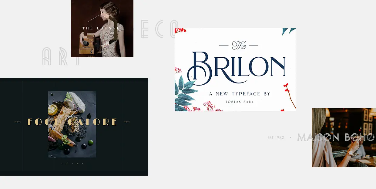
Art Deco snuck into some of the demos in our Qi Theme for Elementor, too:
While Art Deco was undeniably a style of decorative and visual arts, it was most widely used in architecture. It all began in the second half of the 19th century when people started using reinforced concrete for building construction. For the first time in history, in early 20th century Paris two residential buildings were made out of reinforced concrete. The introduction of this new material in construction was so important because it allowed architects to design buildings in almost any shape they wanted.
However, it wasn’t until after World War I that we began to see buildings in Art Deco style sprout up all over Europe and the USA. By the 1930s, the use of Art Deco in architecture was in full force. Buildings were being built either using horizontal and vertical lines in combination with bright colors or they had round edges, with lots of detailing and ornaments. Possibly the most famous building created in the Art Deco style is the Chrysler Building, known for its prominent spire, a multi-layered crown with triangular windows, stainless-steel details, and sunburst motifs, all typical of Art Deco.
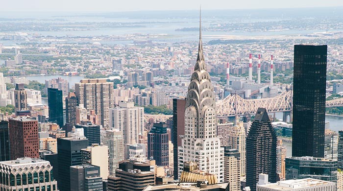
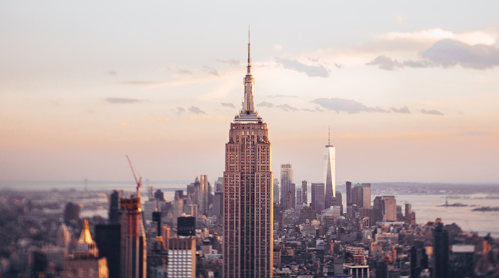
When it was completed in 1930, the Chrysler Building was the tallest building in the world. But just one year later, it was surpassed by another Art Deco skyscraper – the Empire State Building.
Art Deco fell out of favor after the First World War and it wasn’t until a few years ago that it made a grand comeback, particularly in interior design. People became fed up with economic struggles and other types of global issues, so the resurgence of Art Deco happened out of everyone’s need to surround themselves with luxury, even if only in restaurants, hotels, cafes, or bars. The (often ostentatiously) luxurious lifestyle has been further popularized by social media and people sharing snaps of the opulence that surrounds them.
Art Deco in interior design is not significantly different from Art Deco in architecture. It’s still all about geometric patterns, symmetry, hard angles, the use of steel, and golden hues. Nowadays, a lot of designers often combine the elements of Art Deco with other styles, to create more delicate-looking interiors.
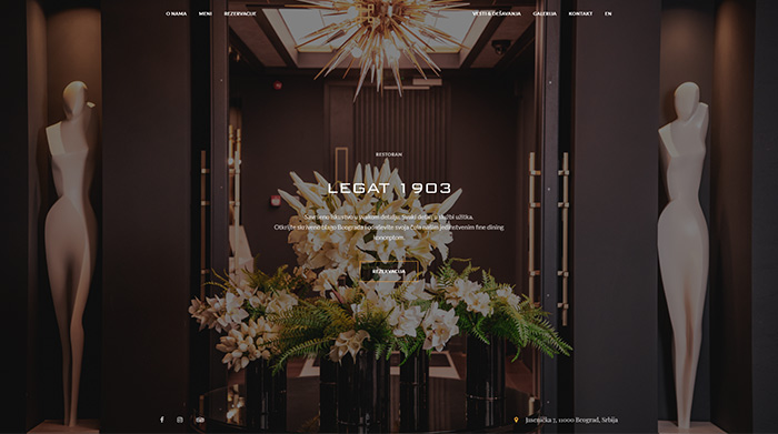
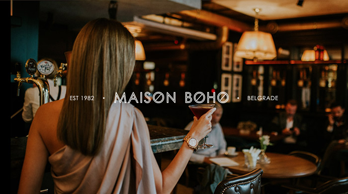
Two great examples of the use of Art Deco in a restaurant setting are the Legat 1903 restaurant and Maison Boho.
Another medium where Art Deco found its expression is graphic design. Elegant posters, illustrations, photographs, and magazine covers created in this fashion often adorned pages of famous magazines such as Vogue, Vanity Fair, Harper’s Bazaar, and La Gazette du Bon Ton, which helped popularize the style even more. For example, the 1919 Vanity Fair cover beautifully illustrates the use of Art Deco in graphic design.
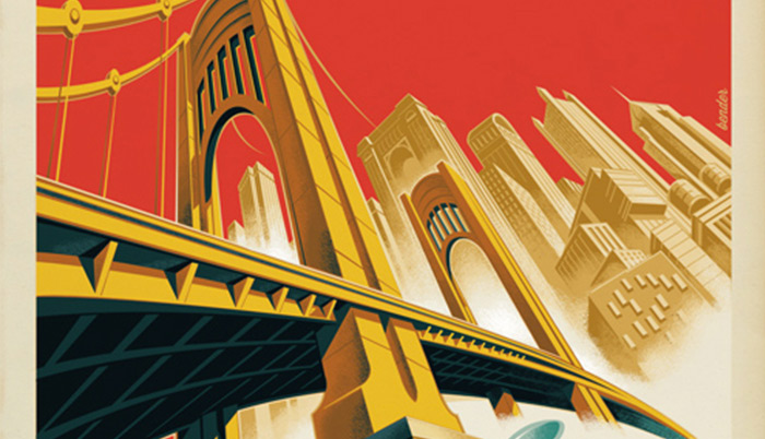
During the late 1800s and early 1900s, advertising became popular. The posters of the time looked refined, simple, often with monochromatic backgrounds (as seen on one of the posters for the Moulin Rouge). Famous dancers and singers of that era, women smoking cigarettes, steamships and airplanes were all common motifs in poster design.

Thanks to technological advancements and editing software, Art Deco posters look even more striking today. When you look at them, you can see how they perfectly accentuate the style’s main features. Some of the most common elements of Art Deco graphic design include geometric shapes (triangles in particular), strong lines, zigzags, and thick-stroked typography, lots of unused space, and chevron patterns.
One of the most famous Art Deco posters was created for the movie The Great Gatsby. This book-to-film adaptation depicts the world of the wealthy in the 1920s. While there are four movie adaptations, the one from 1974 and the most recent one from 2013 stand out. The movie posters for both were created in the Art Deco style, but the poster for the 2013 Great Gatsby movie looks a lot more luxurious than the one made for the 1974 movie.

Art Deco typography is characterized by geometrical shapes, often elongated letters, with lots of opulent and decorative detailing. The style of Art Deco type was created by one man – A.M. Cassandre. We will talk about him in greater detail in the final section of this article, but there is no way one can discuss Art Deco fonts without mentioning him. In 1929, he created the Bifur font, which combines very thick strokes with thinner horizontal or vertical lines. Cassandre also designed the Acier Noir and Peignot fonts. You can check out these, and more of his work, on Cassandre’s official website.
Art Deco letters are mostly used in all caps. Because of that, they are a popular choice for titles and are heavily used for branding purposes. More elegant fonts are often used on wedding invitations, magazine covers, or luxury packaging. People don’t just want to be surrounded by affluent interiors, but also see opulence in their everyday items. By using Art Deco types, even a box of cookies or tea can be easily transformed into a top-notch work of art.
Nowadays, the choice of Art Deco typefaces is huge. Some of the more notable fonts are the Brilon font, Hazel Deco, and London font.

Many creatives experiment with Art Deco lettering, one of them being Stephane Lopes, who has designed a simple and geometric Art Deco font, as seen on his Behance page.

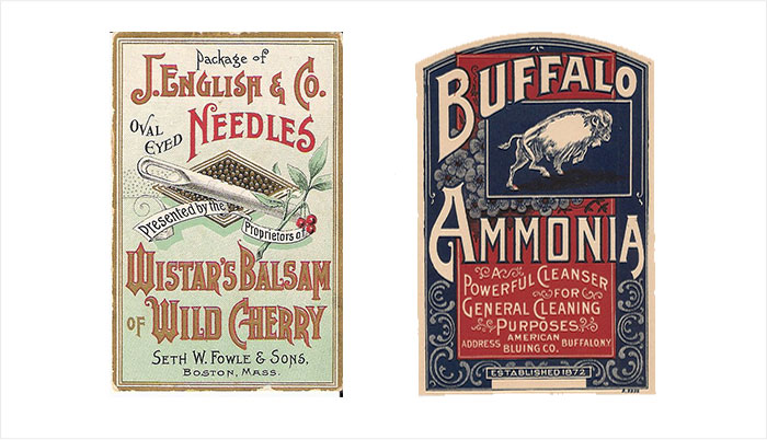
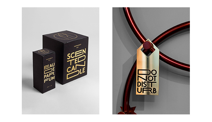
When it comes to packaging design, the elements of Art Deco are clear in typeface choices and the use of various patterns. The designs usually consist of two or three colors at most – one for the background, and the other one (or two) for the letters and displayed elements. And since this is Art Deco we’re talking about, one of those hues is often gold. The patterns are mostly clear and linear, still opulent but not overwhelmingly so. They also contain lots of floral elements, which allow for more freedom in terms of form. Great examples of Art Deco packaging designs are also Wistar’s Balsam of Wild Cherry and vintage Buffalo Ammonia’s Powerful Cleanser.
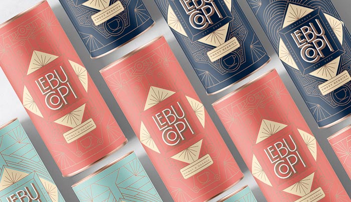
In the 20th century, the packaging colors were predominantly dark, while designers used lots of ornaments in their works. Fast forward to the present day and the digital era, the colors are now more vivid and with higher contrasts, as seen on the Lebu-Copi tea packaging design.
And while numerous striking examples illustrate the beauty of this style in packaging, we’ve singled out several that stood out for us that show different approaches to Art Deco design.
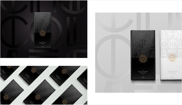
First up is the stunning packaging for Chez Christophe’s Swiss Chocolate that simply oozes elegance and was inspired by the Swiss Art Deco movement.
As we mentioned, typography is often one of the most important elements of Art Deco packaging designs, but there are different ways one can go about it. Ricardo Oliveira’s premium chocolate project depicts a minimalistic approach to lettering.
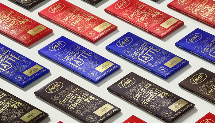
While Feletti’s Le Tavolette Classiche demonstrates the use of highly decorated letters.
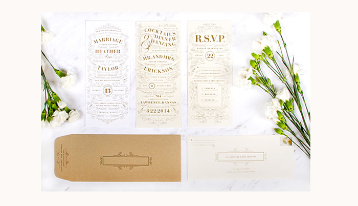
Caitlin Workman’s wedding invitations come with simple lettering and a rich pattern that resembles a wedding gown, making the invitations look sophisticated.
If you’re feeling inspired by looking at these designs and would like to start creating some on your own, Pixelbuddha offers a collection of great Art Deco patterns to use in your work.
New Themes
VIEW COLLECTION

Logos created in the Art Deco fashion emanate power, class, and timelessness. One of the most legendary Art Deco logos is the one Cassandre created for the fashion brand Yves Saint Laurent. Logos such as this one, so simple and refined, are more memorable because their only elements are bold-looking typefaces. Another notable example of an Art Deco logo was designed by Gilbert Lesser for the iconic Studio 54, with massive numbers and more subtle lettering. A great example of a contemporary Art Deco logo design is Dursun.
Nowadays, it’s become a common practice to incorporate the year when a brand was established into their logo. Paired with golden hues, such designs appear traditional and luxurious. The newly-created businesses often opt for this approach to give their brand a vintage look, but they keep the modern vibe aflame by designing logos in 3D.
Another thing we often see in contemporary logo design is the use of illustrations. These are often linear and contain either the name of the company, its initials or a symbol that’s associated with the brand. Such logo designs look very clean, just like Hemma Bruket’s logo.
History has a way of repeating itself and so the fact that many creatives opt for Art Deco elements in branding isn’t surprising in the slightest. The style was already popular in advertising in the early 20th century, so it makes sense that designers wanted to reuse it for contemporary branding purposes.
The same principles apply in branding as they do in other decorative arts. Thick strokes, heavy and rigid lines, geometric forms are all very much present, but the modern Art Deco branding is quite minimal and clear. Golden, linear designs are the most popular, especially in hotels and restaurants, as they exude the type of luxury customers seek. Just take a look at the branding projects for the Haymarket by Scandic hotel, the Twinbrook Quarter, or the restaurant branding example MÜRDÜM. They all demonstrate the power of Art Deco in creating eye-catching and unique designs.
Thanks to contemporary technology, web designers can experiment with projects and tweak them however they please. They continuously push the boundaries and create cutting-edge designs, often playing with classic styles to which they add a modern twist.
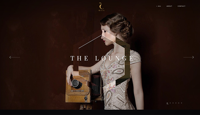
Art Deco web design projects are often characterized by contrasting black and gold hues and the pairing of large images and smaller text. Designers also like to use thin, fine lines that evoke the spirit of classic Art Deco architecture. However, regardless of which Art Deco element is incorporated into a project, be it typography, photographs, and/or patterns, it’s a given that the end result is always going to be a luxurious-looking piece of work, as you can see on the Hôtel Léna, Club Raia, and Hotel Icon websites.
Qode Interactive’s restaurant and bar theme, Laurent, was also created in the Art Deco aesthetic. Our designer incorporated recognizable Art Deco features into this beautiful work, including geometrical and decorative typography and interesting patterns. Inspired by the movie The Great Gatsby, he added lots of golden detailing onto large, dark imagery, creating a theme that oozes luxury and opulence.
The Art Deco era certainly did introduce us to a plethora of outstanding artists and has been an inspiration to many. The work of two artists in particular stands out from the rest. One is Cassandre, a man who has left an indelible mark on the art world, and the other is Mark Bender, a modern-age illustrator that creates awe-inspiring works.
Adolphe Jean-Marie Mouron
One of the greatest graphic designers of the Art Deco style was Adolphe Jean-Marie Mouron, a Ukraine-French artist known under the pseudonym Cassandre. He was a poster designer, costume maker, painter, typographer, and lecturer. Inspired by cubism and surrealism, his works stood out and garnered a lot of attention during the early 1920s in Paris. One of his posters – Au Bûcheron went on to win the first prize at the Exposition Internationale des Arts Décoratifs et Industriels Modernes.
In 1926, he co-founded an advertising agency. During that period, he worked with many well-known clients and created posters that often depicted the Parisian lifestyle at the time. Cassandre was a master of the airbrush and is considered a pioneer of this technique. As we mentioned earlier, his work is also immeasurably significant for typography, since he’s the one who designed some of the first Art Deco fonts.
His posters often celebrated steamships and modern machine technology. Possibly his most famous project is Normandie, which depicted the ocean liner SS Normandie, the largest passenger ship at the time (1935).
Mark Bender
A lot of artists today draw inspiration from the 1920s and the 1930s, reflecting the characteristics of the golden age of Art Deco in their works. But the work of Mark Bender particularly stands out from the rest. He is an illustrator known for colorful, meticulous depictions of Mick Jagger, Tom Waits, Quentin Tarantino, and many others.
Final Words
Art Deco is a concoction of many different styles and influences united to bring optimism to war-shaken people and celebrate modernity. Smooth lines, bold geometry, thorough detailing, rich colors, decadent patterns, gold hues, opulence, are the things that come to one’s mind when talking about this style. Art Deco is tremendously versatile and can be applied to anything from architecture, graphic arts, and furniture design, to sculpturing, decoration, and cinematic animations, to name some. It is functional and always modern-looking, even when we talk about the art pieces from the 1920s. You can experiment with it, and whether you decide to use it extensively or scarcely in your work, it doesn’t even matter. Regardless of how many Art Deco elements your project features, it will undoubtedly look glamorous and distinct.
