How to Create Message Boxes for Your WordPress Website
That the internet has changed the way we receive and process information is not just a cliché: it’s the truth. On the one hand, our attention spans are shortening: people have less and less time for textual content. On the other hand, there is no replacement for it if you want to convey information with any meaning or complexity.
One thing you can do to avoid your visitors just skipping a large body of text is make your textual content scannable, in case all you want is to highlight a few interesting pieces of information. You could also use highlighted text for accents. WordPress message boxes are still another thing you could try: they stand out clearly from the rest of the text and convey choice bits of information to your visitors.
We will show you how to create message boxes for your WordPress website. But before we get into the nitty-gritty, we’d like to discuss the message box in more general terms. If you are sure all you need is to know how to do it, scroll right down to the tutorial section. Here’s what we’ll be talking about:
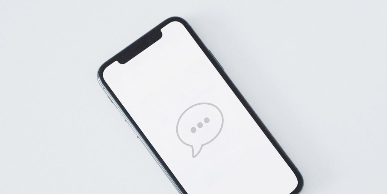
A WordPress message box is a design element used to draw a visitor’s attention to a piece of information. It consists of a box, some text, and possibly icons or other graphics. They typically relate some important information to a website visitor and stand out from the main body of text.
Also, a message box can typically be dismissed by clicking on an X sign or other type of close icon. Once the user gets the information, they can remove the message box with one simple click of the mouse and get on with the reading. They look something like this:
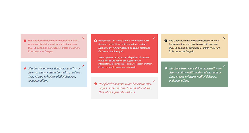
A message box is best used when you want to make your visitors pay special attention to a discrete piece of information which may inform the rest of the content, but is not necessary to understand it. It can be closely related to the text, but it needn’t be.
Perhaps the article a visitor is reading is not the first part of a series. In that case, you may want to alert them with a message box that they need to read something else first. Your shop has a special offer related to the text? Maybe you can advertise it in a message box. Your book or film review contains spoilers? Better make that clear ahead of time.

A message box can be created using code or a plugin. We will be using a free plugin, developed by us, called Qi Addons for Elementor. Qi Addons expand Elementor’s already formidable palette of widgets with 60 brand-new, beautifully designed elements, one of which is the message box.
With our plugin you can create eye-catching WordPress message boxes within minutes. All you need to do beforehand is install the latest version of Elementor (the free version is just fine), and then install Qi Addons. Along with Qi Addons for Elementor, we will be using our own Qi Theme. For best results, we suggest you do, too. If you have already invested in another theme, don’t fret: Qi Addons will work with it, too.
Qi Addons is a separate plugin designed to work with Elementor and supplement it, and it is completely free. After you have installed both, you’re all set. You can see how to create a message box in the video below:
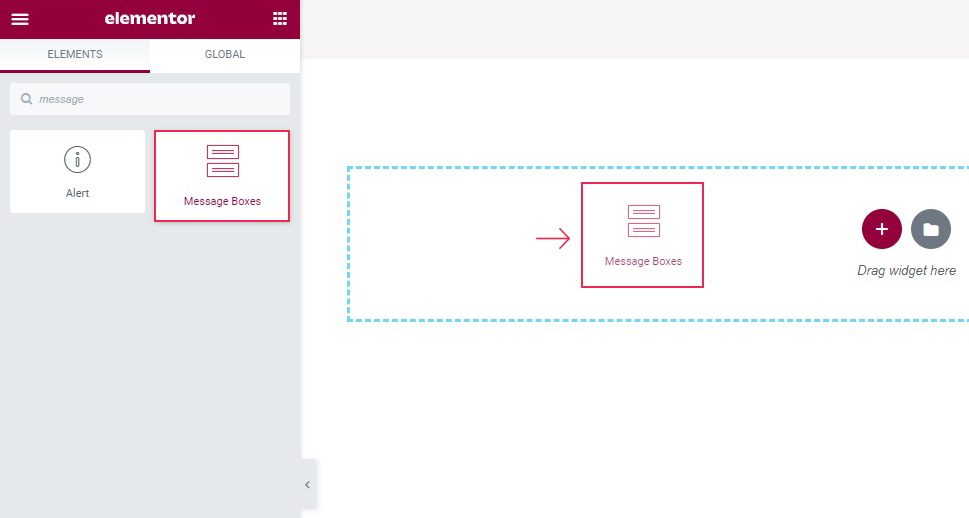
If you prefer your tutorial in text form, though, read on below. To start with, you need to find a Message boxes element in the left hand-side menu and drag it to where you want it on the page.
You will see the message box with its default settings. It has a placeholder title and some lorem ipsum text. You can edit them in the General tab of the widget.
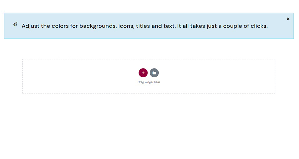
We will not be using the Custom Class settings for this demonstration. What we will do, is change the Title to Adjust the colors for backgrounds, icons, titles and text. It all takes just a couple of clicks and erase the text, making this a very simple message box.
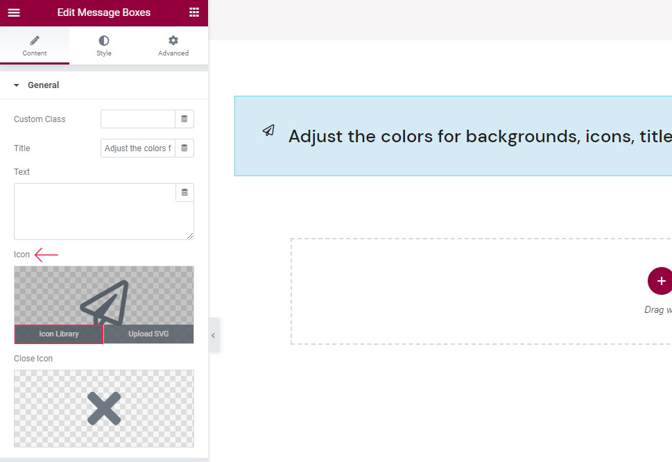
What we also want to do is change the icons. The icon on the upper left hand-side of the box is the first one up in your General app, and is called Icon. Hover to show the menus, then Icon Library to change it.
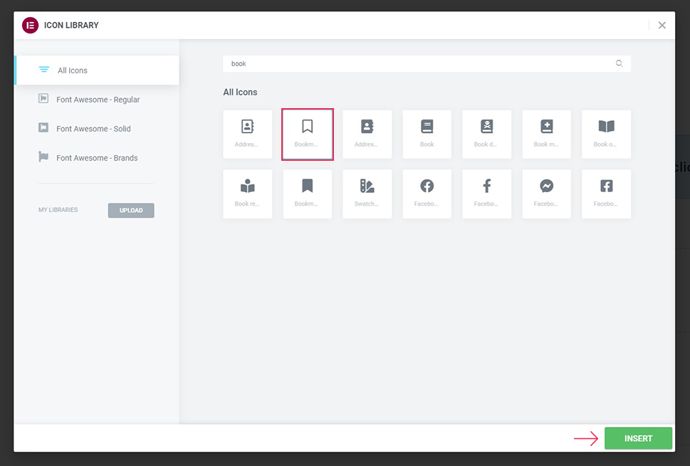
Once there, you can choose from your available libraries. We will be adding a Bookmark icon by searching for it in the search field, selecting it, and clicking Insert.
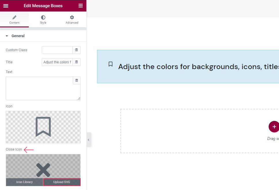
We will also change the Close Icon, the icon on the right which is used to dismiss the message box. To change an icon by uploading an .svg image, hover on the control and then click Upload SVG.
You can then upload a new image or select one from the media library, as we shall. Simply select an image and click Insert Media when ready.
With our icons set, we are ready to move to the Style tab.
In the main section of the Style tab, you can find a lot of options for styling your widget’s title, text, icon and background.
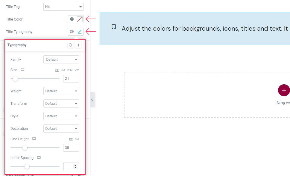
We will change our Title Tag to H4, but you can change it to any heading setting or paragraph text. You can also change the Title Color, which we won’t be doing, and the Title Typography.
In the Title Typography settings, you can change the font type (Family), Size (we have set ours to 21 pixels), and Weight (or “boldness”). The Transform control changes the capitalization of the title, the Style can be used to italicize the font or select an oblique font, while the Decoration control is used for underlining, overlining, or strikethroughs.
The Line Height can space out the lines of a title if it has more than one, but it also has an effect on the size of the box as it reserves space for a line tall enough. We will set ours to 30 pixels. The Letter Spacing control is used to space out individual letters of the title, and we will not be using it for this particular message box.
The Text Color and Text Typography settings are exactly the same, but apply to the text, as opposed to the title. This particular message box has no text, so we won’t be using them.
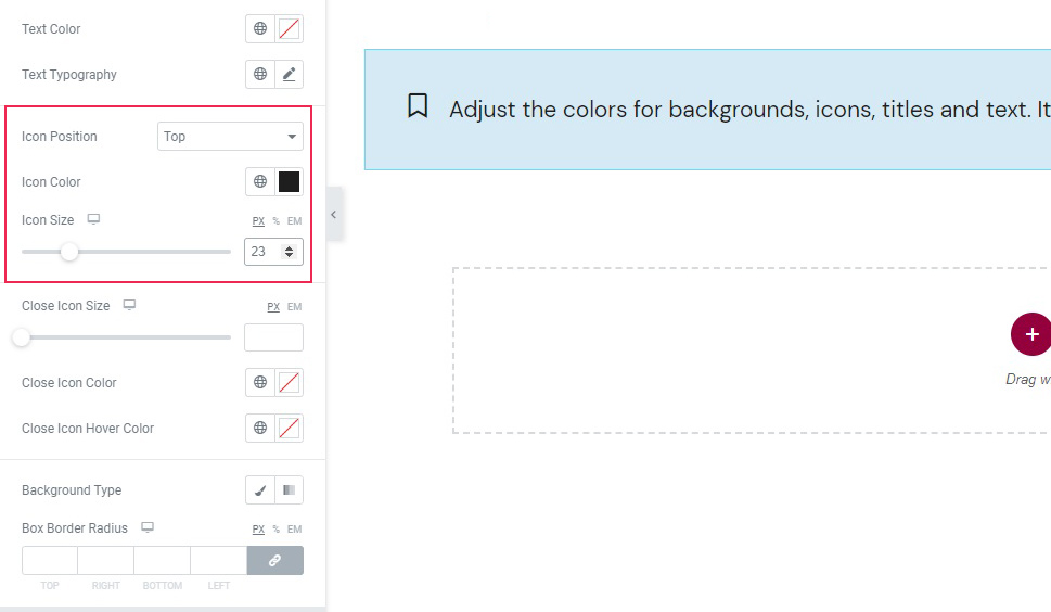
Next down, we find the Icon Position controls. You can place your icon on top, middle, or bottom of the title line. We like it on top, so we’ll leave it as is. We will change Icon Color to #1e1e1e – almost black, to match our title font colour. Finally, we will set the Icon Size to 23 pixels.
The controls for the Close Icon Size work exactly the same as for the Icon. The Close Icon Color control lets you choose a different colour for your icon. We will set it to black (#000000). The Close Icon Hover Color is the colour of the icon when it is hovered over by a user’s mouse. We will set this to black, too, but with some transparency (#000000cc).
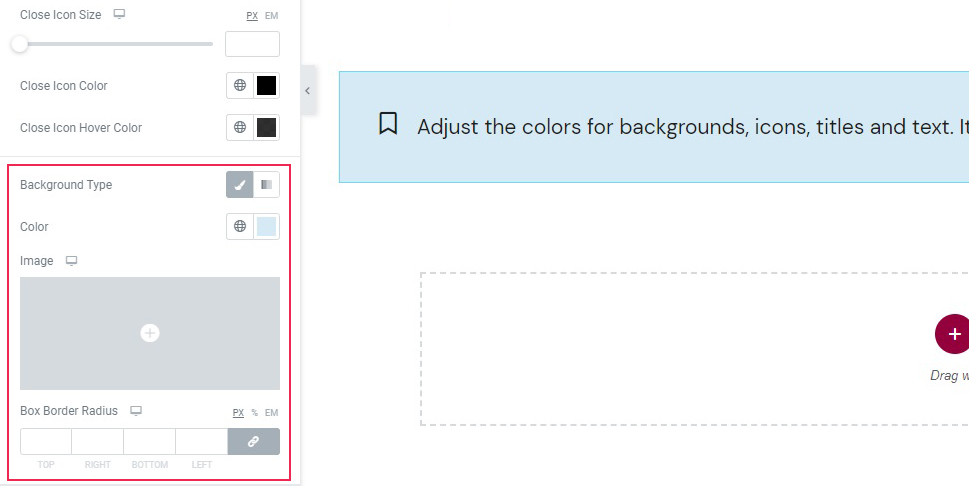
Next down, we find the Background Type controls. This control has two main modes: Gradient, which we will not be using, and Classic, which we will. We will use a plain colour background, a light blue (#d5eaf4), but you can also use an Image if you so choose.
At the bottom of the Style section of this tab you can find the Box Border Radius controls. You can use these to make any or all of your message box’s corners rounder. We will not be using it for this demonstration.
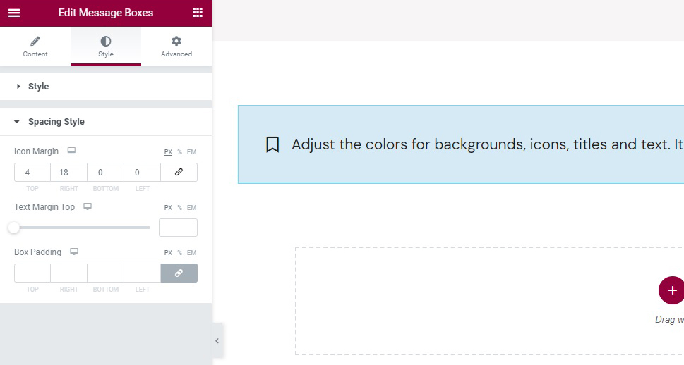
Finally, we find the Spacing Style section of the tab. In the Icon Margin control, you can set the distance between the icon and the other elements. We will click the link icon to unlink the values, because we want to fine-tune the icon’s position. We will set the top margin to 4 and the right margin to 18 pixels.
The Text Margin Top control is there if you want to separate the text from the title. As this message box has no text, we don’t need it.
Finally, the Box Padding control is used to control the distance between the box edges and its contents. We won’t need it for this demonstration.
And there you have it, a beautiful message box in just a couple of minutes.
In Conclusion
As you can see, it is remarkably easy to set up a message box in WordPress. All you need is a couple of free plugins (Elementor and Qi Addons), and a good idea for an eye-catching design. With Qi Addons, you get a fully functional message box with virtually unlimited styling options. We encourage it to put it to good use.
