How to Create an Image Slider in WordPress
With WordPress, creating a website is easy enough. Creating an arresting, eye-catching website is a different kettle of fish, and text alone just doesn’t cut it when there is no shortage of beautifully designed graphical elements to choose from. In this tutorial, we will be showing you one of them: the WordPress image slider.
Creating an image slider in WordPress is easy, and we will be showing you how to do it using just one of the 60 beautiful and functional widgets which come with our very own Qi Addons for Elementor plugin. But before we show you how to create an arresting image slider, we’d like to take some time to discuss the sliders themselves and some use cases you might want to consider. Here’s what we’ll be talking about.

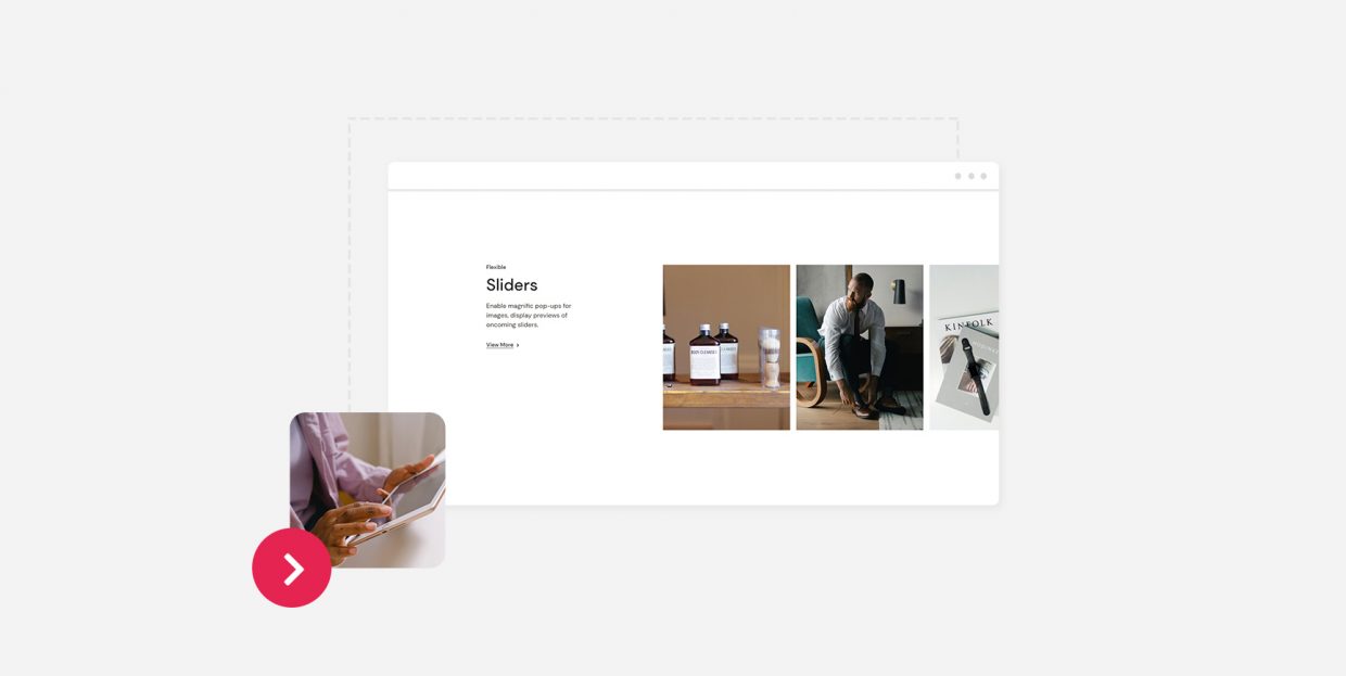
In web design, an image slider is a slideshow of images used on a web page. They consist of several images which shift positions in a transition animation either automatically or as a response to user action such as a click, a scroll or, on mobile devices, a swipe. Whether they are automatic or user triggered, they tend to be attention-grabbing.
Other than the purely aesthetic, though, a slider can also perform navigational functions and convey important information to visitors.
An image slider is typically used as part of a portfolio website or a business website, but there is no real limit to when a slider can be used.
A well designed image slider will typically contain most of the important information a website wishes to convey to a user packaged into attractive graphics. For a business website, it might be a mission statement, for instance. For a bookshop or a film review website, it might be a showcase of new releases. And any shop might use it to advertise a brand new time-limited offer or a similar deal.
Alternatively, you could take a minimalist approach: simply furnish your website with beautiful photos or graphics for your visitors to enjoy – a solution perhaps most suitable for photography websites, galleries, artist portfolios, or museums.
There is one downside to image sliders: their size. A slider typically contains a lot of high quality, high resolution images, which may cause slow loading and slow running of your website, which may lead to bad user experiences, increased bounce rates, and poorer SERP rankings.
If using high resolution images, don’t overdo it. And if the downsides outweigh the possible benefits, you’d do best to avoid sliders altogether.
Another thing to consider is mobile devices. If the functionality of your slider is dependent on large format graphics with a lot of fine detail, it may be useless on mobile devices and should probably be excluded or modified for the mobile version of your website.
We will be creating an image slider using Qi Addons for Elementor, a free plugin we have developed in order to expand Elementor’s already impressive array of widgets. Before you begin using it, though, you need to install the latest version of Elementor, and then install and activate Qi Addons for Elementor.
Qi Addons will work with the free version of Elementor, so the whole kit and caboodle needn’t cost you a penny. All that matters is that your version of Elementor is up to date. We will also be using our free Qi Theme, which we heartily recommend, but Qi Addons will work with any theme.
Once you have done that, adding a WordPress image slider to your website is easy and takes minutes. You can see how it’s done in the video below:
But if you prefer a step-by-step textual tutorial, we’ve got you covered. Read on.
We will be adding an image slider to a post, but you could just as easily add it to a page. Adding the image slider widget works as with any other Elementor element: simply find it in the left hand-side menu, and drag it to where you want it.
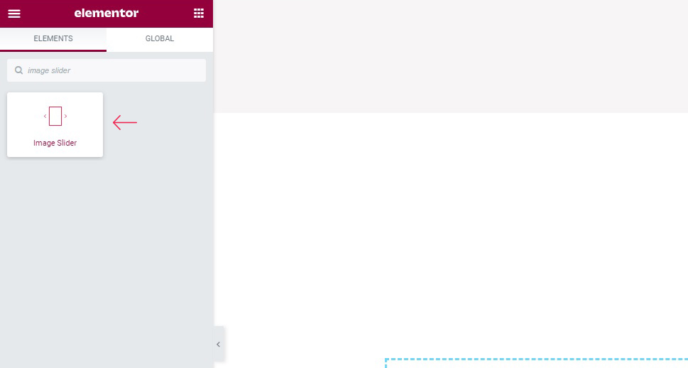
You now have the element in place, but it contains no images. To add images, click on the plus icon in the Images section of the Content/General tab.
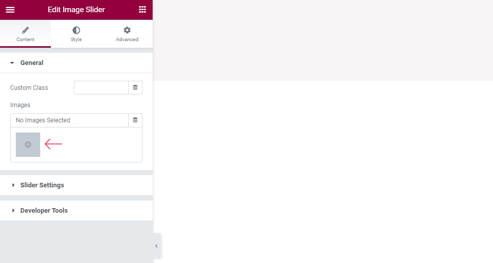
You can now select images from your media library or upload some new ones. Once you have made your selection, click Create Gallery.
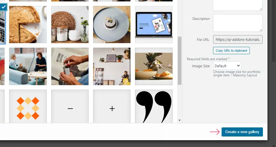
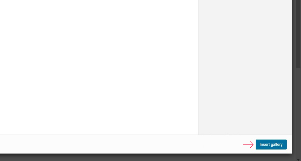
You can now review or edit this gallery before inserting it. You can also change the order of your images as they appear in the slider by dragging them. When you are happy with your gallery, click Insert Gallery.
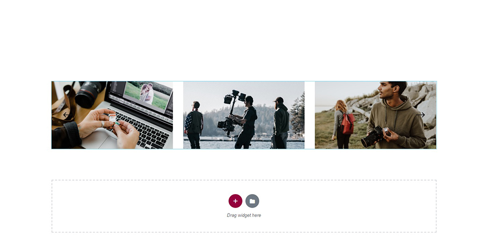
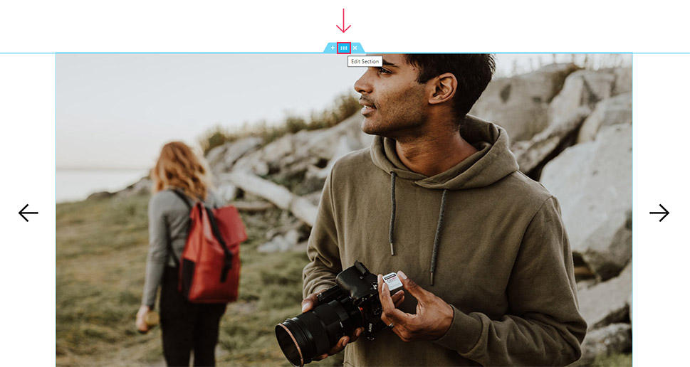
You should now be able to see your image slider in the preview section.
Moving on to the General/Slider Settings section, we find the controls for the behaviour of our image slider.
Enable Slider Loop can be set to Yes or No, and it makes the slider loop back around on itself. We want our images to keep moving on their own, so we are leaving it on Yes, which is the default. The Enable Centered Slides control is used for centering asymmetrical images, while Enable Slider Autoplay makes the slider work without user interaction.
The Slide Duration and the Slide Animation Duration are used to set the time for which an image is in place, and the duration of the transition animation. The unit used is milliseconds. We will set our Slide Duration to 2000, but we won’t be touching the Animation Duration Control.
The Enable Slider Navigation control enables the user to use arrows to navigate the slider, while the Enable Slider Pagination governs the slider pagination dots. We won’t be using the dots for this slider we’re creating, so we will switch it to Off.
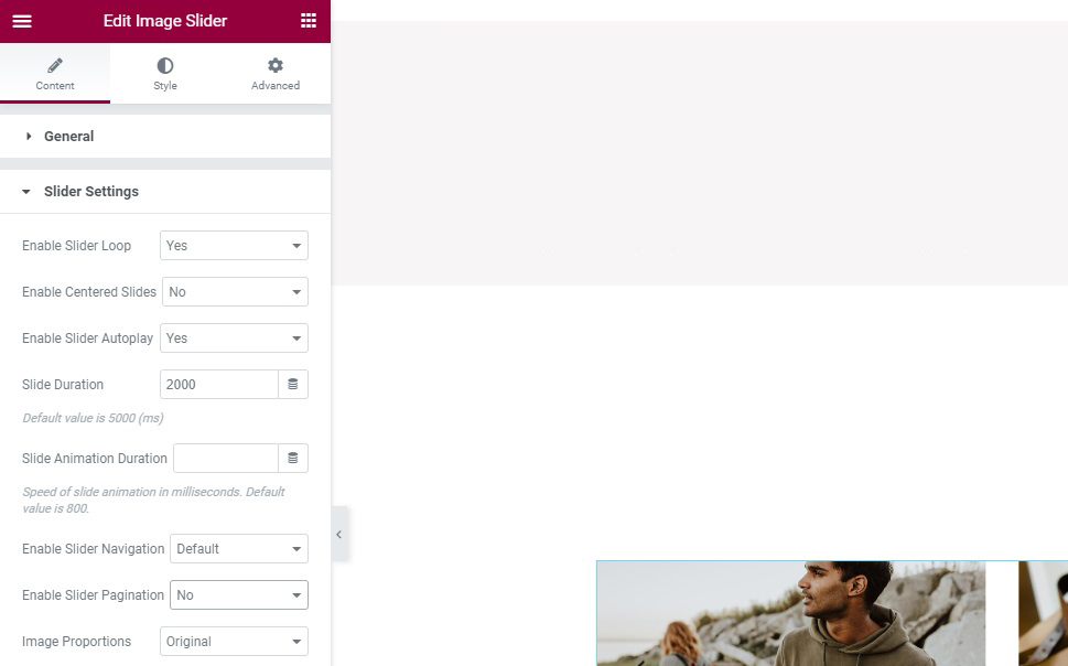
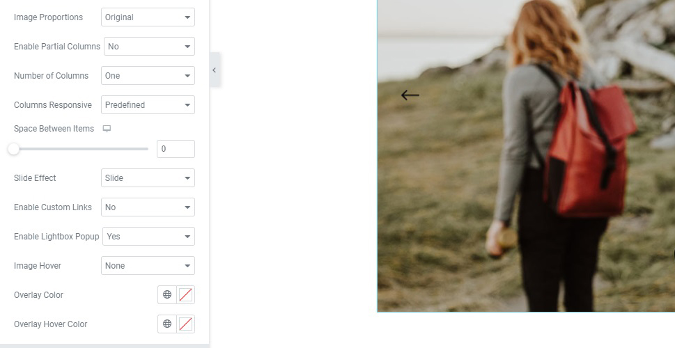
Next down, the Image Proportions control has an array of options which you can use to make your images appear more uniform if they aren’t, such as Thumbnail, Square, Portrait, and others. We will leave it at the default Original, keeping the images’ original proportions.
Enable Partial Column allows you to show the part of the end column you set the Partial Columns Value for. The Number of Columns menu allows you to pick the number of columns of your slider. We will set ours to One.
The Columns Responsive menu lets you set up different numbers of columns for different device sizes, usually meaning fewer columns on smaller devices. Since we only have one image showing at a time (as per our Number of Columns setting), we can leave it at Predefined as there is no way to show fewer than one column.
The Space Between Items slider lets you enter a pixel value between each slide. We will set ours to 0, since we don’t want any space between the images. The Slide Effect menu lets you choose between the Slide and Fade transition animations. We will leave ours at Slide.
Next down, we find the Enable Lightbox Popup. If enabled, as is the default, it will open a clicked image in an overlay. The Image Hover menu controls the behaviour of the slider on mouse hover by the user. You can choose between Zoom In, Zoom Out, None, and Move. We will be leaving ours at None.
The Overlay Color and the Overlay Hover Color settings provide you with the ability to choose a colour overlay for your images, whether by default, or on hover. We will not be using it for our demonstration.
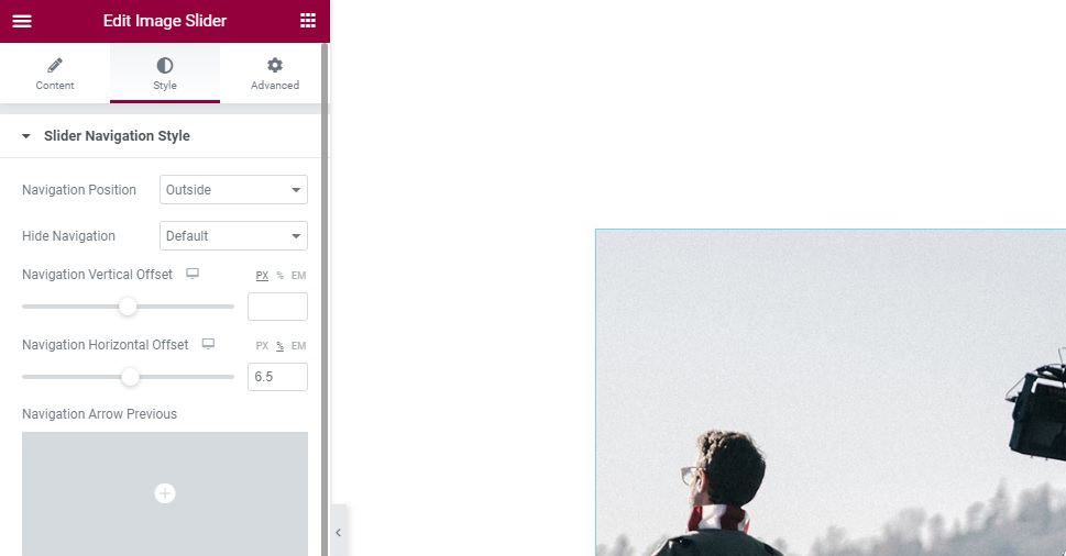
Moving on to the Style tab. You will see two sections: the Slider Navigation Style, which is concerned with the navigation arrows, and the Slider Pagination Style, which is to do with pagination. For the purposes of this design, we have switched the pagination off, so we won’t be using those settings.
In the Slider Navigation Style section the first option up is the Navigation Position menu. Here you can choose the position of the arrows which make the slider switch images. We will place them Outside, but you can also choose the default Inside and Together, which will place them below the picture.
Next down, we find the Hide Navigation option, which lets you hide the navigation arrows for devices below a certain screen width. We will make them invisible for devices Below 768 pixels wide.
The offset sliders (Navigation Vertical Offset and Navigation Horizontal Offset) let you move the navigation arrows from their default positions. You can slide them yourself or input values in pixels, ems, or percentages. We will not be using the vertical offset slider, but we will set the Navigation Horizontal Offset to 6.5%.
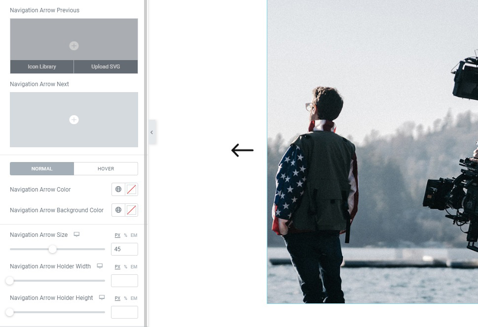
The next two options are the Navigation Arrow Previous (left arrow), and Navigation Arrow Next (right arrow) let you change the default navigation arrows. You can choose one from your icon library or you can upload an SVG. We like the arrows as they are, so we won’t be changing them.
Next down, you can modify the behaviour of your navigational arrows using the Normal/Hover toggle. Setting the arrows’ attributes in the Normal mode will change the arrows as they appear to the user, while the Hover mode governs their behaviour on mouse hover.
The first two options are Navigation Arrow Color and Navigation Arrow Background Color. Here you can pick or input the colour for your navigation arrows or their background. We will not be using the colour options for this design.
The last three sliders control the dimensions of the arrow itself and its holder. The Navigation Arrow Size lets you control the size of the arrow, while the “holder” in Navigation Arrow Holder Width and Navigation Arrow Holder Height refers to the arrow’s background. If you have selected a colour for Navigation Arrow Background, you can use these sliders to change its dimensions. We will increase the size of our arrows to 45 pixels.
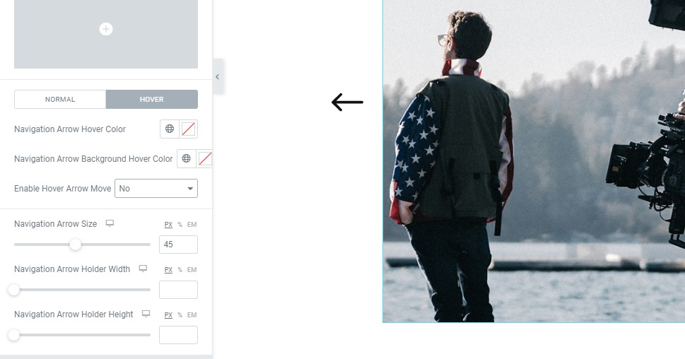
Switching to the Hover section of the toggle, we can see one additional control: Enable Hover Arrow Move. By default, it animates the arrow once a user hovers their mouse over it. We will switch it to No.
The Slider Pagination Style section offers a similar set of options: colours, offset, borders, and size, but we like our image slider as it is, with navigation arrows only, so we will not be using the pagination options.
That said, our image slider is done.

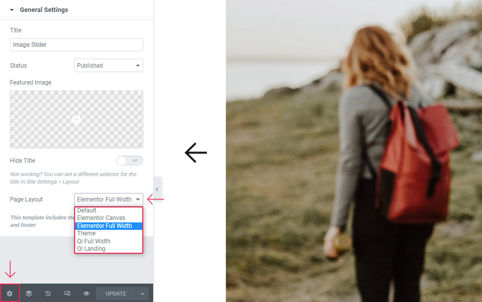
Now, suppose you want a full width WordPress image slider. With Qi Addons for Elementor, you can do that, too.
The first thing you need to do is go to the Settings section by clicking on the Gear icon at the bottom of the left hand-side menu. Find the Page Layout menu and select Elementor Full Width as your layout. If you are using our Qi Theme, you can also select Qi Full Width.
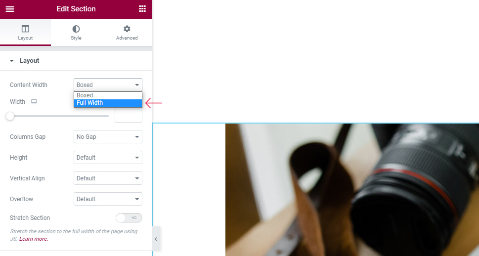
Next, click the middle icon of the blue section tab to edit it.
You should see the Layout tab of your section. The first menu up is Content Width. It is set to Boxed, but you need to change it to Full Width. Once you have selected that, the next menu down should be the Columns Gap menu. Selecting No Gap in it will leave no gap between the element and the edges of the screen.
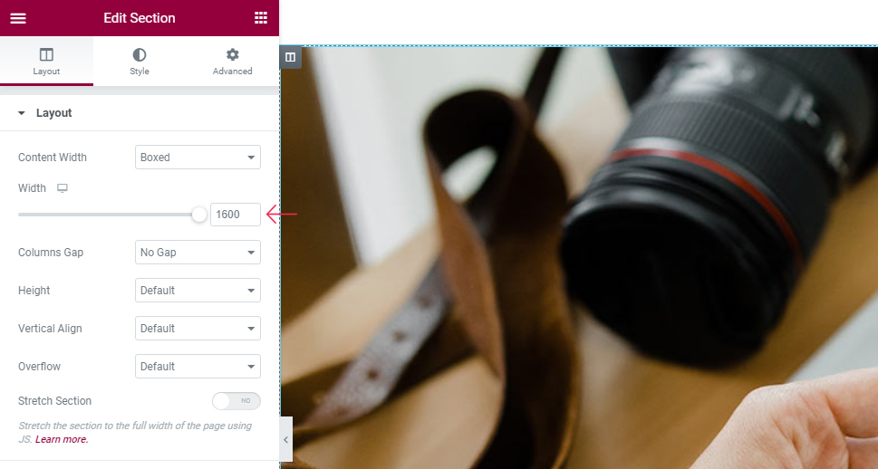
However, even if you are working with the Boxed layout, you can still use the Width slider to change the width of your widget. If you drag it all the way to the right, or if you input the width of your layout in pixels, you will also get a full-width image slider.
In Conclusion
As you can see, setting up a beautiful, arresting WordPress image slider is easy and only takes a couple of minutes. With Qi Addons for Elementor, it can also be completely free. The widget comes bristling with user-friendly styling options with the effects immediately visible in Elementor’s preview section. Now you know all you need to know in order to create beautiful WordPress image sliders for your website, no matter the style.
