How to Create a Blog Carousel in WordPress

There are various creative ways in which you can draw the attention of potential readers to your posts and get them to check out your content. In fact, many blogging sites turn to creating all sorts of captivating blog posts designs for this purpose. There are those that go for a more simplistic approach and only offer the title and a “read more” button that leads to the posts on their home or blog pages. Others go out of their way to create a visually immersive experience for their visitors and arrange snippets of their posts using beautiful masonry layouts, or even provide entire slideshows of their posts using blog carousels. And if you are also among those set on a mission to create an interactive display of your posts using the attention-grabbing blog carousel element, then you’re in the right place.
This time around, we are going to show you how to use our own Qi Addons for Elementor plugin and its highly flexible and dynamic Blog Carousel widget to effectively display a selection of your best blog posts and truly captivate the attention of your readers. There are many different designs you can choose from and plenty of versatile content and styling options you can try out to create a unique-looking and attractive carousel for your blog. We will build a blogging carousel element from scratch and make sure to cover most of the widget’s options while we’re at it. Without further ado, here goes:

With its set of 100+ predefined widgets, Qi Addons for Elementor is one of the biggest freemium Elementor collections you can use to produce beautiful and compelling elements for virtually any WordPress site. Among its widget list, the versatile Blog Carousel widget serves to help you create a stylish blog carousel and place it anywhere you want on your blog. This free widget has the purpose of helping you add the blog posts showcase in all sorts of captivating ways. You can use the widget’s various layout and customization options and even combine them in numerous ways to create a unique-looking carousel for your blog. You will be able to fully customize your text, stylize the icons, buttons, navigation arrows, and pagination bullets, choose different layouts, and plenty more.
Make sure to stick around as we show you how to make the most out of this versatile widget. And if you prefer to watch videos instead of reading, we suggest that you check out the video that covers the same subject:
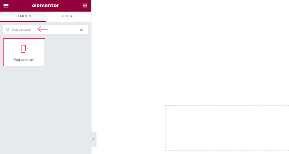
Once you’re in the backend of your Elementor page edit, make sure to search for “Blog Carousel” in the Elementor sidebar.
Drag it over to the right side of your screen. You will instantly be able to see what the default widget looks like. There are three items with a predefined layout and the navigation and pagination are both switched on.
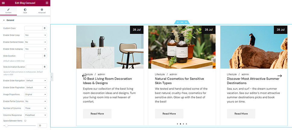
Keep in mind, however, that you need to have some posts prepared in advance in order for the carousel to work – which is what we did:
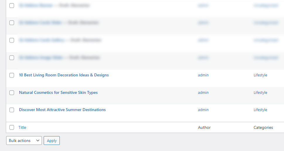
If you have no posts, the carousel won’t be able to display anything. Therefore, you should create some blog posts first before you start working with this widget.
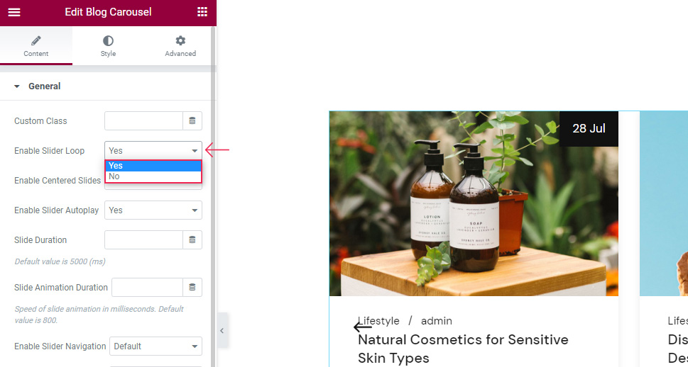
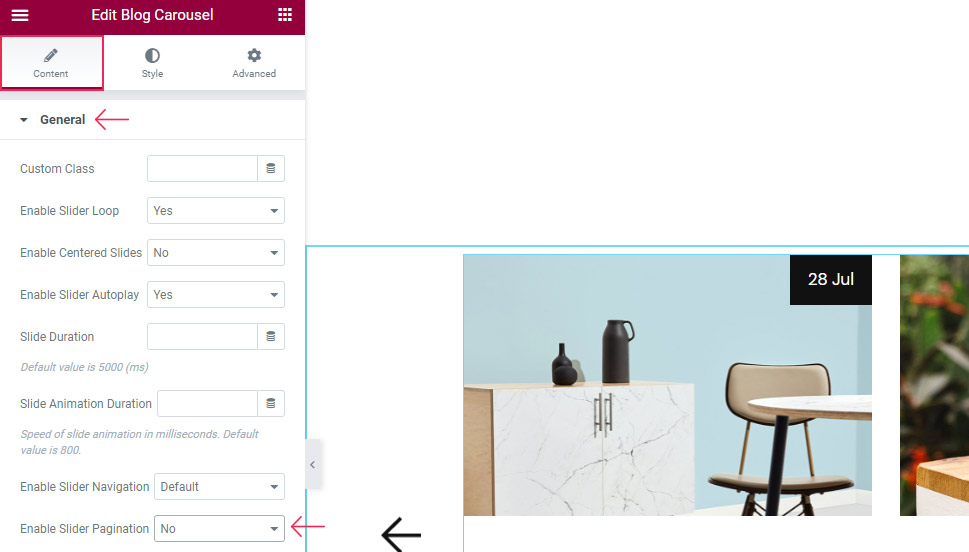
Let’s assume you’ve set up some posts in advance. It’s then time to go to the widget’s General section. One of the first options in this section is called Enable Slider Loop, the name of which is pretty self-explanatory. It is set to Yes by default, so if you set it to No it will stop showing the carousel on loop.
The Enable Center Slides option is set to No by default, but if changed to Yes, it will make a slide appear in the center of the carousel at all times. This option is somewhat connected to another option that you can find if you go a bit further down the list, called Enable Partial Columns. Once you set this option to Yes and use the slider in the Partial Columns Value option (to determine how much the side columns will be visible), you will get the following partial view:
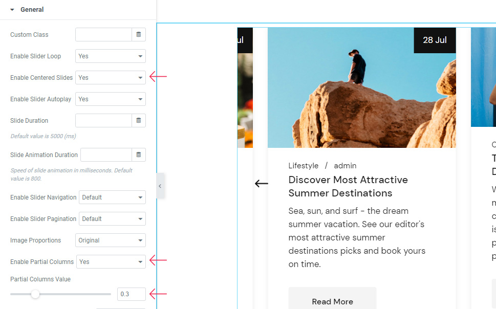
Then, you can enable centered slides and make your carousel appeal symmetrical, which means the partial view is now present on both sides of the widget. Also, the carousel slide will be set in the center.
We will switch these settings off now as we’ve only wanted to quickly demonstrate how combining a few different options can impact the look of your carousel.
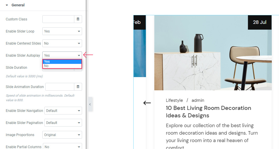
Moving on, there’s also the Enable Slider Autoplay option that allows the carousel to move as soon as the page opens.
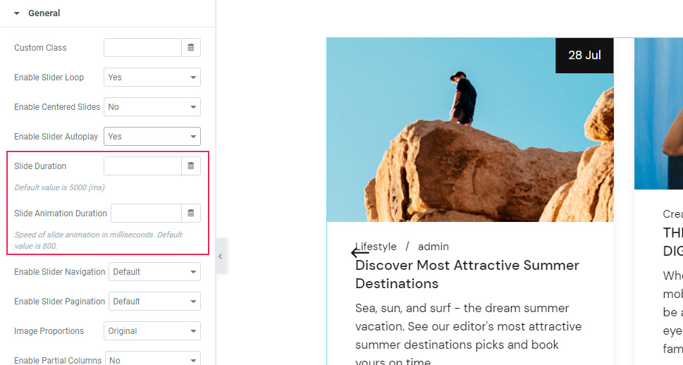
Right below, you can adjust the Slide Duration according to your preferences. This is the amount of time one slide will be shown on the screen before another one replaces it.
There’s also the Slider Animation Duration option that serves to set the amount of time the animated effect will last. We’ve left both options at default for our example.
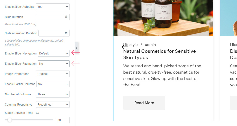
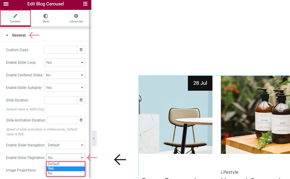
Then, there’s the Enable Slider Navigation option that is enabled by default (as is seen with the arrows).
The Enable Slider Pagination option is also switched on by default, as we’ve mentioned at the very beginning. Since having arrows and bullets switched on at the same time is a bit too much, we’ve disabled the latter option.
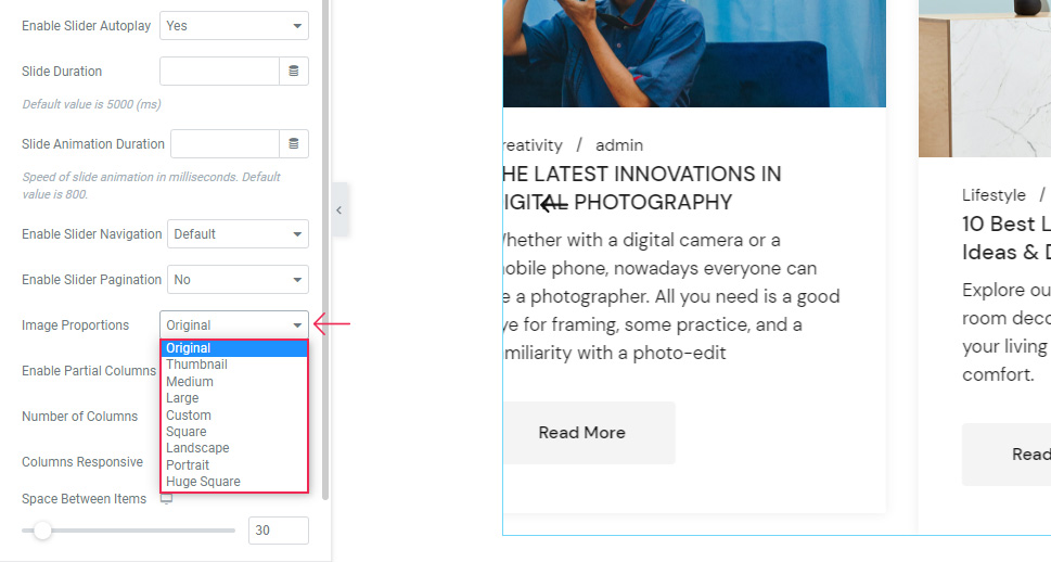
The Image Proportions option allows you to select the size of the images in your slider. Feel free to try some of them out to see which one fits your preferences the most. As for our particular example, we’ve left it at Original.
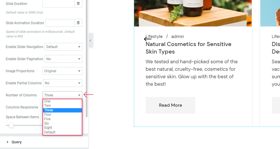
The Number of Columns option is also self-explanatory – it allows you to choose your desired columns number (three is our default).
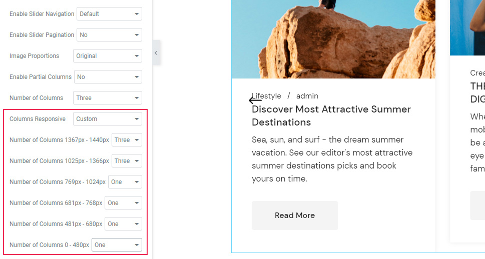
The Columns Responsive option allows you to manually set the number of columns you want to be shown on each screen size. The first two options are for laptops and MacBooks, while the number of columns option is used for regular desktop screens. We’ve left the first two options at their default setting, and we’ve set one column for all the rest (as these are the mobile settings).
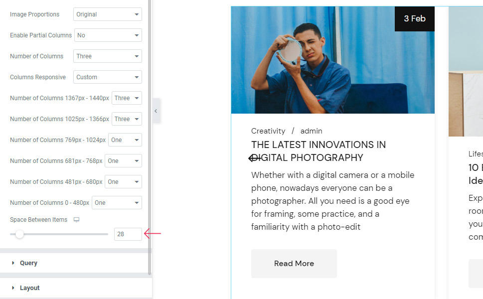
Moving on, there’s the Space Between Items option which can be used to adjust the number of pixels between separate items. We’ve placed it at 28px for ours.
Query Section
Next is the Query section. Here you will find the option to set the maximum number of Posts Per Page shown in the carousel. Our example only has three posts, so we’ve set it to three.
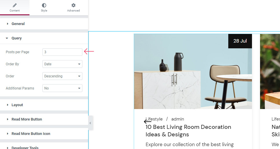
The Order By option will allow you to pick the criterion at which you are ordering the posts within the carousel. It is set to Date by default, which is what we’ve left it at as well.
Next, you can choose the Order in which the posts will be displayed (Default, Descending, and Ascending). We’ve left our setting at Default.
Right below, the Additional Parameters option will let you filter the posts that will appear in the carousel. You can choose to only display posts with specific Post IDs, Taxonomy Slug, or Author Name. We’ve picked the Taxonomy Slug.
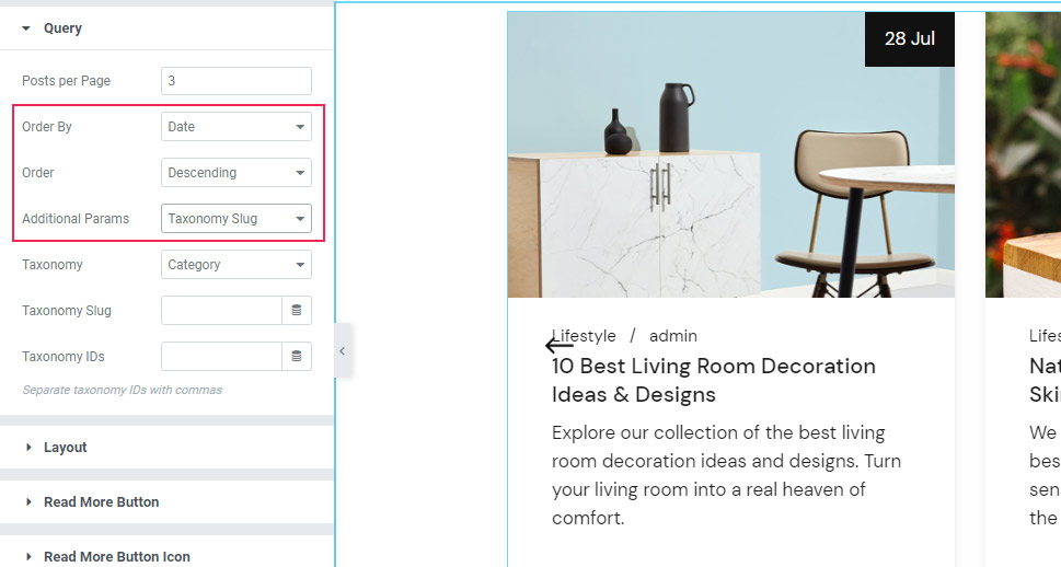
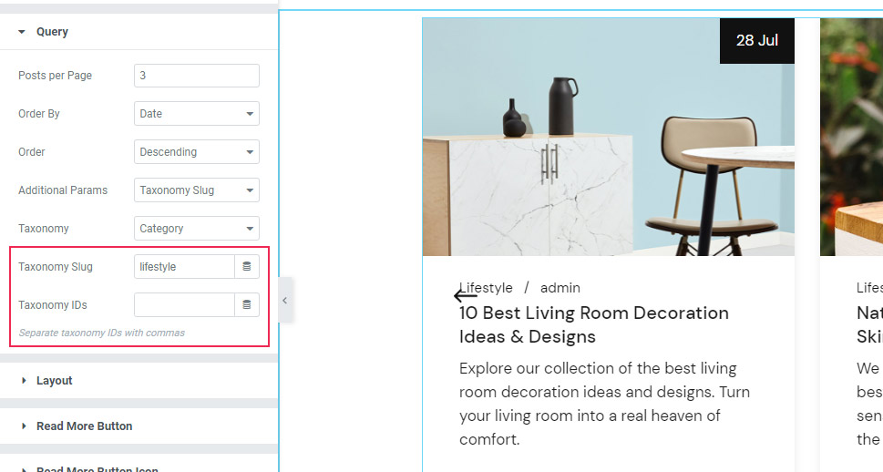
Then, you can pick the Taxonomy you wish to use. We’ve chosen Category.
In the Taxonomy Slug and IDs fields, you can specify the taxonomies you want shown. If you end up using the Taxonomy IDs option, you need to make sure to separate the ID numbers of different posts with a comma. We’ve added “lifestyle” into the Taxonomy Slug field for our example.
Layout Section
Now, the Layout section has a separate set of options related to the carousel layout.
The first, Item Layout option allows you to adjust the look of the items in the carousel. The Boxed setting is the one you can see in the picture below.
However, for our example, we’ve decided to change our layout to Date Boxed.
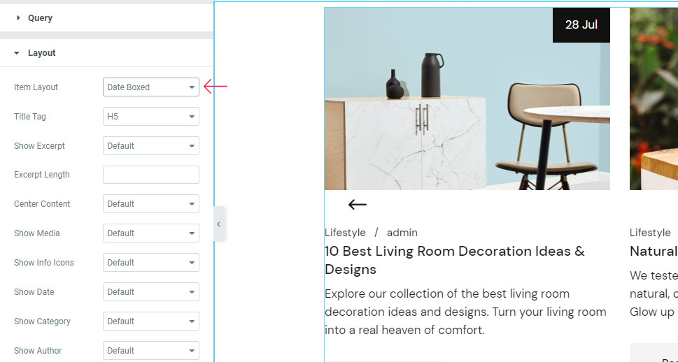
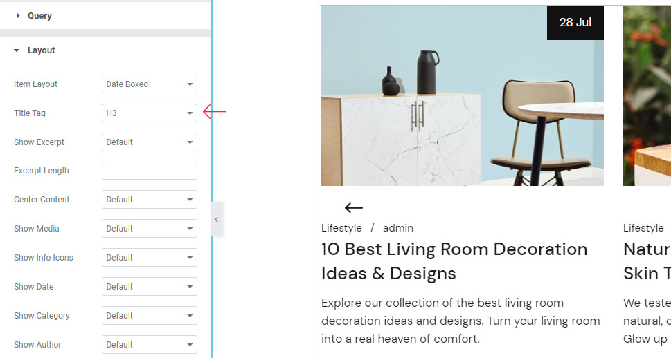
The Title Tag option allows you to choose the tag (H1-H6) of your title. We’ve opted for using the H3 tag.
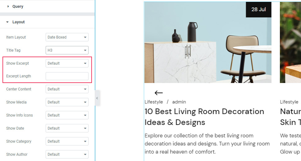
Next, you can enable or disable the excerpt (it’s there by default, so we’ve also decided to keep it) and choose its length.
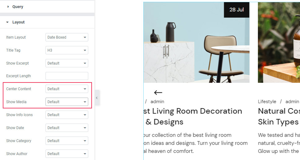
The Center Content option allows you to center your content or not. We’ve left this option at default.
By using the Show Media option, you can disable the display of your image. We’ve decided to keep the image on display for our example.
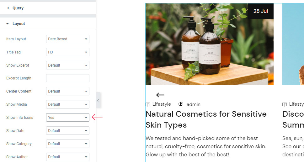
The Show Info Icons option lets you show icons for displaying the info text. You get small icons right next to the info text if you switch the setting to Yes (we’ve switched it off right afterward).
The Show Date option is pretty self-explanatory. It’s enabled by default, and we are going to keep ours as well.
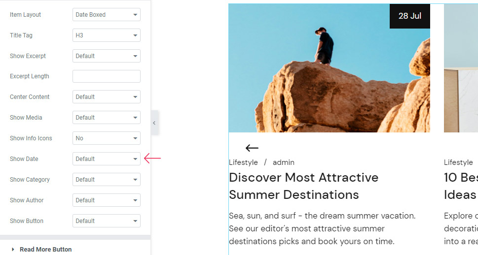
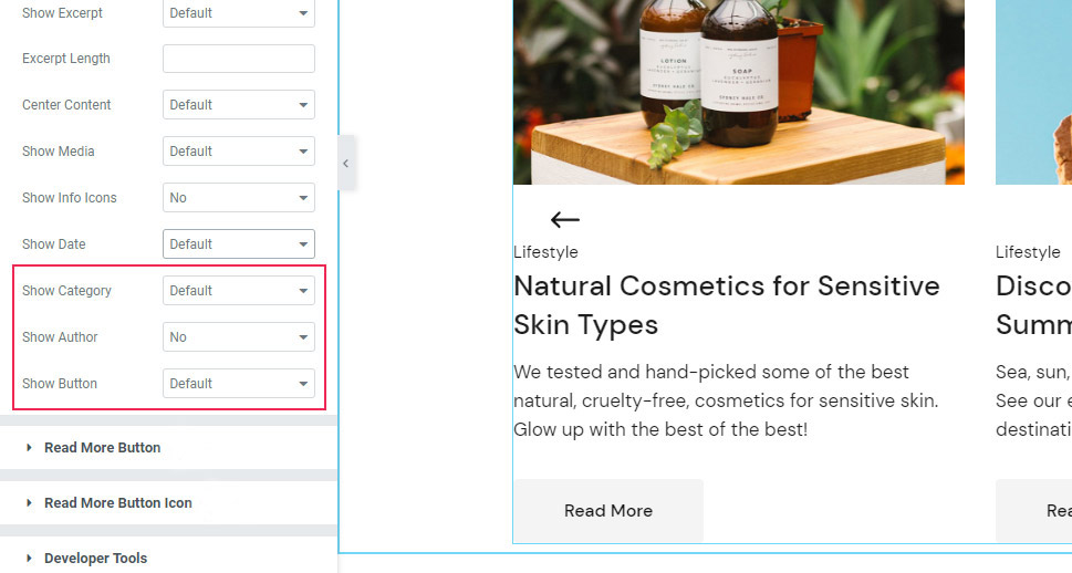
Next is the Show Category option which is also enabled by default, and the same goes for Show Author and Show Button options. For our example, however, we are going to switch the author off, while we’ve decided to keep the button on.
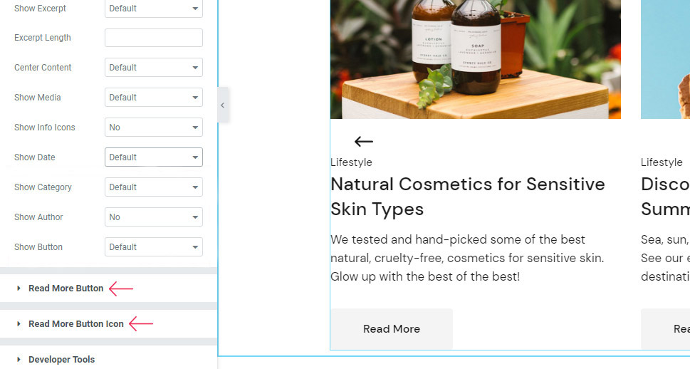
Read More Button
If you also keep your button, you will be able to use another batch of settings (Read More Button and Read More Button Icon) to customize it.
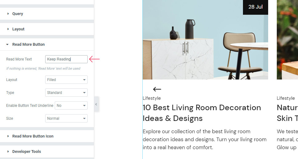
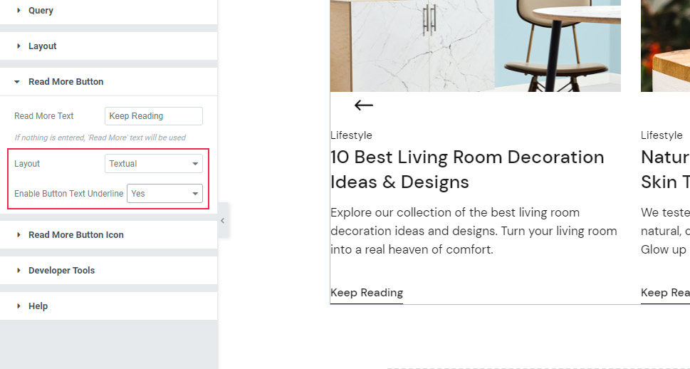
First, in the Read More Button settings, you can change the Read More Text and have it display something else (it says Read More by default). We’ve changed it to “Keep Reading”.
You can choose the Button Layout to be Fixed, Outlined, or Textual (this is the one we’ve used).
We’ve also enabled the Button Text Underline.
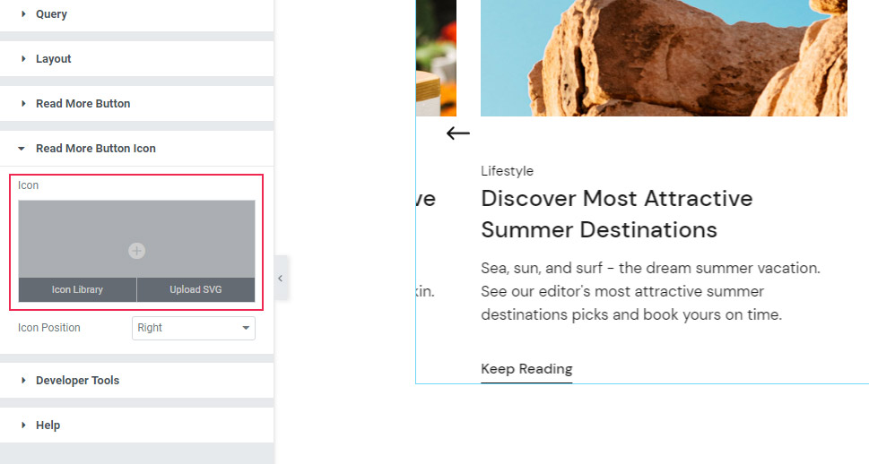
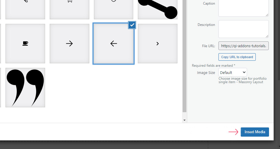
Moving on to the next section, you can choose your Read More Button Icon. You can either upload an SVG or choose from the icon library. We’ve opted for the SVG we’ve previously uploaded to the library.
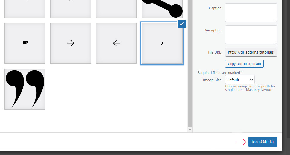
Hit the Insert Media button once you’re done with choosing your icon.
Next, you can either set the Icon Position to be on the right or the left of the button text. We’ve had it stay on the right.
The next, Style tab, contains a whole other set of different options you can use for a comprehensive styling of your blog carousel.
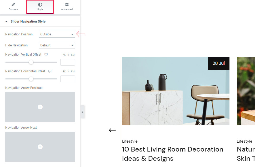
The first section is Slider Navigation Style, with the first option named Navigation Position. Basically, this option determines the position of the navigation arrows. The Inside setting is the default one and it places the arrows right within the carousel. You also have the option to place them outside the carousel or choose Together and position them at the very bottom of the carousel. This time around, we’ve opted for the Outside setting.
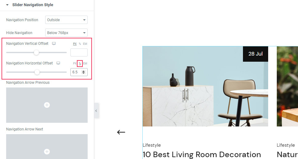
With the Hide Navigation option, you can choose the screen width at which the arrows stop being visible. We’ve set it to below 768px.
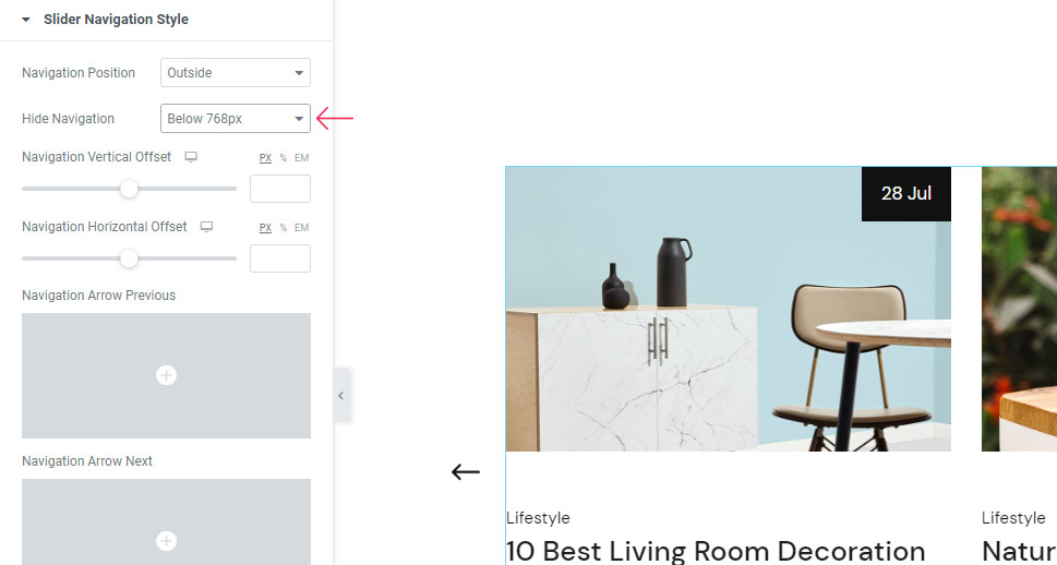
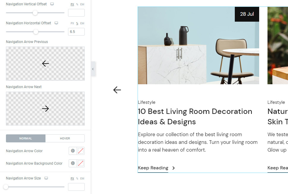
Next, the Navigation Vertical Offset and Navigation Horizontal Offset options will let you move the arrows up or down (or left or right for the horizontal offset). We didn’t change the former option, while we set 6.5% for the horizontal offset.
In case you wish to replace default navigation arrows with something else, you can use the Navigation Arrow Previous and Navigation Arrow Next options. You can either replace them using the icon from the library or upload an SVG.
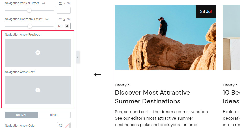
We’ve opted for using the SVG previously uploaded in the Media Library for both Previous and Next arrows.
Make sure to hit Insert Media when you’re done.
After that, you can customize your arrows even further.
Right below, you will see the settings for the Normal icon display and display on Hover. These settings serve to make your icon appear different when hovered over.

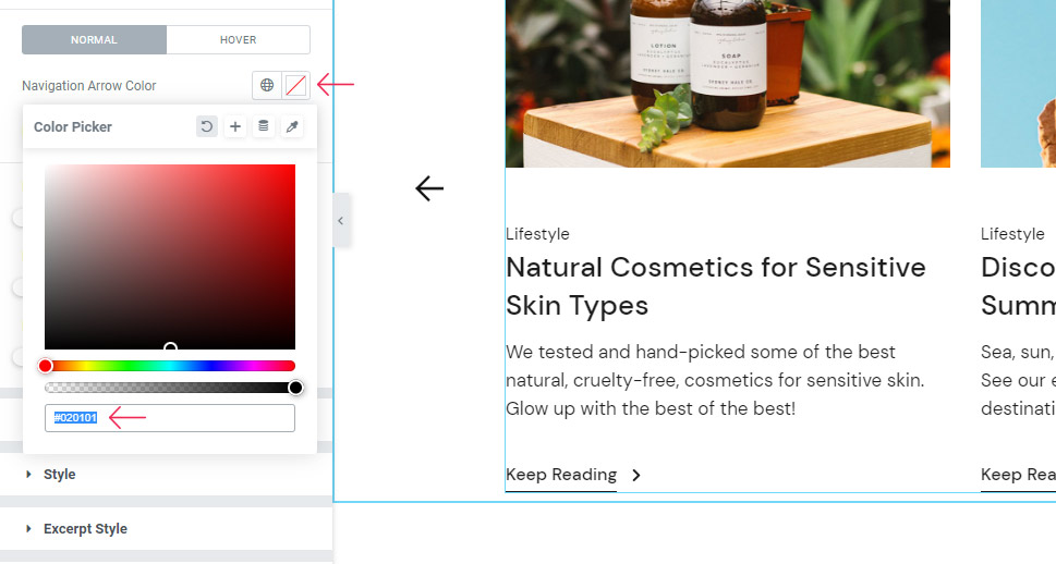
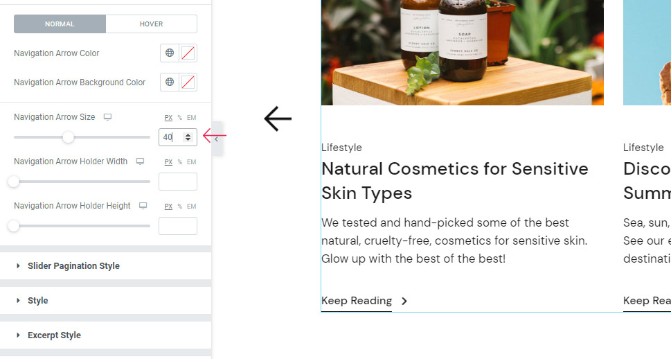
In the Normal settings panel, there’s the Navigation Arrow Color option that you can use to change the color of your icon. You can do this either by using the color picker or entering your own hex code. You can choose any shade you like here.
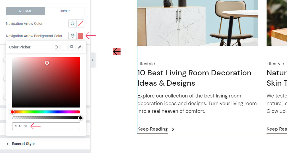
There’s also the Navigation Arrow Background Color. We’ve selected the hex code of #E47070 for the time being, just to demonstrate a few other options.
As its name suggests, the Navigation Arrow Size option allows you to increase the size of the arrows. On the other hand, the Navigation Arrow Holder Width lets you adjust the width of the base that contains the arrow. Finally, the Navigation Arrow Holder Height allows you to adjust the height of the same base.
You can see how the space has changed once we’ve adjusted these options.
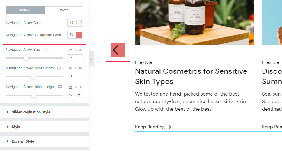
We are going to clear these options now as we’ve only wanted to demonstrate different navigation arrow looks you can achieve if you decide to use them. The only option we are going to use is the Navigation Arrow Size. For this option, we’ve set the size to 40px. Now, our arrows appear significantly bigger.
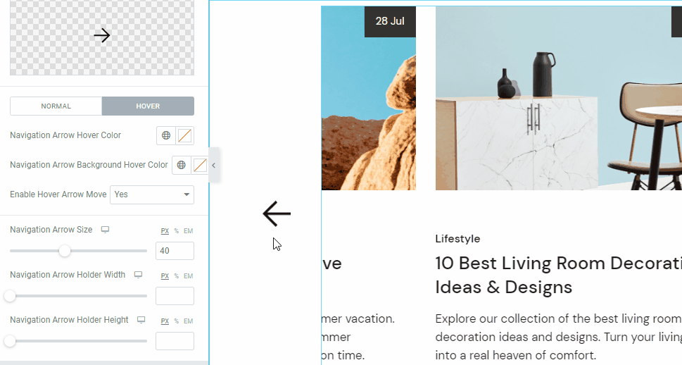
Moving on to the Hover settings – here, you will find the options for Navigation Arrow Hover Color and Navigation Arrow Background Hover Color, which work on the same principle as previous color options, the only difference being that they determine the arrow and background colors on hover.
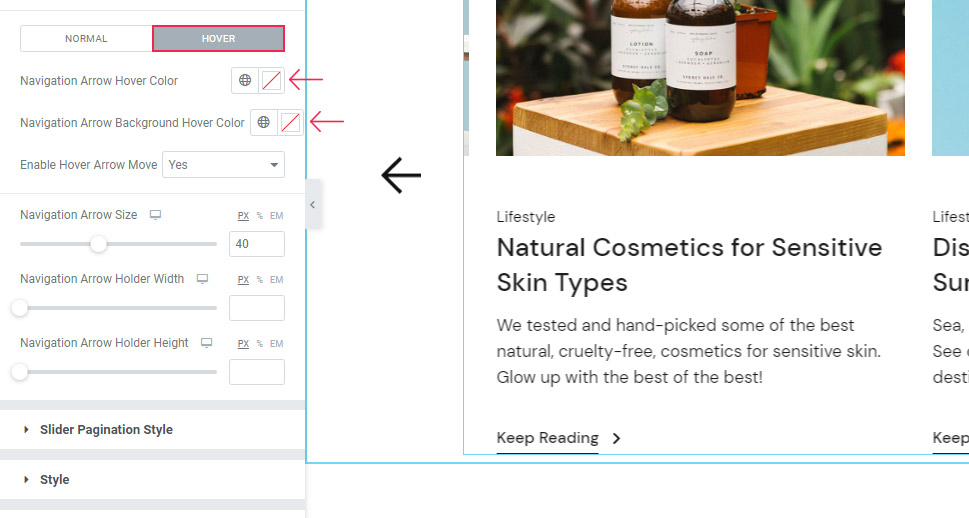
The Enable Hover Arrow Move option allows you to add the animated movement to the arrow on hover:
Slider Pagination Style
Next, there’s the Slider Pagination Style section. However, to get this section to show its options, you need to activate them first using the General tab and enabling the Slider Pagination.
Now, when you switch back to the Slider Pagination Style, you will see that you have a few options at your disposal there.
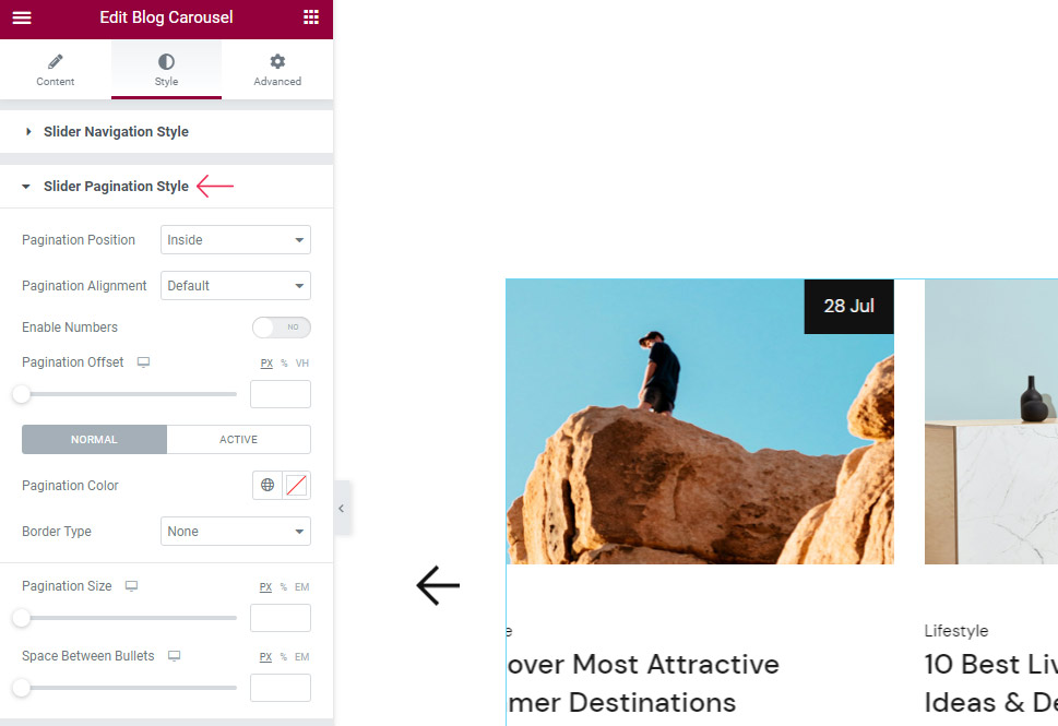
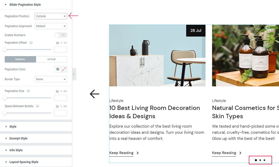
First, there’s the Pagination Position that allows you to move the pagination bullets outside the carousel or let them remain inside it. We’ve kept it on the outside so that we can demonstrate the effect of these options better.
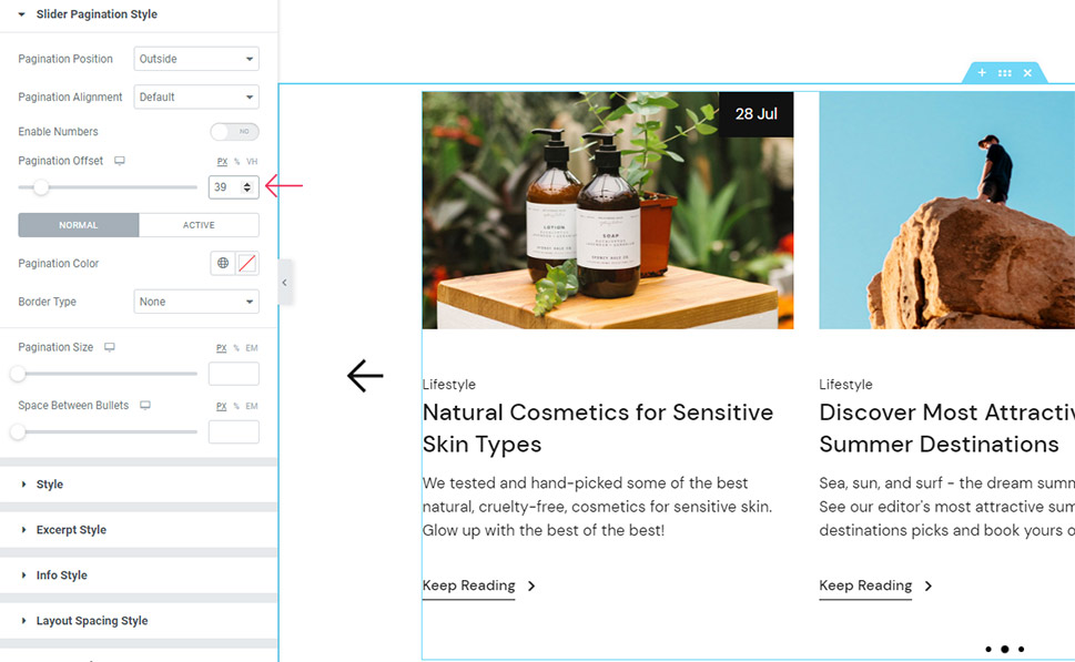
By using the Pagination Offset option, you can move the pagination further away from the slider.
Then, with the Normal and Active settings, you can change Pagination Color for the “normal” pagination bullet as well as for the bullet that represents the currently active slide.
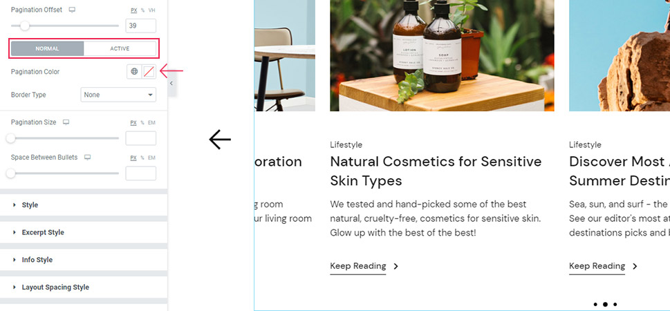
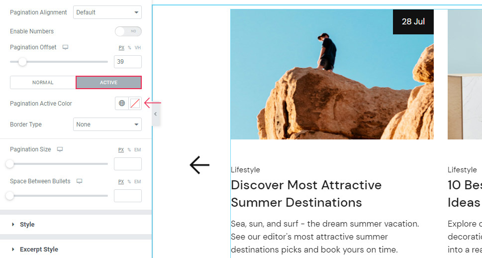
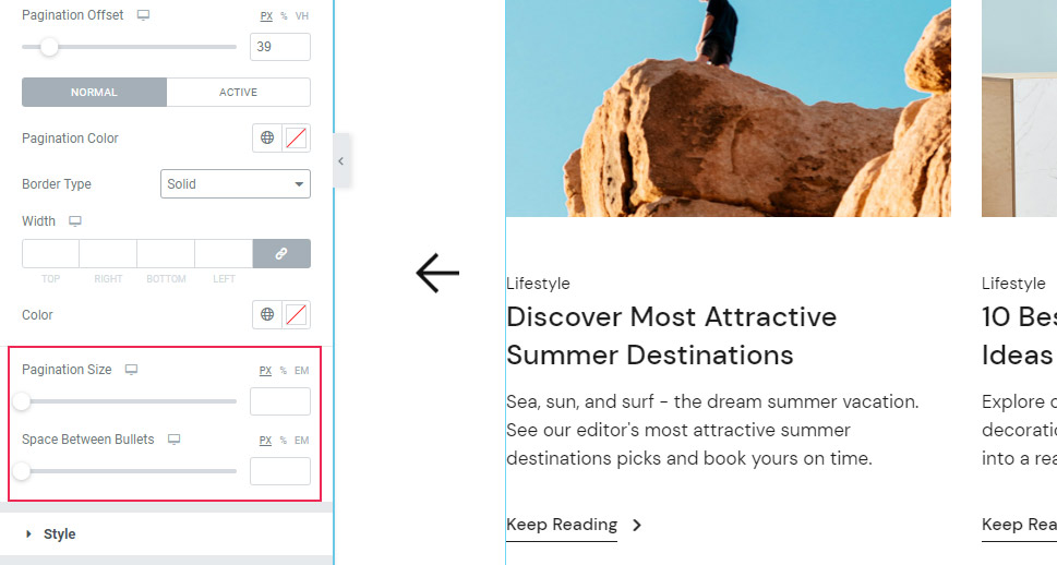
Switching back to the Normal set of options, we’ve got the Border Type option that lets you determine the framing of your pagination bullets (Solid, Dotted, Double, Dashed, etc.). You need to set the type, color, and width in order for the bullets to appear properly. The color and width options show up on the screen once you choose the border type.

Then, there are the Pagination Size and Space Between Bullets options that are pretty straightforward.
And that concludes all the available Pagination options. Also, we’ve disabled the pagination in the Content tab again as it’s not really part of the final design for this widget.
Style Section
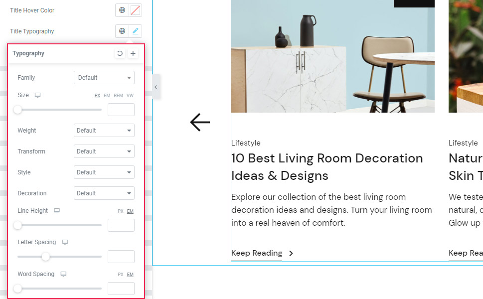
The next section is simply called Style. This batch of options allows you to style different aspects of your title. The first option here allows you to change the color of your title, followed by the Title Hover Color option (to set the color appearing on hover).
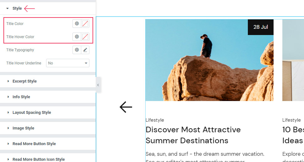
Then, there’s the Title Typography featuring detailed options related to the typography of the title, including Font Family, Size, Weight, Transform, etc.
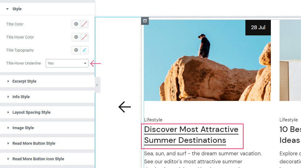
The Title Hover Underline option allows you to add an animated underline that will appear when you hover over the title (we have switched it back to No right after).
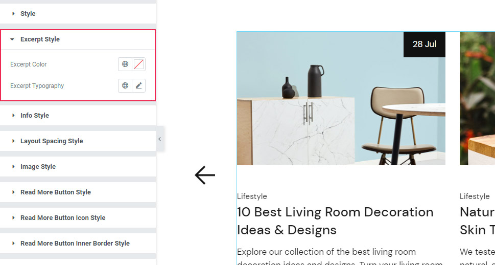
Excerpt Style Section
Next is the Excerpt Style tab with the Excerpt Color option you can use to change the color of the excerpt into anything you like.
Following this option, you’ve got the Excerpt Typography with identical options present in the Title Typography:
Info Style Section
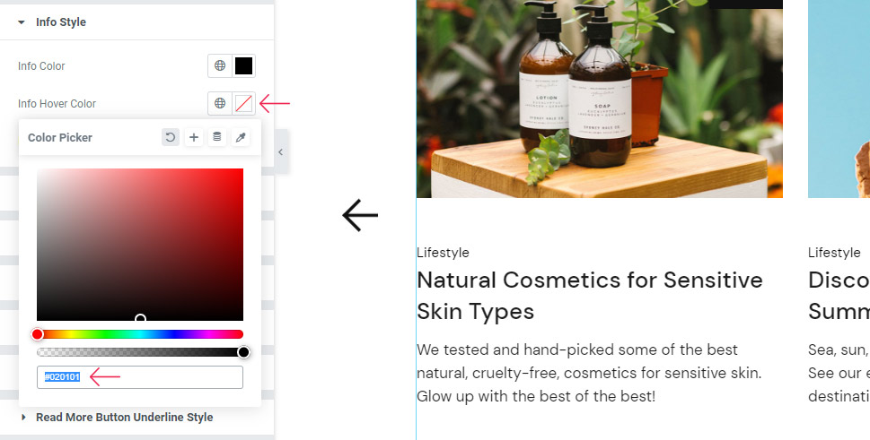
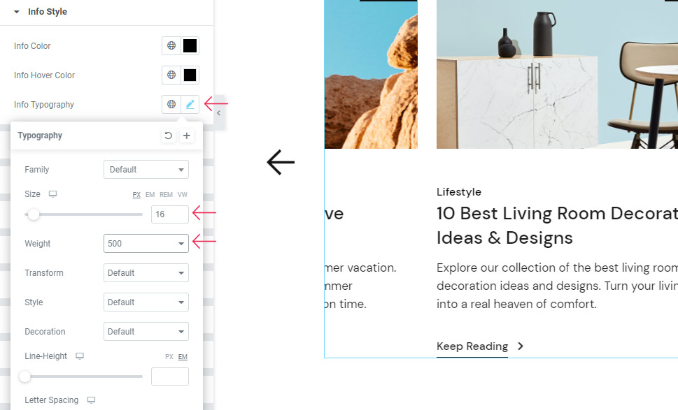
The Info Style section contains options called Info Color, Info Hover Color, and Info Typography.
The Info Color option serves to adjust the color of this text here:
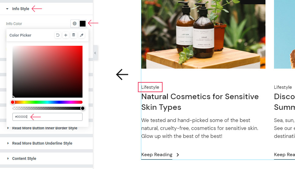
We’ve chosen a plain black color for ours.
If you’d like, you can also choose a different color for Info on Hover.
Once again, you have the typography options for your info text. We’ve used these options to increase the font size to 16px and set the Weight to 500.
Layout Spacing Style Section
In the Layout Spacing Style section, you will find additional options for adjusting the spacing.
For example, the Post Info Margin Bottom lets you adjust the spacing right below the information text.
You can either type in a value or drag the slider to adjust the space to your liking. We’ve set 7px here.

Next, Title Margin Bottom allows you to adjust the space between the title and excerpt. For ours, we’ve put 15px.
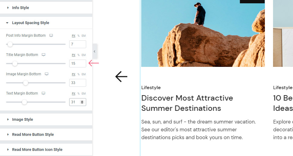
The Image Margin Bottom lets you adjust the space under the image. We’ve left it at 33px for our example.

Last but not least, the Text Margin Bottom option lets you adjust the space below the excerpt, for which we’ve set 31px.
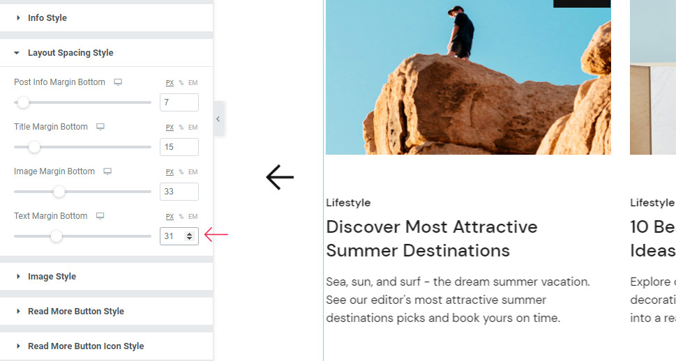
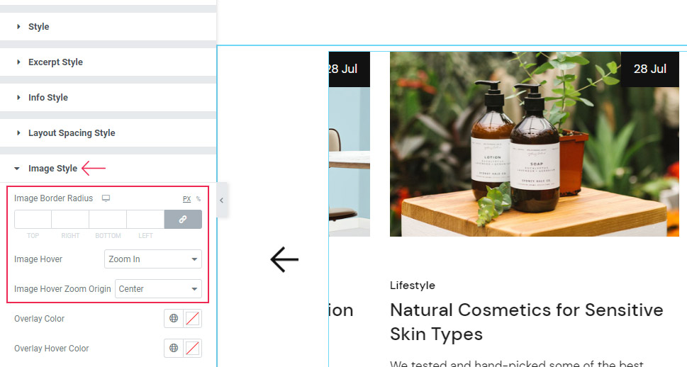
Image Style Section
In the Image Style section, you’ve got options like Image Border Radius, Image Hover (which you can use to create an effect when hovering over the image), and Image Zoom Origin.
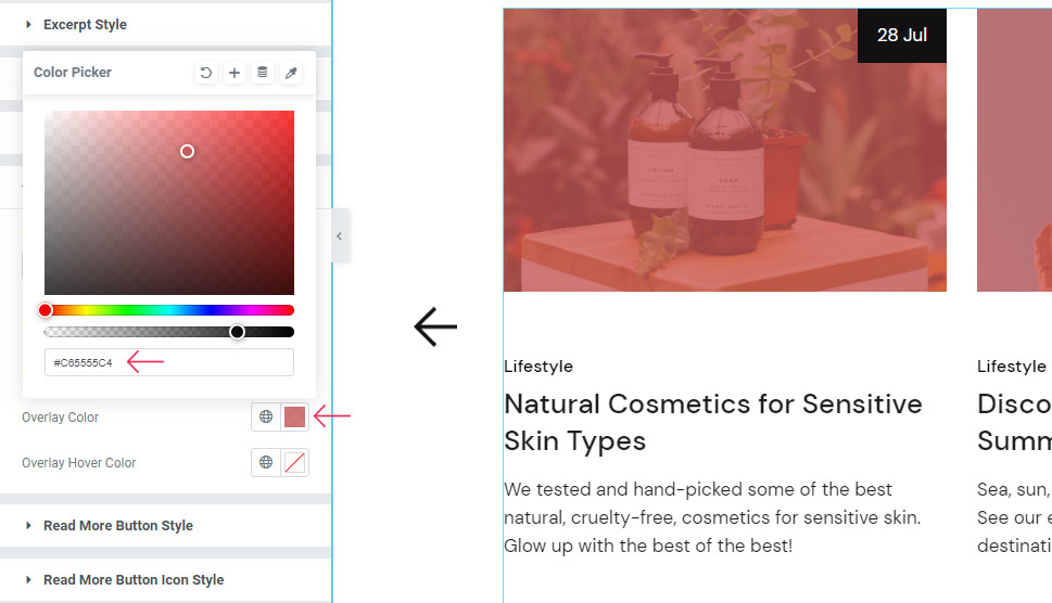
After that, there is the Overlay Color that allows you to give the color to the overlay of your image. If you set the color and give it transparency, the images will have an overlay color of your choice:
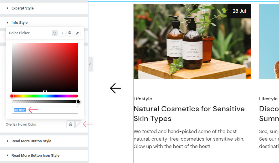
One last option available here is the Overlay Hover Color that works the same, only with the overlay color you set appearing on hover.
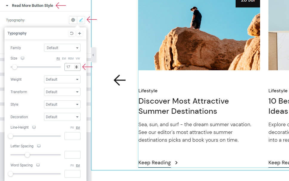
The Read More Button Style section contains the options for styling the button itself.
Once again, you can adjust the Typography settings of your button text. The only thing we’ve changed here is the Size which we’ve set to 17px.
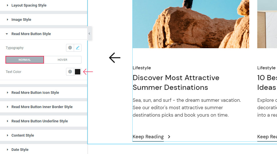
Moving on, there are two switches here – Normal and Hover. Under the Normal switch, there’s the Text Color option to change the color of the button text. We’ve set the dark grey hex code here (#1e1e1e).
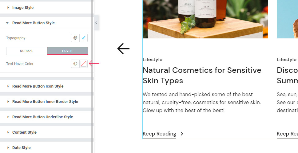
In the Hover settings, you can adjust the Text Hover Color, which changes the color of your button text on hover.
Read More Button Icon Style
The next section is Read More Button Icon Style. If you have the icon present in your button, this is where you’ll be able to set its settings.
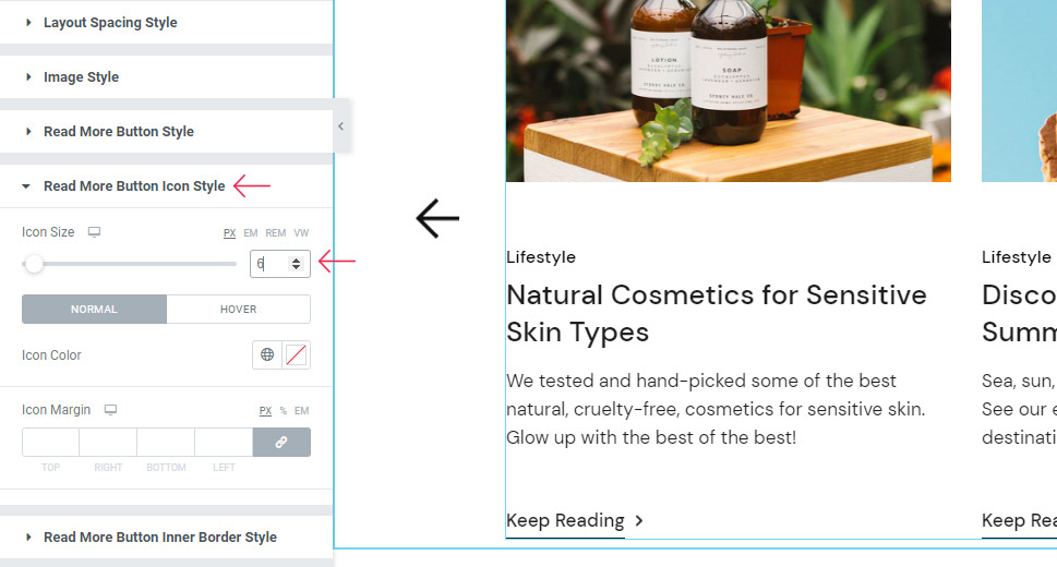
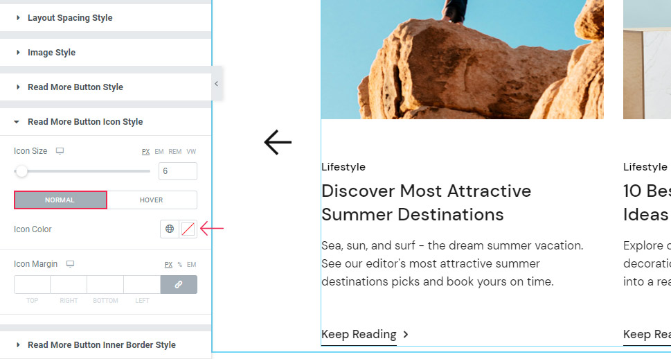
The Icon Size is the first option here – we’ve added 6px for ours.
There’s also the Icon Color option which you can adjust under the Normal switch.
The Hover switch contains the Move Icon option that allows you to select the animation that will appear for your icon when hovered over. We’ve chosen the default, Horizontal Short animation for ours.
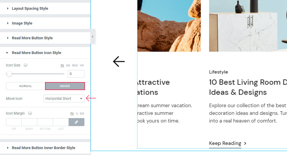
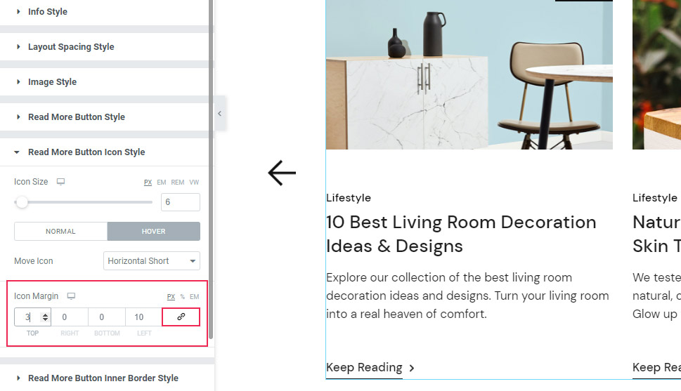
The Icon Margin option lets you adjust the values for the space around the icon.
We’ve delinked the fields here (to adjust each side separately) and added 3px at the top and 10px on the left. We’ve kept the rest at zero pixels.
The Read More Button Inner Border Style is currently empty as it’s meant to apply for the button that has an inner border, and our button doesn’t have one.
Read More Button Underline Style
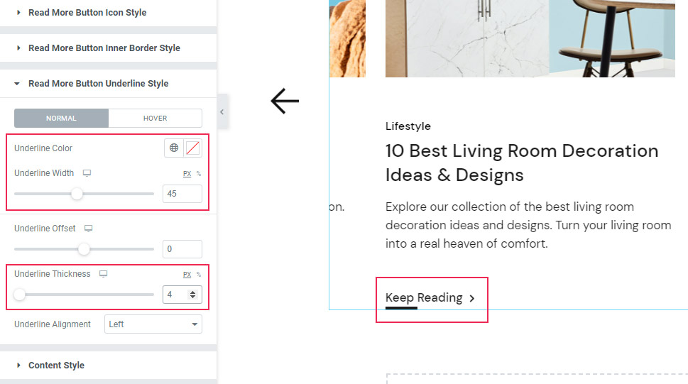
Moving to the section named Read More Button Underline Style. Since we’ve enabled the button text underline earlier, there are options that appear here.
Under the Normal switch, you can change the underline color, if you’d like. You can determine the Underline Width, as well. We’ve changed it to 45 pixels, just to show you what your underline can look like.
You can also set the Underline Thickness – we’ve chosen 4px for ours.
Finally, the Underline Alignment option lets you pick the alignment for the button underline. This option works well if your underline is shorter than the button text.
You can either move it to the left, right, or keep it at the center.
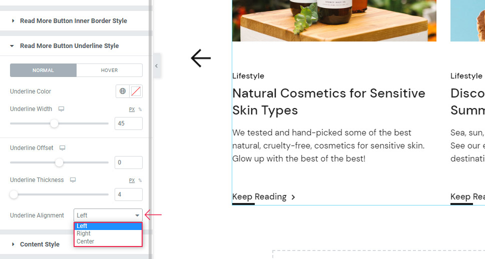
We have reset the previous two options as we’ve done it only to demonstrate properly what they can do for the look of your underline.
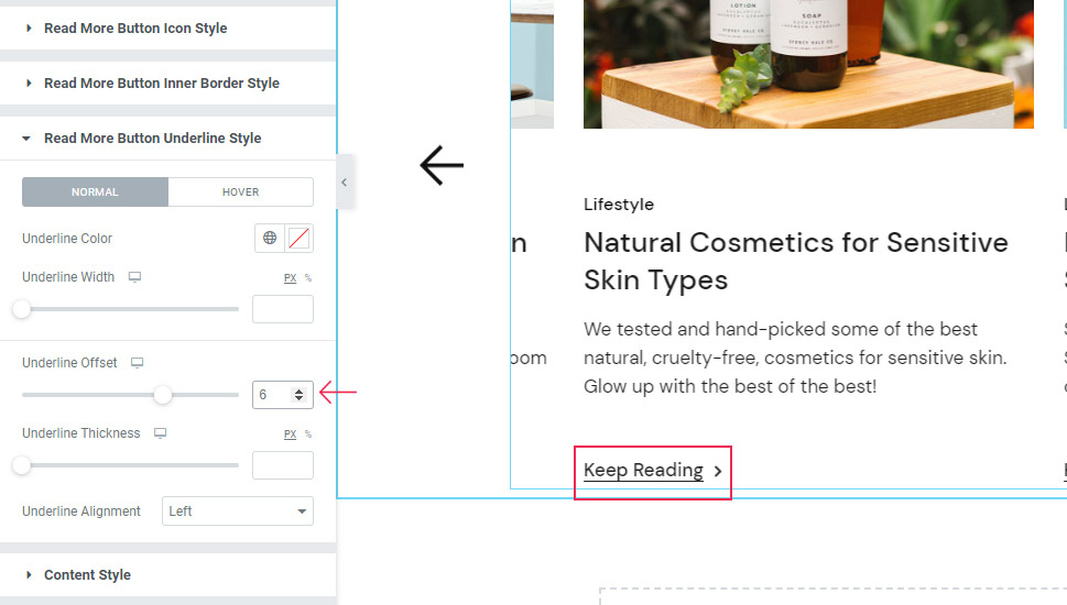
Then, there’s the Underline Offset option. This option serves to determine the space between the button text and the underline. The higher your value, the closer the line will be to the text. We’ve set 6px here.
As for the Hover settings, you can use the Underline Hover Color option to set the new color for your underline on hover.
The Underline Hover Width allows you to increase or decrease the length of the underline that appears when hovered over.
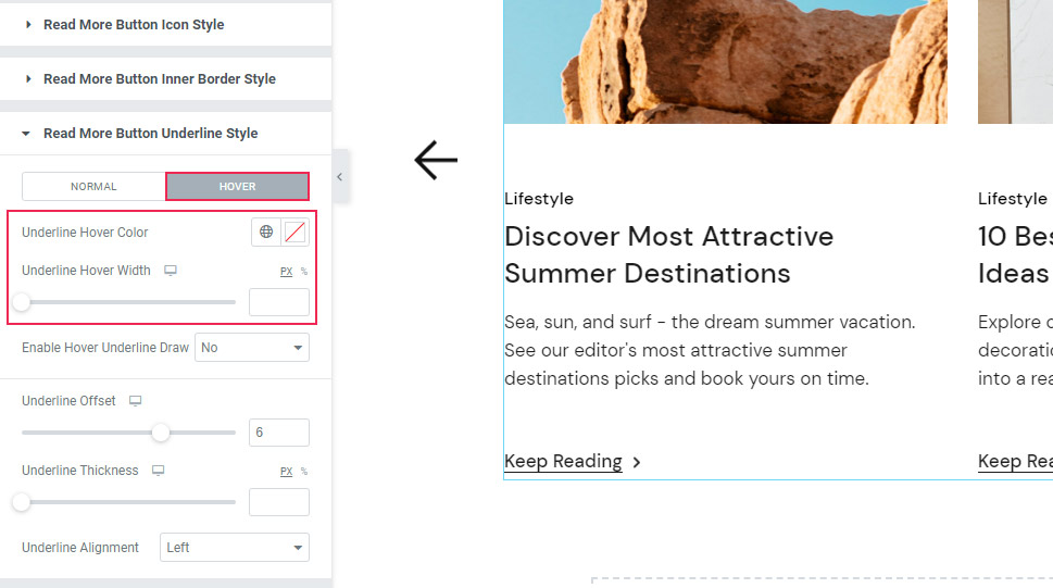
One last option present here is Enable Hover Underline Draw. When switched on, it makes a slight animated effect that makes the line seem drawn upon hover. Like this:
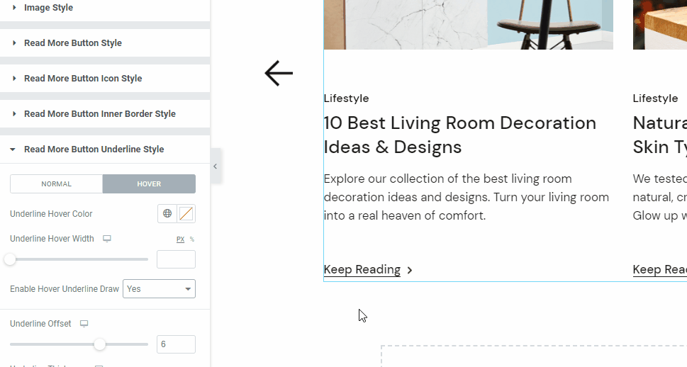
We are going to switch this setting off now as it’s not part of our design.
Date Style Section
The next, Content Style section becomes available only if you use the particular layout for your blog carousel items, so we will return to it a bit later.
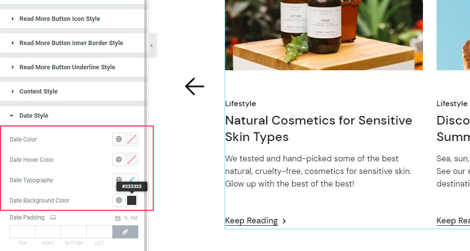
So, let’s look at the Date Style section instead. This section has all the options meant to adjust the look of the date that appears in your carousel.
Here you can change the Date Color and Date Hover Colors. Also, you will get to adjust the date typography (we’ve changed the font size to 15px here), and the Date Background Color option (it will change the color of the box that holds the date).
For the latter option, we’ve added a dark gray color using the #333333 hex code.
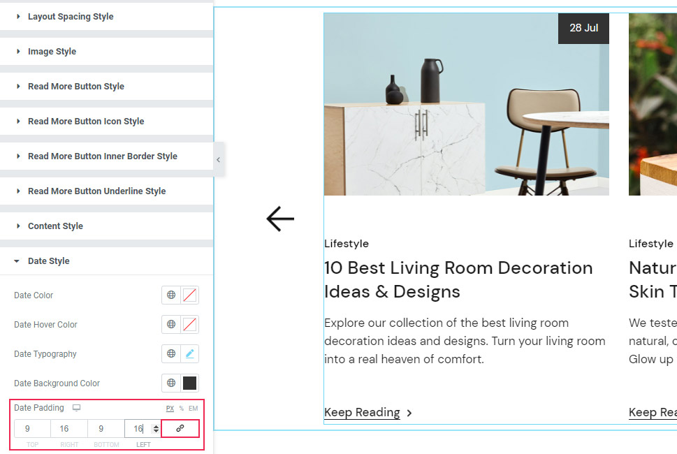
Finally, the Date Padding option lets you create more space around your date. Here we’ve delinked the fields and added 9px at the top, 16px on the right, 9px at the bottom, and 16px on the left.
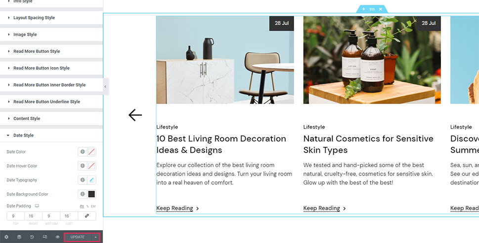
Hit the Update/Publish button if you’re satisfied with the look of your carousel.
This is the final look we wanted to use for ours:
Content Style Section
And one final thing before we go – we did mention we’re going to demonstrate what the options in the Content Style section can do.
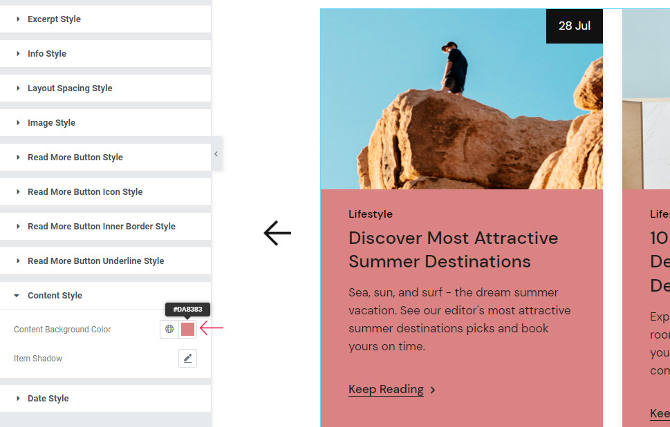
So, we’ve quickly changed the Item Layout (using the Layout section in the Content tab) to Boxed.
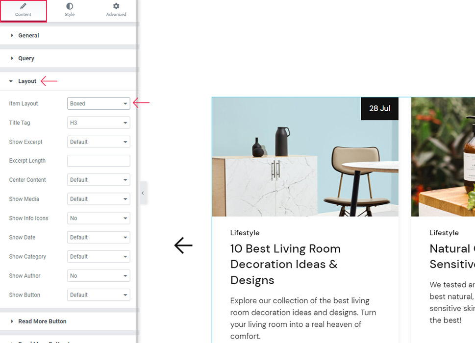
Now, when you go back to the Style tab and choose the Content Style section, you will be able to see (and use) the options there. First is the Content Background Color that appears in the boxes that contain the post singles. Here’s an example of what this option can do for the look of your content:
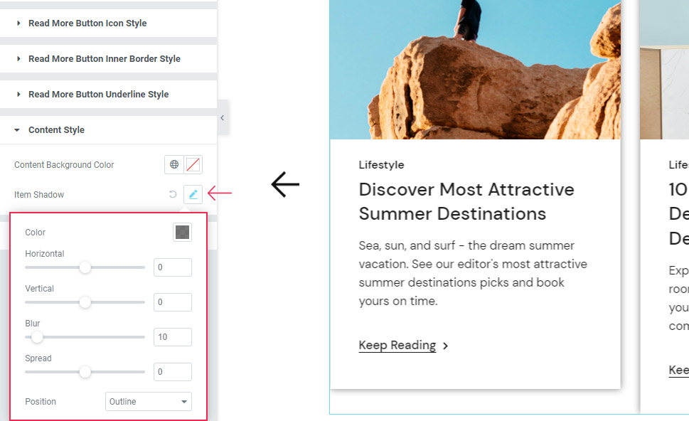
In addition, there’s the Item Shadow option you can use to add the shadow to the content items. Simply clicking on the option automatically adds the shadow. Then, you get the options to adjust it further according to your preferences. For example, you can adjust the Color, Horizontal and Vertical offsets, the Blur shadow setting, as well as the option for the shadow Spread. Last but not least, the Position option allows you to set the shadow within the box instead of outside it.
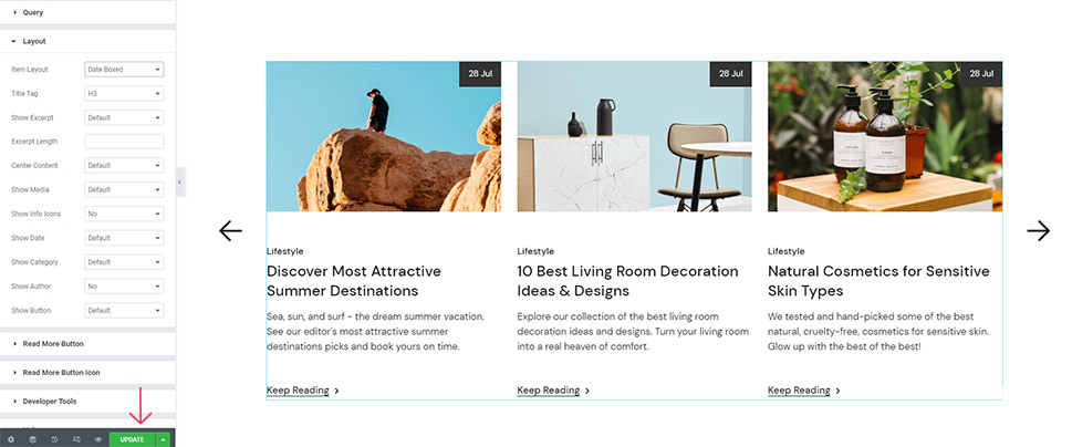
That’s it for the set of options available if you go for the Boxed Item Layout.
While we are going to switch back to the previously styled layout for our design (Date Boxed), you can pick whichever layout you like for your own blog carousel.
Once again, make sure to hit the Update button when you’re done.
Wrapping Things Up
And we’ve reached the end of our tutorial on how to create a blog carousel using the Qi Addons for Elementor’s practical Blog Carousel widget. If you make sure to go inspect each option we presented in this tutorial, then you should have a pretty good idea of what you are working with and should be able to customize your own widget according to your preferences in no time.
You can either go for the design we created, find the inspiration on the official widget page, or go ahead and use the detailed options we presented in this tutorial to customize the design of the carousel that is entirely unique and corresponds with your own design vision. In that case, you should feel free to play around with the different content and styling options, experiment with slider layouts and customize the buttons, icons, and the rest of the content items to create the design of the blog carousel that best works for you.
