How to Add an Icon With Text in WordPress
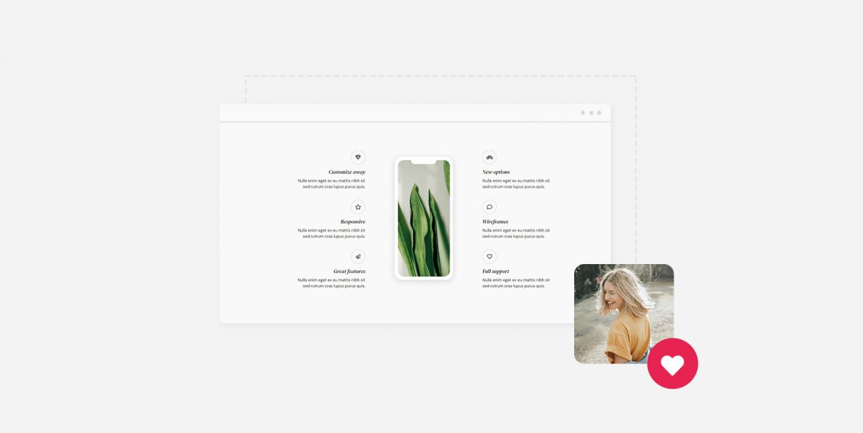
Icons and text, each in its own right, have strengths and flaws that make them a perfect pair when creating a website. An icon alone might be too ambiguous, without any context or fixed meanings. Text might look bland, and it certainly won’t attract that much attention. Put the two together, and you’ll get the best of both worlds. Often, you’ll see the pairing when listing features, services, or any other elements that need to be shown as distinct, yet a part of the group.
This pairing is so prevalent that a lot of premium themes come with a shortcode to quickly insert an icon with text as a design element. If your theme doesn’t, don’t worry. Thanks to Qi Addons for Elementor, the web’s biggest collection of free Elementor addons, you’ll be able to add all the icons with text you need in no time. All you’ll need is Elementor and the Icon with Text widget.
Need some inspiration to help you get started? No worries. Here’s a video showing how you can easily create a group of icons with text just like the one we have on the widget’s page:
If you prefer to read about it, this article will take you through the steps we took to create a nice display of icons with text. Hopefully, you’ll use what you read here to create some amazing designs on your own website!
We’ll cover:

The first step to adding icons with text in WordPress using the Qi Addons for Elementor plugin is to download and install Elementor. As one of the world’s foremost page builders, you might already have it, but if you don’t, simply download and activate it.
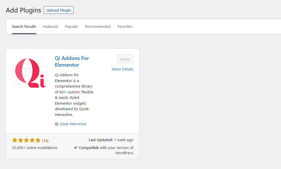
The next step would be to download and activate Qi Addons for Elementor. You can do so by going to Plugins > Add New, searching for it, and installing and activating it once you see it in the results.
With that done, the best way to get familiar with the widget would be to navigate to a page where you might consider adding an icon with text and – getting to it. For our part, we created a three-columned section because we’ve ended up creating three icons with text. Simply searching for the widget and dragging it to the leftmost column did the trick – we had our first icon with text ready for editing.
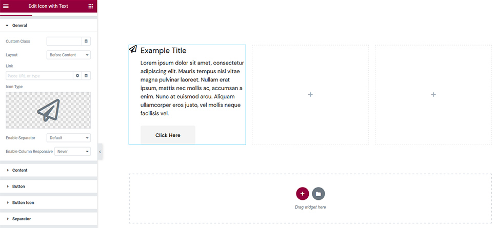
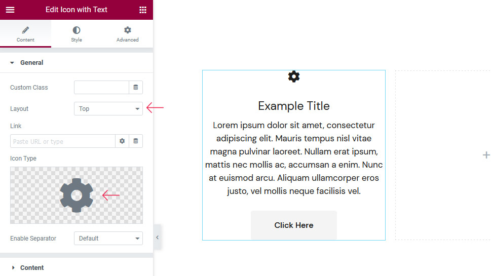
The Content section of the plugin option has a lot of tabs in it, but don’t worry – it only means you’ll be able to customize your design to fine detail. The first tab, General, is where you might go to choose the layout of the icon and text, whether you want to add a link to the icon, and some associated options.
This is also where you’ll choose the icon type you want to use, whether to use a separator or not, as well as some column responsiveness rules. The first change we’ve made was to switch to the Top layout. We changed the icon to the Cog icon that was included in the icon library, and we were ready to move on.
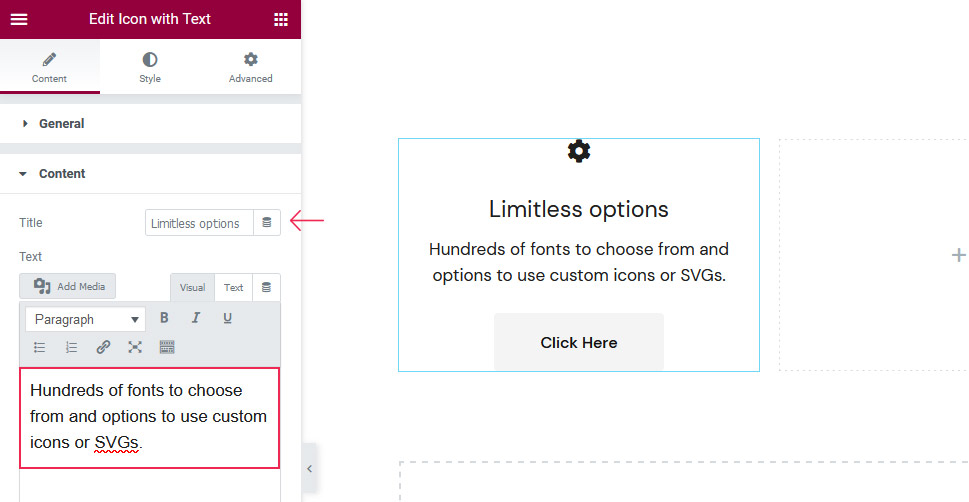
The Content tab is where you can change the tile of the text in the column – or remove it altogether – as well as change the text itself and apply some limited styling options. You’ll also get the chance to choose the text alignment.
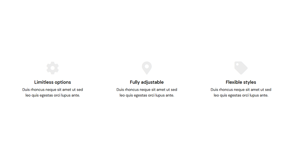
The title we’ve given to this icon and text combination was “Limitless options.” We’ve switched the text to “Hundreds of fonts to choose from and options to use custom icons or SVGs.”
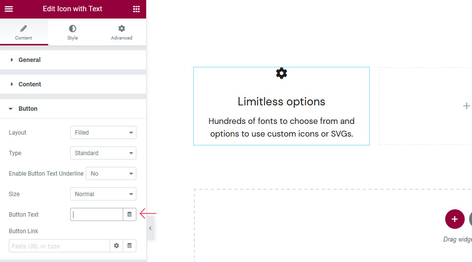
The Button and Button Icon tabs are where you’ll be able to choose how you want your button to look, how large it should be, whether it should have an icon and where, as which link should it point to.
The most interesting option in these two tabs is the Button Text option in the Button tab. By erasing the text, you can completely remove the button. That’s how we did it.
The remaining tabs in the Content options deal with the separator and the appear animation. You’ll be able to choose the layout of the separator, its position, border-image as well as icon. You’ll also have the option to switch between different animation styles and set their delays.
Since we didn’t use a separator in creating our icon with text, and we didn’t want to include animation, we’ve nothing left to show you in the Content section and can move on to see the Style options.
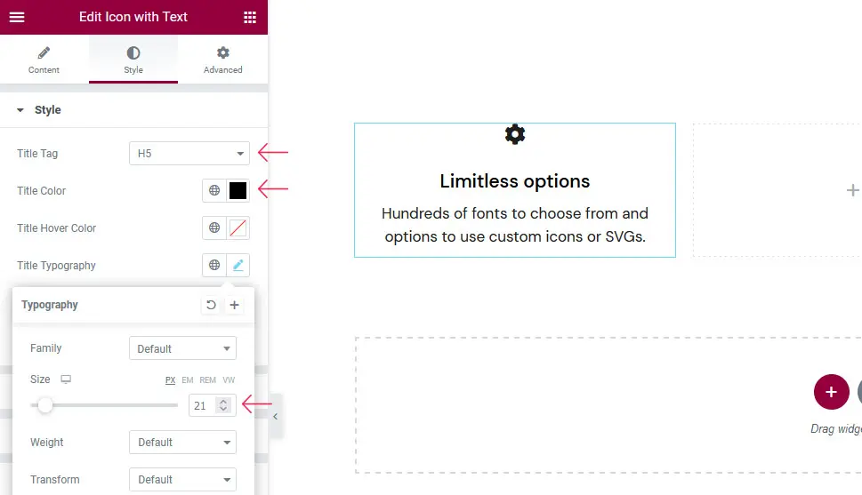
When styling your icon with text, the Style tab will be the first one up. The options you’ll find there will let you choose the title tag, the regular color of the title, and the color on hover, as well as title typography options such as font, size, and weight. For the text, you’ll be able to choose the color and the typography option.
We’ve made some minimal changes to the defaults here. We’ve changed the title tag to H5, the title color to black using the hex code #000000, and we’ve set the size of the title to 21 pixels.
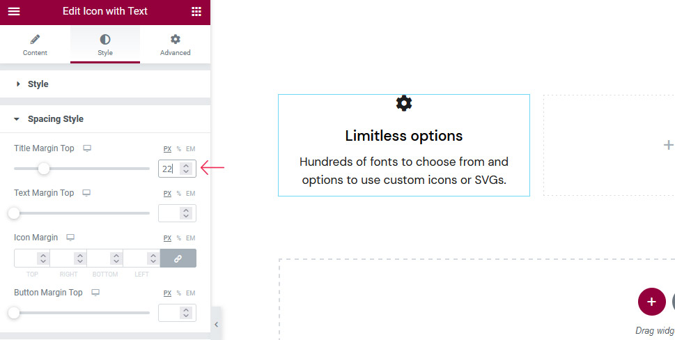
In the Spacing Style tab, it’s all about setting margins. You’ll be able to choose the title margin top, the text margin top, the margin around the icon and, if you have a button, the button margin top.
We again opted for minimal change here by setting the title margin top to 22 pixels.
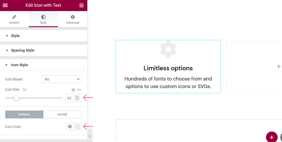
In the Icon Style tab, the options you’ll see will vary greatly on whether you want to put your icon in a box or not. If you do, you’ll be able to choose a variety of options for the shape, size, and color of the box. If you don’t, you’ll be limited to the options that deal with the icon itself – its size, color, and animation on hover.
We’ve opted against putting our icon in a box. We changed the size of our icon to 60 pixels, though, and its color to #ececec. On hover, we’ve given it a slight vertical movement.
The remaining tabs let you do great things with the looks and styling for the buttons, button icons, borders, underlines, separators, and separator icons. We’ve opted against using any of those elements in our design, but if you choose a different path, know that here you’ll find all the size, color, margin, and hover options you’ll need to make your icon-and-text’s buttons and separators pop out.
The final touch involves duplicating the design we’ve created and making some changes to it. This ability to simply duplicate a design with all of its options comes in great after you’ve spent hours perfecting the settings on one element, and then you need to repeat it on a couple of others but with just slight alterations.
To duplicate the design, we’ve right-clicked on it, chosen the duplicate options, and done it once again. Elementor will stack these duplicates under the original – simply drag them to their columns.
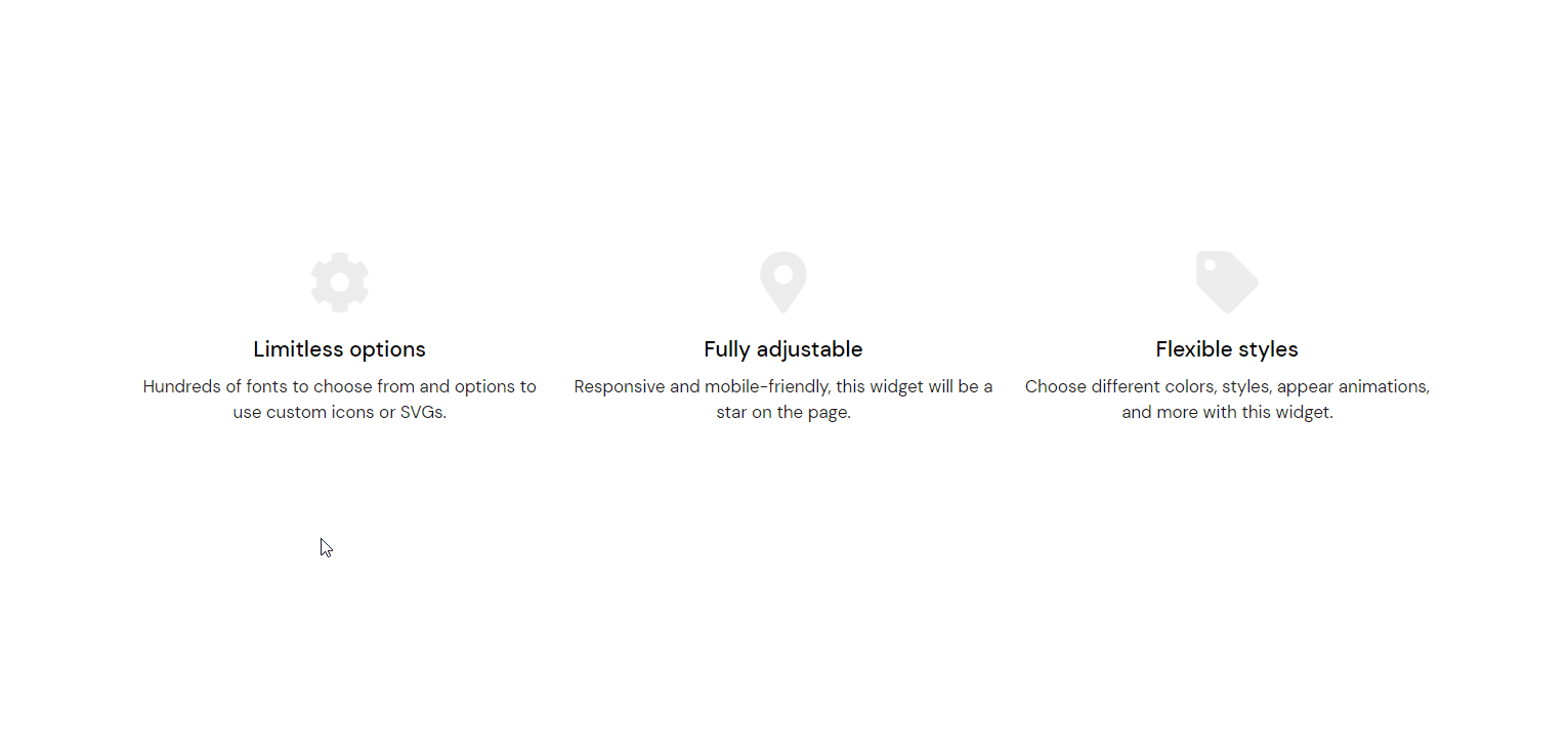
The remaining thing to do is change the icons, the titles, and the text. We’ve changed the icon of the middle one to Map marker alt, its title to “Fully adjustable,” and its text to “Responsive and mobile-friendly, this widget will be a star on the page.” The third one got a tag for its icon, “Flexible styles” for the title, and “Choose different colors, styles, appear animations, and more with this widget” for the text.
Let’s Wrap It Up!
Thanks to Qi Addons for Elementor, adding interesting and useful designs to your website, such as the icon with text, can be easy and interesting. There’s a variety of options you can choose from – many more than the ones we’ve explored in this demonstration, and you should feel free to explore them all and find the best combination of elements this addon offers.
