14 Examples of Gorgeous Skincare and Beauty Websites
Much like the food industry, cosmetics is a field that relies as much on the visual as it does on the substantial (the ingredients, the actual product quality, etc). Today, if you want to make it in the cosmetics, skincare, perfume or makeup industry, you have to build and maintain a rock-solid brand, above all. Visual communication is key, especially for those aiming to advertise and sell digitally. If we can’t smell or feel a product, how can we decide to purchase it? That’s why it is vital to have a strong message, both visually and otherwise, that will contain everything a prospective buyer needs to know about the product, communicated through visual storytelling. The skincare and beauty websites we’re going to visit today all have a compelling story to tell, and stunning design solutions to match and support it. Here they are:
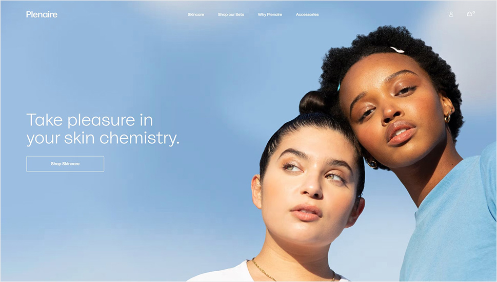
Following the trend of focusing on individual skincare needs and utilizing only natural, carefully chosen ingredients, Plenaire offers a line of products created to help people learn how to indulge in themselves. The design of the website is based on airiness and beautiful blue, lilac and gray tones that, combined with white space, communicate a clear message of wellbeing and health. A particularly lovely touch are fine, discrete dots that float around the screen, reflecting the speckled pattern that is featured on most of the product packaging.
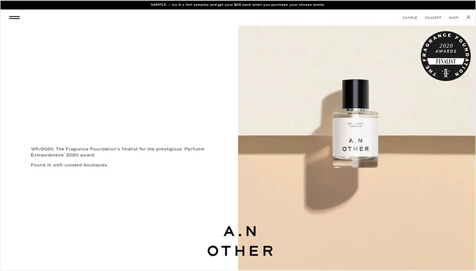
The niche perfume market is known for quite intense brand strategies, focused around meticulously created brand stories. A.N. Other is a fragrance manufacturer that built a powerful, one could perhaps even say revolutionary strategy – they stripped away the narrative completely, both visually and otherwise, allowing the excellence of the product to speak for itself. By ignoring the branding side of the business, they achieved more flexibility in terms of expensive ingredients, basing their production on the most exquisite components and supreme craftsmanship. But enough about the product, let’s take a look at the website. The design concept is simple, elegant and striking. It is based on large, clean sections of text and imagery, interchanging along the page, in a monochromatic palette skillfully broken by occasional touches of warm pastels. It reflects the brand philosophy of minimalism and focus and creates a rather flattering effect.
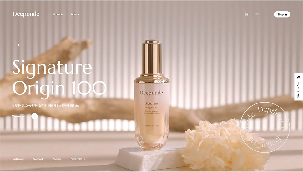
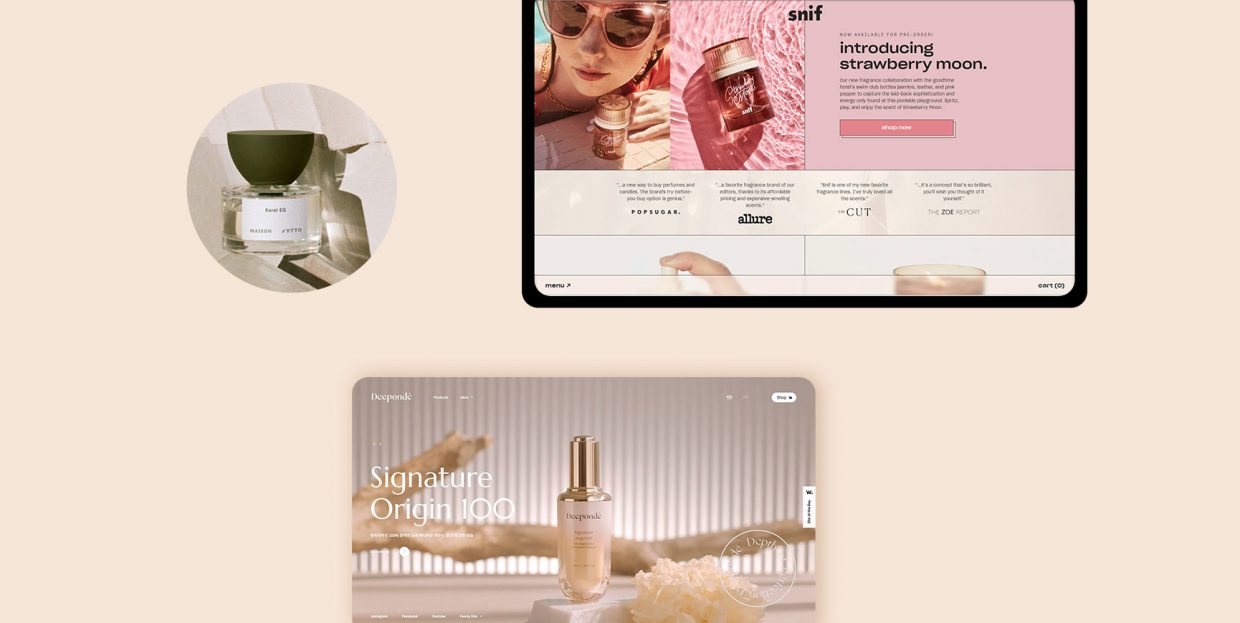
“Deep ponder” is the main idea behind the Korean beauty and cosmetics brand Deepondé. The brand invites us to dive deep into ourselves and ponder what it is that beauty means for us. The homepage is centered around a full-width video section with stunning footage that associates nature and its life-affirming processes with the natural beauty of our skin. The interface is clean and minimalist, allowing the imagery to take center stage, while at the same time supporting the brand philosophy.
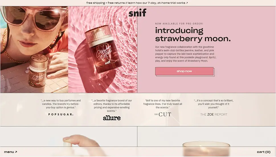
Passing to somewhat more saturated atmospheres, we come to Snif, a luxury scent brand that aims to break with old industry traditions by offering top-grade, exquisite products that don’t break the bank. Sniff offers 7-day trials for their scent kits, allowing the clients to actually get to know the fragrances before committing to a purchase. The website sports a very modern look based on select vintage elements (the colors and the typography, mostly), sharp grid lines and geometric sections in various proportions. While the grid and the palette communicate a sort of design seriousness, the brand made sure to add a few playful touches, like the marquee and the cookie popup, and there are even some brutalist details cleverly peppered around the pages.
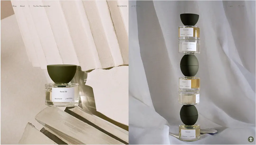
Another luxury brand of artisanal fragrances with a sharply defined philosophical, somewhat individualist approach, Maison D’Etto proposes five pillars of connection to self, the world and the others. Through them, it aims to instill individuality into its luxury fragrances, empowering the clients to explore what each fragrance actually means to them, and them alone. While promising to steer clear from any form of suggestion of interpretation, the brand still delivers a thoroughly crafted visual message through its website. If we were to judge from the layouts, the color choices and the typography, we would be inclined to assume the fragrances pack a soft but elaborate character, unobtrusive and even somewhat veiled, with a hint of nostalgia. The website is very atmospheric, appearing as if beneath a fine sheer curtain, a bit dreamlike, but airy and pleasant.
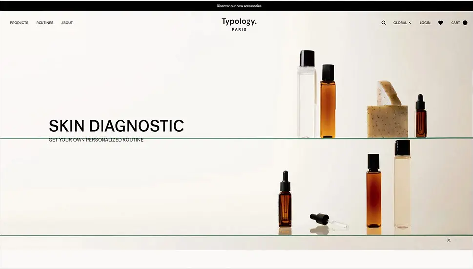
Elegant, minimalist and with just the right amount of contrast, the website of the French cosmetics brand Typology communicates a serious approach to skincare with a strong focus on style and aesthetics. The minimalist vibe is built using basically just black (occasionally gray as well) for the interface elements, and the visual content provides warmth through amber-colored bottles. The clean, airy sections with products and text are interrupted only by a full-width video section that balances the mood with vitality and dynamicity.
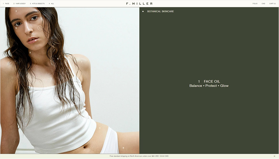
F. Miller is a Canadian brand of clean, botanical skincare. Their line of products is not exactly cheap, but it is developed with the utmost care for every single aspect involved – from extensive research and nutrient-dense ingredients to sustainable manufacturing and ethical business. Aesthetically, F. Miller is all about minimalism, both in product and in web design. The simplicity of the packaging is reflected in the clean, geometric, grid-based layouts of the website, with minimalist black typography that mirrors the white bottle labels. Thanks to white, airy backgrounds and geometric sections, the interface is easy to navigate and instills a sense of freshness.
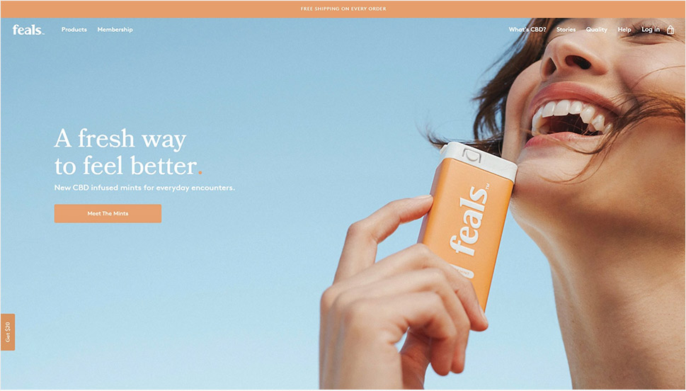
Feals is a US-based company offering balanced CBD products – oils and mints – in a range of strengths. The products are meant to help with anxiety, ease pain and boost sleep, as most CBD products do. The company goal is simple: to make people feel better. And the website reflects this with a smart choice of colors. A soothing sky-blue opens the homepage, combined with a lovely warm orange that promotes joy and optimism. Some of the sections feature a very pale pink background, another soothing hue, white interface text adds a touch of airiness and dark gray text provides a welcome contrast. It is a well-balanced, pleasant design that does an excellent job at communicating the brand mission.
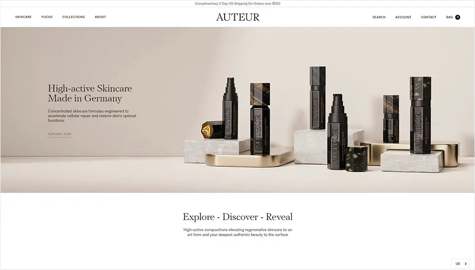
Auteur is a German luxury cosmetics brand with a range of high-active products for repair and rejuvenation. The website design reflects the elegance and sophistication of the brand’s product packaging, but in a lighter, airier vein. Monochromatic interface elements create a lovely balance with the white and gray backgrounds that carry a touch of purple, while the amber and turtle shell in select imagery hint to a more intense, passionate component of the brand. The serif PF Regal typeface is an excellent choice for the titles here, as it carries a distinct elegant feel, and the sans-serif GT America provides for legibility and functionality of the rest of the textual content.
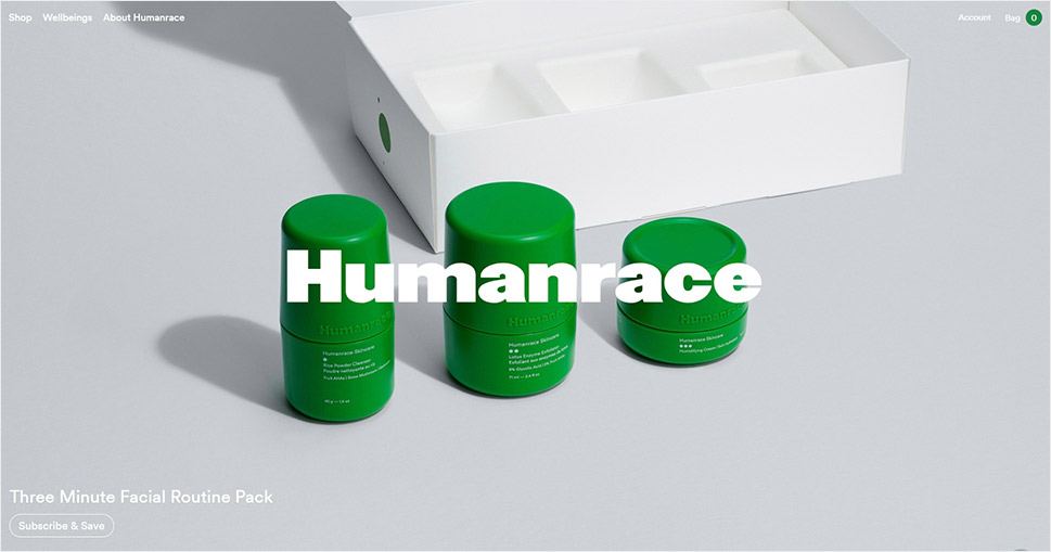
Taking better care of ourselves means taking better care of others – this is the credo that famous musician and producer Pharrell Williams pursued when he founded Humanrace, a wellness product company that has the goal of making wellness accessible to everyone. While not necessarily as happy-go-lucky as the musician’s stellar hit Happy, Humanrace does carry an air of decisive optimism. A lovely, life-affirming forest green is the main color here, featured in product packaging, as well as in the website logo and select interface details. This color pairs wonderfully with white, light gray and blue that dominate this simple, yet effective design.
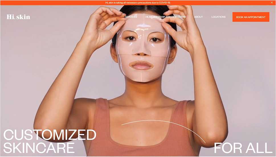
Hi, Skincare is a beauty salon chain based in Arizona that offers personalized skincare services including facials and product recommendations. Their focus is both on the excellence of service and on affordability, with the goal of helping everyone reconnect with their skin and start a journey to rejuvenated and improved skin. The website is marked by a gorgeous combination of deep bright orange with lilac and mauve, creating an atmosphere that is both warm and lively, and a bit vintage. The interface is made up of large full-width sections (including video sections) combined with sections in grid, which contribute to a dynamic yet balanced feel of the page. Occasional bold details, such as orange CTAs, animated icons and SVGs, serve as sort of fresheners of the otherwise rather clean layouts and large typography adds a modern touch to the website.
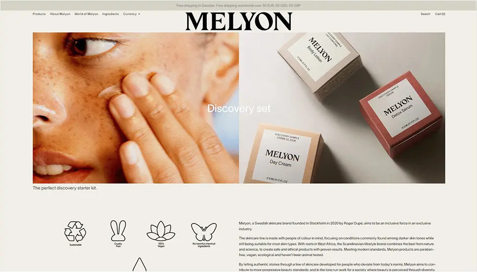
Aiming to become “an inclusive force in an exclusive industry,” the Swedish skincare brand Melyon offers sustainable, cruelty-free, clean products made with people of color in mind. The practical, functional website layout is designed for seamless shopping UX, with neatly divided sections. Split sections with full-width images and videos add dynamicity to the experience and help reinforce the brand message, the one about inclusivity, dignity, diversity and empowerment.
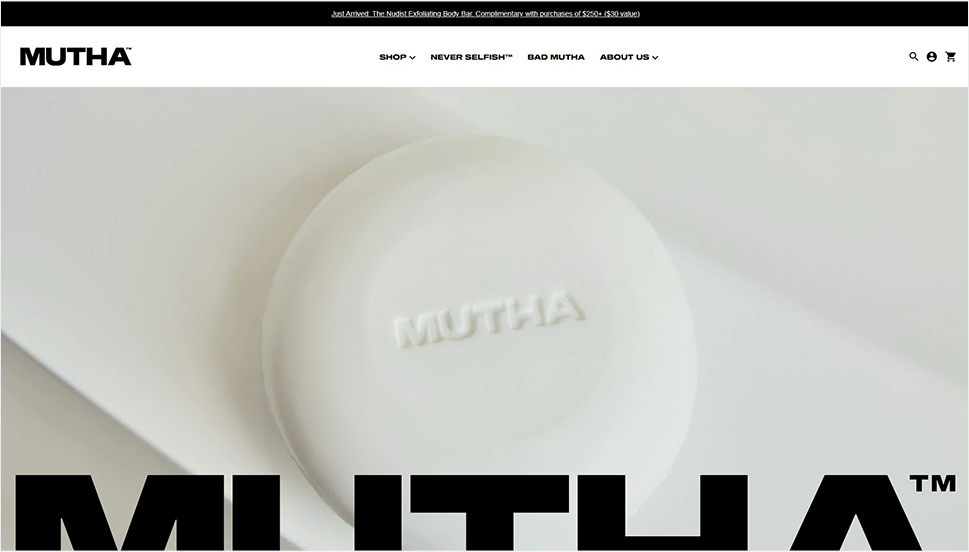
Similarly to Typology, the US-based cosmetics brand Mutha employs a stripped-down, monochromatic palette, with ample use of grayscale, moving perhaps even further than the conventional skincare aesthetics (which is often based on soft tones, pastels and feminine hues). Mutha is a brand with an attitude and a loud, important message. Stressing the fact that our bodies need and deserve care because what they do is so important, Mutha offers a range of high quality products made with top ingredients. The products all come in uniform metallic blue packaging, which gives the shop pages a unique and impressive look. The bold, irreverent character of the brand is perhaps best embodied in the choice of typography – large and occasionally very large Sequel Wide font combined with Sequel Sans, sometimes so large it almost hampers the legibility.
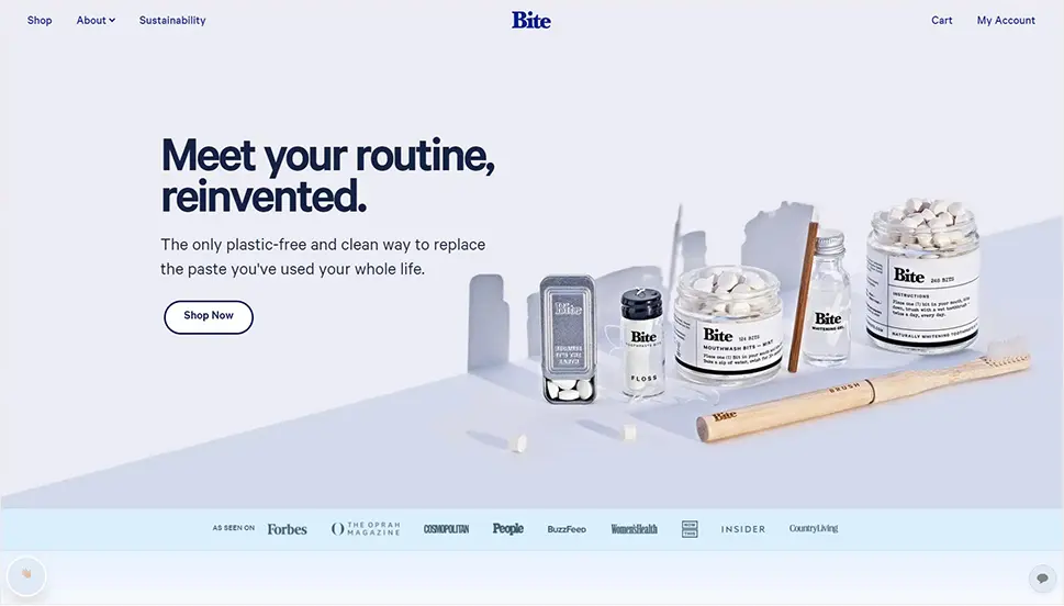
Sustainability, eco-friendliness and ethical approaches to manufacture are some of the principles that have been gaining momentum across all industries over the last decade or so. Bite is one of the brands that did a wonderful job at taking something everyday and simple, specifically – brushing, and making it right in terms of environment. Bite offers dental hygiene products that are sustainable, clean and completely plastics-free. For instance, they sell toothpaste that doesn’t come in a tube. Instead, the paste comes in the form of single-use drops in a glass jar. Bite also sells whitening fluid, mints, deodorants and other products for everyday use – all 100% sustainable. The website features a combination of contemporary, clean design with plenty of breathing room and more playful, 1990’s-style details, emojis and buttons with rounded edges, which lends the brand a modern, hip feel.
Wrapping It Up
If we were to map out some of the common design denominators in the websites we’ve just visited, storytelling would have to be among the obvious ones. Many (if not most) cosmetics and beauty websites rely on this tool for winning the customers over. And the niche is very suitable for it, too. Whether through a careful selection of visuals (both images and videos) with a strong appeal to our senses, or through a meticulously planned page architecture, we’ve all been told some very pretty stories by these websites. And they stuck. Which means they’re done right.
Another thing we can notice here is the color play. We haven’t seen many bold and vibrant colors in these websites, or overly sugary pastels either. Chromatic exploration is, therefore, another trend that has been marking the skincare and beauty industry. We’ve seen a lot of monochromatic or grayscale designs, broken up by occasional, carefully selected color details. We’ve also seen vibrant, loud colors in places where we’d expect to see baby pinks and blues. Experimentation of this sort is always good as it helps us break away from stereotypes and tell more compelling stories that really resonate with their audience.


