Top 13 Winery Websites Made With Qode Themes
The process of winemaking is a fine art that requires experimentation to find the perfect combination of aromas, flavors, and textures that all give the wine its unique personality. Wine lovers appreciate not only the taste of the wine, but also every other aspect of it – from the colors to the bottle shape and design all the way to how it is labeled and marketed. Which is why it is so important to have a beautifully designed and professional website for presenting and selling wine.
Winemakers can use the power of the internet to showcase everything about their business and inspire potential customers to buy their high-quality wines. They should make sure to add elegant and striking product pages to share information about their wines down to the finest detail. This also includes talking about their tradition, their winemaking process, and of course, displaying attractive pictures of their wines and vineyards. User testimonials are another important element often found on winery websites that can help build brand reputation and strengthen credibility.
To craft a beautifully designed and professional winery website, the first thing you need is a quality winery theme. For this reason, many reputable winery businesses across the globe chose Qode themes to create their stunning websites. This time around, we will share a list of websites that serve as a great example of how you can successfully present your own wine production business using Qode themes. The websites we will talk about are:
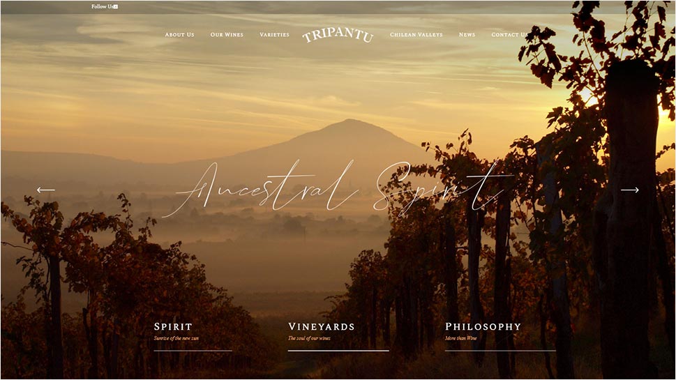
Tripantu website made with the Aperitif theme
Tripantu is a family-owned business from Chile dedicated to producing high-quality wines. Their website was built with Aperitif, a theme perfect for wine shops and passionate winemakers. They’ve made full use of Aperitif’s Main Homepage template, starting off with a fullscreen slider that features beautiful warm-colored images that lure you into the world of wine right away. Elegant beige sections contain more information about their history, while an embedded video serves as a great introduction to what they do. They’ve also chosen to present their assortment of wines using the theme’s practical product list shortcode. Clicking on each product will lead you to a separate product page where you can find out more about a particular wine you’re interested in. Also worth mentioning is their Varieties page. This is where they used the theme’s team shortcode to display images of different Chilean wine types along with additional details below each image.
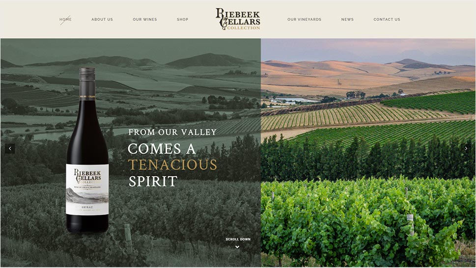
Riebeek Cellars Collection website made with the Thelma theme
Built using the lovely Thelma theme, the website of Riebeek Cellars Collection is truly a sight to see. It consists of a fullscreen slider and large images of their wines that elegantly appear on the screen thanks to the theme’s smooth animation effects. The menu items in the header also have an interesting crossed-out effect upon hover. Beige-colored backgrounds combined with the subtle brown shade they used for the text only contribute to the sophisticated look of the entire page. The Our Wines page is especially well-made, with rows of elegant images of different wine bottles and more info on the side that allows you to get fully introduced to what they’re offering.
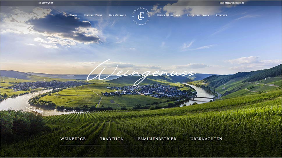
Weingut Eifel website made with the Aperitif theme
The Weingut Eifel website was made using the help of the Aperitif theme. Their homepage is a well-balanced mix of clean sections and galleries filled with images of the gorgeous green scenery of their vineyard. Their Awards page uses the practical image with text shortcode to display some of their many awards, further helping them present their wine brand as reliable and trustworthy. A light-grey footer area located at the bottom of each page offers some useful links and their contact information.
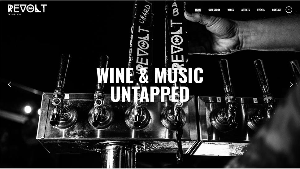
Revolt Wine Co. website made with the Noizzy theme
Revolt Wine Co. is a wine company that serves their wines at different concert venues and band meet & greets, which is why they’ve chosen the Noizzy music theme to convey the bold and urban vibe of their brand. A fullscreen slider with monochrome images leaves a strong impression right from the very beginning, followed by black-and-white sections and buttons that lead straight to their About and Wine pages. Each page is designed in a similar monochrome fashion, which helps emphasize the company’s message to rebel against tradition and stereotypes. They’ve also added an informative Team section to their “Our Story” page to showcase their team members, as well as a video featuring the owner herself telling the story of how it all started. Noizzy’s blog list shortcode is used to showcase articles related to some of the national and emerging headliners. Clicking on a specific artist will lead you to a blog single page that features an interview with the artist in question. You will also get to learn more about Revolt’s wines and browse through their Events page built using the theme’s events list shortcode.
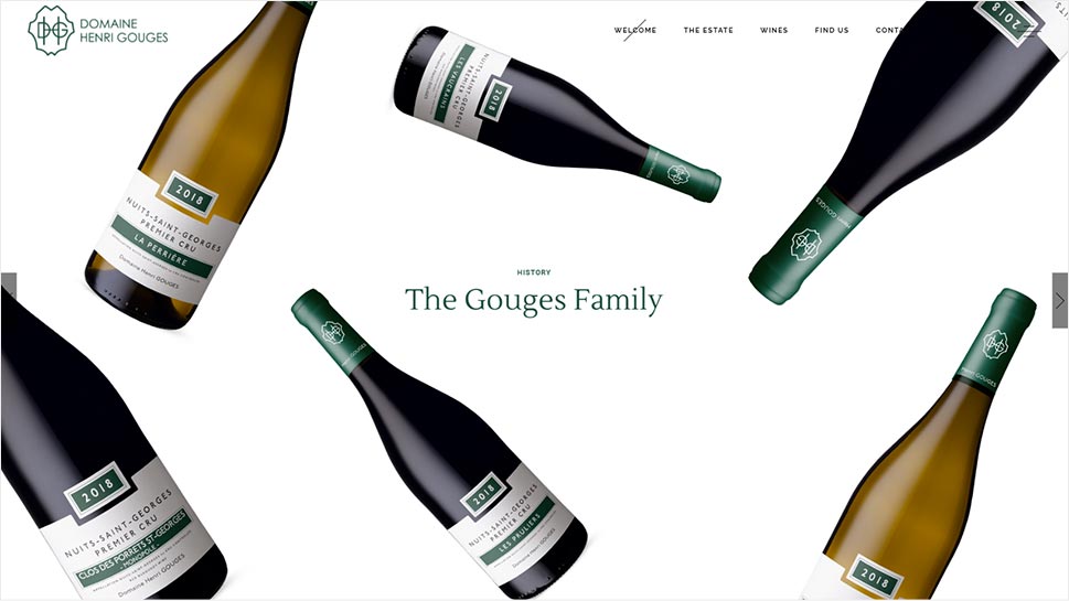
Domaine Henry Gouges website made with the Thelma theme
Using the Thelma theme’s Main Home template to build their homepage, Domaine Henry Gouges have succeeded in creating a nice introduction to their family winery business. Rows of icons with text offer plenty of information about the climate and methods they use to make their wines, while a roadmap shortcode showcases some of their history and offers a glimpse into their wine-making tradition. There is a carousel slider near the bottom of the homepage that shows images of their wine bottles from various angles. The Wines page is built with the theme’s practical portfolio list. You can choose to view all of their wines or list them by category.
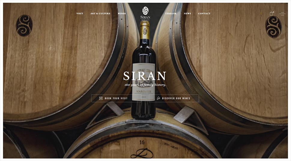
Chateau Siran Margaux website made with the Thelma theme
The website of the Chateau Siran Margaux winery makes the most out of Thelma’s captivating fullscreen animated slider to introduce their business. The homepage looks well-organized and smooth on scroll, with plenty of airy, white sections that contain more info about the winery’s tradition and know-how. The beautiful parallax images that appear in between create a nice contrast as you scroll down. One parallax section in particular looks captivating as it also contains the theme’s informative roadmap shortcode which reveals more about the history of Chateau Siran Margaux. You can learn more about their different harvests and collections by exploring the pages they’ve created using Thelma’s premade inner page templates.
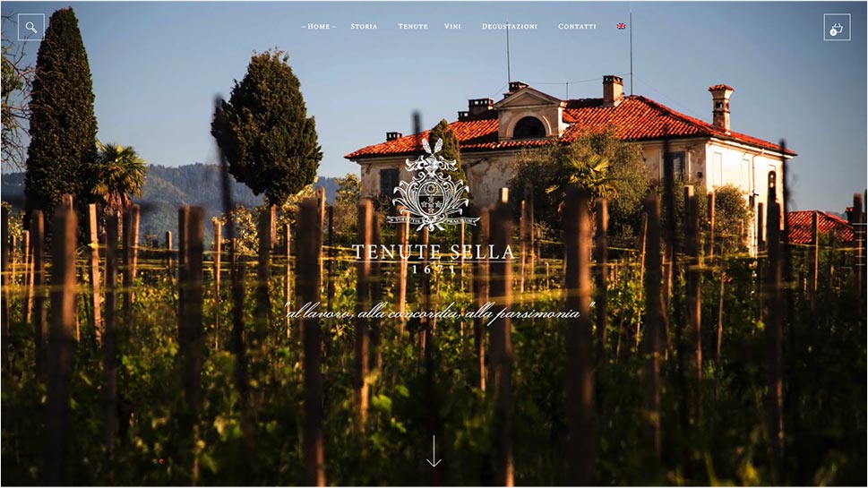
Tenute Sella website made with the Aperitif theme
The designers of the Tenute Sella website used the Aperitif theme’s fullscreen showcase to display stunning pictures of their vineyard and captivate visitors right from the get-go. Actually, the whole page consists of one fullscreen slider, and users can scroll through the slides to find out more information about the Sella family and see a preview of their products. A simple white menu at the top can be used to learn more about their wines, tastings, and more. Their Wines page is built with the help of Aperitif’s three-column shop layout. The entire page has a dark background contrasted with brightly colored pictures of their wines, which helps accentuate their wine selection quite nicely.
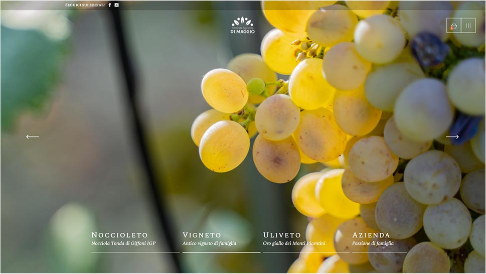
Azienda Agricola Di Maggio website made with the Aperitif theme
A fullscreen slider, an image gallery, and a product list shortcode are just some of the instantly noticeable elements that can be found on the Azienda Agricola DiMaggio winery’s homepage. They’ve used the Aperitif theme’s practical and beautifully designed sections to display some info about their history, their wine, and their extra virgin olive oil. The Casa Rezzaro page contains a carousel slider with beautiful imagery of their grapes and vineyards. They’ve also used the theme’s elegant workflow shortcode to talk more about their ancient vineyards and their production process. An Instagram list at the bottom allows you to visit their Instagram page by clicking on one of the images. Their menu is hidden from view in a side area and can be accessed using the hamburger icon located in the top right corner of the screen.
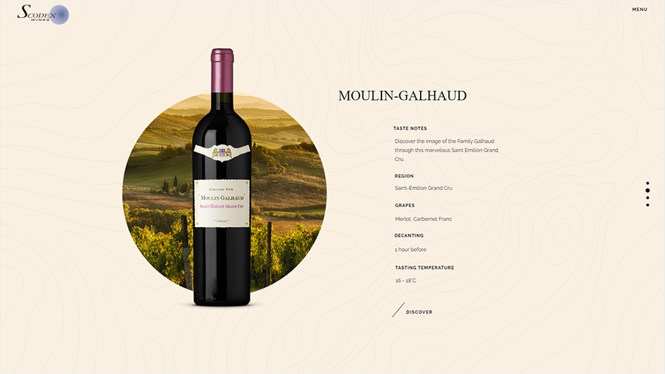
Scodex Wines website made with the Thelma theme
The creators of the Scodex Wines website decided to use the Thelma theme’s stunning Wine Presentation template for their homepage. There is a slider containing picturesque visuals of their vineyard, along with bottles of different wine types and more info about each wine on the side. You can instantly learn more about each harvest, taste notes, region and even the soil the grapes were grown in. A “Discover” link at the bottom will allow you to view even more information about each product using the theme’s product single pages.
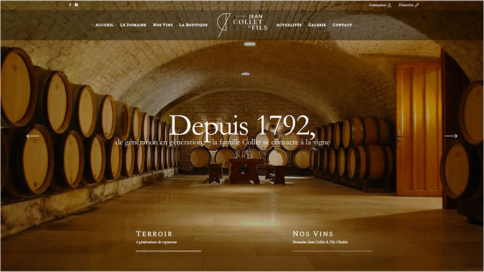
Domaine Collet website made with the Aperitif theme
Domaine Collet opted for using the Aperitif theme’s Main Home template to build their homepage. As you scroll down the page, you will come across a video section that, when clicked on, shows you what their vineyards look like filmed from the sky. The theme’s accordion element reveals more info about their wines as you click through its tabs, while the beautifully designed map shows you the layout of their vineyards. Their homepage also features the theme’s product list with links that lead to separate shop pages. Once you hover over the Domain menu item, you will have access to three different pages you can click on to learn more about the winery’s history, team, and terroir.
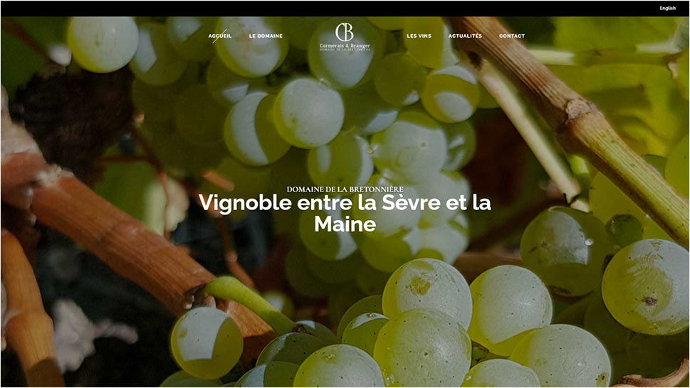
Cormerais Branger website made with the Thelma theme
Cormerais Branger is another winery website that used the stylishness of the Thelma theme to showcase their business. You will see many beautiful sections on their homepage, including the theme’s sophisticated roadmap shortcode, slider images displaying some of their wines, a simple but striking testimonials section, and more. Their Wines page features clickable images that lead you to two separate wine categories. Each one is presented with the help of the theme’s shop list shortcode and allows you to click on each product to learn more.
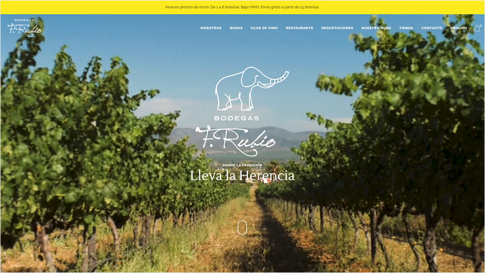
Bodegas F. Rubio website made with the Thelma theme
The Bodegas F. Rubio website used Thelma’s Main Home template for their homepage. The theme’s fullscreen animated slider coupled with various colorful images and clean info sections instantly immerse the viewer into the tradition and history of this family-oriented winery from Mexico. They’ve used a stunning vertical carousel element to display images of the bottles as well as some information about the different wines they have on offer. There is also an elegant shop list shortcode with a vast assortment of wine products that change color and provide more info on hover. Clicking on each product leads you to a separate product single page where you can read a detailed description and add your wines of choice to your cart. Their About page is particularly well-made and comes with a few eye-catching parallax sections and a carousel slider filled with images that illustrate some of the winery’s defining moments. You can also read more about their beginnings and learn more about their winemakers, who are presented using Thelma’s team shortcode.
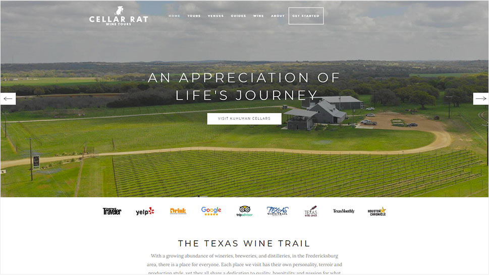
Cellar Rat Wine Tours website made with the Backpack Traveler theme
The Cellar Rat Wine Tours website uses the Backpack Traveler theme’s fullscreen image slider to display some of the scenery and show an enticing preview of what you can expect if you decide to join one of their wine-tasting tours. A slider with links that lead to different tour reviews (from Tripadvisor, Yelp, and many other credible websites), as well as customer reviews presented with the theme’s user testimonial shortcode are a great indicator of the quality of their wine tour services. There is also a Destination list with clickable images that will allow you to learn more about their featured venues. The theme’s horizontal timeline element looks charming, with the names of various destinations presented along with map icons to illustrate the journey you could experience on one of their wine tours. You can click on each destination name to learn more about a particular tour you are interested in.
Wrapping Things Up
As you can see from all the examples above, each one of these businesses has succeeded in crafting a beautiful and professional website that illustrates their passion for winemaking with the help of Qode themes. Thanks to their various elegant home and inner page templates, fullscreen sliders, striking animations, and practical elements such as user testimonials and customizable product lists and singles, our themes have helped these wineries showcase their wine products in the way they deserve.
While most of the sites on this list used themes specifically created for winery businesses and wine shops, there are a few that have opted for using some of the themes from our travel and music collections to present their wine-related businesses and projects. This only serves as further proof of the flexibility and power all Qode themes have and that, no matter which theme you pick, you won’t make a wrong choice. We truly hope this selection of websites helps inspire you to craft a stunning winery website of your own.
