18 Amazing Examples of Industry Websites
The combination of beauty and functionality is probably nowhere more evident than in well-designed industry websites. Most companies in the industry sector want sites that will promote their services, communicate with their audience, help them generate more leads, but also look great at the same time.
As a rule of thumb, industry websites should have a clean design style. Companies usually use imagery and videos to show what their production facilities are like, present their machinery, and demonstrate how their products are made. Their websites include short but precise copy and effective call-to-action buttons. Industry websites are also known for using simple color schemes of no more than two or three colors, as well as subtle animation and transition effects.
Designing a beautiful industry website may seem challenging. More often than not we come across sites that look more like brochures than professional presentations. They usually contain only the most basic information about brands, hoping that will encourage visitors to reach out to them. But there are companies whose sites are simultaneously imaginative, user-friendly, informative, and eye-pleasing. We have selected some of the most impressive examples of industry sites from around the web, to demonstrate just how powerful and effective they can be when done right:
Our Qi Theme for Elementor also features some industry website demos:
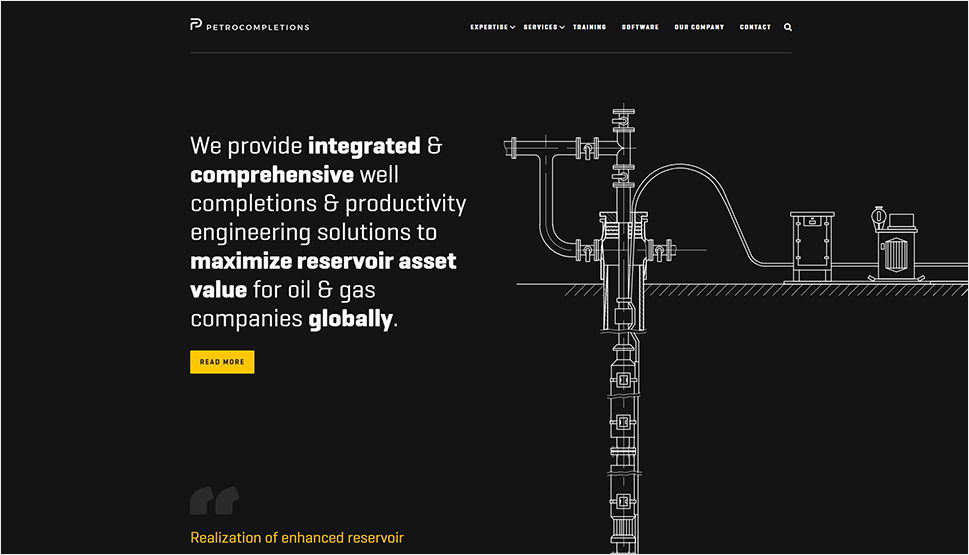
Petrocompletions‘ website looks powerful. On most pages, the background is black, with contrasting white chunks of text introducing you to the company. The site does not contain many colors – the palette is mainly monochromatic, with dashes of yellow used as a highlight color. In terms of imagery, you won’t see too many photos on the site. The well-organized textual content dominates all pages. The chosen font has a somewhat “technocratic” character, with sharper angles and a slightly square look that make it seem more powerful, more industrial. And this is only bolstered by the intricate illustrations and icons throughout the site. This overall approach to design makes Petrocompletions’ website look professional while beautifully accentuating the services they provide. The navigation is clear, fixed, and simple. The sticky sidebar and footer contain practical links, ensuring an effective and easy browsing experience for users.
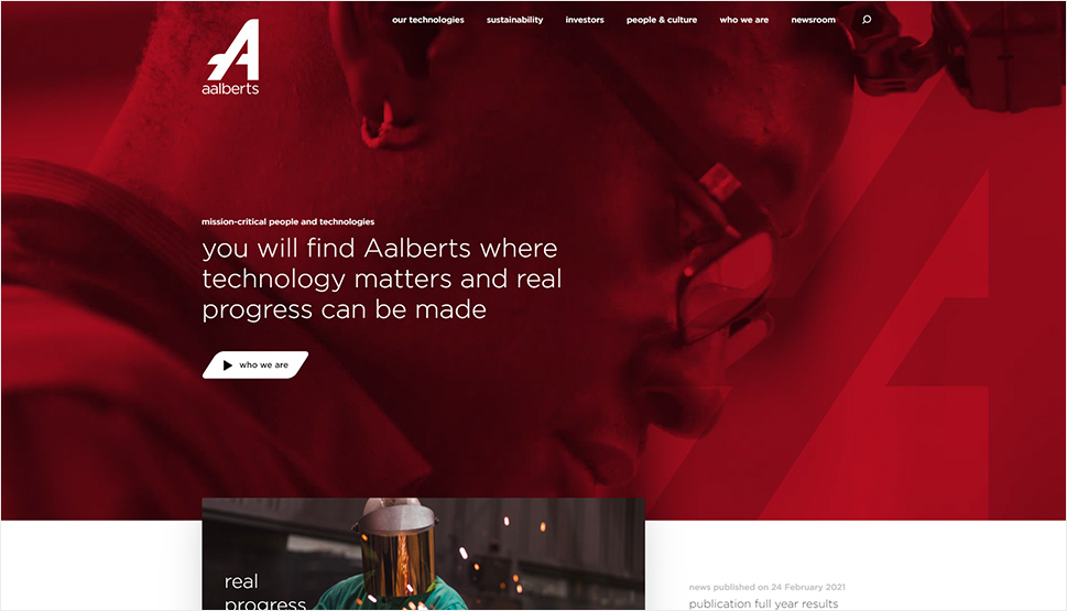
The homepage on Aalberts’ website starts off with a background video that tells the story about this Dutch manufacturer (for a fully immersive experience, you can play the video across the entire screen). The content is well-organized and divided into multiple different categories, enabling you to learn the specifics about Aalberts and what they do. The sticky main menu stays displayed at the top of the screen at all times, helping users easily reach the desired section of the site. The informative copy is paired with interesting photos and delicate animation and transition effects, making the browsing experience enjoyable for all visitors. For the color palette, the designers mostly relied on red, white, black, and grey hues. Several images and videos have a red overlay effect, which adds to the cohesion of the site. This is a great example of an industry website that is both fully functional and beautiful to look at.
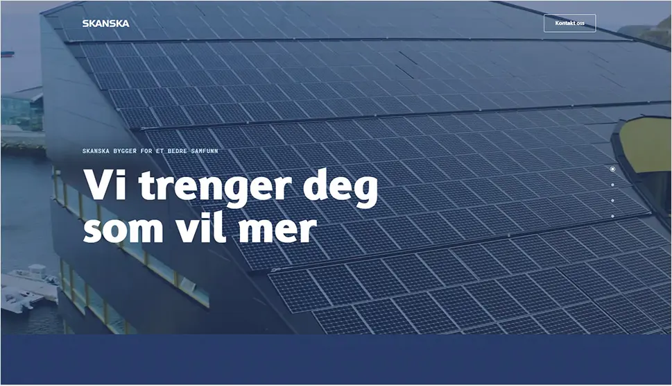
Skanska’s one-page website is in grid. It looks clean, professional, and easy on the eye. The content is divided into four main categories – you will discover them on the right side of the screen by hovering over the navigation, which comes in the form of bullets. There is no navigation in the header whatsoever, but the website remains intuitive. You immediately understand that you can click on the bullets on the right of the screen to jump to the section that interests you the most. The site features fullscreen background videos, strong imagery, as well as several YouTube embeds, ensuring visitors get a clear idea about what kind of company Skanska is. The color palette is subdued, with a navy blue background and white copy. And the gentle entry animation that occurs as new content appears in the viewport makes exploring this site more interesting and helps immerse you into the Skanska experience. The well-thought-out and clever use of modern web design practices has resulted in the creation of a great website that presents this company in the perfect light.
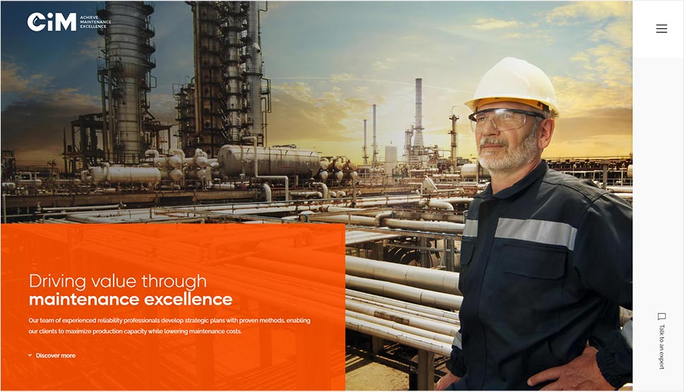
The pages on CiM Maintenance’s website are divided into several sections, each colored in alternating white and black colors. That change from one hue to the other, combined with energetic animation effects, makes browsing the content feel more dynamic. The pages also contain large, vibrant-orange areas. This is a smart color combination that is sure to capture visitors’ undivided attention and make them focus on the company’s services. The hidden menu facilitates the website navigation and it contains a handy language switcher. There is also a message box icon in the sticky sidebar, letting users quickly get in touch with an expert from CiM Maintenance.

RTE – Le voyage électrique’s website represents a memorable combination of interesting audio and visual effects. It features an isometric map that you can explore by moving your mouse in any direction. On the 3D map of a coastal city, you will find three marked areas, each telling you the story of RTE and their project. You can find these marked places either by exploring the map or by clicking on the numbers at the bottom of the screen. The map is not static. In fact, it includes several animated elements, including windmills, cars, boats, etc., creating an immersive 3D experience and helping enliven the site. Upon clicking on the hamburger icon, the fullscreen menu will appear, featuring main site links as well as social media icons. The colors throughout the site are bright and vivacious, even on inner pages without the map. And if at some point you become bothered by the background music and seagull noises, you can easily switch the audio off by clicking the audio button in the bottom left corner of the screen.
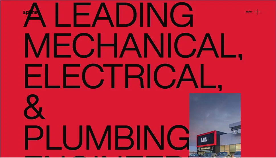
Some of the sections on Spline Group’s site emanate slight brutalist vibes. Those areas are typography-heavy, with large, all-caps letters splayed across the screen. The top area of the homepage is colored in red, but as you begin to scroll, the colors change and the background goes to black and then white. The scrolling effects are smooth, and they beautifully introduce each new section of the site. As you scroll away from some of the parallax sections, you can notice a subtle fade-out effect as the colors in the images become dimmer and turn almost completely black. The menu is hidden. All you see is a simple “+” symbol that is sticky, letting you quickly access other pages on the site, email the company, or visit their social media channels.


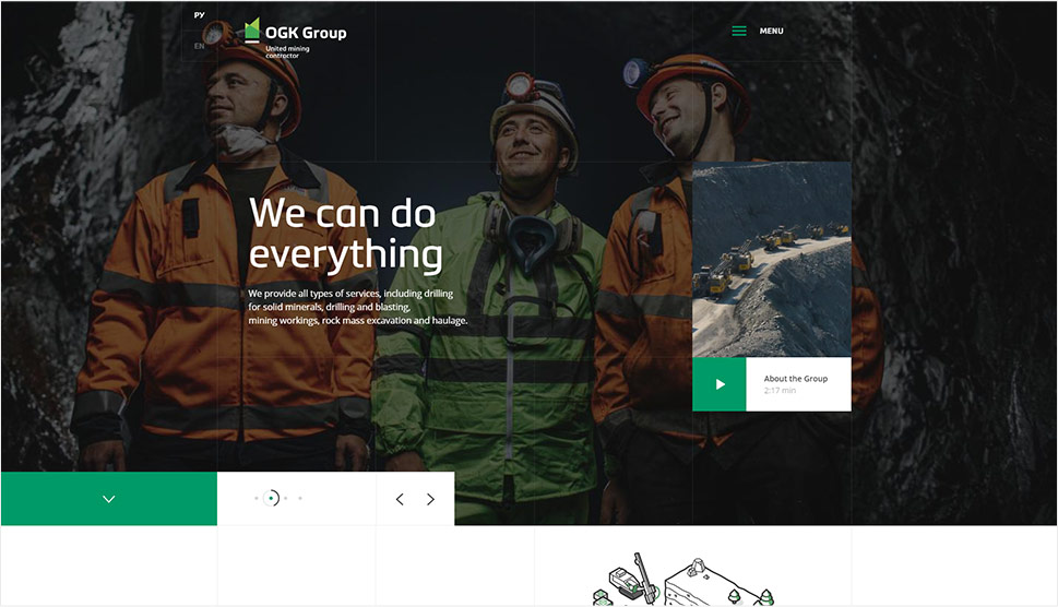
The pages on OGK Group’s site are colored in a palette that matches the hues of their logo. Everything is in green, white, and occasionally black shades. The faint, grey grid lines covering each page serve to draw your eyes to the content, which is smartly organized within the grid. These grid lines are even used in the navigation, creating a unity throughout the site. The homepage starts off with a fullscreen image slider that introduces you to the company. There is also a preview of a video embedded from Vimeo that tells the story about the group. All pages contain concise, informative copy, and lots of illustrations of the machines and equipment OGK Group uses in their work. When you hover over illustrations in the “Services” area on the homepage, they turn into related images. The header is sticky, and it contains the language switcher and the hidden menu icon.
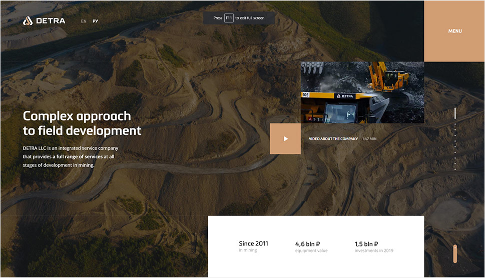
The homepage of Detra’s website is designed as a vertical fullscreen slider with large imagery and a short textual description of the company’s services. You can move from one slide to the next on scroll or click on small dots on the right side of the screen and jump to a particular slide. The menu is hidden but the “Menu” button is fixed, so you can access the main navigation at all times. Inner pages contain lots of photographs and videos as well as information about Detra’s services, clients, projects, equipment, etc. There’s also a well-organized news section, where you can read the company’s latest updates. Besides the main navigation, some pages also contain a sidebar menu, which helps users find their way around the site with greater ease.
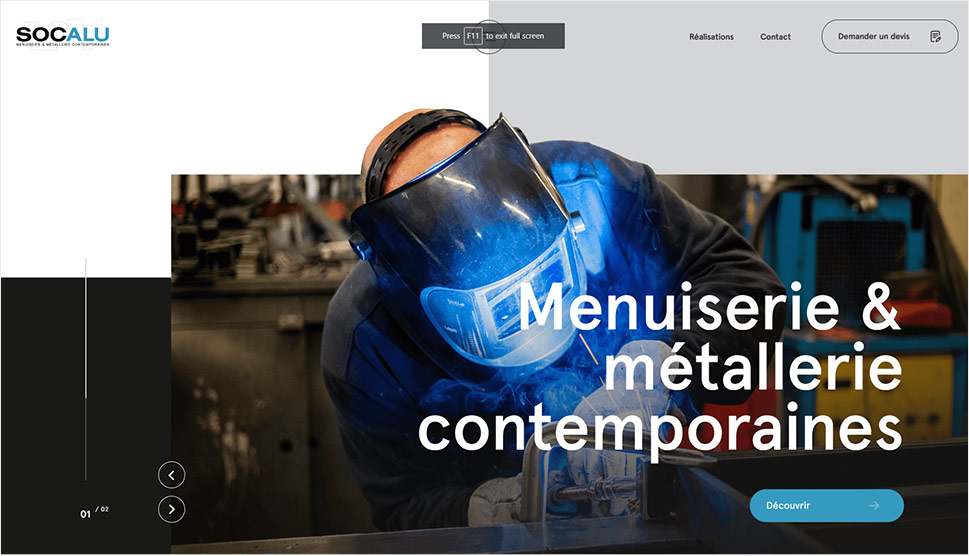
Socalu’s website is a beautiful showcase of this brand’s expertise. It is filled with photographs that demonstrate what Socalu can do with your windows, doors, stairs, and carpentry. The content on the site appears with subtle animation and transition effects that introduce images and texts in an eye-pleasing way. As you scroll down the pages, the background color goes from white to grey and black. Those hues perfectly complement the more vibrant hues featured in the photos. There are also two floating elements on the screen – one is the hamburger icon that on click reveals the overlay menu and the other is the link to the quote form. The color of those two elements changes depending on the background. In some sections, they even become see-through.
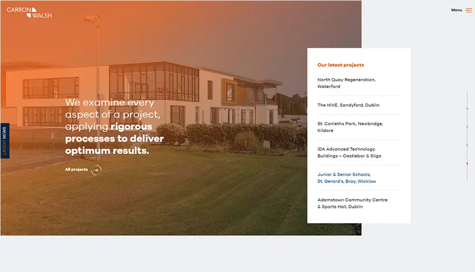
Carron & Walsh chose predominantly blue and orange hues for their site. Those two colors can also be seen on their logo. The homepage is designed as a smooth vertical slider with numerous images splayed across the whole screen. There is also a fullscreen video, showing one of C&W’s projects come to life. As you begin to scroll down the homepage, the main navigation turns into a hidden menu, with the sticky hamburger icon placed in the top right corner of the site. That way, you can learn more about the sectors C&W cover, as well as their team, and their services. On the left, there is another fixed item – the “Latest News” button. When you click on it, a sidebar appears on the screen, containing all the latest news regarding the company. The “Projects” page is a great example of how well-organized content can and should be. The projects are divided into multiple categories, all of which are displayed at the top of the page, facilitating and speeding up your search.
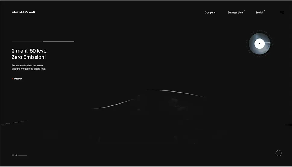
Ballsystem is a company that specializes in car repairs. Their website is dark and powerful, starting off with an animated 3D model of a car that appears to be moving down a road. Right next to it, there is a video button that on click, launches a video introduction to Ballsystem. The homepage includes a horizontal carousel showing the services the company provides and, beneath it, a 3D model of the Earth. The continents are illustrated with curved lines that follow the movement of your cursor. Save for the multicolored pictures, the pages are predominantly in white, grey, and black hues, with occasional contrasting orange shades. As you scroll through the content, you will notice some black and white stripes that stretch across the screen. They match the stripes that can be seen in Ballsystem’s logo. You can spot them on other elements as well, including animated 3D geometric shapes that symbolize the company’s services. Thanks to its overall style and well-executed animations, this entire site has a distinctly contemporary feel to it.
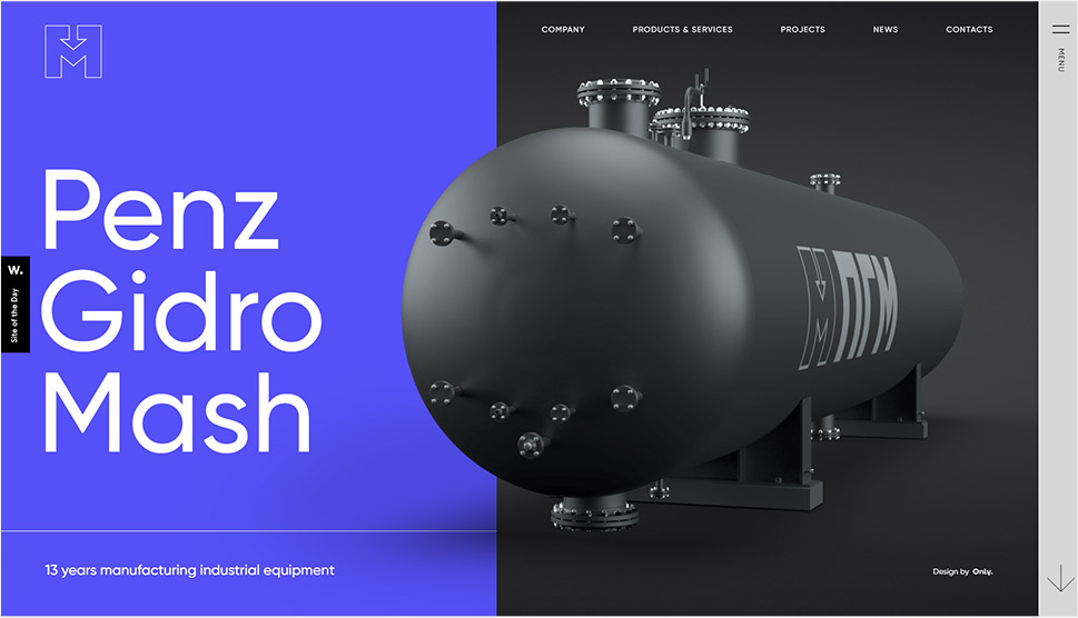
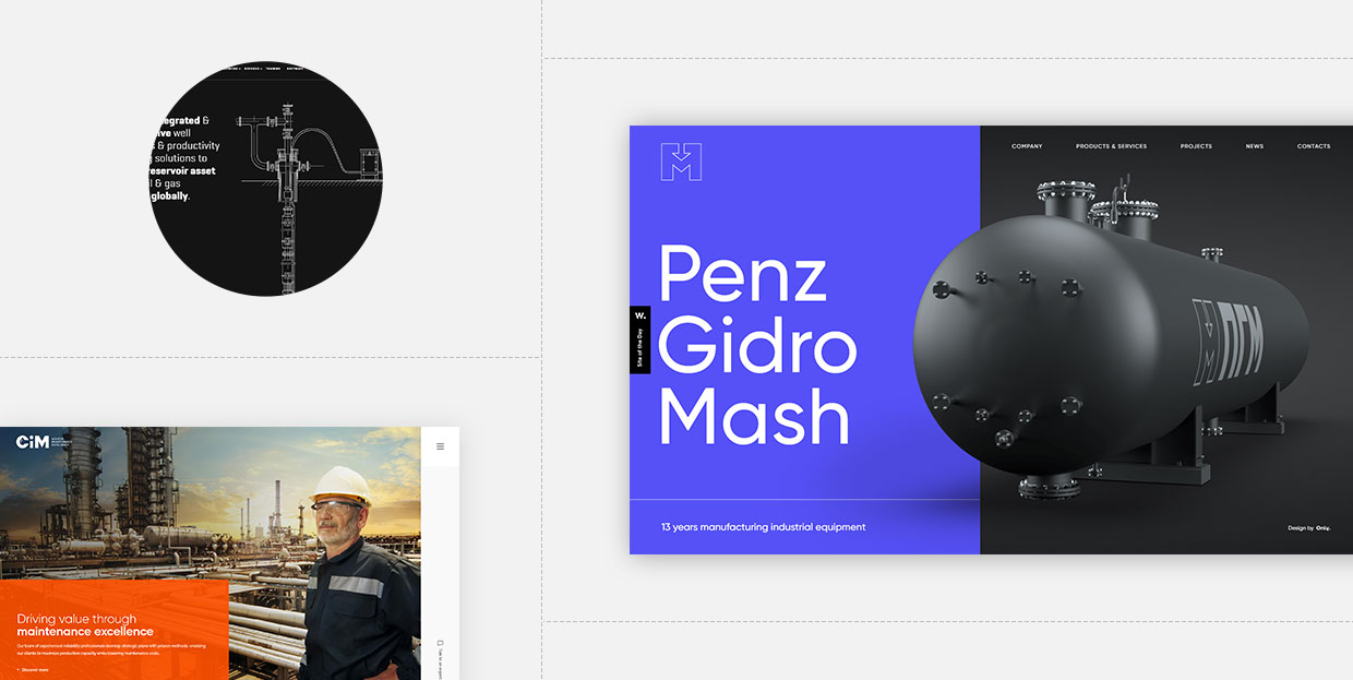
PenzGidroMash makes systems for the oil, gas, chemical, and petrochemical industries. This website showcases their solutions using (often animated) 3D elements. You can explore the content either by scrolling or by clicking on the arrow in the bottom right corner of the screen. Alternatively, you can also open the menu by clicking the hamburger icon, and jump straight to any section you want. The site is essentially very simple and well organized. It contains concise descriptions of PenzGidroMash’s services. The use of striking 3D visuals is a surefire way of grabbing the visitors’ attention as well as making the site stand out from the competition.
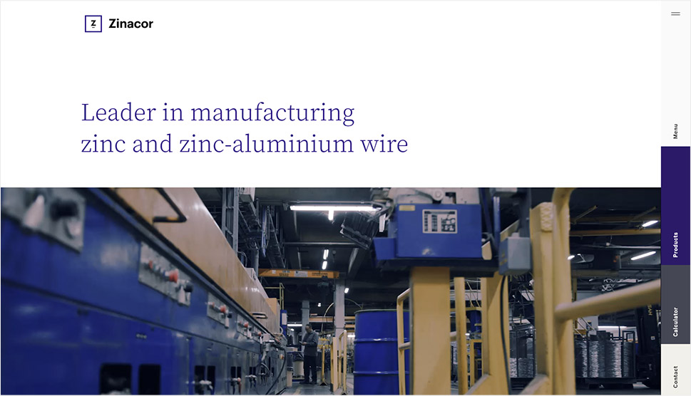
Zinacor’s website is another example where beautiful web design and simplicity meet effectiveness. There are only a few visual elements, but these are used in a smart way – to take you inside Zinacor’s factory and show you what their products look like. The content is easy to explore, well-arranged, and presented in smaller chunks. That way, you won’t get tired from reading too much text or viewing too many photos. The menu is hidden and placed in the right sidebar, along with several practical tabs that link directly to the company’s products, a calculator, and contact information. The color palette on the site is pleasing to the eye, with contrasting deep purple and light grey tones being the most prominent on all pages.
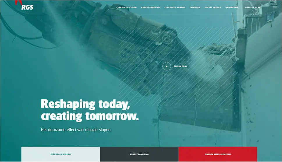
Like many other websites on our list, RGS Groep’s site starts off with a background video showing their experts at work. This instantly helps bring visitors closer to the brand. But what makes this site particularly eye-pleasing are its smooth page transitions and smart choices of font color and font weight. Bold, large headlines are juxtaposed with thin, light-grey text. Keywords and titles are often colored in red and green hues, which are the two most prominent colors on the site. And as you navigate through the pages, you’ll notice several small but extremely well executed animations, like the gentle movement of the “scroll” indicator or the way the circular buttons stretch out on hover.
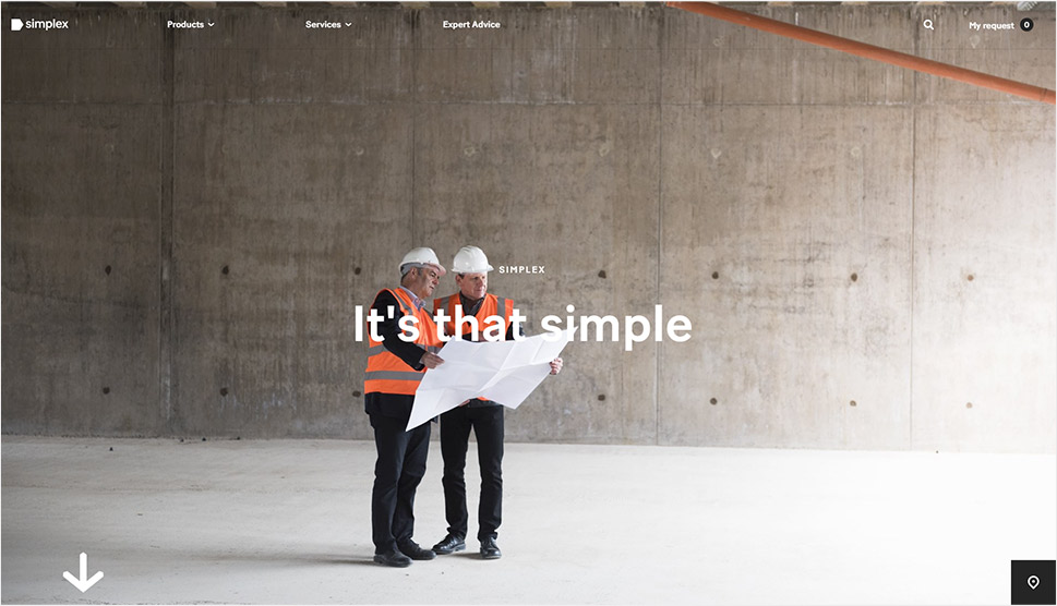
Simplex is a platform for renting all kinds of tools and equipment. They are all about simplicity and efficiency, which becomes apparent the moment you start scrolling through their website. The pages are not cluttered with too much information but Simplex has found a way to make them distinct. Fullscreen images and splashes of red and white immediately catch your eye. The copy is short and straight-to-the-point. The mouse cursor is particularly amusing. In the beginning, it is shaped like the standard arrow we see on most sites. But as you move it over certain sections, its shape changes. At one point, it turns into two arrows, telling you you can scroll left and right to explore a carousel. When you place it on a video, it assumes the form of a hand that’s grabbed the video button and is pulling it in different directions over the video’s surface. When you reach any of the video’s sides, the button bounces back to the middle.
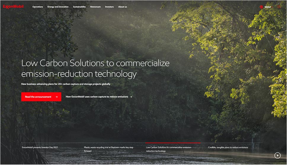
ExxonMobil’s website successfully presents the business goals of this oil and gas giant. On the site, they describe their plans and the way they do business, share their latest news, and tell the story of how the company came to be. To organize all this information, they opted for an engaging mega menu that helps visitors understand what each section of the site is about. The color palette is fairly simple – mostly white and grey, with red as a highlight color used on illustrations, call-to-action-buttons, links, and tags. To keep their users up to date with the latest information, not only did ExxonMobil create a news section and share their latest stock quote, but they also added a social media sidebar to the site, showcasing all the latest content from their social networks.
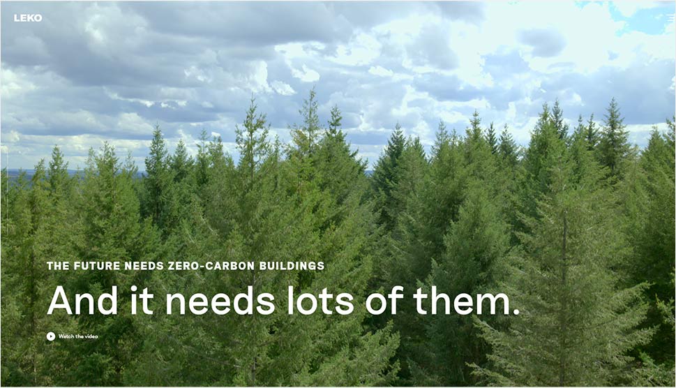
In just six sections, Leko managed to share their story in a memorable way. A fullscreen video, several full-height and full-width images, and descriptive copy were enough to help them present their mission and goals. The transition effects are simple and there are no overpowering animation effects. You can explore the site by scrolling or by using the navigation on the left side of the screen. If you click on the hamburger icon, the main menu will appear, with links to inner pages and a newsletter subscription button. The same links are displayed in the footer as well.
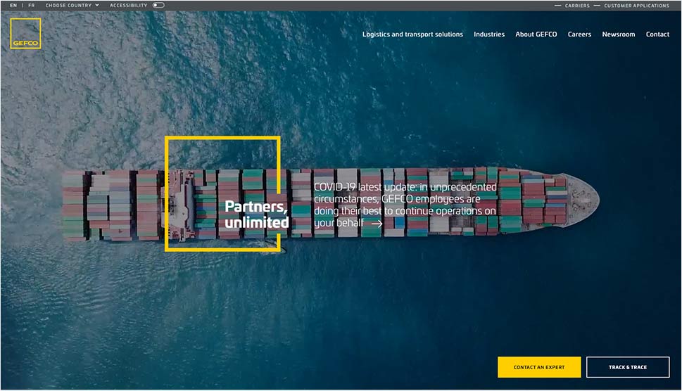
Gefko is one of the leading companies in vehicle logistics. Using contemporary web design techniques, they created a professional website that showcases every single aspect of their business. From fullscreen visuals, a news section, and carousels that show all the industries they partner with, to the user testimonials and raw data demonstrating their power, this site has it all. However, at no point do you feel swamped with information. In fact, the content is well organized, and the playful entry animations make it engaging and easy to consume. Save for the hidden menu icon, there are another two fixed buttons on the site – one allows you to quickly contact their experts while the other enables you to track your package.
Closing Words
Designing industry websites, much like any other creative endeavour, calls for imagination and experimentation in order to achieve striking results. The goal is to highlight all the strong suits of a business, create a sense of reliability, professionalism and quality, and in that way help the company reach prospective customers in a memorable manner. Use powerful videos and pictures. Keep your copy short and informative. And if possible, use the same color scheme on your website as you did on your logo, since color cohesion helps you create a distinct brand identity and achieve better brand recognition. With these few simple tips, you can create an impressive website for any business in the industry sector.
