How to Rearrange Your WordPress Post Edit Screen

When it comes to creating content, WordPress is known as one of the most flexible and user-friendly CMS platforms around. In fact, this is part of the reason why so many big-name companies use WordPress to power their websites.
Now, as for the content editing system of WordPress itself, there are several available editors, two of which are particularly widely used – the older version of the WordPress editor known as Classic (which is now available as a plugin with the same name) and the new, block-based editor called Gutenberg. And while the opinions about which of the two editors is better still remain divided within the WordPress community, that’s not going to be the topic of this article. Rather, this time around, we will talk about how you can adjust the post edit screen of both WordPress editors according to your preferences.
If you rearrange and/or hide different areas and options within your WordPress editor that you’re not using very often, you can create a cleaner environment and one that feels less clogged up and distraction-free. This way, you will be able to fully focus on doing the one thing both of these editors have been developed for in the first place – the content creation itself.
So, stick around as we guide you through all the different ways to rearrange your WordPress post edit screen – both in the Gutenberg and Classic editor.
Rearranging the Post Edit Screen in Gutenberg
According to many, the introduction of the Gutenberg editor has taken the experience of creating content in WordPress to a whole new level. The editing process has become cleaner, more modern, and more efficient than ever before. That being said, once you get more familiarized with Gutenberg’s interface, you will probably notice you can still do without certain areas and sections. Of course, which ones you want to remove will depend entirely on your own preferences. Here are all the different things you can do to adjust the appearance of the Gutenberg editor to your liking.
Hiding Specific Meta Boxes
This is what the default post editing screen in Gutenberg looks like:
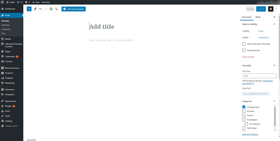
Now, once you pay attention to the right-hand side of your screen, you will notice two types of settings – Document and Block settings. The former are the general settings related to your page or post, while the latter settings are specific to the block you’re working on within the editor.
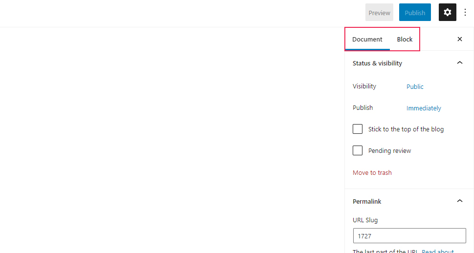
You will also be able to spot the three dots that open a menu when clicked on.
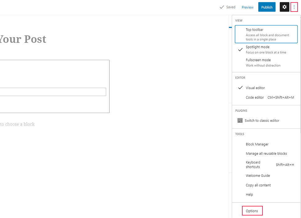
Once you select Options (located at the bottom of the menu), you will be able to check (and uncheck) different meta boxes that also appear on the right side of the screen, such as Permalink, Categories, Discussion, Excerpt, etc.
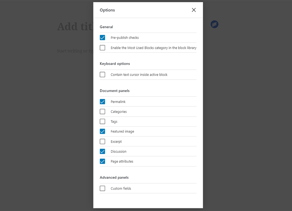
If you’re not using some of these options often and wish to have a cleaner working space in your editor, then we recommend that you hide them.
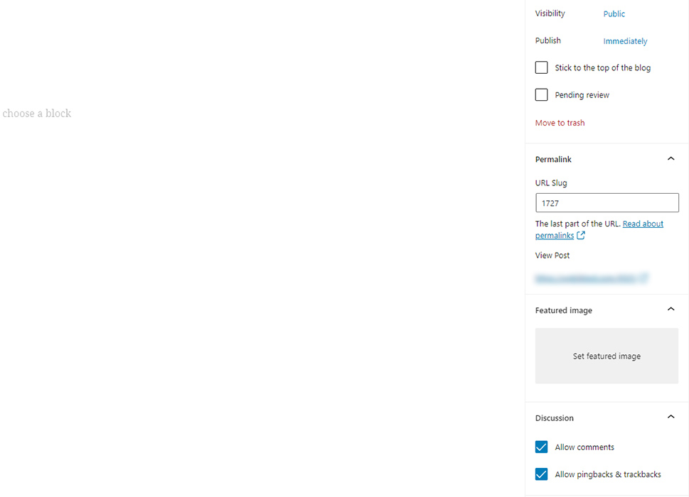
For example, this is what the Document options screen will look like without the Excerpt, Categories, and Tags panels:
Moving the Block Toolbar to the Top
Now, there is also the possibility to rearrange the location of the block toolbar that is usually displayed above the block you’re working on.
To place the toolbar at the top, you can click on the three dots to open the menu and mark the “Top Toolbar” option.
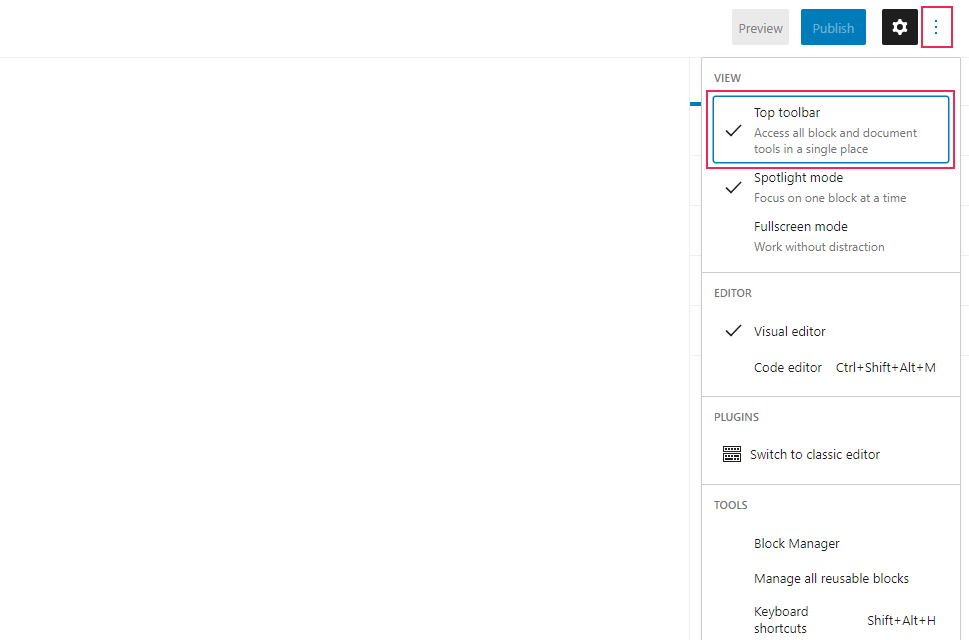
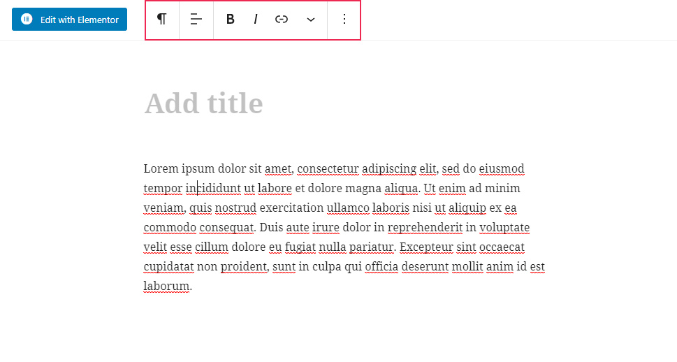
By doing this, you will be able to always access the toolbar options of your blocks in the same place (at the top), which can make the whole editing process easier as you move between different blocks.
And this is the result:
Removing the Right Panel
For less distractions while producing content, you can also clean out your editing area completely and remove the panel on the right side of the screen. To do this, simply click on the gear icon once, and the panel will disappear.
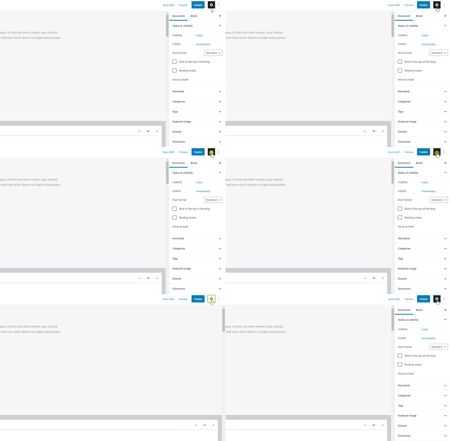
Of course, you can always click on the same gear icon again to make the panel reappear.
Using the Fullscreen Mode
If you want to work without even less distraction, you can always hide the admin toolbar and sidebar. To do this, simply click on the three dots and mark the Fullscreen mode. This will make both your toolbar and sidebar disappear.
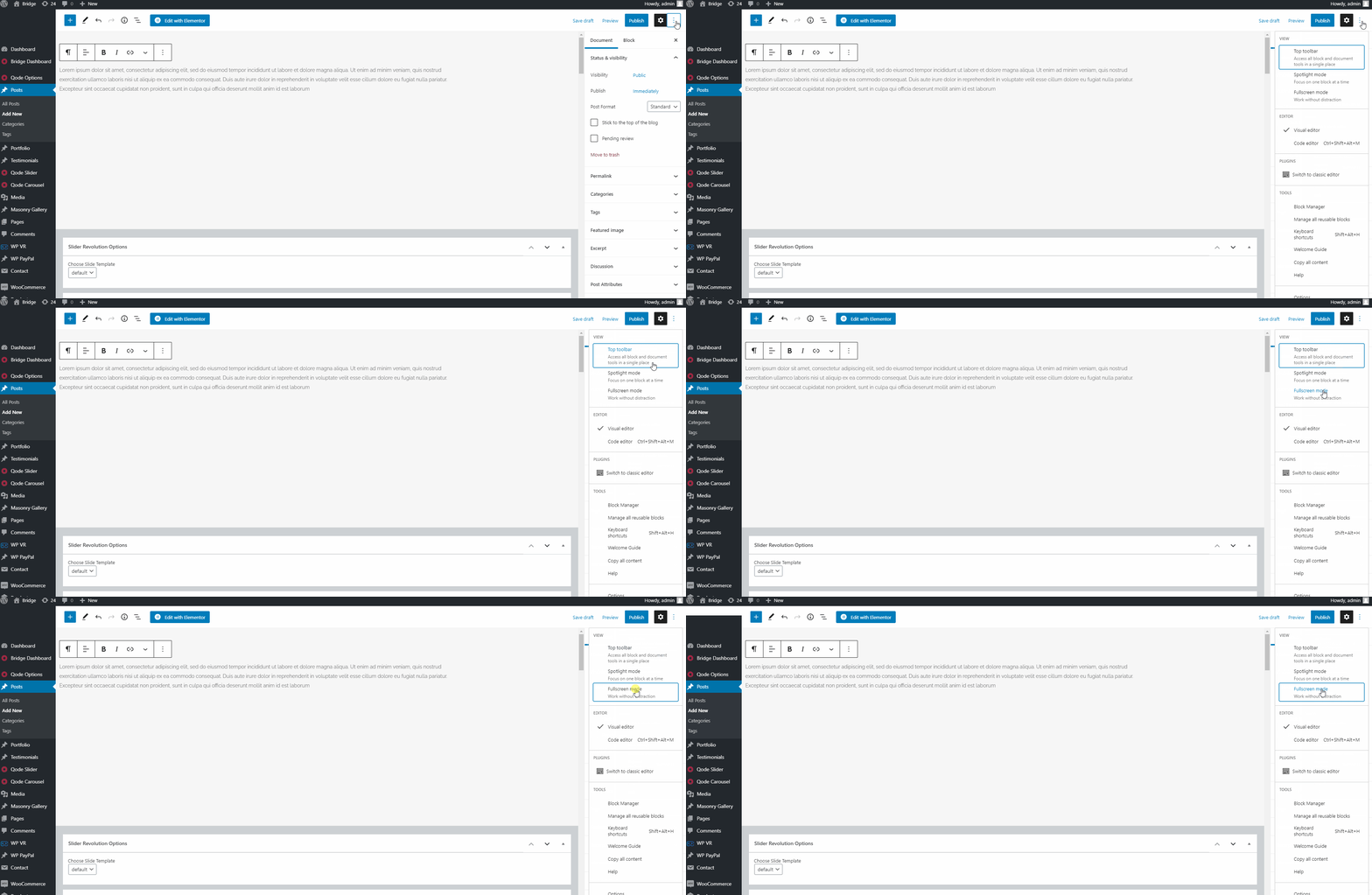
And unmarking this option will make them appear again:
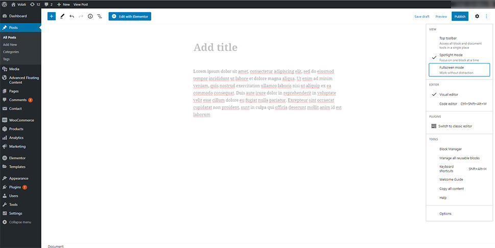
We should note that WordPress will remember the option you selected, so next time, the editor will appear just how you left it.
Using the Spotlight Mode
The Spotlight mode is particularly useful as it emphasizes the block you’re currently editing by reducing the opacity of others, which can help you focus better on the task at hand and locate the block you’re working on faster. This option is activated in Gutenberg by default, so if you want to use it, there’s no need to change anything.
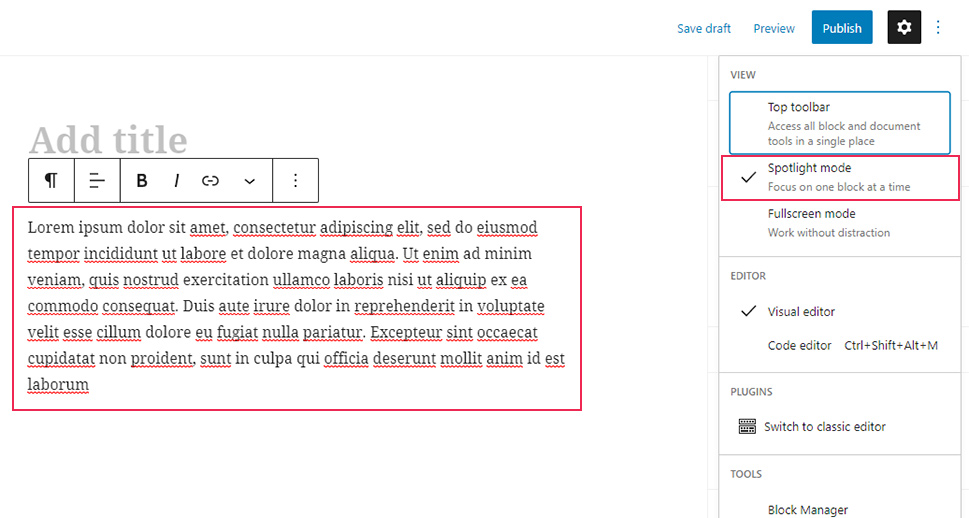
If you wish to deactivate this option, you can click on the three-dotted menu and simply unmark the Spotlight mode.
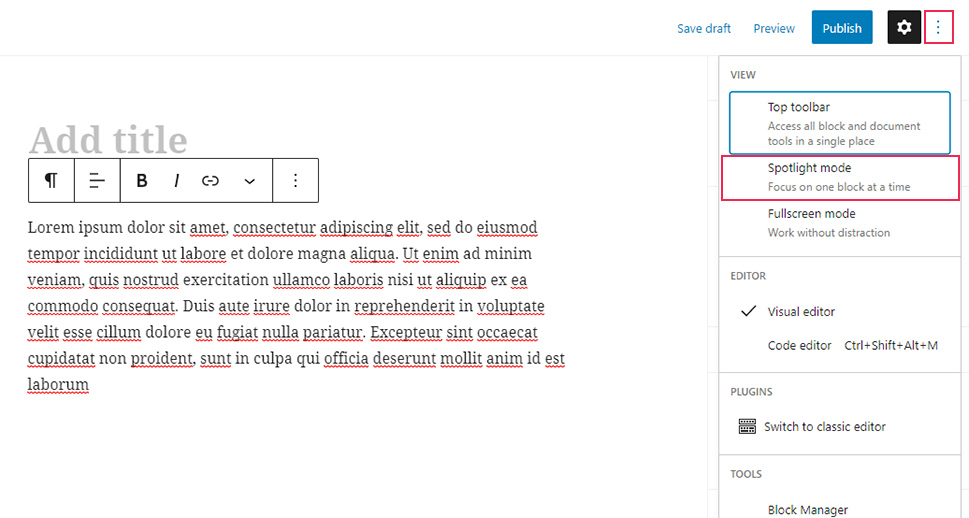
Collapsing the Meta Boxes in the Document Panel
We’ve already mentioned the ability to hide certain meta boxes in the Document Panel earlier. But if you prefer to only temporarily hide them instead of removing them from the panel completely, you can simply collapse one, more, or all of the boxes by clicking the upward arrow on each specific box.
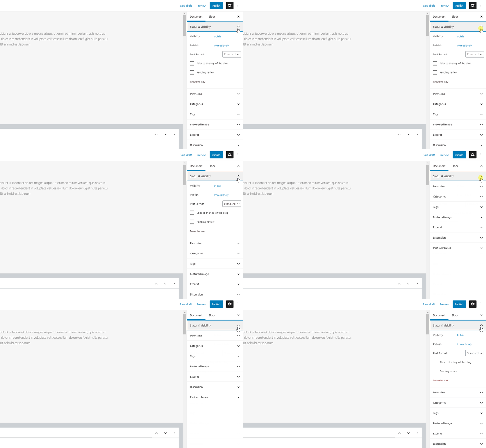
This can make the look of your document appear much cleaner and smoother overall.
Rearranging the Post Edit Screen in the Classic Editor
In case you are one of the users that prefer using the good old Classic editor over Gutenberg, you’ll be happy to hear there are plenty of ways to reorder or hide different sections in this editor as well. We are going to list them one by one.
Minimizing the Meta Boxes
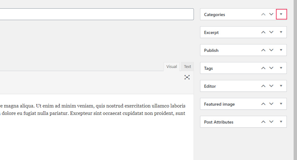
The Classic editor also comes with the section on the right side of the screen that contains various meta boxes. This includes the Publish box, Categories, Tags, Featured Image, and so on.
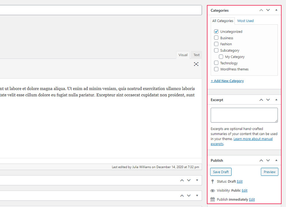
To collapse these boxes, click on the upward arrow on the box in question – just like you would in the Gutenberg editor.
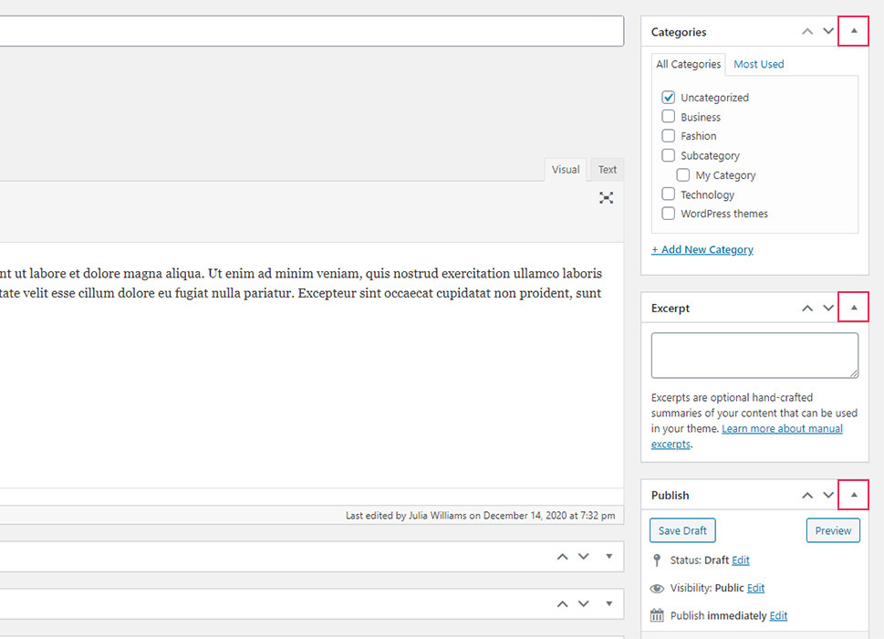
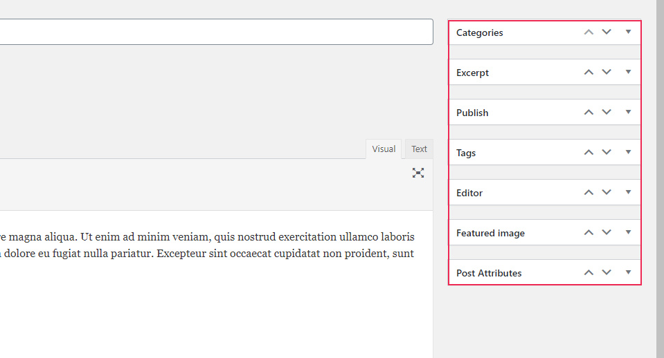
When you want to show the options within the meta boxes again, simply hit the downward arrow.
Rearranging the Meta Boxes
If you want, you can even drag and drop these boxes to change their individual position from within the editor and rearrange them in a way that best fits your needs. For example, you can move your Tags box closer to the top, place the Categories box on the bottom, etc.
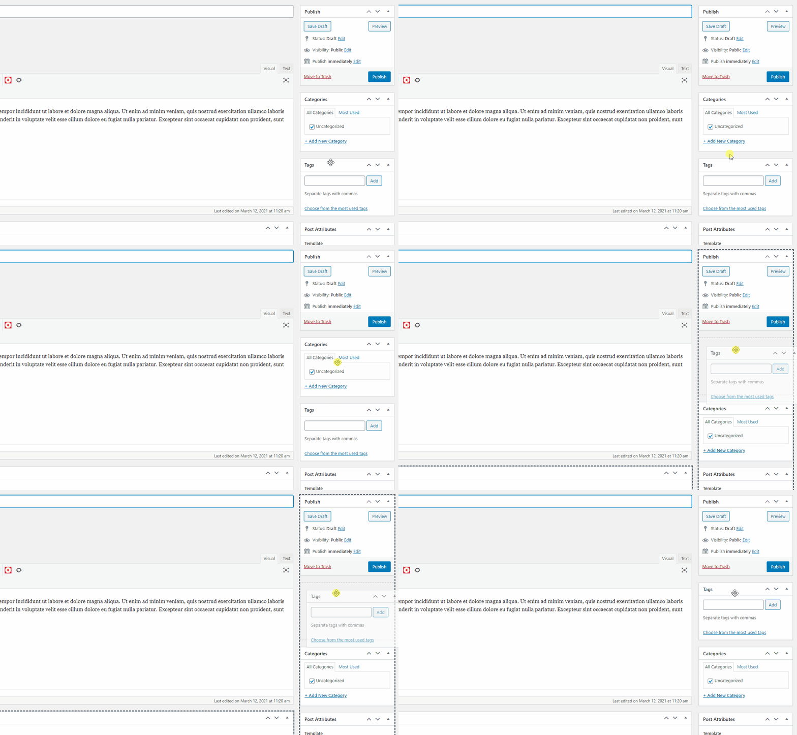
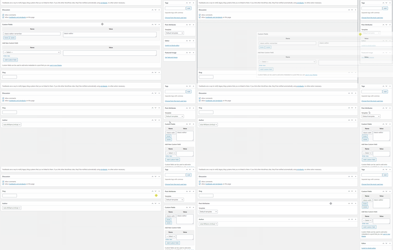
There are also certain boxes you will see placed directly below the post editor. You can also click on any one of these boxes and drag them to the right-hand side of the screen, and vice versa – you can drag the boxes located on right to the bottom of the editing screen.
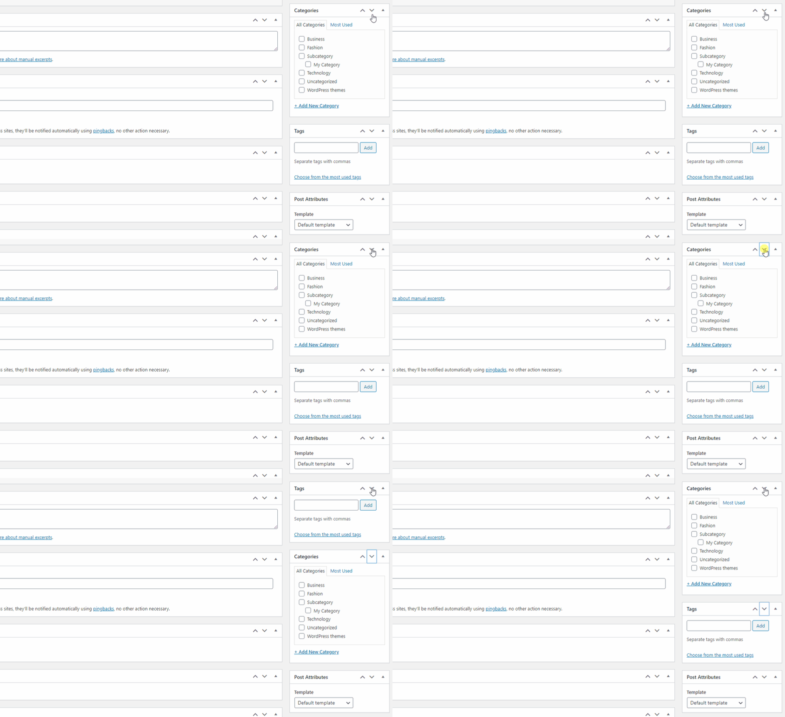
Alternatively, you can move each box up or down and make it switch places with another box by using up or down arrows:
Hiding the Meta Boxes
You can also hide specific meta boxes completely by accessing the Screen Options panel located in the top right corner. Then, simply uncheck the boxes you wish to hide.
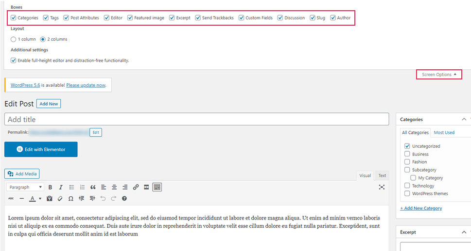
Also, you can mark the boxes you want to be shown, or simply leave them be if they’re already selected.
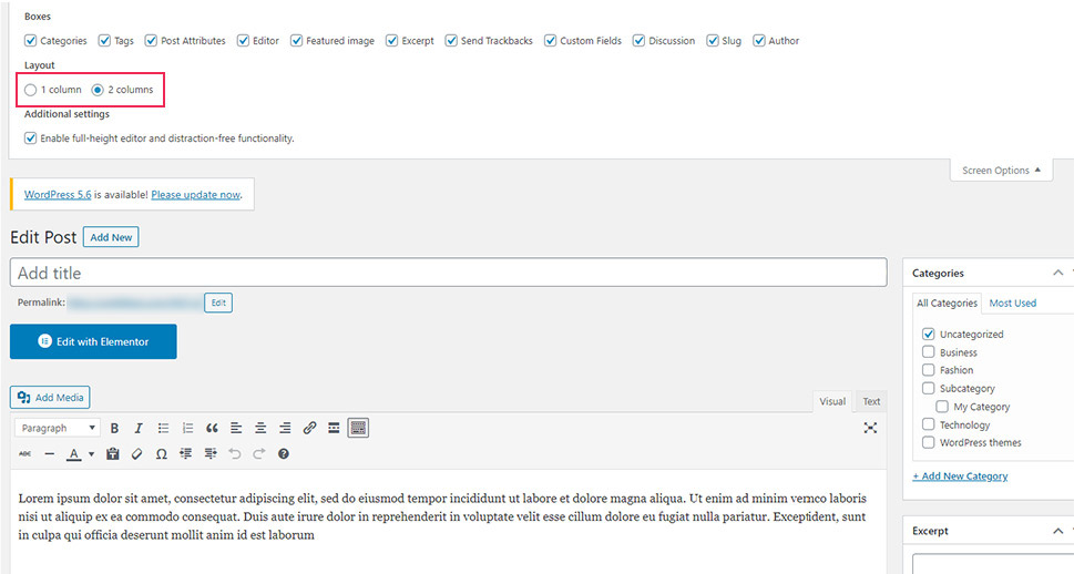
Here you will also be able to choose a single column or double column layout. This will influence the way your meta boxes appear in the editor. One column means all meta boxes will be placed below the editor, while the two columns option displays some boxes below, and the others on the right side of the editing screen (this is the default setting).
Activating the Distraction-Free Writing Mode
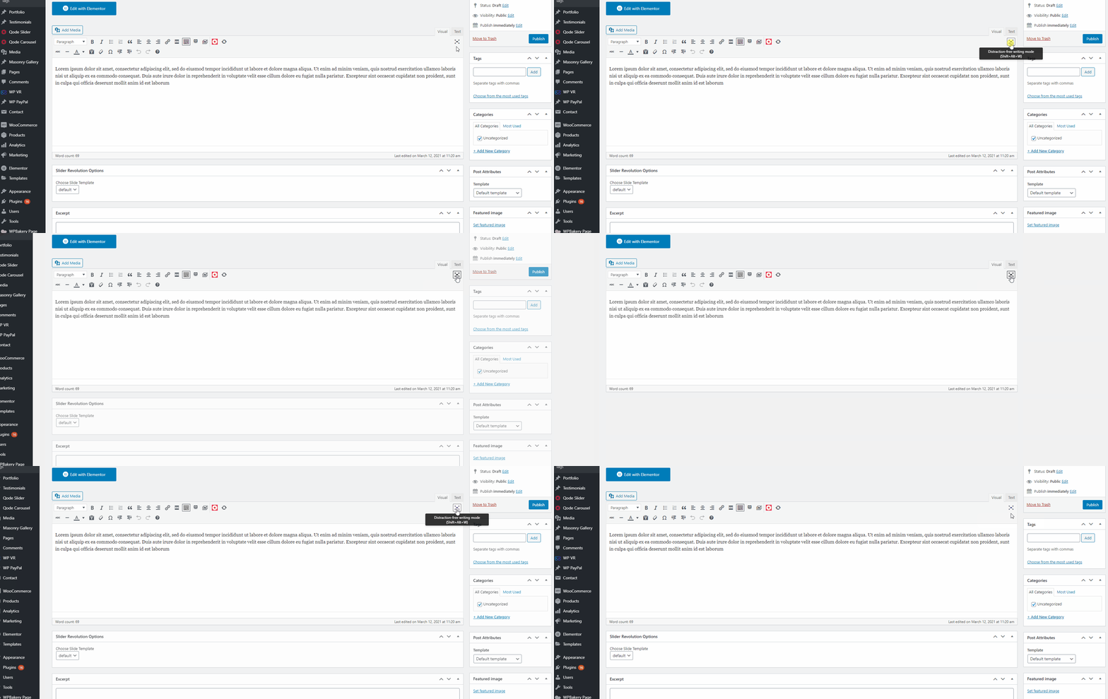
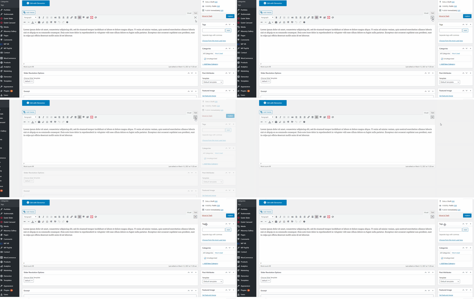
Just like in Gutenberg, you can activate the fullscreen mode in the Classic editor as well. This option instantly removes all the meta boxes and the admin sidebar while blurring the admin toolbar above. To do this, simply click the fullscreen icon located in the editor or press the ALT+Shift+W key combination on your keyboard.
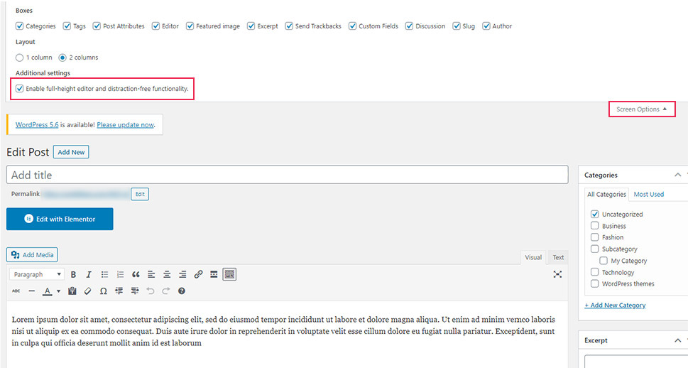
In case you don’t see this option in your editor, you can activate it in the above-mentioned Screen Options by checking the option called “Enable full-height editor and distraction-free functionality.”
You should note that the instant you hover over the sidebar or the meta boxes, you will automatically exit this mode.
Wrapping Up
WordPress is a highly flexible and user-friendly platform that allows you to make your content creation experience as smooth as possible. No matter if you’re using the new Gutenberg editor or if you still prefer the Classic one, you will find plenty of options at your disposal that will allow you to create a clean, distraction-free environment. You can hide different boxes you don’t need during the process, use the fullscreen mode that hides the admin sidebar, and much more. And the best thing about it is that you can always switch the look of your editing screen back to its original state at any given moment.
