15 Examples of Innovative Hero Typography Trends
Hero sections are often the most important part of a website. And while there’s no doubt that it’s the graphical content of a hero section that usually catches our eye first, hero text is the element that actually gets the message across, hooks us and keeps us scrolling. It doesn’t just matter what the text says, what’s also important is how it says what it says – how it’s presented and designed. When done right, typography powers the hero copy, makes the message more compelling and allows it to linger in the visitor’s mind for longer.
While there is no definitive recipe for designing the perfect hero text, one thing is certain: there have never been as many inspiring, creative, breathtaking examples of hero typography as there are these days. Dynamic and kinetic lettering, retro styles, oversized or disruptive text, retro-futurism and overall experimentation are just some of the trends we’ve been witnessing lately, and with great delight too – some examples of hero text are so masterfully executed they almost make you forget about the rest of the page. So let’s take a look at some of them:

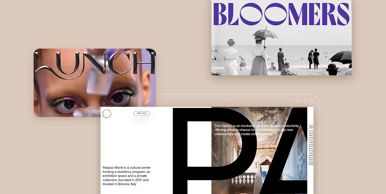
Bloomers is a Brazilian agency developing strategies for brands and businesses with a very distinct approach. Their method consists of detailed brand research with a particular focus on past events, looking for common threads that can create a unique and inspiring story. And this approach is clear right from the start, as the agency’s homepage features some distinctly retro hero typography. A gorgeous full-width black and white photo of a 1980s beach scene is topped by large ‘60s-style typography in a funky purple hue. To add a touch of curiosity and humor to the section, the designers of the Bloomers website animated the two O’s in the agency’s logo, making them spin around like two strange eyes or some curious spinner from a county fair.
After this initial section, the agency delivers its main message in a similar vein – with large retro typography in a silvery grey hue. This color motif is sustained throughout the website, as is the vintage quality of typography and interface elements, which is in line with the agency’s mission of reaching into the past to discover solutions for the future.

Sometimes a hero section is so impressive and immersive it almost makes you forget what you came there for in the first place. Lunch Concept’s website opens with a fullscreen video that you just want to keep watching ad infinitum – the costume, the set design, the animations, they are brimful of details you simply don’t want to miss.This show-stopping video is topped by a similarly striking logo that looks like it’s made of dark matte metal with a convincing 3D effect. The logo has a distinct tactile quality to it – it makes you want to examine its surface with your fingers, feel it on the other side to check if it’s filled or hollow like a mould, to see how sharp its edges and corners are. Together with the background video, the typography rounds up the hero section and lends the entire website a sensual, electrifying vibe.

The website of the Brescian cultural hub, gallery space, collection and artistic incubator, Palazzo Monti, is a beautiful example of typography taking center stage, at least in the hero section of the website. The website opens with a large numerical preloader positioned in the lower left corner of the screen and accompanied by a rotating circular logo of this cultural center. We are then welcomed to a horizontally oriented one-page website with the initial or hero section featuring short blocks of text and introducing the name of the center in enormous typography. The huge letters in the Aeonik typeface that spell out the name of the center are rhythmically interrupted by other content – informative sections with photographs, testimonials, galleries and everything else a website for an institution of this kind should contain. As we mentioned, the website moves horizontally, and these sections unfold in a fluid manner. The enormous typography doesn’t hamper the design in any way – in fact, the large letters are arranged within the layout in a way that assures their perfect integration with the rest of the content.

Safari Riot is an LA-based company specializing in artist development. It provides a full stack of services, from investments and financing to technical and creative development. The company website is modern, monochromatic, and could even be considered somewhat strict if it weren’t for the hero section featuring enormous typography. And, in fact, it’s precisely the typography that lends most of the visual identity to the section, and consequently to the entire website. The giant Fit Variable typeface spells out the words “Artists” and “Depts,” serving as navigation to appropriate sections. Now, as for this specific font, it needs to be said that it is quite hard to read. On top of that, here it’s also animated, which makes things even harder. This is not a design mistake, though – in fact, according to the creator of the typeface, David Jonathan Ross of the DJR foundry, it’s not even meant to be used for content that requires high readability – its main purpose is “filling up space with maximum impact.” And that’s precisely what it does here. Sure, it requires some effort to penetrate the meaning of these gargantuan letters, but it’s not impossible, and the effect is nothing short of powerful.

Ekipa Agency is a booking agency specializing in electronic music. Proudly working with a small roster of international artists, the Berlin-based agency nurtures a close approach to the musicians it represents, working with them from the earliest stages of their careers and helping them shape their sound and artistic persona. It only makes sense for an agency with such a finely-tuned ethos to have a website that is just as carefully crafted.
Ekipa’s website places particular focus on the typography, especially for the logo, placed in the hero section of the page. There is essentially no imagery here, just black text on a background that changes color each time the page is loaded. The designer took a deconstructivist approach, forming the logo from stick-like black rectangles, reflecting the agency’s approach to artist management: talent is key. Without the artists, there is no Ekipa agency, just like there is no Ekipa logo without the individual rectangles forming it.
The homepage features a lot of delightful twists – links to inner pages, in Neuzeit typeface, are scattered all over the screen and are almost completely blacked out when hovered upon. The cursor is a playful black dot and the background changes color each time the page is reloaded. It’s a masterfully crafted page that is equal parts fun, informative and brand-aligned.
Top Themes for Creatives
View Collection


Buck is a global creative company providing services in the fields of design, branding and art direction. The company has offices in Los Angeles, New York City, Sydney and Amsterdam and has over 100 employees and collaborators. Some of its more prominent projects include the Netflix anthology series We the People, projects for Nike, Spotify, Mailchimp, Coca-Cola, Hulu, and many more. Their website is a youthful, vibrant display of the company’s most notable works, as well as its mission and philosophy. It opens with a bright, airy hero section featuring the Buck logo – a beautiful piece of design with a strong architectural character, in which each letter represents a unique approach to design. The letters, each bearing their individual approach, come together in a systematic design solution, which is the way the company approaches their projects – as a collective made up of different perspectives. The section also contains a menu below the logo, with links to the most important parts of the website, as well as a short text in the candid, and straightforward Mabry typeface informing the visitor about the company and its activities. It is a masterfully simple design that checks all the boxes.

Savio Parsons is an architecture studio from Sydney, founded by Gemma Savio and Anthony Parsons. Their website doesn’t reveal much, biographically speaking, which is probably very deliberate, as the website is designed to place a complete emphasis on the visual representation of the work, rather than on facts and information. In fact, the desktop version doesn’t feature a single clickable element, and it appears to “eat up” your cursor. On mobile devices, though, it does follow classic navigational practices, but it doesn’t feature the gorgeous hero section that can be seen on desktop.
The website opens with an elegant, smart section with the studio logo – stylized initials “S” and “P,” in sharp, geometric letters with strong architectural influence. They resemble floors of a long, wide building, and they smoothly slide into their place from the edges of the screen. The white on black palette conveys seriousness and simplicity, which we can assume is the studio’s architectural disposition as well. As we proceed further down the page, the logo seems to follow us, taking up different positions. Since the page with images of featured works is rather long, the logo accompanying the scrolling is a strong branding element that assures the authorship of the displayed work remains clear.

Born from a great love for motion visuals, animation and design, Design in Motion (DEMO) Festival is a traveling showcase that celebrates and promotes the best motion work from studios, designers and academies from all across the world. The festival website is, quite expectedly, all about motion. As such, it contains lots of videos and rich animated sections, but they’re all carefully balanced with more “plain” sections providing information and toning the tempo down a bit. It opens with a big, poster-like hero section with a huge black logo on a red background, combined with light grey for the menu, homepage link and a link to the festival aftermovie. Even if it were static, the section would be nothing short of impressive, as it masterfully recreates the aesthetics of film posters from a certain era. In fact, it almost makes you want to print it out and put it on your wall. But, it’s not static – the huge Graphik Wide letters are animated to change upon hover, becoming asymmetrically “fat,” elongated and shortened. There’s an element of fun in that, and the animation is also in line with the festival’s main point of interest – motion.

Schauspielhaus is a drama theatre located in Zürich that is considered to be one of the most important playhouses in the German-speaking world. Founded in 1892, the theatre today takes a modern approach to classic repertoires, but frequently features contemporary playwrights as well. One of the testimonies to this approach is the homepage for the new 2021/22 theatrical season, particularly the hero section.
The page opens with a squiggly outline of the numbers “2021/22” marking the new season, giving the hero section a comic book-quality and landing a touch of humor to the overall mood. The text welcoming the audience to the new season is given in a simple black-on-white Magister typeface, resembling a newspaper announcement. As we scroll down the page, more black and white outlines introduce the programme and the plays, and that’s when we notice that some of the elements start filling with color upon hover. Finally, on the scroll up, the entire page suddenly assumes full color, and it does so quite gloriously. There are clouds and doves, explosions and thunderbolts, and as we scroll back up to the hero section, we find the outlined “2021/22” now written out in smoke in the sky. The entire section inspires hope and enthusiasm and makes a fitting introduction to the renowned theatre’s new season.

Marx Design is an agency working with all elements of brand identity and communication, design and packaging. The agency’s philosophy is that the best design comes from following the hard path, never settling for the status quo, always challenging the norms and asking the hard questions. This uncompromising attitude is reflected in the agency’s website, especially the homepage that basically bursts onto the screen in a bright flash of light after a dark and somewhat tense fullscreen preloader. Hero content here is basically a huge agency logo in black sans serif typography featuring the name of the agency (and its founder). Instead of assuming the central position in the section, the logo is aligned slightly to the left, while the menu opener is tucked away in the top right corner of the page. So far, nothing revolutionary here, but the real action starts when you move the cursor anywhere within the hero section – the motion causes the logo to shift and bend, as if it’s dragging it or disturbing some viscous surface upon which the letters lie. The effect is somewhat unnerving but definitely striking. It’s a jolt that wakes the visitor up and invites him to dig deeper and discover more about the agency and its work.

Despite its humorous name, Butt Studio has some pretty impressive clients under its belt, from brands like Nike, MTV and Warner Music to artists of such prominence as Tame Impala, Dua Lipa and Planningtorock. The studio founder Harry Butt is a graphic designer by vocation, but his passion for animation and innovative digital tools has led him to some rather mind-bending projects, many of which can be found on the studio website.
The website opens with the name of the studio in large Sometimes Times typeface, nice and elegant, with a lot of breathing air. This simple hero text is topped by pieces of digital art that change each time the page is loaded – unidentifiable, slightly unsettling objects covered in hair, grass or thorns, slippery or gummy shapes sprawling across the section. What appears to be a CTA button inviting the visitor to learn more about the studio is actually not a button at all – it evades being clicked by changing position every time the cursor comes near it. Playing on the duality of conventional, formal aesthetics and weird digital art, this is a playful, humorous and auto-ironic piece of design that speaks volumes about the studio’s approach to creativity.

Lamanna is an Italian bakery and pizza place in Toronto, founded by second-generation immigrants from Puglia and Sicily. The bakery is rather famous throughout the city thanks to some rather decadent menu items – the Big Slice Pizza, which is, indeed, outrageously big, birthday cake pizzas, strawberry shortcake-filled donuts and such. The over-the-top character of the menu is perfectly reflected in the bakery’s website. The homepage opens with a huge, flashy hero section in red and yellow with enormous typography, accentuating the word “BIG,” followed by photo of a juicy, mouth-watering slice of pepperoni pizza, a sun-shaped “Order Now” button and icons representing pizza, cannoli and, to top it all off, the Italian hand gesture. The designer opted for the Right Grotesk’s boldest, loudest style, paired with Ohno Blazeface and Nimbus Sans. The choice of the typefaces and their color give the page a flashy, fun, exaggerated character, just like the items the bakery offers to its devoted customers. The website is pure delight, leaving the viewer craving for some carby guilty pleasures.

The website of Redo Bureau, a Russian full-service design studio specializing in development, art direction and visual identities, is all about neons and metallics, dominated by the large logo appearing to be made of liquid metal. The logo, which is a contemporary nod to 1980’s design trends, can be moved around and rotated by moving the mouse around the page, by almost 180 degrees both on the vertical and on the horizontal axis. Such an elaborate section is the perfect (if not exactly modest) exhibition of the studio’s skill and talent in terms of both design and web development, so it makes sense it basically takes up the entire page. And to keep the page functional and to observe the best UX practices, the section is topped with menu links leading to inner pages, as well as a very brief blurb about the studio itself in the bottom part of the section. These elements are quite discrete, allowing the centerpiece of the section – the floating logo – to capture the full attention of the visitor. In fact, don’t be surprised if you catch yourself just moving your cursor idly around the screen, daydreaming about all the lost futures of your youth.

When you are an interactive designer, you simply cannot afford to have a website that’s anything short of spectacular in terms of dynamicity and animation. Charlie Le Maignan understands this perfectly – specializing in typography and animation, his website is a celebration of the art of the typeface with all its complexities. Starting right from the hero section, everything on the page is in motion, every element is engaged in its own choreography, like a silent disco where each dancer swings to their own tune. Colors are bold and matched in a way that gives off a slight ‘70s feel. In the hero section, huge white-on-black letters spell out the name of the designer, flowing from left to right and changing from quite plump (one might even say – fat) to slim, and back. This uninterrupted wavy motion lends the typography a marked sense of fluidity, while the monochromatic contrast serves great to introduce the website’s bold mood.

In 2019, Bon Iver released I, I (stylized as i, i) as their fourth studio album. In addition to the physical release, the album was also released on all services including, most notably, Spotify. And this is precisely the part we’re interested in here – to accompany the release of the album on the popular platform, the band launched Viisualiizer – a standalone platform, an immersive, almost hypnotic website that was created with the idea to augment the listening experience and to do so using – text.
The website is a complicated, highly innovative project. It mirrors the album streaming stats on Spotify, displaying the number of listeners at any given moment, with history and real-time data. Each streaming instance is represented with a letter “i,” in line with the album title. The album was immensely popular when it came out, so the number of i’s created a complex matrix, so dense it’s almost hard to discern the individual letters. The website opens with a single “i” which then starts multiplying almost infinitely, forming a dense pattern. Clicking on Enter, the pattern bursts, some of the air is cleared allowing the word Viisualiizer to appear in italic lettering. But even that italic lettering is made up of thousands of those tiny “i” characters, which then merge into the shape of the planet Earth and there are even some fireworks to celebrate the success of the album. The movement of the mouse erases parts of the pattern like a wisp of smoke, and as it dissipates, the i’s from the pattern reappear again and “seal” the pattern. To contrast this almost hypnotic background, three randomly placed 1990’s-looking boxes provide the essential info about the platform in all-uppercase GT America Mono typeface, and a strong black button invites the viewer to dive even deeper in this interactive experience.
Closing Words
These were just some of the terrific examples of the hero text game done right. From animation and interactivity to playful irreverence towards the rules and canons, these websites don’t shy away from experimentation, and the result is nothing short of rewarding.
We saw that these days designers are almost trying to “out-design” each other when it comes to this important part of visual branding. Experimentation, humor and exaggeration seem to be the driving forces behind these designs, and this vibrant, progerssive trend definitely inspires optimism and makes us excited for what’s yet to come.
