The 13 Best Type Foundries Every Web Designer Should Check Out
From single-letter tiles and Gutenberg’s revolutionary movable types to contemporary digital design tools, typography has come a long way since its origins. With the expansion of the web, it found a new avenue for its multifaceted functionality. No longer strictly linear, it outgrew its initial communicational purpose and now bears a strong artistic and aesthetic value. Once merely a tool for conveying a message, typography today is both the tool and the message itself. Because of its value as a means of visual communication, it has an equally important role as the other elements of design.
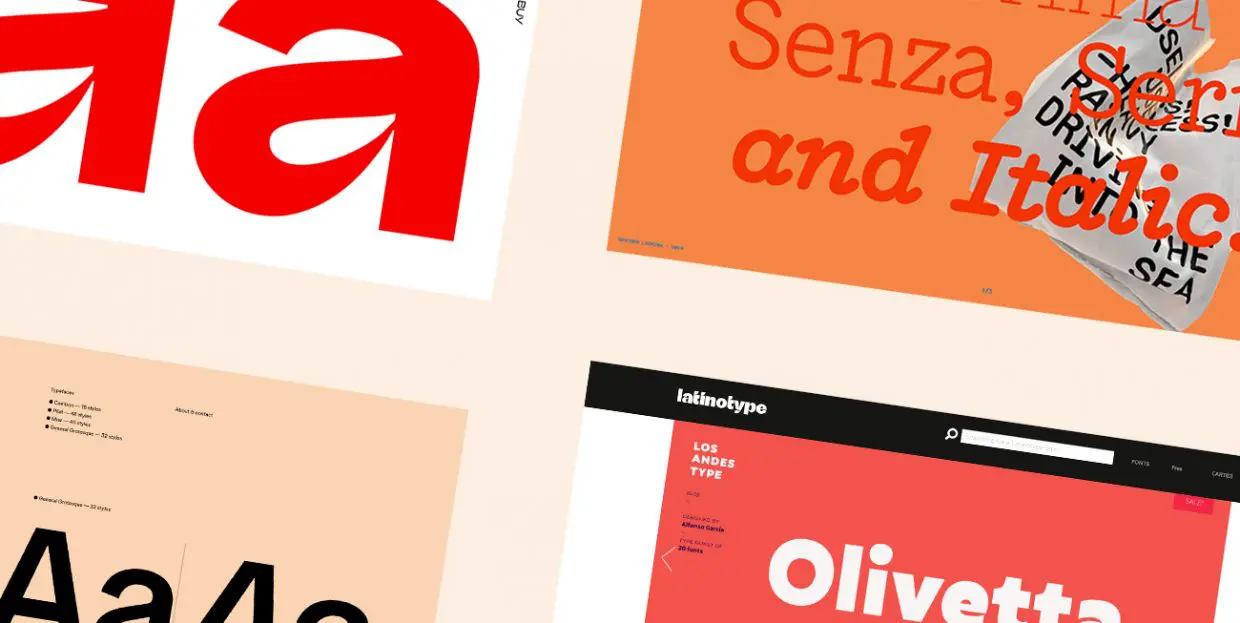
Choosing a typeface that will support, sustain and enhance the design of your website requires great skill and understanding. Hoping to make the choice easier for designers facing type-related dilemmas, we have created a selection of some of the best independent type foundries, as well as some well-established houses with a long tradition, which have successfully adapted to the tendencies of the digital age. These foundries not only create amazing typefaces, but also have impressive visual presentations on their websites that can serve as inspiration and examples of what can be achieved with masterfully designed text:
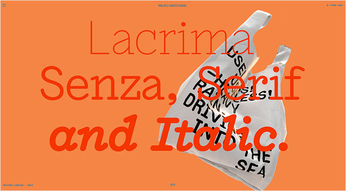
Milieu Grotesque is an independent type foundry established in 2010 in San Isidro, Portugal. Although their library is rather modest in volume, the highly diverse, expressive and flexible font design that fits all needs makes up for the size of the output. The website is extravagant, fun and even a bit grotesque, with visually striking specimens of the typefaces in practical use, which definitely helps when it comes to choosing the right font.
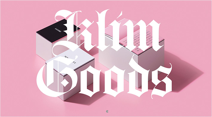
Based out of New Zealand, Klim is an award-winning library with high-profile clients such as The Financial Times, PayPal and National Geographic. With fundamentally correct proportions and carefully selected font variations, these typefaces stand out with their distinctive yet highly balanced individuality.
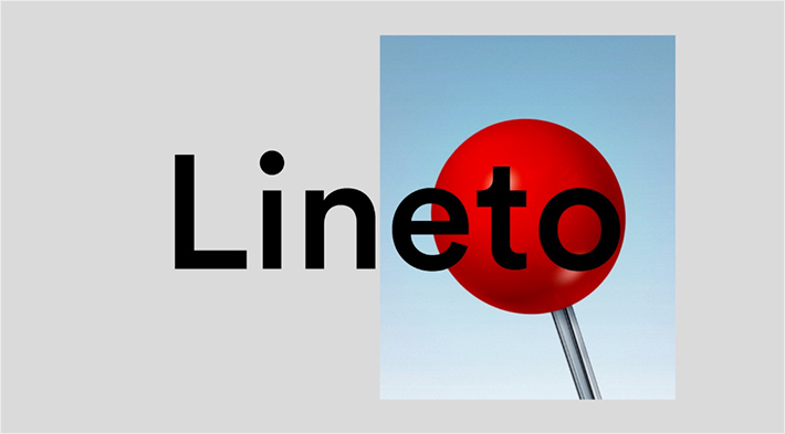
The Lineto foundry from Switzerland has a website with a very specific interface, reminiscing the design of old operating systems, which makes it easy to use and puts the focus on what matters – the typography. In addition to different display, mono, serif and sans serif fonts with the typical Swiss precision in form, the company is also noted for its interactive applications and projects. These allow users to try out the fonts online and to explore the Lego and Rubik typefaces, inspired by the legendary namesake toys, and then export the results in one of the vector programs.

The Studio René Bieder from Berlin uses clean and simple design and elegant forms to convey the reliability of the typographic expression, offering a choice between ready-made typefaces and the design of custom ones, as well as visual branding consultancy. The typefaces reflect an excellent knowledge of the history of typography. Age-old concepts are perfectly integrated with striking, modern forms to create contemporary typefaces that are sure to endure the test of time.
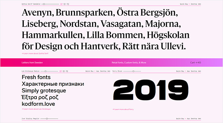
“Our letters come from Sweden, but they are for everyone,” says the group of designers behind Letters from Sweden, whose website stands out with its unique palette and interesting interface. This typography studio uses the totality of the graphic form to communicate its vision, with contrasted fonts placed in almost conflicting dynamics in order to make them stand out. In addition to retail typefaces, they also make custom fonts, such as those for internationally renowned brands from Fjällräven, Ericsson and Lindex to Dieline, Scania and Tele 2.
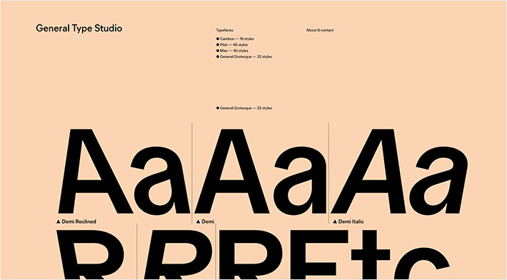
The next website we would like to share with you is General Type Studio with the impressive work by Stéphane Elbaz, a New York-based designer originally from France, noted for his distinctively visual expression. A quick stroll through grotesque representations of sans serif and display fonts and true geometric shapes reveals a designer precision and skillful toying with historic shapes. Perhaps that was the reason why he was commissioned to work on PS Fournier, an homage to the celebrated French typeface designer Pierre-Simon Fournier whose work encompasses the aesthetics of the transitional period and the passage to the modern era of French typography.
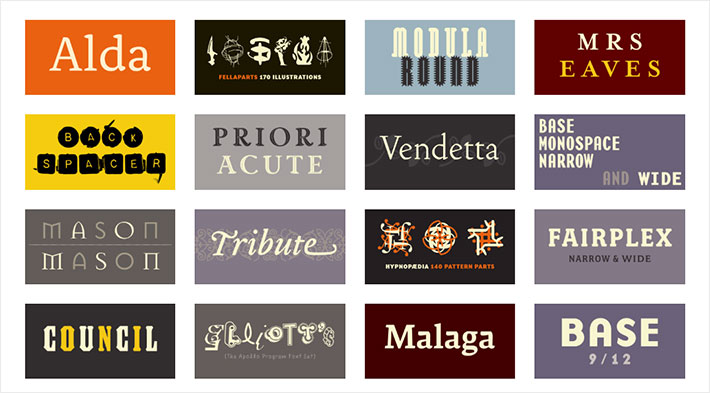
Bruta Types is a relatively new type foundry from Barcelona, helmed by the designer Estela Ibraz, with one fully carried-out project and two more in the making. With strong, eclectic and personalized style, Trash is a font rich in ligatures, style sets and weights, which makes it ideal for specific art projects that call for emphasized character.
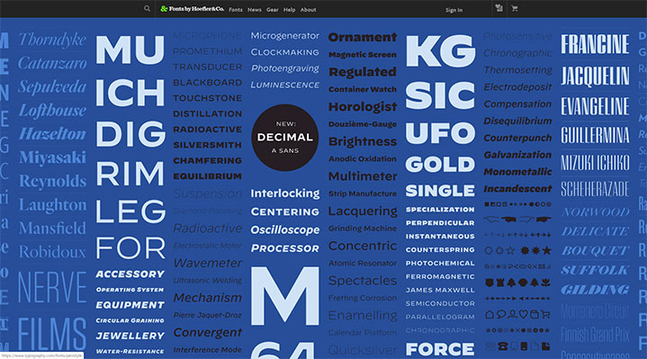
Hoefler&Co is a New York-based agency that creates original fonts for individual clients, but also does retail typography. Founded in 1989 by Jonathan Hoefler, the agency draws inspiration from historical models and was the first one to introduce the stylistic reinterpretation of grunge motifs such as Soviet house numbers, metal lettering on bus terminals, engraved maps and old gas stations, transforming them into typefaces and giving them a fresh, unique look. Although best known for the Gotham font, their base of over 1500 typefaces has expanded to everyday objects, so today we can find their fonts on every iPhone, can of Coke, on Twitter, Wired, The Wall Street Journal. Furthermore, their typefaces have been included into permanent collections of MoMA and the Smithsonian Institute.
Top Themes for Creatives
View Collection


Emigre is a large library of digital typefaces. Active since 1984, it became famous through the foundry’s own Emigre Magazine. Their typefaces are inspired by technical achievements made possible by the first Apple Makintosh 128k computer, of which they said “it forced us to question everything we had learnt about design.” Zuzana Licko and Rudi VanderLans have gathered an amazing crew of designers and own a huge collection of both traditional and experimental types. In 2011, five typefaces by this foundry have been included in MoMA Architecture and Design collection, including the entirety of Emigre Magazine editorials.
Paratype from Moscow was for a long time the first and only private type foundry in the world. Founded in 1989, it was the only foundry to contain a rich collection of Cyrillic typefaces. Today, the foundry bases its work on creating modern typefaces for various languages, but they maintain a passion for historical Russian letters, as well as Cyrillic extensions of the best Latin typefaces.
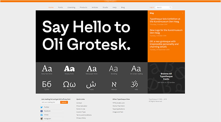
The Dutch-Croatian designer duo of Peter Bilak and Nikola Djurek is the creative force behind Typotheque, a foundry that belongs to the very top of the international typography elite. As representatives of the powerful Hague school, in 2009 they pioneered the licensed adaptation of an entire type collection for the web. With their utilitarian and, at the same time, experimental projects, Typotheque is known for types that reflect the times and the needs the times impose.
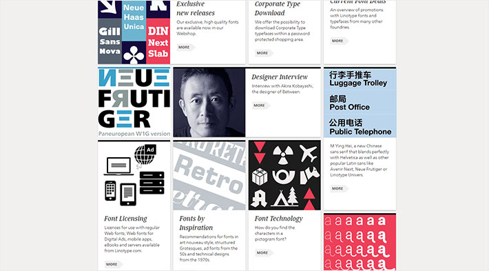
Linotype doesn’t require special introduction, as the company is the absolute leader in design circles with font families like Helvetica, Frutiger, Univers, Din Next, Avenir, Trade Gothic and many others. In addition to the well-established trust in Linotype’s fonts and their quality, the studio is known for always keeping up with the times and making sure each new typeface is a consistent form adapted to the wide spectrum of media. The studio has been part of Monotype since 2006.
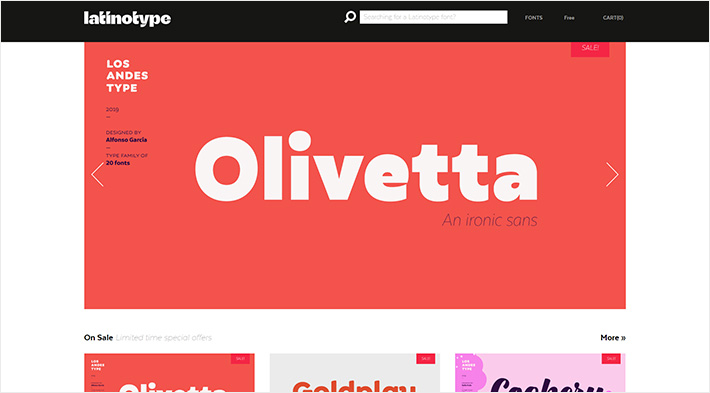
One of the recently most successful foundries on MyFonts, Latinotype was founded in Chile by Luciano Vergara and Daniel Hernandez in 2011. As South America was mainly influenced by American and European trends in typography, the founders of this studio were limited in terms of native models, which, on the other hand, inspired them to create a brand based on rich cultural foundations. Free from the pressure of the past, they passionately create coloristic display, script and other typefaces as an associative reflection of their own country, resulting in the creation of a very strong identity.
Final Thoughts
Type foundries represent a very important part of the web design ecosystem. Unique or custom fonts add an invaluable personal touch to a website and help establish a brand in a way that other design elements can hardly match. That’s why it’s important for designers to explore them to the fullest, tapping into the potential of innovative and often downright brilliant typeface design solutions. We hope you found our list of the best type foundries useful. Even if you’re not planning on using any of the fonts these foundries created, their websites are practical examples of the power of typography and can serve as inspiration for any web designer struggling with their font choices.
