24 Stunning Examples of Movie Industry Websites

Websites within the movie industry are typically used to promote projects, drum up hype, and dish out news about casting, filming, and other intriguing aspects of production. To achieve those goals, such sites combine stunning designs, entertaining concepts and expert marketing tactics to create digital juggernauts that make viewers hooked to the product.
Immersive, fullscreen visual stimuli are an excellent starting point. Most good movie and production company websites use enrapturing images and videos to suck viewers into their artistic vortex and incite them to discover more about showcased works. They often implement interactive features to the site with the idea of increasing user engagement. Viewers are encouraged to play games related to a movie, take a look behind the scenes, perform actions that will affect the way the content is displayed on a site, and so on. Websites sometimes even integrate movie scores as background music to create a certain atmosphere and ensure a more immersive browsing experience.
Having analyzed a great number of websites dedicated to various movies, shows, production studios, and directors, we have compiled a list of highly imaginative, authentic projects that cleverly capture the attention of their audience. We divided all the examples into two groups as their goals and designs are essentially different – one group contains movie presentation sites while the other includes sites dedicated to the overall works of production studios and directors. Let’s kick things off with movie presentation websites.
Movie Presentation Websites
Movie websites are devised so that they thematically and stylistically match the film they are dedicated to. The goal is to translate the storyline and the emotion of a film to the web as vividly and effectively as possible. To that end, all site elements, from copy and visuals to audio and accompanying effects are carefully orchestrated to enrapture viewers and bring them closer to the film. Oftentimes, the graphical richness of a movie site and the power of the added effects are so impressive that they make viewers feel as if they were a guest on the set or a member of the crew who decides in which direction the storyline should go.
The following examples are among the finest movie presentation websites we have come across. They are all immensely creative and enthralling, demonstrating the power of superb filmic design:
Want to make a movie-themed website of your own? Try out these demos from our very own Qi Theme for Elementor:

For the Love of Bread is an eight-part series that takes viewers on a trip around the world to meet the best bread makers. The show’s fully immersive website is rich with beautiful visuals, including fullscreen black-and-white cinematic background videos that provide a taste of what the show is about. On scroll, episode previews play one after the other, introducing you to the countries and cities the show will take you to. Transitions from one video to the next appear as colorful distortions, giving the site a slight alternative touch. The cursor is shaped like a large circle with “Play” written inside of it, encouraging viewers to watch the show (when launched, episodes are in full color). Titles are written using a huge, all-caps sans serif typeface and its simplicity and bold white color are a nice contrast to the buzzing atmosphere of the video in the background. The episode list contains the names of the countries and cities featured on the show, with titles written using large typography. On hover, episode previews appear, but this time not across the entire screen but rather as subtle invitations to discover the charm of For the Love of Bread.

Lady Bird is a coming-of-age movie directed by Greta Gerwig. The film follows the life of Christine “Lady Bird” McPherson, a high school senior. It tells the story about her relationship with her mother and family, while also documenting her trials of love and self-discovery. The website dedicated to the movie is sadly no longer available, but we couldn’t overlook it as it was beautifully thought out. We added a link to the project’s Behance page, where you can see screenshots from the site and get an idea of its overall aesthetic. The site included a predominantly beige background on which the authors placed black, serif typography, and large, playful, fiery-red sans serif titles. Overall, its design, much like the aesthetic of the movie itself, evokes the spirit and nostalgia of the late 90s. Aside from enjoying the grainy, fullscreen imagery from the movie and getting acquainted with the plot and the crew, viewers could also play a game in which they were prompted to choose what memories of home they cherished the most. The memories were presented on tarot-like cards that contained illustrations of holding hands, a hand pierced by an arrow, etc.

Mank is an oscar-nominated biopic about Herman Jacob Mankiewicz. Directed by David Fincher, this movie covers Mankiewicz’s most famous project – co-writing Citizen Kane with eccentric actor and director Orson Welles. To celebrate the release of the movie, a team of creatives made an art book about the project and launched the Mank: the Unmaking website. The site represents a digital take on the book. It was devised by the Watson Design Group, a digital design studio known for their authentic and award-winning movie websites. The site’s layout evokes the feeling of going through book pages, learning more about the movie in a visually staggering fashion. Visuals are mostly presented as thumbnails, but on click, they may take up the entire surface of the screen. There are several parts of the movie you can explore, and, if you click on “Index” you will be presented with a list of available information about that specific part, such as actors, score, costume designers, and more. Everything you wish to learn about this black-and-white movie, you can discover on the Mank: the Unmaking website.

The interactive website for the movie The Greatest Showman was designed by Bahaa Samir. The site is bustling with scroll-triggered actions that reveal stunning fullscreen photo and video material, getting viewers better acquainted with the movie. As you go from one section to the next, music from the movie plays in the background. On some slides, text appears across the screen, instructing you to, for instance, move the mouse to the right, to reveal more content. As you do that, a character depicted in the background rotates their body, following your movement. Or, if you wish to see where you can purchase the movie, you’re instructed to tap and hold a button to enjoy the show, i.e. see a trailer from the movie after which you’re presented with a list of platforms you can get the feature from. You can also take a 360° look behind the scenes, view interviews with the cast and crew, and watch how the show came to be. The hidden menu lets you quickly jump to a specific area of the site. You can find out more about the plot, the characters, or the awards the show has won. Menu links are displayed in a purely cinematic style as if they were movie titles. When you hover over them, specific background images appear for each link. This site is a remarkably engaging project that ensures a fully immersive browsing experience for everyone who visits it.

Dark is a time-travel science-fiction drama on Netflix. The show’s complex plot centers on four families in the fictional city of Winden, Germany that fight for control over time travel. To help viewers learn more about the characters, events, and the places mentioned in the show, Netflix has created the Dark: The Official Guide website. The site’s mysterious visual character matches that of the series. Such an atmosphere was created by coalescing stunning, dark visuals and beautiful effects with some eerie background music. The surface of the black backdrop looks creased, with one of the rumples following the movement of your cursor. The triquetra symbol, which is used throughout the site, represents the show’s three seasons. In the show itself, triquetra symbolizes the past, the present, and the future and their interconnection. You can explore the three seasons episode by episode, study a family tree to better understand complex character relations, or select a character and see a part of their story.

The Naïve New Beaters’ video for their “Words Hurt” song is an interactive, filmic music video that puts you in control of the protagonist’s destiny. You are encouraged to make choices on his behalf that will determine the course of future events. It all starts with you deciding whether he cheats on his exam or not. You are supposed to help your hero (played by the band’s frontman Michael Bensoussan a.k.a. David Boring or Estéban) face some moral dilemmas and assist him in navigating the challenges of adulthood. He can end up anywhere, from participating in a war or ending up glued to the screen playing computer games to leading anti-war movements, becoming a president, and much more. The choose-your-own-adventure approach ensures an engaging experience for audiences that are sure to have some fun while enjoying the band’s song. The remarkably creative video was directed by Romain Chassaing.

LOVE DEATH + ROBOTS, or, in its emoji form – ❤️☠️🤖, is an adult anthology series on Netflix that explores the multifaceted nature of humans. It consists of short stories animated in a variety of styles, from cartoony to photorealistic, immersing viewers into the imaginative world of sci-fi, fantasy, horror, and comedy. The artistic diversity on the show is mirrored on the site that provides an overview of the episodes and an introduction to the creative team behind the project. There are fullscreen visuals, games viewers can play, as well as embedded videos and texts about the project and its development. The cursor is shaped like a white circle that enlarges when you place it on clickable elements. It also tells you that you can interact in some way with specific elements and sections (e.g. it tells you to “Play” content, “Skip” it, etc.). When you place it on some elements, the color of the circle and the element that you’re hovering over inverts. This is a subtle yet interesting effect that helps draw you in even more as you interact with the site’s already intriguing environment.

Waterloo is a movie about the famous battle of Waterloo which marked the end of the Napoleonic wars. The movie takes viewers on a historic journey and places them directly on the battlefield. The website includes a myriad of fullscreen graphics, both photos, and videos, which helps keep visitors engaged and interested in what’s to come. On some pages, there are even 3D images of the actors that help make the site all the more immersive. Viewers can go through the movie synopsis, meet the team behind the movie, watch the trailer in three languages, take a look behind the scenes, read the latest news related to the projects, and more. At the top of the screen, there is a sticky button that takes viewers to the project’s official Facebook page where they can also play the Waterloo game.

The Capitol.pn is a project devised to market the movie Hunger Games: Mockingjay Part 1. The site is sadly no longer available, but we loved its design, so we included its Behance page. The Capitol.pn was designed as the official website of Panem’s government (Panem is the fictional world in which The Hunger Games take place). When people would visit the site, a pixelated image would greet them. They were prompted to identify as inhabitants of one of Panem’s 13 districts and then share the site’s message on Twitter. As more visitors engaged in that action, the pixelated image became clearer. This was an ingenious way of creating user engagement and drumming up hype about both the site and the movie. The Capitol.pn website had an extremely clean, futuristic look and a minimalist interface. It was designed using predominantly white color while its layouts contained terrific 3D visuals. In fact, the site’s design resembled what you might imagine a future government web presentation would look like. It featured interviews with Panem’s fictional characters and speeches of Coriolanus Snow (Panem’s president), which were aired on Capitol TV. This entire project was tremendously well-thought-out and, considering its interactivity and the mélange of engaging elements it included, it undoubtedly managed to spark viewers’ interest in the movie.

American Documentary is a clean, beautifully organized website that provides a lovely introduction to the world of documentary films. Its layout irresistibly reminds of magazines – movie overviews look like article previews, with a featured image and a short description displayed below. The content is organized into several categories, all of which include an image in full color displayed at the top section of the site. The rest of the visuals are in black-and-white until you hover over them, which is when they spring to a colorful life. The most prominent hues on the site are black and a fiery orange that often appears as you hover over typography. You can browse the movies by category, topic, and type, and then watch them directly on the site.
Film WordPress Themes
View Collection
Cinerama
A Theme for Movie Studios and Filmmakers
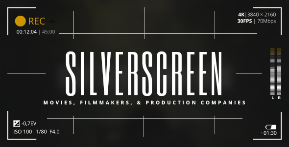
Silverscreen
A Theme for Movies, Filmmakers and Production Companies
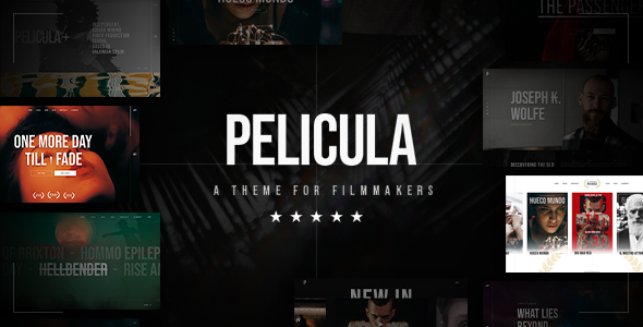
Pelicula
Video Production and Movie Theme
Production Studio and Director Websites
Websites of production studios and directors are usually designed in a way that best showcases their cinematic oeuvre and skillset. That’s why they mostly look like portfolios, with lots of galleries, project showcases, and effects that enhance the style and the authenticity of the creatives’ work.
Sometimes, the aesthetic of these websites truthfully mirrors a particular style a director or a studio may be recognizable for. For instance, if they are known for their love of a black-and-white aesthetic and minimalism, that preference is most likely going to show on their site as well.
While the number of production studio and director websites is undoubtedly large, there are some particularly effective presentations that, for us, stood out from the rest. These sites are imaginative, striking, informative, and memorable, perfectly showcasing the art of the studio or an individual they were created for:

Tandem Films is a production company based in Madrid, Spain. Their website starts off with a beautiful fullscreen video that subtly lures viewers into the creative universe of their movies. There is no navigation in the typical sense, but rather four useful links placed in each corner of the screen, written using outlined, uppercase, sans serif typography. When you hover over movie titles, the color of the background changes every time, making that section of the site look more alive and appealing to the eye. The site also includes news in the journal section that looks more like a gallery because of the featured poetic imagery. On click, photos reveal the featured story. Each page includes a combination of huge, serifless, attention-grabbing typography and cinematic graphics that look stunning placed on plain backdrops.

Skyline Films is a Hollywood movie and TV production company from London. Their portfolio includes movies such as Sherlock Holmes, Rocknrolla, Jane Eyre, King Arthur, Green Zone, and many others. All of their works are presented on an infinity canvas that you can browse in any direction you desire. Each movie includes a short video preview, and its name is written in an outlined serifless font. When you place the cursor on the name of the movie, the letters become white. On click, the video preview enlarges, taking you straight into the world of the selected feature. Single pages include movie quotes that slowly appear on the screen in the typeout effect as you scroll down the page. You can read a synopsis, watch the full trailer, browse photo galleries, and discover exactly what kind of work the studio did on the film. The fullscreen menu is simple, containing just three navigation links that match the typographic style of the movie titles on the homepage. And if the infinity movie canvas is not your cup of tea, the designers made sure to include a list of the movies that you can explore on scroll, with featured images appearing on hover.

The website of Longshot Features is an astounding project that showcases the works of Joe Talbot and his company in a mesmerizing fashion. Much of its alternative and enchanting character is based on the idiosyncratic 8-bit animated art of Mattis Dovier. The horizontal scroll navigation, which is a great choice for the site’s storytelling nature, takes you on a journey through the company’s selected works. The animated illustrations are clickable, revealing the story behind each project. The body text is written using a monospace font and its tech-y, simple vibe beautifully complements the visual complexity of the content. And to further enhance the site’s authenticity and its enrapturing artistic character, the designers added the possibility of playing background music composed by Joe.

Burnish Creative is an Emmy-winning production and post-production company from Los Angeles. Their website’s homepage consists of a collection of fullscreen background videos that the studio has worked on, and large, outlined words displayed on top of the videos, covering the entire screen. Whenever a video changes in the back, a selection of words becomes white, revealing basic information about Burnish. Some inner pages include horizontal navigation, giving visitors an overview of the company’s creative achievements. Project single pages are packed with scroll-triggered animations that lead to colorful visuals and project details appearing in the viewport. The studio’s logo is stylized either as red letters placed on a white background or vice versa, and the color of the fonts on the site matches that of the logo – texts are mostly in red and white, save for the black body text. That way, Burnish achieved a stylistic homogeneity and ensured their audience can easily make the connection between the brand and their site.

Easy Tiger is a French company that produces features and short movies. The homepage includes a slider in the widescreen format that introduces audiences to some of their projects. As you scroll from one slider to the next, the videos split into several smaller screens which then merge again, showing the new video. The complete collection of the studio’s works is displayed under the “Films” menu section. Similar to the style of the slider transitions, the projects here are showcased as a collection of smaller screens organized into two horizontally-scrolling rows. The vivaciousness and colorfulness of these elements is balanced out with a black backdrop. Users can explore the names of Easy Tiger’s directors and learn what projects each of them has worked on. Transition effects from one page to the other are subtle yet eye-catching, with the current content slowly disappearing from right to left and new content taking its place, sliding onto the screen from left to right. The “About” page contains a particularly interesting typographic element – the name of the studio written in enormous letters. While at first sight viewers may think there is nothing out of the ordinary about this, on closer examination, they will notice a pink animated tiger in the background, coloring the otherwise outlined letters in pink to match the brand’s logo.

Tabo Tabo Films is a French production company that creates movies, tv projects and short films. This is instantly evident on their site, where these three categories are displayed on the fullscreen slider. As you hover on any of the categories, video previews begin to play. If you click on a category name, you will reveal a collection of movies that belong to that specific group. They are all listed one below the other, with the names of the movies written on top of the full-width preview images. The image you place your mouse on is displayed in full color while other projects appear to be slightly dimmed and less noticeable. Inner pages are essentially simple, as they include just a few visuals and not that much text – the information is succinct and written with a clean sans serif font. Moreover, it is presented in an easy-to-consume way using contrasting colors for the text and the background. Aside from learning more about the company’s movies, viewers can read a selection of news about Tabo Tabo, discover information about the company, etc.

A24 is an independent company that specializes in film distribution as well as film and television production. Their homepage begins with fullscreen background imagery and videos from some of their projects, giving users a glimpse of their artistry. The immersive introductory section is followed by a medley of items from the official shop, a selection of the studio’s works, news, as well as invitations to play their podcast. The designers decided to display a little bit of everything on the homepage, announcing what sort of content viewers can find on the site. There are several sections you can explore, all of which are featured in the sticky menu at the top of the screen. Most pages come with some filters, helping you discover interesting projects with greater ease. The “Shop” page even has a mega menu, which allows for a quick and easy online shopping experience. Animation and transition effects on the site aren’t too wild. They are, in fact, quite unobtrusive, matching the simplicity of the displayed content and typography. Layouts are clean, with lots of white space, and as such easy to digest.

The website of Faliro House begins with animated images that look like paintings come to life. This interesting detail is a great site opener and an impressive introduction to this production company from Greece. The site is filled with black-and-white imagery that oozes a timeless appeal, perfectly complementing the film industry. There are some pictures in full color, too, shaking up the atmosphere and making the content more exciting for viewers. For instance, the “Locations” page includes a list of places in Greece where filming a project would be good. When you hover over any of those names, an image of the selected place appears in the background in full color. And when you click on the name, a separate page dedicated to the chosen location opens, showing you all the best spots at the place in question. The fonts on the site are interesting to the eye as the company has mingled the elegant, attention-seeking serif font with a monospace typeface. Everything is well-balanced out, informative, and engaging, ensuring an enjoyable browsing experience for all users.

Brother Film is a creative company that makes music as well as movies and commercials. On the homepage, you are encouraged to decide which section you would like to explore first – the studio’s music or the movies they have worked on. You can scroll up to learn more about Brother Music or down to reveal info about Brother Film. The background on the site is black and its grainy texture is a subtle nod to the film industry. As you start to scroll, the letters (Brother Film) begin to dissipate into several rows, providing a bit of an unusual introduction to the rest of the content. As you scroll down to the movies the company has worked on, you will notice that the letters used for project titles are styled in the same way as the ones at the top. The titles are displayed in several interlaced rows above the featured images, so you can’t really make out the title of the project in all that abstractness. However, they are placed below every picture, too, as well as around it, in a clear and easy-to-read fashion. The cursor is shaped like a white square, but when placed on clickable elements, it rotates and either enlarges or becomes outlined. Its look, especially when rotated, is similar to the company’s logo which consists of two B’s merged within a square. The “Films” section on the site is chock-full with movie posters, but if you would like to speed up the process of finding a specific movie, you can use a set of handy filters. Single project pages include lots of visual content and brief information about the selected film, offering gorgeous insight into the studio’s work.

20/20 Films is a company that specializes in commercial and photo production. Their website is predominantly in black-and-white, with lots of large images that often look as if scratched a bit on the surface. The same scratching pattern appears when you place your mouse over menu links. The design of the letters in menu links is particularly interesting. The menu itself is sticky and the letters are by default black. However, as you start to explore the site, they become transparent or white, depending on the color of the content you’re viewing. In most sections, the screen is divided into two parts. Photos of directors are displayed on one side. To see the work of a specific creative, simply click on their image and their projects will appear on the other side of the screen. The “Films” page is an eye-catching one. It looks like a collection of cinema billboards, advertising the now-airing and upcoming movies. Typography is large and in all caps throughout the whole site. But no matter the size and their geometric character, the letters do not overpower the visuals. In fact, their robustness beautifully adds to the site’s cinematic aesthetic.

Ali Ali is a commercial director known for his work with many notable brands, such as Coca-Cola, Diesel, Bud, Amazon, Lavazza, and many others. His website is a striking minimalist showcase of his artistry and a terrific reflection of Ali’s love for minimalism and typography. Navigation is simple, consisting of just three links – Bio, Work, and Contact. The background on each of those pages is grainy, but its color changes from black to white and, lastly, grey, adding a bit of stylistic divergence to the site. The content elegantly appears in the viewport, slowly assembling into a captivating showcase of Ali Ali’s portfolio. The “Work” page is designed using a modular grid layout. As you start to explore that page, video thumbnails slide onto the screen. And when you hover over them, commercial previews start to play. On click, you launch a video player. While a commercial plays, you can scroll down to read more information about it. As you do that, the audio slightly fades out, allowing you to fully focus on the text in front of you.

Edoardo Smerilli is a multidisciplinary movie director based in Bologna, Italy. His interactive idiosyncratic website starts with a fullscreen image from one of his projects. As you move the cursor over it, the surface of the photo distorts. If you hold the mouse button, the photo becomes smaller and slightly convex, and its bottom right corner twists, encouraging you to get acquainted with Smerilli’s artistry by flipping the project pages as if you were going through a book. Alternatively, you can click on the “All Projects” button to see a list of all of his works. The overview comes with the infinite scroll effect and appears to be convex, too. Project names are written using an outlined font that on hover becomes white. When you place the mouse on a project title, preview images appear in the background, inviting you to discover more details about a project in question. Project single pages include a gripping combination of the horizontal scroll effect and a vertical menu, making them particularly interesting to browse. The design of the “Archive” page is gripping, and the content can be explored by dragging the mouse across the screen. The combination of different navigation styles on the site amplifies its riveting appeal and the captivating beauty of Smerilli’s artistry.

Will Mayer is an American film director. His website is essentially simple, with the layout divided into two rectangular sections. In the smaller one, he nestled a vertical menu, while the larger one houses attractive project previews with a horizontally scrolling navigation. The “Video” page features a colorful progress bar, where a specific color and a small fraction of the bar correspond to one video embed. Viewers can explore Mayer’s videos either by using the horizontal navigation, skipping to a specific section on the progress bar or by clicking on the “view all” button that reveals a list of all of his projects. When placed on video previews, the cursor assumes the form of a play button. On click, users are redirected to a Vimeo page where they can view the video in its entirety. The light, grainy background adds a touch of warmth to the site and balances out the colorful visuals. Fonts are mostly simple, with lots of lowercase typography, although he did use bold letters to display project names, instantly capturing the viewer’s attention.

Dexter Navy’s website is an empire of floating, edgy visuals, dispersed all over a black canvas. Visitors can move the cursor in any direction they like to explore the studio’s extensive portfolio. On hover, project names appear at the bottom left corner of the screen in the eye-catching, bold, white color. The same typographic style is used for the menu that consists of three sections, enabling users to explore just the films or photos as well as view the studio’s contact information. Project single pages include only images and horizontal navigation. There is no copy. Instead, visuals do all the talking on this site designed to showcase Dexter Navy’s astonishing creativity.
Closing Words
To create memorable and engaging movie industry websites, designers experiment with various elements and effects that highlight and enhance the beauty of the presented movies as well as the appeal of production companies’ and directors’ portfolios. They add movie trailers to sites, as well as behind-the-scenes materials, interviews with the cast, episode guides, and sometimes even choose-your-own-adventure elements and movie-themed games, increasing the level of user’s excitement and engagement.
All the examples we reviewed are characterized by clever and immersive combinations in terms of visual content, special effects, interactions, navigation styles, as well as color and font choices. The final results aesthetically and thematically match the movie and the style of the filmmaker or production company these sites were devised for. They also put the product into the spotlight and are easy to navigate, no matter how wild and prominent animation, transition, and hover effects may be. You can use these sites as an inspiration in your work and a reminder that there are no limits to the techniques and features you can implement in your next movie-industry-related website.
