25 Creative Logo Designs for Inspiration

People have always felt the need to use symbols to visually represent themselves, the society they belong to, their families and heritage. Back in the day, this was a matter of prestige, typical of the socially privileged.
Fast forward to the present moment, visual identification is no longer reserved only for the rich. It has become paramount for all businesses, regardless of their size and niche. Whether you’re an individual trying to make it or an already established company, you need a suitable logo to communicate your brand identity.
In this article, we’ll take a look at some of the most creative designs on the market you can use for logo inspiration. With the brand religion so omnipresent, designing logos and developing visual identities for businesses has turned into an inspiring and creative affair, and these examples are a true testament to that:
We’ll talk about several types of logo design, but you’ll see that, despite their differences, they all have some things in common. For instance, they share a belief that a logotype doesn’t necessarily have to portray the nature of the company’s business. Instead, in order to attract people, it’s better for brands to rely on emotional marketing that connects them to their audience in a more personal way, and these companies have all done just that.
Logos with Multiple Meanings
A widely used and popular logo design style is the one that emphasizes the importance of combining creative and lucid ideas into messages that provoke strong reactions. In such cases the aesthetics are important, but they’re not the most significant element of design. Instead, it’s all about capturing the observer’s attention. The combination of unusual and strange elements is used to create very simple, memorable solutions that leave a strong impression on the observer.

Mirko Ilić Corp.’s logo has become a trademark for this well-known design studio and it stands as a great example of how classic symbols can acquire new and perhaps unexpected meanings. They decided to go with the well-known copyright symbol, but they’ve tweaked it a bit at the top. The alteration is small but effective, and carries a powerful symbolic meaning. The logo indicates the niche this company belongs to, but it also serves as a nod to the city where they’re based – the great New York City, a.k.a. the Big Apple. A graphic solution of this sort also tells us what we can expect from the agency it represents, and in this case, that’s highly creative and original design solutions that go way beyond the sphere that visual communication commonly defines.
This logo was designed by the Norwegian Heydays Studio. Oslo City Bike is all about sharing bikes, and they’ve got a logo to match their activities. They’ve opted for a subtly-styled bike that at the same time resembles a human face. It looks like a mascot of sorts that guides and assists users through the app and on rides using different facial expressions. This animated character acts as an assistant that gives people useful advice, provides them with the necessary information, and it sends them warnings when needed. By doing that, it helps instill trust and deepen the connection between users and the brand.
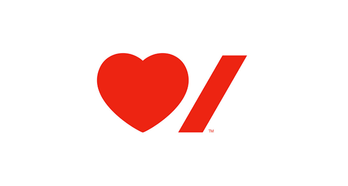
The Heart and Stroke Foundation is a Canadian organization that supports heart disease prevention. Their logo was created by the legendary Paula Scher from the Pentagram design studio, and it beautifully illustrates the permeation of visual and verbal elements, which we often see in graphic design. This trademark is a great conceptual solution that exudes freshness and originality because of its asymmetry and the surprising combination of various graphic symbols.
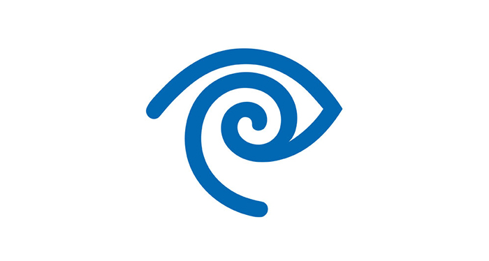
Time Warner is an American media and entertainment company created from the merger of Time Inc. and Warner Communications. The logo was designed by Steff Geissbuhler in 1989. This original and clever graphic stylization unites eye and ear symbols, and it emphasizes the basic values of these two companies, which are “looking and listening, reading and hearing, receiving and sending”.
Elegant Logos
From sophisticated cosmetic brands, luxurious restaurants and hotels, to personal trademarks of artists and craftsmen, logos with elegant lines suit a myriad of different needs and give each project an intimate, handmade vibe. These logo designs range from richly illustrated symbols to conceptually reduced solutions, and each of them stands as a work of art in its own right.
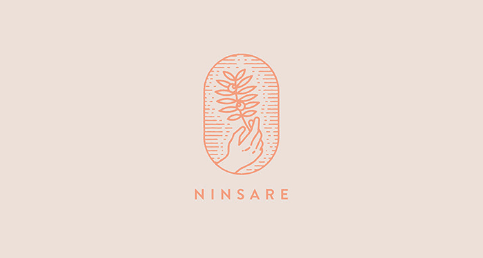
The logo of the cosmetic brand Ninsare was created by Ju&Ke design studio and it stands as a beautiful illustrative example of a linear logotype in action. Here they’ve opted for the shield form to assemble all the rich, artistic elements into a compact form. Uneven lines that resemble engraved works exude the spirit of ancient times that’s beautifully juxtaposed with the modern sans serif typography.
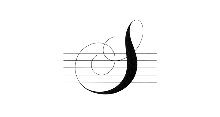
The logo for the Stravinsky Festival Trust was crafted in 1979 in the studio of the iconic designer Alan Fletcher. This symbol represents the composer’s integrated initials styled as a musical treble clef, placed on thin staff lines. Even though such fine lines make the sign appear less compact and reduce its functionality, this is an example of a logo that’s so grand that it bypasses common rules and principles of design.
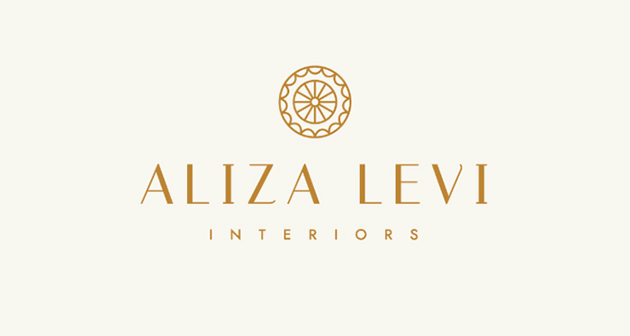
Regular, circular logos arranged in a shield form, adorned with different types of linear ornaments can look almost identical, but the number of variations within these shapes alone, and thus their character, seems limitless. The logo for Aliza Levi interiors represents the work of the Dutch designer Rose van der Ende. Even though it’s completely geometric and symmetrical, this symbol looks like a wonderful handcrafted piece of work.
Illustrative Logo Designs
Illustrative logos very easily and quickly evoke the most adorable and pleasant reactions among the observers. They strongly rely on aesthetic qualities, but their messages are usually very original and creative. They can be very complex in terms of colors and graphics, and sometimes they can be quite minimal too. These are some of our favorite examples.
Mateja Kovač is a Croatian illustrator and painter. Her works look subtle and light, and she illustrates anything from fashion to everyday life events. The logo for the brand was born out of a collaboration between Mateja and the Mireldy design studio. It represents the author herself through beautiful, playful, amorphous shapes and brush strokes typical of her paintings. Lovely colors wonderfully match the modern black sans serif typeface. The logo comes in several versions, each using different shapes and color palettes, and so it can work well in various contexts.
Mexicorama – A Mexican Cultural Exposition’s trademark logo was created in 2010. This is one of the numerous examples of Lance Wyman’s outstanding work, a designer who specializes in creating visual identities and graphic arts. He is also known for developing the branding and design campaign for the 1968 Summer Olympic Games in Mexico. Even though the logo is quite complex, it’s still easy on the eye because of its strong colors and compactness, which make it look on-trend even today.
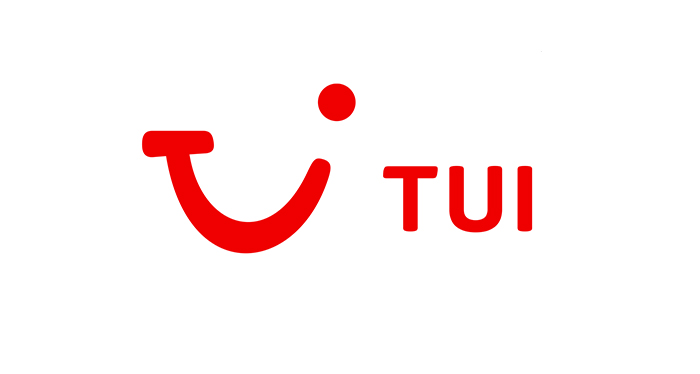
The logo for Touristik Union International was crafted by creatives from the Interbrand design studio. Even though we don’t necessarily have to see it as illustrative (after all, it’s quite minimal), we’ve placed it in this category because it carries the vibe of illustrative logo designs. The three letters – a T, a U, and an I have been morphed into a pleasant-looking face that beautifully depicts the company’s values and their “Discover your smile” motto.
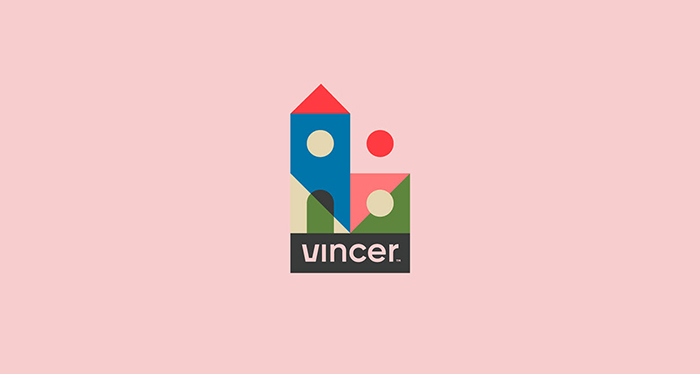
The Vincer Real Estate agency trademark logo was designed by the Brazilian graphic designer Gabriel M. Ramos. Its aesthetics and design look truly refreshing and bold compared to traditional and bland logos real estate agencies usually have. Modular geometric shapes that make up the symbol can be used in a plethora of different ways, depending on what you wish to craft. They’re highly practical and as such are an excellent choice when developing a brand’s visual identity. They also look great in promo materials, catalogs, and advertising campaigns.
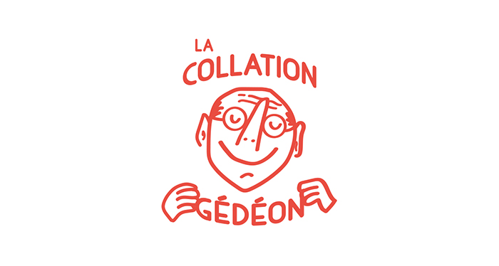
This hand-made logo is an example of an entirely illustrative brand symbol. Even the typefaces are illustrated. The hand-drawn portrait looks very descriptive and rich, but it still retains graphic simplicity that makes it look like a proper trademark. This interesting logo for La Collation Gédéon was designed by a Canadian designer Amelie Vaillancourt.
Handwritten Logos
Handwritten logos range from elegant and sophisticated, well-readable, done in classic calligraphy, modern and clear, to intricate, illegible, abstract, and those that look like a child drew them. They’re widely used by people who wish to introduce themselves through their work and who consider their brand an indispensable part of their own identity. Furthermore, they’re quite popular amongst large companies, in the hospitality industry, and brands with a long-standing tradition.
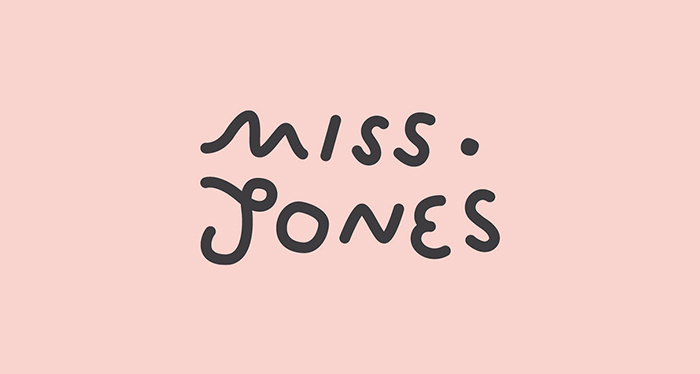
The Miss Jones Café logo was created by Brenton Craig and the Autumn Studio. This is one of those perfectly clear and readable handwritten logotypes done in a child-like and fresh style. It’s not defined by any design rules, but it’s rather created using free motion handwriting that beautifully reflects the spirit of the café.
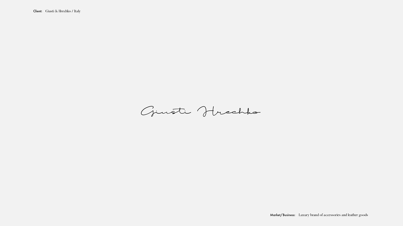
The brands that are all about individuality and originality often incorporate those same values in logo design, and that becomes the foundation of their visual identity. For them, the focus is not as much on information and functionality as it is on portraying a specific feeling. The logotype for the luxurious handbag brand Giusti & Hrechko was made by Marina Mescaline. It oozes Italian impulsiveness and energy. These attributes make the logo look quite novel and are more important than the readability of the letters itself.

The logotype for LetterScout comes from the collection of symbols and signs of the typographer Joseph Arp. It’s based on principles of classic calligraphy and handwriting but with a modern twist. This is a common approach in contemporary calligraphy, where the authentic stroke of a hand is used as a starting point for a logo design, which is then further processed and shaped until the desired result is achieved.
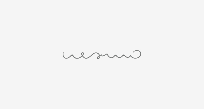
There are examples where the illegibility of a logo is not considered a fault, but is rather seen as its artistic quality. That’s exactly what the Nezhno Ceramics’ logo, created by Radmir Volk, looks like. This is a light, delicate print in the form of a linear vignette, that looks even more distinct when engraved at the bottom of ceramic vessels.
New Themes
VIEW COLLECTION
Brutalist Logos
Brutalism is a very popular style in various different areas of design and visual art, as well as in web design, branding, architecture, and even illustration. Aside from being used for projects that share the same sensibility, brutalism is popular among all kinds of brands whose character significantly differs from this art style.

The visual identity of Noji Architects fully illustrates what they do. Robert Boyle, a designer and creative director, has created a logotype using very simple, geometric letters. These letters are actually extracted from a 3D cube in such a sustainable way that there’s no leftover material. This kind of graphic solution looks great on all kinds of advertising spaces, but most importantly, it exemplifies simplicity and sustainability, which represent the ethos of this company.
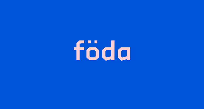
Robust and strong visual styles aren’t typical of architectural and industrial brands only, and this example perfectly demonstrates it. Created by Mike Morton, this project celebrates Föda, a brand that promotes Swedish cuisine in all its forms. Even though this is essentially a typographic solution, thanks to its playful, sharp edges and strokes it actually looks like a rich, artistic logo trademark.
Vyazminova & Selvinsky Architects is another studio known for its modern architectural approach. Even though their logo appears extremely abstract, it still maintains clear and recognizable letter shapes, which make it easy to read and comprehend. Just like numerous other examples from our list, this symbol, too, allows for logo variations. The author of the studio’s visual identity is Aleksandr Maksimov. His unusual color palette choices wonderfully unite elegance and sophistication with brutalism.
Typographic Logos
Handwritten logos come in multiple styles, and typographic logotypes aren’t any different. They range from illustrative and simple, to elegant and abstract even. They’re very popular and widely used, and work great in all kinds of scenarios.
Proto Proto is a global platform for designers and craftsmen who make unique, hand-made accessories and clothes. Their aesthetics is all about diversity and freedom, and their products as well as the logo both prove it. The logo was created in the Bedow design studio, and it consists of letters written in 32 languages. You can find eight different versions of the logo on the web, and not one is similar, much like all of their products are unique in their own way.
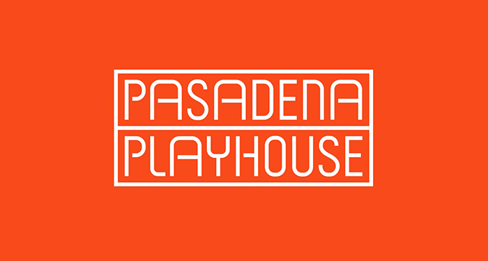
The visual identity for Pasadena Playhouse is created by the renowned Pentagram studio. The logo represents a combination of original and fresh typography of uneven proportions in the strong cinnabar color. It’s also framed, and so are all other elements that represent their new identity, which creates a clear visual cohesion within the brand.
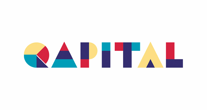
This is another creation of the Stockholm’s Bedow design studio. Even though the Qapital’s logo has a strong, illustrative character, typography is still at the forefront. As we’ve seen in numerous other examples where logos were created by putting together different modular geometric shapes, the same principle was used here, and then applied to the rest of the company’s visual identity.

As we discussed earlier, typographic trademark symbols are probably the most common type of them all. In fact, it’s not that uncommon to see a logotype made up of just one word written in some popular font. Sometimes such solutions lack originality, other times they’re beautifully executed and are all you need from a logo. In some cases, the peculiarity of a language or the brand’s name alone give a whole new value to a logo. Of course, there’s always room for small, subtle typeface modifications that can make a logotype really stand out. The Moujan Lusso’s logo is a lovely and unobtrusive example of a typographic logo coming from Alexandra Necula’s design collection.
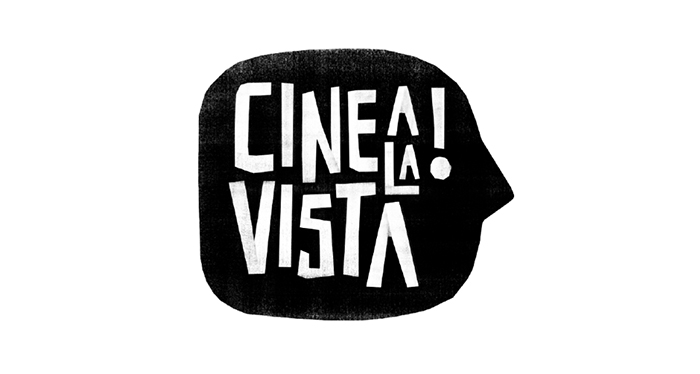
The logo for Cine a la Vista, the International Film Festival in Argentina is a playful, interesting piece of handcrafted work made by cutting through paper stencils. The author is Leo Franchi, a designer and animator. The character of this logotype is in complete harmony with this festival that celebrates youth and has a jury comprised of teenagers only.
Final Words
There are many different types of inspiring logos on the web, and when it comes to creating one that will represent your brand, the possibilities are virtually endless. Creativity allows you to think conceptually and outside of the box. What matters is to pin-point the sensibility that best matches your business and reflects your values, interests, and character. Success will surely follow, because the strategy of using visuals to evoke emotions in people and make them reflect on human values has been proven to be highly effective.
