How to Arrange Your WordPress Blog Posts in a Grid Layout

With WordPress, anyone can create and design a website. That much is true. But if you want to truly express yourself and show off your design chops, you will find that WordPress’s default themes often lack some functionalities that you want to use, or that there are effects which are difficult to achieve.
Displaying your WordPress content in a grid layout is one of those things which don’t always come out-of-the-box with a WordPress theme. This is why many professionally made themes offer a grid layout – specifically, themes made for blogging will typically have it. But maybe you don’t have the means for a professionally made theme, or the theme you absolutely love simply doesn’t have everything you want from it. Fortunately, that can be remedied: there are a couple of WordPress plugins which allow you to lay out your posts as a grid.
We will show you how to arrange your WordPress posts into a grid layout using a plugin. But first, we’ll take a while to talk to you about when a grid layout is useful – there are cases in which you might be better off with a different layout. If you are dead-set on a grid layout for your WordPress website, feel free to skip the why section, and head straight on to the how-to.
Why Would You Want a Grid Layout
A grid, as opposed to a linear display, shows your posts arranged into a matrix, instead of one underneath the other. A grid means arranging your posts into rows and columns, often also displaying such data as title, featured image, post author, date, and so on. You can see a typical take on it in this demo of our Stockholm theme:

But what is it good for?
First of all, a grid layout is more efficient in terms of space, and will allow your website visitors a quick overview of your posts and their titles, making it easier for them to find the content they want – provided your titles are meaningful and informative, as they should be.
Secondly, a grid layout is a good way of bringing your featured images to prominence, making grids an especially interesting feature for visual-heavy blogs.
Thirdly, there’s no reason to think your grid should hold all your posts. With a judicious use of filters, you can have many different grids on your WordPress website. You could, for instance, give your visitors an overview of all your latest posts, but you could also organize your grids by topic, category, tag, or any other characteristic (recent TV reviews, your shop’s best deals, all your French language articles – whatever you want, really), or even allow your valued contributing authors to come to the fore by displaying all their content.
There are also times when a grid layout is not the best solution for your WordPress website. Generally speaking, all content can be arranged into a grid, but we find a grid works best if you have a lot of content, most of which you want accessible at a glance at once. What good would a four-column grid be, for instance, if you only have three items to display in it? Only if you have a substantial amount of content will a grid save space and look good, which is a consideration you have to have in mind when laying out your grid.
How to Create a WordPress Grid Layout Using a Plugin
So, if you are sure you want a grid layout for your WordPress posts, and if your theme doesn’t provide you with the requisite functionality, you’ll likely be looking for a plugin. The plugin we will be using is The Post Grid.
After you have installed and activated the plugin, you need to generate some new grids before you start posting them. First, navigate to The Post Grid/Add New Grid from your WordPress dashboard.
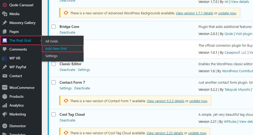
There you will find several tabs which govern the content and look of a grid as well as a preview underneath. You can use this plugin to generate any number of different grids.
In the Source tab, you can select which items you want to include in a grid. The default is post, but you can also choose pages, custom CSS, or other items. You can also filter your posts by post ID, and set a limit to the number of posts in a grid.
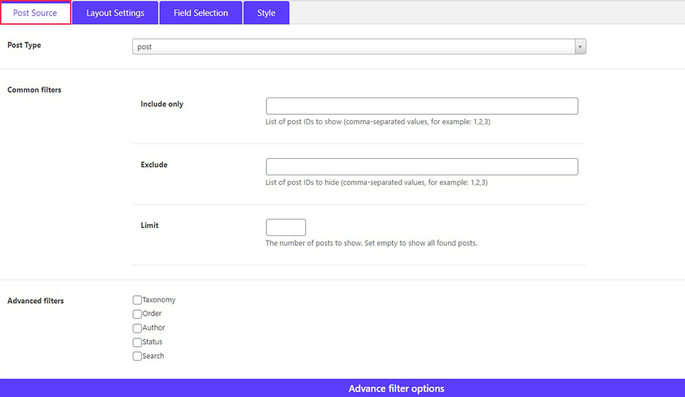
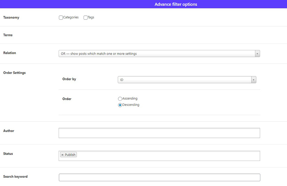
You could also filter your posts by category and tags, order, author, status, or search keyword.
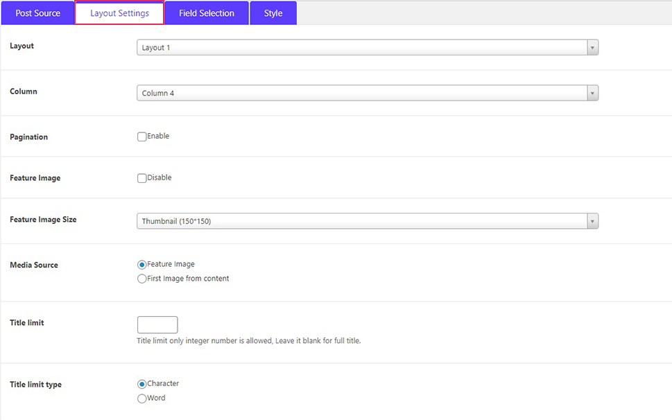
In the Layout tab, you can select between preset layout types, number of columns, featured image settings, excerpt settings, and link behaviour.
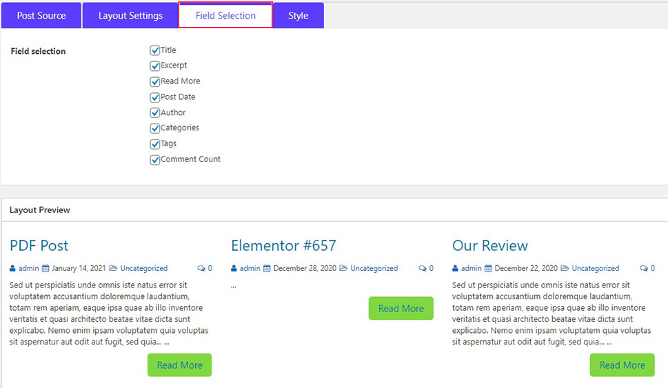
The Field Selection tab allows you to pick which parts of post data will be displayed in the grid: title, excerpt, a read more button, post date, author, categories, tags, and comments.
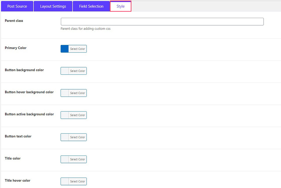
Finally, in the Style tab, you have the options of styling your grid. You can change the colours of all the elements of your grid: title, button, button text, and so on. Note, though, that in some cases theme settings may override plugin settings regarding stylization, which was not the case with the Bridge theme we were using here
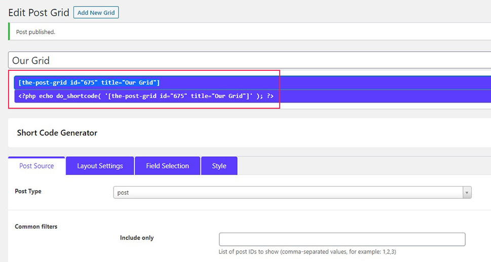
Once you have set your grid, you can give it a title and hit Publish. Your grid will now be ready to embed into your website. To do that, you will need the shortcode right underneath the title. Copy it.
You can now embed the shortcode into any shortcode-ready space on your website. We will show you how to do it on a page. To do that, create a page.
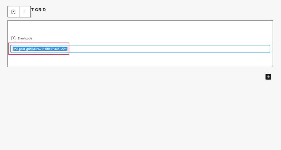
Next, click the plus sign and choose a Shortcode block. If you are a Gutenberg user, that is. If you are an Elementor user, use the shortcode element, while, if you are a Classic editor user, you can simply paste the shortcode wherever you want it on the page.
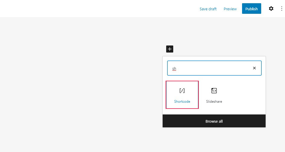
You then need to paste your shortcode into the block’s field. Once you have done that, simply click Publish.
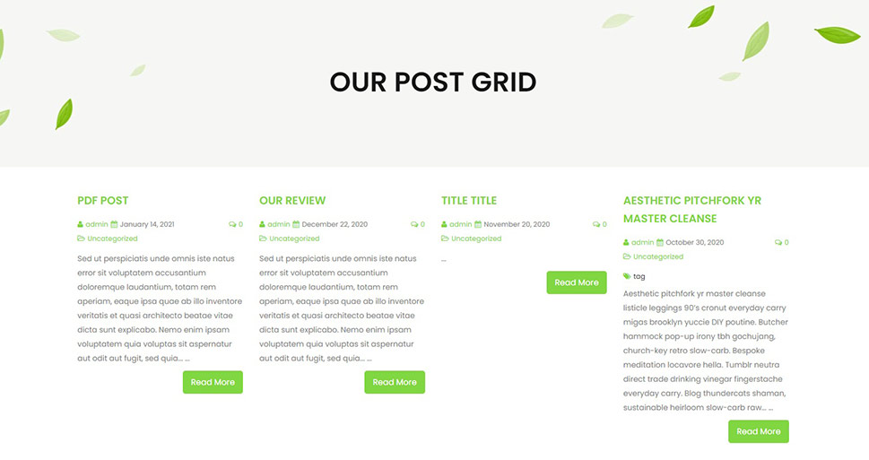
And your post grid page is ready!
In Conclusion
And that’s really all there is to creating a post grid in WordPress. You can create however many grids you like, and use them for various purposes: to showcase an author, to provide your visitors with the most recent news at a glance, or to make the best possible use of your media library in presenting your content. Whichever the reason or purpose, you can make your WordPress website richer by a grid or two or more easy and free.


