24 Beautiful Examples of Gradient Websites
Gradients are among the most prominent styles in graphic design. They became a huge thing in the ‘90s and were widely used on all types of websites. But by the start of the 2010s, they were pushed to the side in favor of flat designs and minimalism. However, around 2016, perhaps a bit unexpectedly, gradients resurged. In that year, the social media giant, Instagram, redesigned their logo, opting for a somewhat flat solution with a striking gradient splashed all over it. While many of its users demanded the company revert back to the previous design, the vibrant logo stuck around, marking the comeback of the gradient design trend.
A lot of other large brands followed in Instagram’s footsteps and started experimenting with gradients. But unlike the early 2000’s websites, this time round gradients were far more subtle. We can see them mostly on backgrounds, logos, and image overlays. There are, of course, absolutely stunning gradient WordPress themes, too. Designers embraced them because gradients allow them to mix colors they want and combine them with other effects, such as duotone (e.g. Spotify). The end results are unique styles and colorful schemes that add a whole new dimension to their projects.
A confluence of two or more colors can be seen on a myriad of modern websites, and we’ve selected the most interesting examples that demonstrate how gradients can enhance the appeal of a site. We will talk about:
Our Qi Theme for Elementor contains many demos you can use for your website, including some with a gradient color scheme:

Murmure is a French creative agency with offices in Caen and Paris. Their homepage is predominantly in black and white. At the top of the page, you can see the studio’s logo with a dotted sphere in the background. As soon as you bring the cursor close to the sphere, the dots morph into strips and the whole shape starts to look like some kind of pom-pom. The more you move the mouse over it, the messier its shape becomes. The colorful project previews and the blue cursor break the monochromatic aesthetic of the site. There are strategically placed gradients throughout the site’s imagery, usually combined with black and white backgrounds, which makes the vibrant colors pop even more. But the most prominent use of gradients, perhaps, is in the hidden menu. Once you open it, you will notice links on the right side of the screen, while the left is dominated by a large circle with a gradient that changes color depending on the page you’re currently on. When you click on any of the links, the circle expands, taking up the entirety of the viewport and serving as a beautiful transition effect. The way Murmure uses gradients sparsely demonstrates just how effective they can be, especially when combined with a mostly monochromatic and minimalist interface.

Zeus Jones is a creative agency based in Milan. Their homepage starts off with a plain black background with the text “Most people can only see today.” displayed on it. But if you wait for a few seconds, more text will show up on the page and the background will transform into a restless sea of black and grey hues before, finally, as the words “We help brands imagine a new world.” appear on the screen, it reaches a crescendo and turns into a colorful, animated gradient of blue, violet, yellow, and orange hues. The gradation of colors complements the textual content and highlights the agency’s powerful message. This vibrant site opener captures the attention from the onset, encouraging viewers to find out more about Zeus Jones.

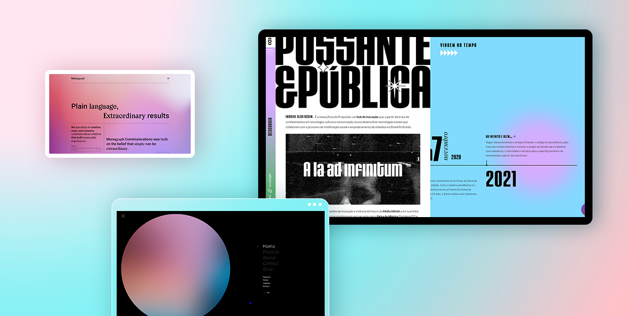
Every page of the Monograph Communications website contains a gradient in the background. The exciting aesthetic invites viewers to discover more about this brand that specializes in communications solutions. Gradient colors change from one layout to the next, ranging from fuchsia to soft pink, orange and yellow to lime green, and cerulean to purple. The site is typography rich and filled with grid lines. Even though there are no visuals, the liveliness of the gradients and the contrasting content in black creates a visually exciting unit that viewers will enjoy exploring.

St. Martin is a creative agency that works with small businesses. The background on their homepage is adorned with a psychedelic, undulating gradient in orange, yellow, pink, blue, and green hues. Its movement and colorfulness clash with the seriousness of the black elements displayed on the homepage. The menu is placed at the bottom, with each of the five straight black lines representing one menu section. The background on the inner pages is a lot more tame and in one color only, but you can still spot gradients here and there. For example, on the “Team” page, images of the team members have a red duotone gradient effect. Moreover, the background behind some elements contains a subtle red gradient, making the content more attention-grabbing.

Virgile Guinard is a French photographer based in Paris. His homepage seemingly consists of rectangles of varying sizes, with each rectangle colored in different gradient colors. On hover, they turn into project previews, containing both photo and video material. Project single layouts are designed in the same style. In some sections, gradient rectangles remain in the background, with photographs and videos highlighted at the forefront. In others, they remain visible until the content loads. Then they disappear from view. Considering the richness and variety of colors used for gradients, other elements on the site had to be more demure. Typography is in a simple, slightly geometric white font. Menu links are unobtrusively placed in the corners of the screen – you can see them, but Guinard’s projects remain in the spotlight at all times.

Jemima is a graphic designer that specializes in print, editorial, and book design. On her portfolio website, she combines a grainy, alluring, predominantly blue and orange gradient with white typography. The homepage includes only project names. When you click on them, you will be redirected to project single pages that contain the grainy gradient in blue. Even though the displayed imagery has lots of colors, their vivaciousness does not clash with the vibrancy of the gradient effect. To avoid bad UX, Jemima made sure her photos have flat backgrounds that separate the displayed content from the gradients. That way, she ensured the colors of the gradient and those on the pictures do not overshadow each other and that her work is the star of the site.

Zona de Propulsão is an innovation hub where different types of cultural projects come to life. The loading screen of this one-page website includes an animated GIF of TV static – a beautiful harbinger announcing the impressively designed website. This one-pager is packed with large typography, terrific animation effects, and microinteractions that bring the content to life. The layout is mostly divided into two columns, with a vertical menu on the left side of the screen. Gradients in green and lavender hues define the site’s visual identity. The cursor is designed as a medium-sized circle colored in the blue and green gradient. When you place it on the site’s content or on the white space, it changes to a gradient consisting of red and pink hues. At the same time, it also colors the elements you place it onto in playful gradients.

EarCOUTURE is an audio shop. The homepage contains a fullscreen slider that puts a few of the selected products into the spotlight. Gradients are noticeable in the background and slightly on product images. The colorful gradient backdrop contains some abstract elements, lines, swirls, and light fractions that make the slider all the more interesting to the viewer’s eye. Slide transitions include an edgy effect that slightly distorts the content, immersing you into the world of EarCOUTURE’s products. Gradients are applied to other site sections as well. For instance, page transitions include a subtle gradient that moves from the bottom of the page to the top, slowly revealing the new content. The colorfulness of gradients shakes up the quiet palette used on the majority of the pages, with white backgrounds and content mostly in black.
Gradient WordPress Themes
View Collection


Haiku-Haiku is a cool website developed by Ezekiel Aquino. This is the place where people can participate in writing haikus with other website visitors. The layout is split into two parts. On the right, you can explore the list of completed haikus. And on the left-hand side of the screen, you will find the collection of haikus that still need to be completed. The gradient background is in eye-catching colors that change as you move the cursor across the screen. When you open the “About” page, a transparent layover text appears on a grey background, but you can still see the gradients shifting behind it.

Thirst is a packaging agency that specializes in working with drink brands. Their website starts off with an animated rainbow gradient that gives the site a dreamy vibe. Menu items and a brief introduction to what this company does are placed in the middle of the screen, enveloped by the beauty of the delicate gradient. Other pages include a white background with lots of immersive, colorful visuals, but the striking gradient remains the most memorable feature of this website.

DICE is a music and discourse festival held in Berlin. The homepage includes a stunning gradient in blue and purple shades. In the middle of the screen, you’ll see an animated 3D object with a gradient effect. Various shades of orange and pink mix and merge as the object rotates, making the homepage look particularly memorable and striking. The homepage also contains lots of uppercase sans serif typography, with performers’ names appearing in the viewport with an infinite loop effect. The simplicity of the fonts beautifully balances out the untamed spirit of the gradients, making the site easy to digest yet attention-grabbing.

Prism Data is a transaction intelligence platform used for getting financial insights and predicting risk scores. The pages on their website are predominantly in black or white, with gradients subtly appearing in the background. For instance, at the top of their homepage, the animated gradient initially appears only in the far right part of the screen. But, then it begins to move towards the middle of the screen, breaking into three separate colors that find their way back together again. As you scroll down the page, a straight line follows your movement, connecting one section to the other, with several colorful gradients dispersed throughout the page. Inner pages also contain gradients that look particularly delicate against a white backdrop. Prism Data’s website is a great example of how even the smallest touch of gradients can define the visual character of a website and how these striking elements can be used by all types of businesses.

Better Half is a creative studio based in Los Angeles. Their one-page website begins and ends with a sandy gradient that gives warmth to the entire presentation. Elsewhere on the site, there aren’t so many colors. In fact, save for a few colorful images and the ochre gradient, most of the content is in black while the background is predominantly white. The overall design is simple, but there are some majestic hover animations that occur when you place the cursor on the studio’s logo at the top and the bottom of the page. The letters bend and move in the opposite direction of the mouse. At the top, project images also appear on hover. Even though the effects, typographic choices, and imagery are all impressive, the coziness that the gradient evokes makes all the difference. Its unobtrusiveness and lovely color provide a warm welcome to the site, as well as a sweet send-off.

François Hulet is a Belgian designer. On his homepage, he briefly introduces himself and immediately states his love for gradients. His passion for blending colors and creating transitions from one hue to the next is evident on every page of his website. He blends dark and light blue as well as powdery pink and cerulean shades to create eye-appealing transitions from one color to another. But he also goes a step further, using the mouse cursor as a tool that allows visitors to play around and modify the look of the site’s backgrounds. Whichever page you visit, the cursor will shine a faint light on the backdrops, turning the already vivacious backgrounds into fully interactive canvases. This can be seen best on the “Lab” page. While this is the only page on the site with a flat black background, the pointer shines some indigo blue onto it. So as you move the mouse around the page, the blue circle follows you around, creating a regal gradient by merging black and indigo blue hues. This interactive element lets you further experiment with Hulet’s gradients and experience all the variety you can get from them, depending on where the cursor is located on the screen at any given moment.

Antara is a multidisciplinary design studio. On their website, they created a gradient effect by adding unobtrusive splashes of yellow and grey to a light background. The shades are delicate and non-distracting. You can clearly notice the gradients, but both colors elegantly blend in with the featured content without stealing its spotlight. The subtleness of the gradients beautifully complements the sophisticated serif font and the minimalist, yet refined vibe of the site. All elements are in perfect harmony, highlighting Antara’s work in an appealing fashion.

Michelberger Hotel is one of Berlin’s top hotels known for its authentic and playful interiors. The style the hotel is famous for beautifully translates onto their website. The first screen you see is completely white, with the hotel’s logo written on it. The cursor on this screen is fittingly shaped like a prism, and once you click, the white light is split into a colorful spectrum, turning the background into a rainbow gradient . The homepage includes the infinite loop effect so the gradient seems never-ending. On its surface, there are only the names of inner pages listed one below the other. The transition from one section to the next is followed by the color changes in the background. Inner pages don’t contain gradients but they are colored in hues that constitute the rainbow. For example, the link to the “Restaurant” page is placed on an orange part of the rainbow, and the backdrop on this page is in that same shade.

Lēonard is an inventive agency located in Paris. When the site’s loading animation appears, the screen is initially grey. As the content loads, a gradient in a lighter shade of grey appears on one side of the screen and an orange gradient shows up on the other end. The closer you get to content fully loading, the more prominent the gradients become. They are not static. They continue to move over the edges of the screen while you explore the site’s content. Gradients are displayed on every page, but you can also spot them in the fullscreen menu. The backdrop in the menu is white, but the links contain an animated gradient effect. You can observe as the fiery orange gradient travels from the top link to the last one, leaving fonts in light blue and light grey shades behind.

Gucci Beauty Foundation is a website that celebrates one of the brand’s latest foundations. Like all the other websites created in celebration of Gucci’s products, this one, too, mesmerizes viewers with its creativity. The loading screen consists of a house of cards that collapses. Several cards then slowly assemble in front of you, as if you were holding them in your hand. The background turns into an eye-appealing gradient that changes its colors every few seconds. Even though each displayed image i.e. card contains a vivid color palette, their colorfulness does not interfere with the vibrancy of the gradients. If anything, the content on the cards looks even more prominent, capturing the viewer’s attention from the get-go. The site contains lots of video tutorials, interactive shade picker palettes, as well as a quiz – all the cool and smart ways to increase user engagement.

When the Worksmiths website loads, all you see is a black background with white typography on it. But as you start to scroll down the page and reveal more about this branding studio, you come across soft, pastel pink gradients that gently awaken the entire site. Worksmiths played with gradient and black backdrops, using them to mark transitions from one section of their one-page site to the next. Besides pink and black, bold yellow is another prominent color on the site. You can spot it in quirky animated illustrations and on some uppercase typography. Its vividness contrasts the calmness of the pink gradient and the neutrality of the black color, but the disparity between the three colors is what makes this site so striking and beautiful.

Life In Vogue is Vogue Italia’s annual event when they open their Milan offices to the public. However, due to the ongoing Covid-19 pandemic, this year’s edition couldn’t be held. Instead, Vogue created this interactive platform, i.e. a virtual replica of Vogue’s offices in Milan that anyone can tour from the comfort of their own home. As the “Life in Vogue” text and the illustration of the magazine appear on the loading screen, the peachy colored gradient appears in the background. It stays there when you flip the first page of the magazine, revealing a 3D pop-up book depicting Cadorna Square with Condé Nast’s building on it. The softness of the gradient perfectly fits the pastel color palette used for the pop-up book, creating a highly enjoyable visual experience for viewers. Upon turning the page once again, you find yourself inside the elevator, where each floor corresponds to one area of the site. Vogue’s virtual rooms were designed by a team of six designers who were allowed to unbridle their creativity and place stunning, imaginative worlds inside Vogue’s offices.

Jam3 – FWA 100 is a project created by the Jam3 design agency to commemorate their 100 FWA wins. This website is filled with eye-appealing animated gradients in lavender, violet, and blue shades. You can see them in the background the entire time you explore this terrific project but also on some other website elements. For example, as you explore the site, you will stumble upon a 3D rock. You are encouraged to draw on it by holding your mouse. The longer you press the mouse button, the larger the stone and its gradient-colored spikes become. Ultimately, they all explode into a myriad of colorful gradient triangles. By coloring this website and its content almost exclusively in gradients, Jam 3 gave a new, more interesting life to the displayed 3D virtual objects, creating a remarkable celebration of their creative achievements.

Memory Work is a research-based scenario and immersive speculative soundscape, indicating possible futures of women’s labor. The website contains a soft color palette, with lots of violet, pink, blue, green, and yellow elements. In the top section of the homepage, the aforementioned colors are all blended together, creating a tranquil gradient sea of pastel hues. Elsewhere on the site, gradients are applied to the menu. When you hover over the menu links, a bold gradient appears, coloring the selected link in the colors of the rainbow.

Listen! is an electronic music festival held in Brussels. Their website is bathed in delicate gradients of powdery pink and baby blue hues which can be spotted in the background on the majority of the pages. The top section of the homepage includes a magnetic horizontal animation of interlocking 3D rings colored in a chromatic rainbow gradient. While the rings move from one side of the screen to the next, a swirling delicate gradient in the background amplifies the dynamicity of the page. Imagery is in black-and-white (photos gain color on hover), but the delicate gradient in the background softens the slight edginess of the visuals, resulting in a highly enjoyable visual experience for users.

Blobmixer is your virtual playground for creating 3D art. You can craft your own animated blob and style it to your taste by using a myriad of customization options. For example, you can adjust the roughness levels of the blob and the environment map values, set specific distortion levels, modify the animation speed, change the size of the blob, as well as its color. You can opt for a flat hue, but the site allows you to play with a gradient map and blend a palette you like the most. You can then change the color of the background, to make it suit the style of your blob. There’s also a cool library of selected blobs, showcasing the creativity of the site’s visitors.
Closing Words
When used in a well-thought-out manner, gradients are a surefire way of increasing the vibrancy and appeal of your designs. They will make your projects more memorable and help them stand out from the competition. Whether you skillfully apply them to larger surfaces such as the background on your site or add them only to cursors or call-to-action buttons, they are always impossible to miss.
As the websites on our list demonstrate, there is no need to go overboard with flashy colors and overwhelm viewers with too intense visual experiences. You can still add a unique feel to your projects even if you opt for a subtle, delicate gradient color scheme. No matter how subdued the mixed hues may seem, they will still elevate your work. You can also use all types of animation effects to amplify the beauty of the gradients and make them more eye-catching. All that matters is that you ensure gradients don’t steal the viewer’s attention but rather help direct it to your work, sparking users’ interest in learning more about what you do.
