52 Impressive Examples of Websites with Beige Backgrounds
Beige is traditionally perceived as a neutral, simple, and pretty much foolproof color. While some people may consider it dull or say it lacks a wow factor, the allure of this hue lies precisely in its subtle, pristine, soothing vibes.
Beige oozes equanimity and warmth no matter the scenario you use it in. It suits numerous different styles and complements virtually any other color. It even has a certain mimicry-like quality that allows it to take on the attributes of other hues it is paired with, while simultaneously enabling those other colors to come to prominence. Due to its inconspicuous character, this medley of off-white and earthy, light brown hues has become a widely used backdrop color.
Websites with beige backgrounds became popular around 2019. Up to that point, it seemed the web was full of bright palettes and multi-colored gradients. But as creatives slowly started experimenting with beige, they realized there was a certain power in its tranquil neutrality. There was something inherently familiar, perhaps even nostalgic about large beige backdrops. Something that evokes the age-old sensation of writing on old paper. The more they played with this hue, the more they realized it could act as the perfect foundation for any type of project and help them evoke a variety of moods and aesthetics, ranging from elegant or earthy to dreamy, feminine, relaxing, and more.
While the number of websites with a beige background is undoubtedly large, we have prepared a carefully curated collection of designs that demonstrate the multi-layered beauty of this sophisticated color:
Some of the demos you get with our Qi Theme for Elementor also feature being backgrounds:

Beauty, simplicity, and elegance – three words that best describe Thibaud Allie’s portfolio website. This one-page introduction to his creativity bears an unmistakable magazine vibe. Enormous captions and large, colorful images are masterfully placed against a beige background that, thanks to its unimposing nature, helps put the site’s content into the spotlight. The highlighted project is displayed at the top of the page. The preview image is initially slightly askew but then it grows larger in size, straightens, and blends in with the rest of the content. If you reload the page, another featured image will appear. In general, Allie didn’t go overboard with visuals. There’s only one more section on the site where preview images from a number of his projects appear as you move the cursor across that particular part of the site. When you click on them, you will be redirected to a site of one of Allie’s clients or his Behance page dedicated to the selected project.

Angela Milosevic is an art director and digital designer working at Squarespace. For her personal website, she created a simple yet engaging one-page layout that combines big, black typography with immersive hover effects. As you move the cursor over project names, grainy visuals appear in the viewport, following the pointer and leaving a trail behind. The clarity of the light background allowed Angela to experiment with interesting effects and interlace her site with cool imagery that speaks volumes of her creative genius.

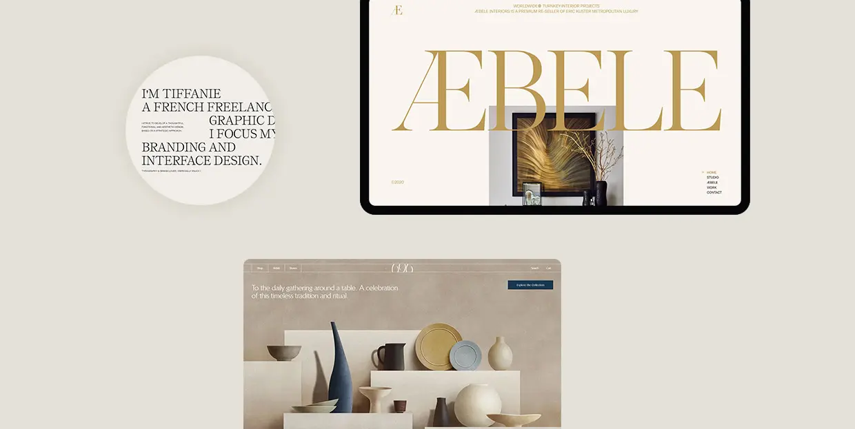
Tiffanie Mazellier’s website starts off with a fun loading animation in the shape of a mouse that runs from one side of the screen to the other leaving a white trail behind. As the mouse reaches the end of its road, the black screen turns to beige, revealing Tiffanie’s short introduction. She combines large, all-caps letters with lowercase typography and creates a playful typographic scenery with sans serif and serif fonts. Most letters are colored in black, but she did implement a red typeout effect into some sections, adding to the appeal of the textual content and injecting life into it. The cursor is in the shape of a small circle, but as you place it on preview images of her projects, the circle grows bigger and begins to fluctuate. Uppercase text also appears inside of it, inviting you to discover more about her work. The “About” page is a beautiful testament to this artist’s creativity. There is an outlined drawing of Tiffanie, but when you put the pointer on it, it turns into a black-and-white image that swirls and distorts, mimicking the movement of your mouse. In general, there aren’t that many colors on the site, save for project pages that contain a more vivid palette. Everything is predominantly in black-and-white and beige tones, with sporadic splashes of red. The subtle beige background is a constant, gluing all elements together in a visually appealing, congruous unit.

The website of Marvin Schwaibold gives viewers a lovely insight into his artistry. He displayed a number of preview images from some of his most notable projects on the homepage. The colorfulness of the visuals is beautifully enhanced by the tame beige hue in the background. The backdrop on most pages and in the fullscreen menu is colored in beige tones, creating a sense of consistency throughout the site. The pages are not swamped with too much content nor are there any wild effects, so you can stay fully focused on Schwaibold’s amazing work. The typography on the site looks refined but there’s a slight edge to it, as he coupled an elegant serif font with a clean sans serif type. The contrast between dark typography and the light beige background ensures excellent readability at all times.

Craig Raynolds is a photographer and art director. His website is bursting with visuals that seem to appear in the viewport wherever you move your mouse. While you hover over Raynolds’ name displayed at the top of the page, several preview images emerge on the screen, giving you a taste of his artistry. When you move the mouse over his project titles, the letters change their color from light grey to black. Preview photos also appear behind titles, following the movement of your pointer. Considering the visual richness of the site, the choice of the beige background makes perfect sense. In fact, its tame character helps bring out the beauty of Raynolds’ work.

Dunderville is a creative motion studio from Sweden. The story of the studio is told as the “Chronicle of Dunderville”, which is why the site’s design resembles newspapers. On every page, the content is divided into multiple sections using a precise grid system. The color of the background goes from beige to black to soft, light pink, but the majority of the vibrant content is placed on a beige backdrop. The studio added lots of animated, multi-colored elements and illustrations to the site, so the background had to be more demure. One of the most interesting sections is the area where studio founders introduce themselves. You can press a button to hit them (i.e. the photos of them) with virtual lightning. The screen then goes from beige to black and an illustration of their skull and their interests briefly appear on the page.

Tablet is an online Jewish magazine. The beige background on their website looks like a piece of paper through and through. On its surface, you will see a myriad of articles organized into multiple sections. At first glance, featured images appear to be black-and-white, but when you place the cursor on them, they spring to life and gain color. Some elements and call-to-action buttons are colored in red, and as such are impossible to miss on a beige backdrop. The “Scroll” section is particularly fun to explore. It is hidden on the right-hand side of the screen, behind the “Explore the Scroll” invitation in all red. On click, you will reveal a collection of selected articles from all categories featured in the magazine. The background stays beige at all times, bringing the content into the spotlight.
Beige WordPress Themes
View Collection


You can explore Laura Bize’s website in two modes – dark and light. Both the black background and the beige allow her content to fully shine. This is especially evident on the brightly colored illustrations of flowers that appear wherever you click on the screen and the colorful project previews. The beige background creates a more gentle atmosphere in which Bize introduces herself and her skills in an appealing fashion. On some pages, she even combines both black and beige sections, making the backdrop more interesting to the eye. Elegant typography wonderfully complements the site’s charming vibe, while all elements combined paint an adorable picture of who Bize is and what she can do.

Chungi Yoo’s website combines various shades of beige in the background with occasional splashes of pastel yellow and pink. This interactive project is visually rich, with lots of colorful pictures and illustrations, large typography, combinations of bold and regular letters, cool microinteractions, and playfully animated elements. The whole site is fun to browse, bustling with action. If you click on the asterisk in the top right corner, a virtual playground will launch. It is filled with rotating pink and red circles that fall from the top of the screen towards the bottom. A bunch of them also follow the movement of your mouse. The beige background on the site provides a beautiful canvas to play on.

Zhenya Rynzhuk is an art director and a visual designer. The loading animation on her site consists of a simple “Hey!” placed against two circles in soft pink and orange. Once the site loads, you notice that Zhenya juxtaposed the beige background with fiery orange elements dispersed all over it. That way, she managed to set up a lively, gripping scenery for the presentation of her artistry. Other pages on the site are colored in soft pink and light grey colors, but beige is still a dominant backdrop hue. At the very top of the homepage, you can catch a glimpse of some of her projects. When you place the cursor on the photo of Zhenya with her head bowed down, preview images start to change in quick succession. You can also launch a fullscreen showreel that fully immerses you into Zhenya’s creativity. A rotating asterisk invites you to “Click Click” on it, and when you do several orange and light pink circles appear in the top section of the homepage, moving in the opposite direction of your mouse. All pages are imbued with lots of scroll-triggered actions and animated elements that mesmerize viewers and keep them wanting to learn more about Zhenya’s work. Given the omnipresent vivaciousness of the entire website, the contrasting subtlety of background colors provides a sense of creative calm and adds stability to this stunning portfolio presentation.

Neuebel & Mark is a micro graphic and type design studio. Their website is designed as a modern and refined celebration of their 2020 – 2021 font catalog. It starts off strong, with the name of the studio written in a fiery red shade, clashing with the calmness of the beige background. Red is dispersed throughout the site, breaking the monotony of dark typography and enlivening the pages. There is also an interesting photo in cerulean and white tones at the top of the homepage providing a lovely contrast to the beige canvas and ensuring a striking introduction to the studio’s catalog. The all-black texts placed on the beige backdrop look sharp, with every detail of the letters clearly visible. Inner pages don’t contain many visuals, save for the “About” page that includes photos of Neuebel’s team. It’s all about the fonts made by the studio and the way they are captivatingly showcased on the beige background.

Victor Work’s one-page portfolio website is a compelling presentation of this creative’s skills. The loading animation consists of the dark blue shade splashed all over the screen. Once the content loads, the blue background disappears from the view like a theater drape, revealing the site’s content. The backdrop is then in beige while the content displayed at the top of the page is in the dark blue hue that was used for the loading screen. The combination of beige and blue is a regal site opener, leaving a terrific first impression on the viewer. After several scrolls, the background changes its color – it becomes baby blue while the content turns red. As you keep going further down the page, the practice of changing colors after a few scrolls continues until you reach the final section. All color schemes you will come across on the site are displayed at the bottom of the homepage. You can select one and view the content entirely in that particular color combination. All pairings look terrific, but dark blue and beige are a particularly effective and attention-grabbing combination, which is probably why Work used it at the top of the site.

The loading animation in the form of fullscreen hero text lures you into Érika Moreira’s portfolio website. This stunning online presentation is a terrific example of how well beige can blend with other colors. The background is beige by default, but as soon as you place the cursor on any of the listed project names, the background color changes to some other hue, such as black, yellow, and brown, to name a few. At the same time, three undulating island-like areas appear on the screen, giving viewers a preview of the selected work. The moment you move the pointer away from the project name, the background becomes beige again. By using the subtle, neutral beige as the main color on the site, Érika was able to experiment and play with other hues more.
New Themes
VIEW COLLECTION

Exploring Cusp’s website is a highly enjoyable experience. The homepage is filled with playfully animated content. As you move your cursor over displayed images, their surface becomes wavy thanks to the exciting distortion effect. The dominant colors on the photos are black, white, dark olive green, and light brown. The names of the collective’s projects are written using big, crimson red letters, while inner pages include black typography. The circular cursor is also colored in the prominent red hue. The beige background, which is used on the entire site, blends beautifully with this color scheme, no matter how eye-catching or subdued any other hue may be, connecting all the elements into an aesthetically cohesive unit.

Upon accessing Chiara Luzzana’s website, you will see her brief introduction in large, all-caps blackletter typography. She tells you that she is a sound designer and invites you to enable the sound on the site, to fully enjoy the browsing experience. The featured music is probably what beige color would sound like if it were turned into music – soft and easy on your senses. The background on all pages is beige, perfectly complementing the site’s minimalist design. The neutral quality of the backdrop allowed Luzzana to go slightly more wild with typography, so textual content is at the forefront. She combined bold uppercase fonts with outlined letters as well as serifs with sans-serifs, creating a lively typographic play for viewers. Letters are black on all pages, save for the fullscreen menu, where the color of the fonts and the background inverts.

Bruegel – Once in a Lifetime is a terrific interactive project created by the Art History Museum in Vienna to commemorate the 450th anniversary of Pieter Bruegel the Elder’s death. All pages are bustling with engaging multimedia content. You can enjoy not just the visual aspect of the site, but also the audio material that entirely immerses you into Bruegel’s world. For instance, one of his paintings, the “Peasant Wedding”, is brought to life with remarkable animations and sound effects that make you feel like a guest at the celebratory wedding lunch. There is also a video of the museum’s director introducing you to this exhibition. The use of the warm neutral beige background is spot on because a warm beige background enhances the magnificence of Bruegel’s works, flawlessly blending with every color palette he used on paintings. This website is a great example of how well a beige backdrop can fit any analog project. Whenever you wish to present drawings or anything analog, you won’t go wrong with beige because it resembles real-life paper. The earthy hue of the backdrop does not steal your attention, but it does help create a warm, pleasant atmosphere for exploring Bruegel’s Renaissance artistry.

The Queen and the Crown website introduces viewers to the costumes used in the shows “The Queen’s Gambit” and “The Crown”. This interactive project takes you into a virtual beige museum with luxurious beige walls that level out the colors of the displayed costumes. You can go from one costume to the next simply by clicking on any of the mannequins. And if you click on the “+” button placed next to all exhibited pieces, you will discover more information about the selected outfit and see close-up photos of it. Some presentations even include clips from the show in which the actors wore that piece of clothing. The background, i.e. the museum interior remains beige at all times, creating a sophisticated environment for viewing the gorgeous costumes.

Sea Harvest is a seafood market in Canberra, Australia. The design of the website resembles a poster or old newspapers with content that looks as if drawn on the beige surface with a pencil. The font combinations are interesting, uniting a monospace font with large, bold sans serif uppercase letters. The pages are filled with gorgeous illustrations and typography in all black. On hover, they all turn to the color of the sea. Photographs on inner pages are initially in black-and-white, and so is the fun snippet from Garfield, the comic strip featured on the contact page. The graphic content on the site gains color when you place your cursor on it. But no matter how many different hues the visuals may include, all of them seamlessly blend with the beige background.

Provider Store is an e-commerce website where you can purchase slow-made Japanese homeware. The beige background perfectly matches the simple, unique beauty of the products and the overall color palette on the site, which is delicate and easy on the eye. There are lots of greys, whites, browns, and powder blue tones. The beauty of the pictures, typography, and cute illustrations is amplified by the beige background, ensuring a highly appealing browsing experience for the viewer.

Norm Architects website is bathed in earthy and nude tones, with beige, grey, and soft brown shades dominating the digital scenery and providing a harmonious and enjoyable visual experience for viewers. The site’s aesthetic looks sophisticated from the first scroll to the last. Every layout is rich in photos that present the studio’s work in a stunning light. The homepage starts off with a suave image slider, providing a striking welcome to visitors and a taste of what they are about to experience on the site. The design of every page is refined and perfectly balanced, reflecting the studio’s philosophy of “soft minimalism”.

Karimoku is a Japanese furniture manufacturer and Karimoku Case Study is their architect-designed collection. The project was devised in collaboration with the Norm Architects studio and Keiji Ashizawa Design. All collections are featured in a horizontally scrolling layout on the homepage. You can learn more about each studio that participated in the project, read the related news, and find the nearest dealer of this furniture. The imagery on the site looks minimal, inviting, and often subtly bathed in sunlight. The warmth of the imagery and the furniture entirely made of wood is mirrored by the beige background that perfectly matches the site’s soft, elegant aesthetic.

George Nakashima Woodworkers website embodies the company’s philosophy that “the shapes and the colors of the wood speak to those who listen”. The colors typical of wood and the forest can be seen on the entire website, with lots of elements in various shades of green and brown. There are many images not just of the furniture, but of nature as well, the company’s biggest inspiration. The beige background glues all the elements together, and this lovely website is the further proof that beige is one of the best background colors for online furniture presentations.

&Tradition is a company that creates furnishings and luxurious home items. At the top of the homepage, a video presentation of some of their works stretches across the entire screen, completely immersing you into &Tradition’s world. The site contains lots of visuals and textual content, inviting visitors to learn as much as possible about selected pieces, discover how they were created, tour the studio, and much more. It contains a myriad of photographs, illustrations, and lots of video material, ensuring an engaging browsing experience for viewers. Featured elements are rich in colors, all wrapped in a beige weil that brings out the ritzy quality of the &Tradition’s pieces.

Loeven Morcel is a studio that makes custom high-end furniture and the design of their website complements the look of their pieces. The first thing you see is the grandiose uppercase serif typeface. It is used in the most prominent sections on the site, such as surtitles and headlines, announcing the featured imagery and copy with fanfare. A typeface like that matches the grandeur of the studio’s furniture, and so does the beige backdrop. The neutral color helps set up an elegant environment in which viewers can inspect Loeven Morcel’s works up-close.

Eham is a manufacturing company that’s been around for several decades. The top section of their homepage includes an image slider that introduces viewers to the quiet luxury of Eham’s products and, as they say, the source of the brand’s strength – the Bavarian Alps. The pages are filled with imagery, videos, and stories about the company’s creative process and their projects, bringing them closer to their audience. This brand unites sophistication and nature, hence a tame color palette on the site. The beige background seamlessly blends in with the hues typical of a natural landscape and further elevates the refined character of Eham’s stunning creations.

696 NYC sells ceramics and other handmade objects created by Japanese manufacturers. The displayed products are mainly colored in neutral shades of blue, brown, pink, and white. To match the aesthetic dictated by the showcased items, the designers opted for a light beige hue in combination with some smaller white areas. As a result, they created a site that resembles a gorgeous oasis of tranquility that is easy on all of the user’s senses, relaxing them and helping them appreciate gratitude, conversation, and the act of sharing meals with others.

Karst Stone Paper makes notebooks, journals, and planners out of stone paper that consists of recycled calcium carbonate. Even if you’re not familiar with the brand, the illustrated loading animation in the shape of a notebook provides enough of a hint about what they do. The site’s pages are imbued with gorgeous visuals that demonstrate the beauty and versatility of Karst’s products. Visitors can specify a variety of notebook qualities they are looking for and the site will eventually offer them the product that best matches their criteria. The colors on the site are ranging from blue, red, and black to pink, yellow, and green. However, the designers opted for calmer shades that are not aggressive on the viewer’s eye. The backdrop is predominantly colored in beige, matching the color of the paper found in notebooks.

Maurèle is a brand that invites all of us to slow down, read, write, and think. They are dedicated to creating customizable and sustainable stationery which is breathtakingly showcased on their website. Elegant typography adorns all pages, further inciting viewers to pick up a pen and jot down their ideas on Maurèle’s paper. Users can even customize papers according to their requirements by selecting a specific template and typeface or by entering their monogram. As for colors, the palette on the site consists of the hues typical of forests and nature in general. The dominant beige backdrop is coupled with dark green areas. The two create a powerful amalgamation that is not only appealing to the eye but it also amplifies the sophisticated character of Maurèle’s products.

Æbele Interiors is a high-end interior design studio catering to a sophisticated clientele. The design of their website is a facsimile of the opulence typical of their projects. The colors of gold, copper, and sand are dominant on all pages. They are placed on a light beige surface, oozing elegance from one pixel to the next. Typographic choices carry the same vibe, in particular the italicized cursive font. The site is packed with gorgeous imagery that delicately appears on the screen, showcasing the studio’s impressive portfolio in an impressive light.

The background on DDD Hotel’s website represents a mixture of neutral colors such as beige and grey. The calmness of these two hues is occasionally interspersed with deep green sections. The symbiosis of these three hues provides an ideal basis for showcasing the beauty of the hotel. Displayed photos are dark, grainy, mysterious, bearing a distinct cinematic feel and an irresistible charm. The site is designed so that it truthfully reflects the hotel’s contemporary minimalist design, hence the use of shades belonging to the neutral color spectrum. Exploring the site’s content is a highly pleasant affair, not just because of the satisfying color palette, but also thanks to the enrapturing effects. For instance, as soon as you place the pointer on the menu, the top left corner of the screen becomes black. If you click on the menu, the previously tiny black area grows large and assumes the shape of a half-circle, swiping away the content you were enjoying. The same thing happens every time you wish to switch from one page to the next.

The Homecult website celebrates the modern and sleek projects created by this interior design studio. The project page and single project layouts all come with a beige backdrop, beautifully complementing the elegant appeal of the displayed imagery. The mouse pointer is shaped like a circle and colored in eye-catching red. When you place it on menu links, it grows in size. At the same time, the letters you hover over spur into action and start to follow the movement of your mouse. As you hover over images, they become red also, contrasting the calmness of the beige canvas. The backdrop of the fullscreen menu is beige, too. Its neutrality additionally highlights the already vibrant red line that appears below each menu link on hover.

The first thing you see on Rino & Pelle’s website is the following description – “Luxurious and contemporary appeal for every woman”. And the design of their site reflects the same idea. The typography and the color palette on the site ooze elegant vibes. Images and videos depicting the brand’s collection include lots of pastel, sandy, and toffee shades, all attractively displayed on a beige backdrop. The way the content is animated and how softly it appears on the screen adds to the site’s appeal, making it all the more enjoyable for the viewer. For instance, as you explore the homepage, you will come across a fullscreen photo. On scroll, that image starts to drift away from you, becoming smaller with each scroll while more pictures in different sizes assemble around it, offering a charming overview of some of Rino & Pelle’s creations.

DDNA is a brand that creates “jewelry with meaning”. Floating purple bubbles placed on a tranquil beige background instantly catch your eye, inciting you to continue exploring the site to discover what DDNA has to offer. After several scrolls, the bubbles disappear from view, leaving an open space for the inviting imagery and texts that slowly slide onto the screen. The “Collections” page includes a horizontal image slider, arrestingly presenting DDNA’s products. The jewelry depicted on the site comes in various colors and shapes, but that’s not a problem for the beige backdrop as it can effortlessly match any style and design.

As we could observe on some earlier examples, a beige backdrop is a safe choice for websites that include a myriad of multicolored elements. Lafaurie, a French fashion house, used it along with light grey and white to create a warm and soft basis to present their collection. At the top of the homepage, you will see a list of categories that their items have been organized into. When you place the cursor on any category, a colorful preview photo appears, contrasting the peaceful neutral background and keeping you focused on the image. Even though the displayed items aren’t particularly wild in terms of colors, every page features a great number of images, so the beige background helps infuse the site with clarity and simplicity.

Déplacé Maison creates urban trekking shoes and accessories. You can experience their website in two modes – light and dark (i.e. the ink mode). The amalgamation of distinct visuals, typography, and animation effects evokes cool alternative vibes. The cursor is shaped as a restless, liquid form resembling a splash of ink. As you move it around a page, it leaves a trail of tiny dots behind that are also in motion. The page on which all products are displayed includes the enjoyable infinite scroll effect while the items move on their own as if placed on a vertical conveyor belt. The site is packed with imagery and illustrations that highlight the authenticity of the sneakers. The majority of the brand’s collection is in white, grey, olive green, and black colors with orange and gold detailing. Not only does beige go great with all these hues, but it also helps accentuate their allure.

Wannabe is an independent online store that specializes in selling high-end collectibles of action figures and props. The design of the site is simple yet imbued with a few peculiar surprises here and there. The peacefulness of the beige background on the homepage is shaken up with the 3D model of a skull wearing a hat that follows the movement of your mouse. Typography is in large, bold, black serifs, standing out against the light backdrop. The “Index” page contains some sort of a wheel that you can move on scroll or by dragging the cursor sideways. The wheel introduces you to product categories, each marked by a specific action figure. On click, you will reveal the entire collection. The mixture of the beige color and classic typography with terrific animation and hover effects gives this site an irresistible appeal.

Chartogne-Taillet’s website is a majestic example of how a presentation of an alcoholic drink can be designed in a picturesque and imaginative way. The interactive map that shows the vineyards and the region where this champagne is made looks as if illustrated on a soft, beige, textured drawing paper. Upon clicking on a vineyard of your choice, a watercolor illustration of a vineyard appears. It consists of tiny, colorful circles resembling champagne bubbles that, as you begin to scroll down the page, rise toward the top of the screen, much like the bubbles do in a glass. While you enjoy the bucolic presentation of the Chartogne-Taillet brand, classical music plays in the background, making you feel as if you had just joined a sophisticated party in the French countryside.

Discovered Wildfoods is a sustainable wild game brand based in Australia. The visual content and the colors on the site evoke strong natural, earthy vibes. They speak loudly to an audience interested in sustainability and purchasing high-quality meat. The grainy beige and dark green background has a relaxing effect on the viewer, much like nature does. Some of the images appear in the viewport with the parallax effect, fully immersing visitors into the Discovered Wildfoods world. Strong, bold typography amplifies the brand’s message regarding sustainability and helps increase users’ interest in the company’s offer.

Kenkashi makes microbial composting additives. Their mission is to contribute to improving the quality of the soil and making it more healthy. The choice of the beige background on their site beautifully complements the visuals. The synergy of green texts on a beige surface makes viewers think of nature, matching the style and the content of the displayed photographs. There are also several sweet, seemingly hand-drawn illustrations in a slightly darker shade of beige, enhancing the site’s charm.

Brews & Grooves is a fun website that finds perfect musical pairings for specific beers. While you wait for the site to load, a can of beer and an album cover show up on the beige screen, giving you a taste of what you’re about to experience. Once the content loads, the background color changes to black, but beige still remains a prominent color on the site. Specks of this hue are dispersed all over the backdrop and the typography is, for the most part, in a warm shade of beige. Red is also used as a highlight color throughout the site. The combination of sandy shades and the contrasting red and black colors creates a slightly retro aesthetic. When you open the hidden menu, the colors of the background and typography invert. The menu backdrop becomes beige, with menu links in black. However, once you hover over a menu item, the color of the letters changes to the attention-grabbing red. The site is packed with action, with immersive hover and scroll-triggered effects. For example, as you move the mouse over the list of available pairings, project previews appear on the page, waking up your curiosity and inciting you to continue exploring.

Enid is a digital studio based in the UK. The creativity of their team is clear from the onset – the beige loading screen features several logo variants that appear one after the other in quick succession. This commanding one-page website fuses several pastel colors, including pink, green, and beige. The content is placed on a grainy beige background, which gives the site a warm retro look. The layout is split in two, with the projects this creative studio has worked on listed as folders on the left-hand side of the screen. Going through them feels like a never-ending action because of the infinite loop effect. If you do not enjoy it, you can turn it off by clicking on a wavy line in the top right corner. Contact information takes up a significantly smaller portion of the page and stays glued to the right side of the screen at all times.

Crafted is a platform and an initiative created by the BASIC agency. This project unites artists from San Francisco and encourages cultural exchange between them. The site’s design is essentially simple – it includes lots of images and accompanying text, but the overall appeal lies in the way the content is presented. In the first section of the homepage, images are characterized by the constant vertical movement. In other sections of the site, photos have been edited so that they appear to be grainy, reminding you of hangouts during summers passed. The beige background complements the cosy atmosphere depicted on images and in videos. The seriousness of the website is occasionally interrupted by some quirky animated illustrations such as a pizza slice riding a skateboard, an icecream cone with sunglasses, a talking mouth with feet, etc. They appear while the content is loading, but you can also see some of them at the bottom of the screen at all times.

The grainy backdrop on BASIC’s website carries a strong cinematic vibe and its interesting appearance amalgamates the site’s alternative aesthetic. The color of the background ranges from beige on some pages to black on others, surprising the user with the unexpected change. Uppercase sans serif typography is omnipresent on the site, in headlines and body text alike. On layouts with a black background, texts are in a soft pink shade, making them particularly prominent against the dark surface. Beige and black together are a particularly eye-catching pairing and the contrast between the two hues helps enhance the beauty of the displayed content.

Antara is a multidisciplinary design studio with a simple and refined website. The background on the site is not entirely homogeneous – in the top left corner, there is a small grey-ish area, and on the right-hand side of the screen, you’ll notice a splash of yellow color. The sunny yellow shade adds a touch of warmth to the light grey-ish backdrop, giving it a sandy-like, beige vibe. As you scroll down the homepage, the content elegantly appears on the screen. The studio used a gorgeous, attention-grabbing serif font in headlines and project titles. When you place your cursor on project names, featured images appear. As that happens, only the title of the selected work stays fully black while the other project names stay on the sidelines and become grey. Project single pages also contain splashes of color similar to those on the homepage. Depending on the project you’re viewing, their color will change to match the dominant color of that specific brand or design. The use of the neutral background allowed for this dynamic and playful use of color.

Kacper Chlebowitz is an art director focused on motion and interaction design, and that shows on his terrific portfolio website that’s bustling with cool effects. The first thing you see once the site loads is his last name in gigantic letters splayed across the better part of the screen while a background video provides an insight into Kacper’s work. After some horizontal scrolling that reveals his last name in its entirety, the backdrop changes to beige. The homepage contains a selection of his works, placed in rectangular shapes with some geometric forms on them. On click, project single pages reveal information about each piece while the background changes to varying shades of grey or brown. In some cases, it stays beige. Project names are displayed in a slightly askew text marquee that imbues the pages with a subtle dynamicity. Featured images seem to be placed in some sort of a wheel that you can scroll through for an in-depth look at Kacper’s work.

Wedding websites are known for their sophisticated and clean design, and a beige background can greatly help enhance such a look. Veley / Ross opted for a light background that looks lovely coupled with elegant, occasionally outlined dark green and grey typography. The importance of using a neutral background on projects with lots of colorful content is particularly evident on the “Gallery” page. It contains pictures only, dispersed all over the screen. You can drag your cursor in any direction you like to explore the gallery.

In 2020, Aēsop launched a collection of candles inspired by ancient astronomy. The trio of aromatique candles is named after astronomers Ptolemy, Aganice, and Callippus. The website designed for the occasion is a majestic work of art where the flicker of candles is compared to that of the stars. It includes stunning illustrations by Mattis Dovier who’s known for his pixelated monochrome art. At first, you see an animated illustration of the sea and starry sky, with lots of shooting stars falling into the water. You can drag your mouse horizontally to explore your surroundings and to start discovering more information about the candles. Dovier also created a movie for the occasion, poetically showing how candles came to be from shooting stars. The beige color on the site exudes the warmth of the candles. The sandy hue is used for pixel art and typography. It is also applied to the background on some product pages, where its subtle character completes the story about aromatic candles in an enchanting, ethereal, and subtle way.

Most beauty brands strive to achieve a fresh and inviting look on their websites. The goal is to attractively show viewers what benefits they can expect from using the company’s products and a beige background is a great basis for creating such an aesthetic. Typology is a French skincare brand focused on producing vegan and cruelty-free products. Most of their skincare items are brown-ish and yellow-ish, and the warmth of these hues translates onto the bright background. The site includes lots of stunning photos and inviting videos that lure you into purchasing some of their terrific items.

Grid design is heavily deployed on the F. Miller Skincare website. Large and delicately beautiful visuals coalesce with green typography and a bright background, revealing the subtle beauty of this brand to their audience. On hover, a rippled effect appears on images, simulating the movement of water, a strong symbol of freshness. The website includes lots of open, breathable areas that enable viewers to easily soak up the content featured on the site.

Maison d’Etto have achieved the perfect aesthetic equilibrium on their site by combining large visuals with more subtle graphic and textual details. The warm, earthy palette and the beige backdrop enhance the specific design of the perfume bottles inspired by contemporary art and architecture. The green color seen on the domed perfume cap and the packaging is interspersed throughout the site, forming a powerful and enjoyable synergy with the interchanging beige and white sections.

Museum of Peace & Quiet is a contemporary fashion brand that encourages people to find their inner peace and focus on things that truly matter. They specialize in crafting simplistic clothing and accessories. That is why most of the items showcased on the site don’t have any embellishments and come in neutral colors, including various shades of brown and green. The background is beige, beautifully complementing the site’s earthy color palette. On the “Shop” page, items are displayed against a light grey surface. Some product sections are empty, which allows the site to breathe and the viewer to enjoy some peace and quiet while they scroll down to the next product. The design of the site complements the aesthetic of their products and the use of grids highlights the overall simplicity they advocate in life.

Monastery is a brand that makes skincare products from high-quality plant oils and absolutes. Their website is further proof that neutral and pastel colors fit cosmetic and beauty websites like a glove. The color of the background varies from one page to the next, ranging from cerulean, soft orange, and beige to white and taupe, sometimes even combining a few of them in the same layout. All of these hues are highly enjoyable to look at and as such, a delightful cornerstone for “the best that Nature has to offer”.
Closing Words
Beige is an extremely versatile color, suitable for all types of brands, including skincare companies, interior and furniture design studios, architecture firms, food manufacturers, jewelry designers, clothing manufacturers, and many others. There are simply no limits to what you can achieve with this gorgeous hue. You can create any kind of setting you like with it and use it to depict a range of different emotions that resonate with your audience.
Due to its subtle character, beige is a safe color, and as such, it can be coupled with any other hue. It all just depends on what kind of a visual identity you aim to create on your site. As some of the examples on our list illustrate, you can use it to achieve a tender, elegant aesthetic. On the other hand, some brands rely on it because it helps them bring out the sharpness and colorfulness of their projects. Whatever your goal may be, you simply can’t go wrong with the subtlety of the beige background. No matter what elements and colors you pair it with, its multifaceted potential is tremendous, making it the ideal background color.
